
Don't wanna be here? Send us removal request.
Statistics
We looked inside some of the posts by justgoingwithit and here's what we found interesting.
Average Info
Notes Per Post
4M
Likes Per Post
1M
Reblog Per Post
2M
Reply Per Post
106
Time Between Posts
2 months
Number of Posts By Type
Photo
16
Text
1
Last Seen Tumblr Blogs


Fun Fact
If you dial 1-866-584-6757, you can leave an audio post for your followers.
Photo
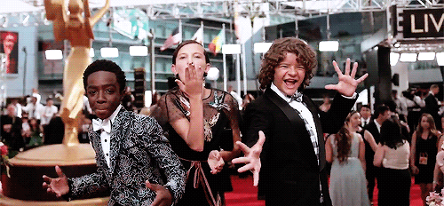

Caleb McLaughlin, Millie Bobby Brown and Gaten Matarazzo pose for the glambot at the Emmys (September 18th, 2016)
102K notes
·
View notes

Photo


danipanteez asked:
Hi Claire! Thanks so much for helping out! I’ve attached the sketch.
So, for some clarification on what’s going on in the scene. It’s very slightly inspired by an old fairy tale about broken porcelain dolls. In the picture I wanted the story to be this girl is holding one of the dolls from the hutch behind her, but the man who owns them has just entered the room, and she looks up at him. Want him to be casting a shadow on about half the comp. (Which you can faintly see in the sketch.)
The thing is. I wanted this picture to be a super drastic angle and really push three point perspective. But I’m having trouble doing so and without it looking too weird. haha! Especially the girl. I keep trying to bring the horizon line down to about her knees. But somehow it just keeps going back to where it was everytime I redraw it. And last but not least, I even tried taking some reference photos and I still can’t quite capture the the angle and perspective I want.
That was a mouthful. My apologies for the novel! So my questions to you would be, do you have any advice in exaggerating an angle that we can’t quite get in real life? Any ideas as to how I can better capture this correctly. And for composition. i still feel it’s a bit weak since I made it a head-on shot. I thought of making the corner of the room visible and so her back is not against the hutch, if that makes sense. But then i worry it might take away from the story I want it to tell? And if i can even pull that off. haha. okay! I’m done now! So sorry for being so wordy!
You can feel free to make a post about it on tumblr, as others can always benefit from a critique! But if you just reply here, I don’t mind either. :) Thanks so much love!
So you found me out, I’m actually a total perspective junkie! I don’t use it a ton in my own work, weirdly enough, but drawing things in perspective is one of my secret artsy happy places. This stuff is like candy. :)
So first things first, composition aside, you do have a nice handle on perspective- while the composition can definitely use some tweaking, there’s definitely nothing innately wrong about your sketch! It’s just a matter of shaking up the camera angle a little bit and being less tied to that idea of “placing the horizon line.”
If you look at your current composition, it’s actually (almost!) a vertical 2-point perspective- if you rotate the image 90 degrees you’ll notice that one of the perspective planes is straight-on! Totally valid composition, but it also lacks the dynamism/imbalance that’s usually associated with full-on three-point perspective:
(Quick aside- props to you for taking the time to design/draw an actual clutch! I feel like a lot of people phone it in when they’re drawing environments, so the specificity and details you’re hinting at are really compelling. Makes the clutch a character in its own right.)
—-
Let’s talk about designing three-point perspective in a small space.
So I find it immensely weird that a lot of perspective surveys stop at three-point perspective, or at least don’t touch on the fact that, once you bring the horizon into play, you have to take into account the fourth perspective point as objects start to diminish in the other direction. If you don’t, things look less like proper perspective and more like actual shape distortion:
…I’m not gonna go too deep into this right now but, suffice to say for our immediate purposes, forget the horizon line. Throw it out the window. INTO THE HORIZON you might say, hohohohoho.
In a (confined) indoor space, it takes tilting your head/camera pretty damn dramatically to get the vertical lines of a room to diminish á la three-point perspective. Because of this, you probably aren’t going to be able to see the horizon line from that camera angle- you’re either staring at the floor or the ceiling, so the horizon line becomes less of a tool and more of a crutch that’s limiting your options. That dude’s such an asshole.
So to make your life easier, worry less about horizon lines, and more about your individual vanishing points. When you’re thumbnailing, a great way to solidify your perspective (or come up with new ideas, honestly), is to do this:
If you want to push a vanishing point even further away you can just enlarge the pinwheel! pretty cut and dry.
—-
Using compositional hierarchy to reflect narrative.
So now that we’ve covered the actual mechanics of three-point perspective, let’s talk about how to make it work for the story you’re trying to tell.
Option no. 1: (see above) My first instinct would be to consider shifting the camera angle so it’s looking down on her, as opposed to the other way around. It puts us, the viewer, in (or near) the position of the figure in the doorway, and has the added benefit of making her smaller and more vulnerable in the composition- it visually traps her in the space of the room by showing the surrounding walls.
Option no. 1b: never overestimate the value of tilting/canting a composition for a quick Dutch angle! Kinda cheating if you use it too much, but WHAM POW instant drama.
Option no. 2: There are an infinite number of variations on this idea- a sharper angle, cropping in closer on her, etc.- so my solution is by no means the PERFECT BEST COMPOSITION EVER, but it gives you some idea of a different direction you could take with this piece while maintaining your sense of drama/tension.
Option no. 3: Aaaaand of course, as I defiantly drew the previous angles, I started thinking about how it could work from her perspective, kinda closer to your original piece. I do agree with your concerns about a straightforward, “head-on” composition, so I’d imagine at that point you’d have to show the figure silhouetted in the door- your main character would be reacting either to his shadow, or turning to face him.
This methodology for finding narrative compositions is by no means an absolute rule of illustration, by the by- visually “choosing a side” is a great way to immediately interject some drama into an image, but it’s also entirely up to you! You want to end up with something you’re happy with.
—-
Being a “fly in the room.” One of the best pieces of advice I got from one of my professors, Mary Jane-Begin, was to be a fly in the room. We all tend to settle on certain camera angles, either out of convenience of experience, so letting your mind wander and just sketching out some absurd alternatives can help you stumble across something unexpectedly cool. :)
So tl;dr, it feels like you know what you want out of this piece- these might not be the exact solutions for your tastes, but they might be enough of a push in the right direction that you don’t feel like you’re stalling anymore. I hope all of this is helpful/relevant!
Best of luck, and I can’t wait to see the finished piece! CLAIRE OUT <3
8K notes
·
View notes


Photo


Fun work? Is that even possible? What do you think?
This comics essay is part of a book called Brick by Brick, which I am now raising money to self publish on Kickstarter! Please check out the link for more details!
53K notes
·
View notes


Text
THE PRESIDENT OF FRANCE WANTS TO BAN HOMEWORK
well this is it
bonjour my petite crossaints
838K notes
·
View notes