
justindigital
Digitaland
Website development, UI/UX Design, Digital Media
8 posts
Don't wanna be here? Send us removal request.
Last Seen Blogs

banannasui
Cut From A Different Cloth

propertyadvisior
Property Advisior


whenxyourexstrange
Set Me Free, Leave Me Be

chaeiou
chaesicons
Photo
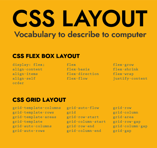
If you think of learning code like learning English, here are the “vocabularies” for you to describe layout to computers.
- - -
Connect with me:
Portfolio | Linkedin | Instagram
#padding#margin#css#computer language#website#web developers#web developer#web design#web interface#web interaction#digital#digital media#dublin#ireland
17 notes
·
View notes
Photo
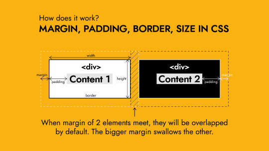
1/ margin: top right bottom left;
Tip: to center the whole page. Apply this margin setting to the biggest container of the website: margin: 0 auto;
2/ padding: top right bottom left;
3/ border: weight style color; (style can be: solid/ dashed)
- - -
Connect with me:
Portfolio | Linkedin | Instagram
#css#padding#layout#margin#website#web design#web developers#dublin#web developer#web development#coding#html
7 notes
·
View notes
Text
225 CSS PROPERTIES IN ALPHABETICAL ORDER
When it comes to CSS, it’s all about selector, properties and value. Here is the list of all CSS properties you need to take control of the front-end appearance.
A
align-content: Specifies the alignment between the lines inside a flexible container when the items do not use all available space
align-items: Specifies the alignment for items inside a flexible container
align-self: Specifies the alignment for selected items inside a flexible container
all: Resets all properties (except unicode-bidi and direction)
animation: A shorthand property for all the animation-* properties
animation-delay: Specifies a delay for the start of an animation
animation-direction: Specifies whether an animation should be played forwards, backwards or in alternate cycles
animation-duration: Specifies how long an animation should take to complete one cycle
animation-fill-mode: Specifies a style for the element when the animation is not playing (before it starts, after it ends, or both)
animation-iteration-count: Specifies the number of times an animation should be played
animation-name: Specifies a name for the @keyframes animation
animation-play-state: Specifies whether the animation is running or paused
animation-timing-function: Specifies the speed curve of an animation
B
backface-visibility: Defines whether or not the back face of an element should be visible when facing the user
background: A shorthand property for all the background-* properties
background-attachment: Sets whether a background image scrolls with the rest of the page, or is fixed
background-blend-mode: Specifies the blending mode of each background layer (color/image)
background-clip: Defines how far the background (color or image) should extend within an element
background-color: Specifies the background color of an element
background-image: Specifies one or more background images for an element
background-origin: Specifies the origin position of a background image
background-position: Specifies the position of a background image
background-repeat: Sets if/how a background image will be repeated
background-size: Specifies the size of the background images
border: A shorthand property for border-width, border-style and border-color
border-bottom: A shorthand property for border-bottom-width, border-bottom-style and border-bottom-color
border-bottom-color: Sets the color of the bottom border
border-bottom-left-radius: Defines the radius of the border of the bottom-left corner
border-bottom-right-radius: Defines the radius of the border of the bottom-right corner
border-bottom-style: Sets the style of the bottom border
border-bottom-width: Sets the width of the bottom border
border-collapse: Sets whether table borders should collapse into a single border or be separated
border-color: Sets the color of the four borders
border-image: A shorthand property for all the border-image-* properties
border-image-outset: Specifies the amount by which the border image area extends beyond the border box
border-image-repeat: Specifies whether the border image should be repeated, rounded or stretched
border-image-slice: Specifies how to slice the border image
border-image-source: Specifies the path to the image to be used as a border
border-image-width: Specifies the width of the border image
border-left: A shorthand property for all the border-left-* properties
border-left-color: Sets the color of the left border
border-left-style: Sets the style of the left border
border-left-width: Sets the width of the left border
border-radius: A shorthand property for the four border-*-radius properties
border-right: A shorthand property for all the border-right-* properties
border-right-color: Sets the color of the right border
border-right-style: Sets the style of the right border
border-right-width: Sets the width of the right border
border-spacing: Sets the distance between the borders of adjacent cells
border-style: Sets the style of the four borders
border-top: A shorthand property for border-top-width, border-top-style and border-top-color
border-top-color: Sets the color of the top border
border-top-left-radius: Defines the radius of the border of the top-left corner
border-top-right-radius: Defines the radius of the border of the top-right corner
border-top-style: Sets the style of the top border
border-top-width: Sets the width of the top border
border-width: Sets the width of the four borders
bottom: Sets the elements position, from the bottom of its parent element
box-decoration-break: Sets the behavior of the background and border of an element at page-break, or, for in-line elements, at line-break.
box-shadow: Attaches one or more shadows to an element
box-sizing: Defines how the width and height of an element are calculated: should they include padding and borders, or not
break-after: Specifies whether or not a page-, column-, or region-break should occur after the specified element
break-before: Specifies whether or not a page-, column-, or region-break should occur before the specified element
break-inside: Specifies whether or not a page-, column-, or region-break should occur inside the specified element
C
caption-side: Specifies the placement of a table caption
caret-color: Specifies the color of the cursor (caret) in inputs, text areas, or any element that is editable
@charset: Specifies the character encoding used in the style sheet
clear: Specifies on which sides of an element floating elements are not allowed to float
clip: Clips an absolutely positioned element
color: Sets the color of text
column-count: Specifies the number of columns an element should be divided into
column-fill: Specifies how to fill columns, balanced or not
column-gap: Specifies the gap between the columns
column-rule: A shorthand property for all the column-rule-* properties
column-rule-color: Specifies the color of the rule between columns
column-rule-style: Specifies the style of the rule between columns
column-rule-width: Specifies the width of the rule between columns
column-span: Specifies how many columns an element should span across
column-width: Specifies the column width
columns: A shorthand property for column-width and column-count
content: Used with the :before and :after pseudo-elements, to insert generated content
counter-increment: Increases or decreases the value of one or more CSS counters
counter-reset: Creates or resets one or more CSS counters
cursor: Specifies the mouse cursor to be displayed when pointing over an element
D
direction: Specifies the text direction/writing direction
display: Specifies how a certain HTML element should be displayed
E
empty-cells: Specifies whether or not to display borders and background on empty cells in a table
F
filter: Defines effects (e.g. blurring or color shifting) on an element before the element is displayed
flex: A shorthand property for the flex-grow, flex-shrink, and the flex-basis properties
flex-basis: Specifies the initial length of a flexible item
flex-direction: Specifies the direction of the flexible items
flex-flow: A shorthand property for the flex-direction and the flex-wrap properties
flex-grow: Specifies how much the item will grow relative to the rest
flex-shrink: Specifies how the item will shrink relative to the rest
flex-wrap: Specifies whether the flexible items should wrap or not
float: Specifies whether or not a box should float
font: A shorthand property for the font-style, font-variant, font-weight, font-size/line-height, and the font-family properties
@font-face: A rule that allows websites to download and use fonts other than the "web-safe" fonts
font-family: Specifies the font family for text
font-feature-settings: Allows control over advanced typographic features in OpenType fonts
@font-feature-values: Allows authors to use a common name in font-variant-alternate for feature activated differently in OpenType
font-kerning: Controls the usage of the kerning information (how letters are spaced)
font-language-override: Controls the usage of language-specific glyphs in a typeface
font-size: Specifies the font size of text
font-size-adjust: Preserves the readability of text when font fallback occurs
font-stretch: Selects a normal, condensed, or expanded face from a font family
font-style: Specifies the font style for text
font-synthesis: Controls which missing typefaces (bold or italic) may be synthesized by the browser
font-variant: Specifies whether or not a text should be displayed in a small-caps font
font-variant-alternates: Controls the usage of alternate glyphs associated to alternative names defined in @font-feature-values
font-variant-caps: Controls the usage of alternate glyphs for capital letters
font-variant-east-asian: Controls the usage of alternate glyphs for East Asian scripts (e.g Japanese and Chinese)
font-variant-ligatures: Controls which ligatures and contextual forms are used in textual content of the elements it applies to
font-variant-numeric: Controls the usage of alternate glyphs for numbers, fractions, and ordinal markers
font-variant-position: Controls the usage of alternate glyphs of smaller size positioned as superscript or subscript regarding the baseline of the font
font-weight: Specifies the weight of a font
G
grid: A shorthand property for the grid-template-rows, grid-template-columns, grid-template-areas, grid-auto-rows, grid-auto-columns, and the grid-auto-flow properties
grid-area: Either specifies a name for the grid item, or this property is a shorthand property for the grid-row-start, grid-column-start, grid-row-end, and grid-column-end properties
grid-auto-columns: Specifies a default column size
grid-auto-flow: Specifies how auto-placed items are inserted in the grid
grid-auto-rows: Specifies a default row size
grid-column: A shorthand property for the grid-column-start and the grid-column-end properties
grid-column-end: Specifies where to end the grid item
grid-column-gap: Specifies the size of the gap between columns
grid-column-start: Specifies where to start the grid item
grid-gap: A shorthand property for the grid-row-gap and grid-column-gap properties
grid-row: A shorthand property for the grid-row-start and the grid-row-end properties
grid-row-end: Specifies where to end the grid item
grid-row-gap: Specifies the size of the gap between rows
grid-row-start: Specifies where to start the grid item
grid-template: A shorthand property for the grid-template-rows, grid-template-columns and grid-areas properties
grid-template-areas: Specifies how to display columns and rows, using named grid items
grid-template-columns: Specifies the size of the columns, and how many columns in a grid layout
grid-template-rows: Specifies the size of the rows in a grid layout
H
hanging-punctuation: Specifies whether a punctuation character may be placed outside the line box
height: Sets the height of an element
hyphens: Sets how to split words to improve the layout of paragraphs
I
image-rendering: Gives a hint to the browser about what aspects of an image are most important to preserve when the image is scaled
@import: Allows you to import a style sheet into another style sheet
isolation: Defines whether an element must create a new stacking content
J
justify-content: Specifies the alignment between the items inside a flexible container when the items do not use all available space
K
@keyframes: Specifies the animation code
L
left: Specifies the left position of a positioned element
letter-spacing: Increases or decreases the space between characters in a text
line-breakSpecifies how/if to break lines
line-height: Sets the line height
list-style: Sets all the properties for a list in one declaration
list-style-image: Specifies an image as the list-item marker
list-style-position: Specifies the position of the list-item markers (bullet points)
list-style-type: Specifies the type of list-item marker
M
margin: Sets all the margin properties in one declaration
margin-bottom: Sets the bottom margin of an element
margin-left: Sets the left margin of an element
margin-right: Sets the right margin of an element
margin-top: Sets the top margin of an element
mask: Hides an element by masking or clipping the image at specific places
mask-type: Specifies whether a mask element is used as a luminance or an alpha mask
max-height: Sets the maximum height of an element
max-width: Sets the maximum width of an element
@media: Sets the style rules for different media types/devices/sizes
min-height: Sets the minimum height of an element
min-width: Sets the minimum width of an element
mix-blend-mode: Specifies how an element's content should blend with its direct parent background
O
object-fit: Specifies how the contents of a replaced element should be fitted to the box established by its used height and width
object-position: Specifies the alignment of the replaced element inside its box
opacity: Sets the opacity level for an element
order: Sets the order of the flexible item, relative to the rest
orphans: Sets the minimum number of lines that must be left at the bottom of a page when a page break occurs inside an element
outline: A shorthand property for the outline-width, outline-style, and the outline-color properties
outline-color: Sets the color of an outline
outline-offset: Offsets an outline, and draws it beyond the border edge
outline-style: Sets the style of an outline
outline-width: Sets the width of an outline
overflow: Specifies what happens if content overflows an element's box
overflow-wrap: Specifies whether or not the browser may break lines within words in order to prevent overflow (when a string is too long to fit its containing box)
overflow-x: Specifies whether or not to clip the left/right edges of the content, if it overflows the element's content area
overflow-y: Specifies whether or not to clip the top/bottom edges of the content, if it overflows the element's content area
P
padding: A shorthand property for all the padding-* properties
padding-bottom: Sets the bottom padding of an element
padding-left: Sets the left padding of an element
padding-right: Sets the right padding of an element
padding-top: Sets the top padding of an element
page-break-after: Sets the page-break behavior after an element
page-break-before: Sets the page-break behavior before an element
page-break-inside: Sets the page-break behavior inside an element
perspective: Gives a 3D-positioned element some perspective
perspective-origin: Defines at which position the user is looking at the 3D-positioned element
pointer-events: Defines whether or not an element reacts to pointer events
position: Specifies the type of positioning method used for an element (static, relative, absolute or fixed)
Q
quotes: Sets the type of quotation marks for embedded quotations
R
resize: Defines if (and how) an element is resizable by the user
right: Specifies the right position of a positioned element
S
scroll-behavior: Specifies whether to smoothly animate the scroll position in a scrollable box, instead of a straight jump
T
tab-size: Specifies the width of a tab character
table-layout: Defines the algorithm used to lay out table cells, rows, and columns
text-align: Specifies the horizontal alignment of text
text-align-last: Describes how the last line of a block or a line right before a forced line break is aligned when text-align is "justify"
text-combine-upright: Specifies the combination of multiple characters into the space of a single character
text-decoration: Specifies the decoration added to text
text-decoration-color: Specifies the color of the text-decoration
text-decoration-line: Specifies the type of line in a text-decoration
text-decoration-style: Specifies the style of the line in a text decoration
text-indent: Specifies the indentation of the first line in a text-block
text-justify: Specifies the justification method used when text-align is "justify"
text-orientation: Defines the orientation of the text in a line
text-overflow: Specifies what should happen when text overflows the containing element
text-shadow: Adds shadow to text
text-transform: Controls the capitalization of text
text-underline-position: Specifies the position of the underline which is set using the text-decoration property
top: Specifies the top position of a positioned element
transform: Applies a 2D or 3D transformation to an element
transform-origin: Allows you to change the position on transformed elements
transform-style: Specifies how nested elements are rendered in 3D space
transition: A shorthand property for all the transition-* properties
transition-delay: Specifies when the transition effect will start
transition-duration: Specifies how many seconds or milliseconds a transition effect takes to complete
transition-property: Specifies the name of the CSS property the transition effect is for
transition-timing-function: Specifies the speed curve of the transition effect
U
unicode-bidi: Used together with the
direction: property to set or return whether the text should be overridden to support multiple languages in the same document
user-select: Specifies whether the text of an element can be selected
V
vertical-align: Sets the vertical alignment of an element
visibility: Specifies whether or not an element is visible
W
white-space: Specifies how white-space inside an element is handled
widows: Sets the minimum number of lines that must be left at the top of a page when a page break occurs inside an element
width: Sets the width of an element
word-break: Specifies how words should break when reaching the end of a line
word-spacing: Increases or decreases the space between words in a text
word-wrap: Allows long, unbreakable words to be broken and wrap to the next line
writing-mode: Specifies whether lines of text are laid out horizontally or vertically
Z
z-index: Sets the stack order of a positioned element
Reference: https://www.w3schools.com/cssref/
#web developing dublin#web developers#web development#web design#website#css properties#css#dublin#ireland
36 notes
·
View notes
Photo
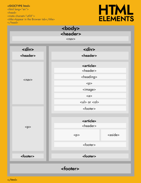
HOW TO USE HTML ELEMENTS
A summary of what I have learnt last week about marking up a website structure using html elements.
The biggest concept of Html for me is the idea of nested. To make sure this nested rule being implemented properly, I always remind myself to open and close any elements immediately before inputting the content. I also learnt that some elements are empty (so called void elements) so that they don’t have an ending tag. However, void elements might have attributes.
Exciting to start on CSS this week.
- - -
Connect with me:
Portfolio | Linkedin | Instagram
13 notes
·
View notes
Text
An inspiring thought about Online Identity since 1995, picked up from Digital Media & Society reading.
- - -
Connect with me:
Portfolio | Linkedin | Instagram
4 notes
·
View notes
Photo
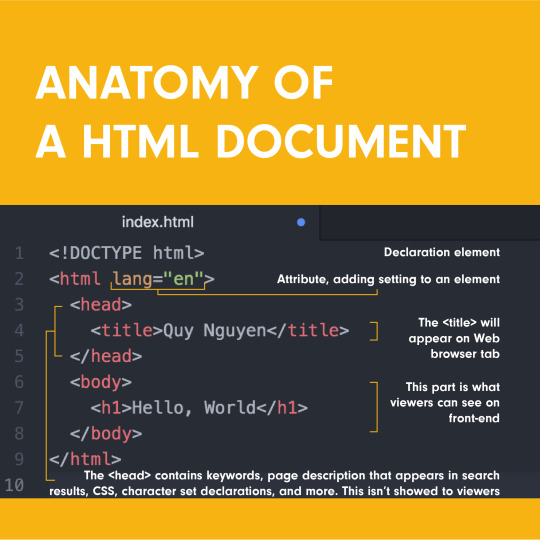
HTML is a markup language that defines the structure of the website content. HTML consists of a series of elements, which enclose, or wrap, different parts of the content to make it appear a certain way, or act a certain way.
<!DOCTYPE html> — doctype. It is a required preamble. In the mists of time, when HTML was young (around 1991/92), doctypes were meant to act as links to a set of rules that the HTML page had to follow to be considered good HTML, which could mean automatic error checking and other useful things. However these days, they don't do much and are basically just needed to make sure your document behaves correctly.
<html></html> — the <html> element. This element wraps all the content on the entire page and is sometimes known as the root element.
<head></head> — the <head> element. This element acts as a container for all the stuff you want to include on the HTML page that isn't the content you are showing to your page's viewers. This includes things like keywords and a page description that you want to appear in search results, CSS to style our content, character set declarations, and more.
<title></title> — the <title> element. This sets the title of your page, which is the title that appears in the browser tab the page is loaded in. It is also used to describe the page when you bookmark/favorite it.
<body></body> — the <body> element. This contains all the content that you want to show to web users when they visit your page, whether that's text, images, videos, games, playable audio tracks, or whatever else.
---
Connect with me:
Portfolio | Linkedin | Instagram
11 notes
·
View notes
Text
Roadmap to a front-end web developer
1. Get to understand How the web technologies work?
2. Learn HTML and CSS in detail.
3. Move on to Javascript and Server Side Development.
4. Build up expertise by digging into client-side web development tools, client-side JavaScript Frameworks and server-side website programming.
This roadmap is suggested by Mozilla MDN Web Docs. I found it very inspiring and helpful for beginners to see what steps to take and key areas of knowledge to focus on.
Find out more at: https://developer.mozilla.org/en-US/docs/Learn
---
Connect with me:
Portfolio | Linkedin | Instagram
11 notes
·
View notes
Photo
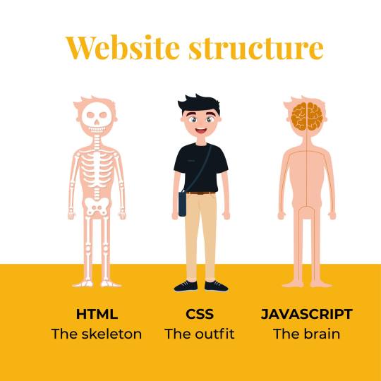
A website from my point of view. How do you see a website?
Portfolio | Linkedin | Instagram
7 notes
·
View notes