
LSAD student First year graphic design discipline. Previous selected electives: animation, graphic design and print.1st semester attempting the NOW project based on the issue of plastic pollution in our oceans.
Don't wanna be here? Send us removal request.
Statistics
We looked inside some of the posts by k00242817 and here's what we found interesting.
Average Info
Notes Per Post
33
Likes Per Post
33
Reblog Per Post
0
Reply Per Post
0
Time Between Posts
8 hours
Number of Posts By Type
Text
17
Last Seen Tumblr Blogs


Fun Fact
If you dial 1-866-584-6757, you can leave an audio post for your followers.
Text

And complete. Assessment day ready.
3 notes
·
View notes
Text

Packaging design surviving the post
1 note
·
View note
Text

Final design. I am quite please with the final design of the poster. I opted to keep the background colour and upper text to the same tones as the “ask about alcohol” footer at the bottom of the poster. The colour of the text under the image I opted to tie with the tones of the glass. The footer and portrait format were the only requirements that needed to be adhered to for this brief along with a suitable tag line and image.
1 note
·
View note
Text

Having finally decided on a final layout design of the Ask about alcohol poster came the printing process. It was important to ensure that the correct settings were selected before proceeding to print on the special matte photo paper.
1 note
·
View note
Text


Poster layout. I imported the photograph that I took of the cocktail into illustrator, creating different effects and changing the colours and shapes within the image of the glass. Some of the first images of the glass were quite brown so I had to edit to lighten the colours. The measuring tape was added separately to the glass and the colours changed to mimic the actual lemon rind. I experimented with the poster layout in Indesign changing background colour, the colour and size of type, the font type and placement.
1 note
·
View note
Text


Back to the poster design, I began experimenting with various layout versions of the cocktail glass and the type on the tag line. I was going to add the tag line “Measure your intake” and include a stastistic at the end of the poster but could not seem to find an appealing layout that I liked. I decided to change the tag line to something that I would not necessarily need a stat to back it up. “Measurable drinks, memorable nights” is what I have decided to go with.
1 note
·
View note
Text
Packaging complete. I am quite please with how the final piece turned out.
14 notes
·
View notes
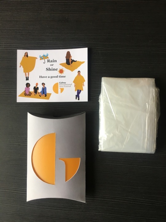
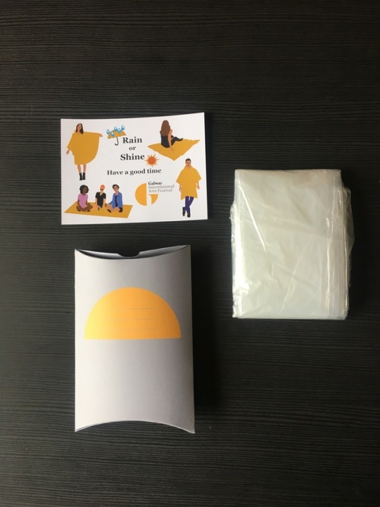
Text


Packaging. Along with the poncho, I wanted to include a small postcard size card to show the receiver the different uses for it. I created the people on Adobe Illustrator before placing into Indesign to deign the card. I ensured the all weather poncho was the same shade in each image designed in illustrator (including the umbrella and sun) I played around with different type, background colour and placement of images.
2 notes
·
View notes
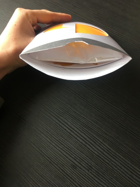
Text


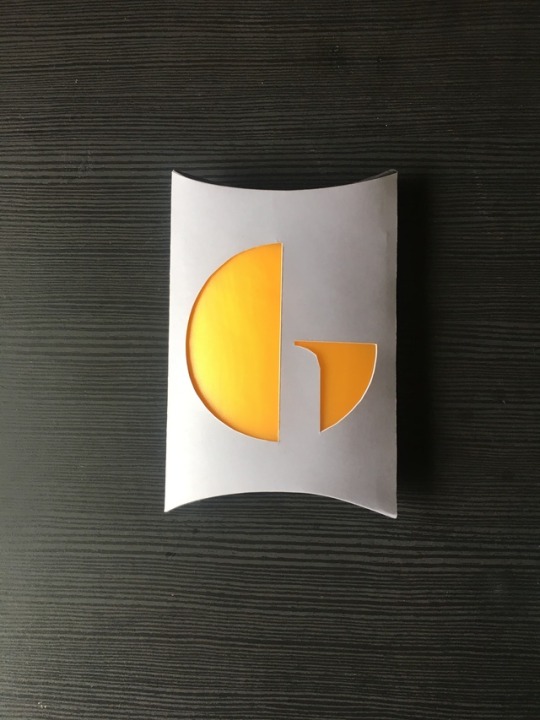
Having finalised the packaging design using Adobe Indesign, I began assembling the pillow pack template. I used double sided sticky tape and super glue to secure the sides. I cut out the G on the front of the package with the idea of having a yellow rain poncho peeking through. As I could not find one that colour I have reverted to including a plastic covering instead (and clear poncho) to give the effect.
1 note
·
View note
Text


Some packaging layouts and colours. I decided to go with the pillow pack style package design. The idea is to cut out the yellow G logo on the front of the pack to allow for the yellow of the all weather poncho to be seen thus putting the yellow back into the festivals logo.
1 note
·
View note
Text

Next I was trying to come up with a suitable package for the all weather poncho. A package that would with stand postal travel. The colouring was also important as I wanted it to stand out among all the other packages an influencer, radio station might receive on a given day. One requirement was that the package must be completely recyclable and eco friendly with visible unaltered festival logo
1 note
·
View note
Text


Creating the object/item to be sent. The item needed to reflect the spirit and ethos of the festival. Perhaps something that they could bring with them to the festival. Following a crit with advice and opinions I have decided to go with the idea of the rain poncho that can also be used as a ground cover/picnic throw. It is a Summer festival but the Irish weather means be prepared for all seasons what ever day of the month.
1 note
·
View note
Text


More thumbnails for my direct marketing product and packaging. Yellow is a colour that I find a lot in Galway. There are quite a few shop fronts and signs with this shade, even the iconic Blackrock diving board in Salthill is yellow. Also on the festivals logo, the G is yellow. I think this is definitely a colour I will be bringing forward in relation to my product.
1 note
·
View note
Text


Continuing on from the research assignment, the second part of the brief was to design a product and packaging that is to be sent in the post as a form a direct marketing. The package would be sent to bloggers, radio stations etc encouraging them to promote the festival. I began by brainstorming words and thumbnailing images I felt related to the Galway arts festival.
1 note
·
View note
Text


Some slides from my festival presentation. This time I designed my work using PowerPoint before exporting as a pdf. In each slide I wanted to keep the colouring of the festival which based on the Galway Arts festival’s logo is grey, black and yellow. The last image here is the moodboard which I included iconic Galway scenes and shots from previous years festivals showing its great energy and spirit.
1 note
·
View note
Text


The next brief received was a research brief to be carried out on a festival of choice based in Ireland. The festival that I chose was the Galway International Arts Festival (GIAF). We needed to create a presentation of no less than 5 pages and include a moodboard containing the spirit, colours and tones of your chosen festival.
1 note
·
View note
Text


The next brief that we got was to create a moodboard of a given cocktail in Adobe Indesign. The cocktail that I got was called Caipirinha which is a Brazilian rum based drink with lime and brown sugar. The poster could not include an actual image of the drink. I included images of brown/green tones relating to the cocktails ingredients and images of Brazil to tie in with its origins. The word Saúde means cheers.
1 note
·
View note