
Graphic Design and Visual Communication - Festival Poster Brief - Puca Festival
Don't wanna be here? Send us removal request.
Statistics
We looked inside some of the posts by k00287999 and here's what we found interesting.
Average Info
Notes Per Post
67
Likes Per Post
67
Reblog Per Post
0
Reply Per Post
0
Time Between Posts
2 days
Number of Posts By Type
Text
17
Last Seen Tumblr Blogs


Fun Fact
Tumblr is available in 18 languages.
Text
Finished Poster Design:


My finished poster design for Puca Festival (left), alongside the original 2022 Puca Festival poster (right). Rather than using photography (which was my initial design choice for this poster), I instead went with a paper-cut-out style design inspired by Saul Bass as I felt this both looked better aesthetically and was easier to achieve, as well as adding to the story-telling aspect of Puca Festival. I used a scanned-in sheet of sugarpaper to give a textured effect on the poster, and I put this over a green colour gradient background (I was initially going to use a yellow, orange and black gradient but felt this was too typically associative with Halloween, so instead opted for a 'ghoulish' green look instead). Finally, I used CelticHand font for the title text as I felt this fit well with the theme of Samhain and it's Celtic Irish origins.
I really enjoyed this brief overall, and I'm pleased with my final result.
18 notes
·
View notes
Text

Images of design inspiration, including Saul Bass designs, Wayang Kulit shadow puppetry, Celtic Hand Font and the original Puca Festival poster.
2 notes
·
View notes
Text


Two very rough final sketches for my Puca Festival poster design. Inspired by Saul Bass, I have decided to go with a minimalist, paper-cut-out style for my poster rather than using photography, as I feel this will give my poster a sleek, artistic look without looking too twee or complicated, whilst also being much more time efficient. I was greatly inspired by Saul Bass's poster design for Alfred Hitchcock's Shadow of a Doubt, and his use of silhouettes and shadow to create sinister undertones.
3 notes
·
View notes
Text


Pages from my sketchbook showing various different rough designs and inspirations for my festival poster.
2 notes
·
View notes
Text
Artist Research: Saul Bass


Saul Bass was an American graphic designer, well known for his minimalist style and use of shadows and silhouettes in his designs. As I'm planning on incorporating the use of shadow for my Puca Festival poster design, I find these designs by Saul Bass to be very inspirational, particularly the composition of the middle design of ' Saul Bass was an American graphic designer, well known for his minimalist style and use of shadows and silhouettes in his designs. As I'm planning on incorporating the use of shadow for my Puca Festival poster design, I find these designs by Saul Bass to be very inspirational, particularly the composition of the middle design of 'Shadow of a Doubt' by Alfred Hitchcock. I really like the Idea of something being illuminated and casting a shadow of something sinister behind it, and I think this idea would fit really well for my festival poster.
0 notes
Text
Anthony Burrill Talk:

We were lucky enough to be given a talk by graphic designer Anthony Burrill via Zoom call. He spoke about his beginnings in letter-press typography and his influences such as suffragette protest art and everyday iconography. Although I found his pieces didn't resonate with me much, I found the way in which he went about his creative processes and the sources he took inspiration from to be very inspirational.
1 note
·
View note
Text


My final icon design for the Anthony Burrill brief using the given icon (letter Z) made on Adobe Illustrator. I decided to use the Earth in the hourglass design as I felt this conveyed the theme of Anthropocene best and the use of the Z icon was more obvious. I used GoBold Thin High for the anthropocene font because I liked the simplicity of it and it fit best into the hourglass shape. I then rearranged the individual letters and changed the sizes of them to give the impression of falling particles like the falling sand in the hourglass, in order to convey the sense of Earth's time running out due to humanity's impact on the planet.
5 notes
·
View notes
Text
Digital Mood-Board for the Puca Festival Poster:

This is the digital mood-board I put together for my festival poster brief. I used a mix of images I found online and photos I took myself, as well as Celtic style font and a suitable colour pallet, to convey the overall, traditional Celtic, Halloween-esque feeling of the festival.
2 notes
·
View notes
Text
Anthony Burrill Brief:


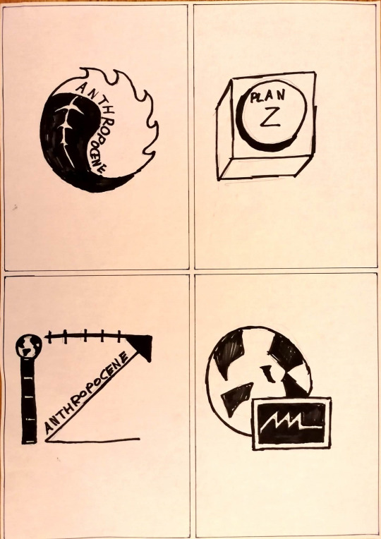

For this brief we were tasked with visually expressing the concept of Anthropocene using a given icon, through mind-mapping and thumb-nailing to create two mid-to-end prototype thumbnails. Above is my randomly-given icon (the letter Z), as well as my mind-map and two pages of four rough thumbnail sketches exploring Anthropocene using my given icon. From my mind-map I explored the themes of global warming, pollution and extinction, as well as symbols such as the hourglass, Earth and alchemical symbols. Below are the two mid-to-end concept thumbnails I created by further developing my two favorite thumbnail sketches.

For the thumbnail on the left, I used to letter Z's combined to create an hourglass symbol, to convey the feeling of time running out. I tried to further convey this feeling of 'planet Earth's time running out' by drawing Earth as sand in the hourglass, with the text Anthropocene creating the particles draining to the bottom. For the image on the right, I cut the letter Z in half to create an upside-down triangle, then added the line through it to create the alchemical symbol for Earth. I then put this in a blacked out circle and added an upward pointing triangle - the alchemical symbol for fire - to create an icon that literally translates to 'Earth on fire' through alchemical symbology.
5 notes
·
View notes
Text


Four design-concept thumbnails of my Puca Festival poster, the first two showing Puca using a costume and fire, and the next two showing Puca using shadow cast by fire. I explored different layouts of text and images, as well as different colour schemes. My personal favorite is the thumbnail on the left of the right-hand image. I want to try and recreate this using photography going forward.
10 notes
·
View notes
Text


Four layout sketches for my Puca Festival poster, exploring different placements of text, images and colour gradients.
2 notes
·
View notes
Text
Secondary Research: Wayang Kulit

While exploring the idea of using fire for my Puca Festival Poster, I thought of the idea of using shadows cast by fire to display an image. From researching this, I then came across Wayang Kulit. This is a traditional form of shadow-puppet theater originating from Indonesia that uses shadows cast from leather two-dimensional puppets in front of a light source to tell a story. A large part of Puca Festival involves the telling and reenactments of ancient Irish mythology using costumes, and this made me think of the idea of the Halloween tradition of telling scary stories around a fire, and the shadows cast from the fire adding to the fun and scary atmosphere, almost as if becoming characters themselves, similar to forms of shadow puppetry such as Wayang Kulit. I am going to explore this idea further and develop ideas that incorporate shadows for my poster design going forward.
The Wayang Puppet Theater-UNESCO Youtube link below:
https://www.youtube.com/redirect?event=video_description&redir_token=QUFFLUhqa3RYZzQzREh6WEtudkZMRTFCSVEtUE51VVRIZ3xBQ3Jtc0ttZ0RmR1h6dk9rblp3UFlMSklQVEtTVDJYaThiOVR1LXlib0lISHlvSU54SWk0ZE9lTWpFNzdXV3pMT0RsXzJ5QlJ0Z3JHM01DWklNZzdGY3cyeWk1TFZyZVRnMWtBUVhxeTF4Vnp3M1BCdVA4YzVIOA&q=https%3A%2F%2Fich.unesco.org%2Fen%2FRL%2Fwayang-puppet-theatre-00063&v=pfydro4X2t0
2 notes
·
View notes
Text


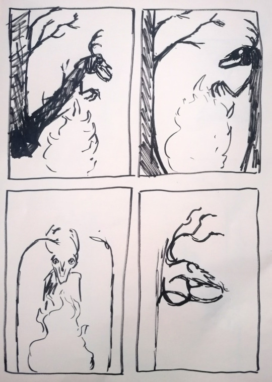
Three pages of drawings further exploring the visuals from my previous drawings. I chose the skulls, the Puca, ravens and fire to further explore and develop in different interpretations, as I felt these really captured the essence of Puca Festival from my research. I feel the skulls, antlers and fire are ideas that I can envision on my poster especially.
6 notes
·
View notes
Text

Four miniature mood-board layouts created in preparation for my digital mood-board for Puca Festival. I tried to use imagery appropriate to theme of Samhain and Puca Festival, as well as exploring different shapes and colour schemes.
4 notes
·
View notes
Text
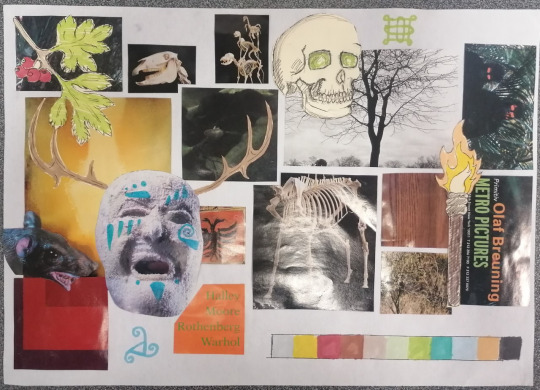
Analogue mood-board for my ongoing Puca Festival poster, exploring Puca Festival through colour, imagery and symbolisms. I chose images that gave a sense of Samhain, such as the mask, horse-skulls and nature, as well as colours and symbols.
2 notes
·
View notes
Text
Cocktail Mood-Board


In preparation for creating the digital mood-boards for our festival posters, we were tasked with choosing a random cocktail from a blind-bag, and creating a mood-board that gave the feeling and sense of the cocktail without the image of the cocktail itself. I chose Tom Collins, a cocktail made from gin, lemon and syrup that originated in New York 1878, and I tried to use imagery and colours such as the photos of New York, ingredients and colour pallet to convey this.
2 notes
·
View notes
Text


Visual interpretations of my mind-map for the Puca Festival poster. I chose six words from my mind-maps that interested me most and that I thought gave the feeling of Samhain most. These words were Death, Samhain, Costumes, Celtic, Nature and Ireland. We then had a group criticism meeting in which my fellow class-mates chose their two favorite drawings, from which the drawings of Puca and the Puca costume were chosen. Although these drawings were the most popular, I felt fire, the skulls and the raven would be interesting ideas to explore for my poster as I felt these were quite iconic with the origins of Samhain, so I decided to choose these to develop further as well as the Puca drawings.
1 note
·
View note