
In this project I am conveying the message of Anthropocene through the heartbeat of the earth
Don't wanna be here? Send us removal request.
Statistics
We looked inside some of the posts by k00317355 and here's what we found interesting.
Average Info
Notes Per Post
21
Likes Per Post
21
Reblog Per Post
0
Reply Per Post
0
Time Between Posts
2 days
Number of Posts By Type
Text
17
Last Seen Tumblr Blogs


Fun Fact
Tumblr Inc. has $15.1M in annual revenue.

Text
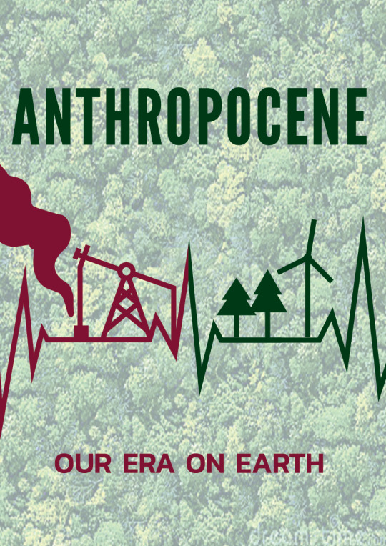
Final Piece

For my Final Project I printed the one above. I think it adequately illustrated the danger and importance of Anthropocene. I created a simple graphic of a heartbeat monitor display to symbolise: Life on Earth, our reliance on the Earth, the sustainability of the planet and our effect on the planet. By using the graphic of a heartbeat line I wanted to convey the message that the Earth we know is not going to last forever if we continue using fossil fuels and emitting greenhouse. The heartbeat is a metaphor for the fact that our planet is under threat because of greenhouse gas emissions, which I hope to show by using an eye catching shade of red on the left side and a nice calm green on the other. I tried to make either side as symmetrical as possible, putting the word Anthropocene at the top to show the words importance. Although I was originally going to use a black/dark background to make the poster further resemble a heartbeat monitor, Sharon gave me good advice on using a paler textured image for the background so the poster would be more pleasing on the eye.
When choosing the colours, I was originally planning on using just red and green, but my classmates gave feedback about these colours being too loud and simple, so I used the website Adobe Colour to find ones that would suit better.
1 note
·
View note


Text


My Two Favourite Pieces So Far
That being said, I spoke with Sharon about how to improve the poster, and she had great feedback.
She encouraged me make the lines thinner, change the background and experiment a bit more with the colours.
Ill try to do this going forward.
3 notes
·
View notes
Text

I tried out different fonts for the words and I found the font I liked best was the one on the bottom right. I was also unsure of which side to put as red and green. I think going from red to green would change the tone of the poster to a more hopeful one, as it would show the we can go from damaging our planet to fixing it.
1 note
·
View note
Text

Final poster designs for the Anthropocene project. We were tasked with designing graphic posters with the word anthropocene and at least one graphic image in a portrait style. We were asked on the brief to emphasise sustainability and the impact of humans in our design.
For this poster I want to try and convey the opposite effects of fossil fuels and green energy have on our planet and the sustainability of life on Earth.
The key graphic I would like to have in my poster is a heartbeat monitor with small designs of an oil drill, trees, and wind turbines on it.
I think the words 'Our Era On Earth' illustrate the responsibility we all have as a group to look after this planet.
3 notes
·
View notes
Text


We made stylescapes to help give us a better idea of where to go with our project
2 notes
·
View notes
Text
I went looking for primary research and so I went to a Wind Farm a half an hour or so from my house.


(my head for size reference)
While in Limerick I also saw a crane on a construction site so i took some photos as i could use it as an example of the influence of people in my poster.


(my head for size reference)
We also explored limerick city and the college library looking for different typefaces that caught our eye.


0 notes
Text


As I made more thumbnails, Lydia advised simply putting the word Anthropocene in a regular text, rather than trying to merge it with a graphic.
This was a very good idea as it will make the word much easier to read.
2 notes
·
View notes
Text
On Thursday we learned how to make typography animations in Adobe InDesign.
This will be hugely beneficial when adding dynamism and movement to our posters in the coming weeks.
1 note
·
View note
Text


Different stylescapes that we made in class using cutouts from different magazines .
This exercise was very helpful as it helped it try out different colours and design we would like to have on our posters.
After doing this exercise i realised th main colours i wanted in the final poster are orange/red and green. Red/orange would grab the veiwers attention and convey a feeling of warning or urgency, while green would convey sustainability, life and safety.
0 notes
Text


Today we learned about colour theory and the effects different colours have on our emotions.
We then experimented with colour in adobe illustrator.
This will come in very handy when deciding what colour to use in my project.
0 notes
Text


More thumbnails for my final poster. I find myself circling around the idea of illustrating the earth heartbeat, and mankinds effect on it.
I got very good feedback from my classmates about their preferred thumbnails. The majority agreed that heartbeat idea and simple graphics fitted the project best.
0 notes
Text
Artist Research: Katrina Romulo


What really caught my eye in Katrina's work was her incredibly broad use of fonts and typography. Her designs are often simple with the text being the sole focus, and she makes fantastic use of colour to convey the message/mood of the design.
0 notes
Text
Artist Research: Alexey Brodovitch


Alexey Brodovitch was a Belarusian-American photographer, designer and instructor who is most famous for his art direction of fashion magazine Harper's Bazaar from 1934 to 1958.
I like his compositions and use of colour.
1 note
·
View note


