
Anthropocenenoun, the current geological age, viewed as the period during which human activity has been the dominant influence on climate and the environment.Evan Ruane K00320853, Graphic Design
Don't wanna be here? Send us removal request.
Statistics
We looked inside some of the posts by k00320853 and here's what we found interesting.
Average Info
Notes Per Post
7
Likes Per Post
7
Reblog Per Post
0
Reply Per Post
0
Time Between Posts
2 days
Number of Posts By Type
Text
17
Last Seen Tumblr Blogs


Fun Fact
The KCSC sent more than 20K requests to delete posts related to prostitution and porn to Tumblr from January to June 2017.
Text
Graphic Design Project (Final Piece)

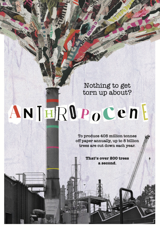
When I first envisioned this poster, I gave it the subhjeading "Up in Smoke", a reference to - what I thought would be - the poster's main focus: the loss of biodiversity and the environment due to industrialisation. As it developed, that focus changed. Now, looking at the final poster, I see it as tackling a different, but related issue - the overuse of paper and its waste, all at the expense of the world's forests.
A grey factory, drab, cluttered and sprawling, releases fumes taking the appearance of newspaper and magazine cuttings. I deliberately avoided any recognizable imagery that would have symbolic value (in my old version, I included images of icebergs, forests, crowds of people, etc.). Instead, I sought a barrage of gaudy colours, barely discernible text, and of tears and shreds of paper. The colours are not meant to be natural: there is hardly any green in the poster, aside from some acidic lime green tones (most obvious in the "H").
4 notes
·
View notes
Text
Graphic Design Project (28-29/04/25)
As I had my poster essentially nailed down, the day's work consisted of adjusting and tinkering small details.
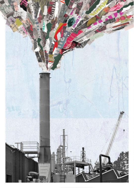
First off, I changed the background from blue to purple. I felt the purple tied in better with the reds, magentas, violets et al. in the collage. The blue was a bit too normal: the Anthropocene is anything but.
Also, I went back to that idea of adding colour to the industrial estate images. Instead of placing blocks of colour here and there haphazardly, I kept it to just a few stripes along the smokestack. This way, the colour catches your eye, you follow it up the smokestack, to the collage part.

Then, I added colour to some of the letters, and increased the sizes of the stripes incrementally the further along the chimney they go.

Due to printing problems, the white border had to go. I wasn't too disappointed, as I feel that effect where the industrial estate is enclosed by the border at the bottom while the "smoke" collage escapes it at the top is interesting, but more effective on a screen than in person.
I added some text, featruring statistics on tree felling and paper production. I used the "American Typewriter" typeface as it seemed appropriate in a poster about paper, made from paper. The writing itself is fine, but in retrospect, a sans serif font, in a smaller size, would have been better, as the text does dominate the poster now. For my final version, there will be no text.
With time to spare, I went back and edited one of my rejected proposals. I prefer the look of the type here better (set the colour to red, and applied the Hard Light opacity setting), and the H and R are more well spaced between the chimney. I still wouldn't choose this over my final poster, but I like it.

0 notes
Text
Graphic Design Project 27/03/24 - Primary Research
On Sunday, I went to the Shannon Industrial Estate to take (or make) some photographs as primary sources for my project. I am adopting an industrial, mechanical, almost dystopian aesthetic for my poster, and I believed that the Industrial Estate would have what I was looking for. It had, and more. It was the weekend, so the place was deserted: the lack of humanity in these pictures lends an eerie quality, as if it has been abandoned - which of course, if climate change continues on its course, it will be (think Wall-E).
I focused on chimneys, piping, signage, ventilators, bins, machines; patterns, bits of texture, interesting angles and details. Here is the raw material I shot:


These pictures will be handy for references and perhaps imagery if I do a collage. However, some photos I was very proud of, so I tinkered with them in the edit, and present them to you now. All of these communicate the aesthetic and ambiance that I am striving for: dingy, dirty, in disrepair, and a kind of bleak beauty.


0 notes
Text
Graphic Design Project (10/04/25)
Imagery:
I decided to make another collage as the first one simply didn't look like it was coming out of the chimney stacks: it looked like what it was, pieces of paper stuck on top of each other. This time, I used long strips of paper to evoke a sense of direction. I also tried not to use overly obvious imagery. Instead of the images on the paper, I want the viewer to focus on the paper itself.

Then I brought it into Photoshop to adjust the hues and up the contrast and saturation.

How it looks:
2. New Type
I experimented with type interacting with other elements: on the left, the type stretches outside the border; in the other, Anthropocene (in impact) is obscured by the smokestack. While I prefer the latter over the former (Impact is a very dominating, brutal typeface: very appropriate for Anthropocene), I concede that both are very gimmicky and don't tie into the main element of the poster - the collage.


Therefore, I cut out some letters from various newspapers and magazines, aiming for variety in style, shape, etc. (size wasn't much of a concern, as that can be changed in the edit), leaving in the tears for an added sense of realism and texture.

After placing the letters in, I could see the poster coming together before me.

0 notes
Text
Graphic Design Project - Artist Influence: Cody Hudson
Cody Hudson is a Chicago-based artist and designer.
I discovered this designer from a book in the library, Juxtapose Poster Art. These two posters by Hudson featured, and struck me for various reasons:
The combination of photographic imagery with hand-drawn shapes, and the way the shapes emphasize certain aspects of the photos (e.g. how the arrows in "Libérez" convey a sense of movement; the black dot in "l'Humanité" makes an exclamtion point below the long strip of people.)
The expressive, yet restrained use of colour (vibrant red and blue, with some black). The red contrasts with the blue, as does the black with the pure white background. This limited palette makes for extremely striking posters.


0 notes
Text
Graphic Design Project (08/04/25)
Today saw a lot of progress made on the poster. I have divided the days work into three main areas:

1. Background Textures:
As I've said before, the white background is too blank and dull. My first thought was to use an image that would tie into the paper collage aesthetic. I got a stock image of pages piled on top of one another as a placeholder, and applied the "stamp" effect, turning it into a black and white image. The result wasn't great: it was too distracting, even when the opacity was lowered.

I searched my library of primary research photos, and came upon this snap of a old gas container. The thick layers of rust had such lovely texture. I used the stamp function, again in black and white (as well as green and pink, a bit of long shot, I know).


Again, when I made the image the background, it overpowered the main imagery; when I lowered the opacity to compensate, it just didn't pop out. I knew at this point, that I needed colour.

I was drawn to the streaks and scuffed lettering on this old bin, so I adjusted the hues to a pale blue-lavender, applied a holftone dot effect and a high contrast grain effect simultaneously. The result was not perfect, as I feel it still needs a bit more of an impact, but it will do for now.


2. Type
I chose the fonr PT Sans Pro Narrow Light, due to its clean, sharp, and matter-of-fact sans serif forms. The question was how to present them. I had this idea to have the letters over a smoke graphic (as mocked up with the paintbrush tool below), but it came to nothing as it there was no room for it in the poster, and took attention away from the poster's main focus.

I decided that leaving the letters beside the chimney, as I had done in my proposal, was the simplest, and best option.
3. Textures/Style Effects
I used the stamp effect again for the industrial estate images (now all the one), in black and white, and green and pink. I actually did like how the green and pink turned out, but I felt it would tray too far from my original intentions. The black and white lost too much detail.

The half-tone dot effect added texture and a kind of quirkiness without overpowering the poster or taking away from the overall bleakness of the image. It was also appropriate due to half-tone dots' association with printed media.

My fear now was, in monotone, the industrial estate would look awfully bleak. I overlaid some blocks of colour (eyedropped from the collage) using the Transparency window, but the shapes I applied never seemed to gel with the image. This is something I must investigate further.


0 notes
Text
Graphic Design Project (07/04/25)
I adjusted the hues and upped the contrast of the collage, as I felt the colours as they were were a tad dull. The sickly lime greens, the acidic blood oranges, and the garish pinks are very suitable I find. I've moved away from a purely black & white piece: the collage part being in colour opens up many more opportunities.

The first mockup: not a bad start, but a lot to workupon. The arrangement of the buildings in the bottom is acceptable, but they look a bit drab. I may add a few style effects in order to make them pop out. The background musn't distract from the main points of focus, but as it stands is too blank.

0 notes
Text
Graphic Design Project (04/04/24)
Last night, I made the collage which would appear in my poster. Based off the measurements of the smoke in my proposals, I included many different images and cuttings all culled from newspapers lying around the house. I tried not to be overly obvious, particularly with the text: words like "dying", "inhale", "God, greed" I obscured. Other images include icebergs, forests, butterflies, flowers, crowds of people, otters, diesel trucks, cigarette butts, and a child's drawing of people holding hands, all torn up and divided.

I printed this collage out in black and white, and stuck it down onto my proposals from yesterday. I'm very happy with the result. By keeping the text and the (drawn) imagery simple, the attention is drawn to the collage.


In Photoshop, we were to continue with our style scapes, this timeour digital versions. My two versions make heavy use of the paintbrush tool and th smudge tool.

0 notes
Text
Graphic Design Project - Artist Influence: Paul Citroen
Paul Citroen was a Dadaist artist who studied at the Bauhaus. This work Metropolis, is perhaps his most well-known work. It is a collage of city buildings shot from various angles and locations, all brought together to form a collage of an imaginary, titanic cityscape.
Citroen's collage style inspires me through the way he brings different, disjointed photographic elements together to form a work all of one piece. My poster is definitely leaning towards collage and use of photographic primary sources, and I will bear the work of Paul Citroen in mind.

Metropolis (1923), Paul Citroen
0 notes
Text
Graphic Design Project (03/04/25)
Today was all about nailing down the final composition (at least, before we bring it into Adobe).
At this stage, all the thumbnails were very similar: a smokestack with a large plume of smoke, to be depicted in collage, rising to the top fo the page. The only questions to be asked were small, but still significant: should the smokestack be on the left right, or in the middle? Should the smoke rise to the left or right of the poster? Where should the text be placed? Should it be small or large, lowercase or uppercase?


Finally, I made two proposals, variations of the one design. I went for the second (the right-hand side), as I felt the ground in the bottom third gave it more structure, and I didn't want it to be separated from the natural world; in comparison, the first proposal merely exists in a void.


Back in After Effects, I experimented with type animations.
0 notes
Text
Graphic Design Project (01/04/25)
Today's work was devoted to creating "style scapes". We were to make two of them: one physically, out of cutting from newspapers and magazines or printouts of primary sources; the second, based on the first, digitally on Adobe.
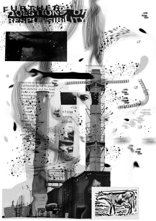
I mostly confined my searches for imagery from back issues of CIRCA art magazine, as all of the images are printed in black and white, and being an art magazine, there's sure to be very unusual images (my favourites being the naked man cradling what looks like pig trotters or sock puupets in his arms, a Paul Henry landscape, and the mountain of skulls). Images featuring machines, industry, nature, closeups of the human face and body parts were what I wanted. I also cut out two columns of text, in the shape of a plume of smoke. The headline "Further Questions of Responsibility", when divorced from the context of its article, felt very appropriate for a poster on Anthropocene. I also printed out some of my photographs from the Shannon Industrial Estate.

Here were some of my compositions:


The problems with most of these was how cluttered everything is. I decided to focus on a few specific images (the smokestacks and the columns of text), and worked around them, with the intention of enforcing that image, rather than distracting from it.
Final Layout:

My intention was to express the damage we have done to the earth and to ourselves: the idyllic Paul Henry landscape hovers above like a mirage, surrounded by smoke; a pair of arms cling onto a factory; disembodied heads express pain and fear; phrases like "stone upon stone", "nothing and dust" and "further questions of responsibility" are chilling and mysterious statements; the woodcut of a cow, with its harsh black lines and jagged cuts, evoke to me a skeleton.
0 notes
Text
Graphic Design Project (31/03/25)
Today's workshop revolved around colour, and the way it works on our emotions, our senses, etc.
On this theme, we had an exercise where we had to give our own responses to certain words and ideas in the form of colours. Some of it could be obvious: for example, below, I assigned red to 'anger' (reason: expressions like "red with anger", the fact that one can literally go red with anger, and associations with things like fire, blood, danger, etc.), bright yellow to 'joy', a royal blue to 'trust'. However, 'fear' made me pause. Most others in the class chose purple, as it is an offsetting colour with cultural associations to scary things (i.e. Halloween, witches, bishops), but I thought a sickly off-white was more appropriate: on the one hand, it refers to that expression, "going white with fear"; on the other, it resembles that sterile shade of white found in old hospitals and psyciatric institutions, always scary places I find.


These panels were, again, word associations, but this time restricted to single hues, and their respective tints and tones. It made me aware of just how broad the opportunities to express different ideas and emotions are with just the one tone. The Grey panel was probably my favourite to do, as we associate grey with being lifeless and vapid. Actually, it allowed me to be more subtle with my colour choices, to suggest a feeling, instead of forcing it. I will try to incorporate that idea into my main brief, as I am tending toward a black & white design.


These pictures were taken from the internet, by searching "industrial sites", the kind of aesthetic I'm aiming for in my poster. It made me reconsider going down the route of solely black & white.


0 notes
Text
Graphic Design Project - Artist Influence: Karel Martens
Karel Martens design style is rubbish: literally. This quote from Art in America ought to explain it:
Karel Martens collects garbage. He has for almost fifty years. Martens finds and keeps small pieces of metal of particular shapes and heights—industrial byproducts with a specific, but unknown function—and uses them in monoprinting, a kind of printmaking that produces a unique original rather than multiples. Two pieces of Martens’s garbage became the conjoined shapes on the cover of the 2016 edition of A.i.A.’s Annual Guide. The shapes are vaguely typographic. They could be J’s, or L’s, or 7’s, but maybe they aren’t. On their own, they say very little. But when placed together, they begin to say a lot more.

The use of industrial garbage and other errata lends Martens' work a mechanical quality, but never the feeling that it came off a production line. The hand of the designer is always present, as evidenced by the small imperfections in the work, like these slightly offset circles in "Untitled" 2014:

Martens style is abstract and geometric. He does not portray things as such, but conveys ideas and conbcepts, even abstract ones, through his shapes and colours. For example, Martens design for this book "Het verrad van de anderen" (The betrayal of others) conveys the titular idea through the offset circurlar patterns, suggesting a connection, but also a divide, a shift away.


1 note
·
View note
Text
Graphic Design Project (28/03/25)
Following on from my artist inspiration, I reinterpreted my smokestack idea through collage. I feel by doing this, it will lend a sense of physicality, tactility and urgency to the design. Along with the smokestack, I included designs that shared the same aesthetic, but with different subjects (e.g. the world split in half with an oil well on it; a picture of the world charred and burned by a match), but interesting as they were, I still feel that my original concept was simpler, more striking and had a more impactful message.


In the afternoon, we used After Effects to practice animation work. It was my first time ever using the program, so it was really just baby steps: plaing with shapes, movement, rotation, scale, colour etc.
0 notes
Text
Graphic Design 25/03/25
More thumbnails! Jesus, this Tumblr page has more thumbnails than a chiropodist's office. At this stage I had narrowed my focus on two options. The first, the Earth as a dinner served for eating.

Further development of the "Up in smoke" designs.

For a side-project, we each made posters exclusivly featuring type, using cuttings from magazines and blockprints.


2 notes
·
View notes
Text
Graphic Design 24/03/25
Today's workshop revolved around typefaces. We went along the the senior years' studio space to see what they were up to: on one table were little leftover bits from the laser cutting studio. Arranging them gave these very primitive, but interesting letter forms. Obviously nothing that could be used in a poster, but it taught me that not everything has to be done on a computer: sometimes the imperfect option can be the perfect choice.


Later, we took off into town on a Typeface safari, scouring the town for fonts on storefronts, walls, windows, billboards, and dark secluded back alleys (maybe not that last one). It was an interesting exercise, as it encouraged you to examine the familiar world with a fresh and critical eye. Most of the typefaces, and the way they were used, were abysmal, most probably dating from the early neolithic period to the 1980s, with nary a graphic designer in sight. That being said, many of these fonts I can see making their way into my poster.


0 notes