
Statistics
We looked inside some of the posts by k00323570 and here's what we found interesting.
Average Info
Notes Per Post
30
Likes Per Post
28
Reblog Per Post
2
Reply Per Post
0
Time Between Posts
3 days
Number of Posts By Type
Text
17
Last Seen Tumblr Blogs


Fun Fact
69% of Tumblr users are millennials.
Text
Timelapse as promised!
1 note
·
View note
Text
My board of everything that I've done since I've joined the animation discipline (best pick)

1 note
·
View note
Text
Here's an edited version of MIniMe
1 note
·
View note
Text
The process of creation of MiniMe


I wanted the model to stand on its own, so I asked the staff to help me make a stand.
Then I started making armature so I wouldn't have to waste clay and filled it with papers tightly. Covered it with masking tape and started layering air-dry clay on top.

I was going off my plan of the character and my brainstorming process of how I decided to make MiniMe. It was inspired by an illustrator Forrest Burdett that uses rounded squares and rectangles for the head with big eyes. And for the outfit, I went with what I mostly wear.

I wanted to make MiniMe in black and white (following comic style theme) and vibrant details such as tie and leaves...which a lot of comic artists use such as Guac_2626, "Miss Peregrine's Home for Peculiar Children", @ST4LK1NG__Y0U on X, and Roger Langridge
to bring attention to the character and the facial features.

But I wanted to give it a more unhinged look so I added a more realistic nose and ears.
In regards to the piercing, I did the holes with a needle while the clay was in the middle of hardening. And I was brainstorming the best materials to use for it... I was thinking of using a hairband, but it seemed fake to match as an earring, so I thought — a keychain hoop might do the job. I snipped the spiral in half and then, using pliers, closed the loop around tighter so the make-do earring won't fall off.
I wanted to use different media of materials, so I ended up using clay, cloth, and paper.
I wanted to do clothes out of paper because it resembles origami of sorts; you still need to measure it right and I was using templates for actual blouse:

I painted the top of the head with black paint so when I layer black paper on top, the white wouldn't be visible. And then started layering hair; I had to cut them in a petal shape and had to layer them on top of each other in 3 layers.
When I reached the step of working with paper, a few problems occurred as I wouldn't be able to hot glue the pieces together due to clay — even if the surface was dry — it was still drying from the inside... The decision to make a wig came, and then when it was fully dry, I glued it on top of the head.
I found a ribbon that I made into a tie and took 2 leaves from my huge herbarium collection (thanks to my previous projects).


For expressions, I studied TheEndIsNearUs phonemes chart and started replicating my own.
Then for the lip sync, I had to remove the background for mouths and import them into Adobe Animate library.
There were a few problems with the audio, as even when I edited that — it wasn't working properly while exporting; and I had troubles importing it into Adobe Animate as the program couldn't read the mp3 format, so I had to convert it into WAV; it finally imported itself... Then I used Adobe lipsync with phonemes that I previously made and fixed up some frames that I deemed weird-looking.
I wanted to also animate the eyes, and I tried using IbisPaint to see how it would look like, and I didn't like the result, so I decided to make a creepy model with just a mouth, as many other artists would do https://objectheads.tumblr.com/.
1 note
·
View note
Text
Finilasation of the town layout and 3D models

Our team has decided on the layout, and I had to finalize it.
Also, I have finished the 3D models of the city where the main action will happen and have shared screenshots of the environment for my team to work with.


I have built the rest of the town and added a bit more colour to some of the buildings, crops, and the tavern.

We have put eveything we had on the wall and are practicing for the presentation.
5 notes
·
View notes
Text
Project update!
So after further research, I have made a few drawings of the objects that will be used in the animation.


I had to remake a map as it has to be on a hill:


I used IbisPaint and the Inkarnate app for models and ground.
It's not a final design—as you can see, it is pretty squished. Me and my team are trying to figure out the best placement of the city and the layout on the map, so right now it's an experimentation angle.
Also, I further developed 3D models of mine:


As we've already discussed how a tavern should look from the inside, I started making it—also working on the layout of the city bit by bit. I added a base colour and slapped on some textures to see how it would look realistically.
And here's a video of an animation that I'm experimenting with for our shots.
As the kid (that we're about to come up with a name for) will be chasing our antagonist.
I must clarify that I only modeled the bar myself; the others were imports from Sketchfab, as I do not have enough time to make everything from scratch. But even with the imported models, I had to change and fix a few things, like lags from overlapping textures and adding or removing some fancy details we didn’t need. So each model, even if imported, was edited by me—though I’m not claiming I made them from scratch, as they are still imports. I was working on the details.
0 notes
Text
Enviroment further research


references document:
https://docs.google.com/document/d/1i8kQC2mIs6A5WIdA70Zdr2bWWXak62twjnF4GaOqT2k/edit?usp=sharing
0 notes
Text
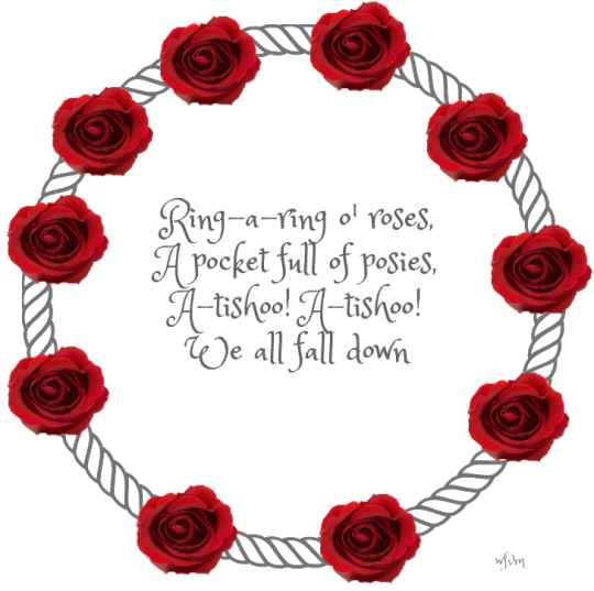
Ring A Ring O' Roses RESEARCH (Western Renaissance)
- RESEARCH


Story/Script


Storyboarding
Izzy, Jules, Ighor


Clothing
Izzy:


Environment
me:


0 notes
Text
My contributionnursery rhyme (Ring o' Ring o' roses)
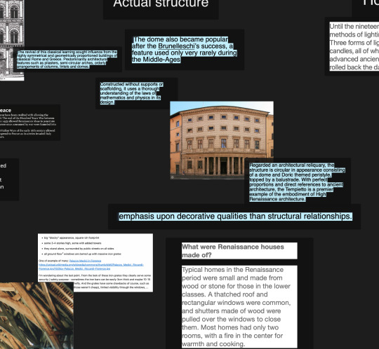
I was the one responsible for the research of the environment. We had to cover the Renaissance period.
I focused more on functionality and the general layout of old villages, which wasn't very specific, so I will need to continue my research.
And when I talk about functionality, I mean considering what was important for the survival of a village (which includes: water supply, cemetery, fertile ground to grow crops, church for human morale, town centre for gatherings, and a bazaar where people could trade with each other).
I discussed with my team what would be the best option for drawing the environment—freehand or creating 3D models—as it would be easier to get perspective and POV quickly. Since a child character will be following the plague antagonist and walking around the city, we'll be seeing streets, a bar, and markets. And as I was more familiar with 3D software (Blender), I took on the job of creating the map (opening and ending scene) and the town.
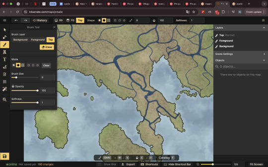
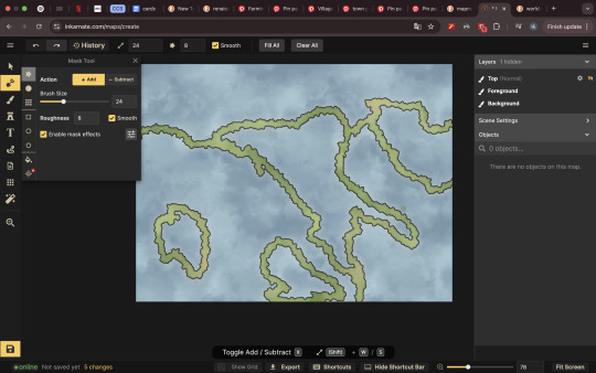
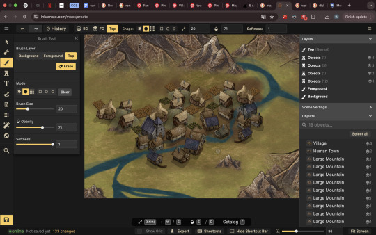
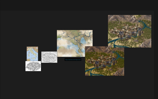

For maps creation I have used Inkarnate software that has pre insalled mdels for maps creation.


For 3D models, I have used already pre-existing free models of old houses, mills, cemeteries, and bars.
But then I had to figure out how to dissect the mesh so later on we can edit some details of the houses so they won't look the same.
Had tor eserach about it a bit: https://gachoki.com/how-to-split-and-separate-an-object-in-blender/#elementor-toc__heading-anchor-1
And for now, I have gathered all the things we’d need in the 3D software, including a bar that I will need to edit myself from the inside. However, we’ll have to discuss the interior design as a group once we fully develop the idea and get into the specifics.
3 notes
·
View notes
Text
References of artist and their artstyle
Devilman cry baby anime


What I really like about this style is how completely exaggerated it is and how squishy and stretchy it is... the characters feel like rubber, as if you can do whatever with their limbs—you can stretch, and it would look really fluid.
On a side note, I really like how the artist draws eyebrows—they are so curly and have their own personality, depending on what character it is.
The Boondocks:

The same thing applies to how they make expressions more exaggerated, using lines where muscles fuse together, creating a kind of valley in the face.


The background in the original comic by Aaron McGruder is rather simple and uses dotted texture to separate shapes and add more depth. I would like to recreate the bed scene.
As for the background in the animated series, the process is confidential, so there are no available reports. However, it was done digitally, so I will try to analyze it visually and see how I can recreate it myself.

The History of Everything
Victoria Evans


I am i love with the way Vitoria combines background and colour to create an underlying emotion.
Soma
Fernando Llor, Carles Dalmau

The way expressions are made 'ugly' with saliva, tears, and a runny nose adds a sense of realism. The artists also add textures on top of the drawing depending on the action that’s happening—for example, wave textures when the character is about to drown.
Hunger's Bite
Taylor Robin


Quick contrast of colours to show the cahge of emotion
The Firelight Apprentice
Bree Paulsen


The way they use shadows helps convey mood and color, enhancing the emotional tone of the scene. Additionally, the line quality changes depending on the character—for example, more rigid or uneven lines can make us subconsciously feel that a character is sketchy or untrustworthy, just based on their outline.
It’s similar to how we associate certain shapes with personality traits—sharp angles feel dangerous, soft curves feel friendly, and so on.
Arcane for exaple:


the lineart done ontop was by me.
youtube
youtube
production of arcane ^
Now onto the physical part, as I wanted to do the research within ALL media, including digital and physical.
I went to the library that is located in Tus and Limerick City Library to look at some of the visual novels that were created.
Paul recommended that we pick out novels for children due to it being the most visually telling and colourful.
So what this exercise entails is that we try to recreate the art style and study it closely—trying to understand the thought process of the artist while they were drawing it, the colours they chose, how they draw expressions, and how they use line art, line weight, etc.
youtube
youtube
I really love a quote that stuck to me about creativity ( i do not rememeber who said that):
"There's no such thing as exclusive creativity, we make something new out of all the different pieces that we are fond of and then we create something of our own"
So what it means is that we must study art styles that we really like, and then subconsciously we pick up the parts that we really like—for example: how the artist draws and shades eyes, the brushes they use, how they start drawing characters. We pick up all those different little bits and then combine them into something of our own making.


I have photocopied some of the artists that I really liked.
One of my favourites are:
https://maryamkhaleghiyazdi.com/about
And I will recreate each character or little details in all the styles that I like over the wekend and today. I want to experiment with the shapes adn line art and.
Okay so I was notified that we have to focus on background first, welp no biggied I'll just switch to them for now. I will draw landscape in the artstyle that I chose. I willl take a closer look at how they draw backgrounds also, what shortcuts they're using etc.


I was trying to recreate a background from one of the illustrators I photocopied, which is Lacharbonne, and the way she uses funky backgrounds and abstract landscapes—oversimplified, with a more detailed character in the foreground. It is, I believe, a very clever use of background to draw attention to the character.
Background study by TIM LEVINS & LEE LOUGHRIDGE


Object study:


Artists' artstyle that I've studied: Ted McKeever, Joe Todd-Stanton, Forrest Burdett, Ed Bruballer & Sean Phillips (in order of the pictures)
3 notes
·
View notes
Text
Clean footage
Today, I had to re-tweak some frames, making some longer to build anticipation and improve the timing.
I also added some cartoony expressions and visuals, like when the book is falling, to enhance the animation.
I still need to add the sound, and after that, I'll go back to Premiere Pro and Photoshop once again to create the contrast effect that I really wanted.
2 notes
·
View notes
Text
Pixilation edit of stopmotion.
So, what happened is that we didn’t just use stop motion, but also incorporated different close-ups and some video footage of a book falling.
At first, I planned to transport everything as frames, thinking I could just copy and paste motions—that way, I’d have full control over each frame. It was definitely more time-consuming, and my professor mentioned that I could have done it in Premiere Pro just by extending the length of a selected clip.
But the thing is... I have no idea how to use Premiere Pro.
I assumed it would be similar to other editing software I’ve used, like Kinemaster, Clip Studio, Cute Cut, CapCut, Clipmaker—but sadly, it was a bit more complicated and advanced than that. I also couldn’t figure out the shortcuts (they’ll come back into the story later).
So, after discussing with my professor, I exported all my frames as a video file—which took some time (and a lot of Googling).
Next came the editing phase—clipping everything together and adding visual language for the characters (Jules and Ighor).
I wanted to go for a comic-style look, with dotted shadow effects, checkers, and contrasting colors as an isolation technique in animation to make certain elements stand out.
Insiperd by my favourite artist: https://youtu.be/NF1FboliEKg?si=BZ4Q2lVSUxN9Lm4h
(chip)
youtube
(nighligthfish)
You can see how much contrast they both use—it really resonates with me, and I believe it intensifies the emotion and captivates human attention.

After a few hours of trying to figure out how to make this star stand out... I realized it’s actually really hard to find any tutorials for it.
And just when I was happily editing—my system crashed. :D
I seem to have a lucky streak of Adobe programs crashing. The worst part? My progress wasn't autosaved, and I couldn’t retrieve my files. So, I had to redo everything—the light contrast, adding tint, and additional effects for the footage. That completely drained me.
Later on, I started recording some sounds that I wanted to incorporate into the video—not just music, but also ambient sounds and effects to add more depth.


I used Audacity since I’m most familiar with it, and honestly, I couldn’t handle another crash wiping out all my work T-T.
I recorded all the sounds as one big track, then handpicked and sliced the audio, exporting each separate track as a new file. Of course, I had to tweak the audio settings to make it more engaging and pleasing to the ear.
(my last save before the crash)
1 note
·
View note
Text


During the shooting process, we had to decide who would be the actors, which wasn't hard at all since we had a good team combination.
Jules and Ighor were our actors, while Yarik, Izzy, and I worked as the lighting and backstage crew, handling equipment, strings, and other setup details.
1 note
·
View note
Text
And then I thought it would be cool to paint the inside to make it more scary.


And it turned out really nicely!
1 note
·
View note
Text
Another try, but with more planning this time.
I will wrap a wire around and then use hot glue for the unmoving parts—the divided sections—so the tongue can actually move properly. This is the same technique used for dinosaur displays with movable tongues.
Then, I’ll sew a sock over it because we want the tongue to look unsettling and monstrous.


So, I didn’t have red-colored cloth, so I had to experiment with dyes… food coloring, because I didn’t have anything else.
Fast forward—I let it soak for an hour, but it didn’t give me the color I wanted, so I decided to paint it with gouache instead. And it worked!
Then, I thought it would be cool to add saliva, so I experimented with nail polish and UV resin, but it made the whole structure too stiff to move—so I scrapped that idea.
4 notes
·
View notes
Text
Pixilation Project
Pixilation is an animation method that records stop-motion of real people doing cartoony actions—things that couldn’t be achieved with regular video recording.
The team makes the dream, and I’m lucky to have such a great team where communication is key.
I was assigned to create a book prop for our story about a book monster.
Development of the Idea:


Our brainstorming session led to everyone drawing storyboards to visualize the concept and combine some really great ideas.
Jules finalized the storyboard that we all agreed on.
We decided to go with my idea of making the book more monstrous, and since I’m pretty good at making props, I took on this job.
I had to visit a second-hand store to find an old book, then discuss with the team which book to choose.

We decided that the first option would be the best fit for our project.
Then, I started making a prototype.


I was thinking that the tongue should be more 3D, rather than just putting a wire through red paper.
So, I knew I needed a wired frame with moving parts for stop-motion. I first tried using air-dry clay, but it wasn't as flexible as I had hoped.
So, I scrapped that idea and looked for a better solution.
2 notes
·
View notes
Text


So, why a burning heart, you ask?
It’s similar to burning passion, but in a more twisted way.
When someone is obsessed, they become hyperfocused on another person. They’ll do anything to get their attention and love—they’ll smother them until there’s nothing left but a dummy who says yes to whatever Monster (me refering to my first animation wery smooth indeed) asks.
Sculpture elective: Burning heart (literally)
I love Icelandic designer Thorunn Arnadottir. I first discovered her work through a very unique candle—a burning cat with a metal skeleton inside. When the candle burns down completely, a metal skeleton remains standing.
It fascinated me because it portrays the movement of life and rotting.

It got me thinking about doing something similar but connecting it to my theme of love—and what’s a better representation of love than a heart?
So, I would carve a heart shape out of red wax, turn it into a candle, and then set it on fire, documenting how it burns and melts away until there’s nothing left.
And also, the main idea appeared while I was brainstorming things to draw on human skin—a.k.a. body art, as I named it.
4 notes
·
View notes