
Don't wanna be here? Send us removal request.
Statistics
We looked inside some of the posts by kamranhaqueunit19 and here's what we found interesting.
Average Info
Notes Per Post
0
Likes Per Post
0
Reblog Per Post
0
Reply Per Post
0
Time Between Posts
12 days
Number of Posts By Type
Text
11
Last Seen Tumblr Blogs


Fun Fact
Tumblr was named as a finalist in Lead411’s New York City Hot 125 in Aug 2010.
Text
Assignment - Mini Teach
The task was to design a lesson that uses Art & Design in some way to teach the class a skill or some knowledge. The lesson must be 10 minutes long, no more or no less, something easy and simple.
The lesson I decided to teach was how to make an origami bird. The way I thought I could teach this is through a visual tutorial. I have chosen this route because through my research into learning, I have found out that the way people learn best is through visual representations, like videos and pictures, rather than listening to someone talk about it.
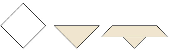
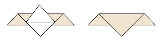
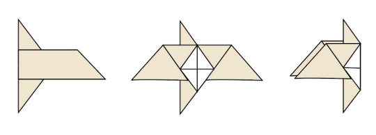
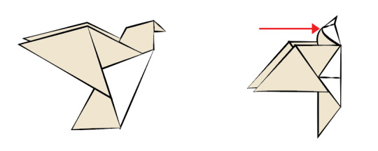
Using Illustrator and images from a website tutorial (https://www.origamiway.com/easy-origami-bird.shtml), I created illustrations of a step-by-step tutorial of how to create an origami bird. I used the pen tool and drew the illustrations based on the images on the website. I made sure that I used two colours for the illustrations so that the reader will understand that it is different sides of one paper.
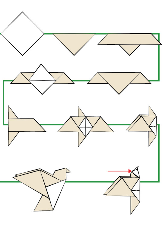
The next thing I did was line all the illustrations up with each other and add a green line behind it to show what order to follow the steps. I also added an additional arrow to make the directions I’ve given more clear for the reader. I changed the stroke profiles of the illustrations to give it a hand drawn effect and make it look like it was painted, like Japanese art.
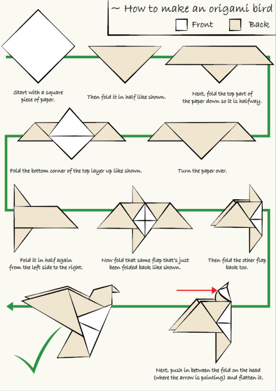
From here, I added finishing touches onto the document and added text to describe what’s going on in the illustration, in case it’s hard to understand. I also changed the green line at the back to an arrow to make it even clearer that it’s showing what direction it is meant to go. I added a green tick to show it is the final step. I added keys at the top to show which side of the paper is which by colour coding them and put it into a box with the title.
0 notes
Text
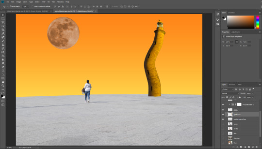
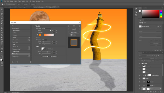
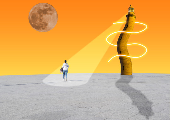
Surreal Landscape
The task was to create a surreal landscape using bright colours and weird shapes and images together.
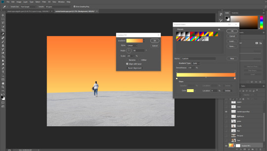
The first thing I did was enlarge the image so that the floor area meets the end of the background. After this I added a gradient to the background and used a orange/yellow gradient to make it look a bit like a sunset.
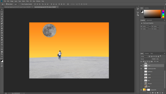
Next I added a moon to the image and resized and re-positioned it to however and wherever I want.
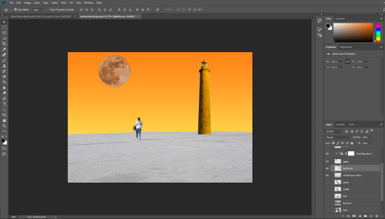
I then changed the hue/saturation of the moon and made it match my background and held alt then selected between the two layers so it only edits the moon and not everything else. I also added a lighthouse to the image and resized and re-positioned it.
After this, I used the puppet warp tool and edited the shape of the lighthouse and made it into a weird curvy shape by pinpointing the top, bottom, and 3 points in the middle that are evenly spaced out and moved the points to start changing the shape.
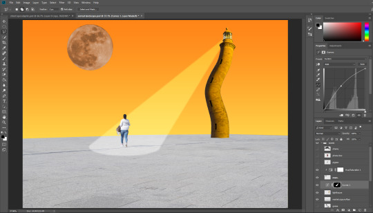
Next I added a beam of light by using the elliptical marquee tool and making an oval shape under the woman. I then added to the selection and used the polygonal lasso tool to create the rest of the beam shape that would connect to the oval. The I edited the curves to the beam so that it looks like an actual beam of light and used Gaussian blur to soften the edges of the beam.
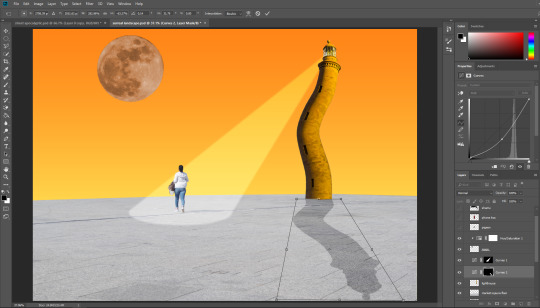
From here, I added a shadow to the building by using another curve adjustment layer.
0 notes
Text
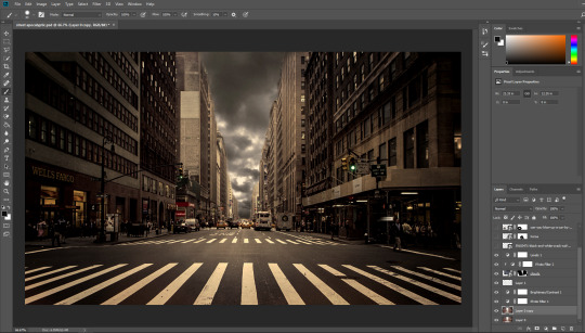
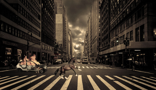
Post-Apocalyptic Street
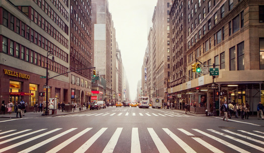
The task was to create a post-apocalyptic effect on an image of a street. I chose a picture of the streets of New York and also made sure it had good lighting so I can edit it better if I wanted it to be darker.
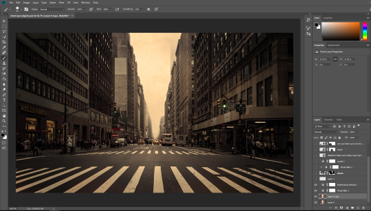
The first thing I did was open the image up in Photoshop and add a filter to it. I made sure to make it look like a dusted/polluted world so I made the filter a brownish colour. I also edited the brightness and contrast to make add more shadows to it and give it less exposure from all the light in the original image.
After this I added some clouds to make it look more like an apocalypse which clear skies wouldn’t look good with. I used layer masks to mask out the areas I don’t want so the image of the clouds can fit in between the buildings. I also added a filter over this and edited the levels so that it matches with the rest of the image and surroundings.
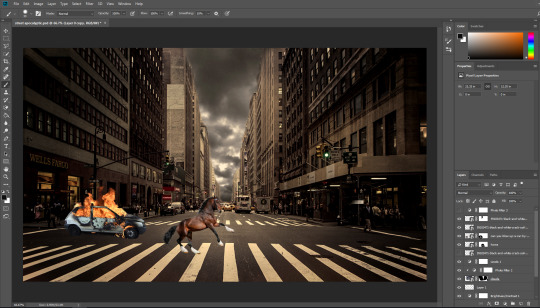
Next I added a horse and a blown up car to add to the apocalyptic effect. For these images I masked out the bits of the images I don’t want and resized them so they look natural and like they were originally in the image. I also added faint cracks on the left side on the buildings and used a blending mode to make the image blend into the background and layer masks to remove the parts I don’t want.
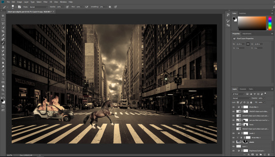
After this I added a filter layer on top for the horse and car to match with the rest of the image. I made sure to make the colour of the filter similar to the filter for the other parts.
0 notes
Text
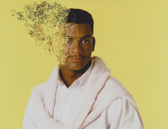
Dissolve Effect
The task was to manipulate an image so that it looks like a person it dissolving away. We needed to open an image of someone with a blank background behind it into Photoshop.
After this we used the Polygonal lasso tool to select areas of the face that we are going to fade away. We used shift to add more selections. From here, we went to edit > define brush preset and made our selection into a brush. We went to brush settings and edited different areas so it’s random and created a new layer to start creating the dissolve effect.
We selected alt and then the area where there is yellow and then clicked onto the face with our brush so that it can start removing bits of the face in the shape of our brush.
After this we added a new layer and did the same thing but the opposite way around, we selected areas of the face and put them onto the background. This will then make the dissolving look better.
Next, we added an image of a cracked texture and place embedded it onto the image. We then warped the image to fit around the face and changed the blending mode to multiply. After this we duplicated that layer and changed the blending mode to divide. We added a layer mask to both of these layers and started masking out the areas we don’t want.
0 notes
Text
Building Edits
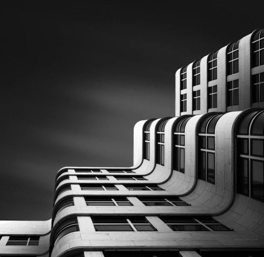
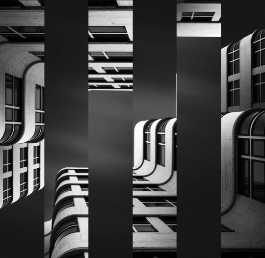
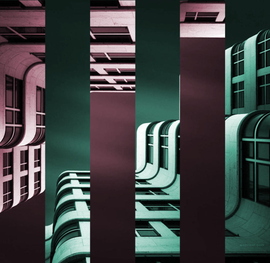
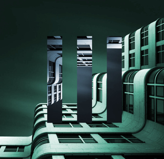
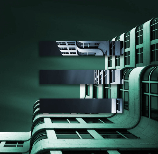
These are some photo edits I have made of a building. I have experimented in different ways of how it can look best. To start it I opened the original image up in Photoshop and used the rectangle tool and guides so ensure the rectangles are even and have an even gap between them. After this is made them into a selection and added them to a new layer and started experimenting with how I can edit the image. To start, I rotated the selected rectangles 180 degrees. After this, I went to adjustments > hue/saturation and edited the colours in both areas of the image. To make the selected rectangles a different colour, I used alt and selected between the layer and another adjustment layer and added another colour. After this, I experimented with size and changed the size of the rectangles. I centered it and changed the colours again and then rotated it again and added a drop shadow to see how it would look. I think these edits look quite good as they are unique and interesting. They work well with images that already have weird shapes and curves. I think these kind of edits can be used in general graphic art, like Victoria Siemer’s work, or for things like album covers.
0 notes
Text
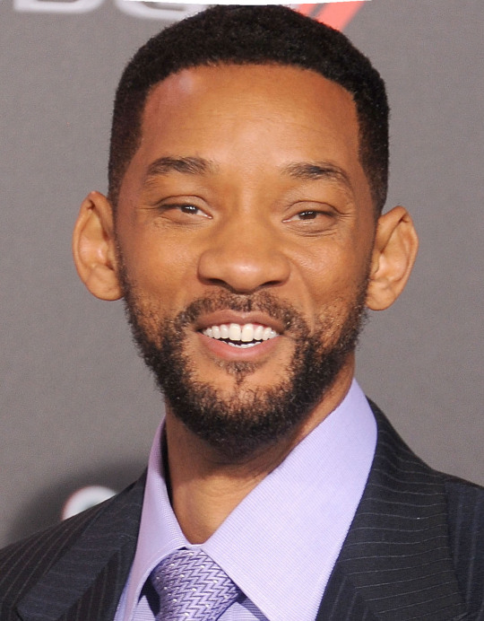
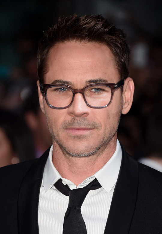
Caricatures
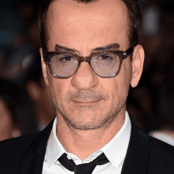
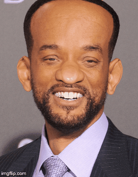
These are two caricatures I’ve made of Robert Downey Junior and Will Smith. To create these, I opened the original images into Photoshop and used the liquify tool to edit them to how I want them to look.
I used the forward warp tool to make their heads bigger, the pucker tool to make their eyes smaller, and the bloat tool to make their ears bigger.
From here, I edited other parts, like making RDJ’s mouth smaller with the pucker tool and the forward warp tool to make his earlobes bigger. I also used the bloat and pucker tool to make Will Smith’s ears bigger.
I also tested with the face aware liquify and edited different bites in the panel:
Face swap
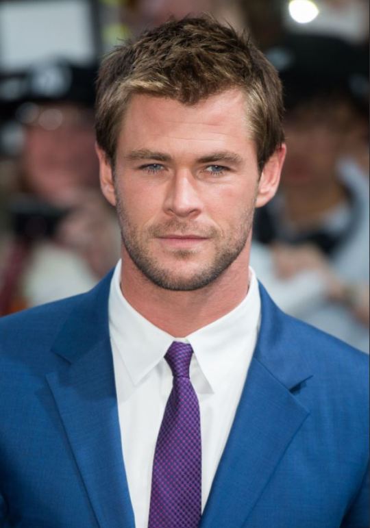
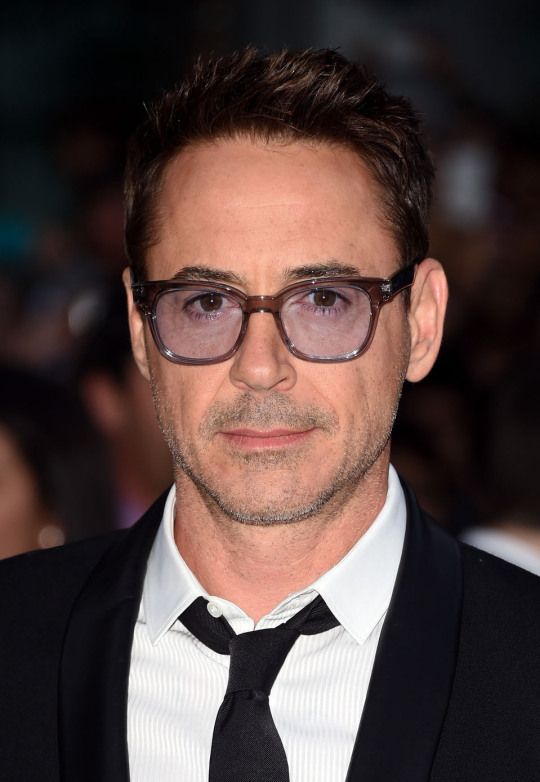
This is the face swap I’ve created of Robert Downey Junior and Chris Hemsworth. I created this by opening both the images on Photoshop and using the pen tool to draw around Chris Hemsworth’s face. From here, I made it into a selection and added a feather radius of 30. Next I pasted this onto the picture of RDJ and resized it so it lines up with RDJ’s facial features. Next, I added a layer mask to it so I can use the brush tool to reveal and conceal different areas of the face so it matches with the features of RDJ. I also included the glasses so it doesn’t look too weird with the random sides of the glasses on Hemsworth’s face so I revealed the glasses underneath. After I made sure it’s blended in well, I added an adjustment layer to make sure the skin tones match by changing the hue/saturation.
0 notes
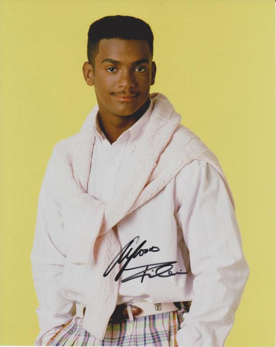
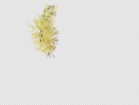
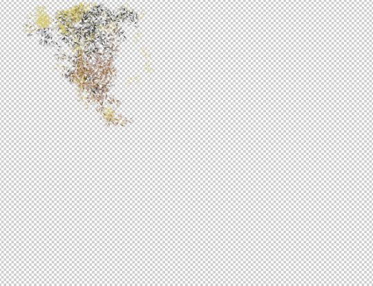
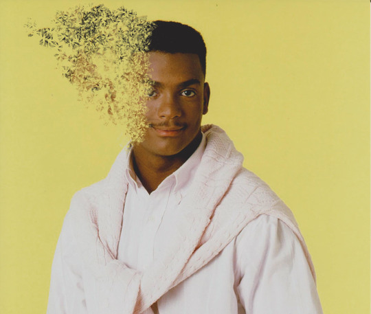
Text
“Where is my mind?”
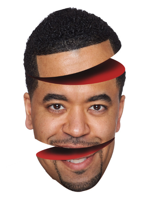
This is work that I have created where we practiced splitting an image and making it look like we split a mans head in pieces. We started by using the curvature pen tool to cut out an oval in the area where we want to split. From here, we made a selection and made it so that it is a 0 feather radius so it’s a sharp cut. We then added a solid fill colour layer for the inside of the area we cut off so it looks like the inside of his head. Next, we control and selected the layer mask of the solid colour layer and and used the pen tool to draw around the area we want to move. After this, we added it to the selection and we inversed the selection to get rid of any of the white background and then moved it into a position we want. For example, the top of the mans head has been positioned diagonally. After this we selected the colour layer again and rasterised it to edit it and used the burn tool to add the shadow.
0 notes
Text
Post Pitch Review
The problem we were trying to solve is how to teach a child how to ride a bike in a simpler way.
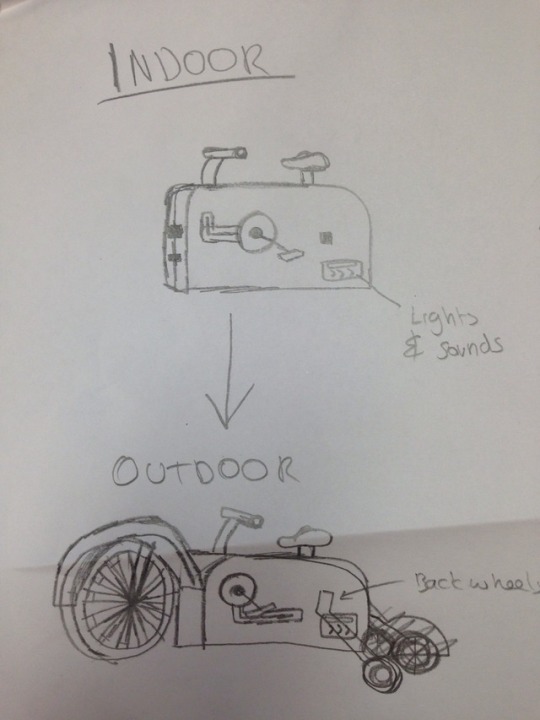
We thought of a product that would make it easier for a child to learn how to ride a bike and sketched out how we imagined it would look. The product would first start off similar to an exercise bike, but for children. This would help the child learn how to pedal and balance and get the feel of what it’s like to ride a bike without actually moving. We added a part for the product where there would be lights and sounds because children tend to have small attention spans and the lights and sounds would keep them entertained and give them a reason to pedal so it makes it more fun for them. It comes with an adjustable seat and handlebars for all sizes. This product also comes with wheels so that once the child gets used to pedaling and balancing, they can move onto the next stage and actually move while doing it.
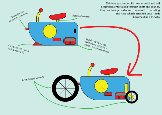
I then started designing the idea onto Illustrator using the shape marquee tools. I labelled it to show what each area does and added a brief description of the product. I used bright vibrant colours and stuck to the primary colours to keep it simple.
The comments and feedback that I got was that I should move the lights and sounds to a place where the child would be able to see the lights, somewhere near the handlebars. I also got told to change the second part to it just being one wheel at the back instead of two stabiliser wheels, so the child can learn how to balance better and move straight onto riding a normal bike. I was also suggested to add a small screen at the front to play videos while the child pedals, maybe like an animated road or something to make the child feel like their actually riding a bike. Another improvement I got was to make different versions of it in different colours to appeal to different children. I think this feedback was good and would improve my product as they would make it more entertaining for the child and more of an interesting product to buy compared to other products that might be similar.
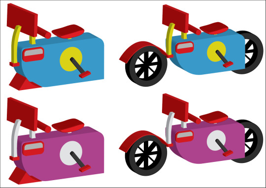
This is the improved version of my product after getting the feedback. I’ve made it 3D to give it a better view and see where everything would connect. I showed both versions of the product with and without the attachments. As you can see, I’ve added a screen, changed the back wheels to one big one, added a version with different colours, moved the lights and sounds in a better area where it’s more visible to the child while they’re riding it. I think that these improvements that have been implemented into the design has made my product better and more appealing. We also created a logo and kept it simple and tried to stay within the original colours of the bike, the primary colours.
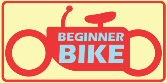
I think the things that worked well are the actual design of the bike and the way that it has improved. It’s a big difference and has changed the way the bike looks and has made it more appealing judging from the feedback that was given from the second pitch. The thing that didn’t work so well is the logo. I think it could’ve looked better but we tried to keep it simple as it won’t look good if it’s too complicated and most logos nowadays are really simple. The colours could’ve worked better and I should’ve tried finding a way to make them look more appealing. I did make the colours lighter, for example the yellow, so it isn’t to vibrant and tacky so I made it look more like pastel colours. If I were to approach this in a different way, I’d make more designs of the original bike to see what kind of other shapes could be used to make it look better and more ergonomic maybe. I’d also test it with different colours to see if it looks good with other colours, these colours could’ve then been used for the logo and then the logo might’ve looked better too. The product has been improved by quite a bit and I do think it’s a lot better now than it originally was. The feedback that was given has clearly helped to make the bike more appealing to children and unique.
0 notes
Text
Investigation and Understanding: Learning
What is learning?
The definition of learning is the process of acquiring new knowledge or skills through studying, experience or being taught. The ability to learn is possessed by humans, animals and even some machines.
How do we learn?
The way someone learns depends of each individual person, as everyone learns in a different way. Some people are more likely to learn through reading, like from textbooks. Others may prefer a visual representation of knowledge, like a video, as people are likely to remember images more than text. And some might find it easiest to learn through audio, like listening to lectures or a podcast.
How can we improve learning?
We can improve learning by being prepared and having everything you need ready so you have no distractions. Stay organised will also save time and help you get a clearer understanding of things. Making sure you’re on time will also help to learn so you have full attention and don’t miss out on anything. Taking notes will also help to remember things as you can come back to it whenever you forget. If you’re in class, ask questions to help get things clarified and make whatever you’ve learnt easier for you. Getting everything done will also help learn as you won’t have to worry about catching up on things instead of actually learning everything.
How can we improve memory?
There are many ways we can improve memory. One way is to make sure our brain stays active and give it a workout; the more we use our brain, the more likely we’ll be able to process information better and remember it. Physical exercise also helps to increase the oxygen to your brain and reduces the chances of getting disorders that lead to memory loss. Getting some sleep helps you function at your best; over 95% of adults need between 7.5-9 hours of sleep to avoid being deprived of sleep as it plays a big part in improving memory. Another way to improve memory is to make sure we have fun and keep our stress in check as it improves emotional and mental health. Eat a brain boosting, well balanced diet to fuel the brain to make sure you have more energy in your entire body.
(Sources:
https://www.pickthebrain.com/blog/7-secrets-to-improve-your-ability-to-learn-for-students-of-all-ages/
https://www.helpguide.org/articles/healthy-living/how-to-improve-your-memory.htm)
Studies on memory
Multi-Store Model (Atkinson & Shiffrin, 1968)
This study suggests that memory exists in 3 states of memory: the sensory, short term and the long term stores. Information entering the memory through our senses, like seeing or smelling or hearing things, is stored in the sensory memory store. Most sensory information decays and is forgotten after a short amount of time. Once we think about this information for some time, it is known as rehearsal and leads to this information being stored in the short term memory store, where it can be held for hours-days. The short term memory lets us use information that is relevant to our current situation, but its capacity is limited, so we need to rehearse it more to remember it for longer. This involves recalling it or using repetition in which it then goes to the long term memory store, where Atkinson and Shriffin believed it could be stored for years, decades, or even a lifetime.
This study focuses more on the memory of everyone than specific gender or ages. However, teenagers and adults may be able to process information to the long term store more likely than children or elderly.
Levels of Processing (Craik & Lockhart, 1972)
This study suggests that there are two types of processing that takes place when we remember something, shallow and deep processing. Shallow processing is similar to the sensory store of the Multi-Store Model, where it is about the overall appearance or sound of something, and usually leads to it being forgotten. For example, walking past many people on the street in the morning and not remembering a single face by lunch. Deep Processing is like the long term store, where we rehearse it more to remember it. For example, reading a news article involves shallow processing but once you think about it, like maybe consequences, it will increase the chances of remembering it. Craik did another study involving the Levels of Processing in which two groups of participants had to remember 60 words. One group had to use shallow processing, while the other used deep processing. When the words were shown again later amongst other words, participants who used deep processing were able to pick out more words than those who used shallow processing.
False Memories (Loftus and Palmer, 1974)
This study suggests that people would recall different memories when asked a question in a specific way. An experiment was conducted in which participatns had to watch 7 videos of traffic accidents in a random order. After watching the videos, they were asked specific questions, “How fast were the cars going when they smashed/collided/bumped/hit/contacted each other?”. They found out that the estimated speed varied depending on the verb used in the question. Participants who were asked the “smashed” question thought the cars were going much faster than those who were asked the “hit” question. The results showed that the verb used alters the participants memories. In other words, eye witness testimonies may be biased by the way questions are asked after a crime is committed.
(Sources:
https://www.psychologistworld.com/memory/influential-memory-psychology-studies-experiments
https://www.simplypsychology.org/loftus-palmer.html)
Different Styles of Learning
Visual - Visual learners use images, maps and graphic organisers to access and understand new information.
Auditory - These learners understand information best through listening and speaking situations such as lectures and group discussions.
Read & write -
0 notes
Text
Infographic
The task was to create an infographic of any recipe I want. We had to use a little steps as possible and use no words. I decided to make an infographic on how to make tea. For the whole infographic, I drew my illustrations from scratch as I knew what these things would look like and they aren’t the hardest of shapes to draw.
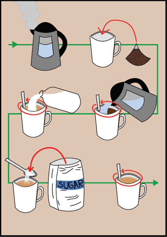
For these illustrations, I used simple shapes and or the pen tool to create the more unique shapes I would need for some of the steps. I made the background colour try to fit within the theme of tea so I made it a lighter version of the colour of tea I used. I added an arrow behind all the steps so the reader would know where the start and end is an what direction to follow.
I think the overall look of the infographic looks good and consistent as it is all illustrations and nothing looks out of place or like it isn’t meant to be there.
0 notes