
Don't wanna be here? Send us removal request.
Statistics
We looked inside some of the posts by kamranhaqueunit85and86-blog and here's what we found interesting.
Average Info
Notes Per Post
0
Likes Per Post
0
Reblog Per Post
0
Reply Per Post
0
Time Between Posts
6 days
Number of Posts By Type
Text
4
Last Seen Tumblr Blogs


Fun Fact
12.7% of mobile users access Tumblr.
Text
Task 4 - Final Piece
Out of the 3 pitches that I came up with, I decided to move forward with creating illustrations within the theme of fashion and creating posters promoting some of Nike’s most popular shoes. I thought this idea would be ideal as it will allow me to get used to using a Wacom Pad in my illustrations. This would be useful for me in the future as it makes me more skilled in designing, using different equipment and software allows me to adapt easier when it comes to designing things that depend on certain equipment or software. Drawing is something I enjoy, but I haven’t done a lot of it digitally, so I thought this would be the best pitch to go with so I can make a start and get used to drawing digitally and creating illustrations.
With these posters, I’ve used the same process as I did while I was practicing other artist’s work, and continued on from my poster of Air Max 95s. The first few screenshots are from the practicing post, so I will be using the same annotations with them.

I started by opening a blank A4 page into Photoshop and added an adjustment layer and made it a solid fill layer and coloured it into a colour I think would look good for the colours I’ll be using for the shoe itself.

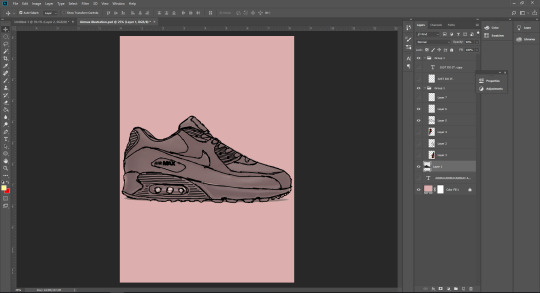
Next, I inserted an image of the shoe I will be tracing over, which is an Air Max 90. I added a new layer and used a Wacom pad and pen to trace over the image using the brush tool in Photoshop. I made sure to get as many details as I could so the finished piece of art looks accurate to the shoe itself. I also made it look not too neat, but also not too messy, so that it looks hand drawn as I originally said in my pitch, to give it a theme and make it look more unique and stylised.

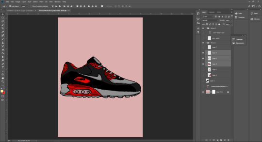
After this, I hid the layer of the image as I only needed it for the outline. While still using a Wacom pad and pen, I coloured in the illustration using colours I thought would look good together, and also go with the background colour I had originally chosen. I also added some shading to the illustration to give it some depth and avoid it from looking simple. For the shading, I just used a darker shade of the original colour I will be drawing over.

From here, I duplicated the illustration and rotated it 180 degrees so that it is displayed as most shoes would be when they are in the box. I chose this layout as I thought it would be the most suitable way, based on the fact that my illustration is in the theme of shoes anyway.
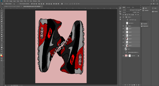
Next, I rotated the two trainers 90 degrees so that they face upwards/downwards. The reason I did this is because I noticed that by doing this, the shape of the trainers looks like an N. I thought this could be a good way to represent Nike as the first letter is N and can be a new way to promote the brand or even create a new logo out of it.

Finally, I created a pattern in the background. For this pattern, I decided to use text to create the pattern ans repeated the name “Air Max” till it fills up the page. I chose the font Franklin Gothic Heavy and set it to Italic as I thought that looks similar to the font Nike use for their text and also looks sporty, which is appropriate for the brand. The text was black but I reduced the opacity down so that it is subtle and doesn’t take any focus away from the trainers.
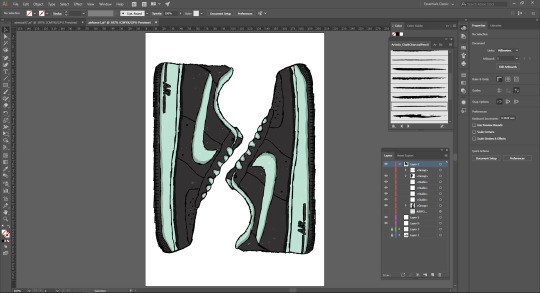
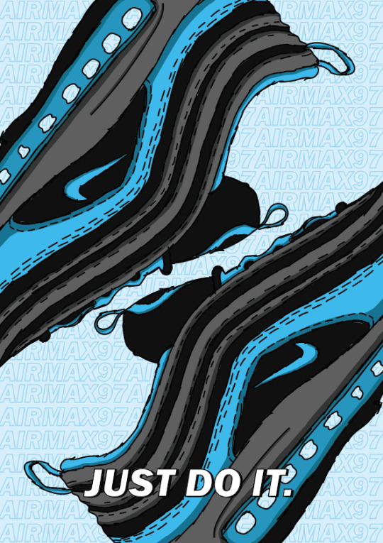
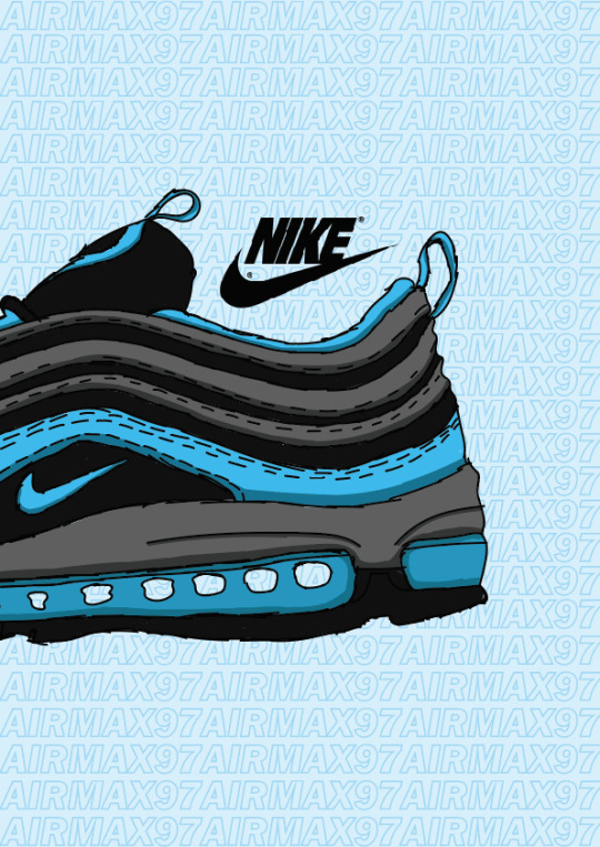
This is the process for my second poster. For this one, I did an illustration of the Air Max 97. I used the same style and layout so it matches with my first poster and looks like they are supposed to be together. For this poster, I decided to use Illustrator as I thought it would look better and stay high quality, as Illustrator is made for vectors and doesn’t rely on pixels. I also found to have a better experience with the Wacom Tablet and pen on here, as my first poster originally started as practice. Below are the screenshots to show my process, which is repeated from the first poster.


This is the process for my third and final poster. I decided to illustrate another one of Nike’s most popular shoes, the Air Force 1s. For this poster, I also followed the same process and layout the keep all 3 of my posters consistent and matching. I continued to use Illustrator for this poster as I’d found I had a better experience with the Wacom Tablet on it, and again, it is best for vectors and high quality illustrations. In addition to that, I also decided to change this poster up by experimenting with different brushes. I used a charcoal brush to paint the shoe, this gives it a nice texture and adds to the whole hand drawn style I am going for. Below are the screenshots of my process, the first showing how the brush looks as I’m painting the shoe.


Here are my final posters in their full sizes and quality. I’ve also presented these posters on Behance (link below).
https://www.behance.net/gallery/81275503/Nike-Air-Posters


These are some alternate versions of the one of the posters that I was experimenting with in position, size, and just the overall look in general.


Evaluation

These are my final posters presented all together so you can see the full triptych.
The things I think came out well are the consistency of my posters; using the same process and layout worked out in the end as it allows the posters to become a series. I also think the illustrations themselves came out well; they have ended up being very detailed, despite having a rough look to them because of the hand drawn style I was going for. I have included as many details I thought was necessary, not too many as it would look messy with the stroke size I use too, and because of smaller areas in the shoes. The shading also came out well and helped give some depth to the shoes and make them stand out even more than they already did and give them a sense of realism. I think using different colours for each poster was another good idea as it makes the posters visually appealing when they’re all together. The use of the lighter shades as the backgrounds helped for the illustrations to stand out against them. The use of text in the background also looks good; it makes my posters look less simple and gives it more of a professional look in my opinion. I think it helps look more like promotion posters as well as graphic art, instead of just art alone.
The things I think didn’t come out so well and could’ve been handled better happens to also be one of the things that did go well, the consistency again. I think the first poster looks out of place; one reason being the thicker stroke, another is that I did it in Photoshop rather than Illustrator. And finally, the text used in the background doesn’t match as it is filled in and not just the stroke, like the other two posters, so it doesn’t look as subtle. I think considering this poster was started as practice, I should’ve redone it in Illustrator and made the changes I need to make so it could match better. As well as as this, I think the painting with the charcoal brush on the third poster could’ve been better, as it looks messy and patchy. I left it like this on purpose to show how I’ve used a different brush but I think I should’ve done it neater. With that being said, these bad qualities also allow each poster to have something different in them, exclusive to each individual poster.
Overall, I am pleased with how my posters have turned out. All 3 of them together, I think they look great. They all look like they’re meant to be together as well as they can be presented individually at stores or social media or even something like bus stops. I’ve stuck to using the same kind of colour schemes, being using one colour on the shoe and the rest being shades of black or white, and that one colour I used is also the background colour, just a lighter shade of it. I’ve made sure the text is always positioned in the same spot, so it always stays consistent. I’ve also used the same layout for the shoes themselves, to create an N shape that represents Nike. I could’ve done a better job with a couple of posters individually, but I think they still look good and professional, especially next to the other posters.
0 notes
Text
Task 3 - Pitch
The first idea I thought of was to create landscape art. I aim to create at least 2 pieces of art that include a landscape or city. I figured that this would help me use the pen tool and shapes in a more creative way. It will also allow me to to experiment with creating shadows and shading within certain areas of the landscape. I would either get an image from the internet to use as my template or I can sketch it out first and scan it in to start working over it. I would use Photoshop for this as I want to add effects to certain aspects of the image to add realism to it, rather than simple vectors on a page, so I think Photoshop would be best for this. I aim to make them look as professional as possible, and use a variety of unique shapes. The audience would be anyone who is into Graphic Design and Illustration or anyone who is looking for wallpapers to use on their computer, phone, etc. The purpose behind the work is to expand on my skills creating Digital Art and create a piece of work that is up to professional standard.
Another idea I have come up with doing is illustrations and art within the fashion industry, like the work of Ciro Gobbe. I aim to create 3 pieces of art within this one theme, as a triptych of artwork. They will all be using the same technique and design, and display/promote Nike’s most popular shoes. I want to try to make it stand out and look like a professional poster. That being said, I also want to add my own spin to it and make it look hand drawn, so the outlines will look more rough rather than neat lines. I think this gives it a unique look and will help it to stand out like I want it to. I believe this artwork can be made for people who are fans of Nike already, sneaker-heads, hype-beasts, etc. as they are the kind of people who will be most involved and loyal to the fashion industry, but these posters could also be used as promotion to the general audience, and expose them to new shoes they could possibly buy if they are interested. I believe this can help me explore with colour theory and schemes and allow me to experiment with them on the shoe itself. I also think this can help me with my skills using a Wacom Pad, as I am still fairly new with it.
My final idea would be to create portraits like the work of Odin Antonsen Torvenes. Like the landscapes, I aim to create at least 2 pieces of art that include the portrait of two different models. I think this would be a good idea as it will let me experiment with different brushes and get me used to using the Wacom Pad and pen. It can help me be able to create realistic and detailed portraits of people and also allow me to get used to shading within my art. If I take inspiration from Odin’s work, not only will it let me experiment with the portrait itself, but it will also let me create unique backgrounds and incorporate it within the portrait. For example, in Odin’s work, the same pattern used in the background is also used in the sunglasses of the model, as a reflection. Therefore I could choose an image of a model with sunglasses on too to create the same effect and add even more detail to the original portrait. The audience would be anyone who is into Illustration and art in general or anyone looking for inspiration for creating the same kind of work. The purpose would be to expand my skills and knowledge using a Wacom Pad and pen and also experimenting with colour schemes. It will also get me used to using different kinds of brushes to refrain from creating work that looks too simple.
0 notes
Text
Task 2 - Investigate & Practice
Ciro Gobbe
https://www.behance.net/gallery/78491753/NIKE-AIR-JORDAN-1

This is the work of Ciro Gobbe, a Behance artist. In this work, he has created an illustration of Nike Air Jordans using Adobe Draw on an iPad. In the image above, I have used the images he displayed in the link to show his process. He started with the outlines and details and then went on to colouring it in two different styles. These are the same steps you would take when drawing in general on paper, but this is all digital.
I decided to attempt to create some work inspired by Ciro’s art.

I started by opening a blank A4 page into Photoshop and added an adjustment layer and made it a solid fill layer and coloured it into a colour I think would look good for the colours I’ll be using for the shoe itself.
Next, I inserted an image of the shoe I will be tracing over, which is an Air Max 90. I added a new layer and used a Wacom pad and pen to trace over the image using the brush tool in Photoshop. I made sure to get as many details as I could so the finished piece of art looks accurate to the shoe itself.
After this, I hid the layer of the image as I only needed it for the outline. While still using a Wacom pad and pen, I coloured in the illustration using colours I thought would look good together, and also go with the background colour I had originally chosen. I also added some shading to the illustration to give it some depth and avoid it from looking simple. For the shading, I just used a darker shade of the original colour I will be drawing over.

From here, I duplicated the illustration and rotated it 180 degrees so that it is displayed as most shoes would be when they are in the box. I chose this layout as I thought it would be the most suitable way, based on the fact that my illustration is in the theme of shoes anyway.

This is the final piece of my art that I have created based on Ciro Giobbe’s work. I made sure that it stays within the theme of fashion like Ciro’s work. I ensured all of the details I thought were necessary were included and also included some shading so it looks more like it is inspired by his work.
Odin Antonsen Torvenes
https://www.behance.net/OdinAntonsen

The is the work of another Behance artist known as Odin Antonsen Torvenes. In this work he has created a portrait of someone using a picture of a model. He used the same steps and even the same device (Adobe Draw on iPad). He started by drawing the outline of the model, most likely by tracing over the image, and then colouring each section of the portrait, like the hair, face, sungasses, etc. I have shown his process and the finished piece in the images above. The are the images Odin shows in the link, also above.
I also attempted to do a portrait using a Wacom Pad and pen.
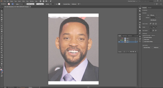
The first thing I did was open up an image of the person I will be creating a portrait of, in this case, Will Smith. I opened it up in Adobe Illustrator and positioned it where I thought would be best.

Next, I used the pen tool to trace over the image. I made sure to get all the prominent details of his face, like the wrinkles and the his beard looks.


This is how the illustration looks after tracing over the image and hiding it in the layers panel. I made the background a light turquoise colour and the lines blue to make it go with a certain colour scheme, sort of like Odin’s work.

This is the final portrait piece I have created. It isn’t as detailed or unique as Odin’s work, but it was more of an attempt to trace over a model and get an idea of how it is to test it out. I think the illustration itself came out well, but I should’ve neatened some lines and progressed further with it, like with shading, different colours, etc.
0 notes
Text
Task 1 - Specialist Field
My specialist field is Illustration.
An illustration is a decoration, interpretation or visual representation of a text, idea or process, that is designed for integration in published media. Some examples include posters, leaflets, magazines, books, teaching materials, animation, games, films, etc.

Art sources:
https://www.behance.net/gallery/41119197/Flat-landscape-digital-illustration
https://sonisoni.com/project/girl-with-hands-digital-illustration/
http://www.lisettemurphy.com/illustration-design/2smytf6fwort79j64jpo50i3bmzjob
https://www.behance.net/gallery/78668563/PICK-A-PORTRAIT
https://www.behance.net/gallery/78491753/NIKE-AIR-JORDAN-1
https://www.behance.net/gallery/79955397/Avengers-Endgame-Fanarts-1-5
https://www.vecteezy.com/vector-art/206269-vector-landscape-illustration
https://idrawforfood.co.uk/Godjira
The History of Illustration
Throughout history, humankind have always used narrative images to tell stories. The earliest illustrations recorded are the cave paintings in Lascaux, France, dating back from 15000 BC. These paintings presented important events in history, featuring pictorial representations or logograms in succession. Ancient civilisations in Greece and Italy used art to honour their gods, humankind, and the cultures themselves. There were illustrations of heroes and festivals, tales and literature, funeral scenes and sport events that were drawn and marked onto ceremonial vessels. Even wall paintings and floor mosaics used illustration to decorate the homes of the rich and powerful.
During the beginning of the 14th century, artists during the Renaissance displayed literature, new music, art, and publications that could be mass produced and distributed due to the invention of the printing press process by Johannes Gutenberg in 1452. The creation of woodcuts and engraved prints allowed images, ideas, and entertainment to be brought to a wide audience and provided them the possibility of experiencing art.
Printing technology rapidly improved and more publications were distributed and seen. Illustration was commonly seen in daily life during this time. Thomas Bewick, an English wood engraver and publisher, created a studio for the creation and printing of commercial illustration that was used for many purposes, including works for children, educational materials for schools, natural history plates, and title page art for books, etc.
Illustration really became a profession during the early 1800s. Both English and French caricaturists made a living as full time independent illustrators with sales of etched or engraved prints through gallery-like shops and stalls. This allowed for illustration to be easily access and afforded. Books by authors like Charles Dickens and many other popular writers were illustrated throughout.
Many dedicated young artists saw that careers could be achieved through illustration, and a flood of talent entered the field. Publishers soon noticed that illustrations increased the sales of magazine subscriptions and advertising revenue. More commissions of original art were allowed through the strong and consistent sales, and the business of illustration became fully established. With more efficient and wider distribution networks, millions of people were amused by illustrated newspapers, books and magazines as affordable entertainment and brought the art of illustration into daily life.
During the early 1900s, illustrations began to develop further into animations and cartoon shorts that Walt Disney established himself. An example of the cartoon shorts is Steamboat Willie (1928), the first sound cartoon. He then went on to create full length animated feature films like Snow White (1937) and Pinocchio (1940).
From here, came the digital age, which marked its entrance into the world between 1950 and 1970. It was only inevitable for artists to grasp it progressive technologies to showcase their talents. Artists began to use these new innovations, including television, personal computers, audio and visual software, and eventually the internet, into their own work, with eager minds for the many opportunities to evolve in the design industry.
Digital illustration widely expanded artists’ tools from the usual raw materials into the advancing new age of electronic technologies. Instead of brushes and acrylic, artists could now paint with light, sound and pixels. Instead of paper, artists could create collages out of existing imagery or computer generated graphics. Instead of a physical, two dimensional canvas, artists could work with three dimensional graphic works for presentation on screen or through multimedia.
Sources:
https://www.illustrationhistory.org/history
https://www.theartstory.org/movement-digital-art.htm
The Process of Illustration Today:
The process of illustration involves a lot of planning and idea generations before one idea is focused on and developed. The first step to illustration involves brainstorming and gathering loads of ideas to see which one is best and can be worked on further. It is used to build momentum and get the ball rolling.
The next step to the process is to choose the best idea and develop on it and sketch it out in more detail and with more details until it looks as good as you want it to look.
After this, it’s time to draw it digitally in Photoshop. The main target for this step is to explore with colours and figure out what combination of colours compliment each other best.
From here, import the sketch into Illustrator and start illustrating basic shapes over the sketch and adding initial detail. It is best to make make many alterations to make sure the illustration looks its best and is visually appealing. This is usually the step that takes the most time.
Next, it is time to start making improvements and add more details to the illustration. This helps bring the illustration to life so that it can be more visually appealing. A lot of this step depends on trial and error; sometimes there are too many small details, or maybe too little, sometimes, a colour might not look good with the rest, etc. If something doesn’t look good, it is either removed or improved.
The final step is the presentation. Presentation is an important step to the process of illustration. Sometimes, the illustration will fill the entire page. other times it will be put onto a white background, perhaps surrounded by text. When in doubt, go back to the beginning, as presentation is determined by the original intent of the illustrator. In conclusion, the illustration process is an ever changing process that is commonly influenced by other artist’s styles.
Sources:
https://focuslabllc.com/digest/illustration-process
0 notes