
Don't wanna be here? Send us removal request.
Statistics
We looked inside some of the posts by katherineworkbook and here's what we found interesting.
Average Info
Notes Per Post
0
Likes Per Post
0
Reblog Per Post
0
Reply Per Post
0
Time Between Posts
1 day
Number of Posts By Type
Text
17
Last Seen Tumblr Blogs


Fun Fact
There are dozens of funny blogs to kill time on Tumblr.
Text
FINAL REFLECTION
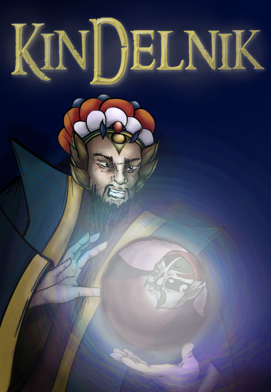
Here is my final poster!
I am extremely happy with this and pleasantly surprised by the personal growth in skills I have made with this project.
Creating my digital artwork for this elective has been a transformative experience, challenging me to explore new techniques while expressing my creativity in a digital format. Throughout this project, I have learned valuable lessons that have enriched both my technical skills and artistic sensibilities.
Concept and Inspiration: The concept of my artwork stemmed from a curiosity for Chinese outfits/ Peking opera and a desire to explore these elements through my designs. I aimed to convey a conflict of power in my composition as well as show my narrative in the fantasy novel book poster format. This concept was important to me because it took me a lot of research and design work to create an accurate representation of the different styles of Peking Opera presentation, while still having my characters be uniquely designed.
Technical Execution: In terms of technique, I experimented with different brushes, hue saturations, colours and drawing styles to create my final poster. Learning to navigate these tools was initially daunting, but through perseverance and practice, I gained confidence in digital painting, composition, color theory but most importantly, keeping things simple. Being someone that likes to focus on a lot of details, it was a hard process for me to simplify my work, however, I feel as if I have improved on that during this elective.
Challenges Faced: One of the major challenges I encountered was time management while I was sick. I feel like there are a few key exercises missing from my workbook because of this, and also the exercises that I did complete later on were rushed as I tried to finish them all on time. In the future, I would like to plan my time out more efficiently, as well as the energy I would like to devote to certain tasks. I really need to learn to prioritise certain tasks over others in order to complete everything on time.
Another challenge was giving myself too many colours to work with, resulting in an indecisive situation. In the future I will limit my colour palettes, and give myself more time to work on the actual design than think about what colours should be use.
Another challenge for me was, as aforementioned, simplification. I tend to go too big with my ideas, and not have the time nor the ability/skill to complete them, leaving me feeling quite disappointed with my work. For instance, my initial character design was far too complex, but I tried my best to still capture the essence of my design in a much more simplified way, and place more emphasis on the mood created, rather than how detailed and complex the actual art was.
Evolution of Ideas: As I progressed with my artwork, my initial ideas evolved in unexpected ways. I found myself changing my concept with help from my teacher and peers and with the feedback given. This really helped me focus on the main point of the project: the mood that is communicated, rather than the details of their outfits. This evolution taught me the importance of flexibility and adaptation in the creative process.
Feedback and Iteration: Feedback from peers and instructors played a crucial role in refining my artwork. Their perspectives helped me [mention specific improvements you made based on feedback]. Incorporating this feedback enhanced the overall quality of my piece.
Personal Growth: This elective has not only honed my technical skills but also deepened my appreciation for digital art as a medium for self-expression. I have gained a greater understanding of colour theory and simplifying things more.
Conclusion: In conclusion, creating this digital artwork has been a fulfilling journey of exploration and learning. It has equipped me with valuable skills and insights that I will carry forward in my artistic endeavors. I am proud of how my artwork has turned out, and I look forward to continuing my artistic journey with newfound enthusiasm and confidence.
Taking the digital art course was a big step for me. It taught me how to use new tools and techniques to create art on a computer. At first, it was hard to be able to manage time, generate viable ideas and use PS brushes, but it felt really good once I got the hang of it.
During the course, I learned that digital art is so versatile. It let me try out different styles and ideas, which helped me grow as an artist. Getting feedback from my teachers and classmates was super helpful too. It showed me how to improve and see my art in new ways.
Overall, this course gave me skills I can use in the future. It inspired me to keep exploring and being creative in my artwork.
Thanks Toby for the great elective :)
0 notes
Text
Poster Creation Process
For this section of my work I made a workbook on powerpoint so I could properly annotate my work.
Here is the link: proj.pdf
I really enjoyed this process and learned a few tricks with PS and painting in general. i am looking forward to creating more digital art in the future.
0 notes
Text
Delnik and Kindel
For this task, I investigated into my character and character's world to be able to create them in more depth and complexity.
Delnik and Kindel
Delnik
Delnik is an immortal mage who was born with the elemental power of Air, however throughout his years he has learned to steal and wield the energy sources of Earth and Fire. There is a tale that when one is able to harness all elements, they reach enlightenment and the final element of Life. He is Peking Opera-esque looking.
Delnik was born with a twin brother, who is a magic crystal ball: Kindel
The pair represent Yin and Yang. Delnik is only afforded the powers of creation when he harnesses a new elemental, while Kindel is afforded the power of destruction. The pair keep each other at an equilibrium, but if separated, they could become the ultimate embodiment of good and evil and Kindel will be able to destroy the world.
Delnik hates the warlords that control him, but without their men and backing, he would not be able to learn or practice any new magic. Kindel is thoroughly corrupted by the warlords and obeys them, so he is as bound to the warlords as Kindel is.
At the beginning of time, both Delnik and Kindel were neutral, but as their magic grew, the more extreme the other became.
Thousands of years ago, Delnik and Kindel fought heavily about how they should use their magic. This resulted in Delnik accidentally killing Kindel’s crush: a nosey fortune teller that carried him around everywhere and was constantly asking him questions. Kindel was outraged and sent fires through Delnik’s favorite creations, creating the desert. The pair were forced into reconciliation by humans, who were terrified of Kindel’s actions. The pair are both addicted to candy. An offering of candy is made by humans to the pair to honor their reconciliation.
Kindel is impatient and petty and has little self control or regulation. Kindel has a huge character flaw, he has a huge ego coupled with the fact he falls in love extremely easily and lets the obsession consume him. He is unable to recognize when people are using him. He is constantly trying to impress the warlord’s sister, who convinces Kindel to continue on his death spree.
Delnik is not well-liked, being constantly taunted as a “goody two shoes” by Kindel and his peers. He is constantly worried and questioning the righteousness of people’s actions, leading them to avoid him and his judgments. He comes off as arrogant to others. He is sensitive despite his age and experiences.
Setting
Setting: Magic filled Earth-esque, War-torn middle ages
On this Earth, certain tribes hold power which are fuelled by their elemental energy source
Qiu people are invading Atlantis which hold the energy source for water power
Atlantis: Assyrian looking, crumbling underwater kingdom that is vulnerable
Knowledge of magic in Atlantis is lost after the great flood, however energy can still be harvested by Qiu people, who send Delnik and Kindel to learn and destroy Atlantis so the warlords can use Delnik and Kindel to conquer the world.
Goal:
Seek out the water energy source, harness to gain control over last most powerful element: water
He wants to collect all the elements, in hopes he will be able to control life. The warlords and Kindel want to use it to kill and destroy, while Delnik wants to use the power to be freed of Kindel and magic, and be reborn as a mortal.
Challenge:
Equilibrium is being broken between him and Kindel through warfare, he becomes weaker as Kindel gets stronger. Kindel because uncontrollable and extremely destructive, which the warlords like. To not raise suspicion, he is forced to use his creation powers to aid destruction, which weakens the equilibrium more.
His challenge is to control Kindel to not completely destroy Atlantis, so he can harness the water energy and keep an equilibrium.
Another challenge is to obey the warlords, who he hates with a passion.
An internal struggle he is faced with is control. He struggles with controlling his emotions which directly affect his powers.
Talent:
Natural ability: air mage
Learned ability: fire, earth
He is able to partially control Kindel, he is able to keep the equilibrium, but as Kindel breaks the equilibrium with more destruction than Delnik is creating, Kindel becomes an untamed destructive beast.
Below: Delnik's word cloud


Above: Kindel's word cloud
I really wanted to have opposing personalities, I chose this because I think it would be easier to portray i n a poster. I wanted there to be a sense of uncertainty with both of their powers.


Here were my original 120 words: (I did shorten to 100 words later)
Delnik is an immortal Air mage with a peculiar crystal ball; his brother Kindel. Over time, the pair harnessed the elements of Fire and Earth.
The pair are bound to the rules of Yin and Yang. Delnik is only afforded powers of creation while Kindel is afforded the power of destruction. The pair must keep their magic at an equilibrium, for without balance, they transform into embodiments of Good and Evil with unbridled power.
Under control of Qiu warlords, Kindel leads a ruthless campaign through Atlantis in search of water elemental, forcing Delnik to join. Delnik hopes to gain the magic Life, allowing him to finally be freed from the chains of immortality and his brother Kindel.
This exercise was really helpful in the way of designing a backstory, like I mentioned before, I am not really one for planning nor narratives. I usually rush into creating before planning out these different factors.
I will be utilising these tools in the future. This exercise has really helped me. I have lots of elements to consider in my poster, and I want to properly represent the character and their narrative. This has given me a lot of ideas on how I want to pose and layout the final poster.
0 notes
Text
Goals for Character Creation: Delnik and Kindel
For the final project, we were tasked to create a character to make a poster of. The poster format that I wanted to choose was book cover for a fantasy novel.
There were a few goals that I wanted to achieve with this part of the elective:
Do not over-complicate things, choose things that will be easier to do within given time frames.
Choose a character that is visually interesting and displays some Chinese cultural features.
Organise time wisely to finish the poster on the due date.
0 notes
Text
Character Investigation: Amethyst Group Task
For this exercise your team will make a three component study of one of these characters.
A one or two page AD (landscape or portrait) page character mood board about this character, showing posters of how they're represented, signature outfits, objects costume and other visual touchpoints, such as other style or practical attire choices that are not worn/used by them but are in the same ballpark, colour swatches matched to them, what car they might drive, or what things they might be into
A completed 20 page questionnaire about the character
A word cloud (with an appropriate colour choice) of your character. Make the word cloud using a word cloud generator and make it from descriptive words about your character's world and personality and character, making the most prominent traits the largest
Directions:
Assign a team member to each of the three tasks or work on them all together / mix it up.
Each team will be assigned a different character from the list above - if you don't like your team's character you can swap with another team or opt for a different character
No two teams can work on the same character
When documenting the results - you can post the pooled work from this project on your own Tumblr - ie. you can post the mood board, the questionnaire (screen grab or paste-in NOT a link to a PDF or word doc) and the word cloud.
When documenting the results - reflect and explore on the ideas of what points make you empathetic towards this character, or any qualities you recognise within this character for yourself or someone you know (without naming anyone). Speculate on whether there's any traits in this character that you would lean into if you were designing a character (or any you would avoid).
The character we were given was Amethyst from Steven Universe.
Here is the character moodboard:

I think my team did a great job on this moodboard, it really conveys the energy that the character gives off.
Here is the word cloud:

I think these words really define the character well.
The task that I did was the 20 questions. The task really helped me understand the character. I chose this because my other team members were already familiar with the character, so I wanted to use this opportunity to learn more about Amethyst.


This task was really insightful to me about how deep character design goes. I never really considered backstories when designing a narrative and characters, I just created something that looked interesting to me. Learning about Amethyst was very interesting, as her world is very complex and she has very complex personal struggles.
These struggles make her very relatable to the audience (children, teenagers and young adults) as many feel those inadequacies that Amethyst feel. However, the character is very inspiring as she learns to conquer her personal fears and issues to become a stronger person.
The significance of Amethyst is very strong throughout the show.
However, when designing my character I would like to shy away from a complex backstory such as Amethyst's because it would make the character brief difficult to understand. I want to try to not over-complicate things (as I sometimes do) and create a character that is easy to realise.
I am excited to begin this process!
0 notes
Text
Character Brief Task (cont)
I looked into the style that Quentin Blake has, and discovered that he likes to use a lot of messy lines:

I wanted to recreate this in my digital illustration:
I tried to make it look as hand drawn as possible and as messy as possible while still keeping clear outlines.
Here is the initial outline:
I used thin lines to create a messy effect:

Here I added more thicker lines to emphasise the style:

I am not sure if I like these anymore, however, I do not have a lot of time allowance for this character. If I did have time, I would do a redesign to make him less long...
Continuing on I added colouring to the character according to the two different colour palettes we had for the first and second feedback session.
Here were the initial colours:


Here are my colouring choices. Honestly, I do not like how this turned out at all. This is not my taste at all and I don't really like how it was executed, so I will be giving myself feedback instead of the first feedback session:
It looks too messy and does not really emphasise any features of the actual character.
Colours look muddy and unflattering
Does not seem like it fits the brief, I would see this as a child's drawing rather than a children's book illustration
Points of improvement:
Different colours!
Show contrast between his "different sides"
Emphasise the key features
Clean it up a bit more!
Here were my group's interpretations at this point.

Here were the feedback we recieved:
Mostly they recommended consistent and matching colours, ad showing both sides of their personalities.


So according to my team's response, we simplified the designs a lot more, and changed the colour palette:
Here was a reference given us for the redesign:

And here was the renewed colour palette:

I definitely like this new colour palette a lot more. The muted tones are much easier to work with. The consistency with all the muted colours make the illustration seem to have more harmony, which i think makes it more visually appealing.
Here is my newly, recoloured character, though I like the colour scheme a lot more, I am unhappy with how the character is coloured in with. I do not have time to recolour it but if I was able to, I would go with less of a washed out/ watercolour look and have coloured it in normally. I think the blurred watercolour effect takes away from the character's contrasting personality and blurs the outfit too much.
I learned to use a new tool: the smudge tool, it really helped me to achieve that watercolour blob effect.
I used a bunch of different PS brushes to create this effect:
I used a large wet brush: oil paint on a lower opacity to create a water colour look, while smudging with a smaller brush at low strength. I did not want to colour things in specifically, rather I wanted the background to indciate how the character was going to be filled in.

I would change the way that I have the character posed, in a way where the two sides of the outfit are equally displayed, and I would aim for a new sort of art style. I do not think this was an 100% failed interpretation, I just think the execution was rushed and the final product could look more ideal if I spent more time on it.
Here was my group's final redesign:

I will add mine in too!

Overall , I think my team did an amazing job and I admire their creativity. I hope that my vision can be seen by people, rather than it being a strange interpretation: its just an unfinished one.
This was a great task, I liked the fact that the brief was given by classmates and we could have a sort of client based exercise.
I think there is a lot of improvement for me to make, but for now, I am happy with the outcome with the time limitations I have.
0 notes
Text
Character Brief Group Task
(I was away sick for this group task, and therefore did not partake in any feedback sessions/creation sessions with my group)
Here is the brief my group was given:


Here were the references for the fashion my group chose:


I personally do not like this character a lot, I am not really a fan of demonising disorders such as DID into murderous sort of tropes, I think it is actually quite a harmful thing as there are so many tropes of people with the disorder having an "evil side". However, I am really interested in the fashion of the character. I really like designing outfits, so this was a fun task for me.
Here was my initial interpretation of the character. I was given the style of Children's book and I instantly thought of Quentin Blake's style.
Here is my first sketch:

The character is wearing a bathrobe looking overcoat and is wearing heels. His face will be split in half-drag half normal looking makeup, with a flamboyant hat and gold-tipped cane. I wanted the illustration to show off how kooky the character is.
Here are some QB references for the illustration:


I was excited for this task, however with me being sick the creation process was greatly delayed and I was not able to start the digital illustration until after the final session. I am a bit disappointed that I missed out on the important feedback sessions, but I will be creating two renditions of the character in the initial colour palette, then the final colour palette, following the feedback we were given.
0 notes
Text
Gestural Poses Task
For this task we were instructed to examine poses from a video and recreate them in PS. Here are the poses:


Here are the poses I selected side by side.
Here is pose 10 filled in:

This exercise was kind of difficult as I barely ever do gestural pose drawings... I kind of just guess where what is and fix it up on the way, I never really plan out a sketch which is probably why my drawings always look strange.....
This is a good practice for me as it really strengthened my skill of being able to draw different poses. I really enjoyed this because it did not take me long to figure out the psoes which was something I did not expect. Having surprised myself with this skill, I feel quite happy with myself. I am looking forward to posing my character and investigating which poses emphasise the characters the most.
0 notes
Text
Moodboard for Illustration
Here are a few of my selected works that i found during my research that represent what styles I want to explore further during this elective:
I really like to explore my own cultural heritage through creation, so I want this to be a focus for this elective.


0 notes
Text
Artist Breakdown/research
An artist that I love is Hayao Miyazaki, with Spirited Away being one of the first movies I had watched as a child. I always found the art style extremely intriguing and I loved the complexity and variety of all the different characters.
Hayao Miyazaki is a Japanese director, animator, and manga artist. Best known for his internationally successful animated films like Spirited Away (2001) and Princess Mononoke (1997), Miyazaki’s style combines soft and painterly backgrounds with more simplified yet expressive characters.
Some of my favourite characters by Miyazaki are:

Yubaba. I love how bejewelled she is, and how expressive she is. I really like the detailed wrinkles of her face, which emphasise her character's expressions.

Bôh as a mouse is also one of my favourites. I love how Miyazaki captures the baby's form as a mouse. So cute!

The wolf (Moro) and San are also very expressive characters by Miyazaki. I really like the outfit design of San as well. Such a beautiful movie too! One of my favourites!
Another artist that I admire is Jiayi Li. I love how versatile her work is, and how she depicts Chinese culture.
Jiayi Li (李佳仪) is a Paris based artist who has studied fine arts in Canton worked for Loewe, NYT, Justine Clenquet, Bloomberg, Jean Paul Gaultier, Vogue Korea, Bang & Olufsen, Vivienne Westwood, Adidas, NPR, Dr. Martens, The New Yorker, Tamburins, Sulo, Carel, Nike, Rimowa, aside from her personal projects.
Here is some of her work that I enjoy:


(Work for Lunar New Year: Tiger for VW)
I love the vibrant colours that she utilises in her work, and the Chinese focused elements. It is rare to see representation in artwork for large brands like V. Westwood and Gaultier that are not cultural appropriation... especially JPG. However Li really uses her skills to represent Chinese culture!
There are many other artworks that I enjoy, I will create a moodboard for them! :)
This research really helped me discover the depth of character design and digital art. I am excited to discover more about my own art style and what I am good at.
0 notes
Text
Value Studies: Character creation

Here are two characters that I created. Using values I will now colour them.
Here are the values I have chosen for them:
I wanted them to be quite bright colours so I did not use dark values.


And here are them colorised:

I love them! They are so cute! Now to give them a back drop....

(Backdrop from pinterest)
I am feeling very confident with both character design and values. I am having a lot of fun just practicing drawing with PS and familiarising myself with colouring etc. It is a challenge because it is sometimes frustrating with the drawing pad not being exactly like how you would draw on paper. However, I am seeing that it is so much easier to correct mistakes, recolour and move drawn lines if you are using the software properly. I like how customisable the drawing is after it is drawn.
I have begun with some more detailed character designs: Here are two iterations of the same character. I did not have the time to finish these digitally, however I would like to in the future in my free time.


I drew this in illustrator with easy shapes as I wanted to try a collaged fill for each shape:

I then filled these with the colours I had selected in my colour palette:
I wanted to use a shell sort of skin tone for the character:


I then began colouring the face:
I used a soft brush for the blushed areas and then a pressurised brush to create sharp edges in the eyes and eyebrows.

I also tried my hand with painting in PS, here is an example:

(Pendant with backdrop removed)
It was very hard and I do not like it at all.. I have never painted on paper before so it was really difficult figuring out what to do. I don't really want to do any more realistic painting as it is very time consuming and not helpful for this project right now.
I wanted to focus more on the character's hair: I experimented with different thickness and directions of the brush tool.


I wanted the hair/tentacle things to resemble different patterns and flail out. I was not really sure what to do after as this was way more difficult than I thought it out to be, and more time consuming than I wanted it to be, so I just left it. I am keen to pick it back up when I have the time for it, but for right now, I need to focus on following school tasks.
I am feeling really excited to create more characters for this elective.
0 notes
Text
Value studies: Colouring a character
For this exercise I will be colouring a character with use of values.
What is a value?
Value (lightness) describes overall intensity to how light or dark a color is.It is the only dimension of color that may exist by itself. Chroma (saturation) may be defined as the strength or dominance of the hue.
Here is a drawing of the outlines of Sandy from Spongebob, which I will be colouring.

I will be using my knowledge of values to attempt to recreate Sandy's original colours.
An easy way to do this is to use the Magic Wand tool to select an area of the drawing. Here is the Magic Wand tool (shortcut W)

Then after selecting, adding a layer and then filling the selection with a value of choice.
This choice can be adjusted using the Hue and Saturation option, to fill the selection with a colour of the same value.

The dotted lines indicate the selection, use Command D to drop selection.
This is how I imagine the values on Sandy. Lets see how accurate these are by adding a Hue Saturation to it. Remember to click colorize!

(Above: Sandy greyscale values)
Here are the controls:
Make sure that the adjustments are clipped to the specific layer.

Here is my Sandy with colours added:
I feel as if this quite accurate, all apart from the neck colouring. I am feeling quite confident about values and feel as if I have a good understanding of them. Things I have to watch out for is making sure that I am creating the selections on SEPARATE layers, so that there are no mixups for the colours when I apply a hue/saturation.

Sandy colorised!
0 notes


Text
Line Practice in PS
For this task we had to trace a picture of a duck to practice for line accuracy with the drawing pad. Here is the original image:

We used the layers tool to add another white layer on top of the drawing, and turned down its opacity so that the lines would not be very obvious, making the drawing easier to follow:

We then traced over the outlines:


This was fairly easy for me, however I know that I need to work on using the drawing pad instead of wanting to use the pen tool for everything. I am excited to get started with designing a character and creating it!
0 notes
Text
Experimenting in PS
The command for the brush tool is B, the icon is:

Here is the drop down menu:
There are different types of brushes, including pressurised brushes, soft and hard brushes, as well as size and softness sliders.

The smoothing option refers to how the programme auto-smoothes brush strokes and can be adjusted with this drop down:

The opacity can be controlled heere:

Here is some experimentations with different size brushes and softness/hardness:

I also experimented with opacity:

Here is a quick sketch I made:

The colour can be controlled through the colour window, click X to toggle the foreground and background colours:


To access the colour wheel, click on the hamburger menu.
Here are some different saturations and brightness that can be achieved through adjust the position on the triangle.


The colour wheel shows complementary colours and the saturation and brightness.
Here is an example of changing a brightness and saturation and showing the complementary colours on the wheel:

This section was quite straightforward and easy for me as I have already had some experience with drawing in PS through DT2 Animation and feel fairly confident using the drawing pad. However, I still have a preference for using the pen tool as I find it is smoother and more accurate.
0 notes
Text
PS Commands
Command a: select all
B: brush
E: eraser
Command a + back space: clears page
P: Pen tool
B: Number keys 1-0: Opacity
Command + Shift + S: Save as
Option: Eye dropper
X: Toggle colours
Option + Delete: Fill screen with foreground colour
0 notes
Text
Character Design
What are we doing?
Set up a narrative for a character and then illustrate the character in that world. The actual work itself is a process where you will:
Learn some industry methods
Understand that illustration is a medium to express ideas and communicate things about characters
Learn methods to express ideas through a character
Examine existing character narratives
Step by step apply these methods to a character of your own narrative and backstory - funnelled down to an accompanying 100 words
Document the process on Tumblr
Make an appealing A2 character illustration in the style of your choice
This blog / portfolio should contain:
Screengrabs
technique breakdowns and process documentation
software screen-shots
character line-ups and iterations (turnarounds if you're doing this course in an advanced capacity)
iterations and explorations of colour, shape, style, accessories, poses, gestures etc
exercises: value studies, shading studies and expressions
reference: found reference, photo reference and drawings from reference
early sketches, compositions iterations and various stages towards intermediate and final project
Written materials
descriptions under screengrabs - at least explaining what we're seeing
drafts of your character story and back story
character breakdown exercises
ongoing reflection and statements of intent / descriptions of how projects are going / project debriefs
character briefs, feedback and comments
group critique comments and feedback responses
a final project and course completion reflection, circling back to your original intent
0 notes