katiecassellshnd1c
Katie's Blog
HND Photography Student @ City of Glasgow College
161 posts
Don't wanna be here? Send us removal request.
Last Seen Blogs
baeefox
𝐷.
ravennaramos
Ravenna Ramos
semkilimpillows
İsimsiz
sbrbbr
sbRBBR's Latex World

kirklcbhorne
Untitled
Text
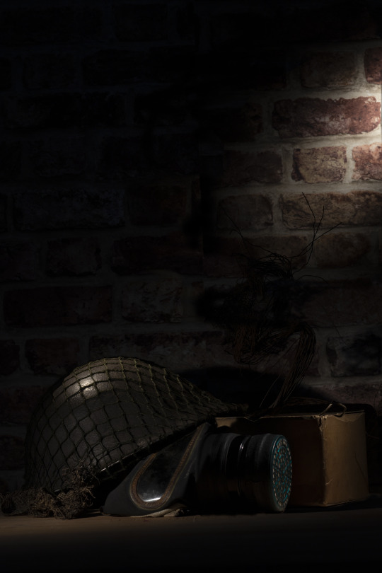
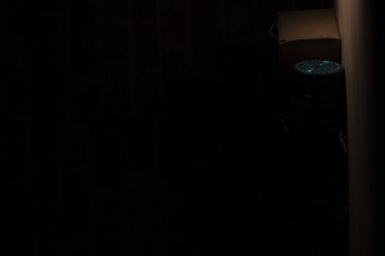
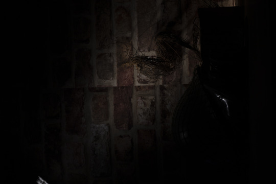
Recycle Evaluation
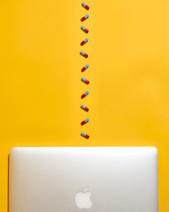
For this brief we were asked to explore a different side of photography, discovering the technique of painting with light. we were asked to take a still life image of old and vintage objects and use painting with light techniques such as light dragging across a long exposure image. we also were asked to take our final images and layer them on top of each other on photoshop.
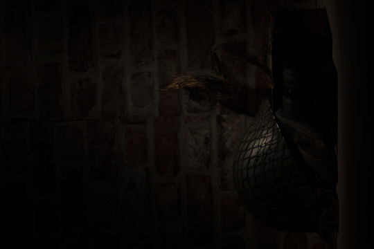
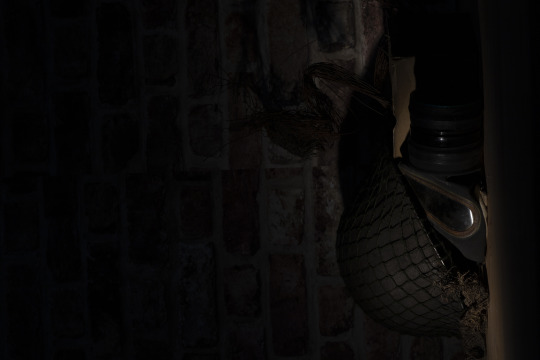
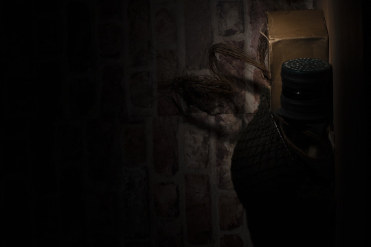
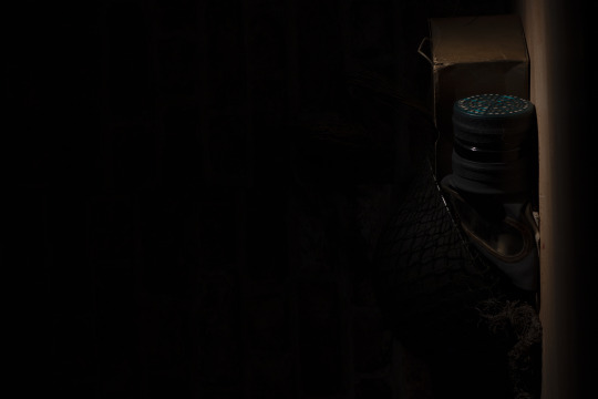
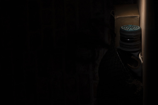
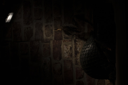
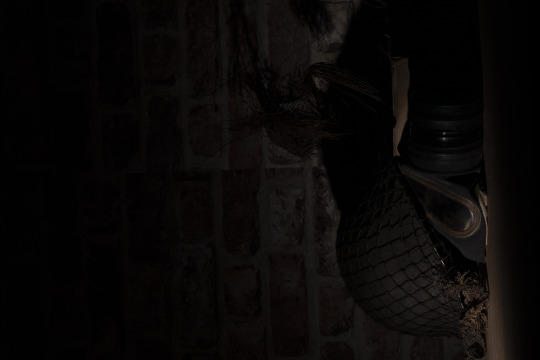
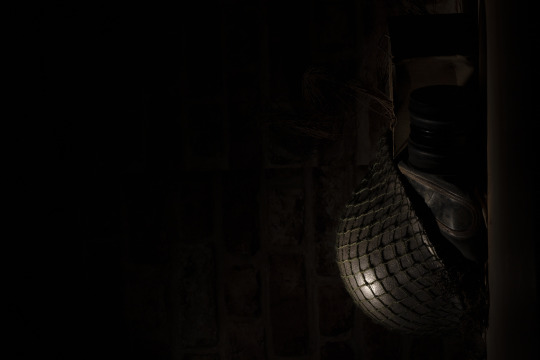
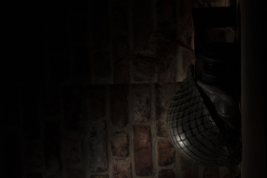
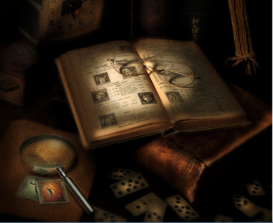
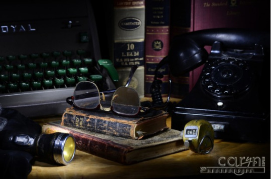
This brief opened up a lot of different creative techniques i have never done before and i fairly enjoyed this project over all as i gained more skills throughout it. i feel like my final image turned out exactly the way i wanted it to. i chose to do a war type style of still life, i borrowed my great papa’s helmet and gas mask from when he was in the war and create a scene with them all shown in a dark lighting.
If i were to complete this theme again i would incorporate more light in places that i didn't show. i would use the same set up and atmosphere as i think it makes the image a lot more interesting.
0 notes
Text
Recycle Research
Painting with light is a type of photography that uses techniques like moving lights source while taking long exposure photographs, either to illuminate a subject or space.
5 examples of painting with light
painting with light techniques
https://www.youtube.com/watch?v=0qnwtww2I3o
Single exposure
Here you determine how long you will leave the shutter open. This will often be multiple seconds or even longer. While the shutter is open, you “paint” the subject with your light, emphasizing the portions of the scene you want to bring out, leaving in shadow those you want subdued.
Your working time will be the shutter duration, and you will make your entire image during that single exposure.
Multiple exposure
This technique is somewhat like the previous one in that you paint a portion of the subject with light during what will often be a multi-second exposure.
The difference is that you will take multiple shots of the subject, each time painting just a portion of the scene. Then in the edit, you combine these multiple images, much like pieces of a jigsaw puzzle, into the final composite image.
1 note
·
View note
Text
Illusion Evaluation
For this brief we were asked to take two different objects and combine them together to create an illusion. I wasn't sure how i would feel about this brief as Still Life Photography isn't my favourite subject to do and its not something i have a lot of skills in. I found the brief quite hard to get into and to get some creative ideas to complete the brief. when i eventually got some inspiration i got to shooting, i found the practical side of the project fairly easy although i doubted my idea for the most part. The bit i found the hardest in this brief was the post production side because i have never done this sort of thing in photoshop before and because our post production classes were still online at this point i found it extremely difficult to work it all out as i didn't have a lecture there to guide me.
if i were to complete this project again i will work a lot more on the post production side of things because i feel this is were i let myself down for this brief.
1 note
·
View note
Text
Illusion Plan
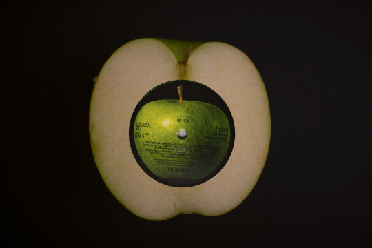
For the illusion brief i want to bring together two circular objects and try and create something interesting to look at. I decided to choose a vinyl record and the inside of an apple. i feel like the shapes work really well together. this brief takes a lot of editing to make your illusion work. I think taking the record label and sizing it down and then blowing up the apple to a record size then placing the label on top along with some grooves from another record would make the apple look as if it is the actual vinyl record creating a cool illusion.
i have to make sure when taking all my images that everything has the same lighting and same placement. to assure this is achieved i will take notes of all camera and lighting settings. i will also take behind the scenes photos to make sure i have everything in the same place.
things i will need for my final shoots:
apples (more than one)
vinyl record label
white vinyl record for grooves
white background
soft box lights
tripod
light meter
light receiver
camera
different lenses
0 notes
Text
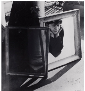
Surrealism Research
Surrealism
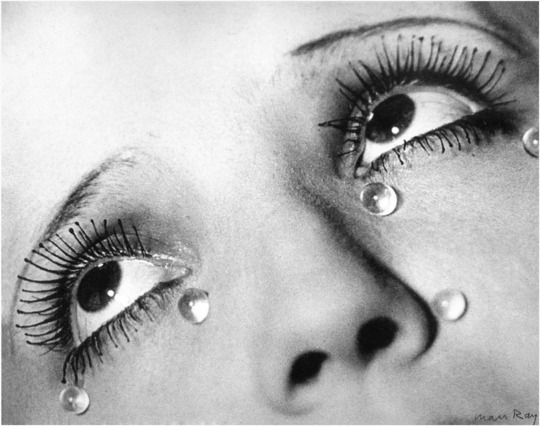
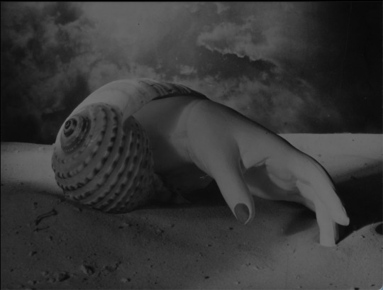
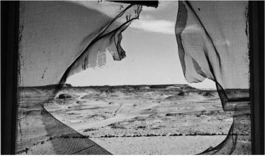
Surreal photography is an artistic and intellectual movement originated in France in the early 1920s. Surreal images tend to be dreamlike and tap into people's unconscious, it is often made of different elements that are put together in unexpected ways. Surreal images almost always contain recognizable elements from real life human figures, clocks, apples arranged in strange ways. Different surrealism techniques include: Photomontage, Blurring, Shutter Speed, Float your subject, Solarization, Perspectives and Colour Choice. Some photographers who specialise in surrealism are: Man Ray, Dora Maar, Lee Millar, Claude Cahun and Florence Henri.
The Uncanny
The Uncanny started in 1835 when a German philosopher Friedrich Schelling wrote a paper called “ Das Unheimliche” (the uncanny). The paper discussed what the meaning of The Uncanny was. Examples of situations that can cause an uncanny feeling including inanimate objects coming to life were discussed.
5 Illusion examples
Man Ray
Dora Maar
Lee Millar
Claude Cahun
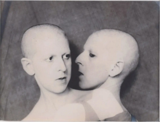
Florence Henri
0 notes
Text
JPG vs RAW
Right : Correctly Exposed
Middle : Under Exposed
Left : Over Exposed

Right : Correctly Exposed
Middle : Under Exposed
Left : Over Exposed
0 notes
Text
RGB Report
HND Image Editing
Colour Management Report
RGB Brief
This report is written by: Katie
HND1C
This project is designed to expand your understanding of professional colour management workflow, including:
• input profiling
• monitor calibration
• printer profiling
• ICC (International Colour Consortium) profiles.
You will be asked to watch a short video and answer the questions relating to this video throughout this document.
You may be required to input diagrams or screenshots as appropriate. This is under open book conditions, meaning that you can use the wider internet to help your research.
The deadline for this brief is Friday 14th May 2021.
Part 1 – Colour Management Basics
Watch this short video on YouTube and answer the questions below.
https://www.youtube.com/watch?v=kP1GgxeY2r0
Q1. What is colour management?
Colour management is a controlled conversion between the colour reprensations of various devices. It can be used with image scanners, digital cameras, monitors etc.
Q2. Why is colour management important for photographers?
Colour management is important as not all programs can reproduce all of the colour range that the human eyes can. The colour space use by each device is designed to produce within given colour space partiecpents
Q3. What colours are the following devices displayed in?
Displays (Screens, monitors, TV etc.): ROYGBIV / Red Orange Yellow Green Blue Indigo Violet
Printers: CMYK / Cyan Magenta Yellow Key
Q4. What does colour space mean?
Colour space is a specific group of colours. This varies on the where the colours are being displayed.
Q5. What are two of the most common colour spaces?
The most commonly used colour spaces are SRGB and adobe RGB.
Q6. Insert a diagram showing the LAB colour space, alongside other common colour spaces and note the differences.
Q7. Explain briefly the difference between ‘colour management’ and ‘colour correct’.
The colour correction process is to make the footage look exactly the way that the human eye sees things.Whereas colour correction changes the aesthetic of the image.
Part 2 – Studio workflow & Input profiling
Watch this short video on YouTube to help answer the questions below.
https://www.youtube.com/watch?v=iAWIYkmuH8Y
Q1. What is the industry standard colour profile for monitors?
The majority of recent high-quality LCDs are around 6500K. Although 6500K is a good starting point, there are times when you should deviate from it. A little lower colour temperature of roughly 5500K, for example, can provide a better screen to print match for your specific work environment.
Q2. Why should you view your images from DSLR computer to print under the same light source?
You should view your images on all devices using the same light source so you can accurately view the colours on each device
Q3. Why should you avoid editing in a room with colourful walls?
You should avoid colours that reflect light such as bright distracting colours. These types of colours end up causing you to see the colours in your images.
Q4. What is the benefit of using a colour checker card in the studio?
Using a colour checker card in the studio is useful to make you can match to the true colour when editing
Q5. What is the benefit of using tethered capture?
Tethered capture is when you take an image on your camera and it gets imported straight into lightroom for example to edit and for you to look at
Q6. What are the three main steps for colour management on set?
1. Image creation
2. Image processing
3. Image reproduction
Part 3 – Post Production (Monitor Calibration)
Watch this short video on YouTube to help answer the questions below.
https://wwww.youtube.com/watch?v=60g0pg0pXFA
Q1. What are the two colour spaces you will most often be working in?
The two-colour spaces most work in are RGB and CMYK.
Q2. If you aren’t going print a lot of your images, what is the recommended colour space?
sRGB as it has a wider colour range. This is fine to use as the printer cannot see the full sRGB range but since we aren’t printing its ok
Q3. If you are printing a lot of your images, what is the recommended colour space and why?
The most recommended colour space is adobe RGB as it has more coour variety compared to other colour spaces like sRGB.
Q4. How regularly should you plan to calibrate your monitor and why?
You should calibrate your monitor once a month or whenever you change lighting conditions. so that you can create prints that accurately represent what you see on your monitor.
Q5. What does a colour meter (for calibration) do? Name three different colourimeter brands and note if they are external or built in.
The colour metre is used to determine the location of a colour on the XYZ axis of non-radioactive materials, in addition to being simple to use and inexpensive. There is densitometers, colour photometers and spectrophotometer.
Q6. What is the industry standard settings for monitor displays?
Gamma: 2.2 for windows, 1.8 for Mac
Luminance: 120 is the recommended for a standard LCD screen
Colour Temperature : If working with video use 6500k, if working with images you plan to print, use 5000k
Part 4 – Post Production (Printer Profiling)
Watch this short video on YouTube to help answer the questions below.
https://www.youtube.com/watch?v=nKI8BZqSuHw
Q1. What colour space should you edit in for print?
Adobe RGB
Q2. What colour space should you export your file in for print and why?
Adobe RGB as this is most compatible with printing as they cant see the full sRGB range
Q3. In terms of colour, why is it sometimes problematic printing on different paper types?
Depending on the paper, the quality of the print may vary. With low quality paper the ink will start too creep away from the text or photograph being printed. Also colour may be different depending on the quality
Q4. Describe what an ICC (International Colour Consortium)
profiles does?
An ICC describes the properties of a colour space, and range of colour it can output
Q5. What is the benefit of checking the ICC available for your image?
Checking the ICC of your image is beneficial to check the colour range your monitor can display or a printer can print
Q6. What does ‘gamut’ mean?
Gamut is the range of colour that a monitor can display or a printer can print
Part 5 – Photoshop Soft Proofing
Watch this short video on YouTube to help answer the questions below.
https://www.youtube.com/watch?v=mWGrfEZjQos
Q1. Why should we use Soft Proofing and what are the benefits?
It allows you to set better expectations and to minimize unexpected results during printing it also gives you more control over colour reproduction in images and overall designs
Q2. What are the main steps to soft proofing in Photoshop?
Open image in photshop
Select ‘view’
Proof setup
Custom
Custom proof condition
Device to simulate- select appropriate printspace
Rendering intent – select appropriate one
Check black point compensation
Tick preview box (on and off)
Click ok
Q3. Once you have soft proofed your image to the desired output result, how should you convert your file to the correct profile?
Select edit
Convert to profile
Use same settings as setting up soft proofing
Rename file
Bibliography:
https://www.loxleycolour.com/help/colour#colourtab2
https://helpx.adobe.com/uk/photoshop/user-guide.html?topic=/uk/en/photoshop/morehelp/color-management.ug.js
https://blog.breathingcolor.com/what-are-color-profiles/
https://www.viewsonic.com/library/photography/color-management-guide/
2 notes
·
View notes
Text
Film Editing Software Research
Film editing software
Adobe Premiere Pro CC
DaVinci
Final Cut Pro
Film editing apps
LumaFusion
iMovie
Videoshop
Pros of Editing Software
- can handle larger file sizes
- more freedom with colour grading
Cons of Editing Software
- a lot more expensive
- need more storage on device
- a lot more techniques to learn
Pros of Editing apps
- some apps are free
- easily accessible
- can be portable
Cons of Editing apps
- less variety of tools
- quality of film will be less than proper software
0 notes
Text
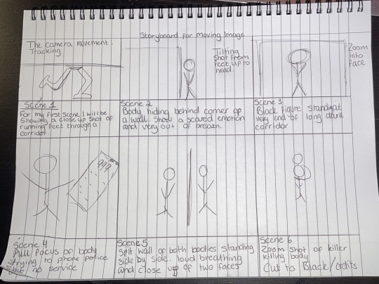
Camera Movement Techniques
Panning:
Panning is when you move your camera horizontally; either left to right or right to left, while its base is fixated on a certain point. You don't actually move the camera just the position it is facing to follow an object. These types of shots are great for establishing a sense of location within your story. You are able to show more in a scene using this technique.
Example of Panning in film.
youtube
Tilt:
Tilting is a cinematographic technique in which the camera stays in a fixed position but rotates up/down in a vertical plane. Tilting the camera results in a motion similar to someone raising or lowering their head to look up or down. this technique could be used in a film to show power in a character when the camera tilts up and when the camera tilts down it makes the character powerless.
youtube
Zoom
A zoom shot is when the camera changes focal length to focus in on or away from a subject during a scene. You must use a zoom lens to do this as a fixed length lens cannot change focal length and the scene will remain at the same distance.
Zooming in on a subject can be used for dramatic effect to heighten the tension within a scene. In the video below, a lot of the examples are of zoom shots being used to go from a wide angle of the whole scene, to a close-up of an actor, sometimes specifically focusing on their eyes. It can create a sense of urgency, fear, dread or danger.
It can also be used to catch a subject in the act of doing something, by focusing in on them and highlighting them out of a wider scene. This is done by zooming in on them and making them bigger on the screen.
Zooming can also be used to zoom out of a scene. This can be used to reveal a wider setting which characters are in, which isn’t apparent at the beginning of a shot or scene.
youtube
Tracking
Tracking is when the camera physically moves to follow a character. The camera moves forward, backwards, to the side, up or down along with how the character is moving. This is different than panning or tilting, where the camera can do those from a fixed location.
This technique can be used to mimic real life and how someone would move in reality. It allows the audience to feel more immersed in the story as they travel along with the character in real time.
In the example below, the camera follows the characters from behind, so you can see the party from their point of view.
youtube
Dolly
When using a dolly, the camera is steady on a mount that is connected to a wheeled rig that moves smoothly from side to side or towards and away from said subject. It creates a really smooth floating like look that creates a steady and seamless line of video. It is often used in moving scenes within movies and where the camera needs to pan in some way to view multiple things or to follow the subject.
youtube
Pull focus
Put simply, the pull focus or rack focus technique allows you to focus on one part of a scene and then focus on another part of the same scene. The depth of field varies within the shot. It can be used to transition from one object to another, add drama, and for something within the shot to be really obvious to the viewer or to act as a clue, reveal something that's hidden, and combine shots together. In order to do the technique you need to think about distance and your subject or objects. You will also need a lens that is capable of manual focus, a follow focus, which is similar to a dolly in which it is a rig that holds the camera steady. How close or far away you are to the subject depends on what you think is best, as well as what depth of field you choose, although with those two factors it will determine how strong and noticeable the pull focus is within your shot.
1 note
·
View note