
Last Seen Blogs

jolie-rouge-hbic-blog
Jolie-Head Bitch in Charge

birdeeandthebeat
Birdee And The Beat

bxbmochi
Tia

motsusocks
Motsu Socks

sugarsugarrrr
center of my world.
Text
Design Final
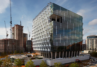
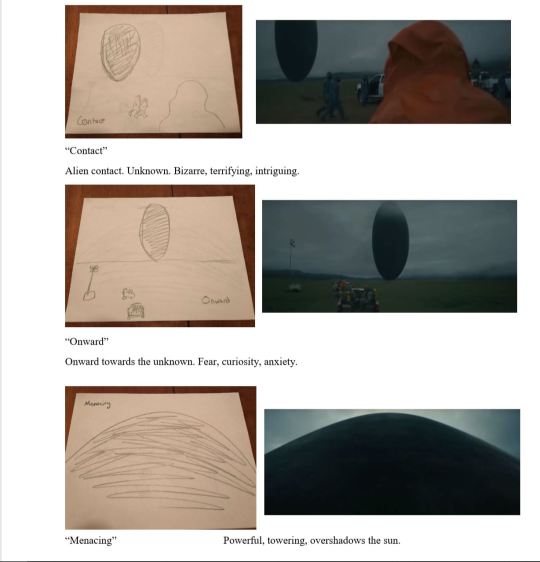
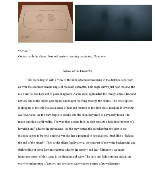
Arrival: A New Encounter
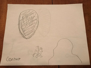

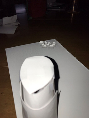
Model 1:
With this first model I wanted to illustrate the menacing and powerful aura the alien ship emits. By having the model of the back of Louise Banks in front of the alien ship and looking up at it, it creates a sense of awe and fear due to the looming presence of the alien structure. Anxiety is created, knowing how powerful the aliens are, yet are they friend or foe?
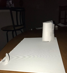
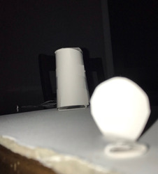
Model 2:
With the second model, I decided to flip the perspective and show how the scene looks from the alien ship’s perspective looking down on the humans. The shadows created from the model of the ship help illustrate just how looming of a presence the ship creates. By having my human models be small and, in the background, it creates a sense of powerlessness and insignificance for the humans compared to this unknown alien structure. Additionally, by having the shadows envelop and cast over the models it further creates a sense of fear and uncertainty for the humans.
0 notes
Text
CoAD Review 3
The purpose of this assignment was to create and design a building that will be constructed at the address 701 E Hill Ave. This design idea was to create an office building that also serves as a residency as well. The design aim is to connect home life to work life. I like the design choices she chose that helped differentiate the residential area and the office area while still allowing them to connect and harmonize. The residential area is built mainly with wood, tin, and cooper to give it a homey feel, whereas the office area utilizes concrete and metals. The floor layout of the building will include four floors, including an atrium to allow for natural light, as well as a grass space on the roof of the building. Madde also proposed that closing the windows would still be viable because of the natural light gained from the atrium as well as the light that comes from the riverside. The critics had some concerns regarding the diagrams and renderings reflecting the feel and atmosphere that Madde is trying to illustrate. For example, the critics said that the renderings show a warm and welcoming atmosphere whereas the diagrams do not reflect that same atmosphere and feeling. The critics considered that there should be more of a diagrammatic understanding with this project. Some solutions that they offered were to label and color the diagram so as to illustrate to the viewer the warm feeling the renderings show. Additionally, the critics were against taking the windows out. The main reason was due to safety concerns, having closed windows would pose a fire hazard. However, the critics did like the courtyard idea of the design. I personally agree with some of the critics’ concerns, the diagram did seem stark and cold whereas the renderings themselves gave me a warm and welcoming feeling. I did really like the idea of combining an office space with residential space, I though the clash of professionalism and home life was compelling. Ultimately, I liked this design especially the feeling the renderings gave me.
0 notes
Text
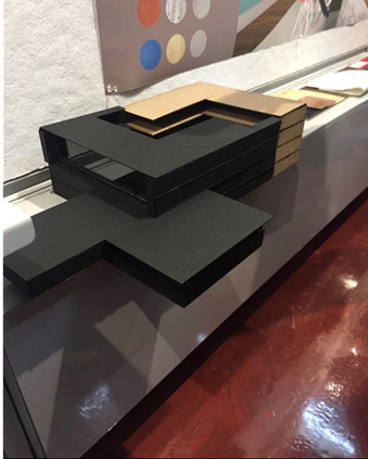
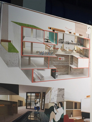
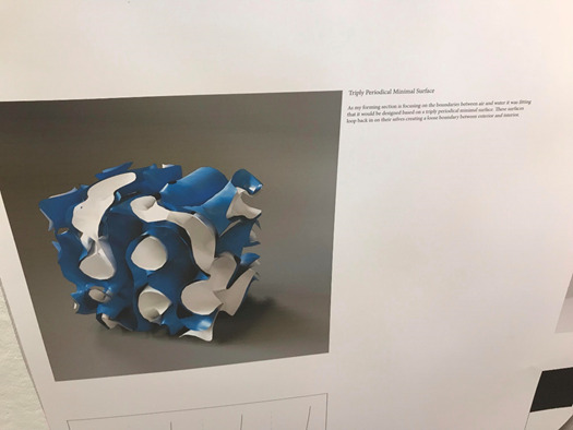
CoAD Review 2
The purpose of this design was to design a building that would be constructed at a preexisting area. This particular design was to create an Aquarium with the objective of merging the boundary of water and air. One of the main design features, if not the center feature of this project was a design that he based around “Triply Periodical Minimal Surfaces”. These surfaces are intended to manipulate the boundary of the interior and exterior by looping in on themselves. Additionally, one of the main elements he looked at and considered was the sin and tangent waves. While this idea is interesting, I have a few questions and concerns that are shared with the critiques. Personally, I was confused about the project from the get-go until the end. I’m not sure if the cause of my confusion is my ignorance of architectural design, but personally, I found the layout and order of the renderings and designs to be confusing. It was hard for me to connect what he was saying and describing to the renderings and images he included in his presentation. One of the main problems that the critics mentioned was that while the idea was interesting and compelling, they had difficulty seeing how it was reflected in the design and renderings. Additionally, they had brought up potential structural and spatial issues with the implementation of the idea. The critics seemed to have difficulty seeing how his Triply Periodical Minimal Surfaces as well as the utilization of sin and tangent waves were reflected in the design of the aquarium. They used the tanks of the fish for an example. The tanks ended up becoming columnal even though the sin and tangent waves are not. While I was confused for most of the time during his project presentation, I certainly can admire and appreciate the thought and design process behind his creation.
0 notes
Text
CoAD Review 1
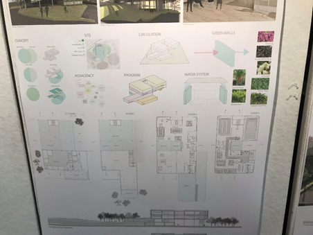
The purpose of this assignment was to take an existing building at the address of 701 E Hill Ave. and create a multipurpose space for both the private and public sector. Kailey Fontan’s design idea was to create an office building that blends artificial elements of the building with natural elements. To successfully realize this idea and goal, Kailey utilized subtle techniques as well as techniques that are eye catching but equally impressive. Many of her design choices were geared towards make sure that the building had a strong connection to nature and that is most certainly reflected in the renderings. For example, the materials used in this project include natural materials such as wood, glass, and “green walls”. These green walls are walls that are covered with natural greenery, and not only do the green walls connect the building to nature and its surroundings, it also serves a more subtle but impressive purpose. The green walls provide cooling for the building, due to the properties of the natural materials, and I find this subtly very impressive and efficient. Not only are you visually achieving your goal of connecting the building to nature, but you are doing it in a way that increases your efficiency and provides natural cooling. Another way Kailey efficiently utilizes resources while still achieving her objective is the indoor waterfall. The indoor waterfall certainly brings nature to the interior of the office, but they way the water is circulated and collected is efficient. To collect the necessary water to run the waterfall, rain water is collected and there is also a cistern which is also used to fuel the waterfall. The critiques of this project I tend to agree with. For example, one of the main aspects that the critics seemed to appreciate was the separation of private and public space. Additionally, the way in which the park area surrounding the office was situated, it allowed the office building to become a destination for the public. Even if the office was closed, the public could still visit the park area that surrounds the building. One of the main critics was regarding the spatial relationship between certain areas inside the building itself. For example, some spaces were tight or awkward and did not flow correctly or as best as they could have. While I can agree with these critiques, I still think the design concept itself does a great job at achieving its objective.
0 notes
Text
Lecture 2 Review
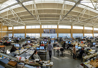
This lecture by Billie Faircloth of KieranTimberlake opened my eyes to a different aspect of architecture that I never really thought about or considered. The lecture covered the topic of “agency” and how at her firm they approach researching and problem solving. I found the approach that she and her firm take to be a very interesting and effective approach. One of the most important aspects of research and design seems to be transdisciplinary and multi method approaches. By incorporating not only the architectural team, but also civil engineers, chemical engineers, and various other disciplines, her team is able to go about the research and design process in a way that pushes their agency and gives them perspectives about certain aspects that they otherwise may have not considered. At KieranTimberlake, the importance of “group work”, for lack of a better term, is reflected in the layout of their studio office space. The open layout of the office space is very conducive to discourse and involvement throughout the studio. By allowing this ease of involvement, it not only makes it easier to collaborate but it also encourages it. A perfect example of transdisciplinary methods and research is KieranTimberlake’s US Embassy in London. Not only is it architecturally impressive, but the research and science behind it is equally if not more impressive. At first glance, the façade of the building may seem like just an interesting design, however it serves a deeper purpose. By thorough material research, they were able to develop the façade in a way that reduces the glare of the sun while also being transparent and manipulating the natural light in the best way possible. This lecture brought to my attention how important working with other disciplines is in architecture.
Source: https://kierantimberlake.com/
0 notes
Text
Blog 12
The upcoming Ko’ula luxury tower in Hawaii has been revealed by Studio Gang. The waterfront tower, measuring 41 stories, has a very intriguing and interesting design. The tower’s exterior has columns which rise from the ground level to the top of the building and are positioned between the windows. These columns are quite interesting in that they are wavy and appear to be pulsating. I like the decision to use wavy columns instead of straight columns because it makes the building harmonize with its surroundings. The wavy columns seem to be playing of the oceans waves to give the building a sense of flow instead of just being a stiff building with only vertical movement. The positioning of the columns also provides a subtle yet also powerful effect. Due to the columns being positioned in between windows, the reflection of clouds off these windows seem to give the building a sense of movement, as if it is moving across the sky like the clouds it reflects.
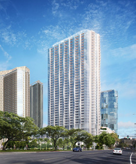
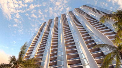
Source:https://www.dezeen.com/2018/11/16/koula-tower-studio-gang-honolulu-hawaii/
0 notes
Text
Blog 11
The Appareil Architecture firm from Montreal has built an impressive extension to the Waterloo Residence in Montreal. The extension is meant to serve as a dining area and has a design scheme that I find interesting. The extension is predominately white with many full windows as well as some walls that are a dark chestnut color. The combination of the white interior and the glass windows provide an influx of light which complement the dark wood walls and gray flooring to create a light contrast which really grabs your attention and makes you appreciate the interior. Additionally, the dark wood and window combination make the interior seem to almost blend in or fit in with the outside, almost as if there is no barrier between the interior and the outside world. Overall, the new extension impressed me with its color scheme which enables the manipulation of light, as well as its simplistic and rustic yet modern design.
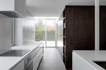
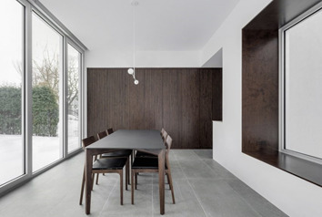
Source: https://www.dezeen.com/2018/11/09/house-extension-white-dining-annex-waterloo-residence-montreal-appareil-architecture/#disqus_thread
0 notes
Text
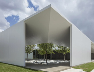
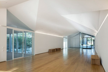
Blog 10
Johnston Marklee’s Menil Drawing Institute has been opened in Texas. The building is single story and measures 30,146 square feet. The purpose of the building is to showcase the collection of drawings of John and Dominique de Menil. The design of the building is very intriguing to me. The stark white color choice combined with the plethora of glass gives the building a sense of brightness. The glass provides a viewing point to the inner courtyard from almost anywhere in the complex. The architecture of the walls and hallways also is fascinating. I like the decision to use many geometrical angles help provide a sense of depth as well as a sense of direction, almost as if it is leading you throughout the facility, directing your attention. Also, the angular walls and ceilings are complementary to the glass walls as well as the trees in the courtyard and surrounding the complex. The glass lets in a significant amount of natural light; however, the trees and the angular walls provide shade and direct to the sunlight so it is not assaulting to the senses.
Source:https://www.dezeen.com/2018/11/02/menil-drawing-institute-museum-johnston-marklee-houston-texas/
Source:https://www.dezeen.com/2018/11/02/menil-drawing-institute-museum-johnston-marklee-houston-texas/
0 notes
Text
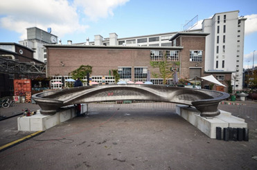
Blog 9
The 3-D printed bridge that is going to be constructed over a canal in Amsterdam is a new step in not only new construction process but also in design and architecture. The steel bridge, measuring 12 meters long, was designed and constructed by Dutch robotics company MX3D. One of the most impressive aspects of this bridge is that it was printed entirely by robots and that it was created using molten steel. By being able to construct this bridge of steel using 3-D printing, new possibilities and ideas can start to be explored. The actual design of this 3-D printed bridge is also impressive and eye catching. The curvatures along the outside of the bridge compliment the water it will go over, almost as if you are part of the flow of the water and part of the river channel itself.
Source: https://www.dezeen.com/2018/10/22/worlds-first-3d-printed-steel-bridge-completed-mx3d-technology/
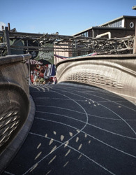
Source: https://www.dezeen.com/2018/10/22/worlds-first-3d-printed-steel-bridge-completed-mx3d-technology/
0 notes
Text
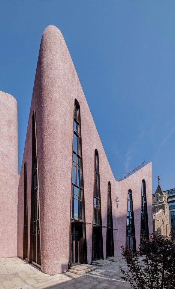
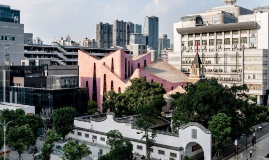
Blog 7
The church hall that was just recently to the Huaxiang Church in Fuzhou, China is a very bold and impressive addition to the old church. The church hall addition was constructed by the studio Inuce due to the increasing number of Christians in China. The addition really sticks out and catches the eye due to the contrast to its surroundings. The new addition, is a pink color which is a stark contrast to the gray and stone buildings surrounding it. Additionally, the form the building takes is very unique. The original church is an old style, similar to a gothic style, while this new pink addition is more urban and modern in design, with erratic geometry yet still seems to have a pattern and consistency.
Source: : https://www.dezeen.com/2018/10/14/inuce-dirk-u-moench-pinkpebble-dash-church-fuzhou-china-architecture/
Sources: : https://www.dezeen.com/2018/10/14/inuce-dirk-u-moench-pinkpebble-dash-church-fuzhou-china-architecture/
0 notes
Text
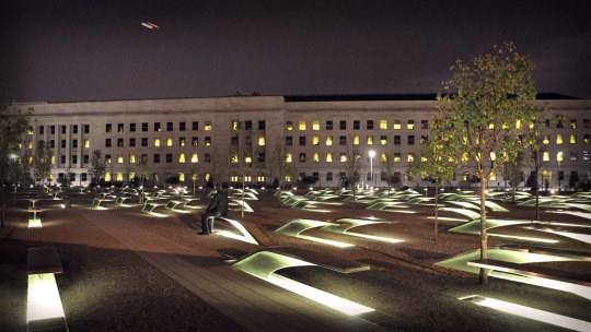
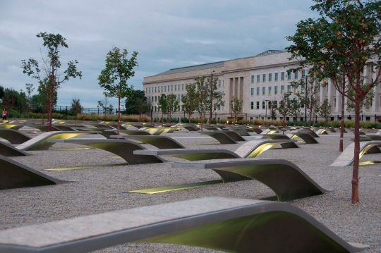
Pentagon Memorial Lecture Review
Prior to Julie Beckman’s lecture regarding the Pentagon Memorial, I was uninformed and did not really know much about the Pentagon Memorial. My experience was mainly with the 9/11 memorial in New York. However, this lecture opened my eyes to the beauty of architecture and just how much architectural thought that went into the memorial. This memorial showed me how certain architectural designs can have powerful effects, no matter how small these decisions may seem. For example, the subtle design of the benches, which also act as the main memorial piece for each victim of the 9/11 tragedy, allow each viewer to interpret the meaning in their own way. Additionally, the age lines where compelling to me. At first, I did not know how and why each bench was positioned the way it was. Once Julie Beckman explained to us the reasons why they were positioned the way there were, I thought that was a very powerful architectural design. Having the benches positioned by age, especially having the youngest victims be the first you encounter when entering the memorial, really gives you perspective about the tragedy. Additionally, at first, I thought the direction each bench was facing was random, however there was a clear and important reason each bench was facing the way they are. Just by moving the direction of the bench, a viewer gets even more perspective about the memorial and the victims of the 9/11 tragedy.
Sources: http://kbas.co/home-3/uncategorized/pentagon-memorial/
https://washington.org/dc-guide-to/pentagon-memorial
0 notes
Text
Blog 6
9/4/18
Clouds
Mountain
Hills
Train
House
Sign
Trees
Path
People
Bison
Rocks
Pavilion
Fire Pit
Reflection
Shadows
White
Cloudy
Peaceful
Light/Dark
Unique
9/13/18
Snow
Clouds
Storm
Mountain
Train
House
Sign
Trees
Path
Bison
People
Rocks
Plants
House
Fire
Bench
Wood
Wind
Window
Glass
Reflection
Dark
9/18/18
Gray Cloud
White Mountain
Red Train
Green Tree
Gray Pavement
Brown Ox
Wooden House
Clear Glass
Dark Sky
Red Orange Fire
9/25/18
Moving Clouds
Moving Train
Grazing Ox
People Walking
Flame Crackling
Nature Reflected
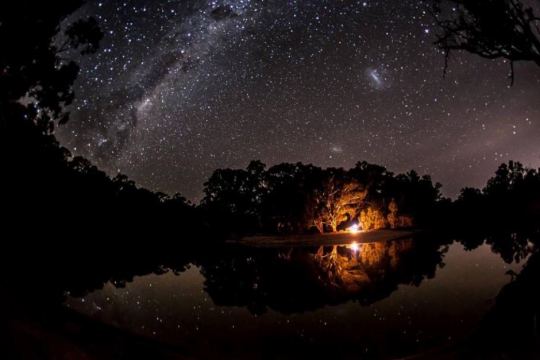
10/2/18
Fire crackling in the fireplace as the clouds in the background move across the landscape
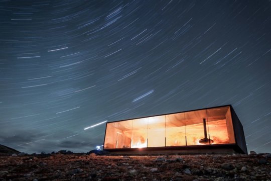
Final Cycle: 10/8/18
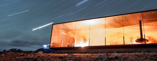
Reflection. Rocky terrain. Cloudy atmosphere. Cobalt sky. Chill in the air.
Wooden interior.
Light foreground and Dark background contrast.
Night Sky. Cosmic Intrigue. Time Lapse.
Illuminated Interior. Shelter from the elements. Window to Space.
Sources: https://snohetta.com/project/2-tverrfjellhytta-norwegian-wild-reindeer-pavilion
https://inhabitat.com/norwegian-wild-reindeer-centre-pavilion-inspired-by-the-robust-landscape/
0 notes
Text
Blog 5 Part 1
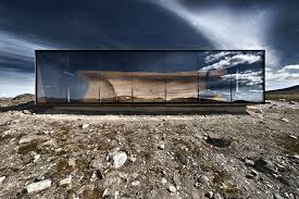
After reading Zumthor’s “A way of Looking at Things”, one particular quote stood out to me. “I believe that buildings only be accepted by their surroundings if they have the ability to appeal to our emotions and minds in various ways.” This quote is interesting to me because if you stop and think about your surroundings you will come to agree with the sentiment of this quote. Additionally, even subconsciously when viewing your everyday surroundings there may be certain things that stand out that don’t quite seem to fit in the surroundings. I think a perfect illustration of this quote would be the Reindeer Pavilion. While it is the only building in the beautiful landscape, it does not at all intrude on the surroundings. The Pavilion is made in such a way that instead of ruining the atmosphere, it actual enhances your surroundings. The wooden paneling and all windowed wall engage the viewer and helps integrate them to their surroundings.
Source: https://inhabitat.com/norwegian-wild-reindeer-centre-pavilion-inspired-by-the-robust-landscape/
Part 2
An early experience that directly impacted me and engaged me to my surroundings happened in my youth. It was a late summer or early fall evening; my family and I were gathered around the fire pit that we had in our back yard and as we sat there I became enthralled with the feeling and atmosphere that night. The light of the stars and moon shining in the background of black space, the crackling fire in front of me providing warmth in the brisk night, the cicadas and other insects chirping in the background providing ambient noise. All these factors complemented each other, and that experience stuck with me ever since.
Source: http://www.abc.net.au/news/2016-05-20/campfire-beside-the-murrumbidgee-river/7431348
0 notes
Text
Blog 4
In Italo Calvino’s Cities & Signs 2, an entry from Invisible Cities, Calvino describes a city referred to as “Zirma”. Zirma is described as a bustling city which gives the traveler distinct memories. For example, “a blind black man shouting in the crowd, a lunatic teetering on a skyscraper's cornice…”. To me, Zirma feels like a chaotic, lively, and exotic city. When Calvino described Zirma, I imagined a place where a variety of different personas, all equally bizarre and outlandish, gather and go through their lives. When imagining Zirma, I pictured a city that never sleeps, one that there is always some event or some other occurrence happening. This picture of Venice relates to my image of Zirma in that there is a massive crowd. This image of Venice is the kind of crowd I would expect to see in Zirma, a crowd which invokes a sense of chaos and excitement.
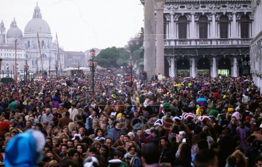
Photo: https://escapingelegance.com/2013/05/20/italy-in-a-previous-life/
0 notes
Text
Blog 3
In Italo Calvino’s Cities & Memory 1, an entry from his Invisible Cities, he describes a city called “Diomira”. In his description, Calvino describes the city taking note specifically of certain landmarks and structures. Calvino describes “sixty silver domes, bronze statues of all the gods, streets paved with lead, a crystal theatre…” Based off this description, I felt that Diomira is a city of elegance and beauty. Although other cities may have similar structures, the atmosphere of Diomira is supposed to be like none other. With the image of Venice, I got a similar feeling of what Calvino was describing. For example, the dome in the picture is similar to what I was imagining one of the silver domes would look like. Additionally, when Calvino was describing the man walking around Diomira on a September evening, I could just imagine him strolling through this image of Venice. I can picture the man walking on the street taking in the scenery, the impressive dome in the background, and the lamps just turning on to signal the beginning of the night. I can even imagine a woman on the terrace just as Calvino illustrates in his entry.
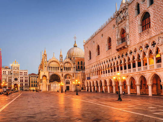
Photo: https://www.timeout.com/venice
0 notes
Text
Blog 2
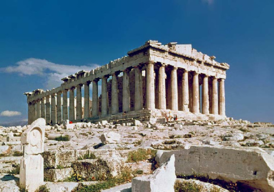
The Parthenon, a temple to the goddess Athena, built by the Greeks in approximately 440 BC, is a truly outstanding architectural feat. I am very fascinated by the Parthenon for many reasons. For instance, it is remarkable that a building built around 2400 years ago is not only still standing but still possesses an aura of power as well as being a symbol of Greek culture. The sheer size and might of the columns and the building itself emits a sense of power and superiority. Also, the panel above the columns depicts images of the gods which even further reinforces how much religion plays an important role in Greek culture. What is the most remarkable aspect of the Parthenon is how the Greeks were able to construct such a massive temple with the technology available to them at the time. Not only were they able to construct the Parthenon with such symmetry, but they even were able to make it withstand the test of time. I believe that this shows the sophistication and the intelligence that the ancient Greeks possessed. Additionally, the influence of the Parthenon’s architectural qualities can be seen in anywhere from the Roman style, all the way to the Lincoln memorial. I believe the Parthenon is the perfect example of the “Classical” architectural design.
Photo: 111_fa18.03_language.of.order.r.pdf Scott Wall
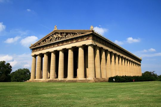
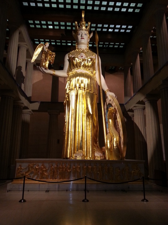
This next picture is also the Parthenon; however, it is located in Nashville, Tennessee and is a replica of the genuine article in Athens. While it is not the original, it is still breathtaking and intriguing to me. The Parthenon in Nashville is almost like if you were able to go back in time and see what the actual Parthenon looked like in its prime. With this Parthenon you can actually see the frieze easily and are able to see what story the ancient Greeks were telling. The original Parthenon is still more impressive to me, however, with the replicated version, you are able to further enhance your understanding and appreciation of the original especially with regards to the frieze, as stated previously, as well as with the roof of the Parthenon. Inside of the Parthenon, the replicated massive statue of the Goddess of Wisdom and the patron Goddess of Athens, Athena, even further illustrates the importance and significance religion had on ancient Greeks, even influencing their architectural design.
Photos: https://en.wikipedia.org/wiki/Parthenon_(Nashville)
https://nashvillefunforfamilies.com/the-parthenon-nashville/
0 notes