
Don't wanna be here? Send us removal request.
Statistics
We looked inside some of the posts by keenartisancoffee and here's what we found interesting.
Average Info
Notes Per Post
0
Likes Per Post
0
Reblog Per Post
0
Reply Per Post
0
Time Between Posts
3 days
Number of Posts By Type
Text
17
Last Seen Tumblr Blogs


Fun Fact
After the announcement of the deal with Yahoo!, there were 170K signatures of unhappy Tumblr users petitioning to prevent the sale in 2013.
Text
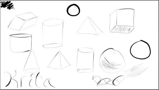
Blog #23 Perspective Wizardry
Perspective is a principle of art that I haven't touched on much. I was working on another blog. In that blog, my goal was to draw a cube with the principles of lighting and perspective. But I believe I was not applying the principle of perspective correctly, so I want to work on that principle before continuing work on which I suspect was wrong. It was, so I want to get perspective right before I continue work on the cube.
Today, I drew drawings featuring perspective and followed tutorials featuring perspective, including the video in the Artistsnetwork page down below. Additionally, I have learned the shortcuts to rotating and zooming the canvas, and using assistant tools. The videos linked down below taught me what I wanted to learn for awhile. Also know that the shortcut for 2 can be used to reset panning. Below are the exercise images.
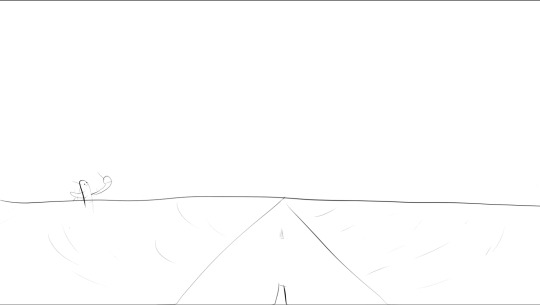
Classic highway in the desert for one-point perspective.
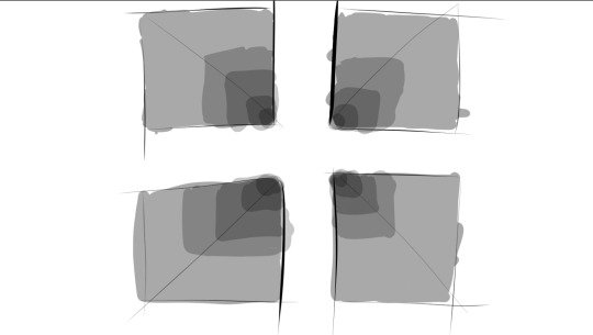
A modified version of the perspective practice on Artistsnetwork, using four holes and opacity sliders rather than nine holes and shading.

Four one point perspective, this time using Krita’s rulers.
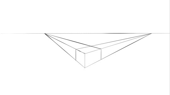
Finally, one example of two point perspective.
Links: What Is Perspective In Art? ( For Beginners): https://trembelingart.com/what-perspective-art-beginners/
The Beginning Artist’s Guide to Perspective Drawing: https://www.artistsnetwork.com/art-mediums/learn-to-draw-perspective/
Canvas - zooming, rotating and panning the canvas in Krita https://www.youtube.com/watch?v=eiP7pXnwu6g
Navigation on the canvas in Krita https://www.youtube.com/watch?v=ZwobU2c4TgA
Krita Basics - Rotate Canvas https://www.youtube.com/watch?v=CWFRV1Bd_Tc
Painting with Assistants https://docs.krita.org/en/user_manual/painting_with_assistants.html
Krita Assistant Tool : Part 1 https://www.youtube.com/watch?v=Tu463N_9gwY
0 notes
Text
Blog #22 Krita Review Part 2
I once again turn to the almighty Krita manual to get a refresher on how to operate Krita.
If you use Krita but do not know how to open the official Krita manual, simply go to the official Krita website, look on the top of the screen, and click the word that says "Learn".
Inside the General Concepts part of the manual, I read everything tied to color: bit depth, color managed workflow, mixing colors, color models, For those seeking information about art, skip the pages about bit depth and color managed workflow. Then I read about shortcut settings in the preferences section of the manual. Then I read about my shortcuts inside Krita itself.
Out of all the color tutorials, I would only read the one about mixing colors and viewing conditions. The rest are too bogged down by overly technical details that are not core to understanding how to use Krita or on understanding art.
I would also have a look at your own shortcuts every once in a while. Shortcuts are shortcuts: they make your life easier.
0 notes
Text
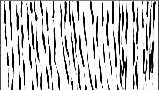
Blog #21 Lines and Sailboats
I will have to figure out what to draw and what else new to practice later, but I can’t skip practice.
By the way, move the pen down if tracing and actually drawing produce different results. Having to lower the pen changes the results.
Here's my practice for today.
It looks like a sailboat with an interesting design, so I cleaned my canvas and made one. I simply placed in the most dots crucial for its structure, then less important dots to give the right texture, then connect all the dots. To give it the 3D look and to make it not look as flat, I gave it an interior using gray dots and lines.
I eventually got this result, which can be seen below. Unfortunate that the body and sail of the ship isn’t nearly as curved; the ship does not look windswept. It also lost its scaly effect.

0 notes
Text
Blog #20 I will get there eventually...
A make up blog for a day I haven't blogged on.
With enough practice, I could become an artist, or at least a person capable of drawing a readable doodle. This could be one of the last blogs dedicated to line practice, since I think I have refined my technique enough to start drawing, but I don’t know what to draw yet.
This time, I held my pen in the way Creativity Clarified does mostly in his video, How to Hold a Graphics Tablet Pen Correctly [ ERGOMICS! ]. The video is in the description.
The pen tip is between my middle finger and my ring finger, rather than located between my index finger and middle finger. Creativity Clarified finds this particular grip easier, and I can see how it could be easier to use than a vertical writer's grip. It can be more stable with less pressure and the pen tip is much closer to the tablet, so there's less cases of touching the screen with a finger that isn't covered by the artist glove.
However, the vertical writer's grip does give more mobility in the fingers, and the new grip is a bit tense on the fingers right now. That might change in the future.
.
As usual, I connected lines to refine my raw technique. I struggle on vertical and diagonal lines, so I work on that mostly. My practice canvas is shown below.

I have several tips just from today. For the audience’s convenience, I organized this into a dotted list.
Use the “Show Canvas Only” key bind and the undo key bind. These are ridiculously helpful for drawing virtually anything. The keybinds are respectively Tab and Control + Z.
Make the motion without touching the screen with the tip first. It can give an idea on what line you will create.
Keep the pen vertical as much as possible, because a slanted pen can produce slants on lines, ruining otherwise great lines.
Use the shoulder and elbow to aim and draw straight lines. I really cannot stress how important this tip is. Especially for drawing diagonal or vertical lines, I would aim with the shoulder and elbow so I can pull down with the confidence that I made a good line.
Links:
How to Hold a Graphics Tablet Pen Correctly [ ERGOMICS! ] https://www.youtube.com/watch?v=OwqLzyusElM
0 notes
Text
Blog #19 Krita Review Part 1
Today, I review information on how to use Krita, which I wanted to do for a long time. I’ll blog more of my adventures into the Krita manual.
Instead of using the youtube video "Complete KRITA tutorial AND Digital Painting Basics" by sociamix, I simply used the official manual.
There are several benefits to using the manual over the video.
Manuals allows a reader to cover information at the reader's own pace, while with a video you are restricted to the speaker's pace.
Manuals allows a reader to easily review information, while with videos you have to spend time listening to the speaker over and over again.
The speaker occasionally does not properly identify or describe the tool or action the speaker is referring to.
Back onto the manual, I started on the page about navigation, then to Introduction to Layers and Masks, and finally to selections. I also read a few other pages that were linked to me on the pages I went to.
There is not much I can say on these pages without turning this blog into a summary. However, I can say that you can hold control to prevent accidentally forming dockers, dockers are the separate panels and not the tools, color labels on layers exist, and path selection is for vector paths.
.
Links:
Krita Manual: https://docs.krita.org/en/index.html
Complete KRITA tutorial AND Digital Painting Basics https://www.youtube.com/watch?v=NbNQmE6WPK0
0 notes
Text
Blog #18 Practice Pictures
As the title says, practice pictures. This time, it’s only two unfortunately.
In this photo, I practiced my line drawing technique by connecting dots, again. As the saying goes, practice makes perfect.

As I practiced drawing circles of varying thickness at one point, I realized that one of my mistakes looks like a hat or a beard, so I drew basic stickmen. A king surrounded by two other individuals with hats. They are in a simple room.
0 notes
Text
Blog #17 Practicar
In Spanish, practicar means “to practice.”
That is what I did today: practice. Not that much practice, but any practice at basic drawing skills is better than no practice at all.

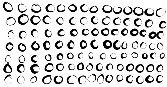
On the first image, I drew lines and circles with varying pressure.
On the second image, I connected dots with light lines most of the time.
On the second image, I drew lines, connected two S’s into an 8, and a light prototype I suppose.
0 notes
Text
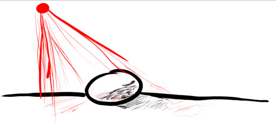
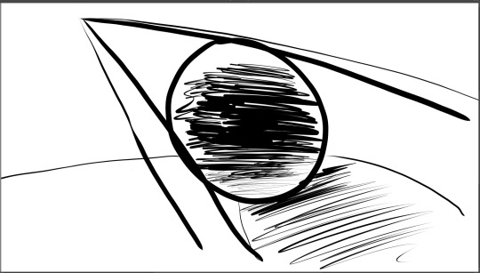
Blog #16 Lights!
Well, I was supposed to do this on Friday, but what hasn't been done hasn't been done. It's time to do some lighting! Today, I did an experiment: I grabbed a flashlight and an apple, and I make some observations on them.
If you are a beginner, you don't have to use an apple, but I would look for other fruits that are not translucent, oddly shaped, or oddly textured. You would preferably want fruits with a shine to them, unless you are trying to study light on varied textured. Examples of fruits I would avoid include tomatoes, bananas, and pineapples.
To start, the first observation is that, if you hold your flashlight diagonally on your fruit on top of a bright, polished surface, you will find a shadow that is shaped as a wedge. This is the core shadow, the darkest shadow. The prominence of this wedge is affected by the distance between the fruit and the light, and the surface used.
A black table will not produce the same effect a white table would.
.
Also, holding your light farther away lowers the size of shadows, and holding your light closer up increases the size of shadows.
I also encountered another bug with Krita. For some reason, whenever you press on the canvas with a pen, the cursor sticks to the area. You have to break out of this area, which will produce a line. From there, its normal other than the fact that pressure isn't used. Closing Krita doesn't work. Restarting my PC actually made things worse by making my pen unresponsive on the Krita canvas. What worked was to unselect and select the "Enable Windows ink" checkbox.
Then the bug happened again, possibly because I was switching between my notes and Krita. Closing and reopening Krita works this time, though for it to register pen input the first time, I had to drag my pen outside the canvas in.
.
So here are my rough sketches of the shadows I saw. Also, today I learned that the insert key is for inserting a new layer.

This is for light from a distance on a dark surface.
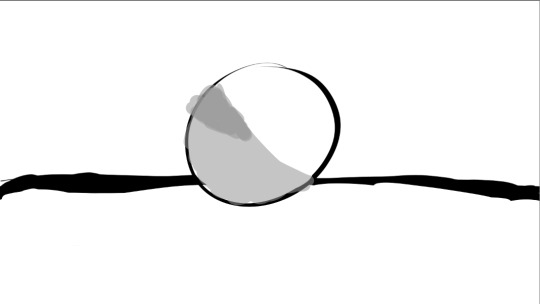
This is for light from a distance on a light surface.

This is for light from close up on a light surface.
0 notes
Text
Blog #15 Practice and a video
These titles are becoming rather unimaginative, aren’t they?
I did more practice and watched one video called "PERFECT PRACTICE: Improve Your Drawing Skills Quickly! Discord art Reviews". For me, the highlights of the video, paraphrased, are:
If you are a beginner, don’t stress about learning all forms of art. Narrow down your scope to what you want to learn.
You can study lighting and its effects on materials with a real light source and anything in your house.
Study dynamic poses.
Study movie stills.
Understand light direction.
Tilting your shoulder one way will tilt the hips the other way.
The second highlight is a ridiculously obvious tip that I don’t believe I have ever thought about.
The fourth highlight reminded me of a little tip. Maybe it is bad advice, like the cool shadows advice, but regardless of whether it’s valid advice, I should still tell how it goes: If you were to hold up a can or cube that has only its outlines visible, you would figure out that the top and bottom would look the same, ignoring perspective.
First image, which involved drawing curved lines, connecting lines, and pressure control.
Second image, involving more of connecting lines. I found looking at my graphics tablet helps with connecting dots using lines. Surprisingly hard things, such as connecting vertical lines or diagonal lines, become easier when I look at my own technique. I think this could help with refining drawing technique, but it’s a bad thing to make a habit out of.
Link:
PERFECT PRACTICE: Improve Your Drawing Skills Quickly! Discord art Reviews: https://www.youtube.com/watch?v=5bV-VqyrtHI
0 notes
Text
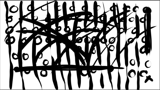
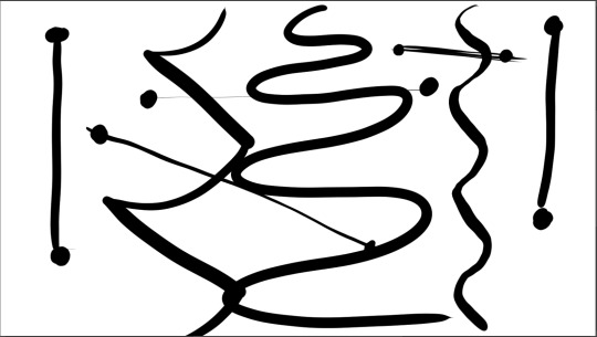
Blog #14 Doodles
Today, I drew and practiced. That's it, enjoy!
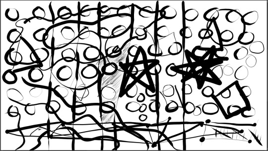
First one.
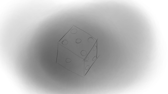
Second one, a dice.
Third one, shapes.

Fourth one.
0 notes
Text
Blog #13 More Art
Today I did more art practice, but nothing too time consuming this time. It's just stroke practice.
I also watched a few videos. I won't say much about these, except that they taught me good posture, a few tips, and a few more drills too. Somewhere later this week (Thursday or Friday, most likely), I plan on improving my lighting skills.
Line connecting and stuff.

I did the first drills taught in the video "Clean Line Art! Digital Inking Tips”. I did it a few times, until I got something I could actually show.
Then I did another one immediately after that attempt.

This one is made a few attempts after the attempt above this test.

I also did a weighted circle drill.
Link: How to Draw on a Tablet - Ultimate Drawing Tablet Tutorial: https://www.youtube.com/watch?v=83BRMfjJXIk Clean Line Art! Digital Inking Tips: https://www.youtube.com/watch?v=NBE-RTFkXDk
0 notes
Text
Blog #12 Practice with a side of structure
I did more practice. I also went back to a video I had covered earlier, which is "A Beginner's Guide to Drawing", and used the part of the video about construction.
Some practice.

Lighting practice. I suppose this shows I know the bare basics of this, but this is far from even being presentable. The sphere isn't properly lighted from red light.
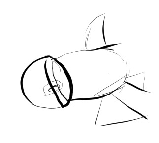
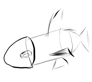
Now, structure practice. The video suggests you to construct things with shapes so you have a better understanding of its structure, so that's what I did to bottles and a fish.
This was somewhat hard, not only of figuring what shapes to use sometimes, but also because my drawing skills aren't the greatest. Often, I will intend to draw down, but because of the angle of the tablet, I end up drawing diagonally to the bottom right. My lines are also still very wobbly, and I am struggling to draw with low pressure.
First, bottles. The reference I used is at the bottom of the blog, in case you're interested. I first drew from memory and clearly, I didn’t go far with that one..

Then I did it not from memory, and this is what I got. Slightly better than last time, and I used a semi sphere on the third bottle, which helped.

Then I used a difference reference: a fish. In hindsight, this was a horrible choice because the fish is mostly an oval.
This time, I learned from my mistakes, I fixed some of the issues that ruined the previous attempt at dividing an object into shapes.
I started off with drawing with a reference up, unlike last time. It took two tries to get something I like; the first time, the eyes were angled weirdly and the body was just an oval.
Then I drew the fish from memory. Compared to what I drew with the bottles, it's better by miles. It’s more angular and less oval shaped, but it has its basic components, including the eye that looks like a tire.
.
Links:
Bottle Reference: https://www.flickr.com/photos/kaylasuzanne/6546371785/in/photolist-aYtSg4-gphGrL-bQWsK4-FvGLow-FLbxLf-bNZboF-7TF79T-bH7oeV-9uXiUG-d3TVK5-rRgX1r-TPwJ4d-dN5A3q-76egAb-5oUAJP-e6RffF-nsmzAo-9w8jSm-J7EgRr-eJ1bW3-wc36GB-9eHkUA-fBQh4g-bz3qzz-dN3EfU-cBNhHf-4YMeuK-6oeCGh-DjadAi-4gSrw-9ke45g-w76Z7v-4LfwVA-pp9cos-avzrpL-a8BsMq-4jwzko-qxUrX7-5TvLc5-25r8Db7-eQj2Ue-dKAEmo-Ezb7Ee-28wyFNd-2T2Xo-P3xaQj-9aoc5f-29UDrYK-8ZKTmo-rcWHGG
Fish Reference: https://www.flickr.com/photos/harveylewis10/4804318331/in/photolist-8jxosF-jcZAdm-e6jGrq-F6Z92D-biXizv-jcVoMc-doMRuT-jcWS66-jcVkFn-7TrsYX-bvkid4-gRnqFT-jcVk5n-gRntAm-gRnu3y-e242pL-gRnsdR-dASQLn-5KpZme-fkahBb-8TsQsj-biXkHe-dN46oL-ESqruE-fKpQyd-tBj9Vx-nLeUrd-gRohHz-prmgtL-AvQrpq-67J9JY-dgjcjG-6CXHQu-5utSrF-2a13y4k-9x4SFm-UHxKzd-rfBzh5-AL9G9w-Kb19o3-pvZkU4-kWgZLv-aq4toy-23Zjh4L-CAUvgA-TJqp5n-drB1DX-dMXweV-emdEED-XrDoAh
0 notes
Text
Blog #11 Practice and Pixel Art
Today, I watched a video about pixel art and I did some practice. Pixel art is not what I will put much focus on, because the focus is on painting art, but pixel art is an artform I am mildly interested in. Besides, the art tends to reflect the fundamentals, a subject I am interested in. Below is an outline of what the video said, put in block quotes so you can distinguish it better:
For beginners, start on a small canvas, learn how to outline, find inspiration, and learn techniques such as dithering and antialiasing (dithering might be something familiar to you if you play Minecraft). For skilled artists, the video covers animation (ever heard of squash and stretch?), a bit of shading different materials, and perspective.
.
Below are two of the canvases I practed on. I practice on a width of 1600 and 900. Luckily for me, clearing a canvas is simply a matter of tapping the delete key; that shortcut simplifies the process of clearing a canvas.
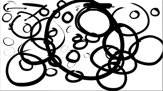
Above this text is one canvas I worked on. As you can tell, I practiced basic circles, again. These come off as lopsided. With large circles, the top right is a bit flat compared to the rest of the circle. Fixing this issue is most likely a matter of observing how I move my arm and breaking old habits.
However, I found drawing circles with my arm instead of my wrist allows me to create these really large and smooth circles, unlike my wrist drawn circles, which tend to be a bit squashed, as if someone dropped weights on top of those circles.
Even though I am drawing circles with my arm, they come off as lopsided. With large circles, the top right is a bit flat compared to the rest of the circle. Fixing this issue is most likely a matter of observing how I move my arm and breaking old habits.
Also, changing my grip really does help with pressure. Previously, the pressure detection felt like it exponentially increase despite the pressure graph being linear. One moment you barely are drawing a line, and the next moment your line is screaming bold. Holding my pen vertically really does help with that, plus it does not sound as bad. A lot of pressure on a pencil grip creates this ugly sanding sound, while on the vertical grip, a lot of pressure maintains a smooth sound.
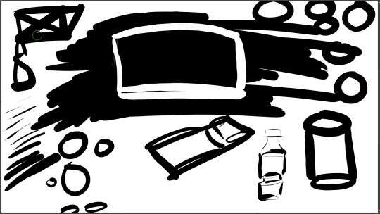
Here is another canvas. It is a lot more complex than the last one. I drew a sleeping bag, some cylinders, an attempt at converting a water bottle to shapes, and a wannabe Rayman.
Even though it is one of my long-term goals, I admit it is hard to find traction in getting started in art, with the school and all of that. Learning art isn't like learning how to play a game. Games often have pacing in the form of goals: beating the next boss, collecting the next upgrade, traveling to another location, and so on. In art, there is no next goal necessarily, which can be really tough for people starting off, like me. Maybe putting this blog as my assignment was a bright idea, or maybe it was not.
.
Link: How To Pixel Art - Beginner To PRO Tutorial: https://www.youtube.com/watch?v=0I_OZ4qQJfY
0 notes
Text
Blog #10 Practice, practice, practice!
Today, I practiced drawing, or rather drawing exercises. I spent maybe about 3/4ths of an hour on this.
I drew circles, connected dots, and drew some 3D things. These are some of the things I drew.
Down below, there are also videos on this topic. One is about practicing and another is about holding your pen right.
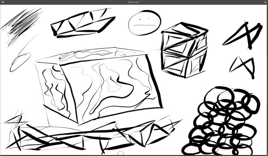
Some crates, chainmail, shattered glass, a fancy cube, and some more.
Lighting practice.

A really bouncy ball.
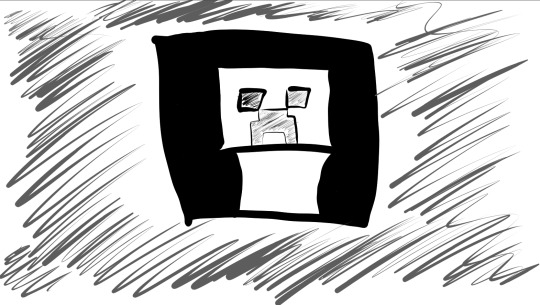
Creeper? Aww man.
Links: Drawing Exercises for Artists - 7 Easy Warm Ups https://www.youtube.com/watch?v=hSaXBVYVcQg How to Hold a Graphics Tablet Pen Correctly [ ERGOMICS! ] https://www.youtube.com/watch?v=OwqLzyusElM
0 notes
Text
Blog #9 Fundamentals
I watch tutorials about some art fundamentals. But, before giving you video summaries, I want to reflect on how this blog is going, and change things up.
The way I have been pacing myself hasn’t been working. The calendar system failed because I prioritized studying over practice, and that it’s not very flexible.
I don’t know where to start because I have covered everything I need to know at this point. I end up finding new topics to dive into on the spot rather than planning about these new topics.
The way I have it doesn’t give me time and experience to deeply understand why the videos teach you this way or that way, so I end up forgetting a lot of what I cover.
Outside of the problematic calendar system, there’s been more time constraints on me as well. I’ve starting a diary for my own use, which has its own challenges as well. I’ve also been practicing PVP games and my aiming skills as well. Lastly, of course there’s school.
I think it would be better if I simply put deadlines per week, like 3 per week or something along those lines. That will give me more flexibility in what I do blogs on and when I do blogs.
.
According to Mattias Pilhede in "A Beginner's Guide to Drawing", the fundamentals are the basis to drawing and they consist of construction, perception, perspective, composition, anatomy, gesture, color theory, and rendering. Then he gives advice and answers commonly asked questions.
Partway through the video, I draw a bad sketch of the shown duck after fighting a technical issue, what I’d solved by closing Krita. (The bug was that the pen didn't register pressure, then later the pen stopped working when I drew on the canvas.)
Back to the duck, I wasn't meant to draw it, he uses it in his hypophora to demonstrate the importance of using a reference. But I suppose it does show the importance of references, because I had to take sneak peaks of the duck again and again.

First duck drawing.

This is a duck I drew later on, after he gave the tip of confident lines, Worse than the previous one in my opinion, even if it’s more accurate.
.
Bobby Chiu teaches the fundamentals in a different way. The fundamentals vary depending on what you draw, but all of these ultimately fall under structure, or how sound it is. Does it feel three-dimensional, real, solid? If you flip an image, does it still look sound? He also shows lighting, edges, and color (or how to express color under situations) if you paint.
Then, none of what he says before 9:20 applies if you already have the supplies. From here, his advice is to balance your lessons and doing what you love with digital art. It’s basically a way on how to not lose motivation
.
The "10 Ways to Cheat at Art" video are just some tips on how to improve your digital drawing skills quick. He gives out a warning to not steal the work and effort of artists.
Links: A Beginner's Guide to Drawing https://www.youtube.com/watch?v=kkmmDJD7QAE What are the art fundamentals? https://www.youtube.com/watch?v=g4DieVnUELk Digital Art for Beginners (2020 Edition) https://www.youtube.com/watch?v=0RmGV5wALG0 10 Ways to Cheat at Art https://www.youtube.com/watch?v=XIYZU_rHIc8
0 notes
Text
Blog #8 Breaking Falsehoods
I watched some short art videos, including art videos I have already watched in the past in ill-fated attempts on learning art. The links to the videos are placed deep deep down in this blog.
Today, I watched and wrote about videos and a website that disprove commonly stated "rules" of art, or otherwise accepted "facts". These are not always true, but they are driven by the principles of art, so it's incredibly important to know when to follow these "rules". But before reading on, as a reminder to all of you including myself, hue is color, saturation is intensity, and value is brightness.
.
Let us start on the rule of "cool shadows". If you ever tipped your toes into the large pool that is art, you might have heard the phrase, "Warm light makes cool shadows". That statement is an oversimplification, because in reality, shadows are not always cool colors. Shadows are simply a darker version of the local color, or object color, plus other lighting influences. It depends on the bouncelight and skylight, on color relationships, and the object's local color.
Second, on color relationships, when colors influence each other. Complementary colors, triads, split-complement, all of these are strategies not principles (or idea that forms a strategy). Without understanding underlining principles, it is not clear why these strageties work or on why these are even used. Simultaneous contrast of color is a principle that states that two colors with any difference, put side by side, will intensify the sense of the difference. Even dull colors close in value will pop out from each other based on their difference in hue. This principle allows you to turn muddy colors, which you get with too little contrast, into magical colors. You can massively improve colors not by what colors you choose, but what colors you surround it with. Bobby Chiu shows a painting of a bazaar and he shows colors that look cyan, green, or purple, but truly aren't. The colors, which look purple or green in one context, would look almost gray in another context. If these colors were truly purple, green, or cyan, they would look horrible. When drawing a location, don't be fooled by the colors into mixing/choosing the wrong color. You have to have a feel for how colors influence each other. If they contrast too much, then lower the constrating hue, saturation, or value.
Third, value is not independent of hue and saturation. Different hues, when being saturated or desaturated, change value at a different rate. When saturating a color, yellow doesn't drop in hue the same way a color like blue does. It's important to know because value makes pictures readable, not hue.
Fourth, the traditional RYB color wheel is not the only color wheel, nor is it even the best. Red, yellow, and blue are not unique as primary colors, because primary colors can really be any color that can mixed into another color. The reason why RYB is still used in art is because theoriests back during the times of Newton thought of red, yellow, and blue being the best primary colors for pigments. The issue is that RYB is not actually the best colors because the three colors are not perfectly spaced across the entire spectrum of colors. Therefore, you can't mix the three colors in a way to get a wide range of greens, cyans, and magentas. They have a relatively small gamut, or range. This is precisely why modern color photography and three-color printing uses cyan, magenta, and yellow as the primary colors.
.
The (Not) Rules of Color Temperature: https://www.youtube.com/watch?v=Whr3E7iLxig The (Not) Rule of Color Relationships: https://www.youtube.com/watch?v=-Kcsur5A0dI The (Not) Rules of Color Relationships 2: https://www.youtube.com/watch?v=84Eg-JuFOEg Something strange you should know about color | QUICK ESSENTIALS: https://www.youtube.com/watch?v=gJ2HOj22gDo
The Art of Color: Color Wheel & Color Relationships: https://online.maryville.edu/liberal-arts-degrees/the-art-of-color/
edit: Are Red, Yellow, and Blue primary colors?: https://www.eetimes.com/are-red-yellow-and-blue-primary-colors/
0 notes
Text
Blog #7 Reflecting on the past video
At this point, I am done with the Youtube video, "Complete KRITA tutorial AND Digital Painting Basics" by sociamix. Considering how they have took four blogs to finish, I might as well reflect on what I have so far.
The vast majority of the video was on Krita tutorials. It works well as a starting point for artists on Krita, though I thought it would cover art itself in more detail.
The video took a ridiculously long amount of time to complete largely due to the technical section. The first part is hard to summarize, loaded with details, and difficult to remember. Most of the section has been forgotten, and I had to refer to the official Krita manual several times to get an idea on what the video covered.
That being said, I could have done a much better job on blogging the video. If I had to go through another section like that one, it would do me a service to jot down notes on general traits of tools, then search details up on the Krita official document.
.
After that video, I will watch a couple of much shorter videos. I might use the video, "HOW TO PAINT IN KRITA 🎨✨ (Digital Art Tutorial 2020)", to help, but I don't expect putting full blog posts on this video.
.
The first short video I watched is "Color Theory for Noobs | Beginner Guide". Its on the basics of color theory and it will help you in using colors in your art.
Hue is color (e.g. purple, yellow, etc). Saturation is a color's intensity. Do not confuse saturation with brightness, less saturation means grayer color. Lightness is how bright or dark a color is. Creating shades means you darken a color, and creating tints means you brighten a color.
.
Color group, or color schemes, are about how colors relate to each other. These are used in theory, but you don't have to follow them strictly, or at all. We have monochromic, analagous, complementary, and triatic as some basic ones.
First, monochromic color group, meaning only one color. Second, analagous, or analog, meaning three colors that sit next to each other on the color wheel. Complementary colors are colors that are opposites. Orange and blue, red and green, and purple and yellow, just to name a few. Triatic color scheme, three colors that are equal distance from each other on a color wheel.
.
Color have meaning too that give off emotion. Color meaning can be objective or cultural and subjective. By the way, red also means heat and yellow also means energy. For some reason or another, he didn't write those down.
.
Also warm colors and cool colors. Red, orange, and yellow are warm; blue, and purple are cool. Green is sorta neutral but for now say its neutral. You can make any color on the color wheel warm or cool. More yellow = more warm, more blue = more cool.
.
Pop-quiz! My answers are below where the link is, so if you want to test yourself, you can.
.
.
Link: Color Theory for Noobs | Beginner Guide: https://www.youtube.com/watch?v=AvgCkHrcj90
.
.
.
My answers: 1.desaturated, 2.tinted up, 3. complementary.
0 notes