
First year student on the Graphic Communication Design course at Chelsea College of Art, UAL
Don't wanna be here? Send us removal request.
Statistics
We looked inside some of the posts by kelseyjadeowen-blog and here's what we found interesting.
Average Info
Notes Per Post
0
Likes Per Post
0
Reblog Per Post
0
Reply Per Post
0
Time Between Posts
4 days
Number of Posts By Type
Text
15
Video
1
Photo
1
Last Seen Tumblr Blogs


Fun Fact
Tumblr was attacked by a cross-site scripting worm deployed by the Internet troll group GNAA on Dec 3, 2012.
Text
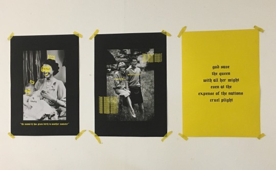
MOVEMENT CATALOGUE & POSTER
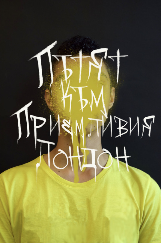
POSTER
“A road to an accepting london” written in Bulgarian (translation is from a friend)
CATALOGUE
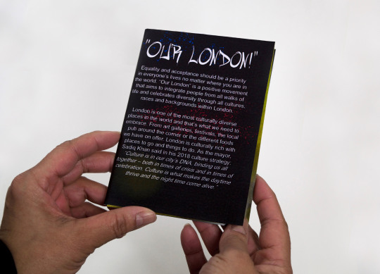
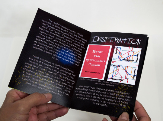
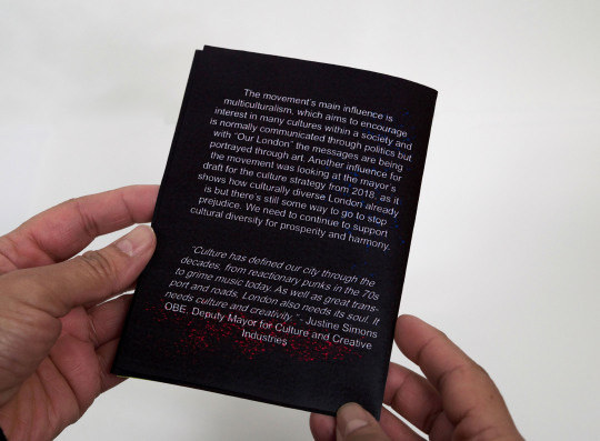
Here is my final design for the movement catalogue and poster. Overall I’m happy with how everything turned out and I feel like it really showcased my take on the movement. There are a few things I would change like in the catalogue I wanted the text to be in a certain order as I wanted the bibliography to be at the end however, I only realised later it was on the wrong page after it had been folded. I also feel the catalogue visually looks very wordy so I could have experimented more with the layout of the text and added more imagery so it didn’t look so word heavy. I feel I could have experimented more with how I folded it and looked at different options.
I only had my InDesign workshop the day before the deadline so I only learnt some of the techniques for InDesign then which I wish I knew at the time but I can take what I’ve learnt and apply it to future projects.
29/1/2019
0 notes
Text
INDESIGN SESSION - HYBRID ZINE
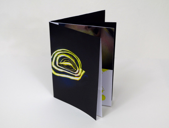
From this session, it really helped me when using InDesign as I’ve only recently started using the software properly. First, I made a template for a zine which would work as a guide for me in the future. Then we made a zine based on the hybrid project. The one I made in the session, I didn’t really like as I felt like I rushed it and I needed more time, so I went back and worked on it further and these pictures are the second zine I made.
I think it shows the journey I went on with the hybrid project and shows how I got to the final idea. I feel I could have played around with the layout more like I did on the first and second page as well as the last page but overall I’m happy with how it turned out.
28/1/2019
0 notes
Text
LIBRARY SESSION
Test prints

Prints on books
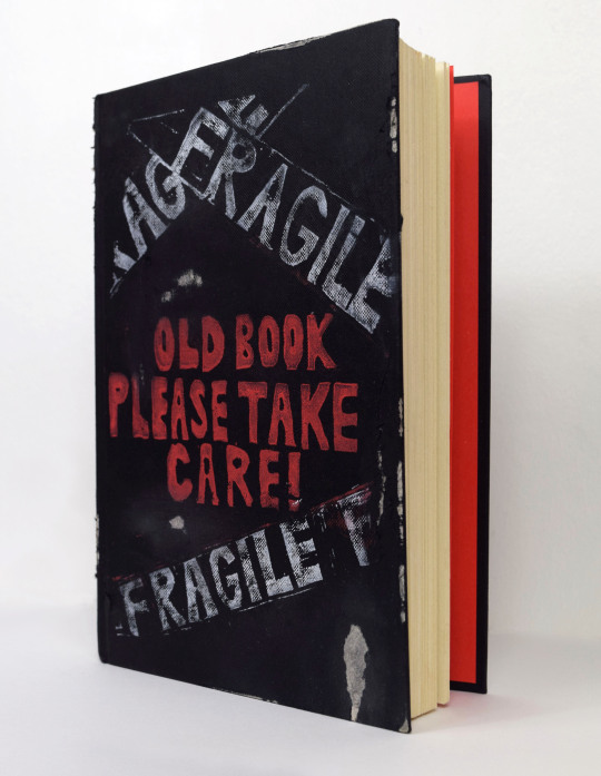
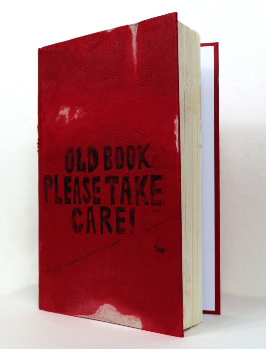
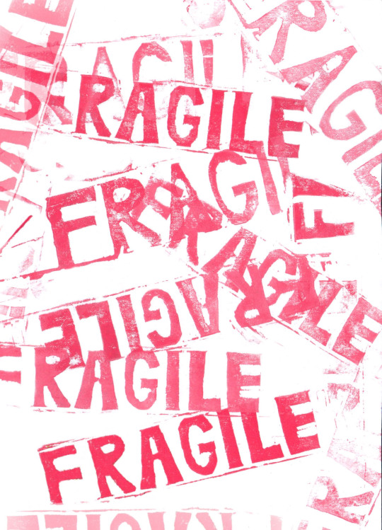
After looking at the material in the special collections room it inspired me to come up with a design for my lino cut. I had the idea of printing on a book rather then just creating a print as I thought it would make it more interesting visually. I wanted to create a print about old books and how they need to be kept in good condition.
I feel printing my design onto a distressed book contradicts the idea of the print which I like. I think it would have worked better if I really distressed the pages of the books or found books that looked really old and fragile for the idea to work but overall, I really like the concept. I feel the red book works best as thinking about it, I don’t think using the word “fragile” works with the idea unless its a really old, antique book. I also love the test prints I did with just the word fragile stamped all over the page. It reminds me of fragile tape used in packaging.
21/1/2019
0 notes
Text
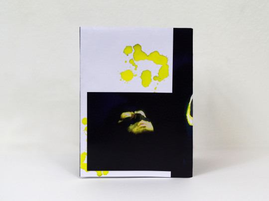
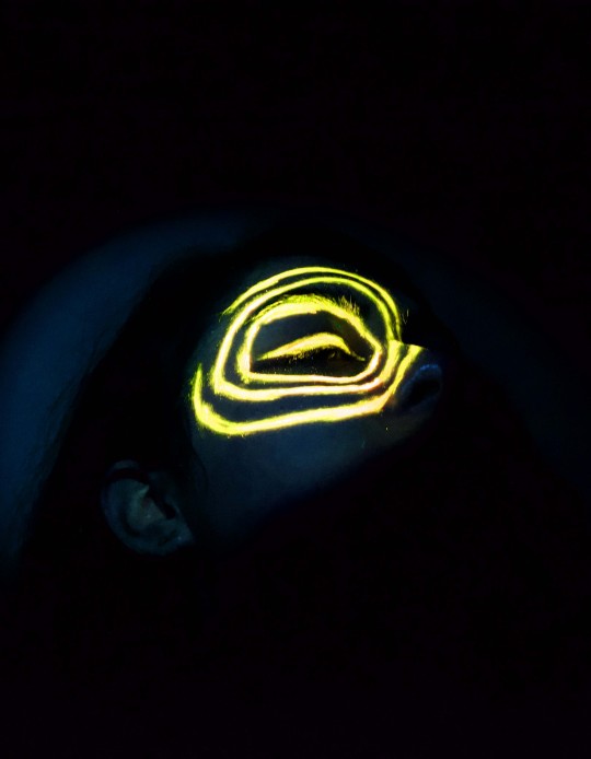
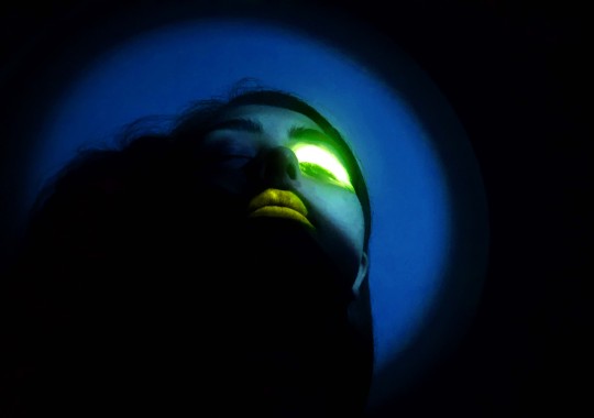
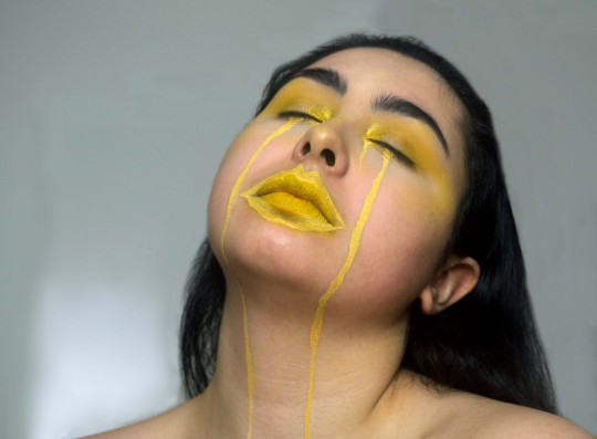
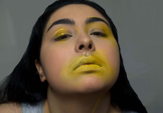
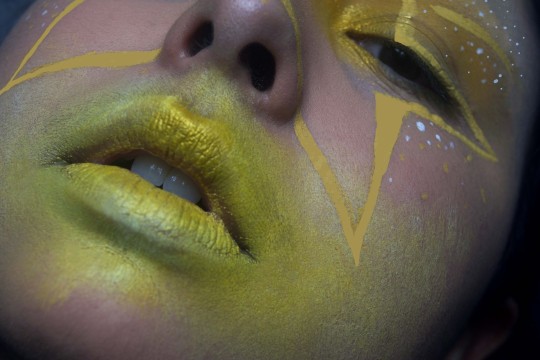
YELLOW/MAKEUP HYBRID FINAL IMAGE
I’m really happy with how my final image turned out for the hybrid project. When having the final presentation I was a bit concerned the image wasn’t going to show up too well on the projector because of how dark it was so I tried my best to brighten it but I didn’t want to brighten it too much because it left the element of curiosity for the viewer of what the actual image is.
17/1/2019
0 notes
Text
SAATCHI GALLERY VISIT
Phillip Colbert
Colbert’s work pushes the boundaries of contemporary narrative. He looks at the saturation of contemporary culture, media and our need for image consumption. Through his work, he’s created his own world with some of his own characters like his alter ego of the lobster dressed in an egg suit. I think by creating his own world through his work, he is question the idea of reality and how our culture and media has helped shaped it. I feel for him, it could even be a method of escapism. I think the exuberant colours and style help bring his pieces together and helps play on the humour of the work as well as show those ideas of image consumption. I also love how he has incorporated styles of artists such as Jean Michel Basquait, Van Gogh and Roy Lichtenstein into his own work which I think are some of the artists he is influenced by and has helped to pave the way for future artists and designers.
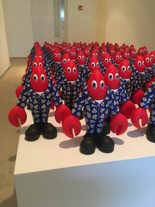
“The Lobster” (2018)
“Nail Fight” (2018)
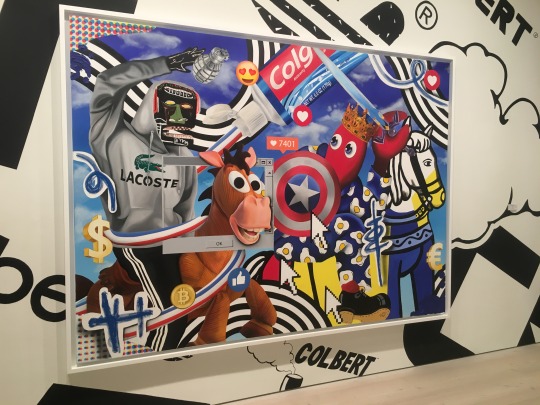
“Untitled II” (2018)
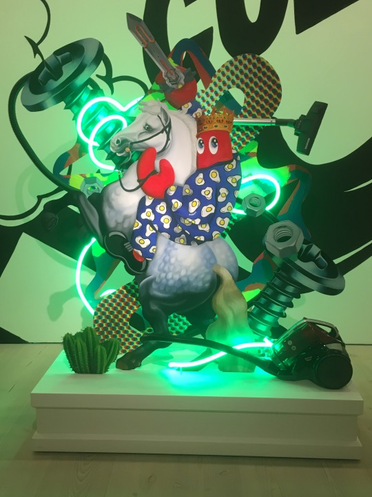
“Dream Hunt Sculpture” (2018)
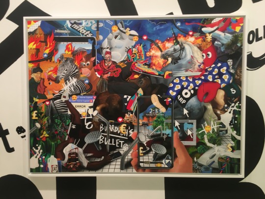
Douglas Kolk
Another artist’s work I really liked from the Saatchi gallery was Douglas Kolk I like the juxtaposition created from using the imagery from magazines and the graffiti like drawing and shapes. A lot of the pieces had eyes or Kolk had cut out the eyes from the images he added into his pieces which I felt made it a bit more creepy and as if the viewer was being watched. Each piece is bombarded with imagery and drawing so I didn’t know where to look first but I like how chaotic each piece is. I think his work looks at identity because he is focusing a lot on certain features like the eyes and fragmenting them to show that in his world no one’s whole.
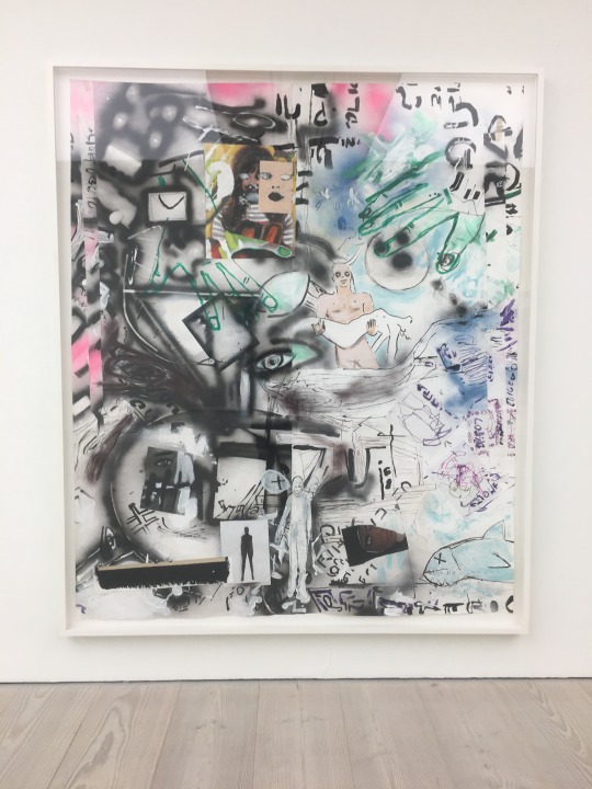
“Into the Trees” (2010)
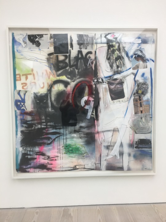
“Nurse City” (2007)
9/1/2019
0 notes
Text
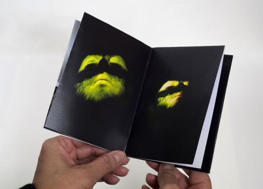
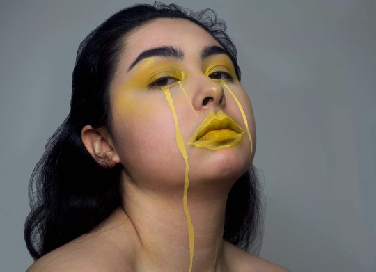
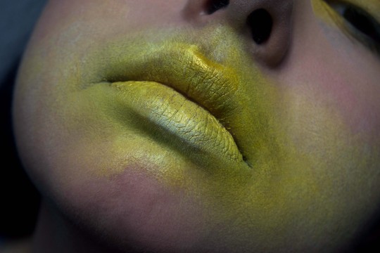
Final group tutorial and feedback
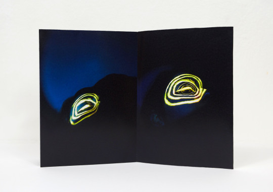
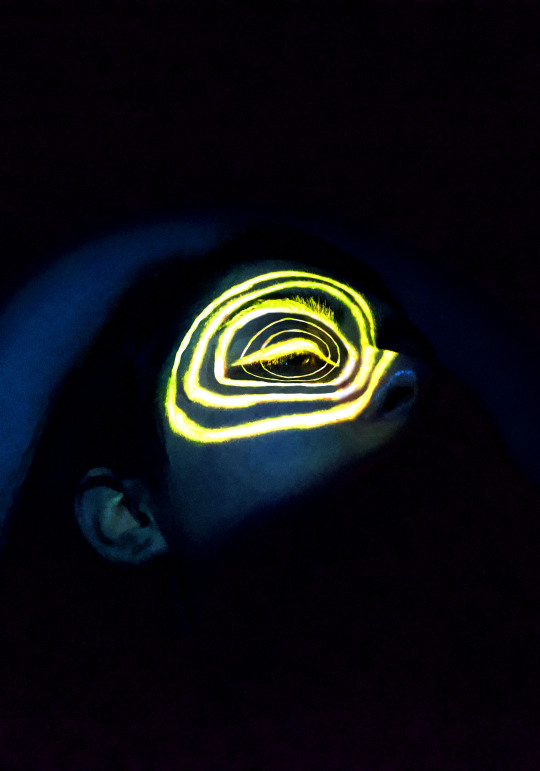
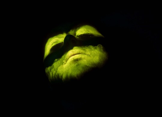
After my tutorial, I was really happy with the feedback I got for my hybrid image. The image below was the image which was most liked and I will use as my final hybrid image. Overall the image people liked and it intrigued them which is what I wanted to achieve with my work. You couldn’t fully see the face because of how dark the setting was when I took the image. I needed a limited amount of light so when I put the UV light as my light source, the neon paint would really show up and have a high contrast which I think is what made my image work.
Before the final deadline, I want to try and brighten it up slightly so when its projected for the review, you're able to see the image a bit better. I also want to add more circles to the image and try and make them thinner on the inside and thicker on the outside to create more dimension and depth to my image.
10/1/2019
0 notes
Text
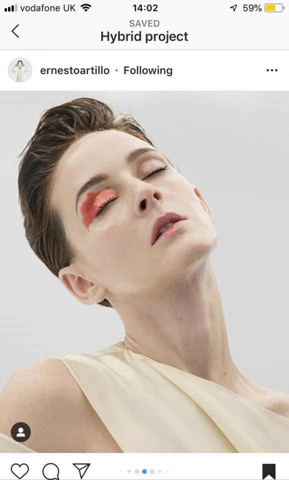
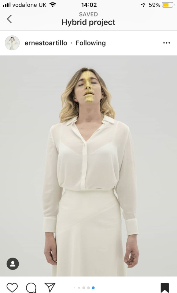
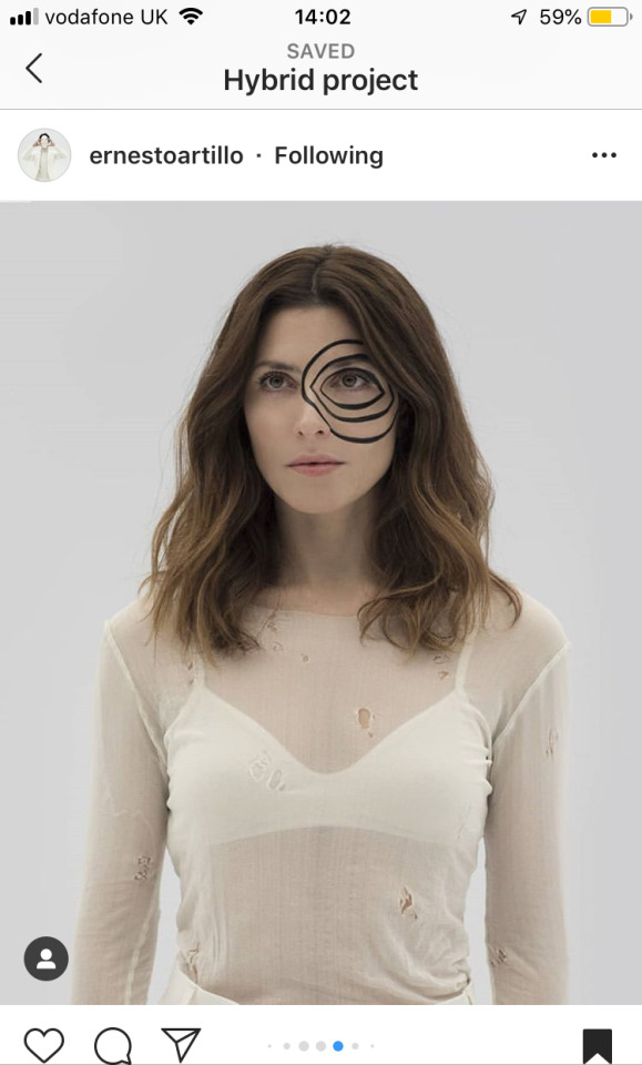
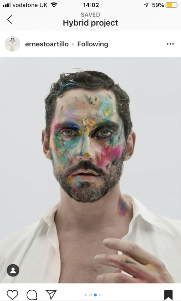
INSPIRATION - ERNESTO ARTILLO
When trying to come up with ideas for my hybrid, I came across some work from the artist Ernesto Artillo & I like how clean his images look, but I also like how he only added makeup to certain areas of the face like the eye or a swipe down the face.
I really loved the image of the circles going around the eye and want to try it out in my work. I want to take it as inspiration for my hybrid and see whether creating something simple like that could work using neon paint and a UV light
0 notes
Text
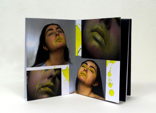
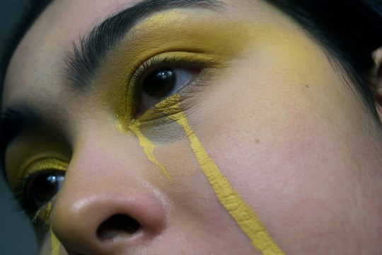
EXPERIMENTATION
After the tutorial from the feedback I got, I was suggested that I could emphasise particular features instead of using the whole face like the Vogue 1950′s cover. One of my ideas from that reference was to use neon paint as makeup as I thought it would be more interesting than using normal cosmetic products. I wanted to start by adding a small amount and then building it up and making it more exaggerated and over the top.
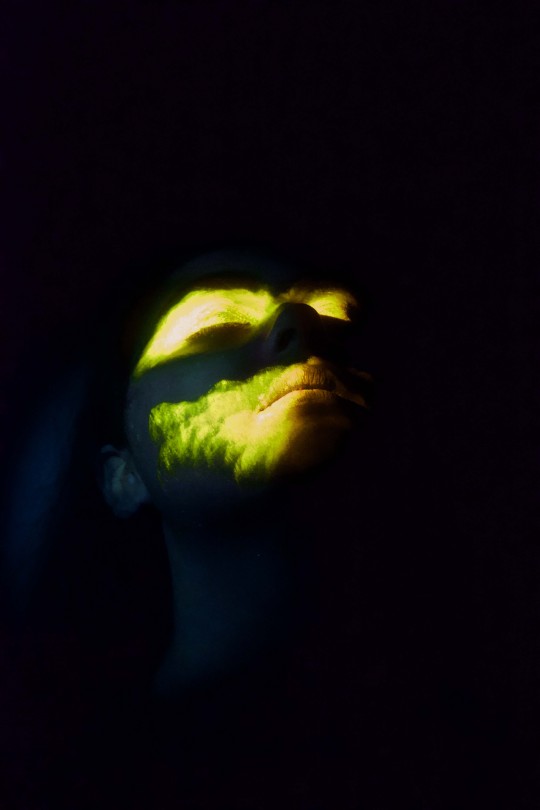
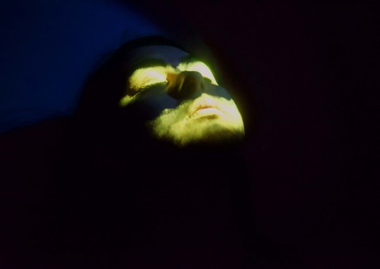
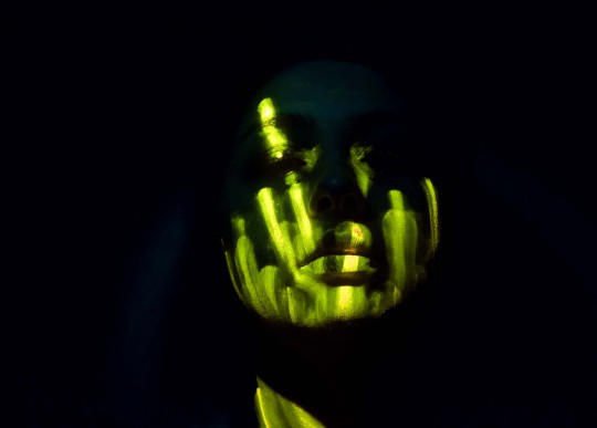
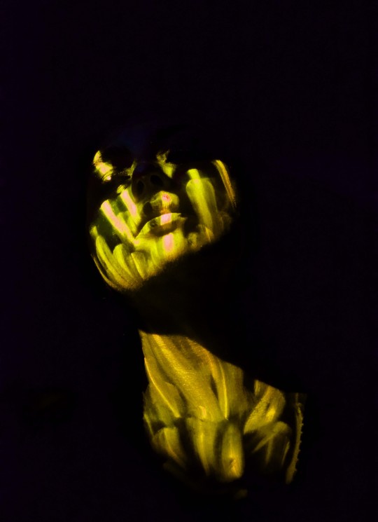
Overall, I’m happy with how these images turned out. I preferred when there was a lot of paint rather then just having it on the eyes and lips. I like the variation of yellow tones within each image and how the neon paint really stands out against the dark background. Some of the images, the neon paint was coming off more green so when I edit my images I have to make sure they come out yellow. I think I need to play around more with where I place the paint on the face and think more carefully about the placement, if I was to develop this idea further. I could also try experimenting with placing it on other parts of the body or painting onto the background to make a more interesting composition.
5/1/2019
0 notes
Text
EXPERIMENTATION
To try and make the hybrid pairing more interesting, I was trying to come up with more ideas on combining the colour yellow and makeup and I thought about different ways I could express the idea of makeup but without using your typical makeup products. I had an idea of using different textiles and embroidery to show the idea of putting on a face of makeup.
I had a few scraps of material so I used latex and a mesh netting as I still wanted to be able to see the face through the material. I also wanted it to look very editorial as I thought it would fit the hybird better.
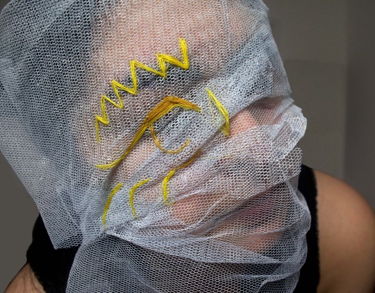
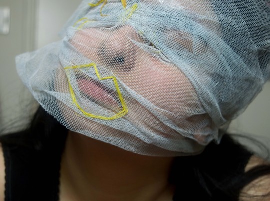
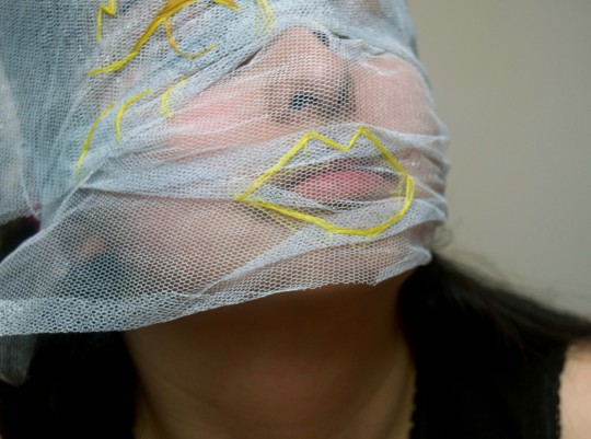
The images with the mesh “mask” and stitching, I get a Basquiat influence from the stitching I created and I like how 2 dimensional and abstract it makes the features look. I also like how you can still see the face but not fully which makes it more intriguing to look at.
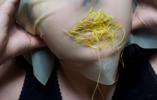
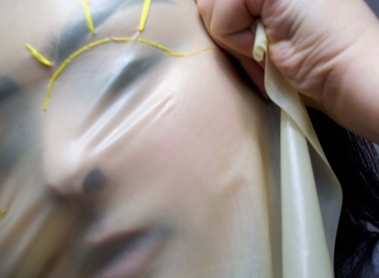
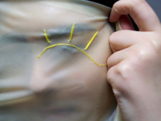
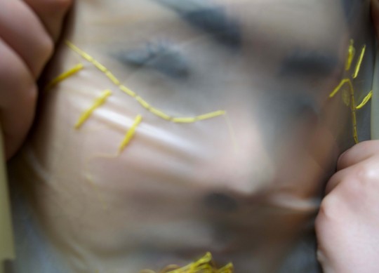
I particularly like how the latex turned out. Again I like how you are able to see parts of the face behind it making an interesting composition. I wanted the stitching to align more with the eye so it looked like the yellow stitching was the “makeup” so if I was to continue with this idea that's how I would develop it. I feel this whole idea of using the yellow stitching as the makeup is a very abstract concept and could be going to far out for the hybrid project so I don’t think I’ll continue with this idea. I’m glad I experimented with it and tried a more unconventional approach to the project so I was able to determine how to go further with the hybrid.
5/1/2019, 6/1/2019 & 7/1/2019
0 notes
Text
TYLER SHIELDS - PROVOCATUER
Research and references for hybrid project “Yellow Makeup”
I like these pictures for the poses of the models. I like how editorial the images are however the images come across very sexualised and I don’t want that to come across in the final image for the hybrid project. I also like the different materials and products used like the glitter and the tights to create different textures to the photos.
“Confessions” & “Confessions 2″ - taken from Tyler Shields book “Provocateur” published January 3rd 2017
Ideas for different poses
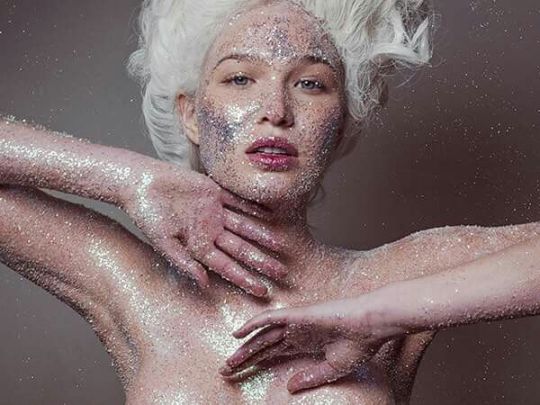
“Glitter Bath” - taken from Tyler Shields book “Provocateur” published January 3rd 2017
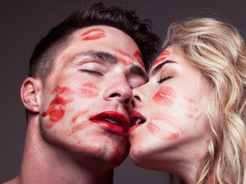
“Colton Emily Kiss” - taken from Tyler Shields book “Provocateur” published January 3rd 2017
0 notes
Text
EXPERIMENTATION - POSES
Here I tried to experiment with the type of poses I want to create in my final image for this project. I also like how these more graphic looks turned out. Again, they are very editorial however I feel I need to go more over the top with the makeup and continue to keep coming up with more out there, wacky ideas for this project.
I also loved how the photos turned out overall. The poses are exactly how I want them to be in the final image so it really showcases the makeup. These where just experimentations but when I do my final image, I need to make sure that the photos are taken with the correct lighting and I think a white background would be the best. The background I took these pictures on was white, however the lighting wasn't the best as I did it in my room with one studio light so I need to bare all this in mind next time.
29/12/2018
0 notes
Text
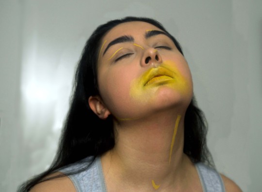
EXPERIMENTATION - CLOSEUPS
Playing around with yellow makeup to see how I want to apply the makeup on the face. I tried to think out the box with the type of makeup looks I created as the colour yellow and makeup have already been combined multiple times before. I wanted to create something different and hasn’t really been done before.
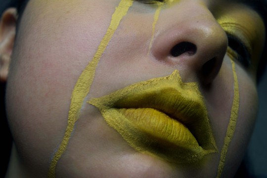
With the lips, I like the different tones of yellow and the highlights that are emphasised. I like how overall these images are very editorial. Also the images came out dark and more sinister, which I wasn’t expecting but I really like. The dark, eeriness of the shadows and hues contradict well with the bright, vibrant yellow on the eyes and lips.
I want to try and emphasise a particular feature on the face like an eye or the lips and try and find a way to block out the other features. I’m going to try experiment with neon paint to try and get that particular effect I want.
29/12/2018
0 notes
Text
Yayoi Kusama: The Moving Moment When I Went To The Universe
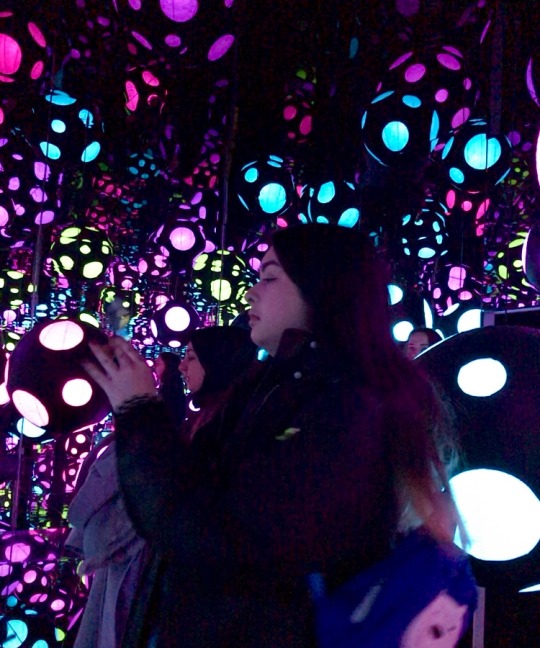
Infinity Mirrored Room - My Heart Is Dancing Into The Universe
Kusama’s work looks at space, the cosmic infinity and personal obsessions. This room is an immersive environment using light and reflection to produce a repetitive illusion. For me it felt like I was enveloped in a different world and I was taken in by all the bright coloured polka dot lanterns that created a cosmic universe.
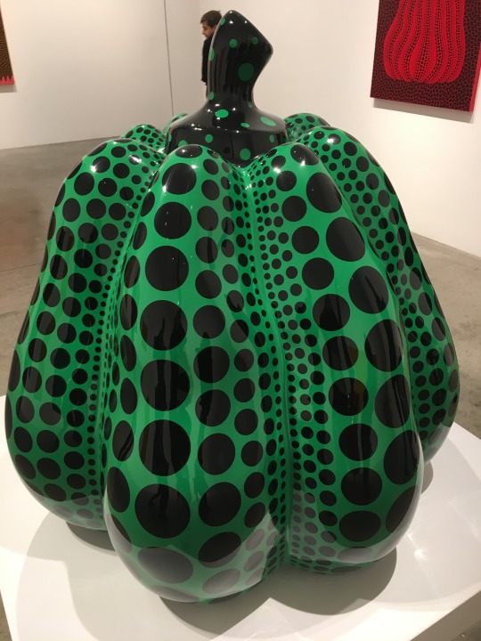
Pumpkins
The pumpkin form has occurred in Kusama’s work numerous times and when doing a bit of research I found that pumpkins have been a comfort to her since childhood as her family cultivated plant seeds in Matsumoto in Japan. To me, pumpkins connotates growth and each pumpkin has its own character and energy to it.
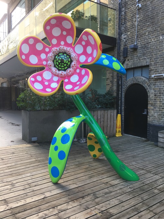
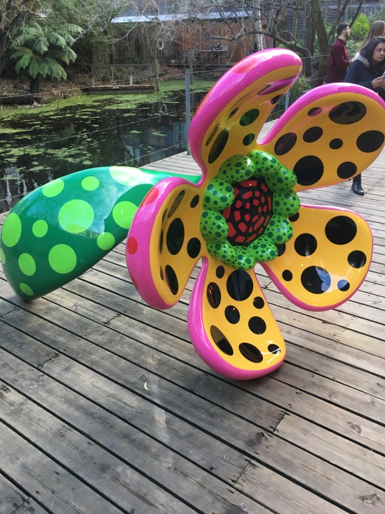
Flowers That Speak All About My Heart Given To The Sky
The flowers outside of the gallery were also really bright, colourful and playful. They where childlike which could represent parts of her childhood. I feel like she creates her own world within her work and through her artwork she is able to share her world with others.
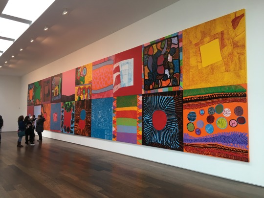
My Eternal Soul Paintings
Looking at the paintings in the second gallery, at first glance theres a lot of bright, beautiful colours which drew me in, but when looking closer at the individual paintings you could see Kasuma is a more complex person. She uses the recurring theme of patterns, which I think represent her hallucinations and these paintings could be a gateway into them. There’s also a juxtaposition with the use of bright colours and the use of lots of eyes in darker colours which to me felt a bit sinister. It was as if all the eyes where watching you.
20/12/2018
0 notes
Video
tumblr
Yayoi Kusama Infinity Room
An infinite polka dot universe showing cosmic image beyond the world we live
20/12/2018
0 notes
Text
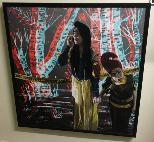
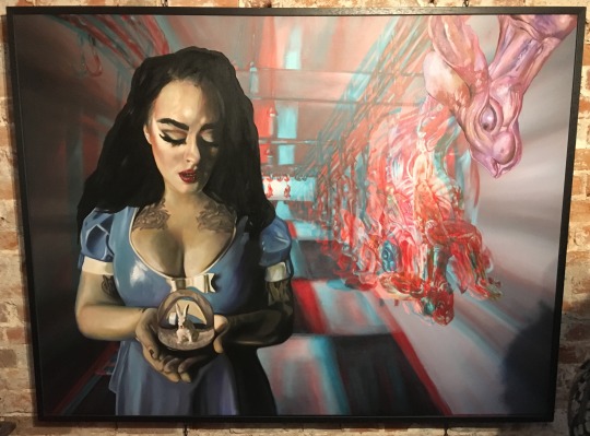
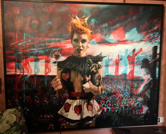
Sara Leroy Exhibition
Whilst walking the streets of Brighton, I came across this tiny gallery that was showcasing Sara Leroy’s work. She uses oil paints to create surreal 3D paintings based on story telling, folklore and mortality. You actually have to put on a pair of 3D glasses to get the full effect and its like the characters are jumping out of the canvas which made it more immersive. I think the ‘playful’ aspects of having the 3D glasses contrasts with the more dark and eerie imagery she creates. This particular exhibition had been described as a surreal journey of psychedelic dark fairytale paintings. She uses beloved fairy tale characters such as Snow White, Alice in Wonderland and Tinkerbell and creates a darker story.
9/12/2018
0 notes
Text
Final Movement Exhibition
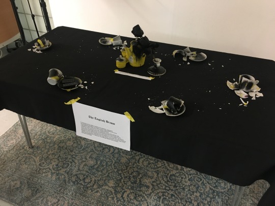
Having a look around the room at the other groups work, I really liked the group called “The English Dream” I feel there aesthetic was really strong as a group. I felt it was one of the strongest exhibitions visually in the room and the pieces worked well together. They really expressed the idea of the movement well and makes you think what actually is the english dream and showing what we think it is is not necessarily the case. It made you question those ideas. I also liked how they incorporated sound into the exhibition because not a lot of groups used sound as part of their exhibitions.
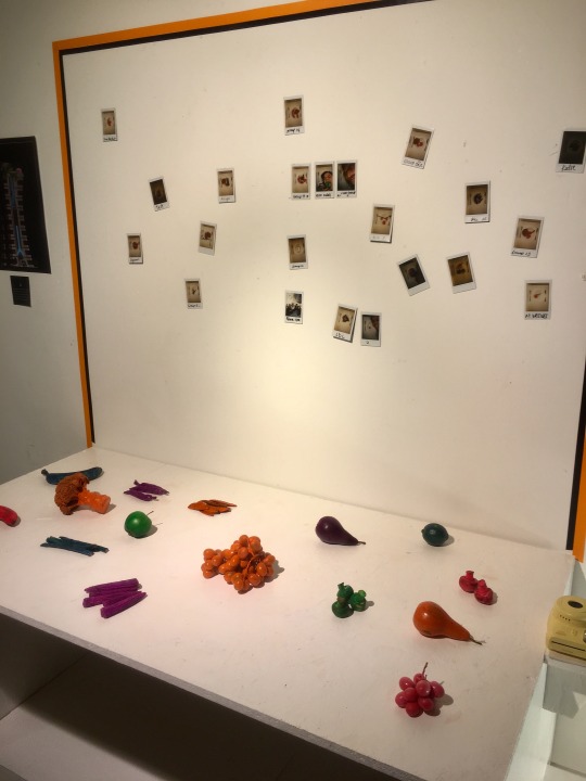
Another group whose exhibition I liked were “Normalism” because they also had a strong aesthetic using bold colours. Their exhibition was also very interactive which I think engaged people more into the piece itself. They had different foods and dipped them in paints and people could use them as stamps. They also had a plate and you could put the foods and chose whatever combination you wanted and take a polaroid of the foods to then stick on the wall which I think really shows of the idea that everyone is unique and we are not all the same. I think they showed the ideas of their movement in a really effective way.
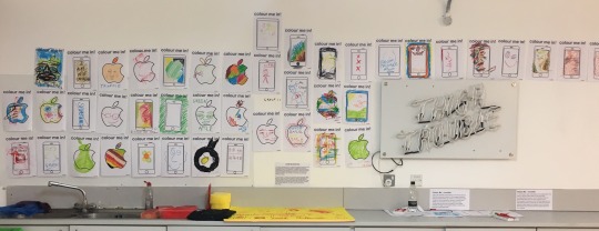
Another group whose exhibition I liked was “1999” because again their pieces where very interactive. It was all to do with how children now a days are always using technology whereas when we where kids we didn’t have all the technology we do now and to keep us entertained we would do colouring in and play outside. So for their pieces they had sheets you could colour in of the apple logo and phones and once you had coloured in the design you could stick them on the wall which was my favourite piece they had in the exhibition as you could be expressive with it and it took me back to when I was a kid and colouring in. I felt that nostalgia and I think thats what the group “1999” wanted to achieve.
6/12/2018
0 notes