
Statistics
We looked inside some of the posts by kendrarichardsdesign and here's what we found interesting.
Average Info
Notes Per Post
0
Likes Per Post
0
Reblog Per Post
0
Reply Per Post
0
Time Between Posts
4 days
Number of Posts By Type
Text
17
Last Seen Tumblr Blogs


Fun Fact
BuzzFeed published a report claiming that Tumblr was utilized as a distribution channel for Russian agents to influence American voting habits during the 2016 presidential election in Feb 2018.
Text
April 13 2025 - Reflection
Overall, I think I could have done better. It was an interesting concept, but the Target Audience wasn't able to fully interact with it. I wasn't helping myself by allowing the Grad Show marketing component to take over every class. I failed at time management and setting boundaries this time around. I know for next time. I think it's an ok book. I'll do it again in the future, and It will get better every time.
0 notes
Text
April 12 2025
I was trying to pick typefaces for the book and I coudn't find anything that felt personal, and like me. Then I decided to handwrite the text in the book. Visually, it connects, becasue it's written in my hand. There's nothing more personal than a hand-written note. It doesn't look as great, but I don't think that matters. After the introduction page for each piece, I have 2 full page squares of details. It's hard to pick up detail in a book that small, I hope this helped.
I did a singer-sewn binding. Or technically a brother-sewn binding haha. This connects with the theme of the show and the books that Kennedy and I made.
To display it at the reception, I took the CD and put it into my CD player with headphones. I know no one listened, but hopefully they understood the idea. I had an empty Jewel Case there to help with the concept further.
0 notes
Text
April 10 2025 - Song Choice
I understand that creating a CD portfolio and burning a CD to go along with it isn't great for the exhibition. It's ridiculous to expect someone to sit down, put on headphones, and listen to a 12 minute track at an art reception. The CD thing is more of a proof of concept in this scenario. I should have made it more accessible to experience the full thing. I burnt a CD with the songs I chose that relate to each piece
Vincent- Don McLean: This is the song I chose for Grandpa. The song is about Vincent Van Gogh and I was listening to it a lot at the time. It has a bittersweet feeling to it. My grandpa was a photographer (as a hobby, professionally, he was a science teacher) and the way the song talks about the deceased artist feels similar... I'm not sure how to describe it.
Chinese Satellite - Pheobe Bridgers: This is the song I chose for Terracotta Urn. The song is about wanting to believe in something greater, even though there's nothing there. The painting is based on an experience I had when my mom died: she bought an orchid a few hours before she died, and in the following months, the plant slowly died as well. Seeing this felt very real, like there was nothing out there. Everything dies, and it's just the way it goes.
i saw you in a dream - The Japanese House: This is the song I chose for Holding On. Really, this painting was the one to give me the idea for this portfolio concept. I had been relating music like this unconsciously in the past, but this project helped me notice how important it is to me. This is what I wrote about it right after making it: "The working name for this painting was “i saw you in a dream” based on a song by The Japanese House. When I’m dreaming I always feel like I’m searching for my mom to talk to her and experience it more vividly than my memory when I’m awake. I’ve had vivid lucid dreams for years but as I’ve gotten older they’ve gotten less clear and harder to control (basically, I usually understand when I’m dreaming, but struggle to make things happen). The desperation to control my dream and find my mom in it was what I was focusing on for this painting. The reference is from when I was maybe 4, which is already hazy and hard to remember. To paint I would add some details, and then wash over it, then add more details, and then wash over it, and just kept doing that. Near the end, I was painting thicker and thicker veils of paint to “camouflage” the image, and then using water to scrub out the image and find the faces in it. The washes and veils let the painting feel like it was in a dream because it makes it appear hazy. I also scraped and scratched through the paint to create more of a desperate feeling. I used more vibrant colours than I typically do to make the images more like they appear in the imagination."
Slipping Through My Fingers - Declan McKenna: I chose this song for Letting Go. This painting is about being okay with letting go, and leaving things unfinished. This is what I wrote about it in class "I approached this painting differently but related it to my original concept. Instead of desperately trying to remember my mom, I wanted to paint the fuzzy memory in a way that was more or less content. The reference photo is a picture I took of her overlooking a view in Kananaskis. She is facing toward the view to signify that she is moving on, and we are letting her go. I restricted myself to only using a giant paintbrush to “camouflage” the image within its brush strokes. I kept the image loose and underworked to channel the feeling of being ok with not making the details out."
0 notes
Text
April 8 2025

This is how I've began to lay the pages out in indesign. I collected the work I would like to show and took photos/ collected photos of them. Work included:
Learning to Love my Hometown
Garryana Typeface
Flowers and Lace Intaglio
Grandpa Intaglio
Letting Go Painting
Holding On Painting
Terracotta Urn Painting
Pip
I feel like this is my best work in a collection of different disciplines. I was still thinking of separating them into different CDs, but I felt like my design work was best literally shown instead of having tiny pictures of a book in another book. After talking with Jess and Ian, I decided to display my process and more about Pip at TREX downtown, so I didn't want to put her in the portfolio. I'm not sure why, but it feels better to have a narrative of the process all in one place instead of bits and bobs. That left my paintings and intaglio and 4/5 relate to grief/loss. I decided to scrap flowers and lace because it didn't relate and it is my weakest of the 5 pieces. I am now doing only one CD with only fine art in it, and displaying my design next to it.
0 notes
Text
April 5
I've found some old Jewel Cases for the portfolio and taken measurements. the front is a 4.75 inch square and I should be able to fit a short book inside. I've been working on what I want to say in the portfolio: the formality of the work, the meaning, what inspired it, or where I will take it? I've stuck with the meaning of the work so far, but part of me thinks that the physical portfolio should be a brief way to gain interest and direct people to the online portfolio. I'll see what feels the best.
0 notes
Text
Initial Ideas April 1 2025
I've honestly been spending most of the classes in Applied working on the grad show marketing component (bad of me). I have a concept for my portfolio but I haven't done much work on it.
I think I'm going to use the CD idea that didn't pan out for the invitations for grad show (I love that Idea and I think involving more senses makes the design more memorable so sound/songs would be fun but also make it feel more complete? Idk? Add different component) I want to do different collections of work, ex) painting, design, work about my mom, work about places. This allows the viewer to decide the lens they want to view my work through.
The CD idea also relates to how I work, I am always listening to music when designing (so unique), sometimes specific to what I'm working on based on a topic or theme. When painting, I curate playlists or queue up songs that have the same feeling I want the painting to feel. Adding music to view the work with will help give context as well.
Also, the different CDs are perfect for my inability to commit and niche down. painting, design, blah, blah, I can make a few tiny portfolios. I've been having a giant existensial crisis this week because I'm so close to graduating about what I want to do with my life. Mostly the conclusion has been design for now, we will see where my interests take me.
0 notes
Text
App Reflection - March 21 2025
Overall, I am pretty neutral about the app. It solves a unique problem that other apps like Facebook or Eventbrite struggle to solve because of their complexity and reach. I feel like, at the end of every project I do, I would've gone about it an entirely different way, which is a good thing. I think I would want to do an app that would be more focused on locations in medicine hat, kind of like what Noah had done. There are a lot of free to use firepits in really random places here that are hard to find if you're not looking for them. Also, things like public bathrooms, tennis courts, basketball hoops are things I try to find when I want to hang out with my friends, but they are kind of if you know, you know, and not public knowledge. I would still use HatWave. I gotta keep doing this to get better. This assignment was out of my comfort zone, but I feel better now. I also could've definitely focused more on this project. I've been pouring time into specific projects but I think I would like to distribute my time more evenly.
0 notes
Text
March 18 2025
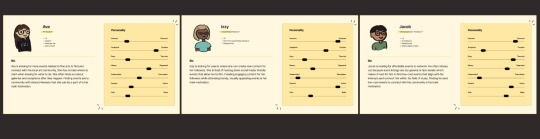
I built all of my style guide information, buttons, and user personas into different figma pages to make designing the app easier. It helps a lot.


This is how my app design looks:

It took a long time to figure out how to make the keyboard semi-functional but I think the time would've been better spent increasing the app's functionality.
0 notes
Text


This is the second half of my notes from the app project
0 notes
Text


These are half of my notes from the app assignment
0 notes
Text
March 9 2025

I've started making the wireframes in figma, it's hard to get into but I think I will get into a good workflow once I've done a little more. Considering time, I don't know if I will be able to incorporate my physical elements into the app.
0 notes
Text
Feb 22 2025
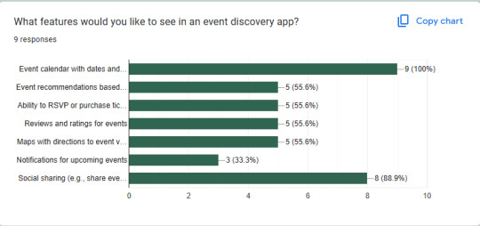
I made a survey and sent it to everyone I knew last week. (only 9 people did it) here are my findings.
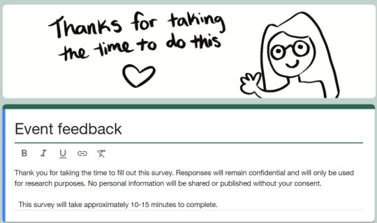
This was the introduction and disclaimer with a little cartoon so people would be more likely to complete it.

These questions were intended to get a general demographic of who was responding to the survey. Most of the people I surveyed were 18-24 that had lived in Medicine Hat for over 7 years. This tells me that most of my data is coming from young locals.

Most of the questions were asked to inform decisions with the utility of the app. Like how long in advance do people need to know about an event to plan to come?

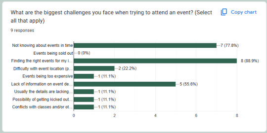
This helped me know what type of events people are interested in. It's clear that most of my friends are artist people because the art category is the highest. Markets/conventions and Drag events were written in. Maybe there could be a section of the app that curates events based on the time of year. It would probably use algorithms/tags/maybe ai? That would be up to the developer. For example: Pride month? Here's how to celebrate in Medicine Hat... Sat Patricks Day? Here's how to...

This was a write-in question to get more input on the question above. From that, I learned people love food, markets, and the arts. I also know that events like spectrum are kind of hard to think about.
If, as a part of spectrum, there is a beer garden/ concert, food trucks/kids activities, and wrestling. Are those all the same event or separate? I'm leaning towards the same event.

This question will help me decide on the hierarchy/importance of information when listing information of the events.

At least no one said no! I will do this app because I think it's needed.
Here are some other questions I asked that will help later on:


0 notes
Text
February 17, 2025 First App Ideas
The goal of the app assignment is to solve a local problem. I was thinking of problems that I wish would be solved/helped and the main one that comes to mind is how it's hard to find events in Medicine Hat. There are lots of events going on like art markets, city events, etc. but the information isn't located conveniently. Some are posted on facebook, some local organizations have limited selections on their websites. I also notice that there aren't very many young people at these events, especially ones involving local politics or business. When I was working at the chamber they asked me: how can we encourage college-aged students to come to the city-type events. I didn't have a great answer.
Also, a lot of local events are meant to bring life to staples of the city, like chili cookoff (downtown), kiln yoga (medalta), and paint nights (esplanade).
I was thinking of calling it "hat wave" or "HatWave" or something like that. hat - medicine hat. wave - waving hi, hello, crowd or wave of people. hatwave - heatwave, medicine hat is the sunniest city, warmth, vibrancy, etc.
0 notes
Text
February 16 2025 Analog Design
A big part of the brand it seems is working physically/analog more often than digitally. Not necessarily without digital work, but more experimenting.
Kennedy and I made a presentation/visual aid to talk with the class about this concept. This would be the time for the class to offer feedback or opinions about the concept. I try my best to make it not just me saying what we're doing and then doing it and asking for feedback or ideas. Most of the time it feels like I pitch something, people nod, and then we do it. I'm trying to make it more like I pitch something, someone else disagrees, they pitch something, I disagree, we talk about it and make an even better end result. It's hard to brainstorm when people agree with me. I'm trying to think of ways to fix this.
These were some visuals from the presentation:


I asked a couple of times for people to ask questions, share opinions, etc. I did most of the talking during the presentation and at about 1/4 of the way through I noticed that the class wasn't really present and listening. I saw people doomscrolling Instagram reels, playing video games, having conversations, working on other assignments, etc. I said something along the lines of "Hey guys, I think this is pretty important to listen to. Can we put away our personal devices for this?" I'm happy because this seemed to work for most people.
This part of the brand identity is seems like it is hard to fully embrace. I don't know how much more effort I can give to make sure everyone is on the same page with this. I think it will work out but it will take time.
0 notes
Text
February 16 2025 Invitations
Big week with lots happening. On Monday Eric and I met with Ian (Alex forgot) and talked about what was going on with the design team because there wasn't enough time to meet the Friday before. We talked about the die-cut invitation and how there isn't intention or reasoning behind doing it die-cut. We also were told previously that the invitations needed to go out March 1st, but was clarified that it was March 21st which helped the stress a little bit. We didn't want to nail ourselves to an idea before exploring until something had reason and felt right.
On Wednesday after our presentation/pizza party, we were catching up on work and listening to music. Most of the class had gone home at this point. We put on Chappell Roan and were having a great time. Kyah remembered they had a cassette tape and we were looking at the design of it. We turned the speaker off and were playing the cassette.


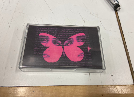
We were like "Wow isn't this awesome" it was nice to interact with and open up. Then we thought that these should be the invitations. Eventually, we decided cassettes wouldn't work (who still has a cassette player other than audiophile nerds or collectors?). We thought a CD and jewel case would be more applicable.

Kennedy remembered we have a giant box of cd inserts in the classroom, so we looked through it.
We thought about buying our own CDs (Doug has about 100 blanks) and sourcing Jewel Cases second hand (asking around, thrifting, and Facebook marketplace). The sustainability aspect fits well with the ethos of the brand. The design would have all the necessary information in the invite, so people without time or a cd player would be able to retain all of the important information. I was thinking we could burn a mixtape of all of our favourite songs. Maybe also having some voice lines in there to get people excited about our personal work.
We brought that concept into Friday, and after giving the presentation about analog > digital we met as design + illustration + Doug + some stragglers. The CD concept was brought up and people were really liking it. Alex said he really didn't like it based on vibes. The idea and excitement didn't really go anywhere after that. I find it hard to try and convince people that an idea is good and it's easier to start over with a new idea. I should get better at this.
We decided to make the invitation a fold-out poster (that people can hang in their living rooms heheh). We are working on thumbnails and ideating rn, and the Friday after the break we plan to have the invitation ready to be critiqued.
The fold-out poster could tie in with the cd inserts and with the magazine concept (fold-out magazines) to keep our options open.
0 notes
Text
February 9 2025
I started with these sketches kind of as a warm up, starting to try to fit letters into each other:

I spent some time flipping through a typography book of mine and let the original font inspire me when making variations:


Then I was like "omg what about graffiti" it seems too obvious because of the original stencil logo, but when actually thinking about the pillars of SAMHC it makes total sense
Accessibility - Graffiti is a relatively low cost way to get into art. It's found everywhere, accessible from relatively any location
Student Focus - Ideas about doodling in sketchbooks, writing on desks, and actually doing graffiti. Medicine Hat has a prominent graffiti culture which ties into this as well.
Adaptability- graffiti can go anywhere!
Collaboration - Anyone can contribute!
These were just some early sketches but I will talk more with Brayten tomorrow and see where we're at for the proposal on Wednesday.
0 notes
Text
February 6 2025
I decided to partner with Brayten for this project because I tend to work more smoothly in this area, and he is better at refining and bouncing off ideas. (if that makes sense). SAMHC requested the students to make the mood board instead of them because they wanted it to be entirely from students.
He made this part of the mood board that highlights the values and pillars of SAMHC and connected them to symbols

I mostly did the more visual parts of the moodboard to capture the vibe for lack of a better term.


Then there was a tiny section of the moodboard I kept the banished visuals:

I think I was feeling very strongly about these that day to make a section for them. I still don't think they work for this though.
0 notes