
Statistics
We looked inside some of the posts by kiarawhitepackaging and here's what we found interesting.
Average Info
Notes Per Post
6
Likes Per Post
6
Reblog Per Post
0
Reply Per Post
0
Time Between Posts
7 days
Number of Posts By Type
Text
14
Last Seen Tumblr Blogs


Fun Fact
Tumblr was named as a finalist in Lead411’s New York City Hot 125 in Aug 2010.
Text
Blog Post #13


Updated Project Rationale
Challenge
We were tasked with creating a branded series of three products, either a redesign of an existing company or a brand we came up with on our own. I chose to create my own brand of superfood chocolate bars, and its own packaging template for it as well. My self-imposed challenge was to reconsider the shape of a traditional chocolate bar where the size consists of a smaller amount of just two servings (50g in total). My brand values, which consist of harmony and balance with yourself and with nature, should be reflected in the design of the packaging and its easy recyclability.
Approach
The environmental commitment, heritage, and innnovation of the brand will be the key ideas behind my design. I wanted the packaging to fit in aesthetic wise in local boutique stores (who values sustainability and slow, beautiful living), but still has its own unique branding. Also, to stand out in a grocery store setting, the product will be simple and to-the-point in its colour palette and typography and not feature any loud photography. The audience that is considered in this approach is primarily working women between the ages of 25-35, who enjoy indulging with mindfulness. The design captivates their desire to fill their life with beautiful things, and the added, carefully chosen facts engage their need to nourish their minds with the foods they eat and knowledge they let in.
Outcome
In the end, I have three packagings that are down-to-earth but feel high quality through elements such as calming visuals and a combination of sans-serif and serif typefaces. The beige cardstock my design is intended to be printed on adds a sense of naturalness to it, while the abstract alcohol ink elements establishes a connection with the customer, one that has a handmade, organic feel to it.
The smaller, square shape reconsideration also allows for consumers to not feel guilty if they eat the entirety of the bar, but still feel satisfied as it is not a tiny, snack-size portion such as Halloween treats. Overall, the packaging would be printed on 100% recycled materials and due to its construction, no glue is needed for it to stay closed, allowing for easy recycalbility.
Final Reflection
Overall, I’m happy with my final outcome and plan to do some further edits for my portfolio. I would like to put more information on the inside of the packaging and revise some of the visuals and point sizes and weights. I’d also like to print my designs on two different papers: a natural beige paper for the label shape; a glossy paper for the alcohol ink design.
0 notes
Text
Blog Post #12


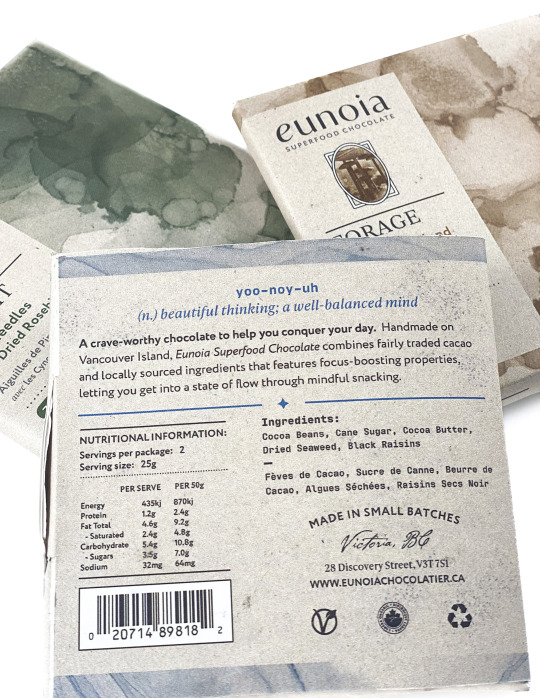
I didn’t manage to do everything I set out to do from the beginning, such as putting information about some of the highlighted ingredients on the inside of the box or creating my own illustrations for the cover of the bars. Instead of illustrations, I took images of my ingredients and edited them in Photoshop to resemble a halftone texture.
For edits from my previous design, I added more colours to the packaging as well as paper and alcohol ink texture for greater interest. There was some feedback about the name of the brand being difficult to know how to pronounce, so on the back of the chocolate bar I have a tidbit about its pronunciation and definition, which relates to my brand as a whole.
0 notes
Text
Blog Post #11
Digital Layout Experimentation


Rough Digital Artwork

The above image is a work in progress shot of my current digital design. This is is the outer design, where different watercolour backgrounds and a bordered illustration will tie each packaging in the series together. At the moment, the visual imagery are placeholders until I do my own textures and drawings.
On the back, I would like to give an explanation of when the chocolate is intended to be eaten (when you're in need of a boost to get to work) and a fun way to say what the name means and how to pronounce it, as it ties into the function of the chocolate.
On the inner design, I intend to have further information that explains more in depth details of a specific ingredient with an illustration for it.
Project Rationale
Challenge
We were tasked with creating a branded series of three products, either a redesign of an existing company or a brand we came up with on our own. I chose to create my own brand of chocolate bars, and thus had to design the packaging template for it as well. My self-imposed challenge was to reconsider the shape of a traditional chocolate bar where the size consists of two servings (50g in total).
Approach
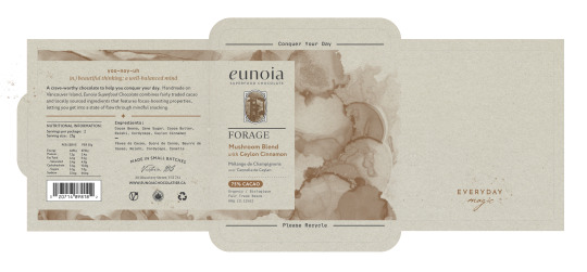
The shape reconsideration allows for consumers to not feel guilty if they eat the entirety of it, but still feel satisfied as it is not a small, snack-size portion such as Halloween treats. Its shape has resulted in being a square, which opens up like an envelope. This feature allows for more surface area where information about the product and brand can be spread out on different sections, so more white space can be employed for an upscale, contemporary design. The envelope also allows for the chocolate to be placed back inside and securely closed.
Outcome
I anticipate the project will result in a functional packaging that attracts working women between the ages of 25-35, who enjoy indulging with mindfulness. The design captivates their desire to fill their life with beautiful things, and the added, carefully chosen facts engage their need to nourish their minds with the foods they eat and knowledge they let in.
0 notes
Text
Blog Post #10

2. There are a variety of stylistic elements that are common in the pictured chocolate bar shelf environment. For imagery, chunks of chocolate are widely used and are often accompanied by other included ingredients. The bars that don’t feature food imagery are either plain, have textural backgrounds, or depict natural landscapes to elude to its organic ingredients.
When a chocolate bar does have organic ingredients, the box tends to be matte with a more minimal design, less decorative typefaces, and subdued colours, often involving green. On the other hand, when organic ingredients are not a priority, the packaging tends to be shiny with bright colours and loud typefaces. To make a bar seem more upscale, gold is often added to the type and dark, rich colours are used on a white background.
Overall, the products tend to be rectangular, with slight variances in width sizes. There is one series of bars that is more square-shaped.
3. To stand out, my packaging will be an alternate size, in between a square and the traditional chocolate bar rectangle. The design will not include imagery of chocolate pieces, but more illustrative elements, and will let the material it is printed on peek through.
4. Visual Brief

5. Design Brief
Brand Name: eunoia (a state of being, of thinking, that is beautiful, kind, and harmonious within one's self)
Core Values: optimization, motivation, connection
Personality Keywords: helpful, innovative, dependable, whimsical, spiritual, creative, trustworthy
Brand Archetypes: Dreamer, Wise, Seductress
Description of the Product: The chocolate is made in small batches in Victoria, with its focus-boosting ingredients being organic and Fair Trade certified. These bars not only help boost cognitive performance to help you get into a state of flow faster, but also acts as a superfood to defend our immune system and support gut health. A variety of the nutrient-dense ingredients, such as mushrooms and seaweed, are grown on Vancouver Island to highlight locally sourced food.
Description of the Series: Each product variety will focus on a different ingredient, such as mushrooms, seaweed, and pine needles. The inside of the packaging will explain the function of each ingredient.
Packaging Objectives: For my packaging, the goal will be to reconsider the size of a traditional chocolate bar. The chocolate bar is to be eaten all at once or throughout the afternoon when the consumer needs a bit of help to get back to work. As a result, the bar should be a large enough size where the amount is satisfying but not too big where eating all of it makes you nauseated.
Target Consumer: The target consumer for my chocolate brand are women in BC between the ages of 25-35. They prioritize local and organic ingredients, enjoy the outdoors, and are interested in intuitive eating and nourishing their body with nutritional foods. They’re also looking for an alternative substitute to coffee.
6. Mapped Layout & Sketch Model Mockups
Below is an idea for what the exterior of the packaging will look like, with a mixture of serif and sans serif typefaces. Abstract watercolour shapes will be used for the background and an illustrative icon will be used to visually differentiate between the flavours of chocolate bars.


7. Template
0 notes
Text
Blog Post #9
For this assignment, I will be creating my own chocolate brand. I am tackling this product as I would like to create a package that is mindful of overindulging. For instance, when I open a chocolate bar, I tend to eat the entirety of it within the span of a couple of hours. Once it’s open, I am unable to put it away and save it for other occasions. In my packaging redesign, I would like to rethink the size of a traditional chocolate bar or consider a larger size for individually wrapped, snack-sized chocolates that will be stored in a box.
Additional objectives include making the design relevant to the ingredients. My chocolate bars will be focused on including ingredients that further aid in cognitive performance in conjunction with the cacao, such as mushrooms, pine needles, or seaweed. The size of the bar should be large enough that it won’t all be eaten in less than a minute, but small enough that if all of it is eaten, the consumer won’t feel nauseated as a result. The idea behind my brand’s chocolate bar is that it will be eaten in an office environment, whether at home or at work, as a way to help get into a state of flow.
Visual design elements of the three chocolate bars will prioritize a sense of earthiness, whether modest with rough collage illustrations inspired by old graphics of National Parks or more elevated with Art Nouveau decorative elements.


The images above is of packaging that will be used as inspiration. For example, the design has an earthy quality to it with a rough, natural texture to its material. The inside design is what I find the most inspiring, as I would like to inject information about a particular star ingredient and facts about the brand’s concept on the inside as well.
Below are my thumbs that display an exploration of the (near) square shape box idea. The thumbs explores ideas of what the front and back of the packaging could look like, as well as possible designs that focuses on natural elements.


0 notes
Text
Edited Pristine Prototype


In my final pristine prototype, I adjusted the measurements so the inner box slides in and out of the outer box better and I made the curved sides much more pronounced so they would read more as curves than wonky straight sides. Certain design elements were resized so they weren’t larger than they should be as well. The back side was also reaaranged o provide greater hierarchy to information that is the most important. The final change is that rather than placing the cut out on the top of the inner box, two cutouts were placed on the sides to emphasize the box should be grabbed there instead.
0 notes
Text
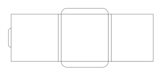
Blog Post #8


In contrast to the previous week, I’ve now changed the shape of the packaging. I went ahead with the bubble-shaped style that includes a drawer which opens and closes with ease to retrieve a detergent pack. However, because of the curved edges, the inner box does not fit inside the outer one as much as I would like it to. To fix this, I will either make the inner box rectangular (although it will still look odd), make both boxes rectangular, or change the shape entirely again.
For the digital design, I tried to keep it minimal while still including the most important information from the original packaging. The front features a grayscale logo with wave-shaped cutouts. Through the cutouts, a marble liquid pattern is peeking from behind on the inner box which has a halftone effect. The back has directions, ingredients, and caution information while the left side has symbols that relate to the product and business. On the top are key words and phrases pulled from the original packaging, but made bigger for greater emphasis. Overall, I think my indecisiveness is really being highlighted in this packaging. In the next project, I will challenge myself to make bigger decisions at a much earlier stage in the assignment.
0 notes
Text
Blog Post #7


Today's feedback session has really helped me decide on the direction I'd like to move forward with. In the beginning, it was a bit daunting to decide on a final solution as there are so many possibilities I could go with or try out. The one solution I did follow through for the above prototype will not be my final one. To illustrate, the above prototype is appealing to look at but it will not be very convenient to open and close it all the time. In the end, most people would leave it open making it susceptible to spilling and putting kids or pets in danger.
The second option (which was suggested frequently in the feedback session) was making it have the quality to pour out a detergent pack like a salt box or milk carton. Due to the heaviness of my products though, this solution will not be accessible to certain people. I could reduce the number of packs and make the packaging smaller, but that increase the amount of material used and consumers might annoyingly get more than one pack poured out at once. Instead, the preferred solution is to have an inner box that slides in and out of an outer box with ease. This solution is much more convenient and the packaging does not have to be lifted off of the shelf to retrieve the product inside. I will be continuing on with this third solution for a more refined prototype for next week.
1 note
·
View note
Text
Blog Post #6 - Rough Prototypes


This week, I experimented with more sketch model mockups.
The middle and left designs both include a handle for easy use and take down (such as from a shelf). The middle design can't be stacked, but it does take up the most vertical space of the three designs. As a result, it has the most eye-catching appeal in that regard. On the other hand, the left design can be stacked, but its squareness has an awkward quality to it. Lastly, the right design does not feature a handle; instead, it can be opened and closed with ease without having to bother with flaps. Because of this, this design may be left on a shelf and does not need to be taken down to retrieve a detergent pod. An attempt to make the sides curved and bubble-shaped was made; however, as the product inside will be numerous and weighty, the curves will likely get deformed.
My rough prototypes consist of the middle and right designs, and I will continue on with different variations of these two before making a final decision.
1 note
·
View note
Text
Blog Post #5 - Sketch Model & 5R's

For the sketch model mockup, I wanted to try out doing a packaging with curved sides to see how it would turn out, but on a smaller scale. I think in order to make this work, so the box doesn't fold in on itself, I would have to double reinforce it. I'd make it so there is a coverless, same-sized box on the inside that can be pulled out and where the detergent pods will reside.
In the 5R's brainstorm, I tried out some other alternatives. At the moment, I'm aiming to find a balance between designing something that can be reused or repurposed with designing something that uses minimal materials.
1 note
·
View note
Text
Blog Post #4 - Thumbs, Map, Rationale


PROJECT RATIONALE
Challenge
The challenge of this project is to recreate a product’s packaging to be more ecologically responsible. I'll be considering solutions that take up less space on a shelf, includes fewer words and visual elements, and made from materials that may be recycled more easily.
Also, consider solutions where the packaging may be difficult for children to open and protective enough where the detergent pods do not get damaged if a spill occurs nearby. The user-friendliness may be improved upon as well, where the packaging can be closed and locked and also include a handle (rather than having a plastic seal that breaks after a while).
Approach
My approach will be to recreate a package to reduce its negative environmental impact. A single material that can be more easily recycled will be used. The redesign should also include only what is necessary in terms of text and visual elements to make it more visually apealing.
Outcome
After recreating the product, the package will be easier to recycle, be able to more easily stand on its own (especially when there is less product inside), and display less visual content so the information won’t be as confusing. The packaging will also feature a handle so it can be more easily transported and a locking mechanism within the paper material to deter kids from opening.
1 note
·
View note
Text
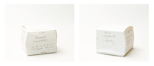
Blog Post #3

ACTIVITY PART 2 — Completed
I did some final adjustments to my packaging to make it resemble the original as much as possible. For example, I made all of the text a dark green and changed the logo to a metallic gradient. Overall, I found this assignment of recreating a professional package to be useful in making future packaging projects less daunting.

PROJECT 1 — Discovery Phase
For Project 1, I’ve decided to redesign Seventh Generation’s pack of laundry detergent pods. The packaging is a plastic pouch — not the most sustainable choice. The material is rather loud to open and scrapes against your hand unpleasantly when you reach in for a pod. Also, the seal of the pouch can be hard to open at times and usually it breaks so at some point it can no longer be sealed closed.
In addition, there is quite a lot of text and supporting visual elements on the front and back sides. My goal for the redesign will be to get rid of what is not necessary and to make the packaging more likely to be recycled by making it out of paper.
0 notes
Text
Activity #2


I wished I had picked a packaging with a more complicated design as I found it fairly easy to recreate my packaging, and only had to use one font (Nimbus Sans) in its regular and condensed versions. In addition, while typing out the content, I noticed a typo on the front side of the box which I found interesting. The original had 'GEL-CRÉME' and so I fixed the accent on my own packaging to 'GEL-CRÈME'.
When I printed it out, I noticed a few things I could adjust. I’ll be making the green background a bit greener with less blue in it, and making sure all of my text boxes are centred. I’ll be refining some of the point sizes of the text and weights of the lines as well and making all of the black elements a dark green like the original packaging. I'd also like to get it professionally printed on much better paper soon.
0 notes
Text
Activity #1


For this activity, I deconstructed a Clinique skincare box, traced it, and made my own rough version of it. The most difficulty I had with my mockup was making sure the measurements were as accurate as I could get them. I did not have a mechanical pencil with me at the time, and so my dull graphite pencil made tracing the real packaging not as quick or smooth.
The reason I chose to work with this packaging was because I wanted to attempt to recreate its small size and the many tiny parts that it consists of. As a result, the tiny curves and angles of my packaging involved the most time and care, but the curved edge die cuts made it easier to create symmetrical curves. Next time, I’ll take even greater care with my measurements to ensure all of the edges align when the mockup is assembled in its 3D form.
2 notes
·
View notes