
Hello, I am Kirei Gin, a Graphic Designer in training and welcome to my tumblr. Here I will write about pretty much anything Art releated that I find interesting or helpful things I stumble upon as I develop as an Artist. Deviant : https://kireigin.deviantart.com/ Instagram: https://www.instagram.com/kireigin/
Don't wanna be here? Send us removal request.
Statistics
We looked inside some of the posts by kireigin-blog and here's what we found interesting.
Average Info
Notes Per Post
5
Likes Per Post
5
Reblog Per Post
0
Reply Per Post
0
Time Between Posts
2 months
Number of Posts By Type
Text
8
Last Seen Tumblr Blogs


Fun Fact
Forty percent of Tumblr users are between the ages of 18 to 25.
Text
Advertising Journal
The purpose of this blog post is to share eight journal entries where I observe advertisements through the lens of different advertising topics after which I say whether I think it was successful and effective as well as stating any changes I would make if any.
Journal entry #1 - Integrated Marketing Communications ( IMC)
Company: Axe aka Lynx
Parent Company: Unilever
Campaign: Axe Anarchy For Him & For Her
Source: YouTube
youtube
About The Advertising Topic
Consistency is one thing that helps seal the idea of a brand and / or campaign into the minds of the consumer. Once all of the communications look, feel and sound the same while being repeatedly fed to the consumer they remember it. Once the campaign was successful the consumers crave the brand in one way or another and act (purchase or brand engagement) in some way; this is all due to Integrated Marketing Communications (IMC). IMC is a simple concept which involves the creation of a single consistent voice and look across all messages in an advertising campaign; by integrating all of the promotional tools so they work in harmony. Thus in a nutshell it ensures that all forms of communications and messages are linked together so, everything communicates the same message.In this journal entry we will examine this advertising campaign through the lens of IMC by first observing the company and campaign and the determining if it was effective and a successful use of IMC.
Observing The Company & Campaign
Axe also known as Lynx in the United Kingdom is known for their risqué ads which play on the idea of sex via the Axe / Lynx effect. This has led to people calling the brand sexist for objectifying women. About seven years ago this changed with the launch of Axe for her where women now had their own Axe/ Lynx effect. Since men and women now had the effect the desire is now mutual and they are so enamored with each other, that they are unaware of their surroundings which can cause a disaster; this was the idea behind the Axe Anarchy campaign. Hence the tagline “ Embrace the chaos”. In this journal entry we will briefly look into how IMC was used by Axe in the Axe Anarchy campaign which they used to launch their “Axe for Her” product by observing the media used how they managed the brand perception and the effectiveness of the campaign.
The Axe Anarchy campaign focused on the tension between male and female “Axe effects” and showing the female axe effect. This was an attempt to refute the idea that the brand was sexist and objectifying women as they have evened the playing field by having the Axe effect apply to men. The campaign still lived up to the brand personality and image of Axe even though they were now targeting a new target market. In this way they were effective at managing their brand identity as well as improving its perception since it was now more inclusive and fair to both sexes. The advertisements in this campaign evoke a feeling of curiosity, surprise and suspense as one sees the disaster that about to occur because the man and woman are entranced by each other as well as a feeling of humor as all of the events unfold.
With regards to the media used, one television AD (broadcast media) from the campaign is shown above but there were also several other media used such as print and unconventional media. Social media was not the same as it was seven years ago but Axe made good use of it back then as persons in their late teens and young adults (their target market) were getting into Apps, games and were avid readers of graphic novels. Axe tapped into all of these online, on computers, tablet and mobile phones. These were unconventional media at the time. Needless to say these youths became very engaged with the apps and graphic novel. The novel integrated a website and social media ( for commenting) as the users were the ones who used the interactive platform to help the story unfold; this part of the campaign can be viewed here. Axe also partnered with the music identification app Shazaam for an Anarchy promotion done by Mindshare (a Belgium based marketing agency) as this application was very popular at the time. This was done to add an extra level of interaction with the television broadcast ADs such as the one shown above (Article 1 & Article 2). Axe had many other promotions during this campaign such as the Axe Anarchy competition where winners would win a trip to Axe Island for a grand time. The look, feel and voice of the ads were the more or less consistent across all media and forms of engagement this also crossed international lines as their Lynx Anarchy advertisements and promotions also held to the consistency of the IMC.
Is IMC Used Successfully In The Campaign ?
The idea and message behind the Axe Anarchy campaign is consistent and a good successful implementation of IMC. The campaign also makes the viewer think about the message then evokes a feeling within the viewer and prompts them to act; this is done by talking about the brand, buying their products, or engaging with other elements of the campaign such as the graphic novel, apps and the promotions. Since the campaign can make the viewer think feel and act I believe that it was very effective. There are no major improvements that I would have made at the time when this campaign ran since I honestly believe Axe did a marvelous job at aggressively targeting their markets and executing the campaign according to IMC.
Journal Entry #2- Internet & Non-Traditional Media: Social Media
Company: Kiss Baking Company
Product: Kiss Cakes
Social Media : Facebook
Post Timestamp: Friday, April 12th 2019 at 12:15pm
Likes = 557, Shares = 37, Comments = 29


With the long awaited final season of Game of Thrones (GOT) being teased for an entire year, fans have a bittersweet taste in their mouths as their favourite show is going to finally resume but is also coming to an end. This poses ample opportunity for brands to use the hype for the season premiere to promote brand awareness and interaction with consumers by making references to the final season or by partnering with the GOT franchise; many brands such as Bud Light and Oreo have done this. The internet specifically social media, is a prime location to do such promotions thus when Kiss Baking Company jumped on the GOT premiere “band wagon” they used social media to publish their post two days before the season eight premiere. They made their post (an iron throne made from kiss cakes) on Facebook and asked followers if they were ready for the premiere. This social media post doubles as an advertisement as it was a paid promotion and will be examined in this journal entry through the lens of Internet and non-traditional media.
The relevance and lifespan of social media posts are short and the messages must be simple and engaging as persons do not have long attention spans when using social media, since they are simply scrolling and are not necessarily always actively engaged. There are different times of the day when users are more likely to pay attention to certain types of advertisements for example most users are not thinking about what to eat for lunch at 2:00am thus they will not be actively engaged and receptive to advertisements about lunch at this time; an appropriate time to make such advertisements would be closer to 11:00am. Social media advertisements and posts get views when they are related to some trend such as the GOT premiere. Social media posts once promoted can be targeted to fans of a brand/product as well as followers of a trend; the reach of the posts and interactions with said posts can be monitored so the company would know in real-time how effective their advertisement is. Furthermore social media post promotion is one of the cheapest forms of advertisement today with a global reach.
The GOT premiere hype was a short term global trend which made it a perfect trend for Kiss to align their advertisement with. The time they chose to publish and promote their post which makes reference to GOT was two days before the premiere ( Friday April 12th 2019) at 12:15pm ( lunch time). This was a perfect time to do so because the premiere was near, and it was on a Friday during the lunch hour of most persons. This is a time they would be using their social media accounts for entertainment and to pass the time as they eagerly await the end of the work day, so their weekend can begin. Persons are more likely to be actively engaged and receptive to advertisements about snacks and weekend activities during the lunch hour on a Friday. The advertisement was well received as there were many likes, shares and comments. With respect to comments there were persons who gave good feedback and the fans reached were sure to comment GOT GIFs and memes to show their excitement for the premiere. The fact that the advertisement is a still advertisement that means the production cost was low and since social media is one of the cheapest forms of advertisement this post was affordable as well as effective. It is effective because made viewers think when they saw the advertisement, feel joy or amusement and then act by liking commenting or sharing.
The Kiss Baking Company checked all of the boxes for social media advertising. This Kiss advertisement was a successful use of social media (Internet & non-traditional media) because it reached the intended audience at the right time, in a positive way and was an effective advertisement for brand awareness and consumer interaction. Although this advertisement was successful within the realm of social media I would have made the change of also sharing and promoting the advertisement on other heavily used social media platforms such as twitter and Instagram and make use of tags related to snacks, cakes and GOT to ensure a wider net is cast to engage more social media users (GOT fans & cake/ snack lovers) and Kiss’ consumers.
Journal #3 - Print Media : Out of Home Media - Billboards
Company: Aunt Jackie’s
Product: Aunt Jackie’s Girl’s Product Line
Location: Before the Valpark Shopping Plaza, along the UBH, Valsayn, Trinidad
Source: Jamila Plata

Text:
“Aunt Jackie’s Girls, Fabulous Curls and Coils. Get your curl on. Designed for your naturalista in training. Sulphate & Paraben Free.”
Aunt Jackie’s hair products are known to be a high quality, safe line of products and have both adult and children lines of products. There are many forms of print media which includes newspapers, magazines, directories and out of home print media ( posters, flyers, billboards and transit media). Billboards are a good cheap long term form of print media and it has a few pros and cons. Its purpose is to remind the consumers of the brand and is usually positioned at high traffic locations. In this journal entry a billboard advertising Aunt Jackie’s line of products for girls shown above is being examined through the lens of print media , specifically billboards and the advertisement is evaluated to determine if it was a successful application of a billboard.
Location
This eye-level billboard is located on the Uriah Butler Highway in Valsayn, just before the Valpark Shopping Centre. This area has two traffic lights which causes traffic to slow down regularly or come to a standstill during rush hour. This means that regardless of the time of day there is a good chance that the passengers and/or the driver of vehicles passing by will be able to clearly view the elements and message on the billboard.
Observation
The colours on the billboard help it to pop out from the wall and sets it apart from the other bill boards nearby. The message is also simple and straight forward; it is also reinforced by the imagery used (redundancy). “Get your curl on” & “For your naturalista in training“ are reinforced by the large image of a cute little African decent girl with kinky/curly hair and the product shown on the right. The primary target of this advertisement are parents whose children has kinky/ curly hair types and it tells them that the product will work for their children’s hair. Since Trinidad has many African decent and African mixed children there will be a lot of parents who would take notice of the message and product. Furthermore the fact that it is stated that the products are sulphate and paraben free parents would further consider the product as it would be thought of as a safer choice.
Since the message and layout are both simple, passers by can quickly and easily get the message. The billboard it is at eye level thus it is highly likely to be in the view of a passenger in traffic. Also as there are no dates or costs on the billboard it is essentially “timeless”. This is a huge positive as billboards have a long lifespan and relevance; this advertisement can be relevant for over 3 years. Furthermore this form of media is actually cheaper in the long term than most other forms of media. This advertisement however can be ignored as the passes by are not actively engaged; meaning they are not specifically seeking out information on the product and brand. This is one of the main cons of billboards but when traffic comes to a standstill more often than not at least one person in the car will look outside and may view and interpret the message of the billboard.
Is this a successful execution of a billboard in this advertisement?
The advertisement via billboard print media in general is successful and should be effective. Since it is simple, to the point, timeless as indicated previously, reminds consumers about the brand and is in a perfect location to allow for viewers to take notice of and grasp the message. Thus with regards to effectiveness and the successful application of the advertisement there are no changes that I would make to the advertisement since it already is successful and effective.
Journal #4 - Brand Communication & Society
Company: Nike
Advertisement Name: Dream Crazier
Media: Broadcast - Television
Air Date: February 24, 2019 ( Academy Awards 2019)
Source: YouTube
youtube
“With great power comes great responsibility” uncle Ben’s advice to Peter Parker holds true in many forms, one being in advertising. Trusted brands have influence over consumers; they can use this influence positively or negatively with regards to social issues. When it is used positively brands tend to tie some social cause into their advertising to show they care, are worth something and to improve or maintain the reputation of the brand; such as highlighting inequality or environmental issues like pollution. It is used negatively when the advertisements are socially insensitive to current and past social issues such as promoting products in a way that depicts one race as inferior to another in some form or by objectifying someone based on their sex. An example faux pas which resulted in negative influence would be Gucci who made and advertised products which mimicked black face thus resulting on a capitalization on the suffering of black people; the public viewed this to be synonymous with racism. Most of the time brands tend to stick to the positive side but there are many faux pas across the globe that swim in the deep end of the negative intentionally and unintentionally such as the aforementioned. By standing up for a positive social cause or against social injustice brands use their influence over their audience in a positive way for the betterment of society as a whole. The act of a brand positively using their influence against social injustice such as sexism or standing with a positive social cause such as gender equality in the media (using commercial and/or an entire campaign) is called and act of social justice. In this journal entry we will be focusing on the positive use of brand influence in brand communication by examining Nike’s Dream Crazier television advertisement that aired during the 2019 Academy Awards within the realms of social justice.
When advertising it is important for good taste to be used which is not an easy thing to do as different things can offend different people at different times in different contexts. It is also important to be diverse and have a wholesome message to ensure the advertisement is in good taste and positive. Nike did just that with their dream crazier advertisement as it points out the sexism in sports and by extension the world. When men are very opinionated regarding something they can be referred to as passionate while a woman can be called aggressive or even crazy. Historically women have been called and treated like they are crazy when they step out from the mold that patriarchy has defined for them. In this advertisement Nike is empowering women to stand up and just do whatever they want regardless of what society labels them as and show society what they can do. By having Serena Williams narrate this advertisement the viewer empathizes with women because prior to this advertisement Ms. Williams was ridiculed for losing her temper and smashing her racket at a match where she was being accused of cheating and penalized for it, when she had not in fact done so was a genius move. Male athletes have been in similar situations or have even been found guilty of said accusations or even because they have not performed as they hoped and acted the same and worse (attacking and verbally abusing individuals). Miss Williams was called crazy among other names and was drawn in a very racist manner as someone throwing a temper tantrum due to the aforementioned; her character was directly attacked while male athletes are called passionate. Every female viewer can relate to her story or the story of all of the women shown in the advertisement who have been called unkempt or even ugly for putting performance before looks and by daring to do things that women had not done before and all male viewers have observed this many of whom empathize with women.
Nike has used this advertisement to highlight sexism, gender bias and gender inequality in a tasteful and inspiring manner; no aspect of their advertisement was offensive to the majority of people in western countries. It may have been offensive to some in heavily patriarchal societies such as some Islamic nations in South Asia and the Middle East. However, they were not their main target and Nike’s brand personality and integrity is such that they will not change their image because someone or some group does not agree with this message. This was seen with their endorsement of Colin Kaepernik to the dismay of many hard conservatives in the USA. The world at large is making moves toward gender equality which makes this a great social cause for Nike to align its brand with. This advertisement is a good example of a postitive use of brand influence via social justice in advertising. It was a good use of good taste and social cause to influence their consumers in a positive way and it was a good way to maintain and further improve the reputation of Nike which is an already good and trusted brand in the eyes of society. I believe this advertisement was perfect,very successful and effective as it had the world as an audience, most of whom were actively viewing the Academy Awards and the advertisements. There is nothing about this advertisement that I would change.
Journal Entry #5 - Introduction to Advertising
Company: Digicel
Product/ Promotion: Zesser Plan
Media: Digital - Social Media ( Facebook)
Advertisement Source: Facebook


A zesser is an often illiterate, promiscuous person who has no main goal in life, likes to party a lot, use drugs and spends most of their money on expensive brand name items; they are usually unable to meet other financial obligations. This term became popular in Trinidad and Tobago in the past couple months due to the popular song ‘More Zessing’ by Trinidad Ghost. Digicel used the trend of the zesser song to in a social media post to promote a limited time mobile plan which is filled with a lot of value for a very affordable price which would make any zesser look good without costing them a lot of money. In this journal we will be examining this post in a general lens of advertising to determine if it is in fact an advertisement, fulfills the basic roles of advertising, what type of advertising is used and the function or effect the advertisement has as well as determining whether or not the advertisement is effective and successful.
Advertising is a paid form of persuasive communication which uses mass and interactive media to reach audiences. An advertisement connects an identified sponsor with buyers (the target audience) and provides information about some product(s) and interprets the product featured in terms of customer’s needs and wants. The Facebook post shown above is an advertisement because the sponsor (Digicel) paid to have the post promoted on social media ( a type of mass & interactive media). The target audience includes persons who want more value for their money and who may subscribe to the “Zesser” lifestyle hence the plan is called the Zesser Plan. The post has information about the plan, how to purchase it and it interprets the plan features in terms of the target consumer’s needs and wants. This social media post is in fact an advertisement but it must fulfill some basic advertising roles.
An advertisement has some basic roles namely identification, information and persuasion. This advertisement identifies the product (zesser plan), provides information on said product ( terms, cost and how to purchase) and persuades persons to purchase the product ( through effective advertising by using the zesser trend). Thus the advertisement fulfills all of the basic roles of advertising. Apart from fulfilling the basic roles of advertising an advertisement would be part of a specific advertising type.
There are multiple types of advertising such as brand, retail or local, direct response, business to business/ trade advertising, institutional / corporate, non-profit and public service. The Digicel advertisement used local advertising to focus on the product they are selling ( Zesser Plan which is offered in Trinidad & Tobago), information on said product and how it can be purchased from Digicel. These features closely fit the mold of retail or local advertising. This retail or local advertisement has a function and/or effect.
Three of the main functions and effects of advertising are demand creation, shaping vs mirroring and over commercialization. Demand creation refers to the effect or function of creating a demand for a product or service as consumers will not buy something that they do not know they want or need. Shaping vs mirroring refers to the effect or function of creating or mirroring social values through the influence that the brand holds. Finally over commercialization refers to the effect or function of encouraging individuals to become materialistic; this is done by making the consumer think that if they have a need or problem, a product will solve the problem or satisfy the need . In the case of the Digicel Zesser Plan advertisement there is the effect of mirroring the less than wholesome lifestyle of the zesser to increase sales with the promotional plan while simultaneously using over commercialization by making the consumer believe they can have the “good life” ( value) for less money, as keeping up appearances is important to the zesser. Both of the functions and effects are being used purely to take advantage of the trend and increase sales in a tasteful manner.
The Digicel Zesser Plan advertisement is a digital (social media) advertisement which fulfills the basic roles of advertising, makes use of retail or local advertising and finally utilizes the functions and effects of mirroring and over commercialization. The advertisement directly targets the target market via the elements used in the advertisement and the functions of social media to target advertising to specific types of persons. This advertisement gets the viewer to think about the song and the plan which then evokes some kind of feeling, causing the targeted Facebook users to act by liking, sharing, commenting or by purchasing the plan, which makes it an effective advertisement. Within the lens of general advertising this advertisement is successful and there is nothing that I would change in this advertisement or how it is depicted.
Journal Entry #6 - Broadcast Media- Television
Company: Deitz & Watson
Product: Dietz Nuts
Date First Aired: January 28th 2019
Created for the Super Bowl which occurred on Sunday 2nd February 2019
youtube
Television broadcasting is one of the most expensive types of media but it is very pervasive, has many viewers and has many viewers and a high impact on the viewer. Unfortunately there can be clutter as advertisements can be run before and after causing the advertisement to become lost in a sea of advertisements. Changes cannot be easily made one the advertisement has aired and some viewers may view the advertisement as intrusive. This is because the active engagement of a viewer reduces during commercials because they are only actively engaged with the television show they tuned in to watch. In this journal entry the Dietz & Watson Super Bowl advertisement would be examined through the lens of television broadcasting.
Yearly the world tunes into the Super Bowl, most viewers are there for the game but many viewers are also there for the commercials. Having a commercial run during the Super Bowl is extremely expensive (5 million dollars per 30 second slot in 2019) but the commercial is guaranteed to be viewed by and otherwise actively engaged audience. Dietz and Watson took advantage of this by having their Dietz Nuts commercial run during the Super Bowl.
This commercial was brilliant as it plays on immature jokes surrounding nuts which resonates with males as such jokes are used during “bro talk”; where they make immature jokes with their typically male friends. This is a good strategy as the majority of super bowl viewers are males, many of whom are enjoying the game with their male friends at home or at a bar/pub house. They would find the advertisement funny and appropriate for the setting as it makes them think and reminisce about nut jokes made when they were teenagers and young adults ( if they are older) which evokes a feeling of humor. Furthermore Super Bowl Sunday is also a ‘snack day’ and the advertisement would encourage persons to buy Dietz Nuts as a snack for that day (as it began running some days before Super Bowl Sunday) or any other game day. The immature and sometimes distasteful jokes were done in a tasteful and fun way ( for a fun snack). The commercial is an effective advertisement as it will make viewers think feel and act.
I believe this advertisement is a successful use and application of television (broadcast) media. This is because it takes advantage of the massive audience and pervasiveness of the media as the commercial can be re-run around the time of other game days. It also takes advantage of the anomaly that is the Super Bowl advertisement block because unlike other times on television there are large actively engaged audiences for advertisements who are not limited to the living room as the persons in the stadium see the advertisements. Furthermore there are many persons who go online to watch all of the advertisement which aired in the event they may have walked away during commercials and missed anything. The actively engaged audience does not see the commercials as intrusive as the game time is paused when they are run. The Super Bowl is a perfect platform to bring awareness to the product or brand globally all while reminding current consumers of the brand and product. This advertisement and its use of broadcast media (television) were very successful and there is nothing that I would change about the advertisement or how it was executed.
Journal Entry #7 - The Consumer Audience
Media: Print (non-profit advertising)
Company: Moms Demand Action For Gun Sense In America
Source: Boredpanda
Other Print Ads in Campaign : #1 & #2

The consumers and audience influence what is advertised and how it is advertised. This is determined by influences on consumer behavior such as cultural and social influences. The consumers are then segmented and targeted based on many personal influences and statistics. This journal entry focuses on who the consumer audience is, how they are identified and targeted as well as the cultural or social influences on said customers’ behavior for the above Moms Demand Action For Gun Sense in America non-profit, print advertisement shown above.
Since the Sandy Hook Elementary School Shooting in 2012 which claimed the lives of 28 persons most of who were children there have been at least 2,016 mass shootings in the USA to date. The USA has a serious problem when it comes to mass shootings as since the school shooting in 2012 at least 2,297 persons have been killed and at least 8,383 persons wounded. Most of the shootings take place on the eastern half of the country and many of the shootings have taken place in schools. It is no secret that the USA has banned many things many of which are harmless like a storybook as shown in the advertisement but dangerous weapons like assault rifles are not; granted the book is only banned in schools and the rifles are not outside the school, the fact remains that there is a serious lack of gun control laws throughout the USA. For this reason non- profit organizations such as Mom’s Demand Action make these non-profit advertisements to raise awareness of the need to address the lack of gun control laws in the USA which is resulting in the death of many children.
The targeted market for this advertisement are adults who are guardians for children (permanent and temporary) such as parents and any other person who typically has children as their charges. All of these persons are concerned about the safety of their children and charges and their ability to protect them should another shooting occur in close proximity to them. This and the general aforementioned social situation in the USA fuels the targeted consumer’s fear and frustration regarding the situation; this is the social influence the situation has on the consumer audience.
The targeted market was segmented along demographic, geographic and psychographic lines. This advertisement is only part of a campaign in which all of the assault rifle holders are children who look white which makes reference to the fact that the majority of mass shooters are in fact white. While the children holding harmless banned items are part of the minority, apart from school shootings in America the majority domestic holders of legal assault weapons are white. This plays on a personal fear that affects the audience psycho-graphically influences their decision making and strong desire to ensure their children are as safe as possible by demanding for better gun control or the banning of guns altogether. Geographically the victims and audience are located in the USA but the majority of them are in eastern states. However in the USA almost no state is safe from mass shootings thus in terms of geographic targeting the USA (not including Alaska and US Territories) is being targeted as the references are broad across general public school lines. Finally in terms of demographics the market is segmented based on parents, guardians and teachers as the advertisement focuses on children in schools and their lack of safety regarding life threatening things as opposed to non-life threatening things.
The consumer audience of this advertisement are identified by persons who empathize with the current cultural and social situation regarding gun control or the lack thereof (as a child can get access to said guns at home) which evokes fear and frustration in the adult. The target was segmented from the audience based on the geographic location of mainland US states as mentioned before. In terms of the consumer audience the advertisement was successful and the advertisement was effective as it causes one to think feel and act. There is nothing that I would change or improve on in the shown Moms Demand Action for Gun Sense in America advertisement.
Journal Entry #8- Semiotics
Company: Woodford Cafe
Media: Digital - Social Media ( facebook)
Date posted: Friday 22nd March 2019
Source : Facebook

Semiotics is the study of signs and sign using behavior. It is what gives an advertisement their meaning and comprises of syntactics ( iconic & arbitrary signs), semantics (denotations & connotations) and pragmatics (paradigmatic & syntagmatic). Semiotics is often used in the case of cultural references. To understand them one must first break down semiotics.Now, I am well aware of your knowledge regarding the breakdown of semiotics thus I wont bore you with specifics, but if you wish to have a refresher click here. The purpose of this journal entry is to examine the Woodford Cafe “ what the Buck?” advertisement through the lens of semiotics (syntatics, semantics & pragmatics) and by stating whether or not it was effective, and a successful use of semiotics.
Syntactics: This refers to signs which are the smallest unit of meaning and consists of iconic signs ( images and pictures) and arbitrary signs ( text). Iconic signs in this advertisement would include a leaf in the background and a small person. While arbitrary signs would include “ What the Buck?”, “ Saturday 23rd March , 1 day only”, “Buy any appetizer and get one of equal or lesser value for a buck”, The contact information for the restaurant and the words “ Woodford Café” in the logo.
Semantics: This refers to the referenced or implied meaning derived from symbols and signs (syntactics). There are two types of meaning the denotation (literal meaning) and connotation ( a cultural secondary meaning). In terms of denotation with regards to the iconic signs, they literally mean what they do; a small person and a leaf or plant. With regards to the arbitrary signs the word “Buck” can have many different meanings such as a male deer, reindeer or antelope or the act of opposition or resistance. All other arbitrary signs in this advertisement mean exactly what they say. In terms of connotations with regards to the iconic signs the leaf in the background refers to nature and small person refers to a very short person. While the arbitrary signs on the other hand are not so simple as the word “Buck” can mean many things culture to culture. Within the military it can mean the lowest ranking position. To Americans it can be another word for a dollar and for Caribbean persons it is a folkloric character (spirit) about the size of a halfling or very small human that originates from Guyana and brings good luck and prosperity once it is fed and taken care of properly.
Pragmatics: This refers to the placement of semantics in context to derive the proper meaning and can have two types paradigmatic ( based on the association of signs meanings with other signs) and syntagmatic ( based on sequential order). Prior to this advertisement being published via social media a family in southern Trinidad claimed to be haunted by a buck who was allegedly eating all of their food, levitating furniture and verbally harassing them. The public eventually found the story to be ridiculous and amusing especially when the claims were proven to be false.
Paradigmatic Pragmatics :This advertisement was published before the claims were disproven but after the public found the unfolding story to be ridiculous which got reactions from readers along the lines of “ What the heck?” more often than not with the ’f-word’ in place of ‘heck’. This is why in the context of the time the advertisement was released and the the unfolding story the arbitrary sign “ What the Buck?” is a cleaver play on words and also a form of censorship by replacing the’f’ in the f-word’ with a ‘b’. Thus this witty censorship and reference to the public’s disbelief toward the ridiculousness of the story as well as the subject of the story, is effective at evoking a feeling of humor. While the arbitrary sign of “ for a buck” uses the American reference of “a dollar” while also again making reference to the subject of the unfolding story ( the buck). Thus in this context the sign “for a buck” means that one can get the deal by just paying $1.00. As for the iconic symbols the leaf signifies nature and the forest as it is believed that the buck comes from the forests of Guyana. The small person refers to the buck which is said to about the size of a halfling or very small human. He is also wearing sunglasses because based on the story the buck had taken over the household essentially establishing himself as the boss; thus it would only be fitting for him to wear sunglasses like boss would.
Syntagmatic Pragmatics: Based on the order of the elements the meaning derived from the advertisement is that one sees the buck walking over the hill toward them and their reaction is censored to “ what the buck?”. This reaction is made toward the unbelievable sighting as well as to the great deal below it. The deal means that only on the next day one can buy an appetizer and get another appetizer of equal or lesser value for only $1.00. The contact information is there so one can contact the restaurant for more information and the logo tells the viewer who is advertising the promotion.
The dominant themes expressed in this advertisement are the story of the buck haunting as well as the legend of the buck. The advertisement also abides by social codes as it is frowned upon to swear in public thus this code was articulated by censoring the” f-word”. There are cultural significance to all of the elements. The cultural significance of all elements tied to the buck ( folkloric character) are significant to Caribbean ( specifically Trinidadian) folklore. There is the cultural significance of the absorption of American culture due to ameri-centrism as the word “buck” being used in place of $1.00 is understood by the majority of the population. This advertisement was effective and a successful use of semiotics thus there are no changes that I would make to this advertisement or the way it was executed.
0 notes
Text
Broke Student Art Supply Tips
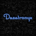
Are you broke or on a low budget and want to develop your art skills? If the answer is yes, then this blog post and future posts on this topic are for you. This post is collaborative in nature with Jody- Ann Rene. She is a lovely homo-sapien whose vlog and blog posts highlight the struggles of inner city youths. If you are unfamiliar with the term “inner city youth” as most of the students at our college were; it is a rather loose term to refer to youths who live in ghettos or the projects or areas where most families are in mid-level middle class to lower class economic brackes. These groups tend to have tight budgets at times. I had a lengthy conversation with her regarding the fact that there are many artistic youths in these areas. Many of whom like photography and digital arts.
As someone who comes from a mid-level middle class family myself I am no stranger to financial dry spells. In this post I have identified some ways in which someone in this situation, a student or someone who is a bit frugal can develop their art skills on a low budget. Please note that some of my suggestions mainly applies to The Republic of Trinidad & Tobago because this is where I live but at the core they may apply to where ever you live.
As a student, I rarely have enough dinero to drop for high quality art products to develop my skills with and when I do my heart and wallet shrieks out of sheer horror. So there are four core points which apply to the suggestions in this post that I need to get out of the way:
You do not need high quality art supplies to develop your skills.
Make use of more affordable or free substitutes.
Sometimes it is not what you are buying but rather where you are buy it.
Don’t have something? Make your own!
Digital Arts/ Graphic Design
Vector Graphics- There are many cheap and free vector graphic programs out there. But if you are on a really tight budget you may want to consider Gravit Designer. This is a browser and desktop based vector graphic program. So you do not have to install it since there is a browser version, you just need an account and you can access your cloud and art anywhere in the world on most computers. So, if you are between computers, you can use computers at the library, school or even at an Internet Cafe to create your art. I do suggest you invest in a flash drive, so if the internet drops you can easily save your work to the flash. If you have a computer even better for you, you can download the desktop version and use that. I have personally used this program for the past four months and it has saved me a few times. Here is a list of some free vector graphic programs that I have come across:
Gravit Designer (can be used online)
Vectr (can be used online)
InkScape
SVG-edit
Boxy SVG Editor
Image manipulation- Unfortunately I have not been able to locate a browser based , free image manipulation app. Granted these programs cannot compare in performance and features to Adobe and Corel programs they can work well enough while you are learning. Here are some alternatives to photoshop that I have come across.
Gimp
Pixlr
SumoPaint (online editor)
Photoshop Express
Lunapic
iPiccy
FotoFlexer
Digital paintings- Applications like Corel Painter allows persons to paint digitally. So here are some free or affordable alternatives.
Krita
PaintTool SAI
Artweaver
FireAlpaca
YouiDraw (can be used online)
MyPaint
Sketchpad (can be used online)

Photography
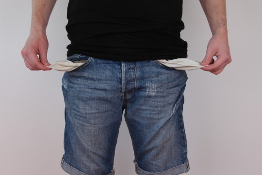
You do not need a DSLR to learn & practice the core elements and principles of photography. A “point & shoot”camera, smartphone or tablet can work. When it comes to photography you need to know, understand and practice the principles and elements of photography so you do not need a fancy DSLR to get started. For the practicality of today the easiest device to obtain and use while being cost effective might just be a smartphone. Mind you it doesn’t have to be an expensive brand. There are Blu, Alcatel and Huawei models with good cameras and software. Just keep an open mind in your search and you will find something that works for you.

Tablets
These are not necessary since you can draw on paper and either take a photo of your work or scan it and then redraw/ colour using software and/or your mouse to create digital art. If you really want a tablet however you can start with lower end models like the Wacom Bamboo(pad tablet). Also contrary to popular belief Wacom is not the only good tablet brand there are many other good and more affordable brands (depending on the model) such as:
Huion
Gaomon
Ugee
Xp-pen
iskn
Also did you know you can use a regular tablet as a screen tablet? There are many people opting to purchase an iPad Pro as opposed to expensive screen tablets. Also others like Microsoft Surface, Lenovo Yoga Book and Samsung Galaxy Tablets can be used as screen tablet alternative. Once again keep and open mind, do some research and consider things you normally wouldn’t consider.
Traditional Art
As stated previously you do not need professional grade materials to get started. In Trinidad and Tobago in particular professional grade or higher end brands can torch your wallet, from $60 Acrylic Paint to $1000+ Prismacolor coloured pencils. Here you really have to hunt to find affordable supplies. I will try to help you out in that endeavor as much as I can if you wish. If this aspect of the topic is interesting to you let me know and I will do dedicated posts to art supply hunting in Trinidad. For now I will include a list of some places I go to for affordable supplies and a couple tips to save some cash regarding buying supplies.
Some Places I have gotten some decent quality supplies that didn’t murder my wallet are:
Knowledge Zone ( I kid you not! You need to check these people out)
Charran’s Bookstore
Naipaul’s Bookstore
Arnim’s Framing & Art Supplies
Craft Creators
Art & more
Please Note: While I got affordable things at these stores it does not mean that everything in these stores will be very affordable. It depends on what you are buying and where you are buying it.
Buy in “bulk”
Instead of paying almost $5 per B type pencil ( like 2b - 8b), consider buying them by the box. At Naipaul’s bookstore in Arima I have gotten 12 pencils in a box for just under $20. I tend to buy somethings in bulk like this since my younger relatives also do art and sharing is caring. You can band together with friends or classmates and buy your supplies in bulk and split the times up among each other. My classmates and myself put together and purchased large sheets of illustration board and then divide it among each other also, Mr Arnim was kind enough to cut the board up for us.
Consider mid - low quality supplies
For initial practice avoid buying expensive paints use low to mid quality ones instead. I have seen people online use crayola washable watercolours and do pretty good work. The cheapest watercolour cake set I have come across locally is Winners brand which was just under $10, at Food Basket. I have also seen decent quality Acrylics at Knowledge Zone and Craft Creators (Trincity Mall) for around $40, also I know there are significantly cheaper Acrylic brands but I have not personally tried them yet.
Invest in the long term
Invest in a few good brushes. Yes, the idea is to save money and investing in a few good brushes which can last you almost a lifetime is better than having to constantly buy new brushes. Visit are stores like Art & More and Arnim’s to get good quality brushes. They have friendly staff who will surely help you out.
Brands do not always matter
Instead of always buying high end brand paper pads consider lower end ones. Watercolour paper pads can run you a good bit but you can get a decent quality watercolour pad (160gsm, acid free, A4 sized, 24 sheets) for just $30 at Charran's Bookstore. In the past couple years I have noticed that Charran’s has been carrying more Asian brands in art supplies and stationery which tend to be cheaper than most other brands you see on the market here and they work very well. Also if you want a thick medium sized sketchbook consider Knowledge Zone because you can get those for $50 as opposed to $80 and up that I have seen at art supply stores.
Use art quality when necessary
Do not use art quality supplies unless you have to. For daily practice like gesture studies or observation ( in some cases) you can use a composition book or plain copy paper. If you want something with a little texture or bit thicker consider card stock or even bristol board. Now, I have only personally seen card stock in Excellent Stores and Naipaul’s Bookstore. At Excellent Stores it was under $30 (if I remember correctly) and there was a decent amount of pages for the price. I will double check the price and amount if I spot it again. Also you can use HB pencils and ballpoint pens for practice, both of which you can buy by the box easily.
Make your own supplies
If you don’t have tool sometimes you can just make one. If you are doing pottery you can dig for clay and prepare it. I once that an individual make their own dip pen from plastic bottles and the you-tuber PeterDraws used it in one of his videos. In terms of simpler items like sketchbooks you can make your own easily. There are many tutorials on youtube and other websites for DIY supplies. I personally made my own ink last month based on tutorials on how to make walnut ink. It most definitely was not what I expected but I had fun doing it and I am going to make as many pieces as I can using it.
Education
I am going to stop you right there. Since you are reading this blog post you are aware of the Internet. There are a multitude of free tutorials and open source education resources. So make use of that google and youtube. You can do free courses from recognized universites to develop your skills via online open learning platforms like coursera or the local site knowledge.tt from the University of Trinidad & Tobago.

So you see guys, where there is a will there's a way. Use those big beautiful brains and imaginations of yours, be optimistic and find a way. Heck, if can make my own ink, I am sure you can make something amazing. Until take care and have fun trying new things.
0 notes
Text
To Drink or To Ink ?

This is a collaborative post with the lovely Elise of The Vanilla Stem food blog. Her blog is focused around healthy meals. So obviously we began chatting about food; mainly about fruit & vegetable nutritional content often being related to their colour. These colours are due to the fruit’s or vegetable’s natural pigments. In the past dyes, inks and paints were made using natural pigments.
Given the fact that the festive season is upon us we decided to use Sorrel aka Hibiscus or Roselle which is typically used to make Sorrel drink; every Trinidadian household has sorrel drink in it for this season. Elise made the drink so check out her recipe for sorrel drink. Elise’s results using dried sorrel to make sorrel drink looks delicious.

I took a different approach and went the route of creating sorrel ink. Yes you read correctly, I figured that since chestnuts can be used to make ink then sorrel (which can stain your clothes) can most likely be used in the same fashion. After watching and reading many tutorials online for making walnut ink and some extra information from a book I took on the challenge.
Elise and I evenly shared a 4 ounce bag of dried sorrel for our collaboration (my mother would flip if I took our fresh sorrel to try this out). The results were unexpected but delightful regardless.

Ink Expectations
I expect the colour of the ink to be deep red and that the ink will not smell bad.
Ingredients
2 oz Dried Sorrel
5 -10 Cloves
5 cups Water ( approx)
1/8 cup of rubbing Alcohol
Materials
1 Small Pot
1 Sieve
1 Pot Spoon
1 Wisk
2 Medium Bowls
Measuring Cup(s)
1 Old T-shirt
1 Funnel
1 Small Bottle
1 Paintbrush
1 Thick sheet of paper
1 Glove ( optional)
Process
Throughout this process feel free to test the colour of your ink as often as you want.
Step1
Put the dried sorrel into the pot, add the water and place the pot on the stove. Set the stove on a medium - high flame and leave the contents to boil.

Monitor the contents intermittently. You will notice that the water will turn deep red and the dried sorrel would have increased in size.

Step 2
When about half of the water has evaporated turn the flame down to low and let the contents simmer for about 5 minutes. Then turn the stove off and let the contents cool.
Step 3
Once the contents are cool enough to handle, strain using the sieve into a clean bowl. You can use your hand or a spoon to squeeze out the extra liquid from the re-hydrated sorrel. I used my hand with a glove to squeeze out the extra liquid.

Here I tested the colour of the juice by making swatchs on the thick paper. I used 160 gsm watercolour paper.

Step 4
Pour the contents back into the pot and set it on the stove on a medium to low flame. This is to reduce the water content further in order to make the colour even darker.
Monitor the contents and once there is half or less than half the amount of liquid remaining in the pot turn the stove off. Leave the contents to cool. The liquid should be a very dark red, almost like blood.
Step 5
Once the contents are cool enough to handle re-strain the contents using the sieve.

Step 6
Then further sieve the contents through the old t-shirt to remove any remaining sorrel puree into another clean bowl.


At this point you should have roughly a 1/2 cup of liquid ( unsweetened & unspiced sorrel juice). You can test the ink colour again here. If you think you have too much liquid put it back onto the stove to boil some more repeat steps 4-6.
Step 7
Add 1/8 cup of Rubbing alcohol a little at a time to the liquid ( sorrel juice) and whisk. As you add the rubbing alcohol you would notice that the liquid would start to clump up a little. The rubbing alcohol is to help prevent mold from forming. You can test the colour again here.
t/n If you have more than or less than a 1/2 cup of liquid add 1/4 of the amount (of liquid) in rubbing alcohol to the sorrel juice ( liquid). Meaning if you have 1 cup of liquid ( sorrel juice) add 1/4 cup of rubbing alcohol to the sorrel juice.
Step 8
Next using a funnel pour the mixture into the bottle then add the cloves and seal the bottle. The cloves are to help prevent mold even further.
Congratulations you have just made sorrel ink!

Findings
Colour
Sorrel Ink is colour changing ink. It goes down as pink- deep red in colour but changes into one of a few variations of gray once dried. This confused me so much that I slapped the sorrel puree onto the paper for like 30 mins just to see if it would keep the reddish colour.. boy was I wrong.
In the end I separated my batch into 3 groups which I let sit for about 4 days before using them :
Stored in the bottle with the cloves added
Stored in an open plastic wine glass (to see how long it lasts exposed)
Stored in a relatively clean glue stick container which was placed in the freezer. ( my little niece suggested this)
All three were a bit darker than before as they were left to sit.. that is pretty much all they had in common in terms of ink colour.
Plastic Wine Glass Batch Comments
As it was left out to sit for 4 days more water evaporated which made the ink darker. At about 7 days being exposed the rubbing alcohol had totally evaporated and a very ominous mold started forming.
Small Bottle Batch With Cloves Comments
This smelled so nice, it was similar to how actual sorrel drink smells. It was noticeably darker and even after 2 weeks absolutely no mold has formed. I used this to try to make a painting of sorrel. It was not my best work but with the help of some coloured pencils and ink from the other 2 batches, I saved the piece somewhat.

I also put the ink in a fountain pen and it is actually pretty fun to use. I have noticed that the colour of the ink also depends on the paper. On sketchbook paper and some notebook pages the ink turned gray while on one notebook of mine the ink stayed pinkish. I do not know why exactly but it is pretty cool.
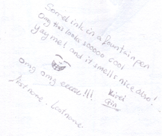
Glue Stick Batch Comments
This blew my mind, my little niece had a moment of accidental genius here. Instead of just turning gray this frozen ink actually turned gray , purpleish gray to a nice deep purple depending on the amount of ink you place on the page. I think there is something in the glue stick that helps the ink retain some colour. I will play with this more in the future.
Swatch Testing Page

Final Comments
This was a fun activity with interesting results. I will continue to use my ink in artwork and I will try this again with other local fruits/vegetables.

0 notes
Text
Promotional COSTAATT Billboards/Banners Project: Part 1
The point of this project is to create 12″x 3.5″ billboards/ banners for the college that I attend using Photoshop. None of these banners will actually be used by the school. They are for portfolio building.
This is part one, it is a banner for the Department of Information Science and Technology.
Rough Work

Images created in Illustrator
I used the tutpad pixel art film villains tutorial to create my grid to create the following.

Base image used for manipulation in photoshop

Final Piece

Rationale
Style Choice: As a former IT student myself on of the most fun parts of my course was game design & development. This is also a reason many youths start programming so I thought it would be a good point to attract new students with. So I went with the pixelated style of old 8-bit games.
Platform Layout: I chose to layout the platform this way to show the story of the student needing COSTAATT to cross the chasm and obtain their degree.
Code: I used the code to reinforce that to get the degree you need COSTAATT and hard work. The way I depicted the code was inspired by pony island.
1 note
·
View note
Text
Logo Design Tips
Designing good a logo is not all that easy. As a graphic designer your work is meant to communicate a message to an audience. Communication is essentially the process of creating and establishing shared meaning between two or more parties via some medium. Graphic Designers have to communicate someone’s message to their audience for them in a simple way using graphic art. A logo is no exception, so I have given some tips for logo design below.
#1 Know your client
In order to create shared understanding you must first understand your client. The easiest way to do this for a company would be to read and understand their mission and vision statement. These two statements will tell you briefly who the company is, who their consumers are, what they stand for, what they do, how they do it and how they view things. Other things you can do are obviously talking to the client but you could also visit the site of operations and take in their atmosphere or vibe. It helps to also know the place the client wants to hold in their consumer’s mind. Doing these things can help you conceptualize ways the desired effect/ place / emotion regarding the client can be invoked in their consumer through graphic design.

#2 Do not underestimate the power of type
The decoration and style of type can easily convey a message as opposed to just writing the whole message. Sans-serif non- script fonts can give a corporate feeling while script can give a personal or sometimes formal feeling. Choose a easily readable font; It makes no sense choosing an elaborate font that cannot be easily read (shared meaning cannot be established). Be mindful of using serif fonts because as they are shrunk in size the serifs can become lost. Consider the weight used if it is too light it may be difficult to notice and if it is too heavy it can be overpowering and affect the balance of your logo. Also the spacing between characters, words and lines can make a huge difference in appearance.


#3 Simplification
Logos should be simple and memorable. Thus suppose the client is a hiking company and you are focusing on the hiking boot. You should not draw an elaborate boot and say “Boom! That is it!”. Break that image down into a simpler form and keep simplifying until you have reached as simple enough form which still conveys the message quickly and clearly. The same applies to something as simple as a smile.

#4 Colour
We all know the importance of colour regarding logos. Also, just so you know in this case black is a colour. Try to limit your logo colours; at least one (1) to a maximum of about five (5) colours is good.
Use a colour scheme- Colour harmonies can help with this ( triadic, analogous, complementary*). Now be very careful of complementary colours, granted they “pop” and attract the eye but this can be bad in the case of things to read or things that must be easily discerned from one another.
Complementaries are special- The thing is complementary colours vibrate against each other and they can confuse the eye which will inhibit communication. Thus direct complements being used close together is not necessarily a good idea and is best avoided. If however you really want to use a complementary colour choose a muted version ( a colour that has some of its complement in it which makes it neutral). You can also consider using split complements which are colours next to the complement. You can just look around the colour family of the complement and choose an appropriate version of the colour type as opposed to a direct complement. Also try to not to layer the complements one on top the other or directly next to each other with no break or dividing colour.

#5 Have a Structure/ Form
By a “structure “ I mean either their overall shape all of the elements of the logo forms or of elements that form part of the logo. Thus multiple structures can be used in a Logo’s layout. The structure can convey a message about a company. Here are four structure types:
Triangular- Consider a pyramid which is the simplest way to erect a very tall stable building with a strong foundation. This is considered the strongest form. Some words associated with the triangle are:
Strong
Stable
Simple
Understandable
Circular- Consider a sphere, now the earth itself. The earth is containing, sustaining and supporting its inhabitants as it goes through its many cycles while maintaining a balance. Some words associated with the circle are:
Secure
Protected
Contained
Caring
Compassionate
Loving
Supportive
Cyclic
Balanced
Community
Universal
Square & Rectangles- These are both quadrilaterals so consider a cube or cuboid. A cube is a uniform block ( all sides are equal) while a cuboid is like a brick ( a practical material in building a solid building). Multiple interlocked and layered bricks are stronger than one brick. Words associated with squares & rectangles are:
Uniform
Straight forward
Solid
Conservative
Practical
Strong
Secure
Practical
Co-operative
Relatable

#6 Use a vector based program to create logos
Please, please do not use an image manipulation program like Adobe Photoshop to create your logo. That is not the intended use of those programs and it is not good practice. Vector based programs such as Adobe Illustrator, Gravit designer and CorelDraw are what should be used. Trust me, take the time to learn how to use vector based programs and trust me you will see a difference.

#7 Remember your colour modes
Remember that CMYK is for things you intend to print ( pigment based colour) and RGB are for things to be displayed on a screen ( light based colour).

#8 Pantones are your friends
Pantones are universal colours, which means they are accepted globally. It is a way to ensure your client can get the exact same colour every time. This makes it easy for them to have future work done in relation to those colours. Remember to get the pantones to match (exactly or closely) the CMYK values of your chosen colours. There are many CMYK to Pantone converters online to help with this. Also remember to convert your colours to CMYK before you send your work to print.

0 notes
Text
Project LimeLight Part 1 : Logo Design
Lime Light is a fictional event management company for which I am creating a series of vector graphic and image manipulation graphic design pieces for my classes. This is the first part; logo design.
Company Profile:
Lime light is an events management company that :
a) organizes private events ( weddings, birthdays etc.)
b) organizes public events ( seminars, carnival fetes etc.)
c) organizes corporate events (office parties, outings etc.)
d) aids in the search for venues
They offer experience that can not only ensure that important decisions will not get overlooked but also that you won’t get tied up choosing decorations or researching caterers.
Thumbnails, Rough Work & Inspiration


Final Logo Design

Rationale
Font Choice: Since LimeLight’s clients are of many types (not just corporate), I chose to use script and non-script sans- serif fonts. I later manipulated the “L” in Light to weave it into the “e” in Lime. I also kerned the characters because the spacing was a little too large.
Image Design: The image behind the word “Lime” is a simplified lime wedge. I really wanted to play with the concept of limes in this project.
Colour Scheme: The colours are based on the the different colours limes can be depending on their ripeness. For the image behind “Lime” I decided to desaturate the colours because when the image is converted to black & white the saturation of the text and image were too close causing the text to become lost.
2 notes
·
View notes
Text
A Well Overdue First Inktober Thoughts Post
How was my first Inktober?
Well my first Inktober was overall okay and pretty fun at times but obviously a bit challenging. It was a bit difficult to keep up with the daily drawing due to my schedule and how long it takes me to make a proper drawing ( I do not like to do rushed drawings). It became really hard to keep up when midterms rolled around and then projects started to increase so I burned out a couple times. You can view all of my Inktober drawings on my Instagram account.
My approach
Planning - I planned out the drawings for the first half of Inktober which made it easier for me to keep up at the time but soon after the halfway mark things started to falter.
Materials- I started using only the few pens I had in my drawer and a sketchbook. I quickly became tired of using only those pens and only using black also I wanted to try new things so I went out and bought some bottled ink and a 12 pack of gel ink pens. I gave them a try and I liked the gel inks more but I will try with the bottled ink again once this semester closes.
Preparations- Once I had the time I looked at quite a few tutorials to figure out how to approach a few of my drawings. The day 3 poison and day 31 Mask were two such cases where I had to learn how to draw a skull and properly use gel inks for colouring respectively.
New things that I tried
1. Using gel ink pens to colour an entire image.
2. Using bottled ink - Now, I did not use the proper ink for this. I used a $9.00 bottle of stamp pad ink ( instead of a $45 bottle of India ink) and used paint brushes. Some art supplies are either very hard to find here in Trinidad & Tobago or are sometimes crazy expensive. I will do some posts regarding this in the future. The piece (shy) started okay but coming down to the end I used too much water so part got a bit muddy and i just went with it. It kind of worked because you got that feeling of the person shrinking then retreating into the darkness around the corner and just peeking out very clearly, but it could have been executed better.

Improvements that I noticed
1. Outlining - I have found that my outlining has greatly improved but I cannot be distracted in anyway or I can totally mess it up.
2. Simplification - In order to draw something quickly and neatly I had to break the image down into the simplest of shapes. I really noticed an improvement with this near the end of Inktober as I was working on a Logo for my Vector Graphics class.
3. Colouring- I honestly feel so happy that my colouring has improved. I know for sure now that I can work with a very limited amount of colours and do a good job.
4. Drawing- My hand has become a bit freer and I do not make as many sketchy lines as I did before.
5. Confidence- I am not quite there yet but I do feel more confident about trying out new things and letting others see them. I have gotten critique and advice from friends who haven’t seen me pick up a pencil in years. Also, getting some likes and a few comments from strangers really boosted my morale and made me happy.

Interesting things I saw other Inktober participants do
1. Using a theme to make coming up with ideas based on the prompts easier.
2. Using one sheet of paper to make one big drawing comprised of all 31 drawings.
3. I saw people do this challenge in ways I didn’t even consider. For example there were people that made their pieces using calligraphy and graffiti based styling only. Those were just so cool!
4. Planing all of their drawings in advance and not being halfway like me.

Things I will do next year
1. I will do the 5k ( one drawing per week) in order to focus on quality as opposed to quantity of drawings.
2. Plan all of my drawings in advance.
3. I will implement a theme. while others did this to make things easier, I want to do this to achieve a cohesiveness among the drawings. That in itself will be a little challenge.
Final thoughts
Inktober is totally worth it and can be very fun. I have gotten inspiration from artists around the world, improved my skills and tried new things. I really believe that this challenge is beneficial and I look forward to doing it again next year. :3

1 note
·
View note
Text
Inktober is coming !

What is Inktober?
Nope, it isn’t something to do with tattoos. Inktober is a drawing challenge started by illustrator Jake Parker back in 2009. This was done to improve his inking skills and develop positive drawing habits. This has since blossomed into a global activity with many artists accepting the challenge yearly. I myself am accepting the challenge this year in effort to improve my skills ( I am a total noob).
I do not have an inkwell or any high quality inks or pens. I will just be using gel ink pens , one micron pen, a sharpie and maybe a cartridge fountain pen. Basically whatever is in my drawer. If any of you are in a similar situation as me, do not sweat it. Use what you have or what is affordable for you. Remember, the purpose of this challenge is to promote good drawing habits and developing your skills, not to bust your pocket. You can have the best products in the world but it won’t mean a thing if you don’t develop the skills. So just give it a try and have FUN!
How does Inktober work?

Basically it can be done in 3 easy steps!
Step1: Make a drawing in ink based on the prompt list. (You can start in pencil and then ink your drawing after, if you so choose)
Step 2: Post your drawing online with the hashtags, #inktober #inktober2017.
Step 3: Repeat steps 1 & 2 respectively according to the frequency of your choice. Just remember to be consistent.
Frequency of uploads

Inktober Prompt List 2017

Don’t know how to ink drawings?
Keep Calm fam the Internet has got you ;)
Although there is a fee, Jake Parker himself has resources to help you out .If you are on that student budget like myself, there are other resources on YouTube and do not forget Google is your friend when it comes to these things.

I have included some free resources below:
Wikihow : How to Ink a Drawing
Tom Richmond Inking Tutorials: Part 1 , Part 2
Mark Fussell at The Virtual Instructor : Pen & Ink Drawing Techniques
Jessie Moore at Craftsy: 7 Pen and Ink Drawing Tips
1 note
·
View note