
Don't wanna be here? Send us removal request.
Statistics
We looked inside some of the posts by kristinechangcd and here's what we found interesting.
Average Info
Notes Per Post
0
Likes Per Post
0
Reblog Per Post
0
Reply Per Post
0
Time Between Posts
2 days
Number of Posts By Type
Text
17
Last Seen Tumblr Blogs


Fun Fact
Celebrities use Tumblr as well.
Text
Mockup Magazine

Reference : https://www.freepik.com/free-psd/top-view-opened-magazine-design-mockup_17254370.htm#query=magazine%20mockup&position=12&from_view=keyword
0 notes
Text
I am thrilled with my magazine. I am glad that the design came out as well as I tried. I did not have a lot of time, but I think I did my best to divide that time well. Of course, there are many things that I need to fix, and there are many things that I need to improve, but it is terrific that I think I have grown to the next level through this experience.
0 notes


Text
Development of Back Cover


I did not know what to put on the back cover, so I placed the illustration on the first cover differently and put the title. I do not like it, but I do not think the back cover is essential, and I think simple is the best, so I just designed it like this. Next time, I will have a look for more examples and work hard to figure out what to put in before designing.
0 notes
Text
Research


It was a little tricky because there was insufficient data on the back cover design. These things that I've just researched did not satisfy my mind. I had a hard time because no back cover was designed as an illustration.
0 notes
Text
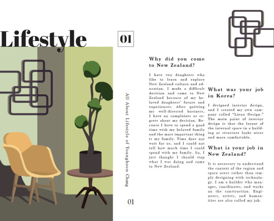
Development of Inner Cover Page


There is lots of information to write on the inner cover pages, so I struggle with how to make a good layout. And since it looked so bored when I only wrote the text, I thought a lot about which simple illustrations to put in and how to fit them well. So, I drew a woman's legs walking while thinking about my title, lifestyle. To be honest, I don't really like it, but I don't think it is not good.
0 notes
Text
Development of Introduction


I'm pretty happy with the introduction page. Because the contents table was designed neatly and simply, I needed a feast to our eyes on this in the introduction, so I drew a recorder illustration related to the interview, and it matched perfectly. However, it was disappointing that the explanation in the magazine was insufficient. I was so upset because I had no idea what to write.
0 notes
Text
Development of Contents
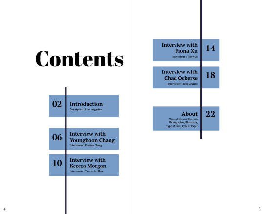


I really like my final contents table because it clearly explains the contents, and I think there is no shortage of design. It would be fun to have an illustration, but I think l have to design it neatly.
0 notes
Text
Research


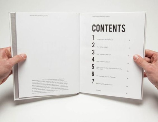

I think the content has to be simple and neat. By looking at the table of contents, you can see what stories are contained in the magazine. So I search for lots of simple content, and I will design it like these.
0 notes
Text
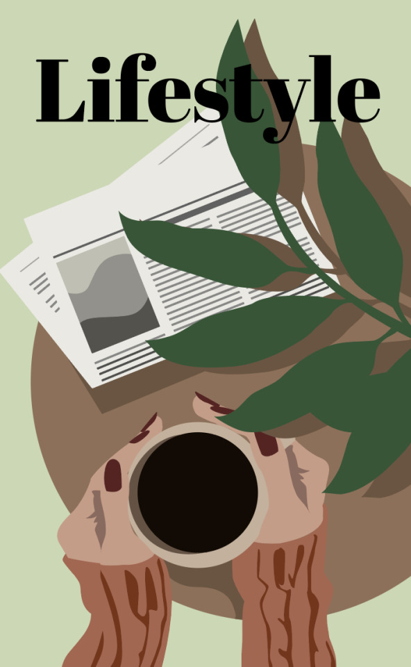
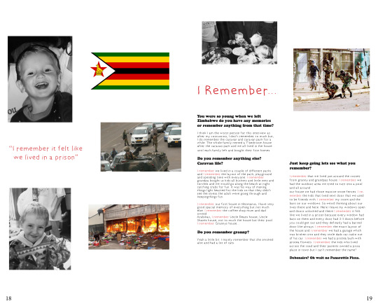
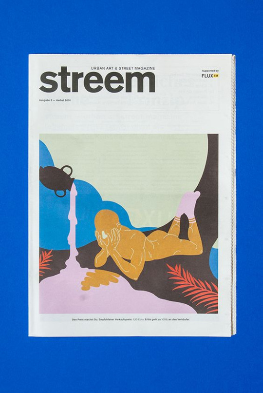
This is my cover page design. I really like the beautiful colour palette, which makes me comfortable. I put a lot of effort into putting the characteristics of the four interviewees on the cover page. Coffee was drawn by being inspired by Kerera Morgan's key quote, and the newspaper was drawn because I think there would have been a lot of articles about the war that Chad Ockerse remembered. And I used bright colours to capture the challenging character of Fiona Xu.
0 notes
Text
Research


I really like lots of different illustration magazine covers. I like the colours they use and the layout of the title and subtitle. Creativity seems to be shown in illustrations. Seeing these beautiful examples, I must also make a fabulous cover page.
0 notes
Text
Feedback from Paul

Paul said my font was too big, so I decreased all the fonts size. Also, for the title “Lifestyle”, “y” and the roof were the same colour, black, so he told me to adjust the colours because the colours overlap. And I changed all the head titles (interview questions) to PT Serif Bold italic because this font looked better. After changing, it looks much prettier and seems to have settled down. It was an excellent experience to print it out because when I printed it out, I could see at a glance the parts that were missed when I was close and the awkward parts when viewed from a distance.
0 notes
Text

This is my formative 2DPS magazine. My magazine interviewed my dad, so I drew illustrations related to him. My father's job in Korea was an interior designer, so the first page was decorated with interior design illustrations. I looked at the photos that my father designed and drew them similarly and was delighted. Simple and detailed, it seems to give pleasure to the eyes. Also, the colour is so cheerful that it resembles my father's mind, so it was perfect. It also organized my sentences in a neat font, so they looked good, but the paragraphs were too close, so I think I should give them space. My dad's job in New Zealand is an architect, so the third page has architectural drawings. I am very satisfied and proud that I paint it similar to my father's house. Similarly, the paragraphs are too close together, so it seems that a gap should be given. It was a very satisfying artwork.
0 notes

Text

I redesign my magazine illustration. I really like the calm colour, but the colour is too flat, so it seems to be a key point to put a high-saturation colour. And the pattern drawn on the wall is loosely attached to the wall, so I have to change the pattern and redraw it. The pattern seems to float too much. However, I really like the composition and drawing style of this illustration, which is 3d, and The colour is too flat, so it seems to be a key point to put a high-saturation colour. And it appears that the pattern drawn on the wall is loosely attached to the wall, so I will have to change the pattern and redraw it. The pattern seems to float too much. However, I really like the composition and drawing style of this illustration, which are 3d and 2d.
0 notes
Text

This is a photo of my father’s interior design. I really like the traditional pattern of the door, so I just copied it and also for the natural colours.

I roughly designed my magazine, but I was really disappointed with my artwork. My magazine design seems to go too far because I am trying so hard to make it pretty. Rather than thinking too complicatedly, I should simply design it based on the references I found. The layout is too simplistic and seems to be uncomfortable for the reader to read. Just focus on the layout.
0 notes
Text
Setting up Indesign
Columns and Gutters
Adding columns to your InDesign file creates one of the most important compositional design tools available to the designer - The Grid.
Using a grid with its columns, rows and gutters helps you as the designer to have control and consistency with your design, as well creativity.
Line Length
Text alignment options
Four main alignments : left, right, centre, and justified
Choose 1 aspect of the story to focus
Lifestyle and job in Korea and New Zealand.
Define the tone / manner / personality visual language (3 traits)
- tone : bright
- manner : modern and progressive
- personality visual language : positive
Choose one pull quote to work
- I work hard with a sense of duty and confidence in my work
Choose 1 typeface for ‘titles’ and type name of the subject
- Abril Fatface , Lifestyle
Choose 1 typeface for ‘copy’ and try it in 1-2 columns in different sizes.
- Marion
Include in Formative :
Title / Name
Subtitle / Intro
Paragraph. Pull quote
1-2 images
Any technique
Size as brief
Prepare PD
0 notes