
Don't wanna be here? Send us removal request.
Statistics
We looked inside some of the posts by kstrand-art and here's what we found interesting.
Average Info
Notes Per Post
1
Likes Per Post
0
Reblog Per Post
1
Reply Per Post
0
Time Between Posts
1 day
Number of Posts By Type
Text
17
Last Seen Tumblr Blogs


Fun Fact
Tumblr has 4 main sources of revenue.
Text
Virtual Art Tour

https://www.youtube.com/watch?v=hjvWXiUp1hI
"I'm Not The Girl Who Misses Much", 1986, Pipilotti Rist
I really enjoyed "I'm Not The Girl Who Misses Much" because of how much I love music videos. The piece was very entertaining and it was interesting to learn the artist's background and their inspiration for the work. This was an homage to popular culture and it's influence on the artist, referencing the work of John Lennon. As the video is sped up, slowed down, looped, and manipulated while Rist sings and dances, it felt like an alternative music video (particularly with the introductory title scene). At the beginning, I couldn't help but laugh at the humorous tone that is taken up by the high pitched singing (it reminded me of Alvin and the Chipmunks). However, as the video progresses and the color balance shifts red, a somber tone overrides the lighthearted, frantic singing and dancing.
While the artists intent may have been a commentary on popular culture, new media, or time, I can agree with the critics that it feels like an "ironic comment" on female representation on MTV. Given the presentation of the material and the inclusion of a mantra-like song, it appears to be an satirical version of the woman portrayed on television (hysterical and sensual). The change in color throughout the video, combined with the use of glitching effects creates visual interest for the viewer as the video progresses. The use of video is perfect for this work of art as it relates to the media she is referencing and imitating.
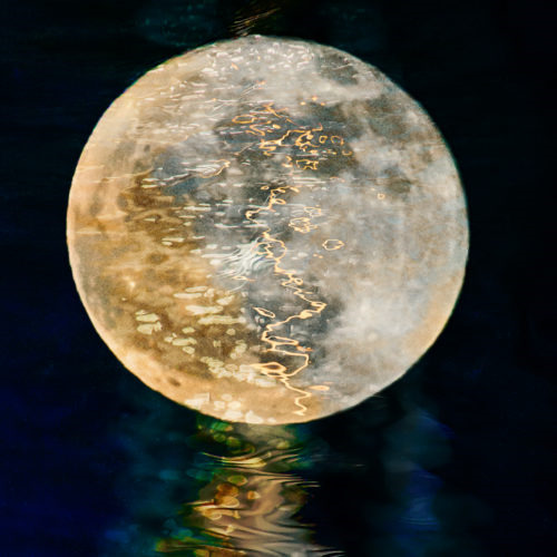
"Remembrance", Vicky Stromee
Envisioning Solitude - Griffin Museum of Photography
I loved the works presented in this exhibition, complete with the organic and natural abstraction Stromee has created. Across her work, there is a signature circular element at the center of the image, with natural elements surrounding and inside the circle. Some of these include leaves, trees, or water ripples. Referencing the moon, the circle at the center provides symbolism for reflection and new perspectives. The texture created by natural elements creates stunning visuals that allow the viewer to peruse the piece slowly and methodically. Examining the series, I feel ease and inner peace. The artist's intent reflects the initial emotions I felt while viewing the photographs: an emphasis on love, human spirit, peace and reflection.
My favorite work in the exhibition is "Remembrance" for it's extraordinary use of color and textured water reflection. The muted color palette and high contrast between the moon and the surroundings creates a stunning work of art. There is a flow through the image, directed by the soft, welcoming reflection of water. I felt very inspired looking at this piece, especially in regard to the composition and imagery. Focusing on natural textures and beauty is not something many photographers excel at, but the simplicity and appreciation Stromee creates is amazing. The aesthetics and continuity throughout the body of work brings to mind a secret garden, waiting to be explored.
0 notes
Text
Final Portfolio Project - Once Upon a Time


My final portfolio project, Once Upon a Time, explores the themes and imagery from fairytales I grew up loving.
Every photo in this series explores a different fairytale or fantastical creature. Included are a Flower Fairy, Thumbelina, Through the Looking Glass, and a Mermaid. I used a green color scheme to tie the images together and emphasize the importance of nature in the world of fantasy that I have created. Each image is a combination of four individual photographs layered and photoshopped together. Prior to planning the images, I looked through some of my old fairytale books to find inspiration. After doing this, I sketched out my ideas and went out to take the photos I needed, editing them together to create the final product.
One of my primary inspirations came from Maggie Taylor and her way of "inventing" a world through a combination of images. Seeing her dream-like imagery prompted me to capture a similarly whimsical world. While her work utilizes a collage approach, integrating illustration, vintage photographs, and a paper-like texture, I wanted to create a more "realistic" surrealism using pictures I captured myself.
I had a lot of fun with this project. It took me back to my childhood and reminded me of how fun it is to enter a world of pretend.
0 notes
Text
Artist Research Paper

She, 1992
Lorna Simpson is a trained photographer, born in Brooklyn, New York, 1960. She is known as a pioneer of conceptual photography, with works that challenge and redefine the world around us. During her college years, her love of documentary photography led her to question implied truths through her work, exploring the objectivity of fact. Using her experience as a Black woman, she juxtaposes words with photography to confront issues regarding woman, race, desire, and culture.
In She, pictured above, four figures are seen sitting in individual frames, wearing the same suit. The only thing that distinguishes each image is the change in pose. Cut off by the frame, the figures heads remain undisclosed, prompting the viewer to imagine who the photographs are of. In portraiture photography, the face is the “window to the soul”. However, with only the images as guides, a viewer might assume that the subject is male from contextual symbolism (suit, pose, etc), however the word above the series of images says “female”. Similarly, the title of the piece is She, implying that there is more to the story than meets the eye. This implication changes the piece into a critical statement on gender and gender stereotypes. Gender binary is non-existent within this piece, as the figures remain in the gray area between male and female. Following Simpson’s signature use of juxtaposing words with photographs, this piece causes the viewer to question their own reality and bias. I really enjoyed learning about this work of art because it addresses a topic very relevant in today’s society. With the current conversations surrounding gender, non-binary, and female empowerment, I found it interesting that such a piece was created 30 years earlier.
0 notes
Text
Passage
For this video, I wanted to address multiple aspects of passage. To me, passage is what happens in every day life. While there can be specific symbols or actions that indicate passage, I consider it to be omnipresent and everlasting. Using moving images, I wanted to show passage in a subtle way. There is no plot to the video, only the flow of water and the movement of foliage swaying in the foreground. The boat is at a pause, awaiting a physical passage of it's own. Passage means something different to everyone, but for my purposes, I depict it as something calm and slow. There is no true end or beginning to the video, indicating that it can go on forever, similar to the passage of life. Life keeps on going regardless of circumstances or person. While boats can be used as a physical symbol of passage, my goal was to invite the viewer to relax and experience the passage of time around them without expecting something to change by the end of it. Passage, by some definitions, indicates a change will occur at the end. However, passage may also indicate a state of being (such as time, or life) that flows around and with the viewer, inviting them to pause and contemplate their place in their own "passage".
0 notes
Text
Sequencing

For this sequence shot, I wanted to show a change in motion. To do this, I looked to my water faucet to snap these shots. A water faucet is something we use every day, but it receives very little attention for all the work it does. My process mainly involved changing the water pressure and snapping the shot, editing in photoshop, and then flattening into a triptych final image.
0 notes
Text
Discussion Board - Video Art
John Baldessari is an American artist of the Conceptual art movement (late 60's - early 70's). For him, and any conceptual artist, anything could be considered an act of art.
youtube
Baldessari's work is interesting to me because it pushes the line of what can be considered art and allows the viewer to walk along that boundary with the artist. I particularly find it interesting how he verbally classifies the smallest movement as art, self aware of his process of "making art". His work challenges me because I am not the biggest fan of conceptual art. However, I do respect the vision he is going for.
0 notes
Text
What is Video Art?
youtube
In Martha Rosler's "Semiotics of the Kitchen 1975", she performs a parody of a housewife demonstration popularized in the 1960's. Each demonstration is a pointed remark towards the rage women were feeling in their designated "role" as a housewife. She changed art by taking it into the domestic space and infusing everyday tasks with meaning. The work was turned into a political statement on the roles of women, opening the pathway for future artists to do the same.
youtube
Tony Oursler is a contemporary video artist, focused on channeling fantastical and sci-fi-like elements to create visually and technically interesting installations. His art is changing the role of video art and the methods it can be displayed in, experimenting with projection methods and video editing techniques.
youtube
Pipilotti Rist is a pioneer in spatial video and audio installations, using multiple projectors to create seamless, space filling projection walls. Through using the space in an innovative way, Rist is changing and challenging art through her mode of presentation. Her work draws from life, using bright colors and interesting social cues.
Out of these three video artists, I really liked Pipilotti Rist and Tony Oursler for their innovation in video content and display. Both of their works are presented using new, technologically advanced methods, adding new meaning to the work. My least favorite video artist would be Martha Rosler. While I love the feminist undertones and understand why her work was revolutionary, I found her work very difficult to watch and hard to engage with.
0 notes
Text
Video Art - Nam June Paik
youtube
Nam June Paik is a Korean American Artist that uses an extensive variety of media to construct images reflecting his perception of media and moving images. This can be through live stream or prerecorded video, intermixed with other sculptural elements (neon lights, pianos, etc.). This video installation inspires me because it is a combination of so many elements that come together to tell a story. My favorite moments are when there is an overall moving image filled in with contrasting video. I think the artist was trying to push the boundaries of what video could become, using it as a medium to create new images and mixed meanings. I can see this work being a response to mass media and user consumption, as the images are repetitive and many taken from modern media sources.
0 notes
Text
Glitch


For the leaf image, I wanted to use linear glitches to contrast the extremely organic shape of the subject. I played with blending tools to create sharp contrast between rectangular areas of the image. Through these edits, I have changed the natural into the altered. These sharp lines add a technological feel that implies falsities and lies.
For the street view, I created waves along the R, G, and B channels and played with different layering styles. I wanted to keep the image somewhat normal, but give it enough "glitch" to make it obvious that something is wrong with it. I also added noise to certain sections of the image. The intent behind this image shifted from a peaceful night photograph, into a psychedelic, "I need help getting home" image.
0 notes
Text
Joiners, Triptych, Grid

For this triptych, I wanted to use the bland, beige aesthetic of my apartment to explore the theme of boredom. In each shot, I am sitting on the couch in an incredibly wrong way, hinting to my boredom. The beige outfit is used to mimic the color scheme of the apartment and acts as a camouflage. My face is omitted from each photo (either through framing or positioning) because it is not relevant to the goal of the image. To create my triptych, I altered the angle of each shot. While the camera stayed in the same physical location, I rotated the lens to imitate a fish-eye effect, incorporating a larger area into the image that could not have been achieved in one shot.
0 notes
Text
The Nature of Photographs
A physical print is an object in space rather than a two dimensional image. While an image could be viewed in both a physical and virtual setting, I can imagine the experience would be completely different. In the physical world, we are surrounded by objects that take up space. Putting a two dimensional image into this space would create a sense of intrigue and curiosity, rather than a virtual platform where everything is two dimensional. Similarly, a physical print forces the viewer to physically shift their gaze and move around the image, rather than just zooming in an online photograph.
Paying attention to your surroundings and actually seeing are incredibly important in art and photography. Without truly understanding what is around you inhibits the best photographic decisions from being made. Knowing what to include, where to shoot the photo, and the spatial layout of the subject allows the photographer to frame the shot the way they envision it. The way I see depends on my mood or location. Sometimes I am hyper aware of my surroundings and know exactly what would make for the best image. Other times, I am focused on other things and it feels like I am living without truly seeing.
What is in the frame vs what is left out of the frame has a significant influence on the narrative a piece is telling. When there is something slightly left out of frame, it causes the viewer to question the artists intent and the subject itself. What is left out of the frame will always be unknown to the viewer. While hints may suggest what could be behind the camera or to the left of the image, without visual identification, there would be no proof. Keeping in mind the power that framing has on describing the situation, it is safe to say that every narrative is shaped by what is left in, and what is left out.
Visual relationships and filling the picture with attention would change my approach to photography because it would challenge me to focus on every part of the image, conscious of my decisions. While the image would look natural, it would be framed in such a manner that appears natural. I agree with this approach because it emphasizes the fact that every part of the image that is being included is important to the narrative being presented.
0 notes
Text
Visualizing Identity

For this photograph, I wanted to capture a nostalgic, dreamy mood with a heavy inclusion on nature and bright colors. A lot of my identity comes from my childhood, which was colorful, cheerful, and pure. Including the floral patterns and leaves represent a hope for the future and a calmness while enjoying the past.

This photograph represents the mood and emotions I was feeling that night (horrible headache). To literally symbolize this, I put a brown paper bag over my head to avoid the light and shut myself in from the world. The stark contrast of light represents how harsh the world felt while the monochromatic scheme of the photograph signifies how colorless everything seemed.
For this pair of photographs, I wanted to offer a similar composition with two completely different feelings. One is bright and dreamy, while the other is colorless and harsh. My process involved a lot of rearranging and playing with lights in my apartment to get the feel I was going for. For the colorful, dreamy photograph, I wrapped plastic around the outside of my lens to blur out the edges of the photograph and used two primary, opposing lights. For the B&W photo, I only used one light to get the shadows and contrast that I wanted.
0 notes

Text
Montage - Identity

For this image montage, I examined the identity of the three graces from Greek mythology. The clock in the background represents their timelessness and immortality. The turn-only sign represents the divergence of roles that the graces could have, such as creativity, beauty, or nature. The pedestrian sign goes along with the turn-only sign in representing the journey a mortal takes to achieve one of these “graces”. The sculpture shows their representation in the past, while the trio of portraits represent a more updated imitation. Gold/yellow were the primary colors chosen for this image, representing compassion, magic, and power. Each image is inherently related to the myth of the three graces, and speaks to the expectation to be attendants for others. Combining these images in an overlaid and repetitive manner blends the various messages together to create a cohesive and startling composition. [All photos are mine, with exception to the sculpture photograph which was not copyrighted][image size is 1000x1500 pixels, 72 ppi]
0 notes


Text
Scavenger Hunt

The elements and principles of composition helped improve my photographs by keeping me aware of what to focus on when taking a photograph. It forced me to think outside the box regarding how to best capture these images. The primary elements and principles I used were texture, lines, and color. Scattered throughout are negative space, rule of thirds, contrast, repetition, and unique point of views. I used I discovered that lighting plays a huge role in how the photograph turns out. I was focused on showing the UTD campus through a new perspective.
0 notes
Text
Photographer of the Week

Oswaldo Cepeda @moodydarkroom
Their work is very dreamy and moody, while beautifully capturing a story or personality. The lighting creates a unique dynamic, and the hazed nature of the image makes it appear out of a dream or book. Every photograph is incredibly thought out and planned, creating interesting dynamics between the subject(s) and their surroundings.
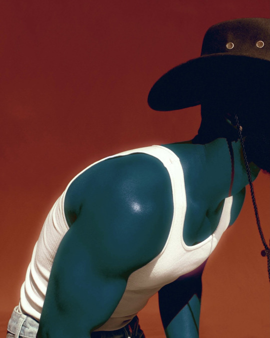
Jhalin Knowles @jhalinknowles
Their work has a lot of expression within the simplicity of the image. The subject works perfectly with their surroundings, which tend to be high contrast or brightly colored. They also use editing to bring interest into the image, such as altering portions of the skin color to blue or overlaying text onto the image.
0 notes