
Don't wanna be here? Send us removal request.
Statistics
We looked inside some of the posts by kuhki123 and here's what we found interesting.
Average Info
Notes Per Post
8
Likes Per Post
5
Reblog Per Post
3
Reply Per Post
0
Time Between Posts
4 days
Number of Posts By Type
Text
17
Last Seen Tumblr Blogs


Fun Fact
The “We are the 99%” Tumblr blog became the slogan for the Occupy Wall Street movement.
Text
Love these sneak peaks!! such an awesome concept and design, I really appreciate the attention to detail!
Here’s some sneak peaks on the “ ask me anything assignment” I have finally finished it, layout and all... I’m so happy with how it turned out !


3 notes
·
View notes
Text
WEEK 12
Our last week!!
What a journey it has been. It was really awesome to see how we were able to continue our studies with this pandemic going on. I had quite a few ups and downs but I MADE IT! I feel as though I am able to get through anything after going through this tough time.
I enjoyed seeing the works of class mates and the ways in which they express their design.
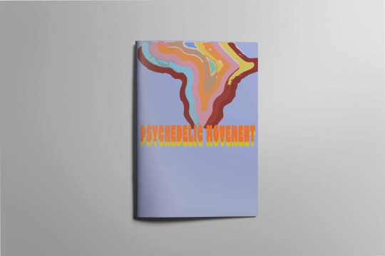
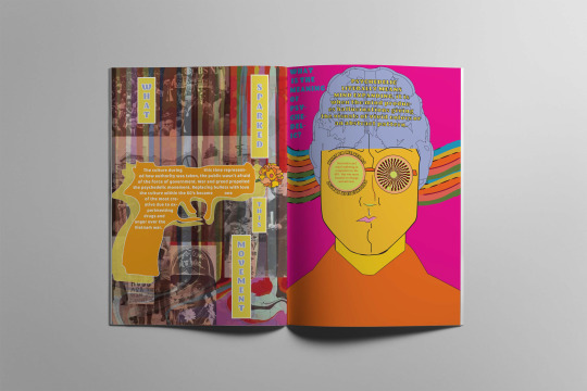
Finally completing my Assessment “Ask me anything” for communication design. I am very pleased with myself and the outcome. There were a lot of areas that I had been struggling with when trying to get the best creative outcome. The feedback from both my teacher and students really allowed me to critique my work, as you can see I have chosen to go with a brochure design rather then a poster design, Bailey suggested this may be better as I was able to explore with graphics and wording and had access to more creativity. I did feel very restricted when doing a poster design, so this assisted me greatly.
The idea behind this was to represent the answers within the graphics, as we know psychedelic to be all about visuals. I Wanted the cover to be simple but effective, and to not take away the detail from the rest of the booklet, Using the pen tool on illustrator I created a smoke effect to represent the drug use within this movement. When asking people what psychedelic meant to them majority mentioned drugs, so my aim was to ask and answer questions that gave more of an insight to what it is. The culture, personality and nature of this movement is what I focused on.
It has been such a great experience developing such cool concepts and Ideas during this course, communication design has taught me a lot when it comes to communicating, through imagery and words and how powerful it can be.
Thanks Bailey you have been really awesome!!


1 note
·
View note
Text
WEEK 11
Update on assignment:
Subject: Psychedelic movement 1960s
Presentation outcome: Poster design, I chose this because this movement was always displayed on poster designs for music events as well as album covers, I thought about doing an album cover but poster design worked better because its used in any way to inform and promote, where as I felt limited with an album design.
What stage? Beginning layout options

This is just a mock up of my ideas! I feel as though the colour scheme may be clashing with the mannequin, it is also difficult to see the sub headings.

This colour scheme of the yellow and green work better although something looks off, I feel as though the mannequin is clashing and making it not seem as 60s as i’d like it to be.
I may respond to this by creating my own graphics that represent the culture and time more.


0 notes
Text
WEEK 11
I have been working with a clothing company called flames apparel. I have been really excited to trial different styles.
My client really wanted the use of skulls and flames within the t-shirt design as well as simple bold type!
It has been such a great experience to design for this company, I am so excited to grow within this field and really become my own!!


2 notes
·
View notes
Text
WEEK 10
Today’s practical was all about collage. Bailey gave us a wide rang of different collage work. We were told that we were able to do a digital version of a collage which I was more so interested in. This is very much something I may explore for my Assignment. Using existing imagery I chopped up this mannequin photo that I had that I then placed on top of existing photography of my friend Erene. I was happy with the outcome, it was really interesting placing the cropped imagery of my mannequin photography being able to manipulate and create such interesting outcomes.
update for assignment:


0 notes
Text
WEEK 9: GIF INSPO
Looking into gifs for my assignment. I thought this would be a really cool way of presenting my work or even adding gifs within it. I have decided I will be creating an online magazine that asks the questions and gives the answers to this psychedelic 1960s movement. I am still exploring ways in which I will present each question and answer in an interesting way, so far I have looked into gifs that I may create using psychedelic colours as well as maybe looking into using my mannequin as a cool concept to ask and answer my questions.


0 notes
Text
WEEK 9 : RESEARCH ASSIGNMENT 3
After choosing my movement I started to research and come up with questions as well as design zine concepts. I painted some random characters that I thought related to pop art well, as pop art was the influence for the psychedelic movement. So far I've been thinking of coming up with a digital magazine or article as my zine. I have started to look in to creating gifs and coming up with concepts of how I will be presenting my ideas.
My questions
1. What was the culture like within this movement?
2. What do we see as psychedelic today? (the movements impact)
3. Who or what influenced this movement?
4. Where was the psychedelic movement seen and formatted in?
5. What is the meaning of Psychedelic?
My mind: Homer is my mood right now.


1 note
·
View note
Text
WEEK 9: ASK ME ANYTHING?
Assignment number 3, I am ready for this one!
This assignment has been one I've been looking forward to, after not doing my best in the last assignment I really want to take it their for this one. For this assignment we are asked to create 5 questions for either a movement or a creative. After this quarantine our brief changed slightly, we are asked to create a zine with our five questions and answers. I enjoy how broad this assignment is and I'm excited to see what I can come up with. After our practical I presented different creatives and movements I was interested in researching, this included, the psychedelic movement in the 1960s, Andy Warhol, Roy linchenstien, the grunge movement and the pop art movement. With feedback from Bailey and other students I decided on the psychedelic movement. I came to realise I could incorporate my interest for Pop art within this assignment also as the psychedelic movement was influenced by both the pop art movement and art noveau.
My mind: Excited.
1 note
·
View note
Text
WEEK 8
As quarantine has made it difficult to photograph my amazing model like friends I decided to pull up some old photography I had taken and create some designs!!! with influence of my mannequin I really wanted to create an illusion like look as well as a mind bending vibe. I think I've found my groove and I am loving it!
My mind: Develop distorted and weird edits of my friends...


0 notes
Text
WEEK 8: MANNEQUIN EDITED
These are my development of random ways in which I edited my photography, I feel as though it really opened up a pathway as to what I am passionate about and get my best designs from.
My mind: Explore

This is a random poster design, I haven't added any text just exploring visuals!!

I enjoy the pastel like colours in this one!! really cool for a retro vibe.

FINDING NEMO!! oh and also designing.... with this one I was going for a really trippy electric vibe I found the contrast of the pink. blue and grey to work really well!!

adding text I just randomly thought of the word mental as I was going through a mental break down over all the work I had to do AHH :(
0 notes
Text
WEEK 8: Mannequin Photography
When completing my certificate in design at RMIT I came across these mannequins in the studio used for fashion students, for some reason they were so intriguing for me so of course anything I like I take photos of. After taking multiple shots it become my brand, I was so interested in how much I could create from these mannequins, and so I did. This photography better helped me understand what type of design path I want to go down, I am very into my weird a whacky design, I appreciate simplicity but I also love an in depth design that can have so much meaning.


The green really allowed we to get the best clean colours when editing on photoshop.

0 notes
Text
WEEK 8
I have always been interested in psychedelics and the art within it. I really enjoy the colour schemes as well as the weird and whacky illusion it gives off. These mannequin edits are of a mannequin I had found at the RMIT Brunswick campus last year that were provided for fashion designers clothing. I randomly thought it would be interesting to photograph, come to find it became my obsession to edit and manipulate it in different ways. I was so fascinated that I could create so much from one mannequin and give people different feelings from each edit that they'd look at.
My mind: Found my groove baby


0 notes
Text
WEEK 7
Life has been hard with this whole quarantine situation, although it has been a great time to reflect and create. I assume everyone is missing their besties as am I so I decided to create designs that incorporated them, needing that hug from a friend I created pills, referring to “your daily dose of the homie pills” 💊
I have also created a scarf design, hopefully this keeps me as warm as my best friends hugs do 🖤
During this hard time keep in tough with your friends, message to see how they are going and always ask if they are okay!!
My mind: Missing the homies.


0 notes
Text
WEEK 6
This week I learnt about the industrialisation of print after Gutenbergs invention. The focus was on layouts, this being the grids, symmetry and systems for designing, Jan Tschichold focused on the space that was used by the type but also the space that wasn't used, I found this a very interesting way of looking at it. Tschichold focused on balance and empty space on a page. Able Steiner was someones work that really stood out to me I loved the layout and simplicity as well as the use of space, this was created in the mid 20th century, I feel as though this design may influence my work as I really appreciated the design. It was really interesting to see different designers from different regions. I have learnt the importance of balance and the use of space within design, This lecture has really opened up how I look at my designs now.
My mind: Able Steiner is a vibe.


0 notes
Text
WEEK 5
Industrialisation of print
In this weeks lecture we learnt about the industrialisation of print. I have never really understood it although I was very interested to gain knowledge upon it through Andys lecture. Around the 1440s, Johannes Gutenberg created his wooden press which used movable metal type. His invention was significant, I really enjoyed the type face of the black letter in the Gutenberg bible, this was his first printable type book. Type face during the 1400s to the 1900s after the spread of Gutenbergs press evolved, I really enjoyed seeing the development of letter forms and shapes for the type face. It is really interesting to see how the period of early print to our present day is very similar. I had never known how type was developed over time and its significance, this lecture really assisted me in comparing what we see as type now and its influence.
0 notes
Text
WEEK 4: Finalisation of Assessment 1
After playing around on photoshop I achieved this outcome! I like the placement and sizing of the text with the emphasis on the “GOOD.” I feel as though I best displayed my ability to deliver my question. When asking others for input they helped me decide on adding the background as well as the question mark made out of paper clips just to take away from the repetitiveness of the sticky notes. The project helped me more so understand ways in which to communicate and how to for letters out of objects.
Reflection: When receiving feedback I realised that I didn't showcase my best ability in this design, The use of repetitive words and only using post it notes restricted my creative capabilities.
My mind: You could've done better damn...

0 notes
Text
WEEK 4: DEVELOPMENT FOR ASSIGNMENT 1
During the process of coming up with the object aspect for the question, I wanted to keep it simple yet effective. The idea of post it notes referring to “note taking,” something we usually do when our work is being criticised whether that be physically or in our brains is what I came up with to portray the letter forms for my question. I feel as though as designers dealing with clients criticism is always a topic of conversation. To further my question I added my white board/pinboard as the background as I believe that also refers to the concept of note taking and gaining more ideas from being criticised. I used photoshop to edit the background of my pinboard as well as add my images in a more block like form.
My mind: Bored in the house and I am in the house bored.


0 notes