
kyoluka
Luka
🇧🇷 • not so good at english • artist • 18y • I draw more at night • addicted to coffee, games, comics, cartoons and movies
110 posts
Don't wanna be here? Send us removal request.
Last Seen Blogs

ourdirtygatheringspot
Untitled

vilescoundrel
Resting Scowl Face

annxietypills
Ann
soyosauce
Consuming Cyberpunk

nashobastone
Nashoba Stone
Photo

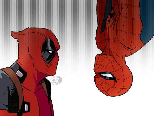
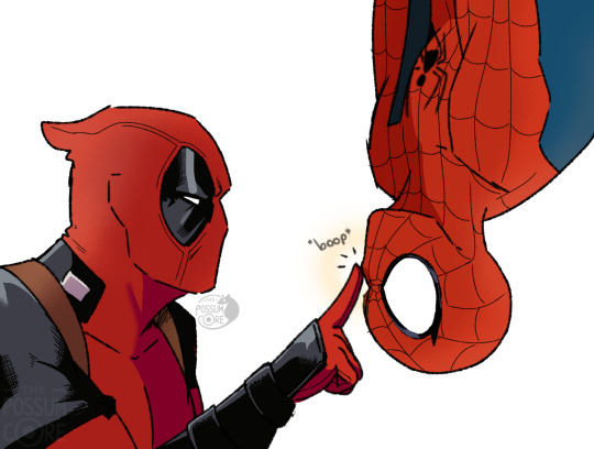
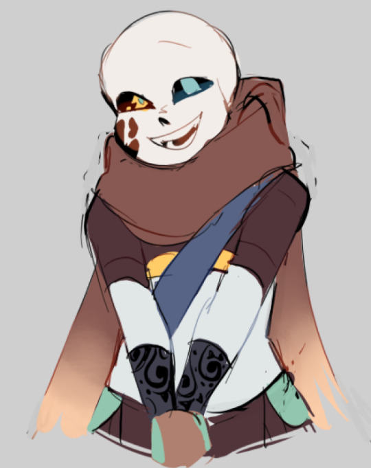
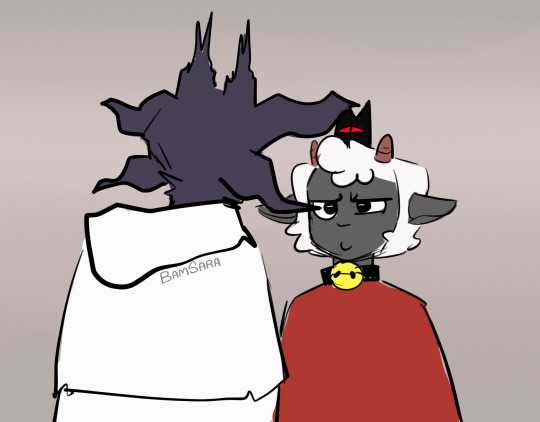
simplemente no lo pude resistir…
amo esta apreja <3
nightmare : @jokublog
ccino: @black-nyanko
1K notes
·
View notes

Text
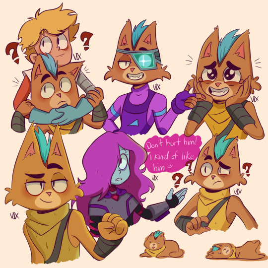
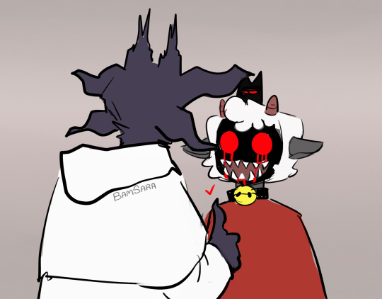
I don’t like the way I drew little Cato here but it turned out nice either way
260 notes
·
View notes
Note
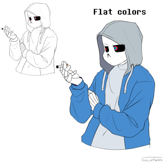
uh hi can you give some shading tips? pls?
Sure! :DD
I think the easier way to give some tips is by showing my own process.
(I won't explain here the basics of shading, but if you want I linked a tutorial down at the end of this.)
First off, the program I use is Krita (but any program is ok 👍✨)
And here's the brushes I use:

I'd say use at least two brushes. A soft one and a harder one.
To show you I'll use this doodle I did of Murder!Sans (by @/ask-dusttale)
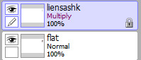
First, flat colors.
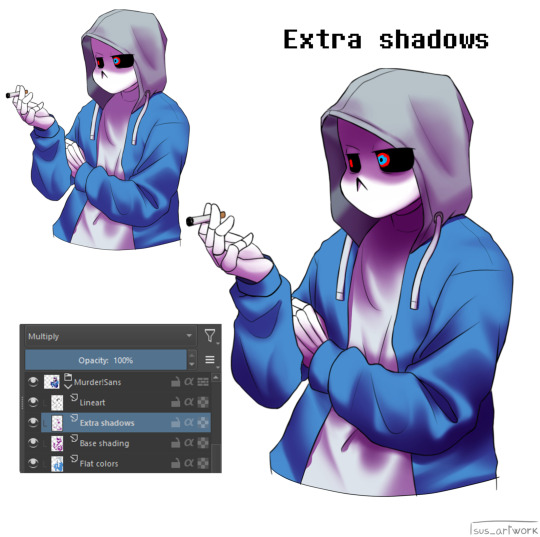
Then start shading on a new layer and put it in Multiply mode, then change the opacity at your liking.
Don't use black for the shadows! Use a dark color.
I usually use a purple or a brown.

Now with the same color, go on a new layer (Multiply mode), and add extra shadows where light has trouble reaching.
This gives more depth to the drawing.
(To make this process easier I use the Select Opaque option, by right clicking on the Base Shading layer, down in the menu, and then paint on the new layer)
Now fill the canvas with the light's color (or do like me and duplicate the Flat Colors layer, and recolor it if you want the light to be only on the subject).
I'm using yellow since it makes a nice contrast with the purple.
Put it in Pin Light mode and change the opacity at your liking.

Aaaand
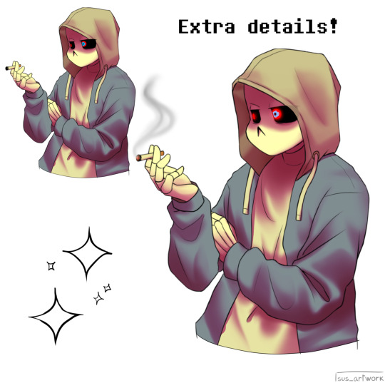
You could say finished!
We could stop here, but if you want some extras, go under the cut:
-EXTRA-
Now I-
I can't explain what "Bouncing Lights" and "Sub-Surface Scattering" are, so... go see on internet :''D
Basically slap some red and blue over the shadows layer in Overlay mode and voilà
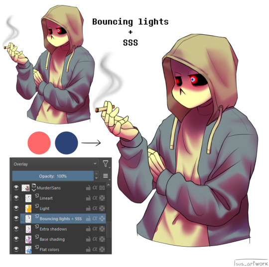
It'd be more noticeable with less light but trust me, it's good
Now let's talk about ambience.
We can create many different scenes just by playing with the light and shadow layers!
Change their colors, change the blending mode, play with 'em and see what you get:

Also I suggest studying how color schemes work (I'll link you a video down below).
I uhh actually kinda suck at color schemes XD but having at least a basic understanding of them it's useful.
And, here's some tutorials that personally helped me a lot:
Shadows and lights tutorial/tips <- great for learning the basics of shading
Time saving shading solutions
This great rendering tutorial by @/licollisa
Different color schemes
For any questions don't hesitate to ask me (^w^)
142 notes
·
View notes
Note
May I ask on how you choose your colors when you color your art pieces? It is so pretty to look at the colors of your art, and I want to color like that, but color picking is very hard q-q
here's!! uh, the general areas in the color wheel where i try to pick depending on the vibe
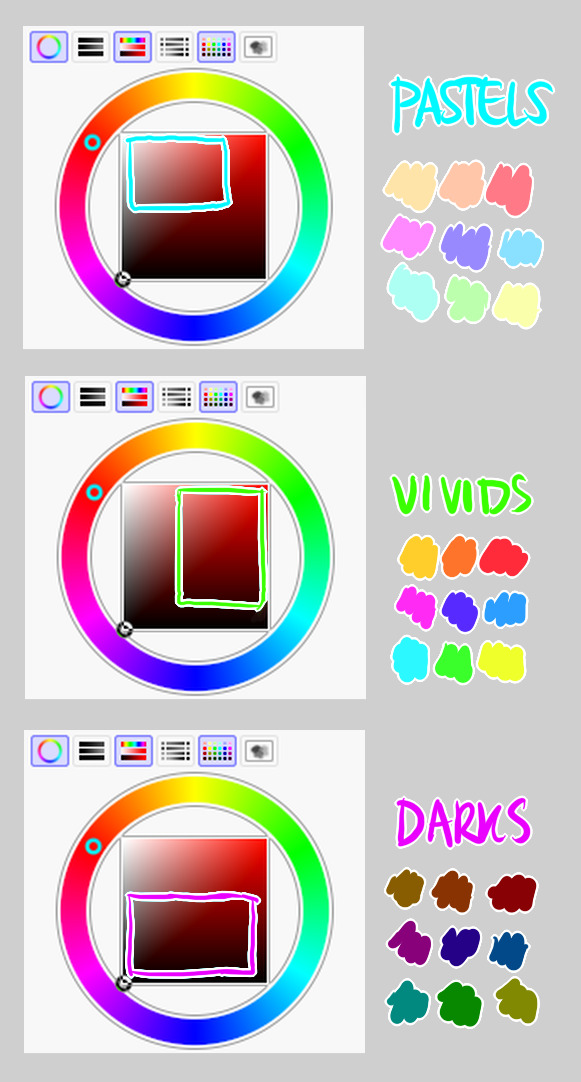
highly inaccurate because tbh i just color pick directly or try to guess the colors from my references and just adjust them to be a little bit more pastel or to the atmosphere
and if i have their colors memorized (such as ink or dream), i just pick by memory or by my modified colors LOL

color your scrunkly!
set your line work to multiply and lock opacity
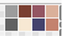
i use warm tones for white ish colors so uhhh idk whatever warm color from here
color the line work!!!!! ofc, shift the hue depending on the undertones of the surrounding colors
the skull color is a warm off-white, the undershirt is a blue-ish off-white, scarf is warm brown, so on and so on
the multiply function rly helps just blend things into the palette a little more, but if ur confident enough, you dont have to set it to multiply at all for extra variation
minimal shading by just taking the surrounding colors n adjusting the hue slightly n its value n saturation
gives it a very messy cel shaded look! been into it lately and stuff

and then i add a few overlays using the pin light layer mode!
i usually use these two colors together, it gives the right amount of pastel colors that really appeals to me
if you have access to gradient maps, i recommend using them lots!
it makes the pieces look a little more cohesive
the pin light layer mode imitates it n is very versatile if u cant use them though (like me when im just doodling on sai)
that's it!!! that's the basic rundown of how i color
i'm not very well versed in color theory so i can only do very basic color picking tips, but maybe next time i can offer ways on how to color more atmospherically!
have a nice time coloring your blorbos ✨
394 notes
·
View notes
Text

finally figured out how i wanna draw glam freddy!! i stylized him a bit more to fit my art style !!
2K notes
·
View notes
Note
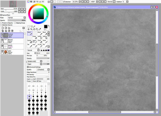
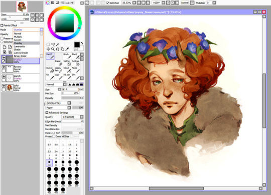
What’s your render process? It’s so pretty ^.^
Hehe thank you!!!
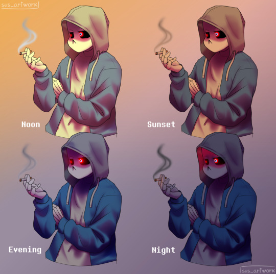
I'll use an out-of-context Night drawing to share the process XD
So first I'll make my sketch, line art, and then my flat colors. A lot of the time, I'll add in some gradients and subtle glow at this stage just to add in some more color variation for when rendering comes around. I also dont draw in all the details yet — like the string that'll be around his brooch later or his face marks. Whatever I feel like will get in the way of the painting process and will be easier to add in later, i leave out for now.
Now the ✨️ugly portion.✨️ For the lighting and shading, I use a paint brush. For the shadows, I'll usually pick them from the wheel myself, rather than using a Multiply layer. Then, for the lights, I'll almost always use a nice bright orange color on a Luminosity layer (note that this is on Paint Tool Sai — the equivalent to Luminosity is an Add layer on most other programs) and slap those on where I think the lights go.
Shit's really messy at this point djejejwj but that doesn't matter toooo much. 80% of the drawing comes from the next step, the painting. It doesn't matter much if ur lights and shadows are messy rn cause it's gonna get all cleaned up anyway aha.

And now we're onto the painting, and this is the point where we merge everything down into one layer and start going ham :0. Usually, what I do is I take Paint Tool Sai's Water brush + Marker brush and start blending out all the colors and cleaning everything up. I color pick whatever part of the drawing I wanna clean up, then I'll blend it out and define the shapes until i feel satisfied with how it looks :DD this part of the drawing took around 2 to 3 hours maybe? Like I said, this is most of the drawing process aha
AND NOW THE BEST BIT, THE COLOR CORRECTION AND FINAL DETAILS !! This is where I make the glowy bits REALLY glow, and make the colors look a little more cohesive :0. Also, I up the contrast more, make them darks look darker and them lights look lighter >:D
And that's pretty much it, I think 🤔🤔 if there's anything anyone would like me to go into more detail with, I'm more than happy to answer :0 I like playing art teacher hehehehehe ❤️❤️✨️✨️
274 notes
·
View notes

Photo

Forever love for Teen Titans Slade. I wish we learned more about him and why he’s so deliciously evil.
I put some elements of the Teen Titans Go design in there, though. I love Ron Perlman’s rendition, but the TTG visual design is more cohesive.
555 notes
·
View notes
Note
Kannst du deine Brush einstellungen bei Paint tool Sai posten? Bitteee ;v;
Klar, gern! : )
Showing you guys my SAI brush settings I use the most!


3K notes
·
View notes
Photo


Tutorial on how I color hair! It’s very stylized, but easy to do.
[Note: only works for straight hair, but i hope it’s still helpful!]
:commissions:
17K notes
·
View notes
Photo
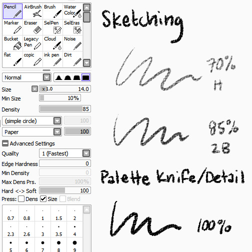
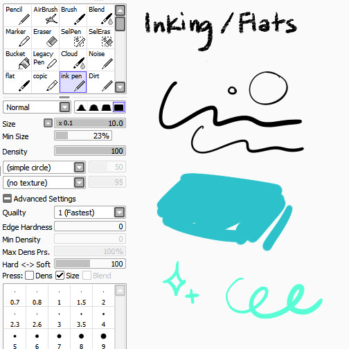
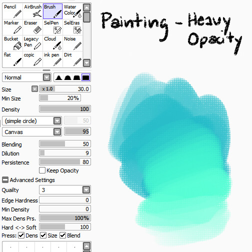

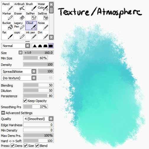


I’ve been getting a lot of asks lately about the brushes and textures I use in my work, so here’s a BIG FAT REFERENCE POST for those of you who were curious! Bear in mind that I’m really lazy and don’t know what half the settings do, so don’t be afraid to experiment to figure out what works best for you :>
BRUSHES
Pencil
I use the pencil tool with SAI’s native paper texture both for sketching and for applying opaque color with no blending. Lower opacities give it the feel of different pencil hardnesses, while full opacity makes it more like a palette knife, laying down hard-edged, heavy color for detail work or eventual blending with other brushes.
Ink Pen
Mostly made this because I’m lazy and I didn’t want to have to keep turning my textures off/opacity up when I wanted to ink something (even though I don’t do it very often), or lay down flat colors. I find the line quality to be much more crisp than Photoshop, and you can manually adjust in-program stabilization to help smooth out hand wobbles.
Round Brush
The plain ol’ brush tool acts as sort of an in-between for me in terms of brush flow. It’s heavier than my usual workhorse brush, for faster color application and rough blending, but not as heavy as the pencil tool, which has no blending at all. I like to use the canvas texture on this brush to help break up the unnatural smoothness that usually accompanies digital brushes, but it works just fine without.
Flat Brush
A brush tool set to flat bristle (try saving this bitmap file to your elemap folder if your version of SAI doesn’t have it) is by far my favorite to paint with. I don’t use any textures with it because I think the shape of the brush provides enough of that by itself. I use it for everything from rough washes to more refined shaping and polish. It’s just GREAT.
Watercolor
Best used for smooth blending, washes, gradients, and smoky atmospheric effects.
Cloud
Basically a grittier version of the watercolor tool, because too much smoothness weird me out. Good for clouds and fog, as the name suggests, or just less boring gradient fills.
TEXTURE OVERLAY
To further stave off the artificially smooth look of digital painting, I almost always overlay some sort of paper texture, and it’s almost always this one, which I scanned and edited myself. You’re all welcome to use it, no permission required!
Using overlays in SAI is just as easy as using them in Photoshop. Just paste the texture into its own layer above everything you want it to apply to, and change the layer mode to Overlay. That’s it!
Want a more prominent texture? Up the contrast. Something more subtle? Lower the contrast or reduce the layer opacity. You can also use a tinted overlay to adjust the overall palette and bring a little more color unity to an otherwise disparate piece! Just be aware that too much texture can hurt the readability of the work beneath it, so I’d err on the side of subtlety.
Hope that helps!
-L
124K notes
·
View notes
Text
✧ simple tips for how I draw full beards ✧
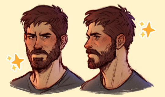
[ I don’t take tutorial requests, so please don’t ask for more! ]
Continuar lendo
2K notes
·
View notes

