Don't wanna be here? Send us removal request.
Photo
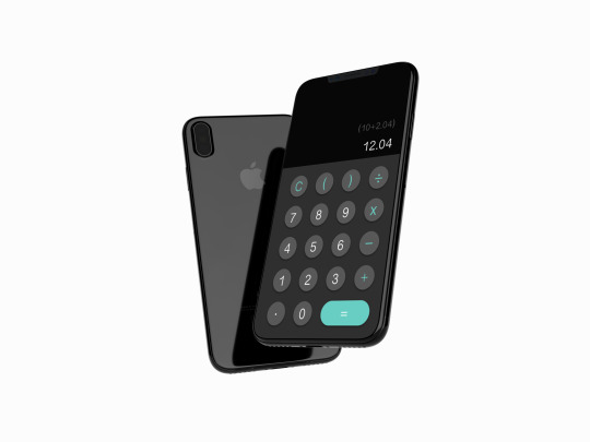
Daily UI challenge - Design a calculator.
For this challenge I just wanted to create a basic calculator as it’s the first time I have made one. I just went with a simple layout and colour palette. I had planned to create a calculator based around food recipes but I decided I didn’t want to over complicate things and stuck with a basic calculator.
0 notes
Link
For creating a landing page for the daily UI challenge I looked at this article which I found really helpful, it shows a wide variety of examples of landing pages and also analyses the good and bad points of each page. I found this really helpful to see what I need to include and what I should avoid.
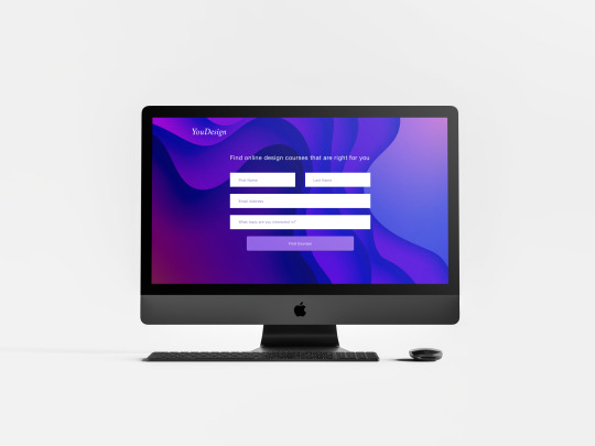
Above is the landing page which I created. It’s based on a made up brand and concept; a website search tool which finds online design courses for each user based on what topic they are looking for. I spent around 15mins making this and came up with the concept as I have been trying to find online design courses while in lockdown, but most design courses I have found all revolve around graphic design and are very expensive.
1 note
·
View note
Link
I wanted to create a sign up page for my NewsAid app and found this article really helpful as it pulls together 10 different examples of sign up pages and analyses what each page does well and what could be done slightly better after some A/B testing.
0 notes
Text
Accessibility Toolbars


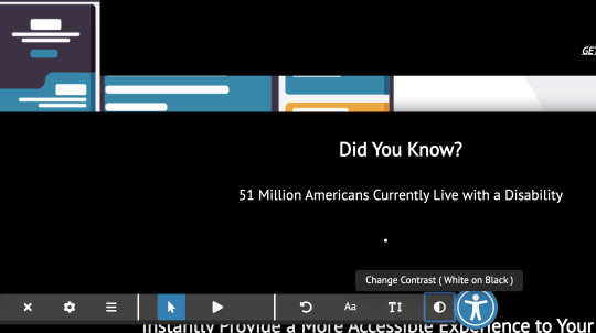

Another example which I looked at was the one above, again this toolbar appeared when you clicked the “man in blue” and then offered a range of accessibility tools. I think this is another good example, but does not offer the vast range of features as the audioeye website. However, I think I would like to include the man in blue icon as it is internationally recognised as the disibilty symbol.
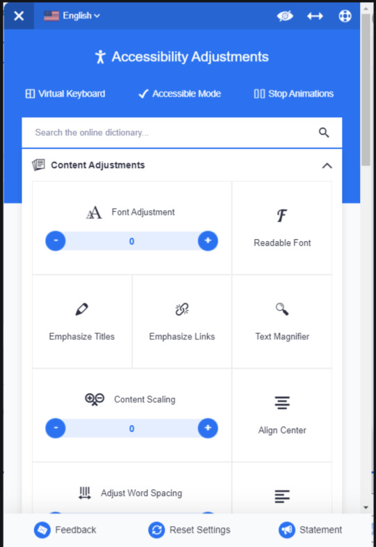
The above example which I also looked at is just an image, but I think it is another good example of a toolbar layout and the icons which I could include. I had originally went for a toolbar layout similar to the above, however I want to move towards a pop-up toolbar which is always present on the main page. Although I am creating an app which limits the space I have but it may be possible depending on how concise I am able to make it.

Another example I looked at (above) follows a sort of Microsoft word style and allows the user to style the text to suit them. I think this is also a good example but it offers very limited tools.

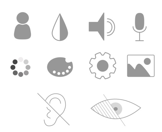
Above are a few more icons which I came across which I think may be useful for my app. It is good to see an example of a colour palette icon as this again is one I struggled with.
0 notes
Text
Audio Eye - Toolbar

A website which I looked at was Audio eye. When you first go onto the website the toolbar at the bottom is hidden, when you click the icons on the right toolbar it then appears. I think this is a great idea as it creates a more simplified and minimal screen and gets rid of any clutter.

When you click on an icon circles appear to highlight the number of settings there are, which you would then need to click the icon 4 times to see the 4 different settings. I also think this is a great idea, I was struggling with placing the different settings and how to show them without any confusion.


When you hover over each icon a text box comes up to tell the user what the icon is for. As I want my app to work with a screen reader I was trying to include a caption for each icon which I now think I will include a pop-up text box instead to minimise the clutter.


The toolbar also features a reset button to change all the preferences back to default.

The toolbar also features a reading guide which helps the user to follow the sentence along with the help of the thick ruled line. This is a feature I hadn’t even considered or known about, so I plan to try and incorporate it too.
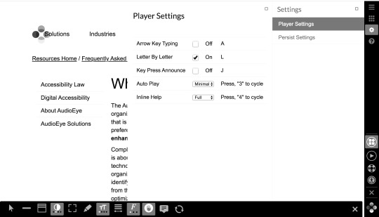
The website also offers the player feature along with settings specifically for that. This is something I had considered but again was struggling with the layout.

This was a great example which I found really helpful and plan to incorporate similar features in my revised toolbar.
0 notes
Link
I created a slidedeck of my proposed idea and the early layout ideas. I plan to tidy up the toolbar and simplify it as much as possible, for this I plan to look at a range of accessibility toolbars and guidelines to follow. I want to create the most accessible app possible while still making it look visually attractive and highly functional.
0 notes
Link
From reviewing the layout of my app, I want to simplify the toolbar as much as possible and limit the amount of screens when adjusting the content preferences. For this I have looked at a few different accessibility toolbars and the style which they follow. This also helped me with the icons I will need. “Man in blue” is an internationally recognised accessibility icon which marks the entrance to the Accessibility Toolbar on websites. I found this article really helpful as it was able to give me a further insight into how to cater for my target audience.
0 notes
Link
I looked at this guide for my research for my app. It gives helpful guidelines on text sizes and weights to use for people with visual impairments. It also gives examples of typefaces which can be used. As my app is aimed towards maximum accessibility for people with hearing and visual impairments I found this guide very helpful and was able to gain an insight into the typefaces and sizes I should be using for my app.
0 notes
Text
Freemium Pricing Strategy
https://blog.hubspot.com/sales/pricing-strategy
A combination of the words “free” and “premium,” freemium pricing is when companies offer a basic version of their product hoping that users will eventually pay to upgrade or access more features. Unlike cost-plus, freemium is a pricing strategy commonly used by SaaS and other software companies. They choose this strategy because free trials and limited memberships offer a “peek” into a software’s full functionality — and also build trust with a potential customer before purchase.
With freemium, a company’s prices must be a function of the perceived value of their products. For example, companies who offer a free version of their software can’t ask users to pay $100 to transition to the paid version. Prices must present a low barrier to entry and grow incrementally as customers are offered more features and benefits.
For my app I plan to use the freemium pricing strategy. I am going to offer the app for free and allow all users to create a profile for free. The app will then allow users to subscribe to a monthly newsletter which is personalised to them depending on the settings they have chosen, the subscription will be at a small fee of around £5.00 per month.
0 notes
Link
I have created a mood board of visual marques to try and gain some inspiration for my own brand. Most of the images which I found all seemed to show a wide variety of bright colours to highlight diversity and often an illustration of people coming together, by holding hands or being linked in a circle etc.
As my app is aimed at being as accessible as possible for everyone I don’t think including loads of bright colours would work as people who are colourblind may not be able to see a clear contrast. I want to go for a more simple colour palette with a stark contrast so it is clearer for everyone to see. I plan to go for an illustration hands in a sort of hand shake, to symbolise someone giving a helping hand which is basically the whole purpose of my app.
0 notes
Text
Wireframing


I created a few different wireframes for my website when trying to work out how I want it to look. I love the idea of the detective board as the main nav and plan to include that. I think its a really nice idea and will be interesting for users. I also like the sort of sticky note idea for extra information and plan to include that within my website.
0 notes
Text
Sitemap

When considering the content and layout of my website I created a sitemap to try and get a feel for where I want everything and how my website will work.
0 notes
Text
User Personas - News Aid
User Persona 1
Name: Joe
Age: 37
Needs: To be able to consume the news with a variable colour palette due to being colour blind and struggling to see colour contrasts clearly.
What am I offering? An app that is personalised to the user and strives to create an experience which is as accessible as possible.
Pain Points: News websites don’t offer a variable colour palette or an experience personalised to the users needs depending on visual and audio impairments.
Devices used: Phone and Ipad.
User Persona 2
Name: Beth
Age: 18
Needs: To be able to consume the news in a larger text due to visual impairment.
What am I offering? An app with variable text sizes and colours to personalise the experience to the user.
Pain points: Most apps only have one font size and to see it better or at a larger size the user has to zoom in on the text which is extra unnecessary hassle.
Devices used: Phone, Ipad and laptop.
0 notes
Link
For my research I also looked at this really useful website. The website gives a breakdown of the estimated number of people around the world who suffer from hearing loss or deafness. I found this really helpful in gaining an insight into the estimated number of my target market and was able to gain a better understanding of who exactly I am aiming my app at.
This also reminded me that my app could be for a user of any age and there are no restrictions on who may be affected by hearing impairments. Although my app is aimed at users from around 18+ due to sensitive content within the news, I would like to consider also developing a news section aimed at children.
0 notes
Link
I found this useful article about jobs-to-be-done and user personas. It gives a great breakdown about what each one actually is and offers comparisons and what each one is useful for.
I was struggling to create a job-to-be-done for my own app and found the below diagram (from the article) to be really useful!

I created my own jobs-to-be-done, based off the above diagram.

As the main job-to-be-done from using my app is to consume the news (with no barriers) I struggled to think of an emotional criteria which is also sociable. As the app will mainly be used from the comfort of the users home and will mean them not having to go out and buy a newspaper I cant really think of any social criteria.
0 notes
Text
Icons
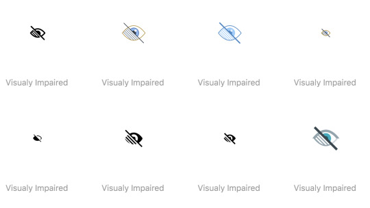
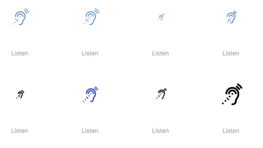
As my app is aimed at those with visual or audio impairments I started looking at different icons they may face and use everyday. I want to make sure that the icons used in my app are widely recognised and won’t cause any barriers. These are some of the main icons which I looked at.
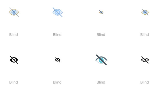
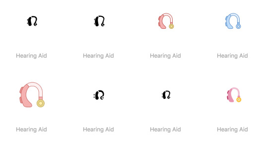

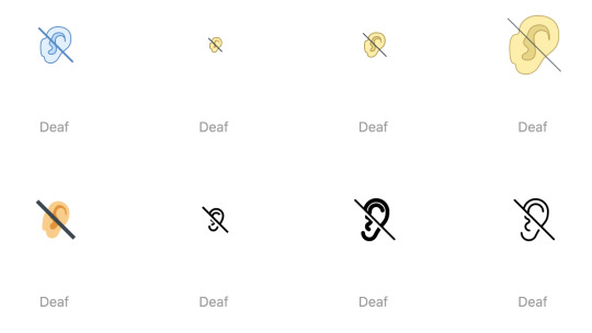
My Icons
I started to sketch a few different icons which I may use within my app. They are all quite simple icons and I wanted to create my own to use in the app.


I then started making a few of them digitally (the ones I’m sure i’ll need). I struggled to make an icon to represent the colour palettes available, I made 2 different ones but still don’t think I’ll use them. I have seen a few different websites use a “T” as the icon for colour palette, I haven’t been able to find out what it means yet, but I think i will aim towards using the “T” for my app also as it seems to be widely recognised.
0 notes
Link
From deciding to aim my app at people with visual and audio impairments I wanted to research my target audience a bit more. This document which I found gives essential facts and figures about people with visual impairments and an estimated number of people who suffer from it. Although the number of people is not massive compared to the world population I still think they are a very important niche and shouldn’t be forgotten about.
Although I may only reach an even smaller number again I would like to try to make the most accessible news app as possible for my target market.
0 notes