
lapublicites
31 posts
freelance creative graduate from ravensbourne university london | https://jsturgeon.myportfolio.com/
Don't wanna be here? Send us removal request.
Statistics
We looked inside some of the posts by lapublicites and here's what we found interesting.
Average Info
Notes Per Post
33
Likes Per Post
1
Reblog Per Post
32
Reply Per Post
0
Time Between Posts
23 days
Number of Posts By Type
Text
17
Last Seen Tumblr Blogs


Fun Fact
Tumblr.com is the 103rd most visited website in the world.
Text
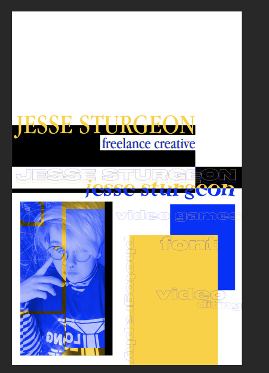
SELF PROMOTION
I started off my self promotion idea with, well, nothing.
I left it to the last moment as I had to focus on my main project and all of that.
Over the last two days (14th of June), I’ve been thinking about what exactly to do. I thought about how best to promote myself, what do I like? What do I do best? These questions lead me on to a starting point.
Blue and yellow.
Blue and yellow are my two absolute favourite colours and I thought that they should be the main colours in my self promotion. I went with these colours and decided to look down my ‘adverts’ pinterest board, which includes a load of posters that I find interesting and inspiring, and it was!
The posters and photos I decided to look at and research all have a lot in common. They all have two prominent colours + one background one (and occasionally just black and white). As well as that, they mostly feature squares and lots of grids. While my work doesn't feature any grids, it does feature the two colours (blue and yellow), squares and also multiple eyes, that were included in one of the pictures I researched.


These pictures remind me of vintage skateboard and snowboard magazines, which I’m very interested in! I love the typeface they use and managed to grab one of them for free (which I ended up not using, but as you can see I did try to implement it)
I messed around with quite a few different ideas, different fonts and more…

The beginning. I started off with just a black square and Rochester Twee font - I absolutely fell in love with this font, for some reason it just works so perfectly and is very aesthetically pleasing for me.


Here’s an up close picture of my face with my editing - the eyes came from one of the posters I researched.

I tried the eyes without the yellow first, however they didn’t stand out as much as I had wanted them to, as shown here:

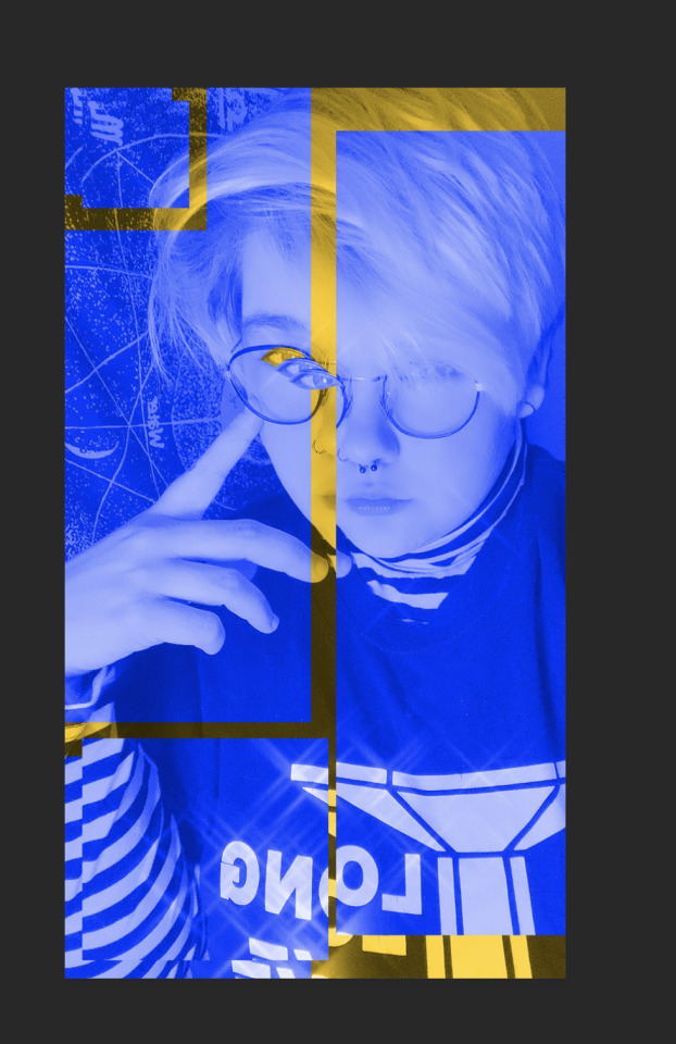
My dad helped me get to this point, which was amazing as I definitely needed a little creative guidance. We messaged around with the lines that went off from around my picture, then trying to bridge the gap between all the images to make them connect just like the images we’d researched. All of those images had something tying them to an anchor point and I decided that I needed to have them connecting.

However, I wasn’t completely satisfied.
I worked on this for ages, shifting through different fonts and other ideas and after deliberating with my dad, spending time looking at the other pictures for reference, I decided to make this piece my final idea.
With help from my dad, we went through the different pieces and picked out our favourite parts.
It encompasses me, my interests, what I can do as well as look creative.

I’m very proud of this piece. Not only does it work as a standalone piece, but I’ve used these colours and this specific font,

To title my PDF portfolio, which can be seen on my presentation - I feel as if this font and the way it’s cut will become a part of my branding for the future. While it may not always be in blue and yellow, the font really speaks to me. Overall, I’m very proud of this piece of work and I’ll be using this to promote myself in the future.
1 note
·
View note
Text
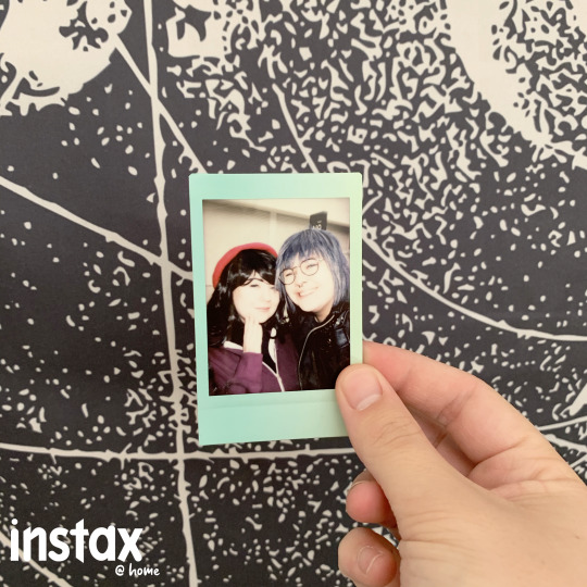
INSTAX @ HOME PROJECT.
For this project, I decided to recreate one of the first ever projects I did in my first year of university at UAL.
This project consisted of two images, showing off various polaroids that I had, however that project - although aesthetically pleasing - didn’t exactly make me feel any type of way towards it. It was pretty but I felt that it lacked depth and meaning, which always helps an advert feel more personal.
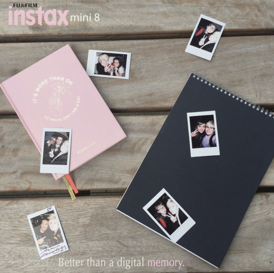
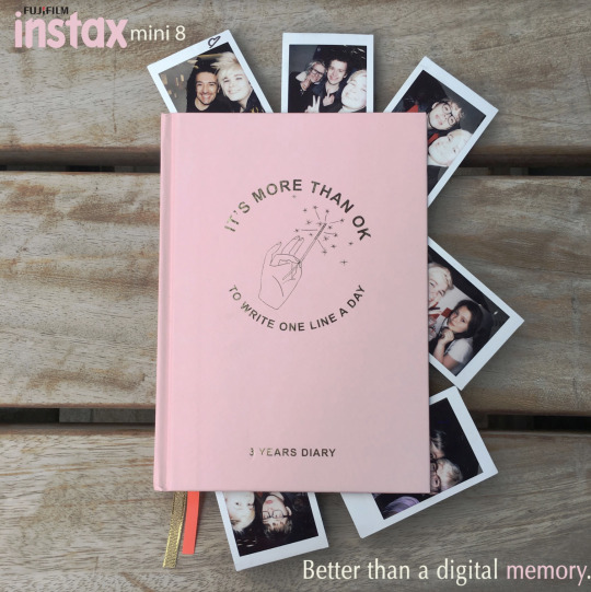
With this, I decided to start researching up previous Instax adverts. While I researched, I realised that their adverts were quite minimalist and bare and I wanted to step away from that.
Not every memory is shot like a day in an Instagrammers life, I wanted my adverts to be messier and more lifelike, something people can relate to in their busy lives, especially now with all of us staying home and houses getting messier, more memories being made despite everything and I wanted to be able to catch that at this vital moment.
I went through a lot of ideas, debating whether I should stay with just photo advertisements or branch out more. I decided on the latter, however the progress to it gave me a lot of things to research.
Instax’ previous adverts are very minimal.


They’re almost similar to my first try back in 2017, hence why I tried to go in a different direction. I focused less on the partying and the adventurous aspect that Instaxs hold, but I inside went for the more close to home and personal vibe.
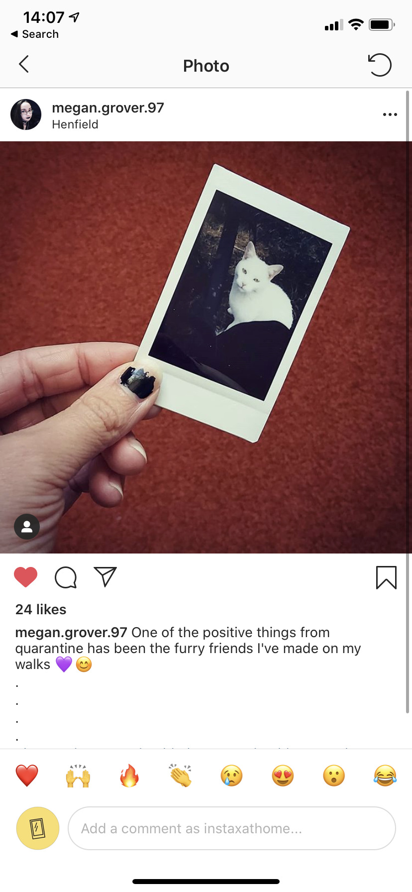
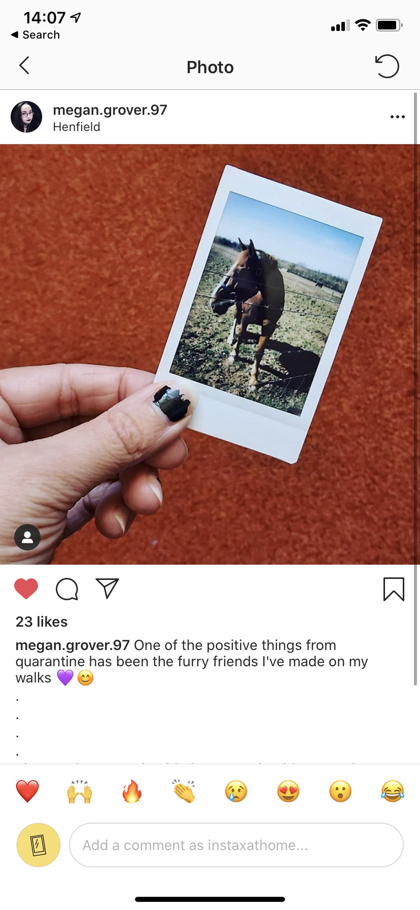
I asked my friends and people close to me to take photos of their own polaroids, scattered on their bed with things they love and that define them.
With these photos, I tried a few different methods of what I wanted to do (insert pic of the faded adverts w the slogan), I was still stuck on wanting to do print adverts before Brian suggested that I try to do this as a live project, so that’s what I did.
I researched into two projects, one called the ‘It Gets Better’ project (@itgetsbetter) and The Live Drawing Project (@livedrawingproject).
These two projects both have under 100k followers and while rather small, they still have a community within them. I first looked at ‘It Gets Better’.

The ‘It Gets Better’ project focuses on uplifting, empowering and connecting with LGBT+ youth around the world. Their posts are primarily video posts from actors and other people all around the world, sharing and showing their support for the LGBT+ youth, especially during this tough time. They’re still active, receiving a decent amount of likes on each post.
I looked at this project as I want my project to be able to uplift peoples day to day lives, showing them that there can be memories in everything, showing them that this quarantine can be used to create memories, despite how sullen the world is currently.
The second project is the Live Drawing Project.
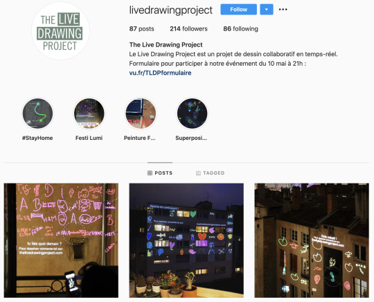
This instagram is the home of LDP, an art project started in France. While the location exactly is unknown (I’m unable to enter their website as I don’t have a log in), their instagram shows pictures of peoples art and creativity shown up on the walls of buildings and houses. They also have an event called the Night Of Illuminations where they’ll have people gather while they project the drawings for all to see in the night, making them show up best.
I absolutely adore this project, I love the fact that it’s still being updated this year and that many, many people are joining in.
While only a small following, they’ve been around for a year and have grown a gathering of people who will follow their projects. They also hosted various art lessons throughout France, which I found amazing.
I chose to focus on this project as I wanted to see the drive that a smaller instagram had. They may not have thousands of followers but they’re still updating and inspiring others to do the same as I said previously with the ‘It Gets Better’ project. I want to bring people together and to inspire them to create memories from their own homes.
I started to create the adverts with Instagram in mind and started to look through the photos and choose which ones I wanted to post first on the ‘gram.
I used these two pictures that my mum (picture one) and my best friend (picture two) sent me and used these to create my first set of posts on my Instagram.
I decided to have a white background as Instagram doesn’t have a ‘dark mode’ and therefore works with the minimalist feel of the whole account. I also used the yellow from the icon as it would match.

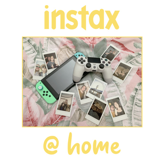
For the ‘@ home’ font I used Sweet Purple, a fun and simplistic style yet one that looks homemade and personal. I’ve used this font on other projects such as my Animal Crossing Amiibo Cards, that can be found on my portfolio here.
I posted these with a relatability in mind. I wanted to hone in to people's personal sides, to make them feel nostalgic and happy to look at photos that they took with loved ones and I want them to feel the urge to create them within their own home, to make memories that’ll replace the thoughts and things that have happened over the last few months.
While creating the Instagram posts, I decided to go with a yellow colour scheme. Yellow is not only my favourite colour but it’s also widely recognised as the happiest colour, according to sources. I wanted to keep the colours light and happy to keep with my message of creating happy and fond memories.
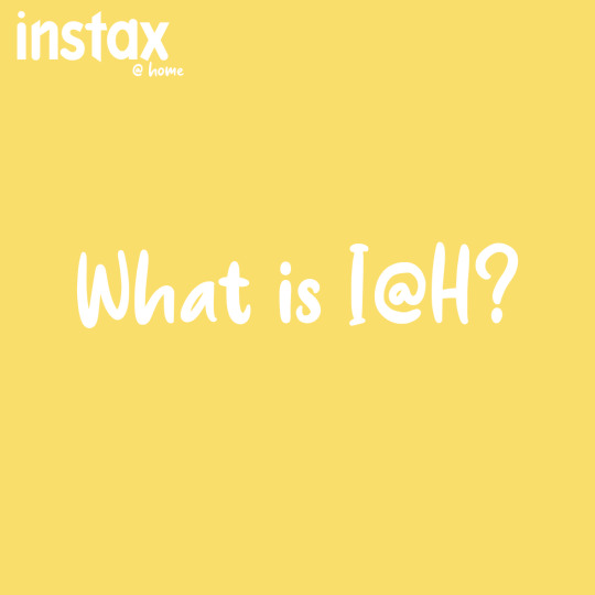
I decided on having ‘picture breaks’, where I’d include a picture like the one above in between photos to somewhat break up the posts, and to be able to give commenters a place to ask questions and talk if they wanted to know anything but didn’t want to comment on the polaroid picture itself. I added a post with what Instax @ Home is, explaining my ideas behind the project and what I would like people to do (partake, comment, tag me in posts, etc). This turned out to work wonderfully, as I’ve had people tagging me in posts!
I created 5 of my own polaroid posts to beef up my feed and to get traction within my account, creating content and tagging it so it can bring in more traffic to my page, as well as bringing in people who’ll want to take part! These photos are ones rom my past memories,


This is what the account looks like currently (apologies if the image is bad quality - it shouldn’t be!).

Now the Instagram is live and I’m waiting for people to start joining in. I’ve got a lot of likes on my first few posts and I hope that I’ll be able to continue this project well after the deadline, or for as long as quarantine is.
UPDATE: 17TH JUNE 2020, DAY BEFORE HAND IN
After I posted the images on Instagram, I got immediate following and interactions!

While I only have 30 or so followers, I’m getting interactions and people tagging me and sharing their own Instax pictures!

I realised, I shouldn’t be so focused on making new memories in a household, but instead finding the polaroids and reminiscing on the old photos that have been taken.
One person, under the @ silenceofthesunflower, they captioned a picture of themselves with ‘a long throwback, @instaxathome made me miss my polaroid camera. I should’ve brought it in with me’

This made me realise that people don’t particularly want to make new memories in this pandemic, but instead focus on the past ones to be able to remember happier times. I wanted to combat the sadness of the world's current situation by creating more memories, but I realise now that some people just want to remember, and that’s okay too. I will be posting both old and new polaroids to this account as a way to expand my userbase!
However, despite that, I do hope this makes more people pick up their Instax camera and use it more in the future. I have my own and I know I don’t use it as much as I should. This project has made me realise, as well, that I should be using my camera more often. I have the means to make memories so why aren’t I?
I know I will absolutely be continuing this project past my deadline and hope to make it a fully fledged account with followers and interactions daily.
0 notes
Text
8BITTER - A GLIMPSE INTO THE WORLD OF 8BIT
When I saw the 8BIT and Twitter brief from D&AD, I immediately took it. Gaming is one of my favourite things, it’s a pastime that I’ll always look to when I’m bored and Twitter is no different.
I will admit, I absolutely struggled with this. I found it incredibly difficult to try and wrap my head around how I’d break into the community. I looked down the #8Bit tag for weeks, deciding who and what to follow and how to make my voice heard.
One thing I learnt while researching into the world behind 8bit was a community full of artists. There’s a plethora of art based 8bit fans who thrive off the nostalgia and their passion for drawing.
I researched into the games that would be considered 8bit, I looked deep into Final Fantasy 1, Super Mario SNES, Zelda and characters such as Chun Li. These were my inspirations for my project as, for me, they encapsulate everything that is 8bit. The games, the genre’s, the popularity and the designs of each game really hones in on the style that was 8bit when it was at its prime.
Creating a mascot was my way of researching into the games that were popular during my demographic's childhoods. I wanted to create something that was nostalgic yet still modern enough to pique the viewers eyes.
In the D&AD brief, it asked me to come up with a way to bring together the current 8bit community that resides on Twitter and give it a new lease of life. I took this and ran with it.
With the help of my friend, I brainstormed and came up with an idea.
I created a gijinka (Mostly done in fan-art, it is the name for the humanisation of any animal-like character. Most popularly done with Sonic the Hedgehog characters, and Pokemon.) of an 8bit Twitter bird. I gave it qualities and designed it to become a mascot for the Twitter page @8BlTTER, which was going to be the home of all things 8bit. By creating a character, I wanted to slot in with the rest and give people a place of similar interests to reside and pull them in via the idea of a character.
Creating the fan art of my character for Twitter took a lot of preparation. I was stuck for a while, I’m not exactly an artist so it took some understanding and some learning of not only pixel type art and how to create it on an iPad, but also understanding the colour theory behind Twitters palettes and how they worked with it.
I’m extremely happy with my creation and I hope that this will help me create more art in the future.

On Twitter, there’s been a trend going round recently called Draw This In Your Style, which is exactly what it sounds like. You post your character with the hashtag and artists will come and draw said character.
I wanted to use this mascot to bring in creators and game lovers via hashtags and engagement. I looked around other accounts that have a huge following for a community page, such as Crunchyroll, which has a mascot with it. My mascot has various shades of blue which represents Twitter and then is done in a pixel-esque style. If you zoom in, you’ll be able to see the amount of work that has gone into this pixel.
Mascots give people a connection to the Twitter. They see a person and rather than thinking they’re interacting with a brand of a brand-esque project (such as this), and it brings them closer to the account in question.
Crunchyroll is a perfect example. Here, you have a mascot that’s been taken to conventions, used on stickers, temporary tattoos, merch and so much more! Having a mascot makes people relate and enjoy the Twitter more which is why I focused on making a mascot for my project.

Doing weekly # challenges would also bring in pre-existing creators of the community and would encourage them to do the challenges, thus bringing more traffic into my Twitter feed as people follow the challenges that the account set up.
Besides hashtags, I wanted to promote Tweets. I delved into the world of advertising on Twitter and learnt the differences between promoting a tweet and posting an advert onto their website. Promoting a tweet means you will have to pay per like and with a stand alone advert, you would be paying for the time it was up.
I decided that if I were to do this, I would do it via promote tweet as the payment per click averages at $1.32 which keeps in check with the cheap aspect that the brief was looking for. https://articles.aplus.com/art-seen/twitter-draw-this-in-your-style-challenge?no_monetization=true

While I didn’t gain the engagement I was hoping for with this project, if it were to be manned with Twitter behind it and became a rather big page, I feel as if it would prosper and not only create a place for creators to reside but to become the first check in page for all things 8bit with minimal spending, if anything at all. Just an understanding of the algorithm that is hashtags.
With this project, I didn’t exactly go ahead with any prototypes. While I’ve been working and stuck at home, I’ve been faced with some rather difficult decisions however I didn’t let this shadow my thoughts and pushed on to create work. I believe that what I’ve done, regardless of the amount of practice, with my research and pre-existing knowledge of the community, fits the brief and has created a place where people can join together.
I researched into the advertising aspect behind Twitter as well as the fonts used by them. Planning took a long while as I had to focus on two projects on once but got them done! I really feel like with Twitter backing me, this project could go on to do big things as I have many plans for hosting things on this account. I would love to try and keep it up outside of this project.
A few other things I was planning on creating for this Twitter would be for things like game nights, being able to host streams, artist spotlight and many more things, as well as creating an online space for people to get away from the current state of the outside world. While I did have these in mind, the deadline is up and I haven’t been able to put any of those plans into action, however I do think that if this were ongoing, it would have the capacity to bring people together in huge numbers and properly lift off.
Here are my final outcomes, showing my account layout. Everything else can be found within this document.


0 notes
Text
FANFIRE - AN E-COMMERECE FANSITE
For my self directed brief, I decided to create an e-commerce website.
E-commerce website I hear you ask? Hasn’t that been done before? Well yes, of course, but never like this.
The concept I have for this website is that it would be used for fan artists to sell their merchandise online with an easy to use shop front and clean, minimalist aesthetic. The shoppers have the experience of a tab-oriented website which makes it easier to connect with artists shop fronts and have a database of artists creating content that the consumers want to buy. I wanted to eliminate the task of looking for an artist and instead create an easy, tag based fan art website where all artists can be based.
It took me a while to actually get to grips with the idea of mocking up a website. Website building wasn’t something I had tackled before, however I took on the challenge and it was actually really enjoyable!
I looked into colour theory for what I should be using and decided to go with an orange base colour. I went with orange as it goes with my name ‘Fanfire’, the spark behind the artwork. Brian gave me a good page to research on the https://en.wikipedia.org/wiki/Yanar_Dag which is a natural gas fire that blazes continuously. I took this idea with me and the name of my website, making the title and the main colour orange.
Matching that with other similar colours made the website feel warm and welcoming yet still minimalist and aesthetically pleasing with an easy to use interface. This also makes the whole website mobile friendly due to the simple nature of it.
For my research, I delved deep into websites such as Etsy, Storenvy, Redbubble and BigCartel. I took what I thought was good about them and placed them in a document before beginning to apply these things to my own work.
I looked down different artists' shop fronts such as lemonboba.bigcartel and maobaby.ca. Maobaby was originally a fan artist I followed, yet they have gone on to create their own merchandise alongside fan art.

(maobaby.ca)
One of these things that these websites don’t have in common is an easy search function.
While you have the better end of search engines such as Storenvy and Redbubble, you have a limited amount of room on Bigcartel, who only gives the artist a url to their name and no place where consumers can search for a specific thing and find multiple artists who post that art.
They have no search function like that which makes it hard for artists to place their work out there without them having to post the link directly. Bigcartel shops are difficult to stumble across as you need to know the artists url name to find the link.
I’m now going to start on my process, showing you how I created my mock up.
I went through many stages of trying different colours and various shapes and sizes of the products and pieces.
This is the base I started off with and my earliest screenshot.
I tried to create a different look for the website, going with something none of the others had which was darker boxes where the text would go, however after messing around I realised that it didn’t exactly look like an e-commerce website. To me, it felt like an Instagram page or a blog page which isn’t what I wanted.

I worked on this for hours, changing many of the squares and taking inspiration from the other websites mentioned. I wanted a clean yet inviting website for people to use.
I ended up with this design which I am incredibly proud of.
Here, it shows the use of my # tagging system which makes my website stand out from the rest. Other websites don’t go by tags, meaning it’s harder to find specific things while also throwing your net wide and bringing in customers.
This can be seen under the title.

I also created a basket which can be hovered upon in the top right hand corner.
It went through many design phases where I decided what worked and what colours went well with the boxes and existing website.
Here, I was testing different fonts (Arial) and different colours on the backgrounds.

(first design dimitri art by twitter.com/kotumari, used with permission
While wanting to keep the orange, I kept messing around and changing shapes before I ended up with this. The second image is my final basket design. This works with the current layout as it’s minimal and smart and has a professional look to it.

(second design dimitri art by twitter.com/kotumari, used with permission)
After I made the basket layout viable, I decided to see what it would look like if it were hovered over on the website and I must say, I really really like it. It looks incredibly clean and easy to use.

As the final mock up piece of my e-commerce website, I decided to show off the unique search function that I have created.
While going hand in hand with the tagging system, I decided to add a clean and friendly interface in the way of filters on the left hand side which can help you narrow down your options.
There’s also a recent searches tab on the right which I haven’t seen as a solid piece in any competitors website yet.

This design went through many, many stages. This was the before.

I messed around with different fonts once more however, as I had already created a product page, the colours were fairly easy to decide on as I wanted to keep orange the main and constant colour throughout all of my work.
I asked many people on Twitter for feedback on my work throughout this process and received some valuable constructive criticism on my work and some pointers as to what I should do, which I will show below.
Getting this feedback is vital for me as it made me able to realise mistakes I had made and learnt new ways to not only improve the website for myself but for what potential users of said site would like to see and use.


As you can see below on my search page, I took the feedback and edited my work accordingly. I added a wishlist button and made the fonts clearer as well as sorting out the actual layout of the whole thing.
Here are the final pictures of my website mockup on Photoshop.
(art used with permission from twitter.com/thanhuki, twitter.com/kotumari and twitter.com/stagfriend) I’m exceedingly proud of this as I had never done something like it before.
I want to say thank you to my friends for helping me with brainstorming this project. I would never be able to have done this without you!
0 notes
Text
The last image didn’t send.

Apple Brief - November.
In November, I did a lot regarding the Apple brief.
I edited the interview Louis and I shot and uploaded to vimeo (here)
I also began editing my final piece. I’ve decided to split it into 3 ten second adverts and use them for things before Instagram posts and Youtube videos, etc.
I also designed t-shirts and badges.


Unfortunately, due to time constraints, I won’t be able to create the t-shirts for hand in but may attempt to make them for the final show.
My first ideas for t-shirts were basic.


In the end, I actually really don’t like them because they don’t fit with Louis’ image. I tried to go with basic ideas, unsure of a brand for Louis at the time I made this.
With the first logo, I created that quickly and used it as a crutch because I didn’t think I could do better. However, now I realise with a little more planning and thought that I would actually be able to create something better and more fitting.

For my work, I’m using the font LIQUIDO. I feel like it flows better than my original idea and I feel way more confident using it as I feel like I would see this as a product design.
5 notes
·
View notes
Text

The posters below are the final ones I’m using.
For the first, below:
For this poster, which is the second of my final three, I decided to go landscape rather than portrait just so I could have a bit of variety between the posters.
As well as that, this poster worked well with the image chosen which was another one taken by Louis. This image is also seen on the badges so it ties into that and they work well together, which is something I’m very pleased with as I wanted the flowers somewhere within the work.
The reason I wanted the flowers was because of the badges I chose to create use this image in the background and they work well with this image, so I was thinking that they would be good as a set, therefore adding another piece of merch to my selection - a bundle.
For the second:
This is one of my final posters. It’s in the design of a tour poster, which Brian actually suggested to me.
This idea was exceedingly fun to execute and I’m glad it ended up in a way that I actually really, really like and would put up on a wall myself.
The colours are on brand with the orange and blue and they match with the other merch I’ve created for this project, as well as the adverts I’ve made too. I wanted everything to go hand in hand and wanted to focus on the brand identity in this one.
I did, however, have an idea of using photos of Louis for the backdrop but never got around to deciding whether I wanted to do that.
And for the third:
Another one of my final posters, for this design I decided to leave the font heavy posters behind and go ahead with more images rather than text!
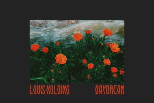
The images provided are ones that Louis has let me use and seeing as they’re taken by him, they’re personal and fit in with the brief. As well as that, the blue and the orange fit in with the entire branding I’ve gone for, for him, and works incredibly well with his other album covers (found on bandcamp.com/louisholding).
The prominence of orange and blue throughout his previous albums was something I wanted to keep through the brand identity creation as it was something established by him.
For the final outcomes, I’ve printed multiples of the three poster designs, and the badges as well as two adverts which are suited to be before and after Youtube, Facebook Videos and Instagram videos.
As specified on the brief, I chose two or more media channels to put my work onto. I chose:
Brand Identity
Short film / advert
Printed media
All of these things have been shown throughout the posts on this blog in the form of progress pictures, however I will now show the final pieces, set up and prepared.
I also have badges, which the design can be shown further up.
As well as that, I have my final adverts that can be found on my vimeo here and here
Apple Brief - November.
In November, I did a lot regarding the Apple brief.
I edited the interview Louis and I shot and uploaded to vimeo (here)
I also began editing my final piece. I’ve decided to split it into 3 ten second adverts and use them for things before Instagram posts and Youtube videos, etc.
I also designed t-shirts and badges.
Unfortunately, due to time constraints, I won’t be able to create the t-shirts for hand in but may attempt to make them for the final show.
My first ideas for t-shirts were basic.
In the end, I actually really don’t like them because they don’t fit with Louis’ image. I tried to go with basic ideas, unsure of a brand for Louis at the time I made this.
With the first logo, I created that quickly and used it as a crutch because I didn’t think I could do better. However, now I realise with a little more planning and thought that I would actually be able to create something better and more fitting.
For my work, I’m using the font LIQUIDO. I feel like it flows better than my original idea and I feel way more confident using it as I feel like I would see this as a product design.
5 notes
·
View notes
Text
These were my very first drafts of posters - I know Louis wanted the colours orange and blue so I tried to keep within the theme and messed around with ideas.
The figure in the first poster is something to do with vaporwave, which I know Louis is very into and is a part of him, however it isn’t much like his music so I decided to scrap that idea. Also, the colours and type of brush chosen for that just didn’t work with the font as it blended in.
The poster on the right wasn’t finished as I stopped half way through - though I do like the idea, I feel as if it wasn’t illegible and decided to scrap it completely and go for something else. I’m glad I chose to change my ideas from these as I realise now they wouldn’t have been my best works.
The poster with the building was one that I had actually finished and really liked.
I went to speak to Brian about this however and he said he didn’t like it, when I asked why, he told me about how the imagery itself didn’t exactly speak ‘Louis’, which I agree with now completely. Despite this being Louis’ photography, it actually has nothing to do with him and nothing that relates to him.
Also, with the way I did the font, his name isn’t illegible, despite the colours used to differentiate the names. While I am sad I won’t be using this poster as I spent time on it, I do understand that it’s the best choice to go with my other options that work better for my project at hand, however I can take this information and the things I’ve learnt away with me for future poster projects.
Apple Brief - November.
In November, I did a lot regarding the Apple brief.
I edited the interview Louis and I shot and uploaded to vimeo (here)
I also began editing my final piece. I’ve decided to split it into 3 ten second adverts and use them for things before Instagram posts and Youtube videos, etc.
I also designed t-shirts and badges.
Unfortunately, due to time constraints, I won’t be able to create the t-shirts for hand in but may attempt to make them for the final show.
My first ideas for t-shirts were basic.
In the end, I actually really don’t like them because they don’t fit with Louis’ image. I tried to go with basic ideas, unsure of a brand for Louis at the time I made this.
With the first logo, I created that quickly and used it as a crutch because I didn’t think I could do better. However, now I realise with a little more planning and thought that I would actually be able to create something better and more fitting.
For my work, I’m using the font LIQUIDO. I feel like it flows better than my original idea and I feel way more confident using it as I feel like I would see this as a product design.
5 notes
·
View notes
Text


I created three posters for Louis’ work, however I’ve currently cut it down to the last two and will be working on one more for the final hand in.
I asked Brian what he liked and didn’t like about my posters and I came away with a vision for a tour poster, hence my last idea. I wanted to keep it simple yet impactive.
Apple Brief - November.
In November, I did a lot regarding the Apple brief.
I edited the interview Louis and I shot and uploaded to vimeo (here)
I also began editing my final piece. I’ve decided to split it into 3 ten second adverts and use them for things before Instagram posts and Youtube videos, etc.
I also designed t-shirts and badges.
Unfortunately, due to time constraints, I won’t be able to create the t-shirts for hand in but may attempt to make them for the final show.
My first ideas for t-shirts were basic.
In the end, I actually really don’t like them because they don’t fit with Louis’ image. I tried to go with basic ideas, unsure of a brand for Louis at the time I made this.
With the first logo, I created that quickly and used it as a crutch because I didn’t think I could do better. However, now I realise with a little more planning and thought that I would actually be able to create something better and more fitting.
For my work, I’m using the font LIQUIDO. I feel like it flows better than my original idea and I feel way more confident using it as I feel like I would see this as a product design.
5 notes
·
View notes
Text

This is the badge design I’ll be using.
With these badge designs, I went from the old logo which became outdated the more I focused on Louis’ brand, and changed it to using LIQUIDO font and using Louis’ promo images.I much prefer the final image as it fits within the other posters and products.
Apple Brief - November.
In November, I did a lot regarding the Apple brief.
I edited the interview Louis and I shot and uploaded to vimeo (here)
I also began editing my final piece. I’ve decided to split it into 3 ten second adverts and use them for things before Instagram posts and Youtube videos, etc.
I also designed t-shirts and badges.
Unfortunately, due to time constraints, I won’t be able to create the t-shirts for hand in but may attempt to make them for the final show.
My first ideas for t-shirts were basic.
In the end, I actually really don’t like them because they don’t fit with Louis’ image. I tried to go with basic ideas, unsure of a brand for Louis at the time I made this.
With the first logo, I created that quickly and used it as a crutch because I didn’t think I could do better. However, now I realise with a little more planning and thought that I would actually be able to create something better and more fitting.
For my work, I’m using the font LIQUIDO. I feel like it flows better than my original idea and I feel way more confident using it as I feel like I would see this as a product design.
5 notes
·
View notes
Text
I also took some photos of Louis and edited them, possibly using them as promotion but also to get a feel for my advert.


Apple Brief so far.
Date: October 28th 2019.
Since beginning this project, I’ve been very quiet on my blog.
However, I now have things to show for it.
In my absence of reporting what I’ve been up to, I’ve been working together with Louis Holding (https://louisholding.bandcamp.com/), to create an advert for Apple in regards to music.
I’ve taken lots of film and have interviewed Louis. Here, you can find said interview. https://vimeo.com/369313901
It includes an array of questions to really get to understand and learn about Louis’ involvement with music and what it means to him. With the Apple brief, it told us to really connect with our musicians that we had chosen, which I think I’ve managed quite well.
I’ve also created a couple logos for Louis, which can be placed here.

Starting next week, I’ll be editing my full film and finding final clips to add to my video, and I’ll be planning out merch as well as possible polaroids to put on a stand at the showing in January.
I would love to have things on show, such as a few t-shirts in front of my advert, to really make mine stand out. It also adds to the DIY scene, if I create the t-shirts myself. Another thing I’d like to make is pins and possibly stickers, as well as a couple signed polaroids to have of Louis, allowing people to take it with them if they please.
I will be working on this within the next week.
1 note
·
View note
Text
Apple Brief so far.
Date: October 28th 2019.
Since beginning this project, I’ve been very quiet on my blog.
However, I now have things to show for it.
In my absence of reporting what I’ve been up to, I’ve been working together with Louis Holding (https://louisholding.bandcamp.com/), to create an advert for Apple in regards to music.
I’ve taken lots of film and have interviewed Louis. Here, you can find said interview. https://vimeo.com/369313901
It includes an array of questions to really get to understand and learn about Louis’ involvement with music and what it means to him. With the Apple brief, it told us to really connect with our musicians that we had chosen, which I think I’ve managed quite well.
I’ve also created a couple logos for Louis, which can be placed here.
Starting next week, I’ll be editing my full film and finding final clips to add to my video, and I’ll be planning out merch as well as possible polaroids to put on a stand at the showing in January.
I would love to have things on show, such as a few t-shirts in front of my advert, to really make mine stand out. It also adds to the DIY scene, if I create the t-shirts myself. Another thing I’d like to make is pins and possibly stickers, as well as a couple signed polaroids to have of Louis, allowing people to take it with them if they please.
I will be working on this within the next week.
1 note
·
View note
Text
Greenwich Psychology Brief.

This brief was a little more difficult for me to do as we only had 10 days to complete it.
Adrianna and I worked on a video and posters, deciding on a rather artistic approach, using media as our form of advertising.


Using soft pastels, it brings the user to the centre piece, letting them look at the soft colours. It breaks the stigma that mental health issues are always black and dark with dashes of red. This is a softer approach, handling your issues with care, just as Greenwich Psychology would.
We also decided on a redesign of the logo as it fit the whole vibe better. The simpler design and the colours overall, to me, are more appealing and easy on the eye. It looks calming.

For another idea, we thought about using texts as simple Instagram adverts, ones that would only take maybe 5 seconds or so.


Above is the left hand image, but in moving .gif form to make it look as if the users are typing to each other. This way of advertising is short and concise and straight to the point, but of course, not as flashy. Inspiration of this came from several sources of Instagram ads, simple adverts that hook you in, such as stories from Hooked.com.

We had decided on a video to use, but soon dropped it as we couldn’t send the message we wanted to properly, so we stuck to print medium instead of any film. The reason it didn’t work was because we couldn’t design on what exact message it was trying to send. We took videos of people walking, avoiding hand / eye contact, etc, but it didn’t work overall in the end. We think this is because it’s difficult to show what’s bothering you, and despite that being a good show of how hiding feelings work, we didn’t manage to show that in our video and it just didn’t fit and didn’t make you think, nor really look like it relates to what we were advertising.
Regardless, I spent time editing it and finding fonts, and uploaded to Vimeo, even if we didn’t use it: https://vimeo.com/338893992
Last Thursday, Adrianna went ahead and presented, I couldn’t attend because of other circumstances, but Adrianna told me she performed well, which I’m exceedingly happy about!
0 notes
Text
spotify brief, resubmission.
Due to me having to resubmit, I’ve decided on creating a short film of my work for this.
Because of the short timeframe, I’ve had to work exceedingly hard, but have chosen to do something relatively simple to keep my work neat and concise. This project is my own as I did not have a group to work with. In hindsight, I feel as if this was better for me and I’m happy with the fact that I get to work on my own project and truly make it my own. I had no feedback to work off of except for the fact that I didn’t show enough of my work in the groups project, so I hope that this will show what my work can be like.
Asking help from my friend Ivan, we decided on a song together that I could work with and went ahead and started on ideas for a drawing base. As he’s an illustrator, he agreed to help me create a piece for my work, which I’m exceedingly grateful for. A trip to Hobbycraft gave us the supplies we needed for the backing of the artwork and paints, etc.
The song we’ve chosen is Omanko, by Sky Ferreira, this song is one we both listen to and really enjoy, it brings us back a small slice of nostalgia to times when we’ve hung out. This piece of work has a little bit of sentimental value to it which I enjoy, as it makes the piece ever so slightly personal.
Here’s the inspiration we had for the artwork:


After choosing the song, I went ahead and started work on the Arduino board, deciding on what we wanted to do. I was told to keep it simple, so we decided to stay along the lines of flashing LEDs, using them in the piece of artwork to highlight different pieces of it. Our board was missing a couple things, but this didn’t stop me having fun and being able to create something, even if it was only simple.
Writing the code was a little bit of a challenge, but I overcame this and managed to get something with the help of tutorials and existing code online!

This code can be found here, I modified it to work with mine, messing around with timing a little! https://www.arduino.cc/en/Tutorial-0007/DigitalWrite
After figuring out the basic code that we needed and the idea for the LEDs, Ivan and I began to work on the artwork. We looked on websites like Pinterest and Tumblr for inspiration for the artwork at hand, and we decided on a final idea we really liked. It’s Manga inspired (to go along with Sky’s song), and in three colours of black, pink and white highlights.
A few mockups were created and inspiration from Sky’s album artwork and lyrics, went on to create it! I filmed a time lapse of the artwork being created on a large white board.

The pink paint on the artwork is conductive, which is the trigger for the light to turn on and off when touched! I took this idea from my original groups project with the ‘Flatbrush Zombies’, and decided that it would be nice to have some sort of homage to the first. It took Ivan and I a while to get the paint to react to the Arduino board, but I’m very happy that it worked in the end!
After the artwork was ready and dry, we cut out a hole where the light should be and sorted out the coding to finalise it, making sure it ran along with what we wanted, and finally, we were ready to test it out.
I filmed this, and put it into a final film, which is what I’m handing in.
Here’s the video.


0 notes
Text
WildFizz Brief.
For my last project, I worked with Karel to create short films and Instagram adverts for the Kombucha company ‘WildFizz’
This was, out of the three, my favourite product as it meant I could create digital artwork and leant towards what I want to do after I leave university.
The first thing I did was go to the briefing lecture, which we were spoken to about the company ‘WildFizz’.
Here, I wrote down everything I think I needed to know into making adverts for the company


I took all the things I wrote down, and began to research the company itself.
Their social media was... exceedingly lacking, with a vast range of more personal posts, etc. Looking at their desires, I realised that they were not looking at the target market that they wanted - having personal posts with lots of x’s and baby pictures makes it difficult to reach out to anyone outside of the ‘yummy mummy’ area. With my ideas, I decided bright colours and eye catching, quick videos would be the way to go. I
I decided to play on the idea of colour schemes and messed around with a few mock ups of my work.


I’ve yet to settle on a final idea but I do love the idea of the oranges in the background for the blood orange piece, as well as the colour scheme that is on the bottle.
I will update my blog with more piece of my work as time goes on and I hope to find something I enjoy to upload and work with!
Next week, Karel and I will be filming and editing, creating a short film to go with our work, as well as a 20 second silent (or music only) advert.
-
Week two:
This week, I started on the news letter.
I decided to keep it short and concise to make sure it was easy to read.
I took influence and inspiration from different product emails in my own inbox, working off their 600 x 600 px size and their simplicity. Here’s a picture.

I’m very proud of this, I like the colours and the font, as well as the new taste type logo.
Here’s a couple of the examples I used.


Using their simplicity and the eye catching images, I based my newsletter off this.
-
We finished our videos, courtesy of Karel, which can be found in the powerpoint (I do not own the videos right now), and we presented today at 10 am.
I was nervous, but managed to keep my head up, voice clear and I think I did my part well.
0 notes
Text
Mozilla Brief.
Lily and I worked together on the Mozilla brief.
I actually really, really enjoyed it. The brief itself allowed me to think outside the box, think of big props and ideas to make something be seen.
Lily and I brain stormed a hell of a lot.


We went through various phases and plans, thinking about the various outcomes and ideas that would come of implementing AI into a project to show how it could affect the future. This brief really challenged me at times, especially putting it all into words and trying to understand what would be the best way to go about this.
We looked up other exhibitions with big installations and how they attracted people towards it, and focusing on that aspect.
As well as that, we took inspiration from TV shows and how they presented themselves, which finally led us up to CH1P - playing on nostalgia and ‘cute factor’, and the Walnut, a little bigger and more interesting to take part of.
In the end, I’m exceedingly happy with this. Finding the information and exploring different projects was definitely interesting!
Here as some pieces that I worked on, as well as some pieces that didn’t make the cut.


0 notes
Text
blog post for mozilla
blog post for psychology
blog for whizz
research, brain storming ideas, finished project
0 notes