Hey, I am a Visual Arts student, currently studying Art Foundation. This blog will follow my journey throughout the year.
Don't wanna be here? Send us removal request.
Text
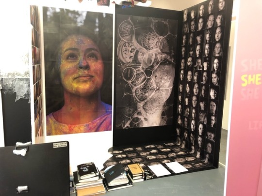
All of my sketchbooks, files and portfolio displayed ready for the examiner
0 notes
Text
Final Major Project Evaluation
Pathway: Photography
The Psychology of Colour
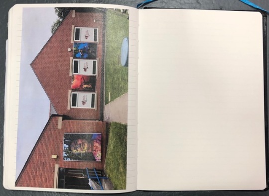
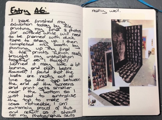
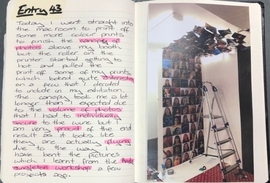
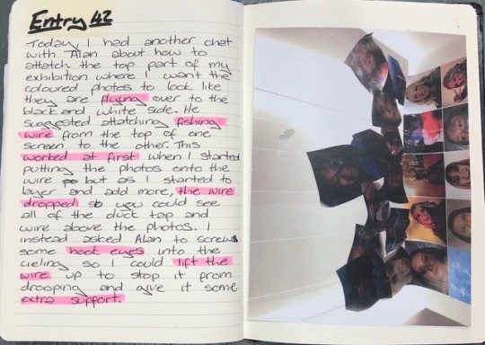
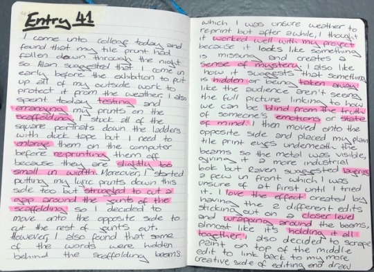
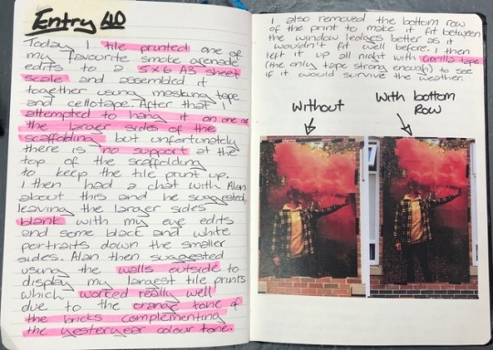
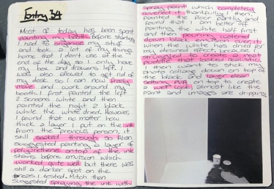
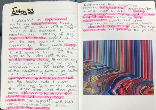
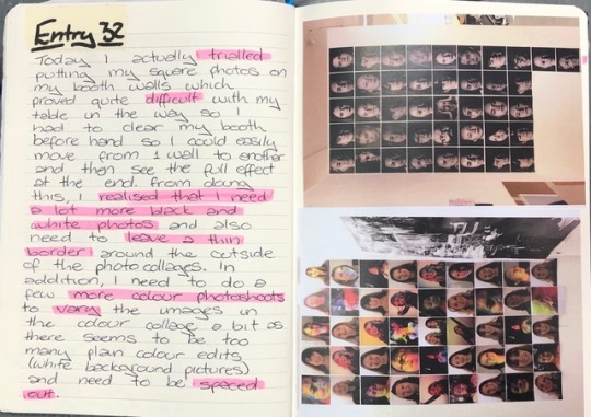
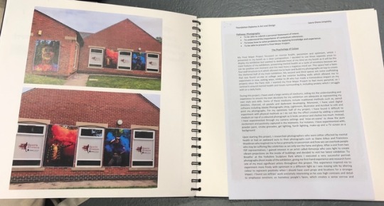
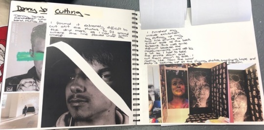
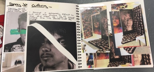
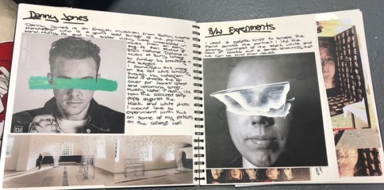
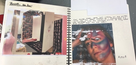
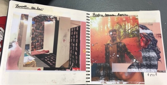
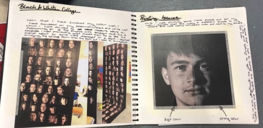
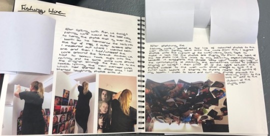
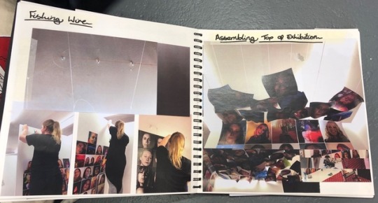
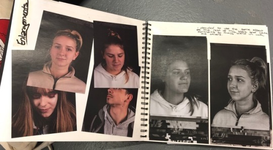
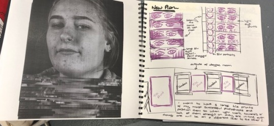
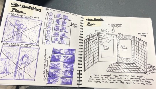
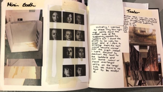
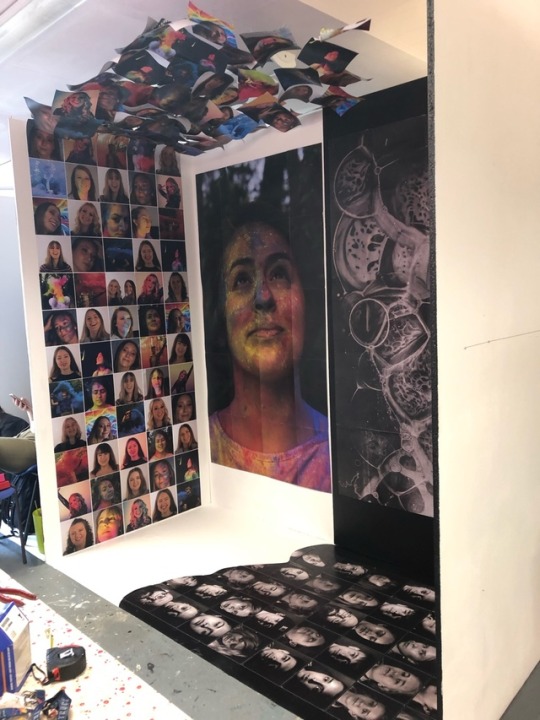
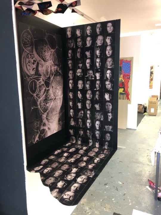
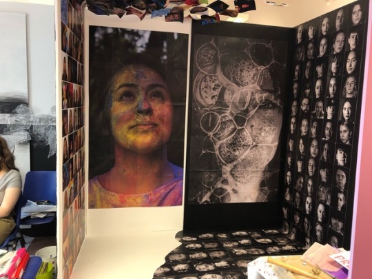
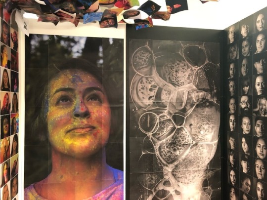
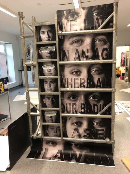
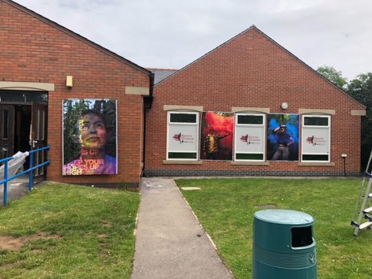
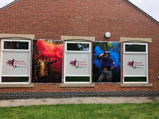
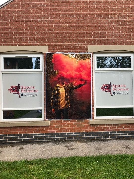
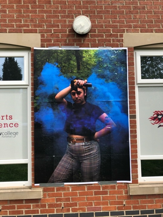
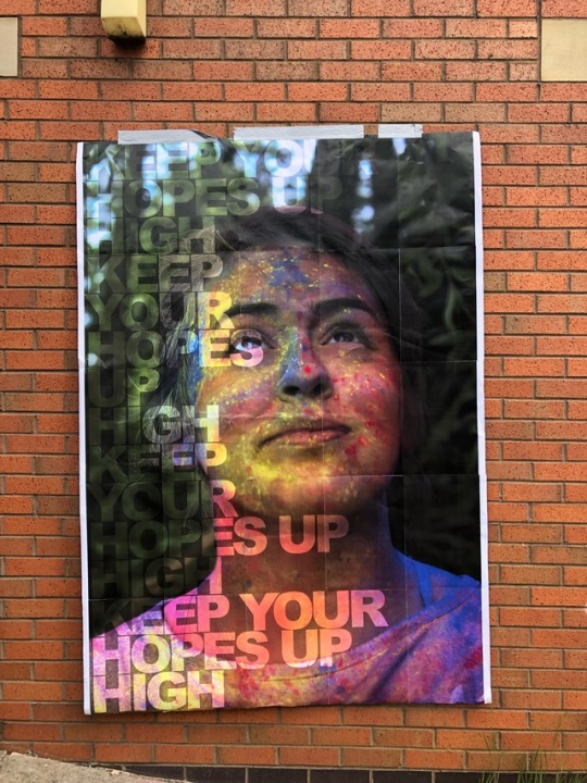
My Final Major Project focussed on mental health, pessimism and optimism, which I presented in my booth as a clear juxtaposition. I decided to use three separate areas to display my exhibition but wanted to dedicate most of my time on my booth as it will be the main feature of my exhibition, presenting mental health as a cycle of emotions because we can be positive one moment and the next have a negative mind set. This space had a basic four wall structure to it which allowed me to layer and build my photographs on top to create the sheltered half of my main exhibition. My second and third spaces are some scaffolding that was found on-site at college and the exterior building walls which allowed me to experiment in new, exiting ways, similar to JR who has made a tremendous impact on my projects since the Paris visit. I wanted my Final Major Project to feel more personal, so I centred it around mental health and issues surrounding it, including anxiety which I struggle with on a daily basis.
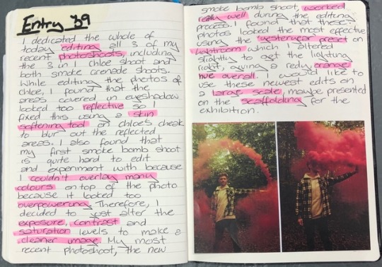
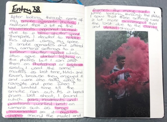
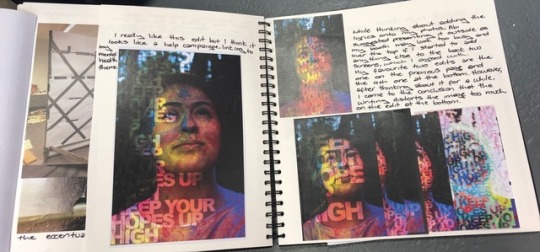
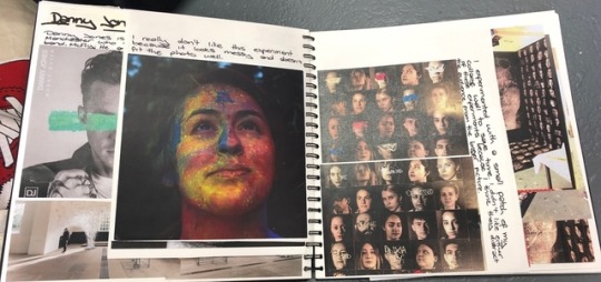
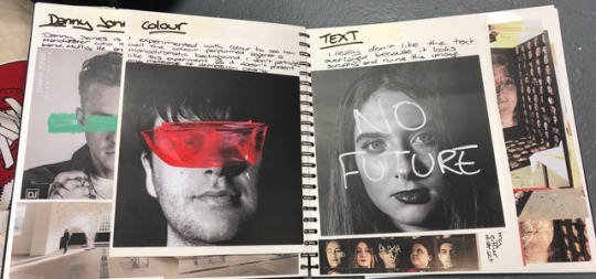
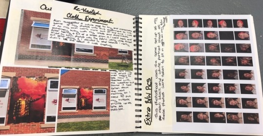
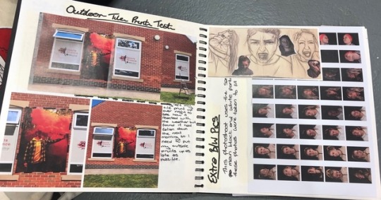
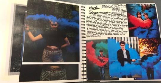
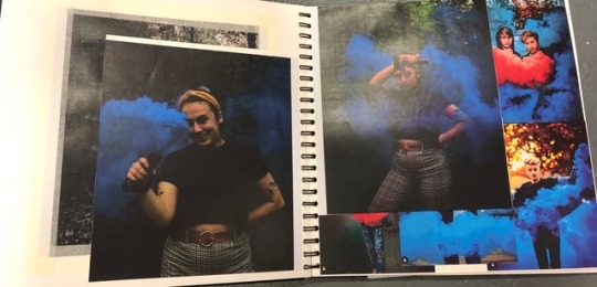
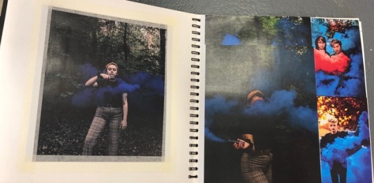
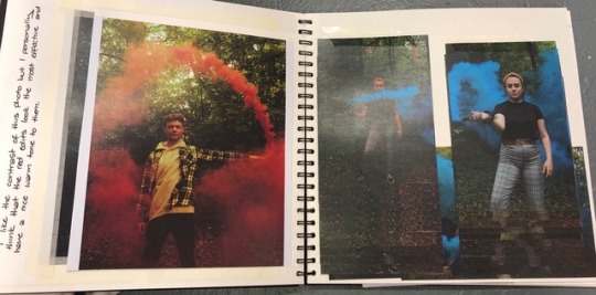
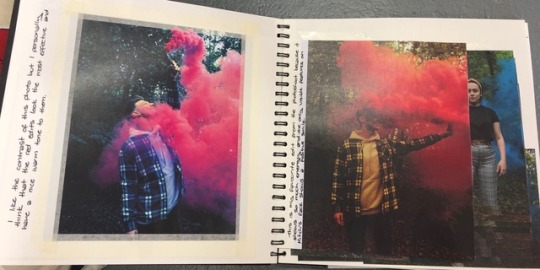
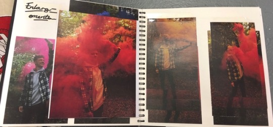
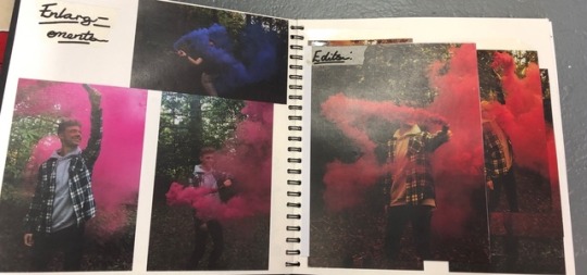
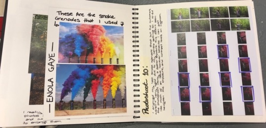
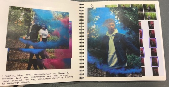
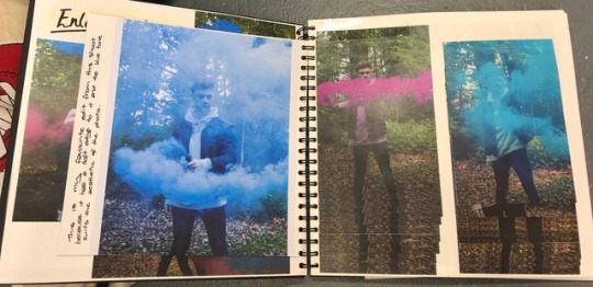
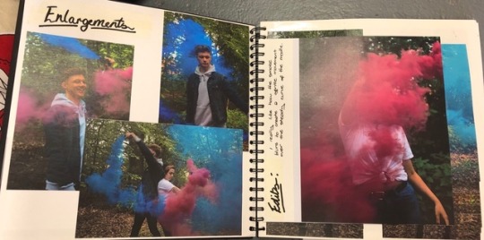
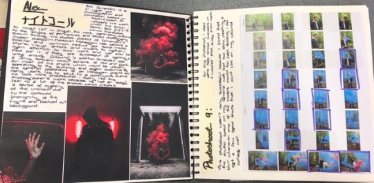
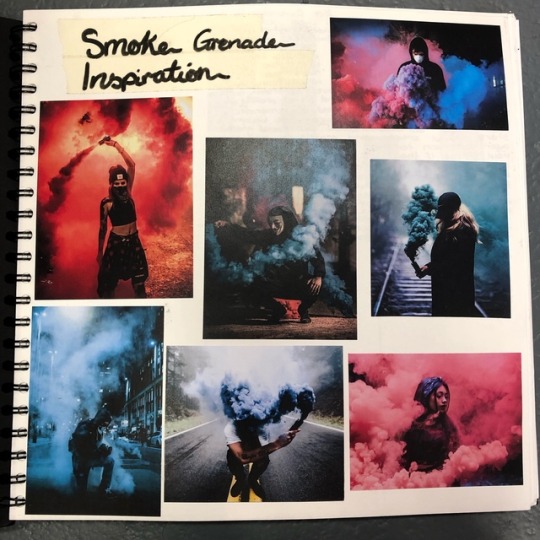
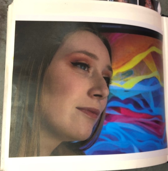
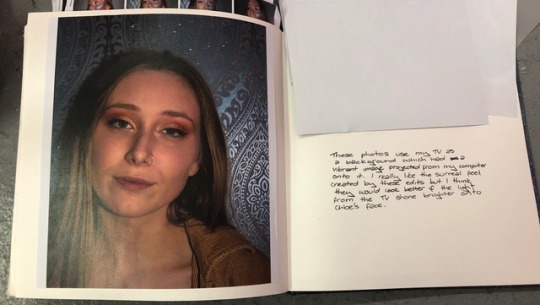
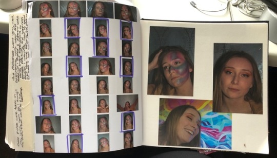
During this project, I have used a large variety of mediums, aiding me the understanding and experience to ensure my own decisions for my exhibition are adequate at representing my own style and skills. Some of these mediums include traditional methods such as, pencil sketches, charcoal, oil pastels and darkroom developing. Moreover, I have used digital software including Adobe Photographs shop, Lightroom, Illustrator and Acrobat to edit and print my photographs. For my optimistic half of my project, I have found it difficult to experiment with physical methods as I do not like the effect created by adding a coloured medium on top of a coloured photograph as it looks amateur and clashes too much. Instead, I have experimented through my camera settings and ‘mise-en-scene’ to show the pure excitement and positivity captured in the moments. For instance, I have experimented with; powder paint, smoke grenades, gel lighting, harsh lighting, make-up and a TV screen as a background.
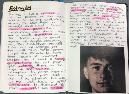
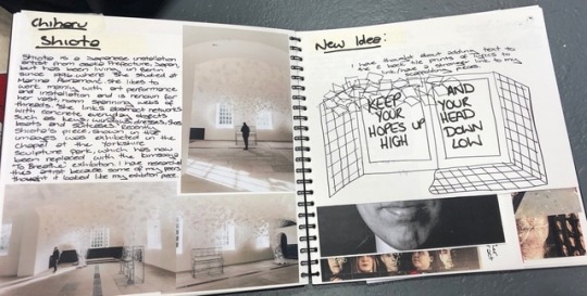
Upon starting this project, I researched photographers who were either effected by mental health or had an awkward aura to their photographs such as Diane Arbus and Francesca Woodman who inspired me to focus primarily on pessimism and how we can overlook people who may be suffering like celebrities as we only see the fame and glory. After a visit from two YSP representatives, I gained interest in an artist called Kimsooja who uses light to create vibrant projections on the inside of buildings and decided to visit her latest exhibition ‘To Breathe’ at the Yorkshire Sculpture Park where I executed a very successful portrait photographs shoot inside of the exhibition, giving me first-hand experience and research form one of my most significant artists throughout this project. This experience inspired me to experiment more freely with optimism in a different light as I was staying safe by altering colour to represent positivity when I should have used props and locations for a stronger impact. I found Lee Jeffries’ work extremely interesting as he uses high contrasts and detail to emphasise emotions on homeless people’s faces, which creates a sense sorrow and sympathy for the subject. I decided to research multiple YouTube videos to recreate this technique to use in my own work which I found was strikingly successful.
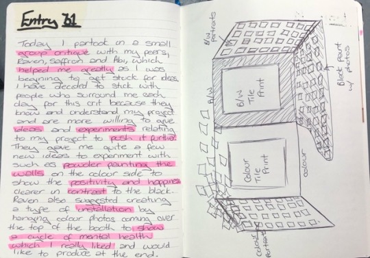
Initially, I did not like the idea of having sketchbook critiques because I just wanted to get on with my work but after having one with a small group of peers, I found them extremely useful to push and further my project to be as successful as possible. I also enjoyed the opportunity to run my ideas by a few people and hear what they would do if it was their project, allowing me to branch out into different disciplinaries that I would not usually work with. However, after my first group critique, I found that they worked better with a smaller group as there are too many people to go through.
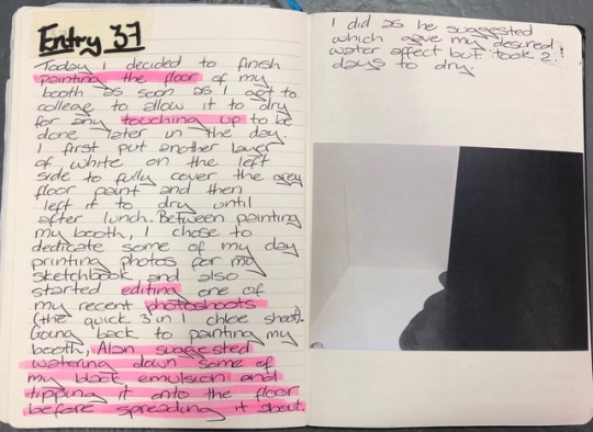
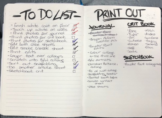
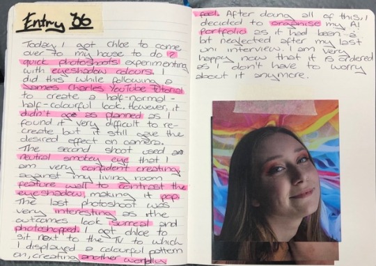
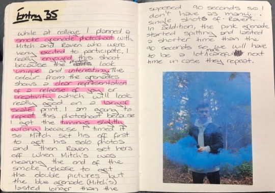
At the beginning of this project, we were tasked to keep a daily journal and Tumblr to record the progression of our projects. I found the journal both helpful and useful as I could explain my decisions and ideas a lot more thoroughly to the examiner and my peers which I may have missed or made unclear in my sketchbook. In addition, it has allowed me to reflect easier on mediums that I have found successful and not which I may want to push further.
Overall, I am extremely pleased with my exhibition because I feel it depicts the juxtaposition between optimism and pessimism but also shows mental health as a cycle. After last minute stress and doubt that my exhibition will look good and also show my message, I am finally proud the end product.
0 notes
Text
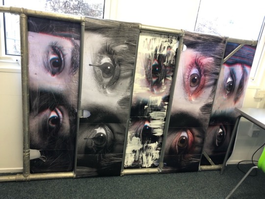
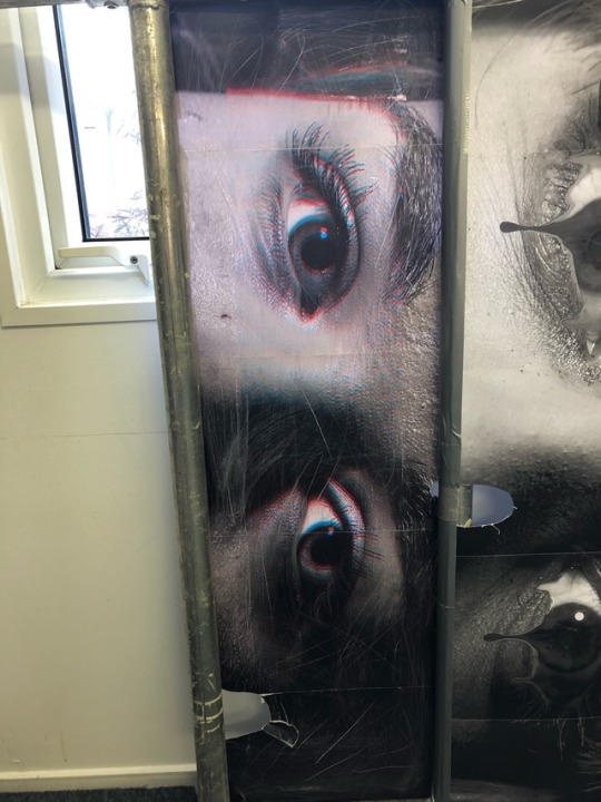
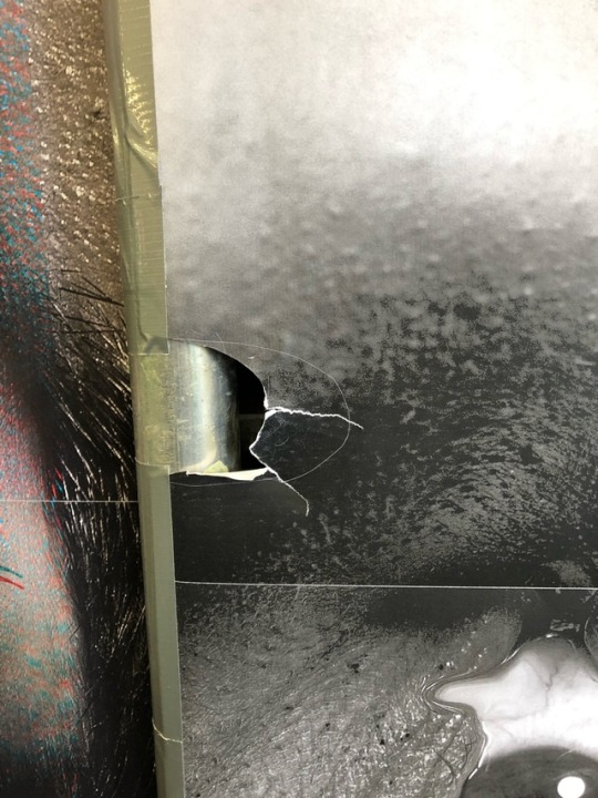
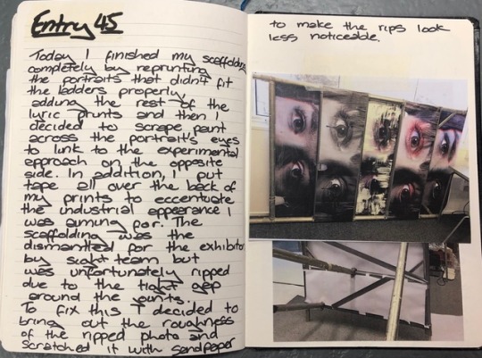
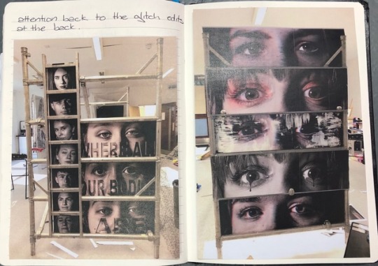
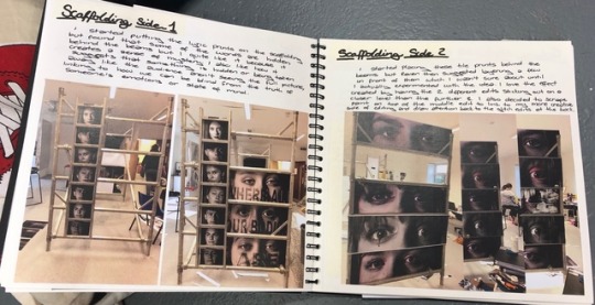
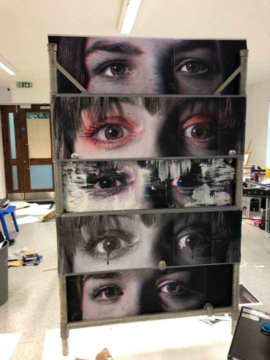
The scaffolding was taken down today and stored in the cafe ready for the morning of the exhibition when it will be re-assembled. Unfortunately, the holes I had previously made were too tight so when the joints were unclipped, they ripped some of the prints. I didn't have enough time to re-print and put the images back on the scaffolding again which would probably rip again when it goes back up so I decided to destroy the bottom print with sandpaper to make the rips look more purposeful. Fortunately, this also links to my pessimistic side of mental health as depression and negative thoughts can destroy you emotionally and physically which I have shown slightly through this print.
0 notes
Text
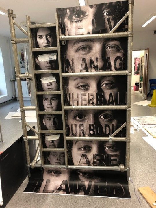
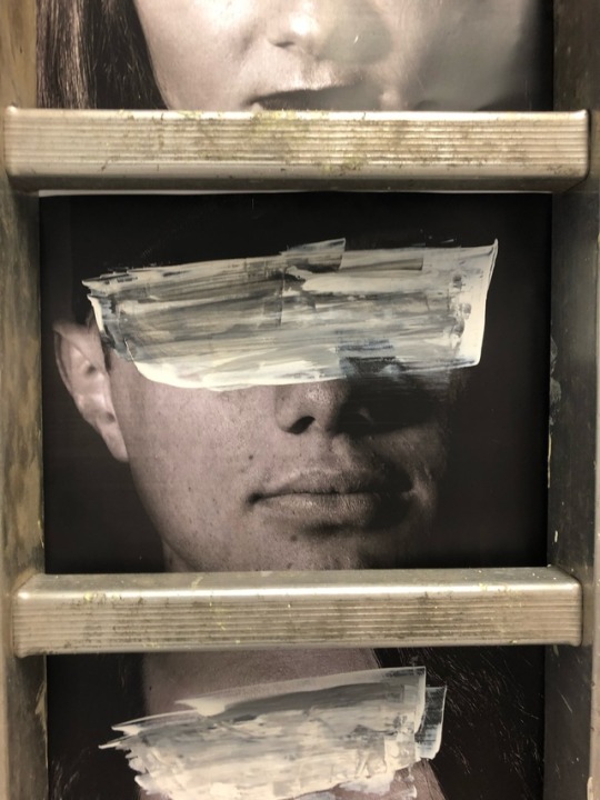
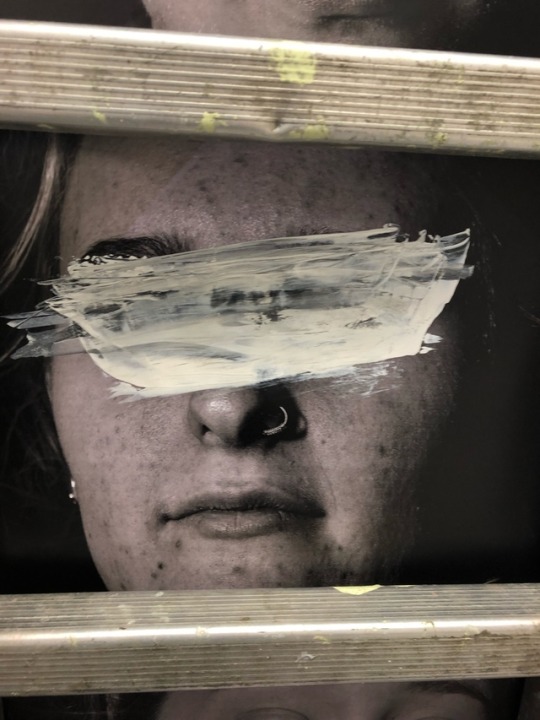
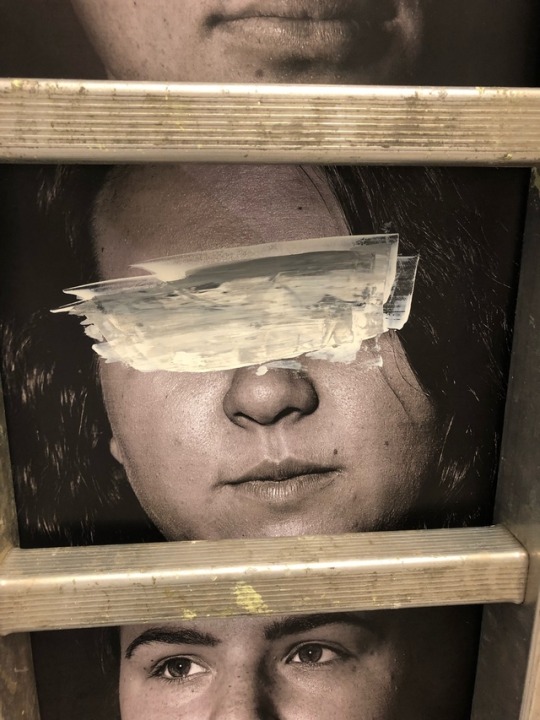
Final side of scaffolding finished. I scraped paint across some of the portraits with a palette knife to add to the more experimental approach I have used on this part of my exhibition.
0 notes
Text

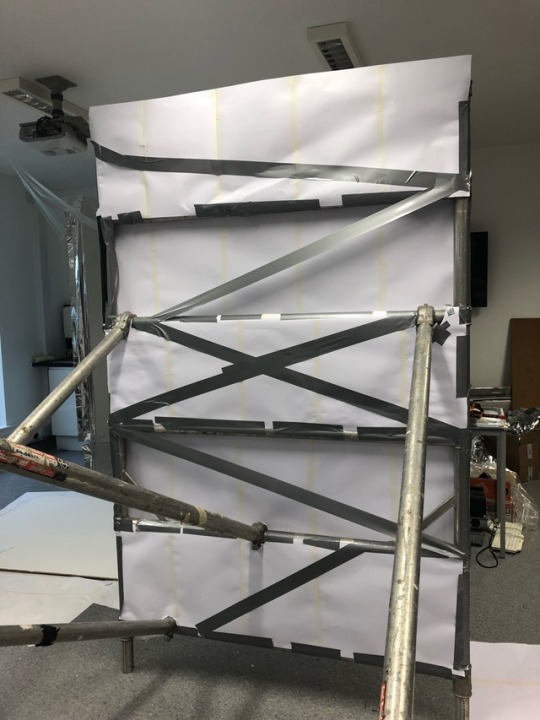
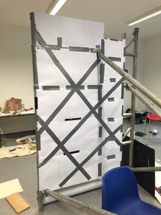
I added tape to the back of my scaffolding prints to emphasise the industrial appearance I was aiming for. I then had to attach a bamboo stick to the back of the top print to give it some extra support as it was flopping a bit.
0 notes
