
Last Seen Blogs


Video
vimeo
Password: mediastudies
For my video project, I wanted to create a fun video that shows how the experience of music changes over the generations, but at the same time stays the same.
0 notes
Video
youtube
My Slideshow--woman loses track of time and makes her way to catch the train, only to find she misses it and it leaves without her.
vimeo
Above is the same exact slideshow. Re-uploaded using Vimeo to improve the picture quality. Found switching to Vimeo helped with the quality.
0 notes
Audio
Above is my audio which is a narrative of my drive to the train station and trying to catch the train as we see by the end of the audio. In the beginning, I added footsteps to emphasize my way into the car. From there you hear the noises of my keys, car door, car starting, engine accelerating, car horn, car signal, the navigation system and more. I overlayed the audio with other clips such as the radio, cell phone ringing/other effects, and the train approaching using Adobe Premiere. I used the fade in & fade out tool in a couple of areas (and also faded a few clips into each other). I also made adjustments in volume where needed.
1 note
·
View note
Photo

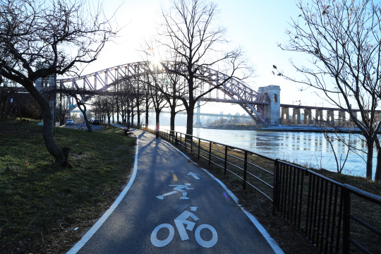
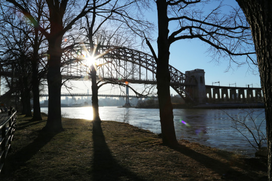


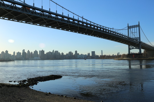

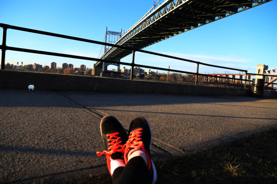

Photos 1-10 (Part 1): My photo essay is of my journey getting closer and closer to the NYC skyline from daylight to sunset. I took these photos in Astoria Park, Queens. I really wanted to capture more of a contrast in my photos. With some of the photos that needed it, I used Photoshop to give them a bit more of a contrast and also brightness/vibrance adjustments in others. I wanted my photos to be simple and crisp, so I used the sharpen tool as well. In these photos, I captured elements such as silhouettes, size contrast, foreshortening, framing/composition, and shadows with the bridge and skyline. I also tried to capture some different points of view on my walk.
1 note
·
View note
Photo


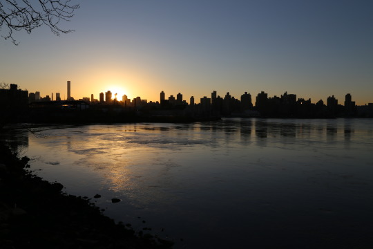
Photos 11-15 (Part 2): My photo essay is of my journey getting closer and closer to the NYC skyline from daylight to sunset. I took these photos in Astoria Park, Queens. I really wanted to capture more of a contrast in my photos. With some of the photos that needed it, I used Photoshop to give them a bit more of a contrast and also brightness/vibrance adjustments in others. I wanted my photos to be simple and crisp, so I used the sharpen tool as well. In these photos, I captured elements such as silhouettes, size contrast, foreshortening, framing/composition, and shadows with the bridge and skyline. I also tried to capture some different points of view on my walk.
1 note
·
View note
Photo

Point of View #1

Point of View #2
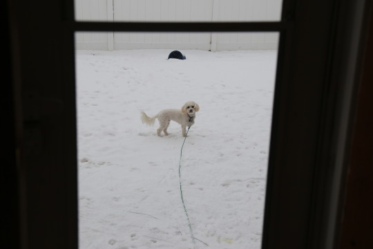
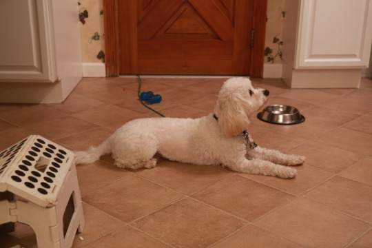
1. Occulut Point of View: In these photos, I played with different camera positions. In the first photo, I captured the dog as a mirrored image with the background a little out of focus. I liked this one and thought it was unique. In the second photo, I played with angles for a different point of view.

Depth of field #1

Depth of field #2
2. Depth of field: The first photo shows a minimum depth of field, with the weights out of focus as we get further into the background. The second photo shows a maximum depth of field with everything in focus--using aperture and drawing more light into the photo. These photos also show shadows as well, with the weights reflecting onto the mat.
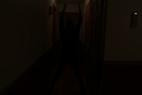
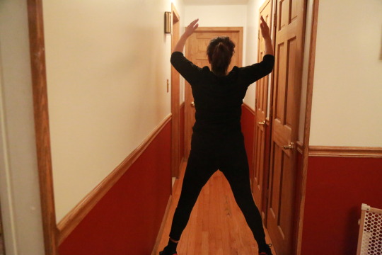
3. Silhouette: I thought this one was interesting and cool to photograph. I used a few different techniques and settings to achieve this. I liked how the woman is dark, but the small amount of light that is showing looks a little like a glow around her and helps to show her movement.


3. Silhouette (EDIT): After getting more familiar with using the DSLR cameras, I was able to understand better how to use natural light and time of day to achieve a silhouette. The sun setting really emphasizes the two bridges and also shows a depth of field with the Triborough Bridge and the skyline in the background. The second picture was taken at a park on Long Island. I really liked the second picture with the sun falling behind the tree, it allows you to see every little branch, something you wouldn’t be able to see if this photo was taken in complete daylight.
Framing & Composition #1
Framing & Composition #2

Framing and Composition #2 (EDIT)

Framing & Composition #3
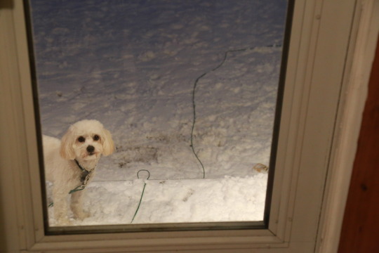
4. Framing and Composition: In these three photos, I used the window as a frame or in-camera framing. I captured a long shot, medium frame, and closeup. The medium and closeup frame (#2 and #3) can be considered rule of thirds as well.
EDIT: In Framing and Composition #2, I added the second photo with suggestions from the class. The photo is more shows more consistency with the other photos, with the frame serving as a silhouette. It also flows with the story better, showing the dog peeking in.

Framing & Composition #3--Rule of thirds
Framing & Composition #4
4 Framing and Composition--Rule of thirds: In the first photo, I captured rule of thirds with the dog at the intersecting points towards the right of the image. In the second, he is centered straight in the middle of the image. I took this one to show the difference.

4. Framing and Composition (ADDITION): This one is not necessarily an edit, but I wanted to add this in because it really exemplifies framing. It frames the landscape nicely and it almost looks as though you are looking through something in order to view the landscape. Could also be considered a silhouette.
Blur #1--Fast shutter

Blur #2--Slow shutter

Blur #3--Slow shutter

Blur #4--Automatic setting
Blur #5
4. Blur: In the first four photos, I captured blur by using a fast shutter speed, slow shutter speed, and the automatic setting. The action is perfectly captured by the fast shutter speed. I adjusted the ISO and aperture to allow more light to come through when using the fast shutter. In the last photo, I captured intentional blur with a slow shutter speed, and painted light by moving the camera a bit as I took the picture. I liked how this one came out, it makes the words pop out and look interesting. I liked using different shutter speeds, since it allows you to get really creative with your photos.

5. Foreshortening and size contrast: In this photo, you can see that the candy bowl and the woman’s hand appears larger and closer in comparison to her body.
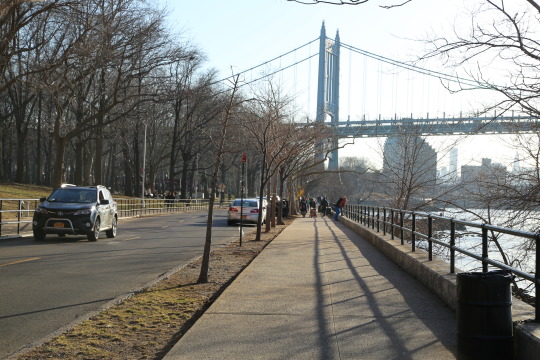
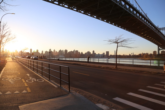
5. Foreshortening and size contrast (ADDITION): This photo shows size contrast and foreshortening--the bridge looks like it is sitting right dab in the middle of the park, whereas it is a lot further down at the edge of the water. The fact that it appears bigger than it is (size contrast) makes it look this way. The second photo of the bridge shows foreshortening--it looks so close that you can reach up and grab it.
2 notes
·
View notes
Photo

1. Billboard Advertisement: This billboard is an advertisement for the New York Lottery Scratch-Off Games that I saw while on my way to class a few days ago. The first criterion that I was able to point out almost immediately is its structure. The small bowls of lettuce that are evenly distributed along the axes of the ad can be classified as formal structure. Furthermore, we see several identical bowls of lettuce which can be classified as repetition. The repetition of this object in the image corresponds with the message of the advertisement which is to “take a break from the expected” by playing the New York State Lotto in hopes of hitting it big. Along with repetition, the distance between the repeated objects is identical, making it an equal frequency. We also see asymmetry used with the use of the lotto card among the uniform and equal frequency of the salad bowls. It throws off the balance of the uniformity of the advertisement, though done intentionally to bring attention to the lotto card and compelling the viewer to play the NY State Lottery. Another element that is evident in this billboard is the position of the circle in the lower right hand corner of the image representing the classic NY State Lottery symbol.

2. Print advertisement: This is a magazine advertisement for Nature’s Way “Immunables” that I saw in a recent edition of Delicious Living magazine. One criterion that is evident in this photograph is the structure in which the dots are placed in the top half, as well as the lower half of the advertisement. The structure we see here can be classified as graduation, since the lines in this structure change evenly and as a result the dotted pattern get smaller and smaller (and conversely at the bottom). In this advertisement, there are also groupings of typography. The ad uses size, color, and positioning with a consistent superhero-like typography that corresponds to the message of fighting immunity with this product. We also see a repetition in typography, with the “POW!” and “BANG!” (wrapped in the same type of shape) or the “SOCK!” and “BOOM!”

3. Online advertisement: This advertisement is for ABC’s popular television dance show, Dancing with the Stars. Love this show! I saw this online advertisement promoting the show on Facebook. Most notably, we see an obvious contrast between the woman’s dress (and her bracelet) and the rest of the black and white image. The bright, yellow color and the flowy, feathery texture of her dress make her stand out. As you can see, the only other object that is slightly highlighted in yellow is the ABC symbol, which immediately draws the audience to which channel to tune into. As evidenced by the image, contrast is a powerful tool that one can use to make a quick and lasting impact on the viewers. The weight of this image is balanced mostly to the right, with the couple dancing to one side of the ad, as opposed to the center like a dance floor (which I think would make more sense). The woman in the ad is also creating direction with her arm that is extended out towards the text, which is diverting our eyes to the name of the show that the advertiser wants us to watch. We also see white space being used to again bring attention to the dancers. This element is utilized to paint the picture of the dancers on stage with the spotlight on them.

4. Print advertisement: This advertisement for Maybelline’s lip balm “Baby Lips” was found in an issue of Glamour magazine. One element that is used in this image is contrast. The image is primarily in a grayish hue except for a few focal points. This includes the baby blue and baby pink lip balm on the right hand side of the image. The model’s eyes and lips are highlighted in correspondence to the colors (blue and pink) of the product. The advertisement uses grouping to gather the typography within the ad. The ad groups information about the formula to the right hand side of the model. The advertisement uses asymmetry to draw your attention to the ad, which could be more powerful than a symmetrical one. If you look at the image, the model is holding a slanted piece of paper that covers up a part of her face. The typography is also not uniform with the paper as it is positioned. You can see position being utilized as the company’s name, Maybelline, is fixed to the bottom edge of the advertisement to bring attention the seller that is marketing this product.

5. Billboard advertisement: This billboard is an advertisement for the famous Broadway show, The Lion King. One criterion that is noticeable in this advertisement is its balance. The large image of the lion visually weighs the photograph to not only the top of the image, but a little to the left as well. Most notably, we can also see that the emptiness of the yellow background, classified as white space, helps to carve out the image of the lion. In addition, we also see the use of positive and negative in this advertisement, as these colors have reversed their polarities. The lion’s black “fur” and the yellow background of this ad have reversed color fields. I believe all of these elements help the ad become simple yet bold, drawing all of the attention to the lion and in turn drawing people’s attention to attending this show. These elements used in conjunction with each other help the ad become less cluttered and confusing. Sometimes less is more and it certainly holds true in this advertisement.
0 notes