
Don't wanna be here? Send us removal request.
Statistics
We looked inside some of the posts by lbbounaries and here's what we found interesting.
Average Info
Notes Per Post
1
Likes Per Post
1
Reblog Per Post
0
Reply Per Post
0
Time Between Posts
2 days
Number of Posts By Type
Text
15
Audio
2
Last Seen Tumblr Blogs


Fun Fact
In February 2021, Tumblr had 518.6 million blog accounts.
Text
Planning Outcome:
For the cover of the book, I chose this piece in its original from, as the simplicity of it captures a bitter sweet feeling of a dream manipulated by our fears to transform it into a nightmare. I was also drawn to choosing this piece due to the impact of the transparency of the paint. I
0 notes
Text
The Dark Side
by Muse
The song written by Muse’s lead singer Matt Bellamy is my chosen song for my project. Matt states that the song contains 'angry lyrics' and has the common Muse themes of frustration and loneliness as well as dealing with ‘the struggle to get away of a dystopian world and the anxieties about technology, trying to escape of your anxieties or from a some kind of matrix.’
My personal interpretation of the song explores the darkness in our minds that are watching the world from the shadows, afraid to show themselves due to criticism and the sensitivity of our society. Another interpretation other may have is a story about battling mental illness, and how it feels like this caged part of you begging to be set free before all hope is lost.
0 notes
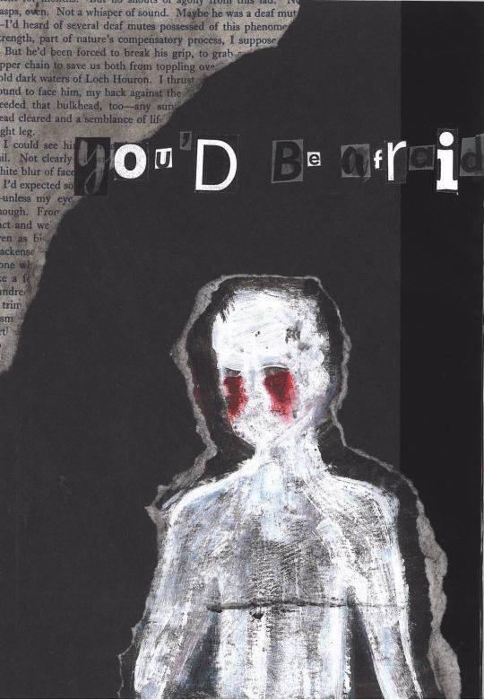
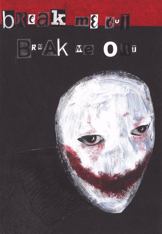
Audio
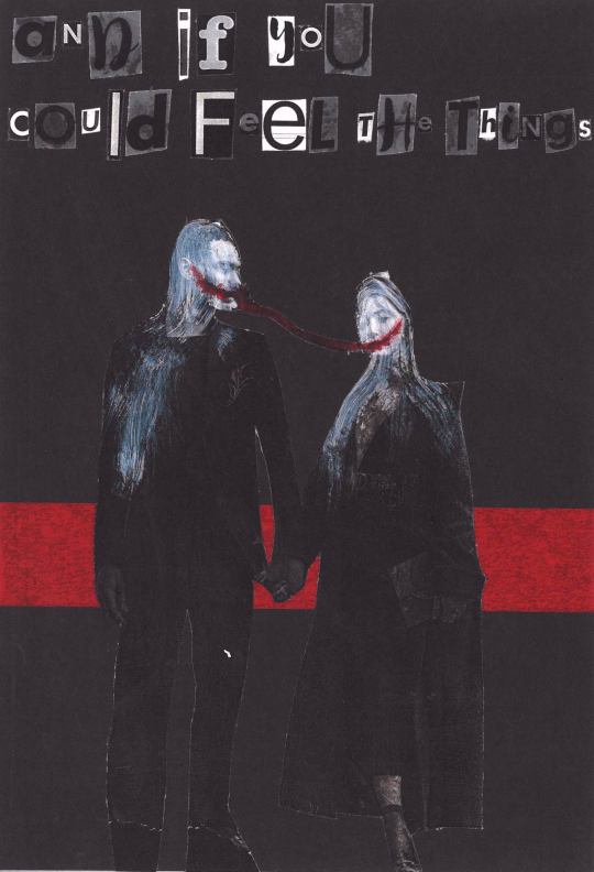
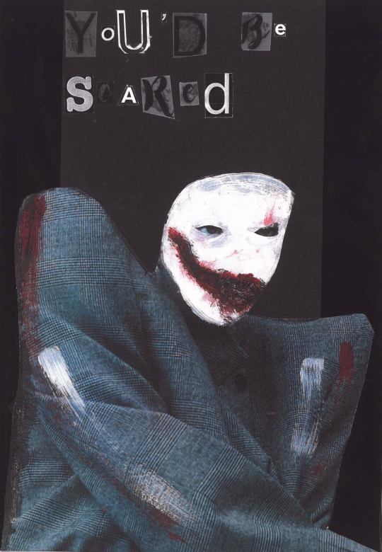
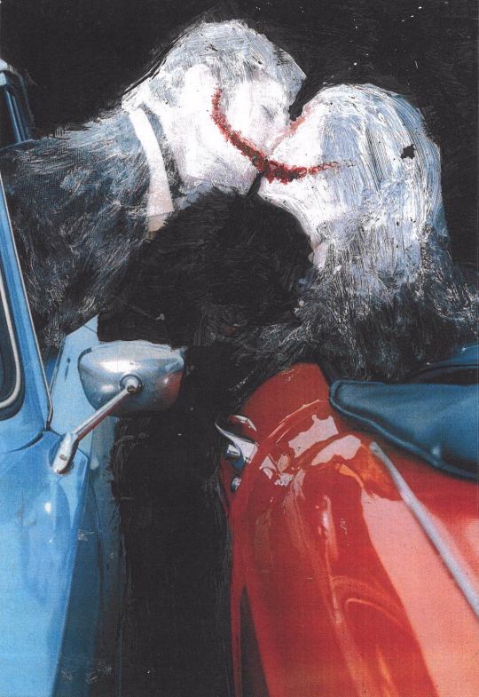
I have lived in darkness For all my life, I've been pursued You'd be afraid if you could feel my pain And if you could see the things I am able to see
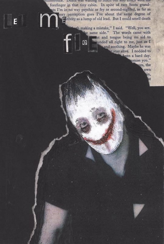
Break me out, break me out Let me flee Break me out, break me out Set me free
I hail from the dark side For all my life, I've been besieged You'd be scared living with my despair And if you could feel the things, I am able to feel
Break me out, break me out Let me flee Break me out, break me out Set me free
0 notes
Text
Evaluation:
My overall thoughts on the ‘Breaking Boundaries’ project was to choose a topic that is censored in today’s society and dig deeper into the meanings and people around it. The theme can be interpreted in a variety of ways; the physical act, the emotional side and the invisible but obvious boundaries in our society.
When choosing a topic, I needed something that would be endless with research meaning there was a low chance of exhausting the topic and/or becoming bored with it. I looked to reason inspiration and interests; I played with the idea of the subconscious mind in relation to dreams as I had begun to draw some of the dreams I was having and writing down, however that would solely rely on me having interesting and dissectible dreams. I turned to T.V and the documentaries I was watching on murders, poisoners and meant to be psychopaths. This had a wide range of possibilities and aspects to focus on, and it peaked my interest the more I looked into it.
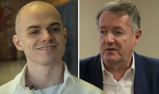
This idea was developed further when I watched an interview Piers Morgan did with a ‘so called’ psychopath, allowing me to pinpoint a certain aspect of the subject of Psychology to psychopaths, sociopaths and murders, exploring the differences, the causes and the traits that are looked for when diagnosing. I decided that I would use documentaries as a source of research and adding my own analysis of the situation and the person in question.
My secondary research would be the documentaries and artists that inspired my outcomes, as for my primary research I started to look into the traits, which lead me to online quizzes to determine what percentage you are of psychopathy and sociopathy, which meant I became my research and started to analysis myself in the same way. The impact it created on my work was the question of masking these characteristics hiding them from others, this led me to my main influence for my final outcome.
This artist was Julia Soboleva, the technique she had developed drew me in for many reasons. It was a quick way to work meaning I was able to create a series of work in a short amount of time, giving me time to choose and develop my favourites for the outcome, as well as fitting in with the subject of masking our true selves. After the workshop of producing a series of work using her technique, I wanted to develop and push it further, filling up a sketchbook of work. It shows the experimentation of the transparency of paint, the use of colour, the choosing of found imagery and which parts to leave exposed. By using Julia Soboleva’s technique as a starting point, I have developed my own way and style of working, keeping to three colours of paint and using mostly black and white imagery and portrait style images.
The wider world issues I have researched are the documentaries on different murder cases, the psychology behind the crimes committed and how the ‘professionals’ identify and diagnose these people. This affected my views on the people and the subject, as I saw that some ‘professionals’ over analysis people turning them into something they’re not, especially if they were diagnosed at a younger age, they will be told all their life ‘ this is what you are, this is what it means, you can’t change that’. It has made me realise that not everything you read is true and most is exaggerated to create this extreme version of the label psychopath.
From the beginning of the project, I knew that my work would be aimed at older audiences due to my darker style but also the more complex topic. Psychology as a subject covers a range of different areas going into great depth and exploring the meanings behind our actions and thoughts, analysing every aspect of the human mind. Very young to early teens would either be confused with this subject or it will just not interest them; therefore my targeted audience is late teens and up due to our need to know why things happen that develops more as we grow up. We begin to overthink and over analyse ourselves as a society and need to know what makes us the way we are. The imagery is also more suitable for older audiences some may find it frightening or uncomfortable to look at. Anticipating this, I asked my younger brothers if they thought my work was suitable and they both agreed that it wasn’t meant for younger people as they found it hard to look at.
As well as age being a factor for my targeted audience, I thought about what my audience has to be drawn to in order to capture their attention. For example, my mother appreciates my work but it does not spark her interest as she looks to nature and folklore for inspiration. My audience are those who are curious about the darker side of humanity but also the way our minds work and how it goes unnoticed in day to day life. I wanted my audience to be those who or inspire them to, like me, already study the body language of others and how they react to situations, wanting to dissect what people put on show to uncover what they are hiding. However my audience are also those who simply like the style of work, who are fans of murder shows and documentaries and/or fans of the band whose song I chose.
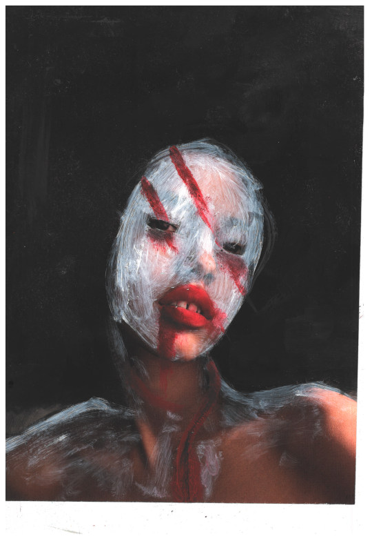
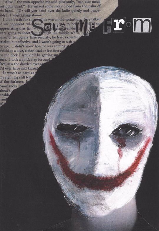
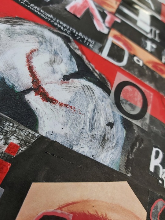
Focusing on my chosen technique, I believe that the choice complements the subject of murders, psychopaths and sociopaths, showing how many mask their lack of emotions, disturbing thoughts and monstrous actions they have committed. For many of my pieces, I’ve left the eyes exposed to remind others and those who it represents that they are still human; this may be comforting but it also may make us fear humanity more. By taking an already existing photo and manipulating it with paint, I am able to alter our reality, leaving some recognisable features whether it be in the environment or on the figure, creating a dream/nightmare sensation.
I believe I have made my final outcome appropriate for my targeted audience as my chosen song, subject and way of working link together with darkness as the theme. The final outcome came out as I had envisaged, meaning that my original idea for my targeted audience has not changed. I do however believe that it has developed to also target those involved with photography as I carefully chose the imagery based on the poses, colour and environment.
During this project, I was introduced to new techniques including etching with acid, collagraph and working with typography. The technique that had the greatest impact was the etching, as it tested my drawing ability as I had to perfectly draw from my original design. This method allows you to incorporate a large amount of detail, meaning that nothing of the original design is lost. The outcomes of this workshop were three black and white professional prints. However, in my original design there was colour which was lost during the printing. The monochrome block look complimented the graphic drawing style of my design which pushed and developed it further.

Until the last three weeks of the project, I had still not settled on a method of working as I wanted to continue developing shown techniques. Not only did each method contrast each other in appearance they also created different feels and would change the meaning behind the lyrics. I was more focused on picking the technique that achieved the feeling and meaning I wanted my audience to get from my work than a technique that I wanted to do. Fortunately, this technique covered both and also allowed me to create a large amount of work to choose from when it came to my final outcome. The workshops taught me that a piece of work doesn’t have to take a long time and have a large amount of detail to be impactful, as it’s about manipulating it to fit your way of working and the theme you want it to fit.
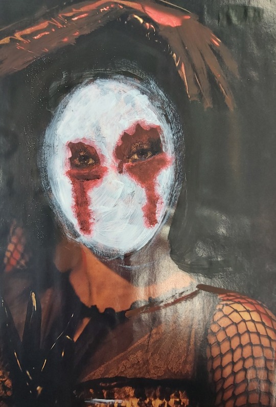
The two workshops that had the most impact on my final outcomes were the Julia Soboleva workshop and the typography workshop with Craig. From the Julia Soboleva workshop, I created a series of work experimenting with the application of the paint, and different ways to add depth. I thought about my brush strokes, which direction I wanted them in and whether or not I wanted them to be visible; I also wanted to see how the effect of the piece would change when changing the transparency of the paint, allowing more or less of the original image to show. This meant that I was able to control what my audience saw, and censored certain parts of the face or image.
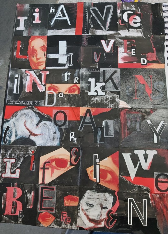
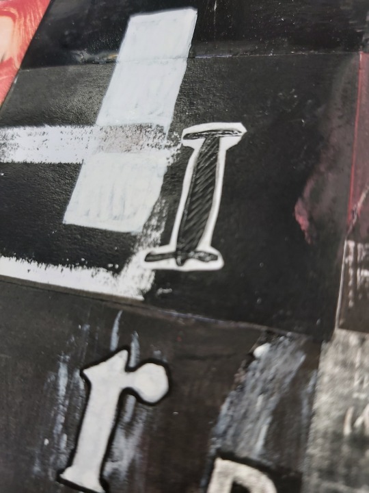
In Craig’s typography workshop, we combined text and collaging, to write out our chosen lyrics. By using a different variety of fonts and sized letters, I created a mismatched and ‘wrong’ look to my work. I decided to develop it further by adding red and using photocopies of my previous work from the project, as well as ink and scraps of imagery. I was able to create a piece that flowed and linked back to the rest of my work, and without knowing, to my final outcome. The workshop inspired how I would write my lyrics that complimented my images but also able to bring it to the next level.
The most important decisions I had to make during this project was what method I would work in and which song I was going to use. When looking at the different methods used, I thought about how they would change the interpretation of the subject but also if it fit with my targeted audience. An example is the Egon Schiele inspired technique, drawing over found imagery in a continuous line, elongating the torso and necks in his style. However I felt I was not able to develop it in a way I wanted to fully represent my subject. I decided straight away that I didn’t want to incorporate collagraph prints as it consists of ‘perfect’ shapes and straight lines, which creates too many contrasts with the exploration of the imperfect human mind and the faults within it. I wanted to use portraits and full body imagery to show human kind in many different shapes and forms.
My original song choice was Every You, Every Me by Placebo, due to the brilliant and clever lyrics, which somewhat exposed some censored subjects. However it didn’t fit perfectly with my subject and I didn’t want to change the lyrics to then spoil them. I discovered my chosen song The Dark Side by Muse when listening to them, but I had never been fully focused on the lyrics; when I did listen to them it fit so perfectly with my subject and truly captured what effect I wanted to give off. The decision was easy and without making it I would not have appealed to my targeted audience.
When creating the original pieces for my final outcomes, I didn’t just want the painted over image with the lyrics, I wanted to add texture and more meaning behind each piece. I first decided which out of a series of work I created using Julia Soboleva’s technique I wanted to use for my book as well as wanting to use black card to work on to push forward the colours but also to be a sturdy surface to work on. One decision that majorly affected the look of the final outcome was the decision to use photocopies of my work rather than the original image. This meant the images were matt and brought out the texture of the brush strokes more.
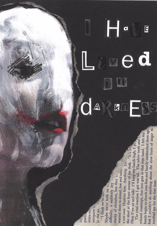
To add texture to the collages, I used pages from a book called When Eight Bells Toll, picking out paragraphs that and phrases that linked with the image. For example on page one I chose the section with the sentences ‘ to clench into fists and hastily unclenched them’ and ‘the slow bum of anger that touched me for the first time’; and on page eight ‘Death was waiting to reach out and touch with his icy forefinger’ and ‘But I could smell death in the air.’ Though this may not be obvious to those viewing it, I believe that it is a subtle and important part of my work.
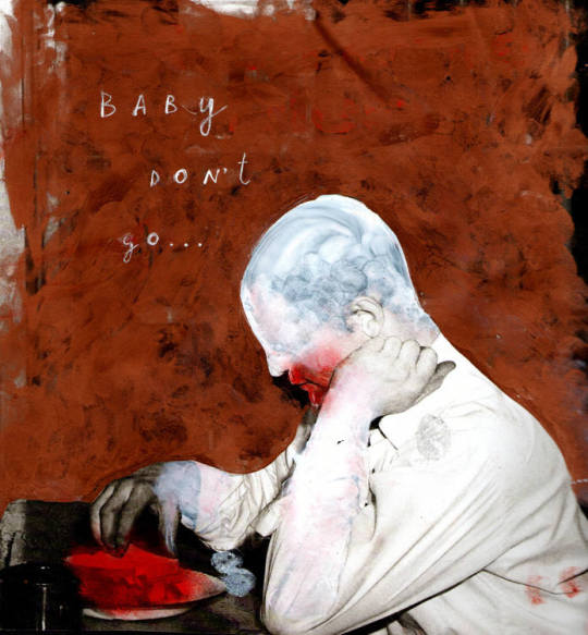
There are hints of red throughout my chosen images, however I wanted to add more to further bring out the rest. I used tape for this as it’s a bright blood red, contrasting with the dark theme as well as using it to separate parts of the collage, highlight parts of the image or simply add a shiny texture. I did this with black tape too which had a more subtle effect, but still separated the matt images from the matt background.
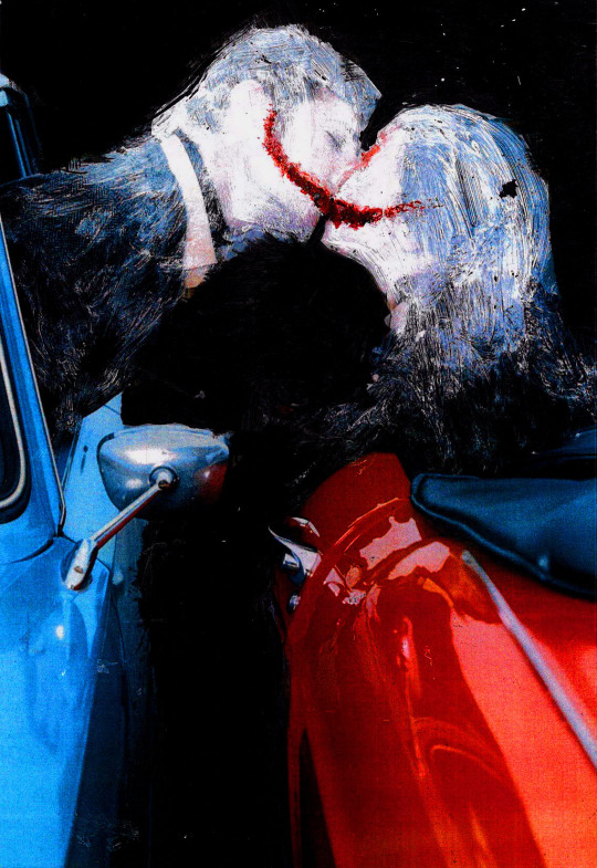
I wanted to get my book professionally printed with a hardback cover to add to the authenticity, choosing it to be matt as to allow the detail of the brush strokes to be seen. My chosen cover was a piece I did at the beginning of the project due to the dream-like sense it has to it as well as the strange peacefulness to it; I chose not to have the title on the front as it would take away from it, and have it on the spine of the book, The Dark Side. For the back cover, I knew on the website having it black wasn’t an option, so I took an inverted piece of paper which had faint white specks and a subtle change of black, which I felt created dimension. On the bottom of the back cover I wrote in white text the title of my book and the song I chose, The Dark Side by Muse. I decided I wanted to write the name of the band as I didn’t want to take credit for the lyrics.
Unfortunately, I was let down by the company who created my book after leaving enough time for it to arrive. I opened the book to discover that some of the letters had been cut off at the sides, making it unreadable as well as printing one image twice meaning one of my designs was missing. I plan on getting a reprint as I want this project to be fully complete and I would like to see my book published correctly.
To be critical, I would say that I planned my final outcome well, as I took a lot of time thinking about the composition of each page and which image would fit with each lyric best. I created a paper mockup to get an idea of the final book, as well as annotating each design talking about the composition. For time management, I am aware it is something I need to improve on, as I have been struggling to get up on my days off and fine motivation due to mental health and being at home for a whole week.
As an artist, I feel I have developed not only my skills but the pressure of having more time and freedom within a project, knowing that what I achieve on my days off greatly affects my grade and outcome. I hope that these developments show in my work as I am more grateful than ever to have access to the college facilities and actually be at college.
0 notes
Text
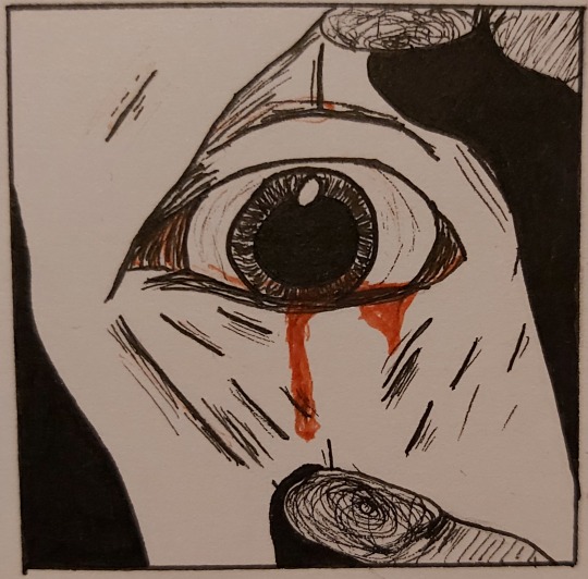
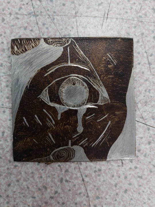
Etching Designs:
For this piece, I wanted to show how for many people, they feel they have to hide behind a face/mask that is acceptable to society. By burying their trauma and true emotions, they fester and grow taking over, seeming uncontrollable.
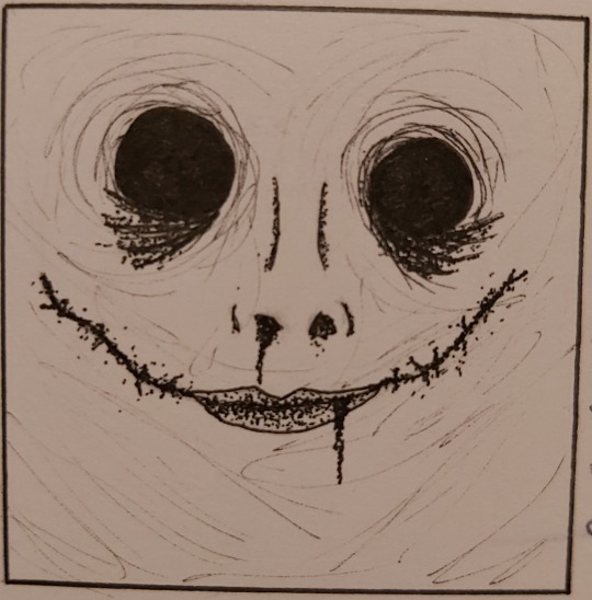
Carrying one from the first design, this shows that our ‘put on’ outward appearance starts to fall away, revealing the inward struggle and the effects it has on us physically. This is based off how I see myself when fighting with exhaustion and trying to please others.
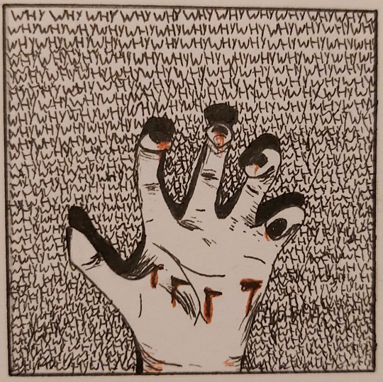
I wanted a little colour and more detail for this design. The background is the word ‘WHY’ written over again. We cannot explain why our minds and bodies work at times. This is the same to how we respond to events in our life and the effect it has to our mental state. We may react in ways we hate or take control of our mental state by reacting in a physical way.

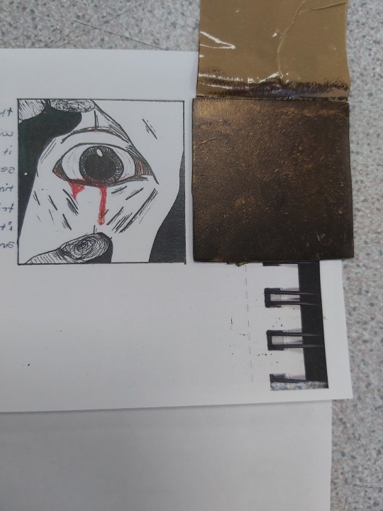
The say the eyes are the windows to the soul-sometimes it feels people are forcing themselves into your mind. It takes time to open up but when someone tries to help in a wrong way, it makes you feel threatened and vulnerable.
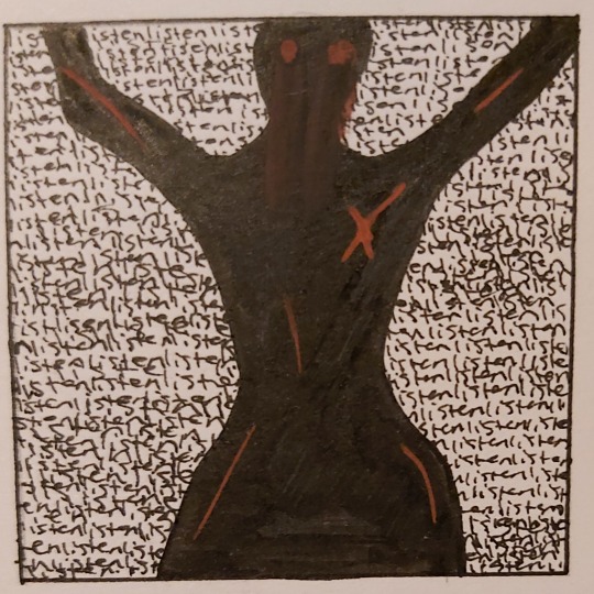
I don’t like this design as there is a lack of detail. The background is the word ‘listen’ with the silhouette of the female body, representing that people may see us as an object, pretending to listen to our problems just to then use us. This leads to insecurities and pain.
Visually, I believe these designs are suitable for all ages, as they are not graphic. For the meaning and the interpretation of the pieces, it is aimed at older audiences as they have experienced the effects of mental health and trauma more.
0 notes
Text
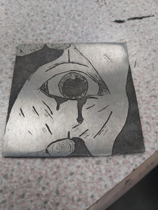
Etching Process:
Etching is traditionally the process of using strong acid or mordant to cut into the unprotected parts of a metal surface to create a design in intaglio in the metal. In modern manufacturing, other chemicals may be used on other types of material.
To prepare the plate for etching, it is first polished to remove all scratches and imperfections from the surface. When the surface is completely smooth, it is covered evenly with a layer of acid-resistant varnish or wax, which is called the ground. Using a blunt stylus called an etching needle, the printmaker gently scratches away parts of the ground following the design, thereby exposing the metal beneath. Once the entire design has been drawn into the ground, acid is poured over the plate or the plate is dipped in acid.
The acid eats into the metal only in the exposed areas creating recesses that can retain ink. To create darker tones, certain areas can be bathed in acid several times, while lighter areas are protected from further acid bite by covering them with ground.
0 notes
Text
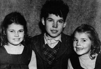
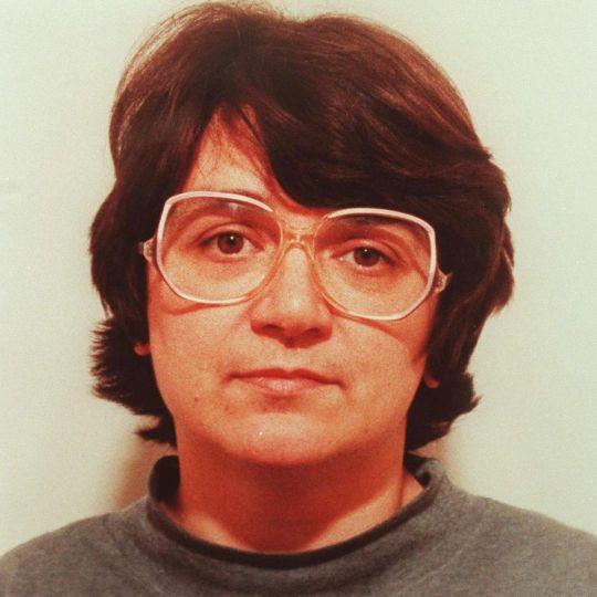
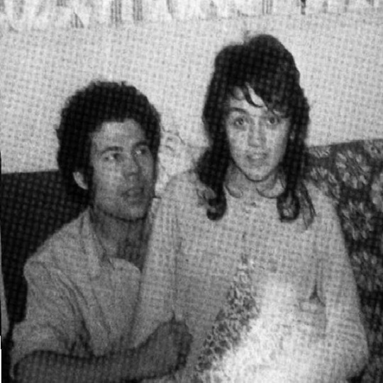
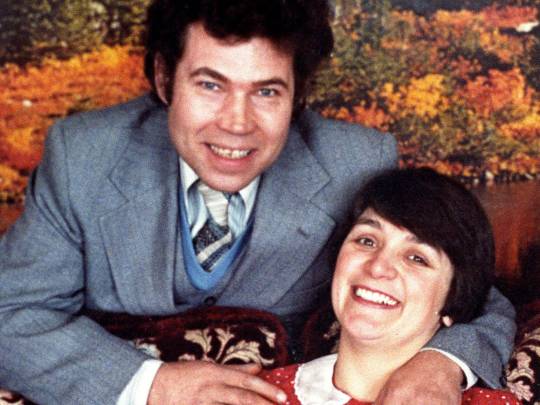
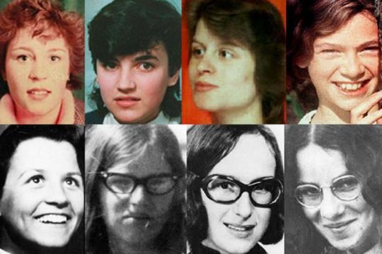
Fred and Rose West:
Frederick Walter and Rosemary Pauline were English married duo of serial killers and serial rapists. They killed at least a dozen young British girls, including several of their own daughters. I recently watched a documentary on them, and wanted to research them further.
Fred was born in Herefordshire, in a small town and was the second of six children. Fred stated that sexual abuse of various kinds was common in the household, mainly from his father, Walter Stephen West. He claimed his father has sexual relationships with his daughters, sexual abuse Fred and taught him bestiality.
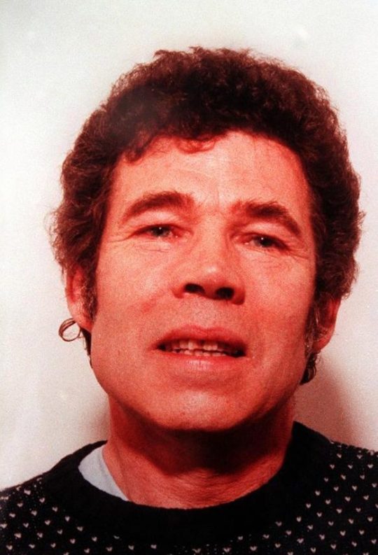
His father would force him to engage in sexual acts with his sisters, one of which he impregnated, and his mother, who he had lost his virginity to. It’s also suspected that his mother started sexually abusing him at the age of twelve, though he never admitted to it. He was often physically punished for doing badly in school.
At the age of seventeen, Fred was in a motorcycle accident that put him in a coma for a week. Afterward, he got a bad temper and would often have violent bursts of anger. Fred hurt his head again two years after the accident, when he stuck his hand up a girl’s skirt and she pushed him down a fire escape. At nineteen, he was convicted of molesting a thirteen-year-old girl; he didn’t serve jail time as his doctor stated that he suffered from epileptic fits.
Rosemary was born in England in 1953; her household was troubled and abusive. Bill Letts, her father, was a schizophrenic who constantly disciplined her siblings, her mother and Rosemary herself. Growing up, Rose was sexually abused by her father. She often got bullied as she wasn’t very bright, and a bit overweight; she responded to this by attacking the bullies aggressively.
As a teenager, she became more sexually active and was caught getting into bed with one of her younger brothers and sexually fondling him. With her father as her figure and with his rules, she was prevented from dating boys her own age, so pursued relationships with older men; one of them took advantage of her and raped her.
Her mother finally had enough of her husband's abuse, took Rosemary and moved in with one of her adult daughters and her husband. Rosemary started spending even more time with male companions. Later the same year, Rosemary, surprisingly, moved back in with her father.
Not long afterwards, Rosemary met Fred, who was twelve years older. Rosemary's father strongly objected to her seeing Fred and even threatened him. Rosemary became pregnant with his daughter, Heather, and took care of his children on her own. However, because of her temper problems and her resentment about caring for children who weren't hers, she often treated her stepdaughters badly.
In 1971, Rosemary apparently snapped completely and killed Charmaine, Fred’s daughter from his first marriage. After severing the body's fingers and toes, Fred buried it under their kitchen floor. Costello, Fred’s first wife, disappeared when she came looking for Charmaine. Her body was found with its fingers and toes cut off, so Fred is suspected to have been the killer.
Fred encouraged Rosemary to have sex with other men, both for money and for fun. In 1972, they had another daughter together, Mae West. To make room for their expanding family and Rosemary's business, they moved to 25 Cromwell Street, where they carried out their rapes and murders. Rosemary continued working as a prostitute from their home. Over the following years, she gave birth to seven more children; three were fathered by Fred. Another may have been conceived by Rosemary and her own father, who kept engaging in incest with her. The other three, who were of mixed race, were all fathered by her clients.
In 1972, Fred and Rosemary hired Caroline Owens to work for them as a nanny for their children. They kept making sexual advances on her, but she declined every time. In December, after they both unsuccessfully tried to seduce her, she tried to leave only to be held captive overnight. The next day, she was released.
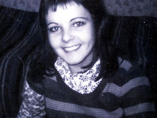
Over the next six years, they killed at least eight young women who made their way to 25 Cromwell Street. Lynda Gough, a seamstress the Wests knew personally. Carol Ann Cooper, who disappeared while walking home from a movie theatre. Lucy Katherine Partington disappeared from a bus stop while on her way home. She was murdered by Fred and Rosemary, who abducted her, held her captive for a week, raped her, tortured her and then killed her.
1974 to 1979, five more women, Therese Siegenthaler, Shirley Hubbard, Juanita Marion Mott, Shirley Anne Robinson, and Alison Chambers, met the same fate. It's unknown if the Wests killed more over the following years. If they did the bodies weren't buried on their property. Some of the girls are known to have been abducted, raped, and then released.
While committing murders, Fred also sexually abused Anne Marie West, Heather West and Mae West. Fred disposed of the victims by burying them under the garage of the house or in the garden. The Wests were finally exposed in May 1992, when Fred videotaped himself raping one of his daughters. When she told her friends, one of them reported the Wests to the police. The investigating officer had heard of Fred while he was in a relationship with Rena Costello. Another girl raped by Fred came forward and the police obtained a search warrant. Fred was arrested for rape and sodomy of a minor and Rose was arrested as an accomplice.
1 note
·
View note
Text
Susan Derges:
Susan Derges is a British photographic artist who specialises in camera less photographic processes working with natural landscapes. Her work revolves around the creation of visual metaphors exploring the relationship between nature and the self. Her pieces capture both scientific and natural processes, the evolution of microbiology, reflections of light on water, the movement of water etc. The artist combines analogue and digital techniques to create a new perspective to capture the impossible. Her work is contemporary and experimental, capturing environmental issues.
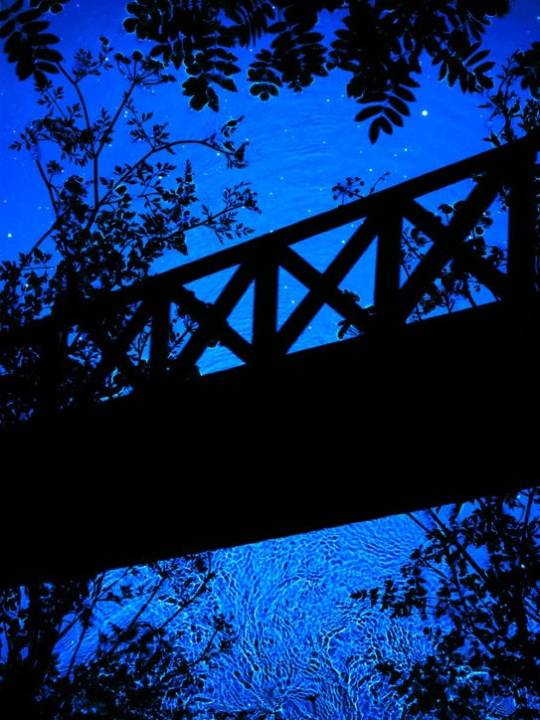
Throughout her work, there is a theme of elemental, magic and the beauty in nature. She works with variations of blue as her colour palette; this links her work together making it visually appealing but also showing the versatility of one colour. These pieces remind me of what you see under a microscope.
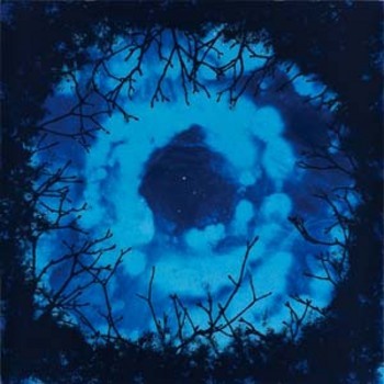
Visually her work is appropriate for all ages, however I don't think it would interest very young audiences as there is not a range of colour to captivate their attention. I believe that the targeted audience are those that have an interest in science, nature and the detail that makes up the universe. It is also targeted at those who study photography and the experimentation within it.
0 notes
Text
Vicki Johnson:
Vicki Johnson is a printer, who translated her approach to screen-printing into Risograph printing. This process led her to illustration and the use of colour overlay has given her work a bright colour palette. Her background is in traditional printmaking and her inspiration is nature, folklore and pattern.
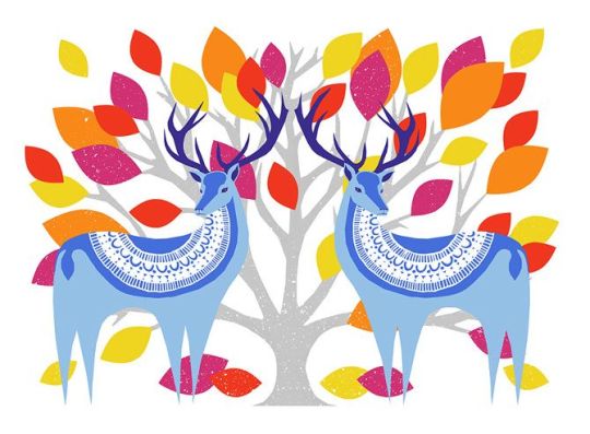
When looking at the prints, you can see a running theme within Johnson's work; the use of vibrant colours and simplistic silhouette-like shapes These shapes are layered on top of each other to add detail and depth. You can see her choice in colours are those that are on the opposites of the colour wheel, creating an abstract look and exaggerating the colours more.
As Vicky designs wrapping paper, décor and festive cards, her targeted audience are those who are attracted to the more extravagant side of gift giving. However, her work is also aimed at those who enjoy what she takes inspiration from which is nature, folklore and patterns. I believe her work is appropriate for all ages and not just visually. The reasoning is that her scenes play out nostalgic and childlike wonder. I believe very young audiences will be drawn into her work to tell her bright colour palette.
0 notes
Text
Cyanotype Process:
Cyanotype is a photographic printing process that produces a cyan blueprint. The process was used well into the 20th century; the simple and low-cost process to produce copies of drawings referred to as blue prints. The cyanotype process uses a mixture of an iron compound, which when exposed to UV light and washed in water oxidises to create Prussian blue images.
The process starts off with the mixture of Ferric Ammonium Citrate, Potassium Ferricyanide and water under UV light. You then coat your paper with this solution away from sunlight. Use a brush to evenly coat your cyanotype solution, then leave the paper to dry in the dark. Place your image onto the prepared paper and piece of glass over the top, to help keep the image sharp. Leave the paper to expose in sunlight or under a UV lamp; the paper will begin to change colour during exposure. It will turn a pale bronze colour letting you know the print is ready to wash. Finally rinsed the paper in water for 2 minutes and you will see the colours reversed. This will fix the exposed image and make it safe to view in daylight. As you leave your print to dry you'll notice the blue get darker.
0 notes
Text
Jasper Johns:
One Image Analysis- Alphabet 1959:
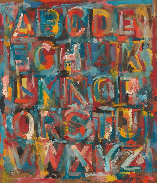
Jasper Johns has been using stencils of alphabet letters since the 1950s but this is his only painting that shows a single sequence from A to Z. He introduced riots of primary colours with touches of green, pink, orange, pale blue, gray, brown, black, and white in his work. Due to the jumble of strokes and collaged fragments of painted paper, it scatters our eyes across the surface and challenges any sense of sequential progress.
By using complimenting colours, the letters are somewhat hiding within the painting, revealing themselves once you give your full attention to the painting. Naturally we would try to read this painting in order, however whether meaning to or not, Jasper Johns has challenged the norm of the human brain.
I personally believe that his targeted audience is all ages visually, as the subject of his painting is appropriate for younger audiences and nothing within the piece would cause upset. However for the interpretation of the piece, I believe that it’s more suited to those who don’t look into things with great depth. My reasoning behind this is that there is not much to interpret with this painting, it is just what you see.
0 notes
Text
Alvaro Tapia:
One Image Analysis:
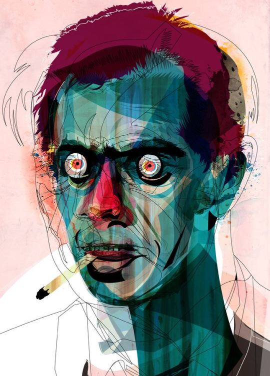
When looking at this piece, you can clearly see that layering plays a major role in the outcome. By layering different colours, shapes and line work the artist is able to create this detailed yet graphic piece. The chosen colours are either next to each other on the colour wheel or are opposites, creating contrast between the different features of the face. The lighter colours are placed on the highest points of the face to show the light hitting them. The contours and shadows of the face are shown by using a darker version of the turquoise.
You are able to see the simple outline layered on top of the coloured piece; this not only adds detail and depth to the piece, but it also shows the progression from the first step to the final piece. There is a simple wash of red for the background which links to the red used on the face, as well as creating an atmosphere and environment around the character. This is also the red used for the eye colour which pierces the audience's gaze. The whites around the eyes are the lightest part of the piece, drawing in your attention and captivating you. The artist draws inspiration from horror, which is shown through the expression of the face.
I believe that his target audience are those who enjoy horror, experimentation within the study of portraits and those who are drawn to bright and contrasting colours. However, as his inspiration are characters from horror movies, I feel his work may not be visually appropriate for younger audiences. I still believe that even those who don't enjoy horror and may not fully understand the reference, may still be drawn in by the colour and the technique used.
0 notes
Text
Takahiro Kimura:
One Image Analysis:
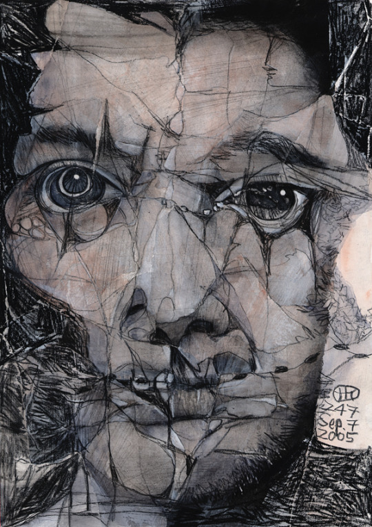
This piece is created by using a collage technique then being painted over with different mediums. The artist works in mostly colour, however I wanted to look at this black and white collage, as I believe it better shows the darkness and faults within humankind. The artist's choice by painting over the rearranged pieces affects the whole feel and message behind his work. The paint seeps into the cracks and tears of the chosen imagery, exposing the would be hidden faults in the face, showing how many feel on the inside.
Straight away, the audience's attention is drawn into the eyes of this figure as the eyes hold the brightest part of the piece which is the reflection of the light. As the rest of the face is distorted, the eyes are the main way to get a sense of the pain and emotion that this person is feeling. I believe that the artist truly explores the saying ‘the eyes are the windows to the soul’, as throughout this series of work that eyes are the main focus of the piece.
As this piece is monochromatic, the artist has used greys, blacks and whites to create dimension and depth. Working in monochromatic, the difference between the light and shadows of the face are subtle yet effective. This also means that the darker parts of the face are exaggerated more due to the light grey that is the overall colour of this piece. By darkening the cracks of the face the artist pushes forward the shattered features, deepening the pain and linking his works together with the name ‘Broken Faces’.
I believe that this piece is appropriate for all ages visually but younger audiences may not have yet experienced the pain and suffering that these figures have gone through. Therefore they will not be able to interpret the meaning behind this piece as they are still in their childhood, and hopefully have not been exposed to negative thoughts and situations. His targeted audience are those who have gone through this, and are looking for themselves, as they may feel like they have not been represented within today's society. This may give them comfort and reassurance they need, as they may feel like they are alone.
0 notes
Text
Dwayne Bell:
One Image Analysis:
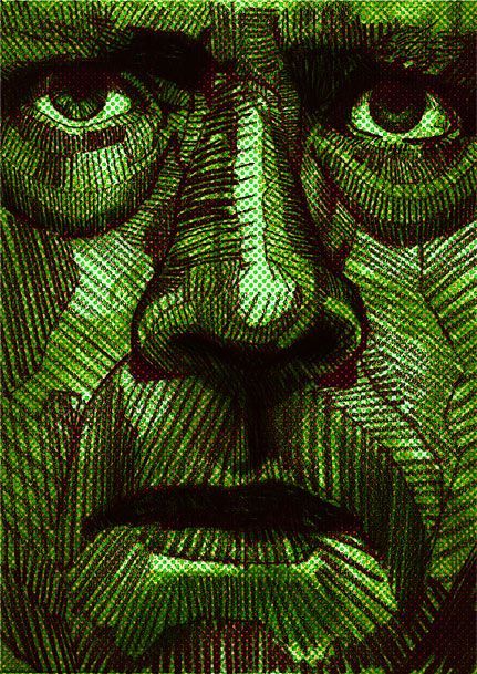
This illustration is created by layering and mark making. Looking at this piece, you are able to see the layering of colours underneath the face, which adds dimension to a would be flat background. Combining green and yellow to the contours of the face, darken that area in a subtle way, as not to overwhelm the rest of the piece. This is achieved by his choosing of the colours that are next to each other on the colour wheel.
Looking at the line work, the mark making is confident and precise. Bell layers straight lines for the darker areas, but for most of the face there is only one layer, meaning the audience is able to see the mark making more clearly. The straight lines contrast the curved features and contours of the human face, combining the natural and unnatural within one piece. The eyes draw in the audience’s attention due to the contrast of light and dark. The whites of the eyes are the brightest part of the piece, which is exaggerated by the shadows and creases around them. The eyes show the age and allow you to make a guess at what emotion they are feeling.
I believe that the targeted audience for this piece are those who are drawn to portrait pieces but also working within the monochromatic theme. The piece is appropriate for all ages but younger audiences may not appreciate the technique used and may not have an interpretation of the meaning and message behind it. It is also most appealing to those within the art world whose focus is the human form and/or the study of portraits.
0 notes
Text
Diana Köhne:
One Image Analysis:
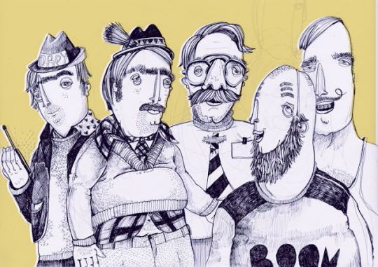
This illustration is created by precise mark making and the observation of light and shadows. The subjects within the piece are shown to have extremely out of proportion features, which is what draws the audience in. This piece contains a high amount of detail bringing out the realism of the figures, adding to the unnaturalness and distorted look.
Focusing on the figures, you can see a resemblance in the clothing of everyday people. This gives the audience something to compare it to as it is a common sight. By exaggerating certain features of these men, to draw attention to parts of the human form we may overlook; this can have both a negative and positive impact depending on peoples opinions about themselves and others.
Köhne has used a block colour for the background, which pushes her work forward even more. The black and white detailed illustration contrasts with the light and blocked colour, both with dark and light, and detailed and simplistic. This changes the mood of the piece enteriley, as the choice in colour is associated with happiness and positivity, creating a child-like feel to the piece. As a result, I believe that her work is appropriate for all ages, but that her targeted audience is most likely younger people, due to the style, colour and the reimagined look of the human form.
0 notes
Text
Laura Slater:
Laura Slater works primarily in textiles and with the experimentation of pattern. She explores the engagement we have with pattern and its ability to connect us with the environments and objects we surround ourselves with. She shows you can use colour, shape and surface to explore ideas around experience and relationship with place.
Slater experiments with mark-making and the different combinations of colour, and the effects it will have on the mood of her audience. Working within the home décor department, her work will affect the whole room and those in it.
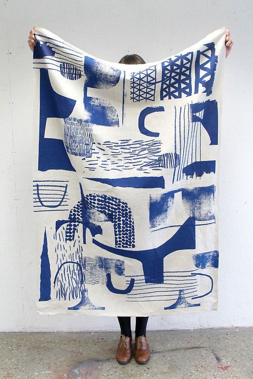
I believe Slater’s targeted audience is the somewhat younger generation, those who are influenced by what they see on Instagram, Youtube etc. The homes you see in the social media world resemble the colourful but graphic theme running throughout Laura Slater’s work.
0 notes