
Don't wanna be here? Send us removal request.
Statistics
We looked inside some of the posts by lbkingofcards and here's what we found interesting.
Average Info
Notes Per Post
0
Likes Per Post
0
Reblog Per Post
0
Reply Per Post
0
Time Between Posts
9 hours
Number of Posts By Type
Text
16
Video
1
Last Seen Tumblr Blogs


Fun Fact
Tumblr has been providing a Korean-language service since 2013.
Text
Evaluation:
This project has taught me a lot. The things that it has taught me have not just been skills and tools within graphic design but have been full on lessons on mindset and how I go about my designing. I used to think that all design had to be perfectly accurate and uniform, but after completing this project I have no realised that it is okay for my work to not be exact. The workshops that I have done have allowed me to expand my knowledge and skills as a graphic designer. One workshop that had the largest impact on me was the Basquiat workshop. This workshop taught me to not get so worked up about minuet mistakes and how to channel these mistakes into further developing my work. This workshop also allowed me to experiment with many different style and techniques that I have never though to use, whether this was because I thought the methods were too basic, or that I completely overlooked them by accident. Another workshop that resonated with me was the Op-Art workshop. It changed my perspective on how powerful optical illusions and monochrome tones are within design. It also showed me how useful analogue media can be when creating outcomes, and more specifically, how analogue media can be injected into digital media so naturally.
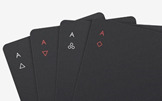
While researching this project, I must have scrolled through tens of thousands of different art pieces. Some stuck with me, whereas others did not. One artist that I regret not discovering earlier is Basquiat, as if I was to find his work sooner, my design would have been much different, and much more personal to me. His work features things that I have never seen used within Art and Design. He has definitely influenced me more than any other artist ever has. When I began research on this topic, one massive theme that influenced me was the whole side of minimalist cards. I had never seen anything other than your generic, traditional cards made up of intricate illustrations and patterns. So this discovery was a real eye opener when it comes to playing cards. They made me realise that playing cards are much more than a game, and more of a blank canvas for creatives. One artist that really utilised this style well was Joe Doucet. His work on his super-minimal deck had a real impact on me, and was a large part of the reason I went down the design route that I did. His design is so simple, yet so powerful.
If I had more time, I would have completely changed my whole deck. I would have gone for something much more personal, where it was less about how perfect it was, and more about how individual it was. I would have wiped the slate clean of all the Ideas that I originally had to do with the minimal cards, and would have gone down a more hand-made route. I believe that if I did go down the other path I would have enjoyed the work much more, and would have been excited about progressing through the project much more than I was, which would have allowed me to produce a much more refined end result. Although I would change my whole design, it does not mean that I am unhappy with my end result that I have produced. Overall, I think my design turned out amazingly when I compare it to what I envisioned at the start of the topic, it is just a shape that I fell out of love with it in the final stages of completion.
In a nutshell, Lockdown was horrendous. I started off so strongly and was so excited to progress and to see my outcomes evolve in the coming weeks. However, this enthusiasm soon depleted and I found myself not enjoying what I was doing in the slightest. I am normally extremely eager to crack on with work as I enjoy this subject massively, but this lockdown has had a real impact on my mindset and general mental health. Being stuck inside seeing the same things day-in day-out, with no change really began to took its toll, the novelty of lockdown completely wore off. I found it insanely difficult to progress when I was no longer surrounded by creatives who all love design too. For the life of me, I could not find the motivation or creativity to complete basic tasks and found my work slowly becoming much more of a chore than a hobby. Despite all of this, I still believe I managed to produce a great end piece that I can proud of, and I can pride myself on that.
0 notes

Text
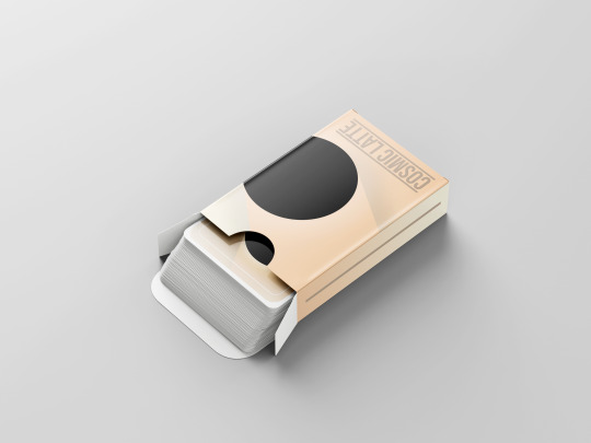
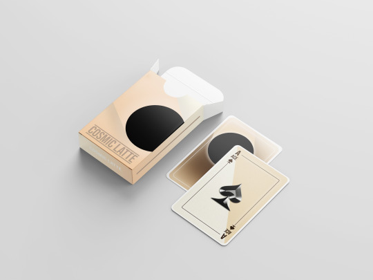
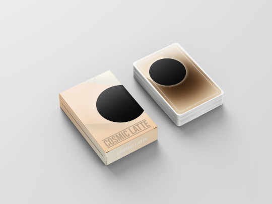
My Final Card Design and Development (The Box):
The box of the last thing that I designed. It was the cherry on top. It was the piece that I wanted to keep as minimal as possible. Again, starting out in Photoshop used the same method to create the gradient background as I did for the back of the cards.
One thing I wanted this deck to do is to be able perfectly similar on all sides. I wanted to be able to drop the pack on the table and it to always be displaying the same thing, not matter which side it was on.
This box was very straight forward to make as I already had all the pieces of the puzzle. I incorporated the colour scheme and circle with the streak from the back of the cards, and implanted it onto the box.
The font was Bebas Neue, which is the same font that I had used for everything previous to this. The bars were added to box the text in and to make it its own entity. This helped to divide the text from the rest of the box. One different thing I added on this compared to the back was a dark outer-glow on the streak. This was to combat the visual effect caused by the clashing of the beige’s. I found this technique to be very appealing and efficient.
Moving onto the top and bottom, I wanted to keep the theme the same, that I was I used the exact same colour scheme was the front/back face of the box.

The slight gradient mixed with the white text makes for a great, slight piece of detail on the box. It is the sort of detail that you would not pick up on on first inspection, but upon further inspection you would realise that there is actually text there. This was of course using the same font as the front.
The sides of the box had to be as minimal as possible. I did not want theme taking any detail away from the rest of the design.

Again, a slight gradient was used and a grey bar was added. This is the same grey seen on the front of the box, used on the text. This gradient provides a great optical Illusion as the top looks a different colour to the bottom. Grain was also added to the whole box to make it almost sparkle when used with the gradients.
Final Outcome:
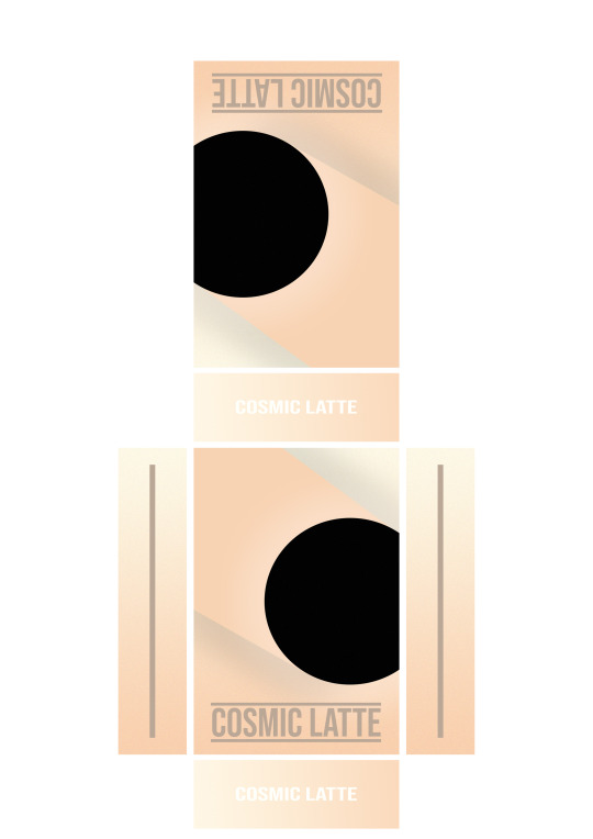
In conclusion, I believe this box is a great addition to the rest of the deck. It really works to tie all of the pieces together and create a finished product. It would make a great addition to anyone’s coffee table.
0 notes
Text
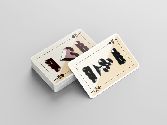
My Final Card Design and Development (The Joker):
The Joker started within Illustrator. I used the pen tool to start drawing out basic shapes of Joker hats. Here is my inspiration for those hats:
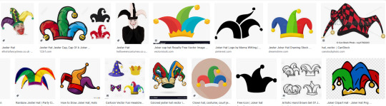
A quick google helped me to understand the basic shape and form factor of these hats. This speedy piece of research was very necessary.
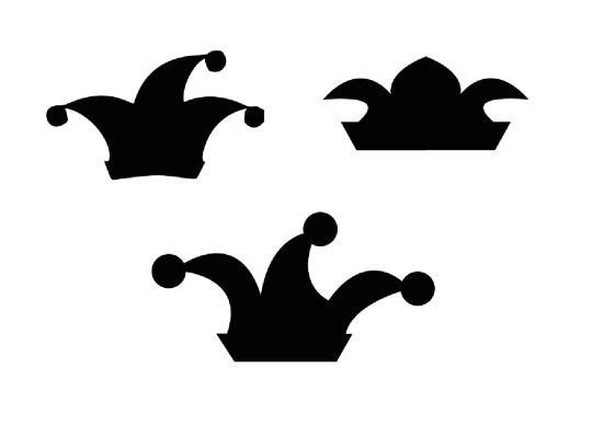
Above are 3 quick sketches that were creating using the pen tool and the pathfinder tool to merge all of the shapes. I wanted the design to be perfectly symmetrical, however, I found it very challenging to draw an effective, symmetrical Joker hat. I had to try to solve the problem of it being different in another way.
I moved it over to Photoshop for further developments:
I used the same base card as the rest of my playing cards. This was to keep continuity between the deck. I placed the Joker hat down and an idea came to me to solve the symmetrical problem. I found place two Joker hats on the page, along the line of reflection in the middle of the card. This really did solve the problem.
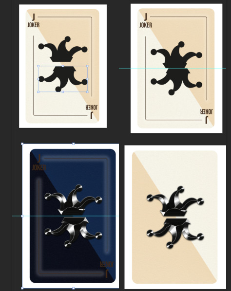
To differentiate the Joker from the rest of the cards I tried inverting the card, however this was way too drastic of change and did not follow the deck guidelines in the slightest. Instead I rotated the background so that it was going in a different direction to the other cards. This was a nice subtle addition. Finally, I removed the details to leave a bland card as the previous markings did not flow correctly with the rest of the card. Personally, I think the plain card with the basic design in the middle is very powerful and classy. It is not too much and is not too little, the perfect balance.
Outcomes:

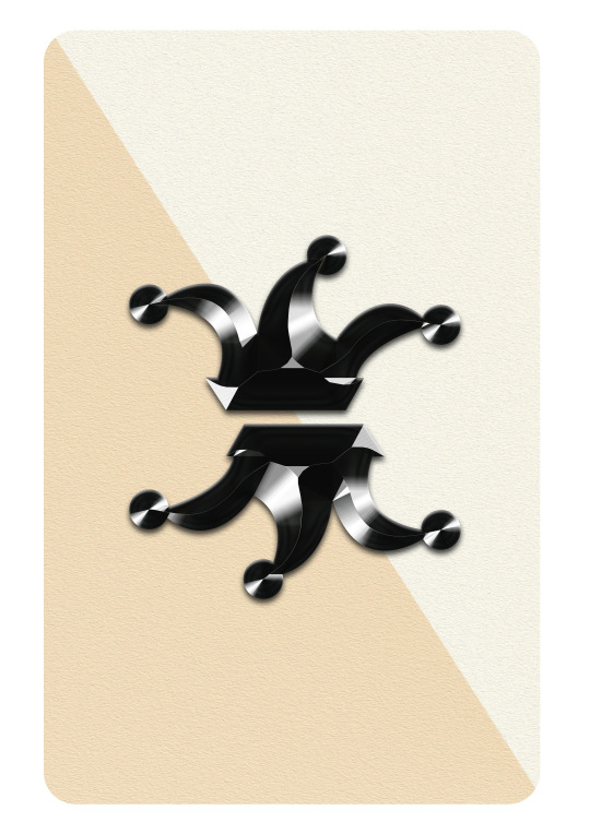
I made a Joker for each colour, as this is what is required in a normal deck.
0 notes
Text
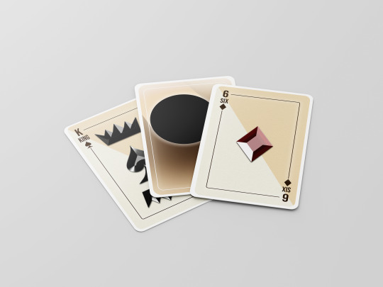
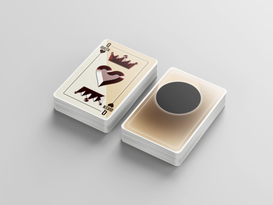
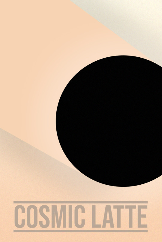
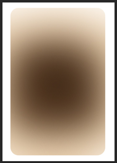
My Final Card Design and Development (The Back):
The back of the cards was one of my favourite pieces of work to create in this project. This is because we get free reign of the entire canvas, there are no guidelines that we have to follow about what information to include.
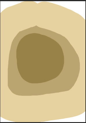
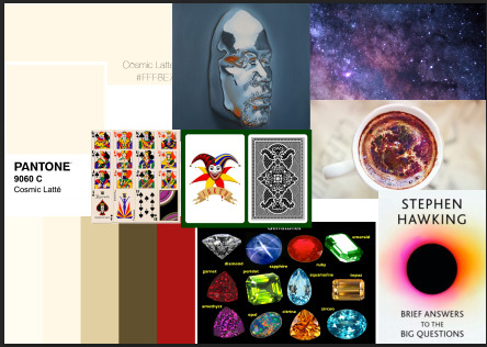
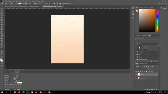
It started on a blank document on photoshop. I wanted to stay true to the earthy tones, so I again used Cosmic Latte with a combination of off-white and brown. This also tied in well with the word Latte, as it was the colours of a latte coffee.
In this blank document I started with the pen tool, drawing rough circles and creating a very harsh gradient.
From here, I used the Blur > Gaussian Blur tool to make this into an easy-on-the-eye gradient. I am very fond of this tool and find myself using it very often.
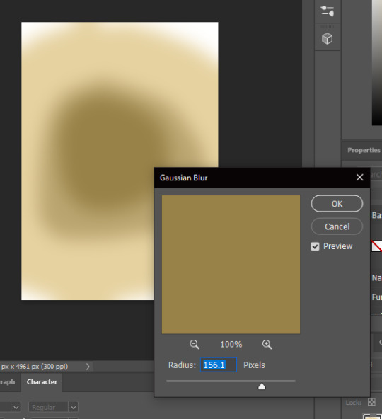
I find this tool works as a gradient tool, where you have more control over what the gradient effects.
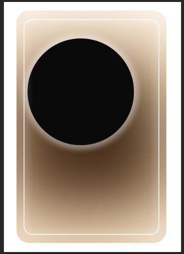
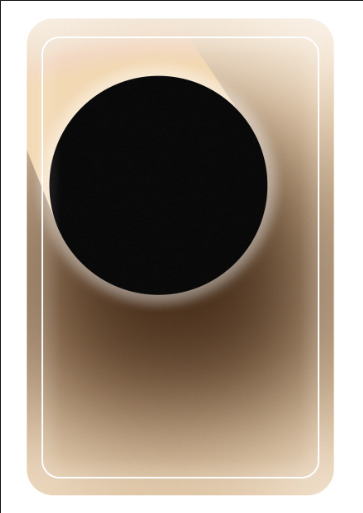
Once I was happy with the background. I put a white border around it to mimic the border that you see on real playing cards. I then wanted to incorporate my old deck, and the cover of Stephen Hawking’s final book. I did this by drawing a circle using the shape tool.
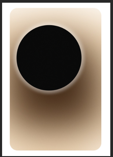
The asymmetrical design was not sitting right until I remembered the lessons that the Basquiat workshop taught me. Not everything has to be perfect and uniform. The outer glow was added to reflect SH’s book cover as his cover includes a glow of many colours. I did not think the palette used on the book covers glow would have worked here, so I stuck to a basic white glow. Finally, I felt like the edges were too empty, So I added a white rectangle around the edge.
This is where I thought I was finished. However, I wanted to add detail to my name of my deck. I wanted to incorporate the latte side of it. That is why I decided to add in a ‘smudge’, as if the black hole was a coffee mug that had been dragged along a table.
I used the selection tool in unison with the gradient fill tool to create the effect shown above. I used the gradient fill tool to diffuse the colour towards the end of the card. Finally, I added a grain over all of the pieces to provide that much needed piece of texture. Overall, I love how the back of my cards turned out, and even though it is extremely basic, I am extremely proud of it.
0 notes
Text
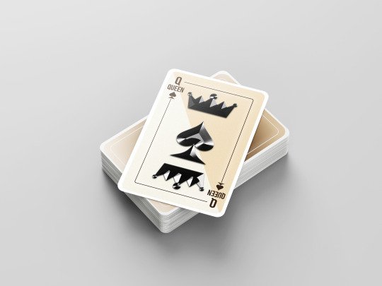
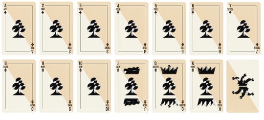
My Final Card Design and Development (The Front):
When going into my final design, I already had a rough sketched design that I could use from my previously created cards. The reason behind the card change that I was getting tunnel vision. I could not see past my previous design until I asked some friends what they thought of it. Once I had received their feedback I realised that my work was far from finished. The main points I got were that it was too complex and over the top for a playing card. This was a big reality check for me because I thought my original design was flawless. This is why in-situ feedback is insanely important as it helped me avoid a poor outcome.
Where it started:
I used my previous card design as a base to rebuild my card. The three main things that I carried from this card to my new card were: 1. The Typeface 2. The Pips 3. The Royalty definers.
It was hard to let this original design go because I had already put so much time and effort into it. I was a huge fan of the gradient and bright colours, but they had to go. One tool I used more than I thought I would is the ruler tool. These markings where absolutely essential when trying to make the card symmetrical and even. One drawback to these lines is that they had a huge impact on the general speed of Photoshop. It began to get fairly awkward to perform small tasks without lagging out Photoshop.
Once I knew which details I would be taking forward, I decided to make a mind map to help visualise the design. This mind map contained many different topics and styles. To me, mind mapping is one of the best forms of Idea generation and movement.
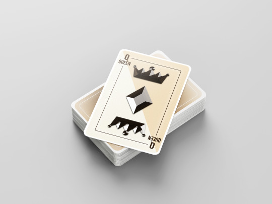
To commence my playing cards I started off with the debatably most important step of anything in design. This was the colour palette. I of course wanted to use the ‘Cosmic Latte’ colour as this what I based a majority the mood board off of.
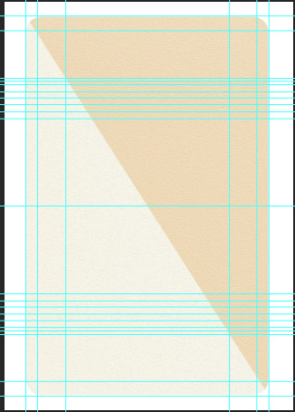
I hard to create the foundation to build my card onto. I started with the whole card as one colour, however I soon saw how bland and flat this looked. This made me turn to the gradient tool. At first I was happy with this outcome, but after rotating the canvas to see how it effected playability I soon realised that the difference in colour at each end of the card was too dramatic and could provide an unfair advantage.
I tried playing around with the gradient tool until I found out about the angled pre-sets:

This formed this symmetrical stripe along the card using two different shades of Cosmic Latte and beige. I was much happier with this result. The next step from here was to start editing the texture of this background to add some depth. I used Photoshop’s in-built stylise function to add the ‘Oil Paint’ effect to the entire background. As I had used this effect before I knew that it created a ‘paper-like’ feel to the document, which is exactly what I wanted.
Although it is barely visible when far away from the card, I believe that it adds a much needed layer. The little details make all of the biggest differences.
From here, I wanted to start work on the borders and fonts. As I was using a previous font I did not have to spend ages scouring through the font websites to find one that would resonate with the card/ theme. The font had to be sharp and bold, while also being easily viable and not too overpowering.
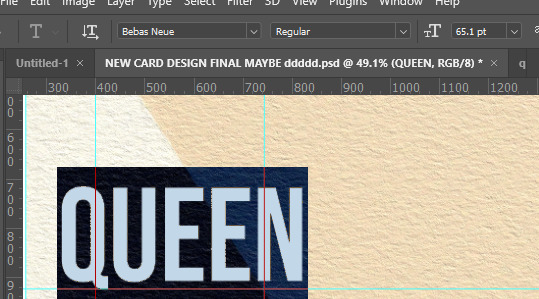
I found this font on dafont.com and it ticked all of the criteria's. It was the perfect balance. The sharpness adds a degree of class and elegance to the card.
Picking a colour for the font and detailing was easy. I have been really appreciating earth tones recently, especially in these dark, wintery times. Brown is a great earthy tone that combines with beige well. It may sound weird but this colour scheme feels almost homely to me. It is a welcoming palette and works well in any environment. It was hard to decide whether to keep the letters in all capitals, or to break it down into capital and lowercase. The end product features all of the letters as capitals as I feel the uniform height and width of every letter supports the contours of this card much better than the lowercase would.
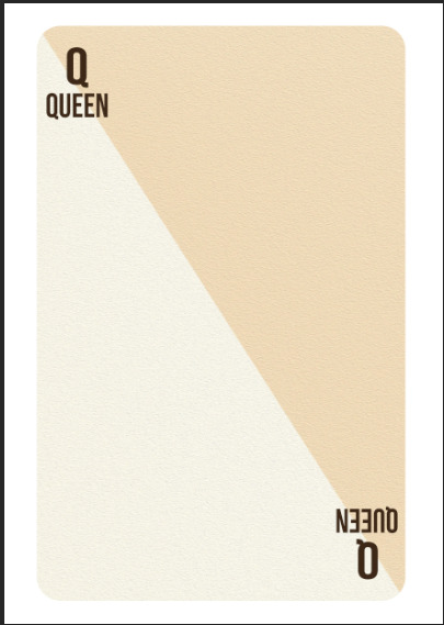
I used the guides to help line up these letters in their perfect corresponding place on the card. Symmetry is a very important feature on playing cards in my eyes.
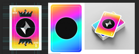
The next problem to tackle was where to put the pips. I wanted to keep this minimal and a playing card that I previously researched had the perfect solution. I was going to place a large, singular pip in the centre of the card, so that it was easy to see and did not obstruct the playability.
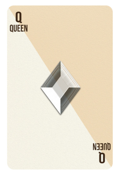
I was a big fan of how this looked, although I wanted a way to make this pip stand out a bit more from the background. I did this by duplicating the pip layer, removing the style, and making it black.
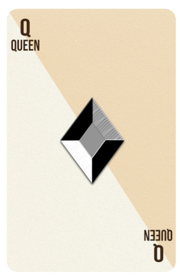
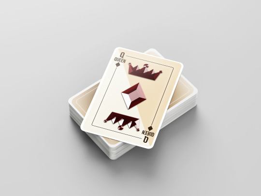
This result really excited me as it looks much better than I could’ve wanted. I love how these pips reflect what is underneath them. However, I soon realised that this method was flawed as it did not differentiate which colour the card was. This would have huge implications on playability and general use of the card.
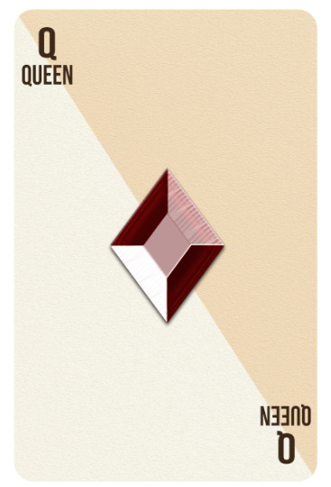
To counter this, I changed the bottom pip to red using the paint bucket tool. This created this amazing gemstone style design, while also solving my issue of differentiation.
The next step was to find a way to show that it was a royalty card. I wanted to keep this along the theme of minimal, while also keeping it symmetrical. I used the designs I made previously within Illustrator as my template.
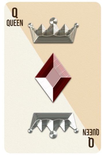
I applied the same style to these templates to create the same chrome effect as the pip. The next thing to do was to duplicate the layer and change it to red to support the rest of the design.
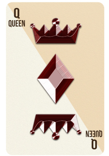
This really helped me see how well the red worked with the beige colour palette, as it was now more dominant.
At this point I thought I was finished, so I sent it to a few friends to receive their input and verdict on my card. This is where I was helped massively, as an outsiders opinion is very beneficial in design. The main things they pointed out was that it wasn’t very easy to tell what the suit was. With this in mind I added a couple of small pips in the corners. This was a silly mistake on my end as I should have incorporated these from the beginning.
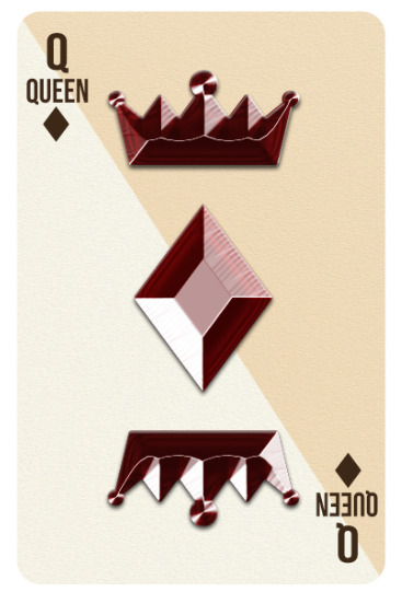
The final piece of input I received was to make the edges look less plain and to fill the space in a minimal way. I did this by adding a box around the card, this was inspired by traditional playing cards. This was done using the rectangle tool. I chose the rectangle to have no fill, and a stroke which was the same colour as the rest of the text.
I erased the rectangle where it met the text and pips to make sure it did not overlap anything and make it look untidy. One last thing I did to this rectangle was to add a white outer glow to add a minimal reflection of Kidmograph’s line work. This small addition helped to balance the tone difference between the brown line and beige card.
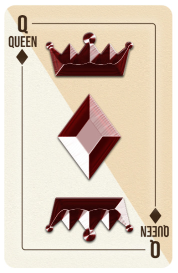
Overall I am very pleased with how this card turned out. I feel like I managed to portray my minimal design style and clean palette well. One slight problem I have with this card is that it is not for everyone. Although it looks clean and simple, many people might see this as lazy and unoriginal design, especially people that are very fond of traditional illustrative cards. I personally think this deck suits the 21st Century as it looks elegant and clean.
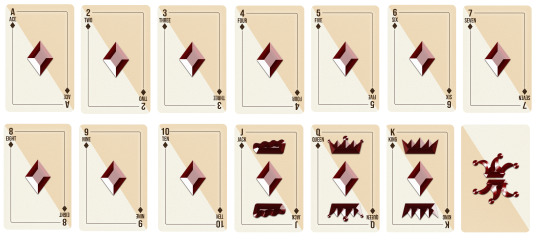
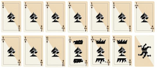
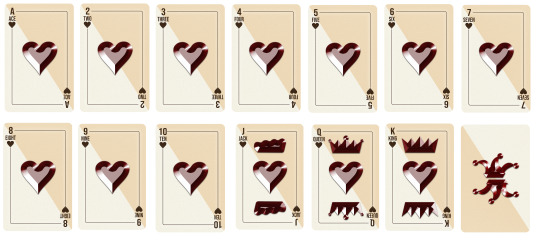
I created the rest of these cards in exactly the same way, however I changed the colours and shapes of the centre and outside pips. I also changed the colours of the royalty marks based off of which colour that suit is.
0 notes
Text
Final Pinterest Research:
Before going on to creating my final deck of cards, I wanted to get some more inspiration from some artists on Pinterest. I have a few ideas for colour scheme and style, however I think some more research could help to solidify these ideas and drive me towards my end product.
Unfortunately, due to how Pinterest works, I could not find the names of the artists that created most of these card designs.
Unknown:
These above playing cards are extremely simple, yet they still stand out to me. I think it is due to the misshapen pips. The slightly chunkier pips and font make a big impact on the over look on the card, especially on such a basic card face.
Unknown:
I love the colour scheme and distressing of the above card. Even though the original design is very simple and open, the distressing makes the card feel vintage and complete. This distressing creates a lovely, warm white/ beige tone. This is the tone I will be going for on my deck of cards.
Unknown:

Although I am not normally fond of Illustration, this above deck really stands out to me because of its simplicity. The pips are very detailed, however it leave the rest of the card open, creating a very clean effect. This clean effect is what I would like to incorporate into my own work.
Unknown:
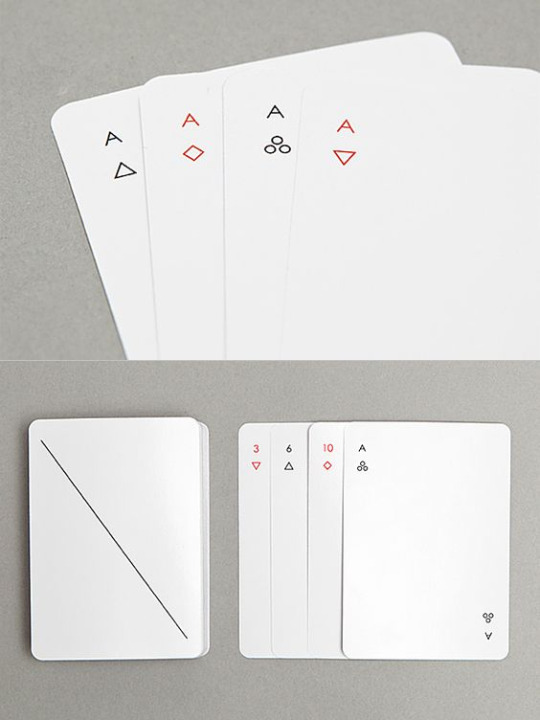
I am in love with this set of cards. It is the purest form of abstraction that can be possible on a playing card. It removes all unnecessary details that re not a priority within a deck of cards. The little details add another level of cleanliness as even the simplified pips make it look insanely tidy. This is the level of cleanness I would like to achieve.
Adam Whitfield:
The details that I took away from this set of cards is the placement of the Pips, slap bang in the middle of the card. I like this large indicator as I feel like it would benefit playability massively. This is a detail that would be a nice addition to my own design.
This quick research has helped me more than I thought it would have. It has helped me visualise my final version in my head and will allow me to make my deck as straight forward as possible.
0 notes
Text
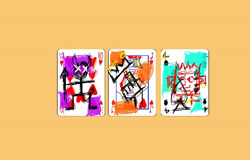
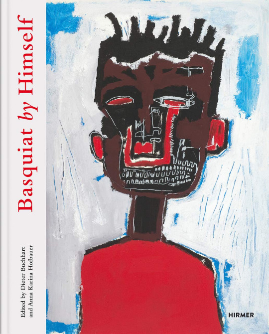
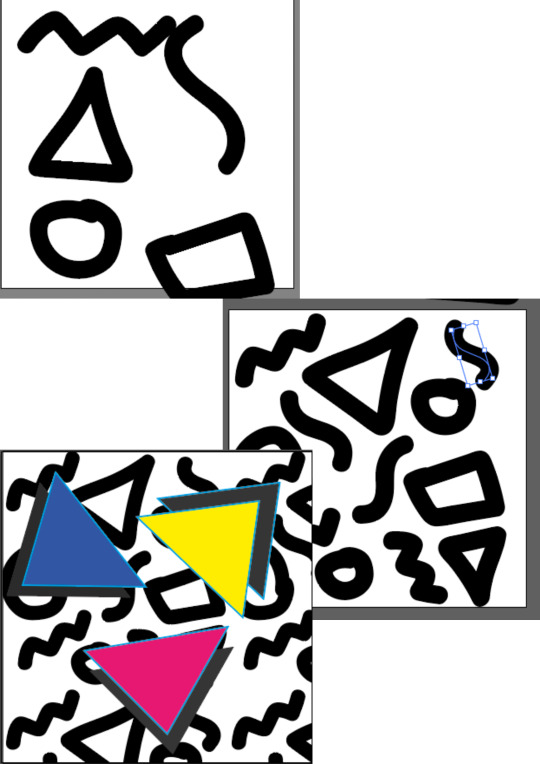
Jean-Michel Basquiat Workshop:
This lockdown has seriously effected my general mood and creativity compared to the other lockdowns, I am not too sure why but it is effecting my work and life more than it should. I think one of these reasons could be that to me, my work has to be perfect and it is hard for me to feel as if a piece of work is complete unless it is perfect. To get out of this rut I decided to try something completely out of my comfort zone and as far away from perfect as it could possibly be. One artist that sprung to mind when I thought of this was Jean-Michel Basquiat. His work has always been somehow amazing to me, even though it is the opposite end of the spectrum to mine. His work shows me that it does not have to be perfect for it to be accepted, he bends the artistic norms.
Basquiat was an American artist who focused on political subjects when creating his work. This seems to be a very powerful subject when creating artwork, as it is also seen in the likes of Banksy and many other artists. His work is very abstract and out of the ordinary, yet everyone still seems to know his name.
This above piece is Basquiat's self portrait. I think this artwork really helps to show off his insanely unique style, it reminds me an awful lot of Picasso’s portraits due to its irregular proportions and crazy colours and placements.
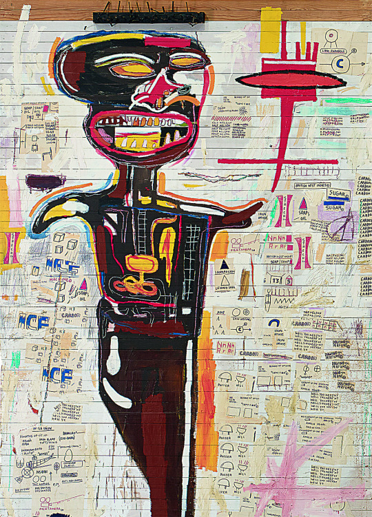
One thing that always amazes me is the amount of mediums Basquiat can use on a single piece of work. I personally think this is one of the things that defines him. For me, the best part of this work is the internals of the body, I think this is down to the powerful colour palette used which contrasts against the body.
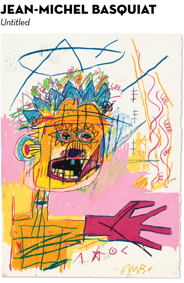
This is the piece that helps me understand that not everything needs to be perfect, as in a sense, this is far from it. The colours and shapes are completely off compared to a real person, however this is the style that he was going for, and this made me realise that you do not have to have the perfect colours or dimensions or even line work, for a work of art to be considered perfect by the world. This piece is a piece that I am heavily influenced by and would like to carry this into my own work.
My Outcomes:
It started within photoshop, where I imported a basic picture of a few playing cards and got drawing. I got the drawing tablet out especially for this. I normally stay as far away from a drawing pad as possible as I always thought that they were near useless for me because I could not use one accurately and precisely. However, this fear soon flew away and I was really enjoying using it, it gave me a new love for the tablet. I sketched round the cards and pips, which created a child-like outline of the card. Once this was done I went in with the pencil tool and went crazy. It almost felt wrong scribbling like this and to start off with it was not sitting right. When I started adding more and more layers something suddenly clicked and I was thoroughly enjoying myself. It is a style that I was very unfamiliar with but this didn’t stop me from having a great time.
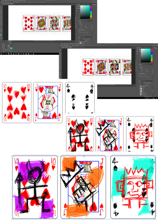
Once I had these rough drawings I went in and did some final details. Here is the final outcome.
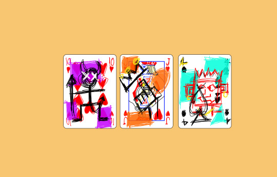
In conclusion, this workshop has taught me so much to do with mindset and design. If I were to do it again I would have done it physically in person, as I feel like I was limited in-terms of mediums on a Photoshop. These are probably the messiest pieces I have ever done, but they are probably one of my favourites just because of the emotion that was put into them. I loved how natural this was, I felt that all of my other work was becoming forced and was no longer enjoyable. I will not be using these moving forward, but I am extremely happy with how they came out and I will be doing this style of work much more often as a release of creativity and idea generation
0 notes
Text
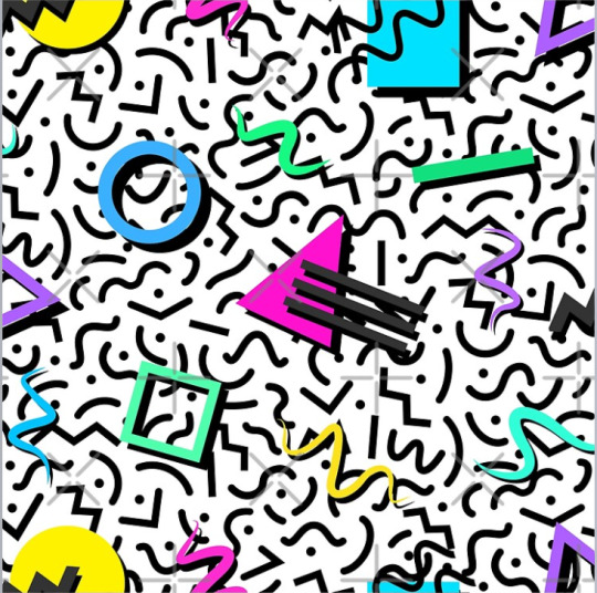
Creating my Own 90′s Style Repeat Pattern:
I decided to make this in illustrator as I thought it would be easier to create the shapes and patterns compared to photoshop as resizing would not be an issue due to Illustrator being a vector based program.
It started as basic shapes that were drawn using the circle tool and pen tool. I then added different gradients and strokes to these items, which created the neon, 90′s style colours. From here I duplicated the shapes using ‘Alt + Drag’ and rearranged them to a position that looked right. This created the basic pattern in which I would use for my larger pattern.
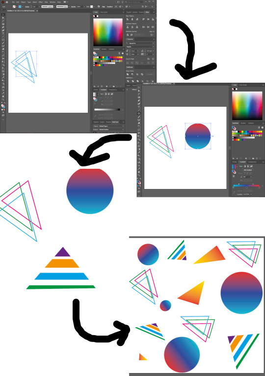
Next, I added a black background so that the shapes would stand out more and provide the similar space theme I was going with. The inspiration behind this was Kidmograph and his work with neon lines and bright gradients. I then used ‘Object > Pattern > Make Pattern’ to create an in-built pattern to use as a fill. One important thing to remember here is to make sure all of your shapes are grouped and selected before you create said pattern.
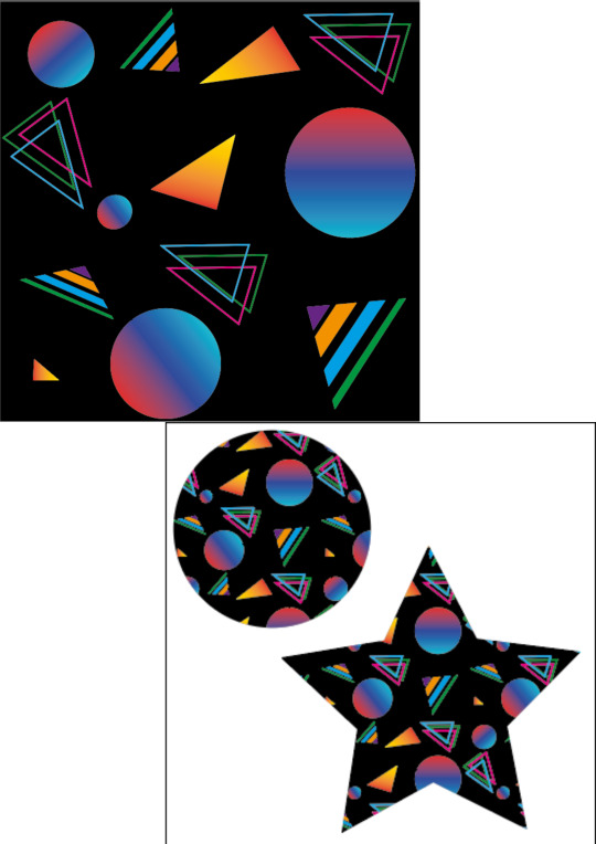
Finally, I made a few random shapes using the Shape tool. These were just to test out that the pattern actually worked. I am very fond of this tool and how simple it is to execute. I wanted to try to experiment a bit more with this tool so I tried creating another 90′s style pattern, in a slightly different way:
This time, I used the Paintbrush tool to create some squiggles and different shapes. I then duplicated and manipulated them many times so that they filled the canvas. Once I was happy with the composition I created another pattern.
This time I filled the entire canvas with this print and created a few triangles using the pen tool on top of the pattern. These triangles where then duplictaed and moved to the back of the shape to create that Iconic 90′s style drop shadow.
This piece was inspired by Neon-Wolf’s artwork. I feel like this technique was very effective in portraying the classic 90′s style. This is down to many things, such as the typical colour scheme on top of a monochrome, crazy background. Overall, I am very happy with how this turned out and was pleasantly surprised at how easy it was. I would love to make a deck of cards in this style, however due to time constraints I do not think this will be viable.
0 notes
Text
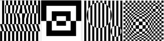
Zentangle Workshop:
What is Zentangle?
Zentangle is a brand that specialises in certain drawing styles. It is said to be a stress-reducing way of drawing that you should do from time to time to relax yourself. After looking at a few of the examples, I have realised that it is extremely ranged.
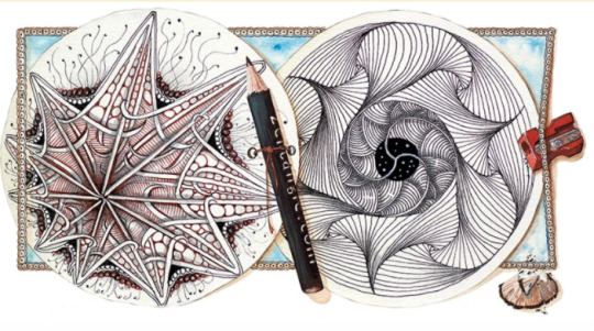
Some of this artwork looks more like Op-Art and features crazy lines and patterns. I really like what Zentangle stand for as they believe that anyone can draw and be creative. This is a very pleasant motto to have as it is insanely positive and creatively driven.
How mine was made:
It started off with a generic picture of a cat, which was then traced with a pencil using a window as a light box. Once the rough shape was finished I added some small details, but I was careful to not make it too detailed as that would ruin the effect I was going for. One problem which I ran into was the colour palette. I chose some shades of pink and blue as I thought these worked well. They looked different in pen form, however when I started using them on the paper my colour blindness came into play and slowly started merging all of the colours together which was far from ideal. This is definitely something to take forward with me in the future as it made it very frustrating when trying to figure out which colour was which.
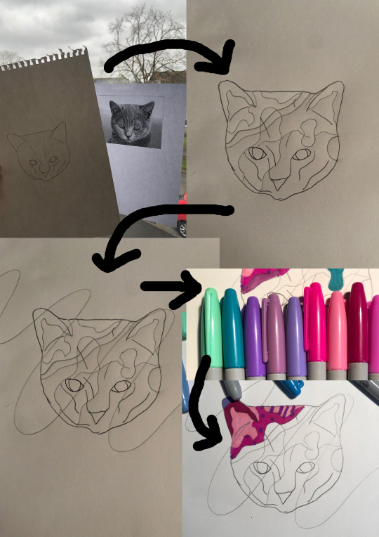
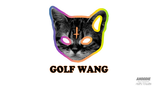
After drawing the rough outline I thought that it looked familiar. I then put two and two together and realised it looked like a logo for a music group that I like. This then gave me some inspiration towards the design as this logo is very simple, yet effective. The plain white eyes make the cat look devilish, this is something I would’ve like to incorporate into my own design, however I only remembered this logo once I had finished unfortunately.
Lastly, I finished adding the colours and went in with a black sharpie to thicken up the previous pencil marks. This really helped to draw the whole thing together and to make it look more finalised. I then added some further detailing using a 0.3mm fine-liner to exaggerate the patterns a bit as I could not see some of them without it.
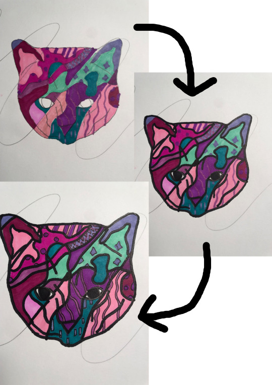
Overall, I am very happy with the outcome of this and I enjoyed the process alot. If I was not on such a strict time constraint I would have found this much more relaxing than it was! I would like to progress this in the future with different objects/ pictures to see what effect they could give.
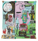
This style reminds me a lot of Jon Burgerman.
Jon Burgerman is an English Artist who is currently living in New York. His work features bold colours and exciting doodles to create a very friendly piece of artwork. His work is very cartoonish and easy on the eye with his bright palettes and simple shapes.
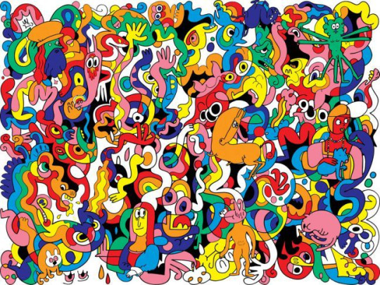
This above piece is fascinating. It has so much going on. I am particularly fond of the negative space used in the middle of the piece as it really helps to break up the sea of colours. I also like his cultural references used, such as the Mona Lisa, or Da Vinci’s drawings.
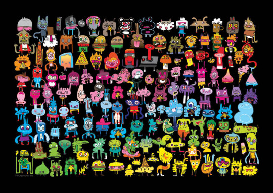
This is another piece that I am very fond of. I love the contrast provided by the bright colours against the black background. His character doodles are also very effective as every single one is different, no two are the same. The rainbow gradient of colours is a great method of composition, as it ticks all of the boxes of the colour spectrum.
This last piece of artwork really stands out to me in many ways. It features a single line drawing which is then drawn into to create all of the different shapes and features seen above. This is the most similar to my Zentangle artwork due to the bold single line running throughout it. I am also a huge fan of the gradients used to colour the individual parts. I would like to develop my Zentangle using Bugerman’s theme in the above piece.
Edited Zentangle:
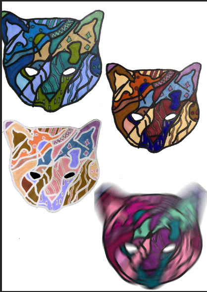
Here are a few edits that I made. I took Jon Bugerman's colour scheme and Golf Wang’s designs as inspiration, as seen by the different colours and white eyes. The last one I made was created using the Radial Blur tool to create this cursed-looking, moving picture. This was a fun, experimental outcome.
0 notes
Text
90′s Style Artwork Inspiration:
I was recently looking into different style of artwork, so I could expand my horizons and explore different techniques and mediums within my project. I stumbled across many, many different genres, however one that really stood out was the cult-classic pattern prints from the 90′s. I had already had a small look at these patterns when completing my FMP last year, although I did not go into it very deeply. Here are a few artists that I found that have inspired me and given me Ideas about what I can create.
Graphicwavedesign:
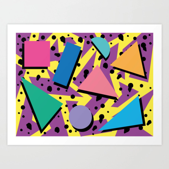
To me, this piece is the epitome of 90′s repeat-style graphics. It features the classic primary colours, mixed with the blocky shapes with the shadow behind them. The lightning style background, in unison with the black textures helps to create a clean, yet messy effect against the bold blocky shaped in the foreground. This is a piece I will take inspiration from when creating my own version.
Katie Malloy:
The reason I included this piece was to showcase that the 90′s repeat pattern came in all shapes and sizes. Although it isn’t your ‘Traditional’ repeat pattern, it uses similar techniques, such as the big blocky shapes with the pastel colours. I really like this piece and it gives me a lot of inspiration going forward.
Neon-Wolf:
Neon-Wolf adds a very funky spin to their pattern, while also keeping it very plain and simple. Although it is simple, there is something about the neon colours against the complex monochrome background that really stands out. I am fond of the overlapping of the lines onto the bigger shape as it adds more layers to the piece.
Alice Alva:
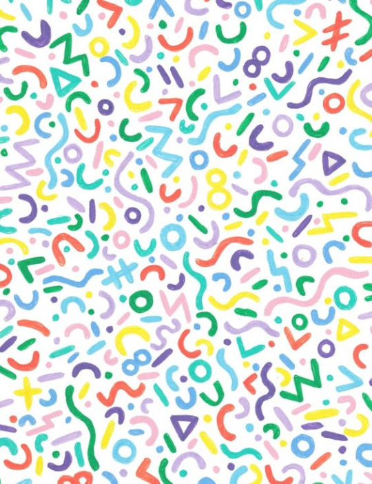
This pattern created by Alice Alva adds a unique spin on the 90′s theme by making it appear more soft and less sharp. It reminds me of a kids like version of the common pattern and looks like it spells out words, even though they are just squiggles. I particularly like the texture and highlights featured on all of the lines. I feel like they add another level of detail and help to make the piece look finished and far less flat. I would like to incorporate the idea of having words hidden in a pattern within my future work.
Kidmograph:
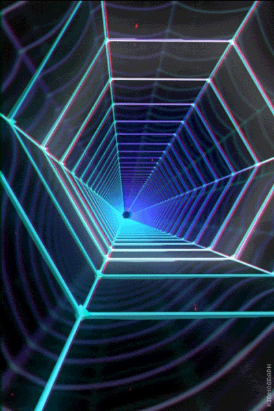
Although this is not exactly a 90′s repeat pattern, I still feel like it could work very well when executed properly. I think the neon lines on the dark contrasting background could create a very unique and effective pattern using basic shapes with an outer glow. I would like to take Kidmograph’s style of vapourwave, in unison with another artists style of pattern to create a one of a kind pattern.
0 notes
Text
Kip Omolade Artist Research:
When researching the use of chrome in artwork, I found one artist popping up time and time again. His name is Kip Omolade, he is an Artist based in Harlem, New York, and started his career off with an internship at Marvel, Whilst also studying at The Center for African Art. His work is iconic for its use of shadowing and reflections on a 2D piece of work.
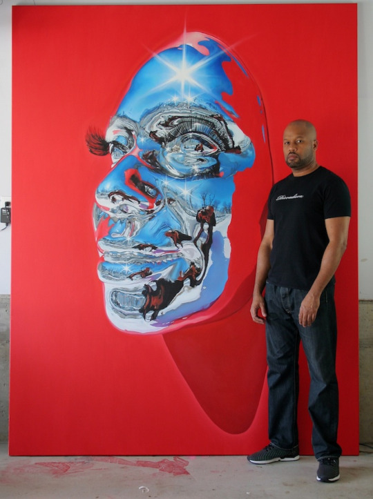
It is insanely hard to replicate what he is doing using a paintbrush, however he seems to manage with ease, and has a huge portfolio to prove this. This is one of his most famous artworks as it features his signature eyelashes. These little details really help to support the realism within his work and help to tire the entire piece together.
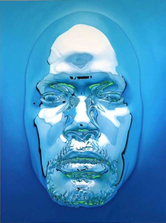
His artworks are based off of traditional African masks that are created physically, and then painted onto a large canvas. This above piece is very appealing to me as it is one of the best representations of the chrome effect. The layering of the whites to blues creates a very clean outcome that is very aesthetically pleasing to look at.
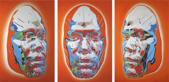
The reflections in this piece is very complicated. You can see the background where the original picture was taken. I find this ability to paint the reflection fascinating as to me it is a near impossible task, yet Kip manages to pull it off every time.
0 notes
Text
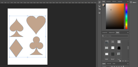
Pip Digital Development:
After sketching out my pips, I decided to make them digitally. This was done in both Illustrator and Photoshop. It started within Illustrator where I started messing around with circles, more specifically, a quarter of a circle, duplicated many times to create the pip.
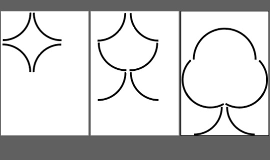
I was very happy with how the first two pips turned out, however as I slowly progressed to the others I soon realised that this method would not work. I wanted to keep the same form factor/ size 1/4 circles, and the last two pips did not look effective when attempting this. I then remembered an old technique in photoshop that makes use of the ‘Style’ tool. The Style tool allows you to apply a certain colour/ texture to an object. I had a metal pack of styles that were downloaded very long ago. So with that in mind, I made some very basic, traditional pips by tracing round a real playing card using the pen tool:
Once these were made, I moved into Photoshop to apply the Styles.
These styles were very appealing to me. It is something I have never made use of before and the outcomes were amazing. This gave me huge ideas on how I could progress my Ideas further.
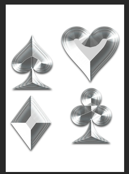
A great thing about this type of Style is that it plays with the blending options, meaning what ever colour you put under it, it will diffract it through the design.
These pips have a huge amount of potential and I will definitely be using these go forward. Although they are very simple, and may not be seen as complex to make, I still believe they are very effective.
0 notes
Video
tumblr
Here is a short video outcome I created for my deck of cards. I have very mixed emotions on how this went. Overall, the outcome is not too bad, but also no award winner. I spent around 5 hours total on this and it is still extremely far away from where I want it to be. For some reason After Effects did not want to work properly and was not cooperating. When exporting, the resolution keeps changing and I cannot control this, that is why it looks extremely ‘squished’. I am normally very fond of animation and movie making, however this has since put me off totally. In conclusion, this video has a lot of potential but was extremely poorly executed. I would like to return to this project to refine it, however I do not think I will have the time.
0 notes
Text
Further Pip Experimentations:
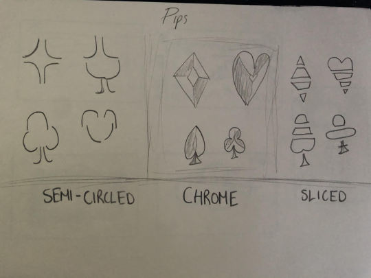
I drew some rough sketches of some pips, this was just to get my ideas onto paper so I could further develop them digitally.
0 notes
Text
More In-Depth Research:
Cosmic latte is the average colour of the universe, found by a team of astronomers from Johns Hopkins University. In 2001, Karl Glazebrook and Ivan Baldry determined that the average colour of the universe was a greenish white, but they soon corrected their analysis in a 2002 paper in which they reported that their survey of the light from over 200,000 galaxies averaged to a slightly beige-ish white. The hex value for cosmic latte is #FFF8E7.
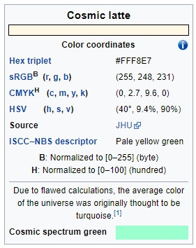
I wanted to incorporate this colour within my work as beige is such a versatile colour. I am really enjoying working with the more earthy tones, and this colour was the perfect excuse to use said terms. The fact that it is the colour of the universe links in nicely with the topic of multiverse.
For the rest of the design I wanted to incorporate a very important human linked to the Universe and Multiverse. That person is the Late Stephen Hawking. While working on this project I have been reading his book ‘Brief Answers to the Big Questions’. This book was a real Eye opener in-terms of this topic. It helped me grasp many different theories and expanded my knowledge massively. I felt like it was only right to try to incorporate his work into mine.
I also want to make these cards based around playability. It is all good and well having a card that looks nice but the card still has to perform within poker and card games.
0 notes
Text
Cosmic Latte V.1:
After receiving input from my friends and family on my previous deck of cards I realised that I was straying too far away from useable playing cards. I previously said that playing cards had to be functional, and my previous design was pushing that boundary. I decided to change my whole design, and that is how Cosmic Latte V.1 was formed. Below is the development of this deck. This deck went through many iterations to get where it is now, however I did not manage to record it in full detail as I was too focused to get it finished
Overall, I am much, much happier with how this deck turned out. The earthy tones and simple design appear very effective when used in conjunction. These cards will be much more playable as they are very easy on the eye. I feel like over the course of me making this deck I have progressed a lot as a graphic designer and have learnt a lot.
0 notes