
lboddington-blog-blog
Liam Boddington
A combination of University projects and personal work as a second year Graphic Design and Illustration student at Liverpool School of Art and Design.
197 posts
Don't wanna be here? Send us removal request.
Last Seen Blogs

annabaksteen
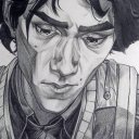
Anna Alieva

idea-crack-er
🏅 Cracks in concrete - the nightmare of engineers

masofista
lxst between darkness n pleasure

vpn-palvelut
VPN palvelut


Photo


Final Outcome
I’m very happy with my final outcomes and feel like I have learnt a lot from doing this brief. Firstly, I gained a greater understanding of what an editorial illustration is and how it works. Secondly I learnt that you don’t have to just repeat what is written in the text. To conclude, burning magazine pages is very dangerous and can cause injuries.
0 notes
Photo


Final ideas
Here are some potential examples of my final half page illustration in context.
0 notes
Photo


Final ideas
Here are some potential examples of my final double page spread illustration over an A3 spread.
0 notes
Photo


Final ideas
Here are some potential examples of my final A4 full page illustration in context.
0 notes
Photo


Development
After burning the magazines, I managed to save some individual pages which i think look really cool.
0 notes
Photo


Development
After my discussion with Matt about reverting back to the magazines and focussing on the culture surrounding the Grammy’s I took some of these images.
0 notes

Photo


Development
I have chosen to use an image from an abroad workers website to represent the “Expats” and an image of asian business people to represent the “Immigrants” to show that not all people who come to this country take money from the government and don’t work. My aim was to question the stereotypes surrounding both these words.
0 notes

Photo


Research
For my research I started looking at British expatriates and what first came to mind was British people going to work abroad. Obviously those who go don’t see themselves as immigrants but they technically are! I want to use this as the content of my illustration.
0 notes


Photo


Development
I tried printing my poster out A3 on newsprint on the printers in uni but I had some complications and it kept jamming. As a result of this I printed it on my own printer on A4 newsprint and it worked!!! I’m very happy with my outcome and think it looks better on A4 as it is a similar size to newspapers/magazines.
0 notes
Photo

Development
This is my final design for my alternative election poster! I would like to print on different paper stocks to try and make it look more authentic as currently the paper from the printer is too white.
I’m happy with my outcome, I think it optimises everything that a election poster has and is just as annoying to look at. I wanted to keep the colours and symbols associated with each political party so that they would be easily identifiable but not completely about them. I choose not use any imagery of the leaders as there is already thousands of photo’s of them everywhere without me using them and wanted to make this look as real as possible.
0 notes
Photo


Development
Using the magazine advertisements found in various magazines as inspiration, I started to construct my own which would subtly include all of the political parties as my alternative election poster. I want to make sure that no party is favoured over another or the opposite, no party is insulted more (photo of Nick Clegg has been removed).
0 notes