
Last Seen Blogs
psychedelic-mood
complete bastard
ofturmoil
willing to fail.
dialga64bitz
Bruh is my stim word
ablurredfriend
he's a kitty!
lovemayari
moved to @spvdermansgirl
Text
I decided to make a photobook flip through, as I thought it would be fun to learn how to do. This way it was easier for me to envisage what the book would look like if it were probably made into a book, than just viewing it on indesign.
I watched some tutorials on how to do this and found one which taught me how to use an Adobe plugin called, Issuu. I also wanted to upload this in case my finished exported PDF isn't clear enough when submitting, as I was having some trouble with this earlier.
0 notes
Text
I thought this website was really cool in terms of lighting and contrast with shadow and light. Lean Timms captures food really well and chooses his colours carefully for the best possible outcome. I find most of the shots on his website have a colour palette that matches nicely with the colours in the other images.
Colour grading and matching was something I was and still am slightly unsure of when editing my images, but I looked to Lean Timms for inspiration in terms of an aesthetic series of photographs. Lean Timms shots all look pretty modern and I wanted my photobook to generate this feeling as well. I wanted my photographs to have mostly warmer tones as this suited the lighting in the restaurant.
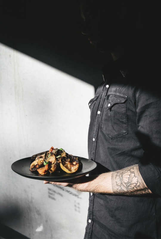
Here are some examples from his work where he has clearly thought hard about the shadow and light contrasting. The way the black areas contrast with the white create a moody, yet still happy image, where the food can still pop with appeal.
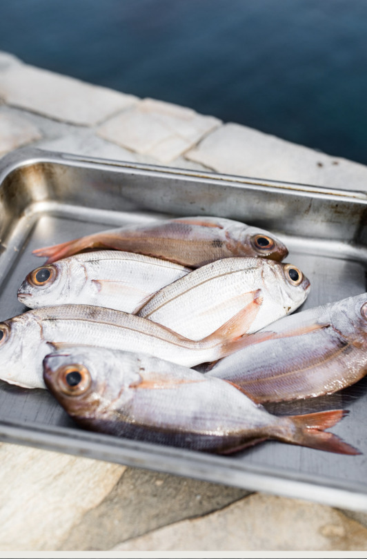
I think the shot of the raw fish is really cool too and the different shade of grey of the tray the fish sit in, contrasting with the grey colour of the fish is really effective and the depth of field used is really strong as well. I felt this image had a similar idea behind it to my shots of the raw fish that I shot with a shallow depth of field also.
0 notes
Text
This is my updated cover page for the photobook. In the end I decided colour looked better than black and white. It just made more sense overall and the black and white ended up looking a bit old fashioned I felt. I also like the title more on the right hand side than the left. Now the only thing I need to do is add my name onto the page somewhere which I will probably make in white.
0 notes
Text
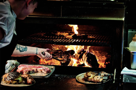
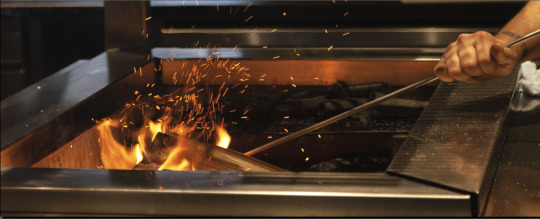
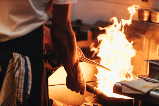
David Griffen's photography is so cool and captivating. This shot of the oven is so strong and the way the flames are captured is amazing. I tried this myself when getting my fire shots. This was a challenge for me as it meant playing with shutter speed. I wasn't sure of how to achieve this prior to taking these shots so I had an idea of my composition, but in terms of getting the flame well captured like the image above took a lot of experimentation. I had to have a pretty high number for my shutter speed so that the flame wouldn't be a blur which then meant having to compensate with ISO and aperture. In the end I was pretty happy with the outcome...
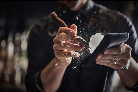
The second image of his uses strong shallow depth of field blurring out the background which allows the viewer to focus purely on the hands. I tried something similar when capturing this shot...
0 notes
Text
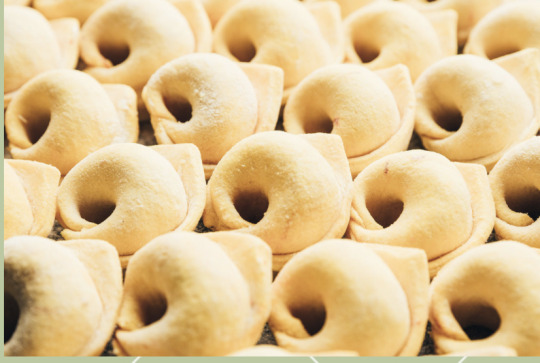
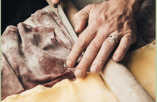
I have been exploring other high end restaurant's galleries in Auckland to see how other photographers capture Aotearoa's food and hospitality scene. Before this project, I hadn't done much other photography like this (hadn't focused on this subject matter much before) so looking at other work that has a similar flavour has helped me develop my eye.
The close up shot of the pasta is interesting in terms of texture and this is what I played around with when photographing the seaweed cracker and some shots of the fish. Those shots were me trying to get up close and capture the food in its state before it has been cooked or fully prepared.
The close up of the hand rolling the pastry provides a good insight into what goes on behind the scenes in the preparation stage which is what I have tried to focus on for some of the first half of my book. I think hands make for a really interesting subject matter. Especially when taking food, restaurant and portrait photography because hands are essential for the creation process when making the finished product (the food).
0 notes
Text
These shots are all from the Hello Beasty's photo gallery which I was looking at for inspo. I think these photos relate really well to my photo theme and vibe.
. The fire shot, I actually found after I took mine but I feel it links well and the colour palette is exactly what I am feeling for may overall shoot.
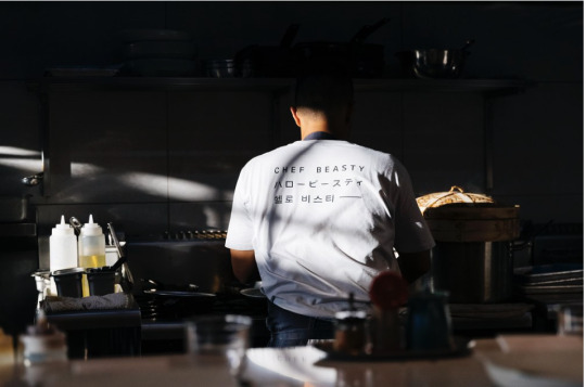
. I love the use of lighting. the lighting is quite different, lighter than the atmosphere in Mr Morris, but I like the shadows generated and I have tried to create something with the photos I have taken of the chef's hands and the front and back portrait shots of the owner of the restaurant. I wanted my shots to look moody, but in a warm and inviting way which I feel these Hello Beasty shots achieve also.
0 notes
Text
Here is my small intro page for the photobook. I have't fully decided on the text, but this is just an idea of the kind of thing I am wanting to write.
I finally found a way to incorporate the fan into a page of the book. I played around with the page number idea, but it didn't work out. Having an image of the fan, no matter how big or small I made it, on the same page as a photo, just distracted from the image and made the book look messy and unprofessional.
I also played around with sizing of the fans a number of times, initially trying 5 down the bottom and then placing them at the top and bottom of the page, but then decided I liked this outcome much more and think I will keep it like this.
0 notes
Text
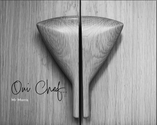
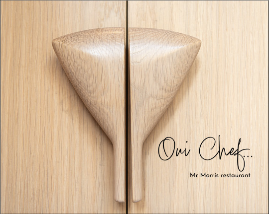
This is my current idea of my cover page. I have been playing around with a range of different fonts and felt this one suited the title best. I also played around with a few for the Mr Morris subtitle and in the end chose this, as it looks quite similar to the Mr Morris font on our business cards.
I think black and white looks best, as it looks modern and I didn't want any colour from anything outside or inside the book other than the images themselves. As I chose to make them all in colour, I wanted all other content to be colourless to create contrast.
I am still not fully sure on text placement. I may move it over to the right hand side or slightly up or down. I will continue playing around with this. I do know that I don't want the text to be much bigger because I want the viewers eyes to notice the door handles before anything else.
0 notes
Text
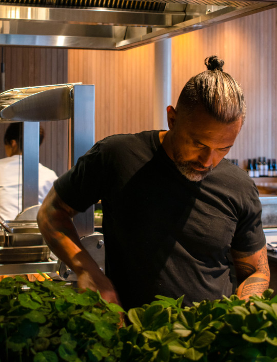
Here is the shot I am thinking of using as my hero image. In my eyes, it is still one of the strongest images I have taken. He is also the owner of the restaurant so I wanted him to be the main focus.
This shot was actually taken in one of my earlier shoots when I was just starting out with the development process of my idea and didn't have much idea on how to capture the best possible images in the lighting conditions of the restaurant. However, I always liked the composition and through experimenting with editing, I like the overall turn out and I feel this was the best one of him that I captured.
The RAW file of this image is very dark and if I had taken this shot in one of my more recent shoots, now that I gave more knowledge and experience with shooting in the lighting conditions, I feel it would have come out a lot better without needing as much editing.
At this stage, I think I will stick with it though because I do really like the shot and I also haven't had many other opportunities since this shoot to get more shots of him. I have tried to find other times where we will both be in the restaurant at the same time, nut there just hasn't;t really been another appropriate moment that worked for him.
When photographing other people, especially people I am having to work around and not arrange things with, one of the greatest challenges is finding a time that works for both and when shooting in a restaurant the appropriate times are even more limited, as I can't be shooting in there freely at night when customers are in there.
0 notes
Text
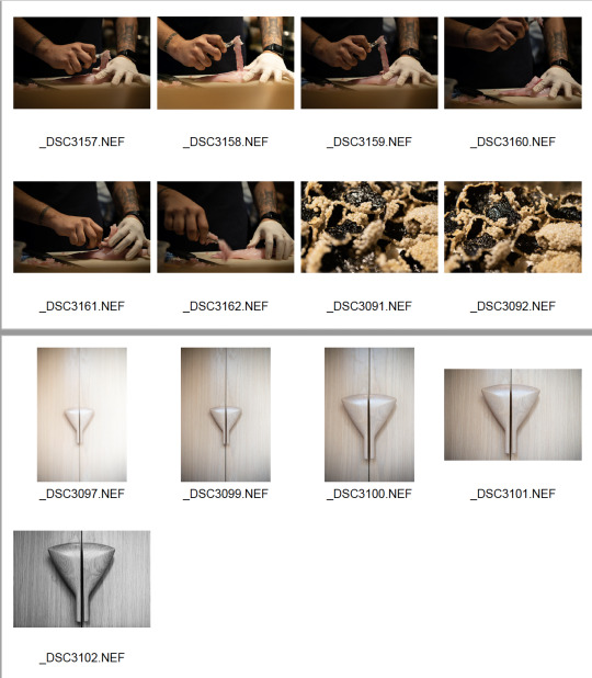
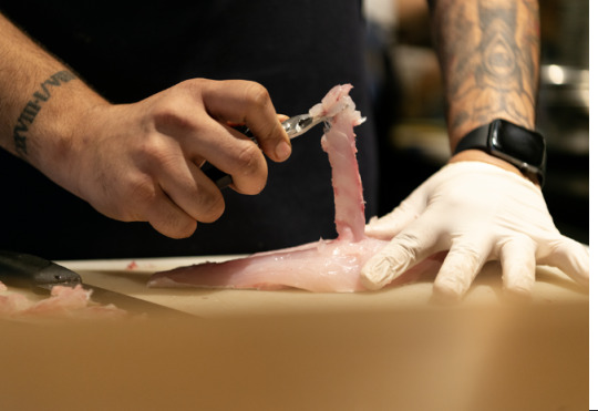
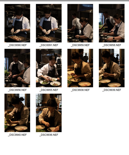
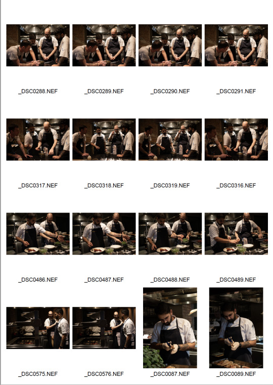
Here is my week 12 shoot. I am at the stage of my project now where I am trying to fill in the gaps that are missing in my photobook. I have finalised a lot of the shots, but just needed to capture a few more close ups, images like the ones of the chef cutting up the fish (more action type shots) and I am still playing around with the sequencing of the images too.
The shots of the wooden door with the fan handles is what I am thinking of using as my cover image. I love the texture of this door and think the fan handles are a really cool and special touch.
I thought about using a close up shots of some hands preparing food, or the stack of bowls and places that the chefs use every night as my cover image, but in the end I felt these doors shots came out the most effective.
The black and white shot is the one I am thinking of using. It looks more contemporary and modern in my eyes which is the look I am going for for this book.
0 notes
Text
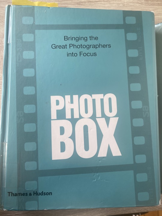
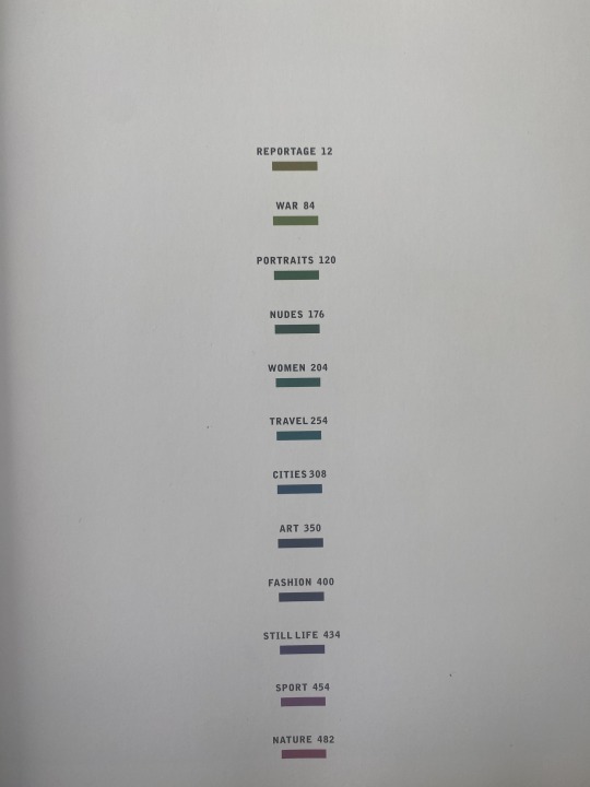
Here is a photography book I have been reading since I went to the AUT library to look for a photobook. I didn't come across any photobooks as such of any individual artists work, but I did find this which I have been really enjoying. It is full of famous and successful photographers who focus on a range of different genres when it comes to making their content. On each page there is a photograph from a particular photographer and some text on the page next to the image, describing the photo, the story behind it, and a little bit about the photographer themselves and some of their achievements. I have found it very interesting and it has opened by eyes to so many new photographers that I didn't;t even know existed prior to reading this. I have done some further research into some of these photographers other work since reading and they have produced some amazing work.
0 notes
Text
This is some of week 9's shoot which came out very dark. This was before I borrowed full frame camera which out improved the quality and lighting of my photos drastically. The focus for that week was trying to capture interaction and team work in the kitchen. I was mostly trying to shoot the chefs talking to one another, working together and helping each other. The image of all the chefs standing together was them all trying a new sauce going on one of the dishes so I jumped on the opportunity to capture this moment, but they didn't really turn out how I wanted them to, or had envisioned them to be. I don't think any of these photos will be used as finals, but this shoot helped push me to inquire ways I could get brighter images in the lighting conditions, which was what led me to borrowing the full frame camera.
0 notes
Text
Trying out fonts and titles for my photobook... Think I will try playing round more with design and font ideas on illustrator so that I have more options and can make it more interesting. I will upload this ideas later.
0 notes
Text
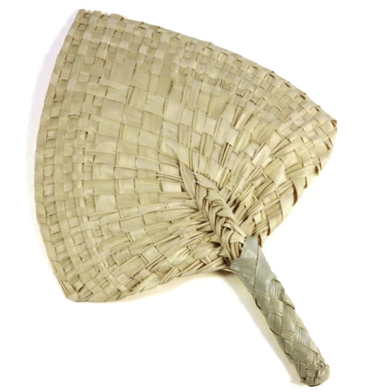
This beautiful Samoan fan is a significant symbol throughout the restaurant, as you can find it in multiple places. The door handles on the door you go in to enter the restaurant are two halves of a fan. This is the same on our wooden wardrobe where we hang people's coats. It is also on the menus, cards and paper which goes on the plates under most of our snakes.
Due to its significance, I want to somehow include this fan in my own design throughout the photobook. I want to do something similar to the way it is displayed on the paper. A light grey is very effective and I am trying to think of ways I can include it in the book.
I am thinking either I would have a white page next to most of the pages with a photo, and on the white page, there would be little fans along the bottom of the page with the page number in the corner. Or I could have just one fan in the corner of a page with the page number on it with a photo. I am still deciding how I do this. I would also love to somehow include the fan in the title, whether that be faded behind the writing or one at each side of the title... I am going to play around with some ideas and sketch them out.
0 notes
Text
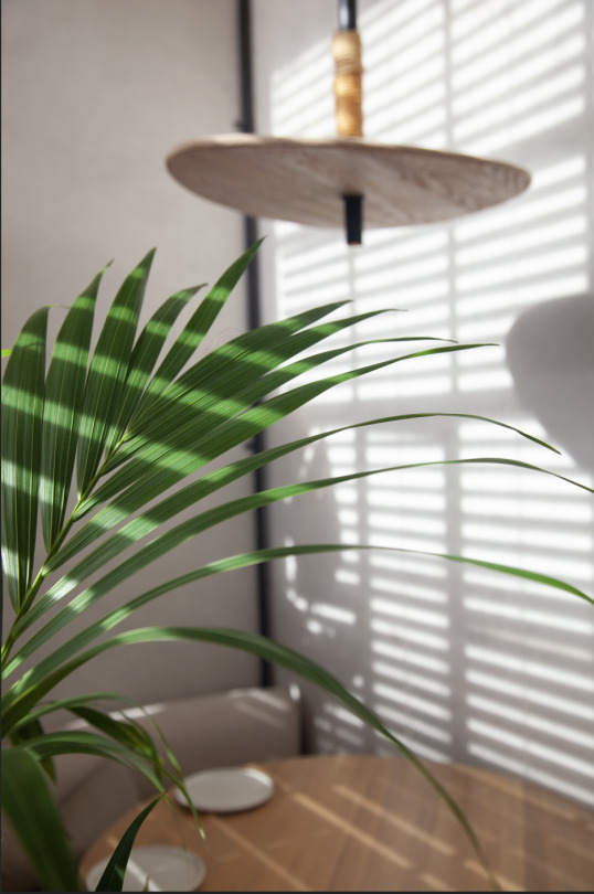
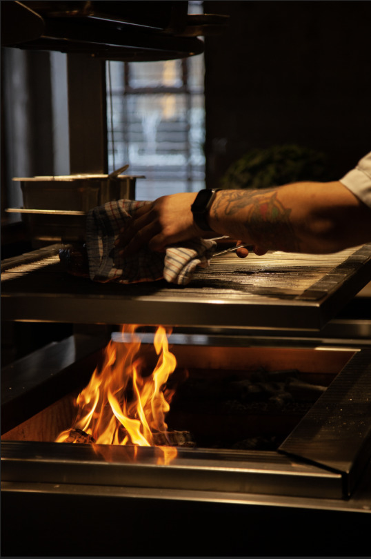
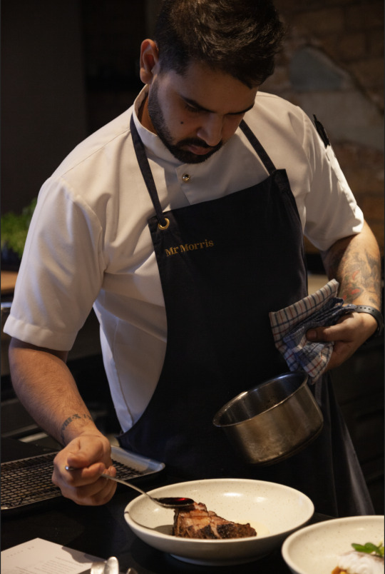
Potential hero images -
Here are 3 images I have taken so far that I probably like the most.
The first one is me experimenting with the interior. The restaurant has some beautiful lighting in the mornings and early arvo as it comes through the blinds which creates really cool shadows on the wall and furniture. My main focus here was the plant and the shadows created on it. Plants are quite a significant part of the restaurant itself, as they are present throughout and make up most of the overall aesthetic. Depth of field was what I was going for. Having a nice subtle blur in the background to allow the plant to pop, but for it to still be clear. I feel having the exterior incorporated into the photobook will provide context so I feel it is quite essential.
The second image is of the fire. The fire in the kitchen is very significant to the chefs as it is what most of the food is cooked on. The smokey flavour of the food on the menu is a significant flavour throughout most of our dishes which is also another thing we are known for. The way the food is cooked on this fire is so important and essential to get right as without it nothing would work. The way the fire is lit is important too and the chefs put so much care and effort into this process so I want to see what else I can do with the fire.
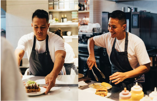
My last shot is a portrait of one of the chefs. I feel here, his stance is strong and and powerful. I tried to capture the care and control that goes into preparing a dish and how much detail goes into one dish. I also wanted to capture the apron with Mr Morris written on it to provide context and the apron is such an integral part of their attire. I also like the way the light is capturing the white shirt and the textures are captured on this with parts being more exposed than others.
I feel all of these images could be stronger with better editing, but this is what I am going with for some of the top three currently.
0 notes
Text
Class discussion and feedback
Photograph the chefs in their own time. On their break, after work, while they're talking in the kitchen
The chefs having their briefing
Close ups of some of the supplies and produce they are getting in
How can I make the photobook more intimate, personal and less generic?
0 notes
Text
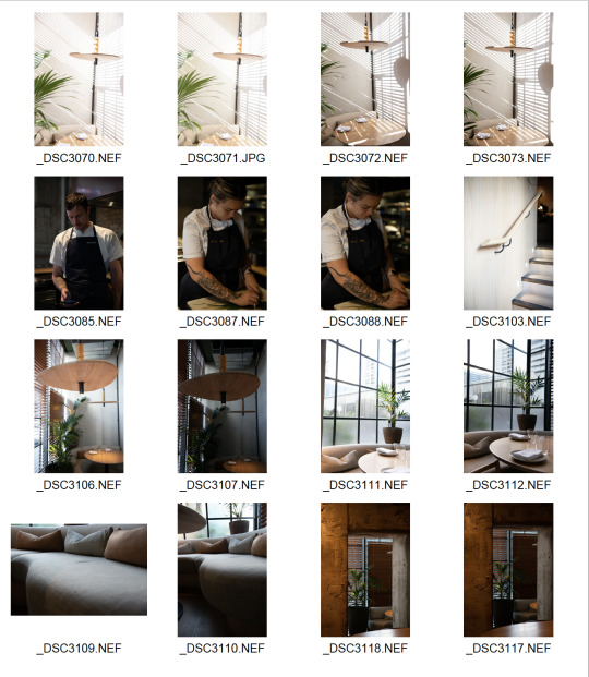
Other photos I need to get for photobook
More exterior shots of restaurant
Close up of the doors and logo - I have already taken some, but they're not super clear and could have a better composition
A few more close ups of the chefs making the food
If possible, some more behind the scene shots of the chefs bonding and working together in the back of the kitchen
0 notes