
Don't wanna be here? Send us removal request.
Statistics
We looked inside some of the posts by ldomenella and here's what we found interesting.
Average Info
Notes Per Post
4
Likes Per Post
3
Reblog Per Post
1
Reply Per Post
0
Time Between Posts
22 days
Number of Posts By Type
Text
3
Last Seen Tumblr Blogs


Fun Fact
Premium Tumblr themes are available from anywhere between $9 to $49.
Text
Responsive Portfolio Website - Project 1
Part 1 & 2
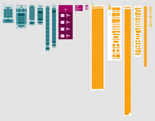
I started this project as I would any project by looking up examples and getting some inspiration online. Some of the websites that I found that inspired me were Heather Shaw’s website (http://heathershaw.com/index.html), Jessica Hische’s website (http://jessicahische.is/anoversharer) and Raoul Gaillard’s website (https://www.raoul-gaillard.com/). I liked individual pieces of each website and tried to incorporate all of the things that I liked into my website. Below are the wireframe sketches for mobile, tablet and desktop that I made for each website. I made one wire frame for their home page and one for an work page.
Part 3
After making the wire frame sketches for the portfolios that I liked, I made my own ones for mobile, tablet and desktop, which incorporated the elements that I liked the best on the portfolio websites that I had found.

Part 4
After I made the wireframe sketches, I made three different style tiles to further digitally sketch out what I would want my website to look like. Originally, I wanted my main page’s images to be overlaid by a color like Heather Shaw’s website, which is what I did for my style tiles. However, it was really hard for me to make the style tiles and after talking it out with my classmates and professor, I realized I wanted a more simple and less colorful front page. Therefore, the color on these style tiles isn’t like my website that I made but the type and overall format is similar. I decided to use DIN as it is used for the Bill and Melinda Gates Foundation website and I think that their website is beautifully designed.


Part 5
After getting feedback from my style tiles I realized that I wanted a more simple front page so that the artwork would standout so when I went to create my static digital layout that is what I did. My static digital layout is very similar to my wire frame sketches, with only minor changes. I actually tried to map out or at least have a layout for every page on a mobile, tablet and desktop layout, which is why there are so many layouts. This actually ended up being very helpful though because once I had a clear idea of what I wanted the website to look like, I just had to make the html and css to match that instead of trying to design the page with html and css.

If you are interested in seeing the end result, please follow this like https://linadomenella.github.io/project3/index.html
1 note
·
View note
Text
Game/Learning Tool - Project 2
Brainstorming – Part 1


For this project we started out by brainstorming things we learned in elementary school, things we do on a daily basis, professions, and things we are passionate about. We tried to break down these ideas and see where they could lead us. Next, we focused in on 6 ideas and sketched simple wireframes of those ideas out.
6 Sketches – Part 2


In these 6 sketches I was thinking of doing one involving a map of the U.S. and clicking on a state and the having a pop-up of simple details of that state. My next idea was to do the planets and again when you would click on the planet you would get a pop up of information about that planet. My third idea was to do a matching game with Spanish and English words. My fourth idea was to do an interactive website with colors and have a quiz at the end. Another idea was to do something like a BuzzFeed quiz where you take a quiz and answer based on what you enjoy and at the end you would get an answer to the question of what you should do the next time you and your friends hang out. My final idea was to do a website teaching people how to do simple friendship bracelets. In part 3 we had to narrow those six concepts to one and the one that I was most excited about and got the best feedback on was the color idea, so that is what I made my paper prototype of.
Paper Prototype – Part 3


I learned a lot from this process of making a paper prototype and having people interact with it. For example, I decided that it would be better to have separate pages instead of one long page for my website as the coding can get very tedious and long if it is all on one page. From these ideas I developed a digital static wireframe in XD based on my paper prototype and the feedback that I got from it.
Digital Static Wireframe – Part 4


From the wireframes that I created I was able to set up what the HTML outline of my website should look like. I also created then and interactive digital wireframe which helped paved the way for my final website. However, before I could start creating and coding for my final website I needed to develop style tiles to know more about the layout and colors that I would be using.
Style Tile – Part 5


I made this style tile from inspiration from other kid websites and mood boards where I was inspired from the color wheel. I was having issues trying to make this website modern, but still look like a kid’s website. I also didn’t want this website to look like a really old crowded kids website like the ABC mouse website. However I took a lot of inspiration from the Funbrain website and the menu bar at the top and the color patterns from both of the websites. I threw some ideas down but was not at all impressed with them. The mood board with the stripes was a lot and very vertical while the color wheel is circular so I decided to make a simpler mood board and was more pleased with those results. From that mood board I made the style tile and decided to make a menu bar like the Funbrain website and have the color wheel be the center image with a very dark grey type and a white background.
Static Digital Layout – Part 6


It took a couple of reiterations, but one night I went to bed thinking of an idea for the main page as I was really struggling with that, and they next morning on a plane I played around with the circles behind the color wheel on the first page. I first thought the fill of the circles should be white and the boarder would be light grey, but that didn’t look good so I played around with it until I arrived at the design for the front page that I currently have. I knew what I wanted on the primary, secondary and tertiary color pages so that page was easier for me to make now that I had the first page done. The design for the quiz page followed the design of the primary, secondary and tertiary color pages to keep the site coherent. The circles at the top of the page were added later as originally I had the color wheel at the top all in the different colors of the color wheel. However, it was hard to read some of the darker letters so I changed the letters to white and put the circles to act as a rule line. I also used to have the buttons inverted where the background was the dark grey and the letters were white but I thought that was too heavy on top of the page with the header so I inverted it.
1 note
·
View note
Text
This is the research that I did on Retiro:
Retiro was designed by Jean Francois Porchez who was the founder of Typofonderie and the designer of many typefaces with a Western European distinction. Retiro was specifically designed for the magazine Madriz as the founder of Madriz was looking for a Didot for his magazine as Didot is used in high-end magazines like Vogue and Harper’s Bazaar. Retiro got its name from a park in Madrid and is a “daring interpretation” of Spanish typography and as a result it contains various elaborate capital forms with the Spanish influence.
Retiro is a “high-contrast serif design” influenced by the Didone variety. Retiro is available in five optical variants, which are each named for the intended point size they were designed to be set. The biggest difference between each of the variant point sizes is the bigger the variant, the thinner the thin lines get.
https://blog.typekit.com/2016/03/23/new-fonts-anisette-and-retiro-macho-and-museo-sans-display/
https://typofonderie.com/fonts/retiro-family/#details
http://www.zecraft.com/fonts/retiro/
https://medium.com/@redheadedmandy/didot-typeface-d38ee7c02c4c
It is clear with the high contrast between the strokes in addition to the flat, unbracketed serifs that Retiro was influenced by Didot.
Bettger, Ivan. “New Fonts: Anisette and Retiro, Macho, and Museo Sans Display.” The Typekit Blog, 23 Mar. 2016, blog.typekit.com/2016/03/23/new-fonts-anisette-and-retiro-macho-and-museo-sans-display/.
Harvey, Amanda. “Didot Typeface – Amanda Harvey – Medium.” Medium.com, Medium, 7 Mar. 2016, medium.com/@redheadedmandy/didot-typeface-d38ee7c02c4c.
“Retiro – ZeCraft.” ZeCraft, www.zecraft.com/fonts/retiro/.
“Retiro.” Typofonderie, typofonderie.com/fonts/retiro-family/#details.
Project 1
Never did I think that when I decided to become a Visual Communications Design major that I would have to learn how to code. This first project opened my eyes to a brand-new skillset that I never knew I even needed. It helped me combine my love for aesthetics with a different way of working with technology.
In the first part of this project I choose 5 different letterforms from 5 different fonts. I choose the Q from Modesto Poster, the d from Retiro Std, the I from Abril Fatface, the t from Gill Sans, and the k from Poppins. After looking at all of my choices I realized that I tended towards the thicker fonts, some that had very thin serifs and some that had no serifs at all. Although my final y wasn’t one of my initial letterforms, I had always been intrigued by it as is very closely resembled a martini glass. I ended up choosing the lowercase y in the Retiro font as I thought I could make the most intriguing graphic with that.


Once I knew that I was choosing that letterform and that font I had a pretty clear image of the olive and stick placed in the “martini glass.” My mom used to have a shirt from a girl’s night out weekend that was black with pink writing and had a martini glass on it which is where I got the color scheme from. I found online a similar girl’s night out image with a martini glass in it that helped me further develop my idea. Additionally, I did some further research and found an Audrey Hepburn poster that helped capture the idea that I was attempting to convey. I also did some research as to where I wanted the olive and stick to fall on my y and knew that I wanted it tilted toward the right, but I didn’t know how far down I wanted the olive to sink in the glass. After looking at many different cartoon images of olives in martini glasses, I settled on where it would be in my digital mockup.

These are my initial sketches:


This is the mood board that I created and was a part of my inspiration:

I ended up placing the y on the top of the page as that is the first thing that I wanted the viewers to see. I then placed all of the other information based on what I thought was most important. I then changed the sizes and colors based on what I thought looked the most visually pleasing.
These are my original static digital mockups:


My final website looks identical to the static digital mockup except I made the olive, which is the button an olive color when you hover over it to let people know that it is a button that the user can click.

2 notes
·
View notes