
leahsalmonunit1
Illustration Unit 1
Graphics Student - Illustration blog
24 posts
Don't wanna be here? Send us removal request.
Last Seen Blogs

jbyrdink-blog
J.ByrdInK


dragontiddies123
WAHAT IFF WE
tragichopeful
kaiser

makassarloker-blog
Loker Makassar
Text
Task 5: Evaluation
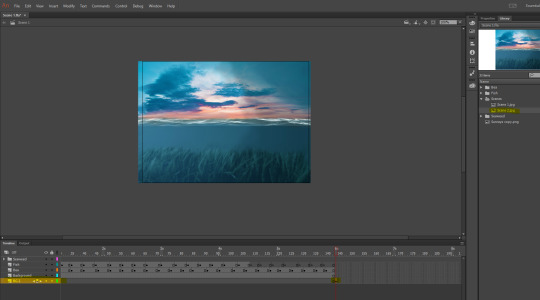
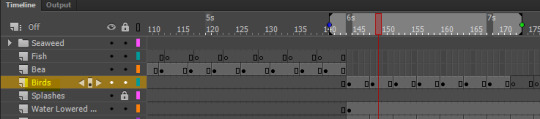
Our final assignment of the year for Liam was to create a scene or two with elements within it that animate and a character that moves in that scene and interacts with it. We had to do this in adobe animate.
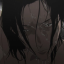
Following the brief, our animation had to be at least 10 seconds long. I wasn’t sure I’d adhere to this specification so I went the extra mile of creating an additional scene. We had to create a minimal of 1 scene and 1 character as well as different objects within the scene(s) that moved. After finishing my animation, I can safely say that it is at least 10 seconds, my character moves and interacts with my scenes and I have objects within the scenes that animate. I had to do a lot of planning and sketching before animating. It was important that I had a visual idea of what I wanted to create before creating it instead of rushing ahead to animate something I haven’t properly thought through. My character is a sea creature for the simple reason that my setting is underwater. I chose an orca because it is one of my favourite sea animals. I wanted my main character to appear cute and cheeky and in places like sea world, Orcas are usually perceived as cheeky, quirky and always curious. I made her pink for the simple reason that I wanted her to stand out within the water and I think giving her an unrealistic body colour also makes her appear cute. I think having my character in the scenes I made, you can come up with the assumption that she is alone and in deep waters for the first few seconds. From this you can gather that she has swam away from her family and is exploring ‘unknown’ waters almost. My style is a mix between anime and realistic. My backgrounds are more realistic whereas my animated objects are more on the anime side of things, this also makes my work different from others’.
My background environments are underwater and sea level. I came up with the concept ‘underwater’ because I figured most people within my peer group would create something more basic and simple like a room and I wanted to create something that was perceived more magical and mysterious, hence why I chose underwater. I had an idea of how I wanted to draw these scenes but I didn’t know how to create them in photoshop from scratch so I followed two tutorials that aided me in making these two scenes. I really like how my first scene came out. It looks lonesome and magical and this was the impression I wanted my animation to give off. I think scenes in every game, movie or the like really affect the overall mood and atmosphere. Dark environments can represent things like horror, danger or sadness whereas light environments can mean the complete opposite. I used photoshop and illustrator to create my backgrounds and background objects. I am most comfortable with photoshop which is why I used this to make my backgrounds.
My final animation:
youtube
I wanted my initial animation to show Bea, my character, swimming in the depths of the ocean before she enters a sunken pirate ship and spots a shiny object which she boops with her nose. As I went through the process of creating my scenes, this idea changed and I instead animated her approaching the surface of the ocean and jumping into the air. I changed my original idea because I wasn’t confident I’d have enough time to create a scene like the sunken pirate ship without a tutorial and have it look good like my first scene. I do believe this has limited me. I was really excited to create my original idea but without the skills and knowledge, I didn’t feel confident enough to go through with it and build a scene like that. I really believe I have gained loads more confidence though using adobe animate. Before this assignment, I had only worked in it once and that one time was quite difficult for me since I didn’t fully understand how to use the timeline. Trial and error has helped me gain more confidence using adobe animate. And also Liam helped me with using the puppet warp tool which I never used before and I definitely can use in the future. I think my animation looks somewhat like a game. I think my second scene doesn’t look that much like a scene that you would find in a game however so I’d change that background if I could redo this project again. I think I also could have added more elements within my scene that moved around in my environments but since I felt pushed for time, I didn’t add as many as I’d have liked initially. My imagination made me plan for an animation that would be heavily detailed and would in turn, take more time to create which is why I do feel like the animation I have so far isn’t as impressive as I’d have liked. I do believe with the time given, my animation turned out as well as it could have but I think I could have managed my time better and planned ahead.
0 notes
Text
Task 4: Animating in Adobe Animate
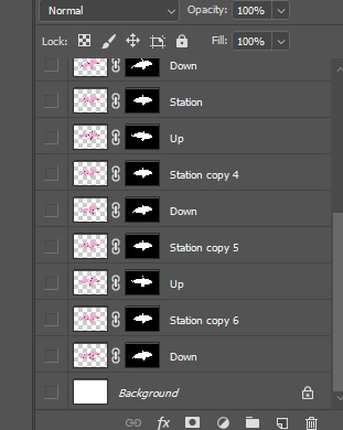
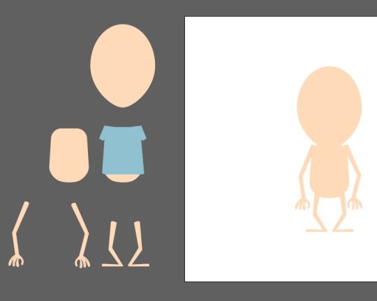
I started off with animating my main character Bea and to do that in photoshop I had to duplicate many layers of her. Each layer I altered her position using the puppet warp. After inserted these layers into animate, I dragged and dropped each of them onto a time frame ensuring they were in similar positions (using the onion skin to ensure this). Playing my sequence it’ll look like Bea is swimming.
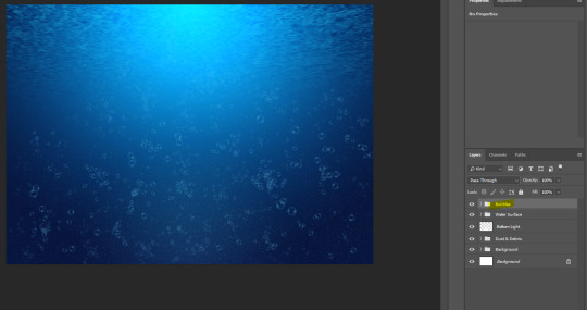
These are the layers I created in photoshop.
I had to save and upload the layers into the library on animate so I could use them. They uploaded in order since I numbered them.
Photoshop Process:
For my seaweed, I only need to animate 1 piece in photoshop and then I can duplicate them later in animate and reflect it vertically. I started off by opening my seaweed piece in photoshop and duplicating it a few times (ctrl +J).
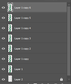
Using the opacity lowered, you can see how your layers above and below look with the one you’re working with. I used the puppet warp to change the shape of two layers of my seaweed as you can see below. I kept the bottom layer the same.
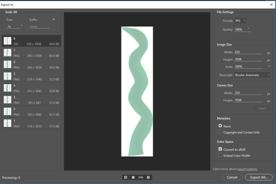
I selected all layers by using shift and exported them as jpegs by right clicking the selected layers and picking export as. I put them in a folder labelled seaweed layers so I can find them easily later when I animate.
I opened my background in animate on a separate layer.
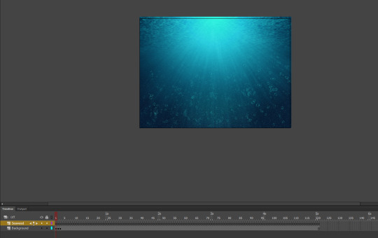
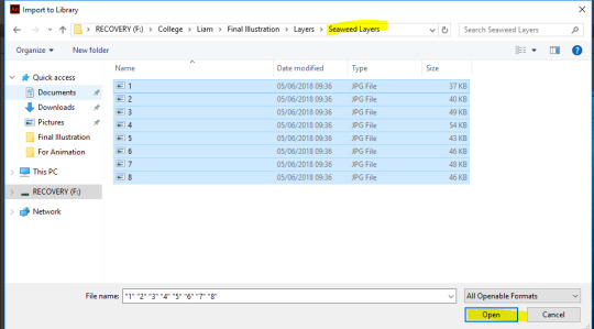
I made a new layer and called it seaweed before going to file > import > import to library where I selected my new seaweed files.
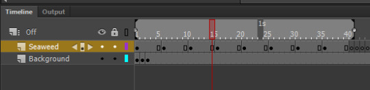
I stretched each keyframe for 5 milliseconds, placing an image of the seaweed on each keyframe. Running it on a loop it looks like the seaweed is moving.
I duplicated these layers moving the seaweed beside each other as you can see below. They have the same movements and move simultaneously.
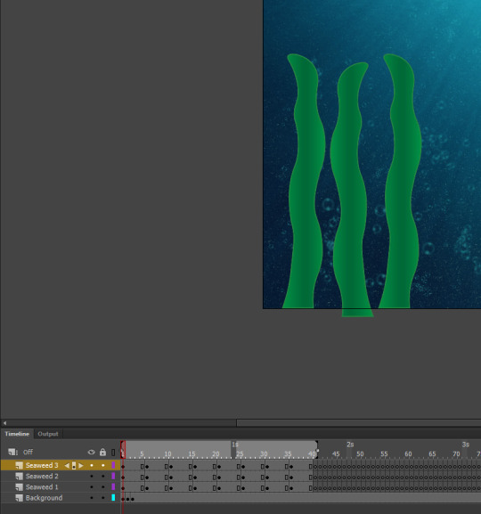
I did the same for the other side but enlarged them and added an extra piece of seaweed.
Main Character:
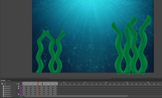
I worked on adding Bea to my scene and as you can see I used the onion skinning to see where the previous image had been placed. I was able to move her along to make it look like she’s swimming.
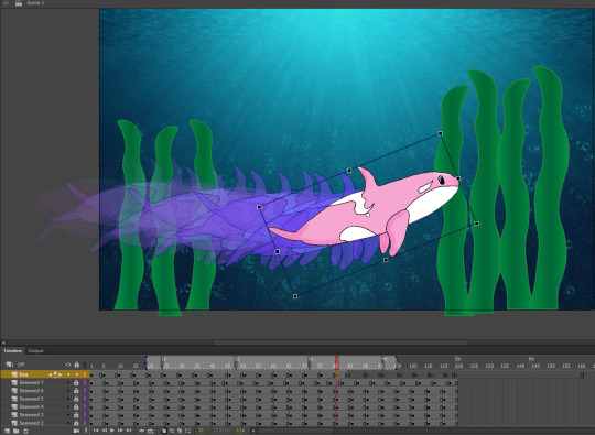
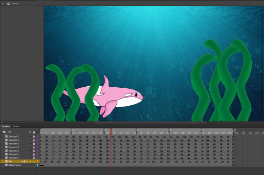
I animated Bea to move from the left side of the screen to the right in which a new scene appears and Bea will approach the surface. I moved the Bea layer below the seaweed layers so it looks like she swims behind the dancing seaweed.
Scene 2:
My next scene involves Bea surfacing and leaping into the air before swimming back down into the depths of the ocean. I plan to have some birds animating in this scene too.
On a new layer, I added the second scene’s background after importing it.
I also added Bea again but this time on a new layer. I animated her swimming just like before in the previous scene.
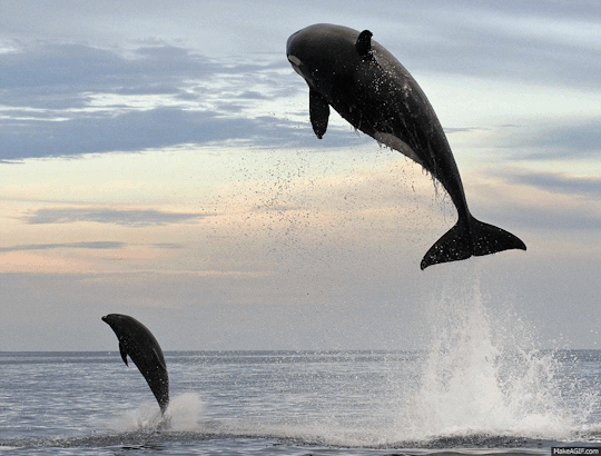
Animating her jumping out of the water was most challenging, but I looked at a gif of an Orca jumping to help me.
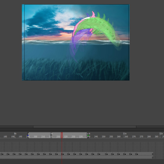
The onion skin shows how I animated her. After the jump I just animated her swimming off back into the ocean.
To make it look a bit realistic, I drew a rectangle over my water on a new layer that was above my Bea layer. I converted it to a symbol, went to colour effects and changed it to Alpha; this allowed me to alter the shapes opacity to which I lowered it. This darkens Bea and my scene but it now looks as if she is in the water and not above it.
I added some ‘splashes’ around Bea that I drew myself with a gradient and animated them to appear when she lands into the water before disappearing again.

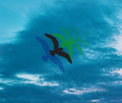
After importing my 3 bird layers, I animated them in the sky while also lowering the opacity for each bird image I duplicate. This gives the illusion that the birds are flying farther away before finally disappearing into the horizon.
0 notes
Text
Task 3: Creating the moving elements of my background
For scene 1, the moving elements will be seaweed and small fish so I created these on a separate document in illustrator.
Seaweed:
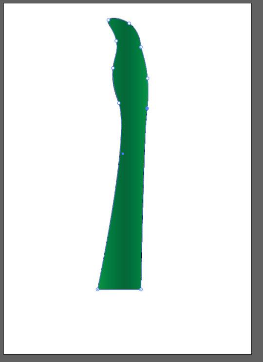
I started with the seaweed. I drew a long rectangle and used the curvature tool to make it wavy as shown in the two steps below:
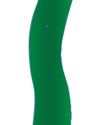
I duplicated it and flipped it as I will alter the thickness and height for different seaweed pieces later when I animate the seaweed in my scenes.
Fish:
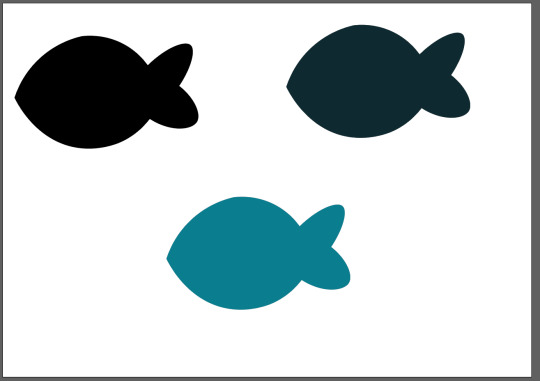
I found a fish silhouette on google and traced over it in illustrator using the pen tool. I used the curvature tool to straighten up the edges. This silhouette is going to be used in my scenes.
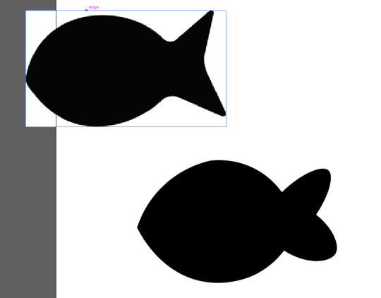
I duplicated my fish and created two other versions but with different shades. I will be able to alter the opacity and shades later while animating if needed.
Birds:
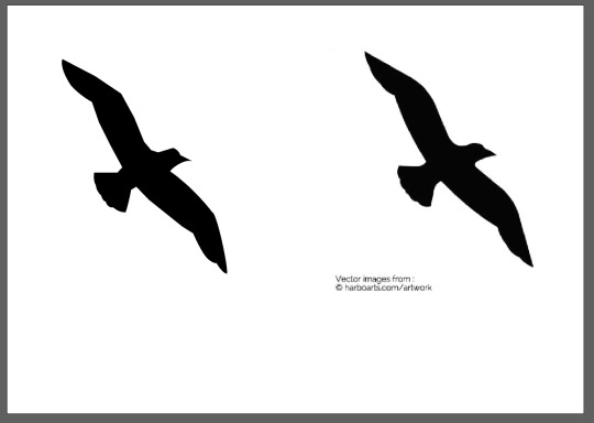
These are for scene 2, above the waterline. I kept them black since I will need them not to blend entirely in with the background but stand out. I again used the pen tool to draw this.
0 notes
Text
Task 3: Creating the Backgrounds
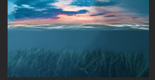
My first scene is open waters with a few seaweed and fishes floating around. I drew a rough sketch of my scene and how I wanted it to look before finding tutorial on creating an underwater scene in photoshop.

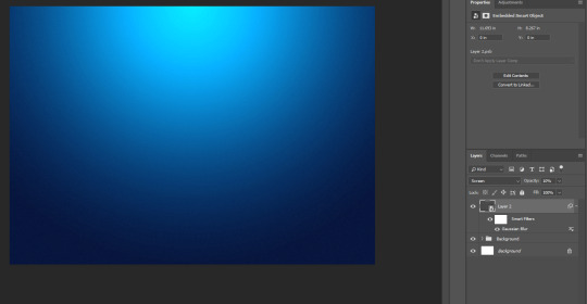
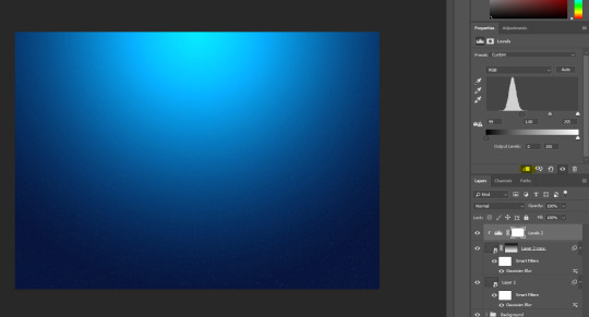
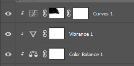
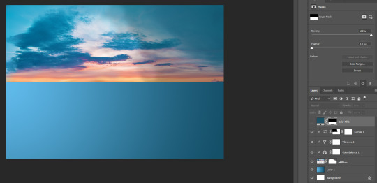
I opened up a new file and chose landscape before creating a new layer and filling it with a cyan shade. Adding a gradient to this cyan layer and altering the levels and curves to make it look like this so far. The top is the surface of the water hence the lighter shade.
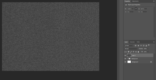
After grouping the layers I have made so far together, I next had to make the noise/debris; this is so the scene doesn’t appear too smooth and clean. I added a new layer and filled it with black. I added the noise with settings of 80.0 + Gaussian + Monochromatic before converting the layer to a smart object.
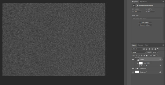
With the layer now as a smart object, I went to filter > blur > gaussian blur and set the radius to 1.5.
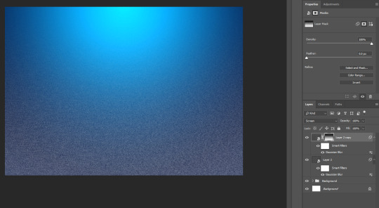
I then changed the layer mode to ‘screen’ and the opacity to 10%. On a wider screen you can see the noise in the scene.
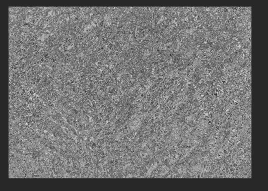
Adding the debris, I duplicated the same layer but set the opacity to 100%. I then used the gradient tool and drew on the canvas to get this effect.
To reduce the debris, I added a curves adjustment to the layer and adding a clipping mask which has been highlighted below. I played around with the curves until the ‘debris’ is minimised. On bigger screen, you can see the debris clearer.
Next I started making the water line. I added a new layer, filling it with black before going to filter > render > clouds.
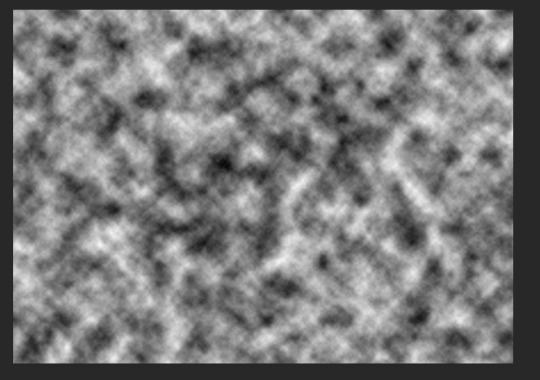
I then added another filter from the filter gallery > sketch + chrome with both settings at max (10).
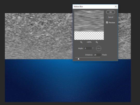
I used the transform tool to stretch and move the layer as shown below before converting it to a smart object.
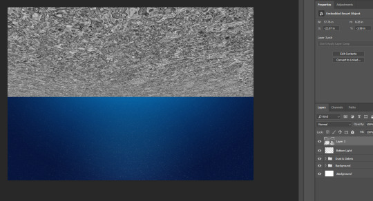
I added a gaussian blur with 1px radius and a motion blur with the settings shown below.
I added a layer mask and used the gradient tool to soften the edges to this layer.
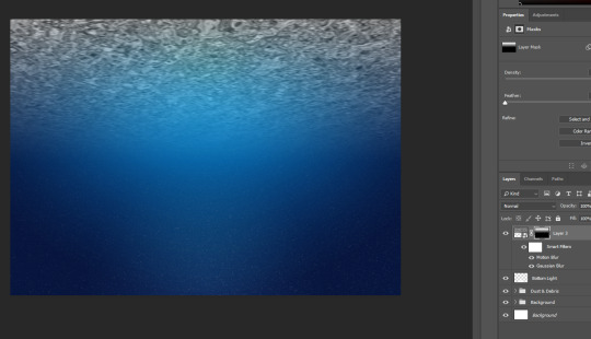
I changed the layer mode to soft light and altered the levels again to get this effect.
I then worked on the bubbles for my scene. I opened up a new document and drew a circle, filling it in black. I added a Gaussian blur of 7px to soften the edges.
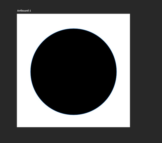
I erased a majority of the middle of the bubble with the paint brush tool and masking layer then added two highlights to the bubble. I saved it under define brush preset.
Back in my scene, I use the paint brush to paint the bubbles into my scene. To make them scatter everywhere, I changed the settings in brush preset. I added a gaussian blur of a radius of 3 to soften the bubbles into the scene.
I created a new layer and drew some smaller bubbles onto the background like so. I lowered the opacity for both my layers before grouping the two layers together.
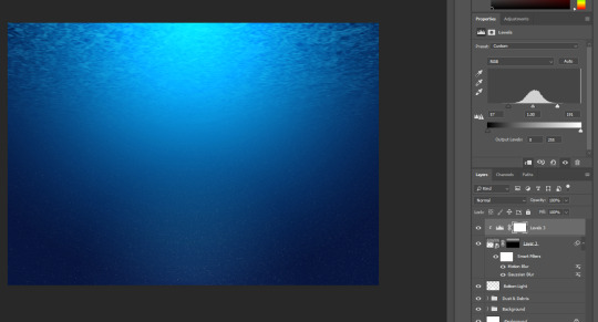
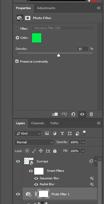
I added a photo filter with these settings to give my scene a greeny tone to it:
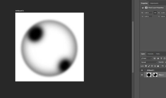
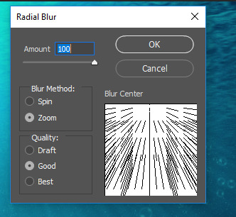
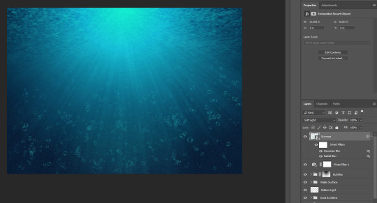
Next I made the sun rays on a separate layer. I used a scattered brush and drew over my scene in a S shape. I converted the layer to a smart object before adding a radical blur with these settings:
And a gaussian blur to soften the edges of the rays. I converted the layer to soft light so the rays aren’t to vibrant.
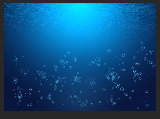
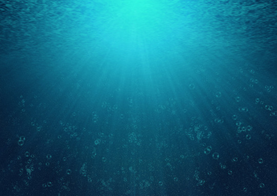
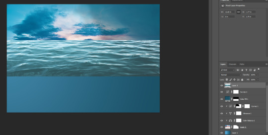
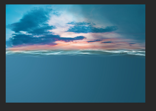
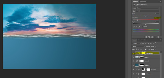
This is my final design for scene 1.
I now have to create the moving elements of my scene which is ocean plants and fish as I have already created my main character.
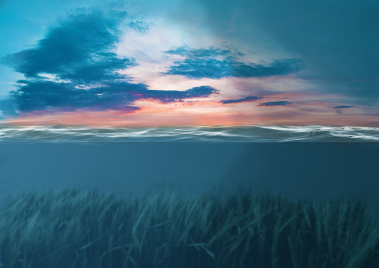
My next scene is of the waterline showing the sky and a bit of underwater, this is where Bea will jump into the air before returning to the sea - this is her interaction with the environment.
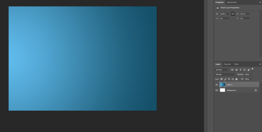
I started with a new canvas in photoshop. With the colours #155069 and #60bbec, I used a radial gradient on a new layer to create this background.
For the sky, I added 3 adjustment layers, clipping them to the layer below. I increased the colour intensity for the left side of my sky while keeping the right darkened.
Next, I added a colour fill layer with the colour #205265, using the rectangular marquee tool and layer mask to reveal the sky behind this layer.
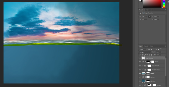
I added the sea in the middle of the sky pic and the blue canvas.
I used a layer mask and the brush tool to remove it until it looked like a water line like below.
I desaturated the waterline to -66.
I made the waterline a little more prominent by using a tiny white brush and set this new layer to soft light so it doesnt stand out too much.
I used a photograph of grass from unsplash and added it to my file, I cropped only the grass and set the layer to soft light.
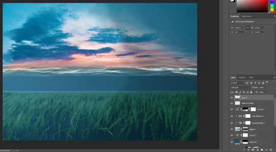
I used a layer mask to blend it in with the background.
And I used Gaussian blur with a radius of 6px to blur it as shown below.

I used a hue/saturation layer adjustment to alter the colour of the grass so it matches the colour of my ocean.
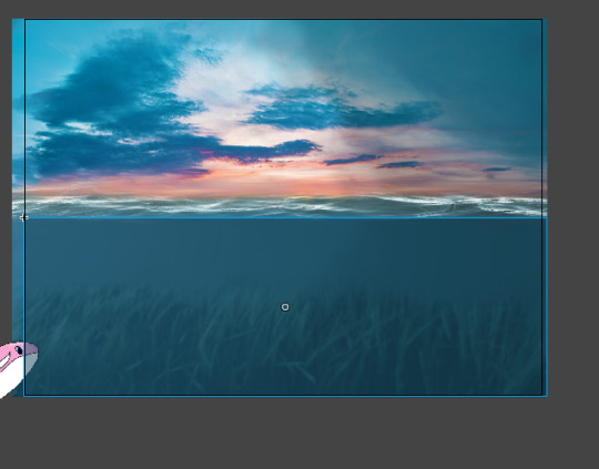
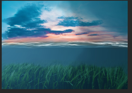
This is my finished scene 2.
I plan to include fish and birds in this scene but I am creating them on a new document since they are the be animated separately.
0 notes
Text
Task 2: Character Design
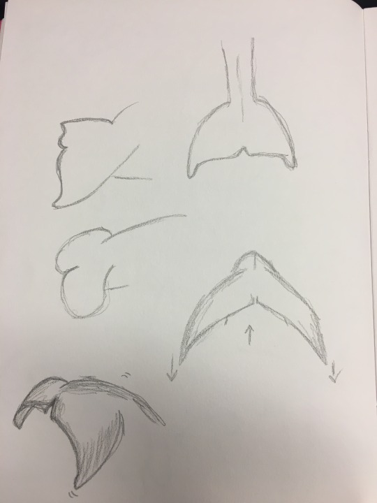
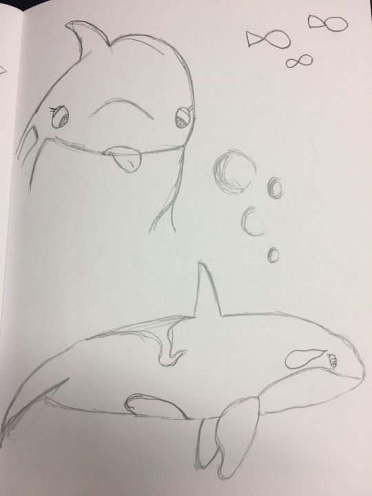
In the second lesson, I started sketching out my character in different poses and angles. It was just for practice and to design her overall appearance. Her key movement will be with her tail so I sketched the tail fluke out a few times to understand how it would move. I looked at videos of Orcas swimming to help me understand the movement with their tails too.
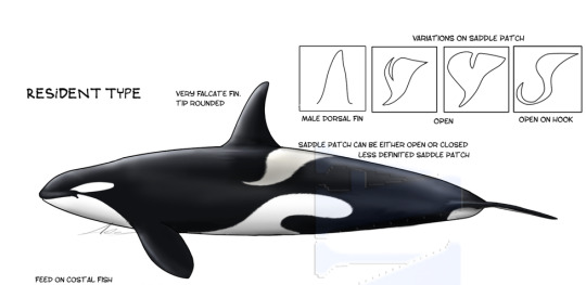
I found an artist who created a guide on the different types of orcas found in different areas of the world here. I found it particularly useful when drawing my character since I can see how orcas differ depending on where they reside around the world.
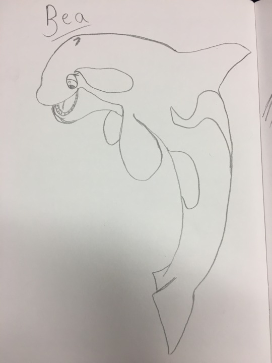
For this sketch of Bea, I like the idea of it being on my title screen. I think the pose is too difficult for me to animate, especially with the time frame given.
I did extensive research into the flukes and its movements of the Orca.
I wanted Bea’s personality to be apparant even though she is an animal. At first I thought it would be difficult for me to show personality and emotion on an animal but by enlarging her eyes and almost adding a facial expression, you can gather that she is a quirky individual.
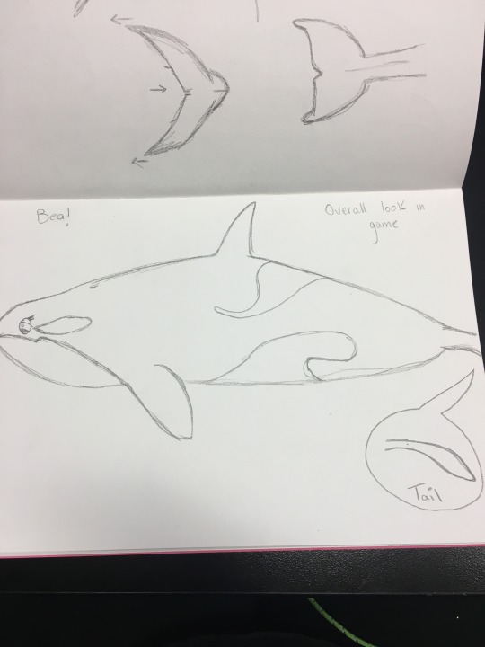
I then created turnaround sheets of my character. I found this process daunting because I haven’t drawn an animal using the turnaround technique and it took me two attempts to get it moreorless accurate. Here is my first attempt:
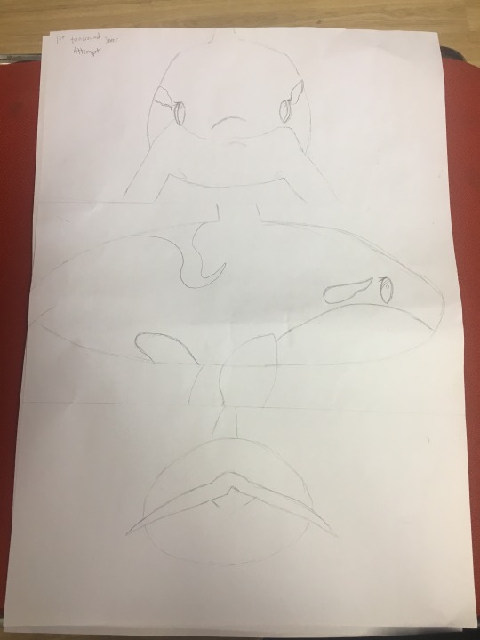
As you can see I drew Bea too big and parts of her body aren’t included on the page therefore, I created another turnaround sheet:
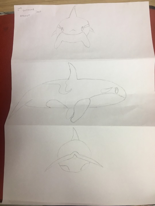
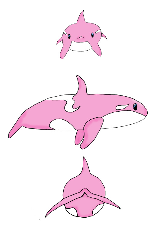
This one is better since you can see every body part of Bea - her fins and dorsal, etc. I don’t have much experience drawing Orcas so I found it daunting and I looked at images of orcas on google for reference but then I added body patterns exclusive to Bea which makes her different from other orcas. I went over the drawing in pen.
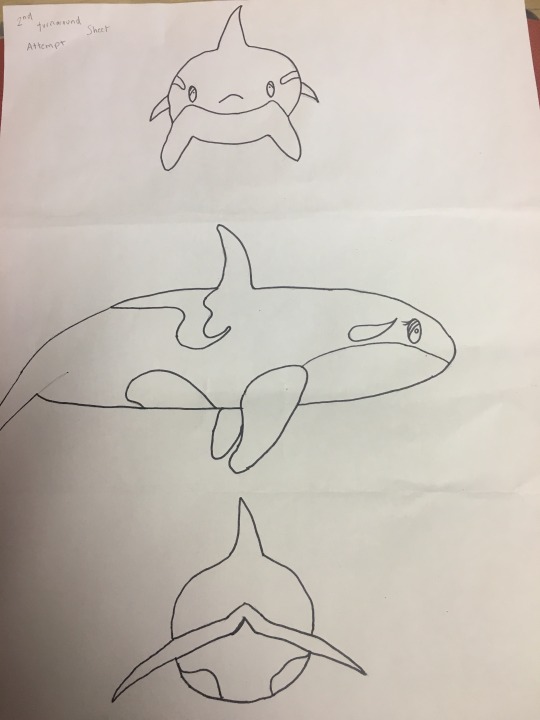
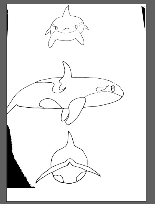
I wanted to render this turnaround sheet in photoshop but first I opened it in illustrator and image traced it:
I started the render in photoshop with basic, flat colour.
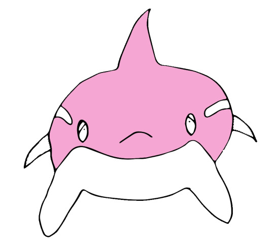
I chose a pale shade of pink (#f6a6d3) for the body and I used an ocean blue for her eyes (#5092dc).
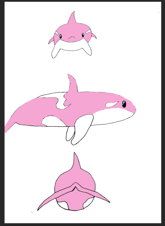
I neatened up the outline for my side view of bea before adding some tone to her body and finishing her tail.
0 notes
Text
Task 1: Main Character
I have decided on my character being an orca. Depending on the tone of my scene, she will either be the regular black and white or pale pink. She is called Bea and she lives in the antarctic ocean. Bea is 5 years of age, so still young she is mischievous and often curious. She strays off from her family and finds herself in lonesome waters, she follows her instincts which lead her to an empty space of some sorts which display a shiny object which she obtains.

0 notes
Text
Task 1: Visual Style
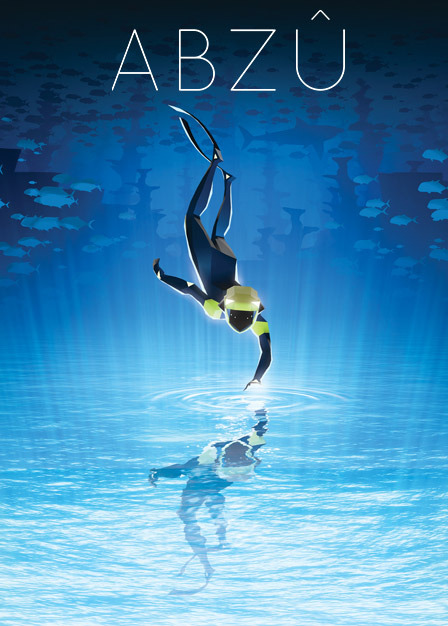
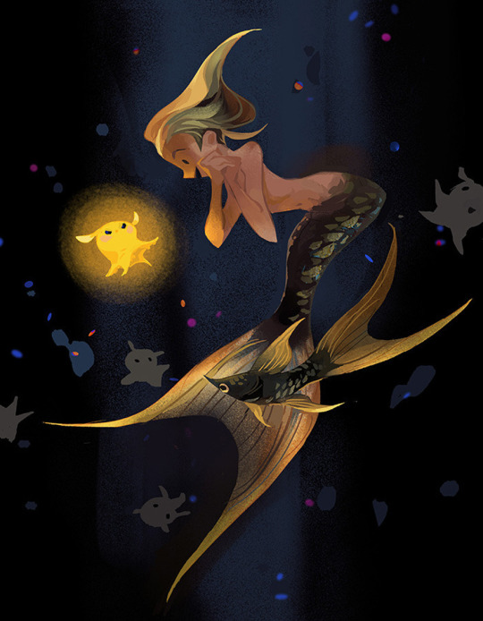
After researching more into these games, I decided to do something around underwater creatures and the underwater world. I particularly looked at ‘mermaid’ art in a similar style to that I have researched and also looked up the game I am inspired by - Abzu.
I really liked this artwork I found in the tumblr tags. It is deep from the use of colours and gives a sense of loneliness since the mermaid figure is on her own. This is a similar style I want to use myself.
I liked this artwork too for its simple style and colours. It is soft on the eyes. I get the vibe that I want my scene to be made up of simple, soft colours. I want people when playing my game, to find it soothing and relaxing to play.
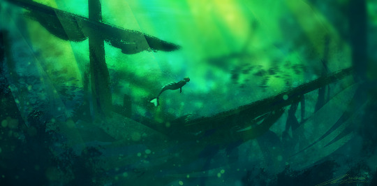
In the mermaid tag, I found this scene:
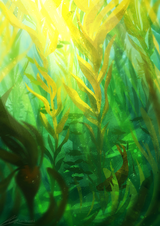
It doesn’t feature a mermaid on it but I find the environment really stunning with the colours used. I like how the artist has given the picture a foreground, midground and background as it gives depth to the image almost as if you are sat within the seaweed.
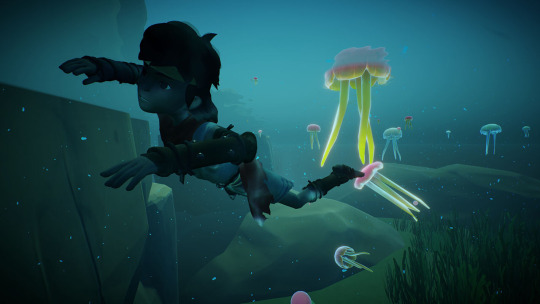
I played a game similar to Abzu called rIme and it features a boy exploring different worlds. The objective isn’t stated or known but to progress through the world, the player just has to walk around and activate different ‘switches’ in order to progress onto something new. The graphics for the game I find really beautiful too. Though it has no dialogue or story in it, I enjoyed playing it. I found it unique since I haven’t played a game before that featured no dialogue in it.
0 notes
Text
Task 1: Plot Summary
After researching point and click games in general and artists in different art styles, I decided on an underwater world theme for my game animation, hopefully including an underwater animal as my character. I decided on an underwater theme as I wanted to create a scene that appears quite soothing and aesthetic, especially with the colours and I found that the ocean is something people acknowledge as ‘soothing and calm’. I looked at the game ‘Abzu’ for inspiration since this underwater-themed game oozes ‘soothe’ and ‘aesthetic’. It gave me many ideas for my own scenes.
So far I will just have my character animated swimming through the ocean abyss until they reach a new scene where they perform a simple action. The action I have in mind will either be picking something up (like a weapon) or activating a switch. The action will be kept simple though.
The style of the games I have researched are all simple and aesthetic. There is no dialogue within the games I have played myself and researched so I plan not to feature dialogue or text in my own work. I want the attention to just be kept on my environment aesthetic and character.
0 notes
Text
Task 1: Researching concepts and point and click games
Today we started our assignment brief of creating a character, that will be animated into a scene which also has animated elements inside. I wasn’t sure where to start so I decided on looking up point and click games and some of my favourite artists so I get an idea of how the style I want to draw in.
I looked up an artist I follow on tumblr called Yaoyao Ma Van As.
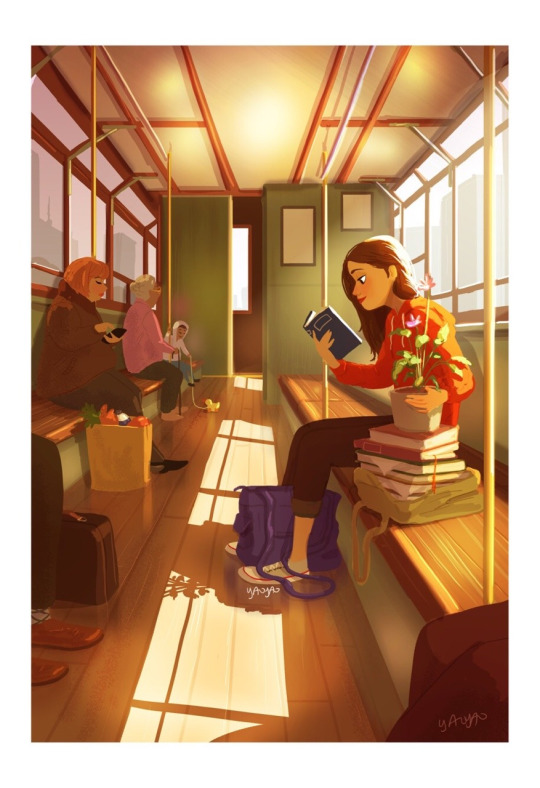
I really enjoy this artist and her art because her art is personal to herself. She suffers mental illnesses such as anxiety and often her art portrays her character with the same illness. The art somewhat has a nostalgic feel to it, often having warm colours in them like the one above and it is almost soothing to look at.
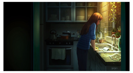
She finishes a piece nearly everyday depending on how she feels that day, for example, on the day she drew this she portrayed her character feeling sad and lonely and has used darker colours. Her pictures rarely feature other people and when they do, it is usually random people in a public place. My aim is to create a scene and character as deep and personal as this, possibly using this style.
I was looking up point and click games and I came across this image:
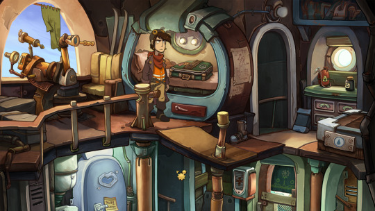
It was also shown in class and the art style is what caught my eye the most. It is soft on the eye even though the colours are quite dull and earthy. The colours are mostly flat yet the scene is still detailed beautifully and this is the type of scene I aim to draw myself.
I wanted to make sure I fully understand the context of ‘a point and click game’ so I researched it. I found this website.
“All the game is built around interactions with items of the world. The most classic interactions are:
- talk
- look at something
- take something
- use an item
- combine items”
I was puzzled as how to make my animation but after just researching it a little, I am now more aware of my task. I started a mind map/moodboard in order to give myself some ideas.
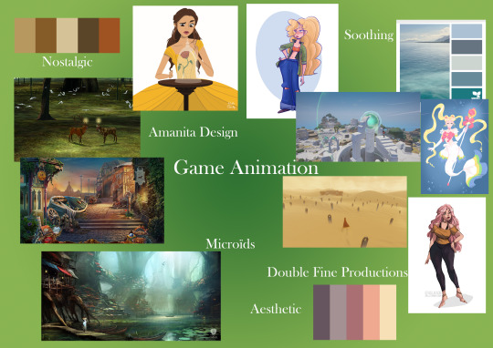
For this, I researched colour palettes for the words, nostalgic, soothing and aesthetic. I chose these words as I want my game to represent them in a sense. I saved the colours that came up most when I googled these words. For soothing, ocean colours were the result and for nostalgic and aesthetic it was earthy, autumn tones.
I then just scrolled through character illustration on tumblr and saved the art that I particularly enjoyed the style of. I also put on game scenes I found that strike me as quite aesthetic and nostalgic to look at.
0 notes
Text
Chalk and Charcoal Drawings
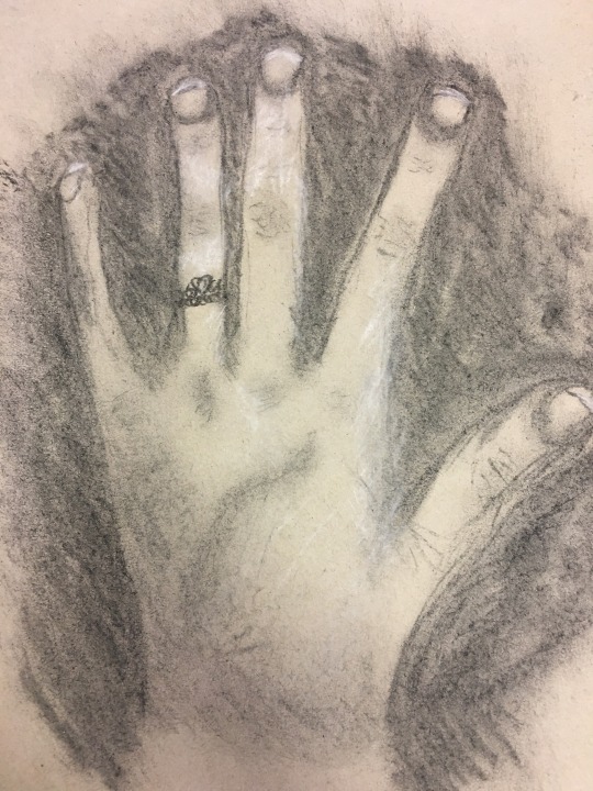
I missed the week prior, but in today’s lesson, the class continued on what they started last week so I was able to catch up effectively. Our task for the first half of the morning was to draw our ‘opposite hand’ (the one we don’t normally use) on mid tone paper using charcoal and chalk.
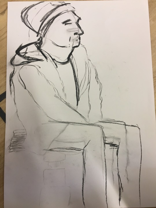
Following that, our next task was to draw a person from observation. Our volunteer was Jake. He positioned himself on a chair and we simply draw what we saw from whichever angle using just charcoal this time, since there was no more mid tone paper.
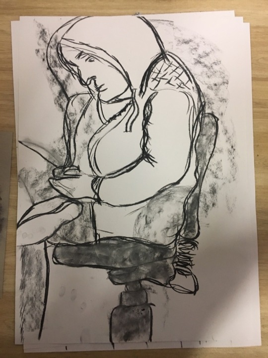
We then did the same but for another volunteer.
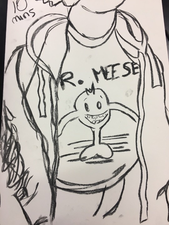
Our last sketch was done for 10 minutes. We were given 10 seconds however to draw an outline and then we had to work on that outline for the 10 minutes. I sadly drew my outline too big but had no more time to correct it, so I only had the torso drawn.
0 notes
Text
Wk 16 + : Creating video footage and creating a rotoscope with it
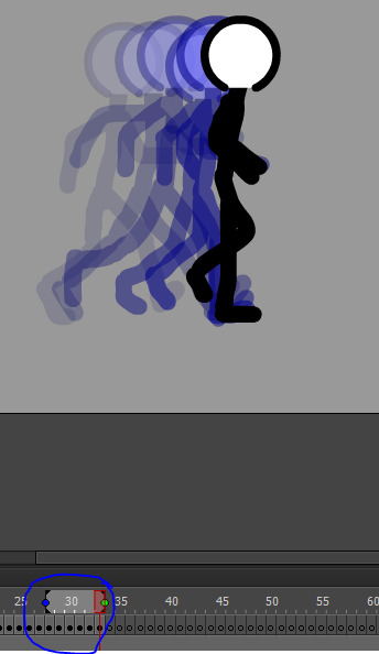
Two weeks ago, we shot some simple footage outside of college. I did walking footage, Hayley did running footage and Holly took care of the jumping footage. These were then to be uploaded into adobe animate where we then outline them. I chose a footage of myself simply walking and I was given a graphics tablet.
Hayley helped me in setting this up in animate. Using file > new, we then imported a footage into animate.
I had an example of the kind of rotoscope I wanted to create.
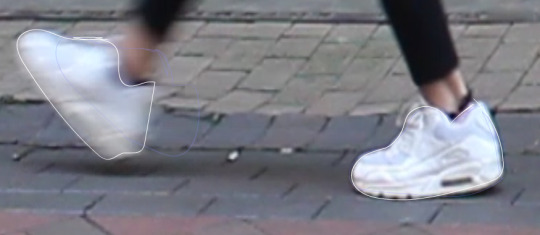
I started with the trainers. My tactic was to draw over them in each frame instead of drawing them in one frame and changing to another part of the body. This was a much faster and effective way.
Here with the onion skinning active, you can see the feet movement in green.
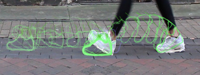
The brown lines are my ankles and the white are my trainers.
What did you do? Explain and use correct terminology when talking about tools and processes in Adobe Animate.
I found this task very time consuming and difficult. It took me just 3 hours alone to finish the feet and ankles. However hard it was, I enjoyed seeing the development come along.
I think I picked a video footage with many frames which added to the length of time it took to finish. I wasn’t prepared for how much I had to do.

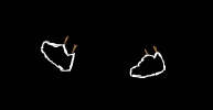
I managed to gif what I had so far. I am really happy with my feet and leg movement. I didn’t imagine it to turn out this fluent and well. It took many hours just to get this far so I am satisfied with this end result.
The style I was going for probably doesn’t look that impressive on this background, I could have changed the colour or filled in the outlines to make them stand out more.
1 note
·
View note
Text
Wk 16: Rotoscope
Week commencing 16/01/2018 we started a new topic. We looked at some animated gifs displaying rotoscope and learnt that classic Disney films were usually made using this method. We were set to be put into groups to go out and film our own actions, which we will later turn into rotoscope, but first we researched the rotoscope.
Rotoscope
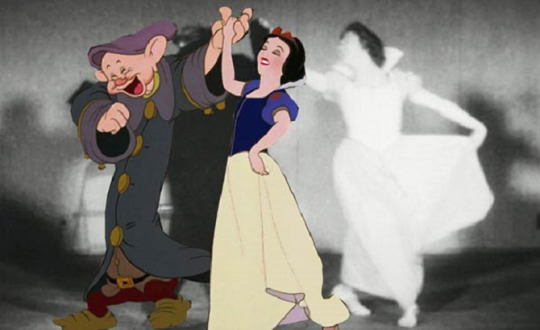
In short, rotoscoping is a type of process to animate. Animators trace over a piece of live action movement. Back when television and cinemas were first heard of, this process was used by many animators. It allowed them to create a piece of animation and keep it looking realistic. For example, Disney - when creating the classical Disney princess movies, used rotoscoping to crate most of their scenes where the dresses flow (Beauty & the Beast for example). The animator would have to trace over each frame however so it can be a tedious process.
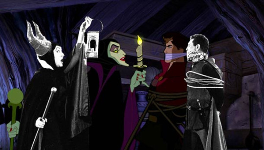
One advantage to rotoscoping is you can recycle and use movement traces for another movie, Disney has done this in their older movies. See here for example. Rotoscoping has few advantages. One of them being that is it inexpensive and can be done with one person alone. It can also make a piece of animation flow beautifully and nowadays, it can be completed on a graphics tablet.
As mentioned before it is time consuming and the person using this method will have to be gifted at drawing, patient and relatively quick at drawing if they are to complete a drawing using this process - there is a heavy workload. You will need access to expensive software however, and depending if you work for a company or not it can prove sour for your wallet. This software is sometimes complex.
Cell Animation
What are the advantages / disadvantages
give examples with images of famous cell animations.
Cel animation is one of the oldest animation techniques. Animators drew on semi-transparent sheets of vellum or acetate cells. You could see through this sheet. As you can see with the diagram below, the outline of the character was drawn over the top and the colour (paint) was on the underside of the acetate sheet.
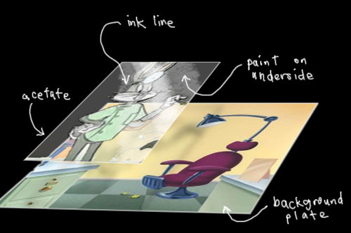
The background/scene is usually on the bottom piece of material. The animators then layer the remaining objects using acetate. This varies from animator to animator and also the actual scene and whats in it. The middle layers may have a character drawn onto it and the top layer, if any, could display little details from the scene.
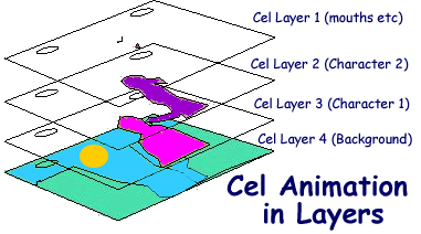
Cel animation is a very tedious process, maybe even more tedious than rotoscoping. The animator has to draw each frame from scratch. It is very time consuming and again, requires a massive amount of patience.
Practice in adobe animate
In adobe animate, we practised animating a person walking. This file was on interact and the purpose of it was to practice drawing the person walking using keyframes and the paint brush.
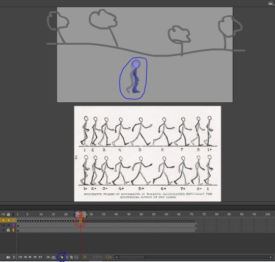
As you can see, the red circle shows a keyframe. Clicking on one allows us to draw on it. The blue circle hightlights the button I must select in order to see a trace of the previous frame. This allows me to see what I have to draw from.
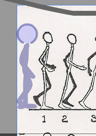
I moved the walk cycle helpsheet beside the onion skin trace of the figure, this allowed me to work out which position he was already in. I had to redraw position 2 as you can notice from the screencap.
I located the brush and drew a line beside the figure, by doing this I could work out and choose the correct size of the paintbrush. which is 19.
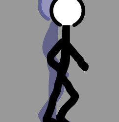
This was my first attempt at following up the walking. I found it quite difficult to draw it as accurate as I could. To make things easier however, I did just copy and paste the head onto my new keyframe so at least that is accurate and in shape. I drew some more keyframes as you can see here:
Here is the walk cycle that I completed.
This was more of a practice run to learn how to draw over a person and make them appear as if they are walking. I found this task relatively challenging, having no previous experience in it before but I did enjoy the challenge and was satisfied upon seeing it put together successfully.
1 note
·
View note
Text
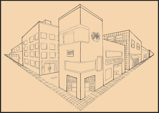
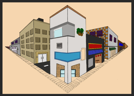
Wk 11, 12, 13: Rendering our Street View
After having some practice drawing from visual references, we used two point perspective to create a corner view of a street, all from imagination. We still used some visual references from the web, I used the tumblr tag ‘Tokyo Buildings’ mostly, to draw certain aspects into my own street.
Before the Christmas holidays, we managed to upload our street view sketches done on A3 paper. Our remaining task was to render them in Photoshop. Here is my upload:
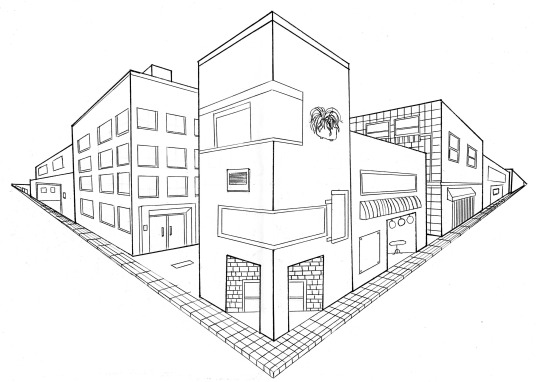
To render, we could use the paint bucket tool or the paint brush. The render process has to be done on a separate layer to our sketch lines so it doesn’t overlap them. I decided to render each building on its own layer.
Before anything however, I held down shift + ctrl + alt + 2 and selected the canvas, I selected ‘select inverse’. I added a mask and this enabled my sketch lines to be on a separate layer to my colour. With my background layer, I filled it with a peach colour. Sometimes in traditional Japanese art, they painted on a coloured canvas. This is the same effect I wanted for my street view.
I then started rendering with the rear buildings as the majority of artists teach you to render art starting from the background. Since I added in a peach background, I wanted to use earthy tones like browns, maroons and greys. I rendered the rear buildings on a separate layer.
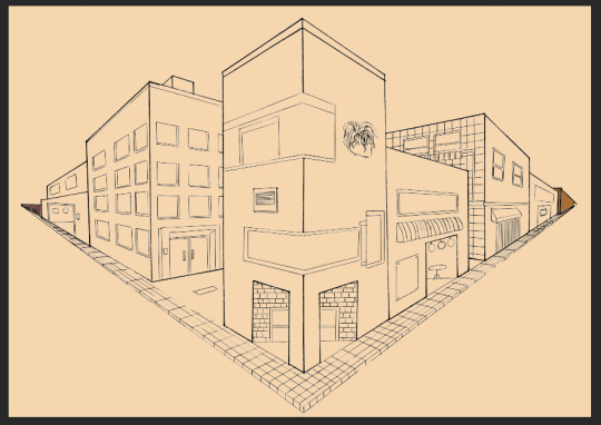
In a new layer, I worked on the next set of buildings.
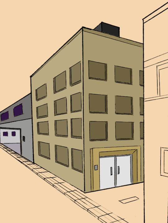
I wanted to use colours that were complimentary with each other. Usually when you select a colour, its the colour on the opposite side of the colour wheel which goes with it aesthetically. I plan to add a little detail later on when I have rendered all of my buildings. Then I can see where the shadows fall and highlights appear if I have any. For the bigger buildings, I used a separate layer for each. I started rendering the building on the right first.
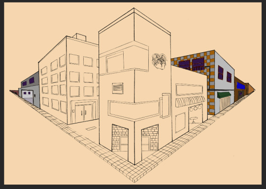
This building has different coloured tiles as you can see, in Tokyo, some of the older buildings were built like this. They didn’t use brown brick like we do here in England. That is another reason why I have stuck to grey, earthy tones. Tokyo is almost a concrete jungle.
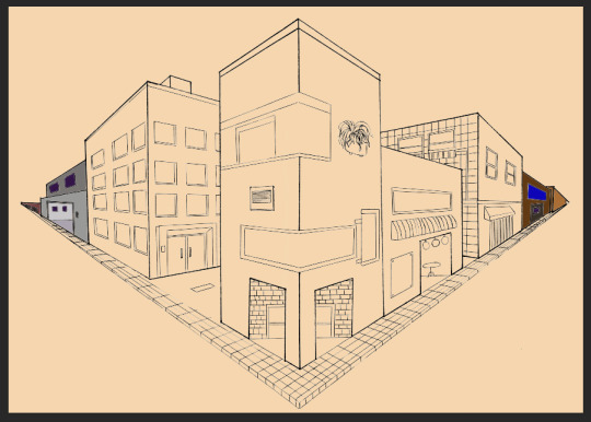
This was the next building I worked on. I used a shade between black, brown and orange. I wanted a more peachier colour but because my background is already peach, I decided against it. I made the wall facing us a shade darker than the other as it would get less light, so naturally it would be darker - as with the windows too. I made the window ledges darker as well and I think it added a 3D effect quite nicely.
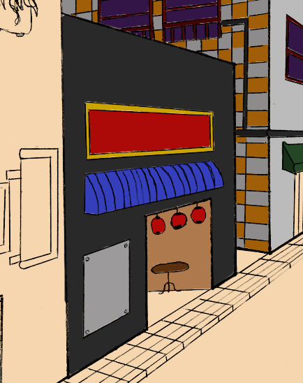
The last building on the other side of the centre building was this one with the Japanese lanterns hanging above the doorway. This was a restaurant of some sorts, hence the colours it has on its exterior. Holding down shift while painting with the paint brush allows you to paint in a straight line, whether vertical or horizontal.
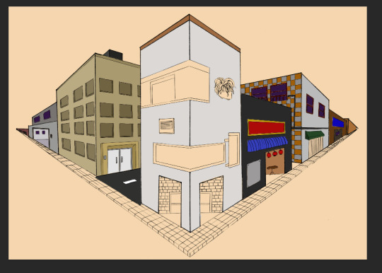
I started rendering my final building. I did it in a light grey colour then added more details such as the bricks and the plant box, etc.
1 note
·
View note
Text
Wk 10: One point perspective
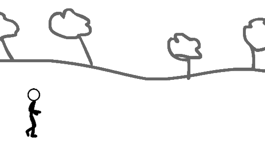
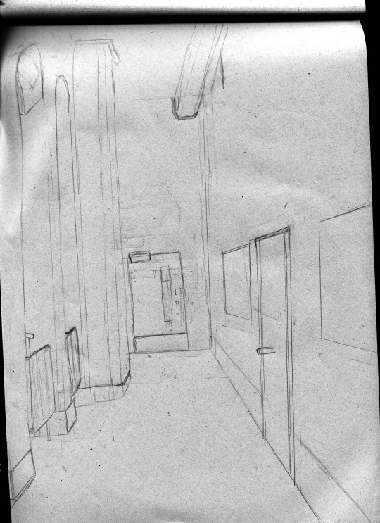
In today’s lesson, we moved away from character design and focused on environments. Our task first was to find a corridor space and draw it from perspective, keeping in mind where the horizon is and where X points meet.
I positioned myself at this empty corridor on the floor. From where I was sat, I had no view of the windows, just the walls that build them up.
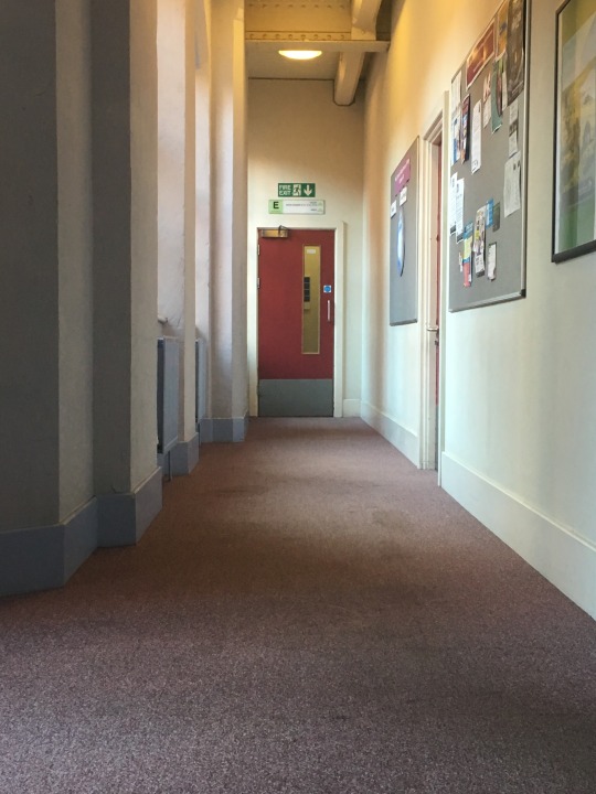
I started drawing the door at the end of the corridor as that was kind of in the middle of my view and I knew once I got the proportions right of the door, the rest of my drawing will look right. I drew the door first followed by the walls around it. I found drawing the walls around the windows most difficult as again, I could only see edges to the walls and not the glass windows themselves. Despite this, I think the way it turned out was good for my first try. However I do believe if I picked a simpler corridor, I would have understood the way the lines meet a little easier and possibly my piece would be less busy.
0 notes
Text
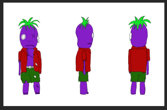
Wk 7, 8 & 9: Turnaround sheets
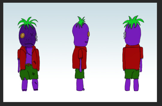
For the first part of the lesson, we were given a visual reference. This was to help us create a character. We were allowed to research these visual references so I researched mine which was a Zombie and Zips and Buttons.
I just loaded up Zips and Buttons into google images and looked at the appearance of them, figuring out a way I could put them on a zombie. That’s when I got the idea of a stuffed toy zombie. I got a textile theme going for my character. He had stitches on his body and also he was torn by his ear with stuffing hanging out. He had a zip for his mouth and a button for his eye, the other eye was stitched up.
I kind of got the idea for button eyes from the movie Coroline.
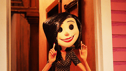
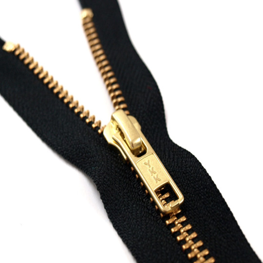
Image Source
I was worried I wouldn’t have a plan of what to sketch so I created a mindmap in my sketchbook with a few small sketches to help me.
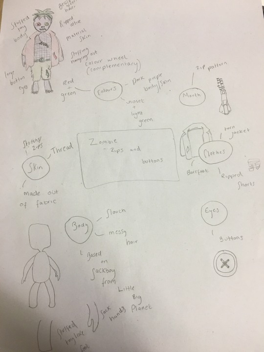
I actually found this first task quite difficult to complete. I think I overthought my character design and aimed to make it complicated and as crazy as can be which is why it took me so long to come up with this idea. I had to keep in mind that whatever my plan was, I had to be sure that I could draw it so I couldn’t think of an idea out of my level of skill.
That being said however, the turnaround sheet definitely brought me out of my comfort zone. I stuck to my initial plan thoroughly. The idea I had in mind is exactly how it came out in my sketches.
Next time I receive a task similar to this, I’ll build my idea slowly and not immediately think of something crazy and not achievable in the time given. I believe that I focused too much on what my peers were doing rather than my own ideas and work.
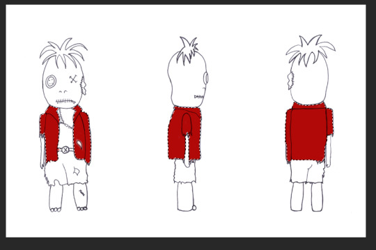
Scanned Turnaround Sheet:
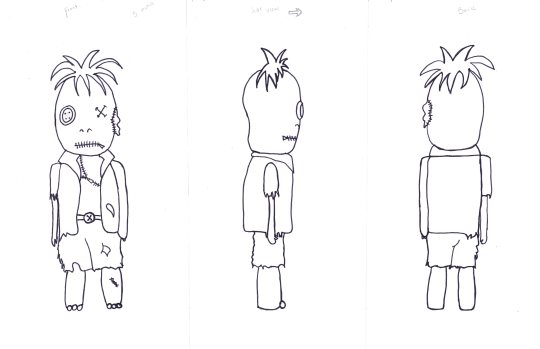
After creating a final sketch of my character, we started our own turnaround sheets which consisted of front view, side view and rear view. We drew guidelines all the way across the page so that each body part were to be the exact same height and size as the original and first drawing. We had to keep in mind the way we turned our characters. For example, if mine was turned to face the left, I had to be sure to remember that the torn sleeve wouldn’t be seen. We had to bare important factors like this in mind. I found that it was harder to keep the same width for the front and back view of my character as my ruler lines were a bit wonky. I also struggled drawing my character’s colour as I didn’t entirely figure out how it would appear in side and rear view.
That being said, I am very happy with how my turnaround sheet came out to say it’s my first time creating one. Even though some parts were uneven and not as accurate as they could be, it still looks neat enough to be a turnaround sheet.
Next time, I should work on improving the accuracy of my guidelines and also to pay attention to the width of my character.
Render Process:
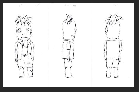
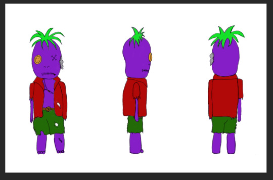
After we sketched our characters, we scanned them into the computers for digitisation (colouring).
To hide some of the sketch marks and also the mucky looking background, we did the technique shift + ctrl + alt + 2 which selects all of the white then we made sure our marquee tool was selected before right clicking and selecting inverse. After, we clicked the mask tool. Adding a new layer, we fill it in white. Doing this method before anything else ensures we have a clean cut background but with the lines bold and in tact to work with.
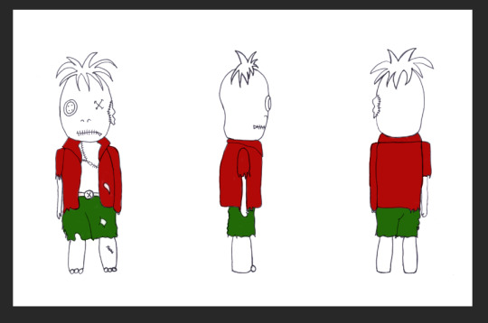
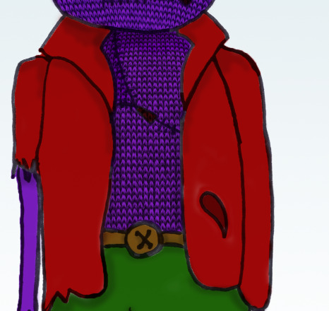
I decided to colour my character in first using flat colours and add details in later. I prefer the method of building layers up from the back to front, adding details last.
I selected the jacket on all figurines of my character using the magic wand tool then created a new layer labelled ‘jacket’. I picked a crimson red and using the brush tool, I started colouring in the jacket.

I decided to colour all the turnarounds at once, fully, before adding detailed shadows and highlights. I used the same method as above to complete my character’s attire and body parts.
The shorts:
The head:
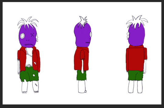
The rest of the body:
The hair:
Smaller details (eyes, belt etc):
I also added a subtle backdrop for my character, I used the gradient tool and opted for a gentle blue to contrast well with my ‘funky’, punk colours.
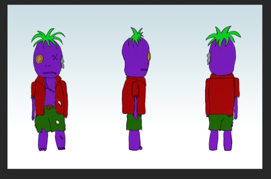
After, I added some more subtle tones. I started with adding shadows, particularly under his hair and clothes before adding a highlight to his button eye. I determined the light source was from above.
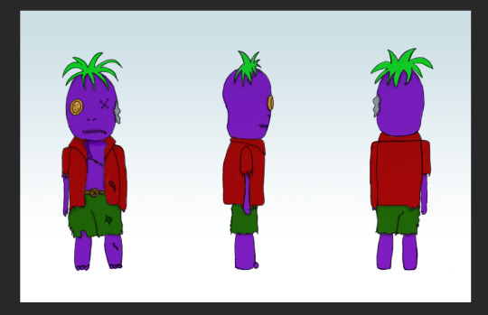
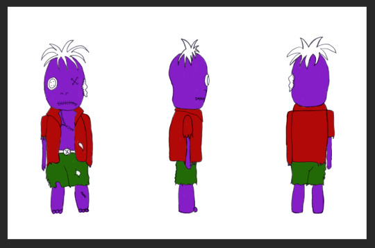
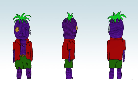
Because my character is based off a stuffed toy, I wanted to add a handmade knitted effect. I have knowledge in adding overlays and transparency so I had an idea of how to achieve this. Firstly I obtained a simple image of knitted material. The lighter the better, so I opted for this one:
In a new document I pasted this image and all I did was turn the entire saturation down low so it appeared a whiteish grey colour. This enables the image to blend better with my neon purple colour.
After copying the edited image onto a new layer, I used the warp tool to make the wool appear more rounded and scrunched together as this is what the material would initially look like for the head of my character as its an egg shape almost. I selected my head layer and used select inverse and the masking tool to add the material to the entire shape of my character’s head. This is an easier method than just adding a square over and erasing around the edges.
I did the same method for the rest of his body. Before masking:

After masking:
I repeated this on every turnaround of my character as you can see below:
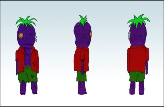
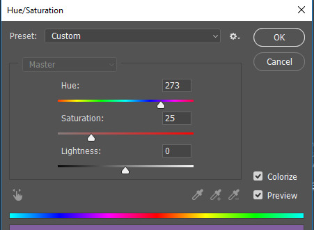
To make it blend in better with my character’s purple skin, I used Hue/Saturation to change the colour of the knitting overlay. Clicking Colourize and moving the Hue dial edits the colour of the overlay. I chose a purple colour so it blends in with my character’s skin.
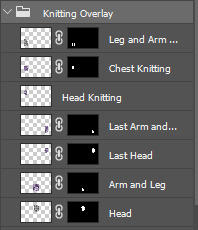
All the layers that I used to mask the material to my character are inside a folder I created called Knitting Overlay.
I found the basic colouring in of my character easy as I have experience with doing something very similar last year. I am proud of my overall final look. I kept to my original plan and had no trouble with rendering. I’d like to improve on my shading and highlighting. I feel as though the shadows aren’t really seen that well and I find it quite difficult to add tone to a drawing either way. I’d like to brush up on these skills.
1 note
·
View note
Text
Wk 6: 1:1 Character made in Illustrator
For the first part of the lesson, we recreated our 1:1 characters from our sketch pads in adobe illustrator. We used a template uploaded on ‘interact’ and designed the clothes and details of the face using shapes.
Final product made in Adobe Illustrator:
I tried sticking to basic shapes such as circles, rounded rectangles and also triangles. But I also have started using the arc tool to create the eyebrows, the shape of the character’s mouth and the outline of her hair.
I wanted to add more detailing to the dress so I created a dark purple semi circle using the pathfinder with a circle and a square then created the frill effect around the bottom of her dress and also the neckline.
I avoided using the colour black. Nearly all everyday objects are not made up of pure black and are instead a very dark shade of a colour. So for the outline of the eyes I took the skin colour and darkened it instead of using black.

-
The task was to recreate our sketches up in adobe illustrator that we started last week sticking to the 1:1 body proportion rule. We used a ready made body template from moodle and created the face along with clothes using shapes, similar to our ‘symmetrical face using shapes’ task prior.
There are many different body proportions and each are used in different ways. An example is the fashion body proportion. Models in the fashion industry are more ideal the taller they are so in sketches, the body is drawn ridiculously tall with legs that seem to dominate 70% of the body and this accentuates the clothing that is being advertised. Another body proportion is heroic and mostly heros in movies, books, anime etc has this body type. It usually consists of a tall male with large muscular thighs, large bulging biceps and a big sturdy chin - again, unrealistic body proportions. A man sketched in this way is typically seen as a hero and a very strong man and it is unheard of for a female protagonist to be drawn like this.
The 1:1 body proportions are unrealistic body proportions and thus are used more so within industries surrounding children and teens. The body proportions mimic those of chibi art and are seen as ‘cute’ and possibly weird, depending on the outcome, so it is more likely that a younger audience would find more interest in art that is similar to something cute - kawaii, chibi etc.
I worked from a visual reference of my sketch that I started a week ago.
I managed to remain accurate with my recreation of my sketch. I stuck to similar shapes and the appearance of my character is moreorless the same as the one I started in my sketchbook.
I had a different vision for my character’s body. I ideally wanted her to appear more of a tomboy with her attire and not be wearing a typical princess dress but with the time I had and with the lack of planning I did, I couldn’t complete this requirement. That being said, I do really like how the outfit turned out. It was easy and fun to create in illustrator.
Creating the simple, small facial parts like the nose and mouth were the easiest as I only needed to use one to two shapes maximum. I found the shoes and hair the most difficult as they required more skill and attention to detail as well as patience. I had to use the curvature tool heavily when creating the shape of her braided hair and shoes.
If I had more time, I’d like to add finer detail to the ears, hair buns and the dress. I liked the way they all turned out initially but I do think the dress needs more detailing.
0 notes