
leftoverkompot-blog
Digital Prototyping
App redesign
5 posts
Don't wanna be here? Send us removal request.
Last Seen Blogs

izigreh
Без названия

acloudykindoflove
a cloudy kind of love

tirecovers-blog
TireCovers.com

moongyaal
luna floreale

fuckyeahpaulavesala
fuck yeah paula vesala!
Text
Tangible and Embodied Interaction
Week 1
Goal of this week was to multi-screen user interface for certain scenario and make a video prototype out of it highlighting the interaction with the multi-screen UI. Our scenario was food delivery man on duty. We did prototyping in paper form, since it offers flexibility in prototyping. Advantage of paper prototyping is relatively limitless use of shapes and objects which is not possible with, for example, Figma. We designed the whole rout from receiving the notification and picking up food to delivering it to the door and calling the customer using connectivity between glanceable and main device. Main idea was to automate the whole project, since from our interview with a person from the industry. The whole process seemed unorganized with many nuances and required a lot of app changing in primary device, the phone. Our design solution was to add second device the smart watch which in our opinion would take role of primary screen and the phone on the bike wheel would act as secondary screen.
From our small research we got that notification about new delivery comes as notification in specialized application and requires constant monitoring for accepting the work and for further interactions. Our goal with adding the second device was to creating environment in which user interaction comes down to one simple press. This is how we saw it – biker is on the bike on his phone, notification of new order comes in on the watch, with one click user accepts the work and phone opens the map with first destination, restaurant, and time limit and distance. Delivery man sets phone on the bike and from now on phone is glanceable devise which is there to show the map. User gets the food and confirms that he got the order on the watch and gets new destination. When he gets to the house, watch as primary screen has option to call the customer and after successful delivery to finish the order.


We had some difficulties with paper prototyping and filming the whole process. We wanted to get by without live action filming of the whole process and keep it to paper prototype which made it difficult to understand the whole concept and interaction between two screens. Therefore it needs to be carried out better and with more attention to the details.
Literature
Designing and Evaluating Glanceable Peripheral Displays – focused on creating literature to a new field, for that time, of glanceable displays. In authors view peripheral screens acted were there for improving multitasking and it was interesting to read how they tried to empirically measure efficiency of their designs. Data on peripheral display comes in form of notification bringing data to the forefront while maintaining primary task flow, keeping track of secondary tasks and reminding you about them. Talked about screen design being simple, symbolic, easy to interpret and memorize.
Exploring the Design Space of Glanceable Feedback for Physical Activity Trackers – did research on tracker like peripheral displays and described a lot of design solutions for displaying statistical information and tested them. Authors looked at glanceable displays as secondary task reminders and the goal of the paper was to find out ways to provoke users to come back to monitoring secondary task, in my opinion. I liked example with slouching sculpture which stayed in front of an office worker and reminded him of stretching although sometimes, during intense course of work it was neglected. Main question was how to design glanceable behavioral feedback and coming back to glancing on the device. They explored many interactions as limit the notification time, display limited amount of data and making users to thrive for more. But the best solution in my opinion was the tournament experiment. In discovered competitive side that motivates or demotivates people for doing set of actions and worked around of improving the productivity of people, through manipulating score boards, giving people hope to win and stimulation for glancing on device. According to the author: “We argue that glanceable feedback for behavior change should be abstract, integrate with existing activities, support comparisons to targets and norms, be actionable, and have the capacity to lead to checking habits and act as a proxy to further engagement.”
Evaluating Peripheral Displaysm – worked with conveying out user tests working with effects of distraction factors and awareness on interaction with peripheral displays. A qualitative method was used in this paper to gather data from peripheral displays and to test their efficiency.
Week 2
Goal of this week was to modify game by adding a smell dimension. The articles from this week were too abstract for me as well as being too similar, leaving too many questions about smell interaction and meaningful ways of implementing them. Articles talked about the limitations in designing for smell and nuances smell perception. Examples that the texts gave were in my opinion vague. Opera example talked about having only smells and sound, but it did not explain reasons for using certain smells for certain parts with certain music nor gave example of smells that were used during performance, in general there were not named any smells that were used with any of the examples. The blood smell CD is pure speculation and we can only imagine how it would be like to smell blood or what smell would it be since blood can smells differently. Only valid example of a game was chess game where every figure had its own smell. We can argue that experience changed and it requires more time and attention to the game, but how can we argue that it is a meaningful interaction and not just a feature.


Unfortunately I could not get answers to those questions at the seminar and our group work was not the best, although we tried to experiment with smell distribution with vortex cannons and spraying the smell as well as smelling the smells and trying to understand the associations and just encourage ourselves to sniff more. Another problem is that smell can be sticky, it can be strong, it can evaporate, in addition nose gets tired and from lack of experience and without everyday use user might experience nausea. It is like going from zero to hundred in using smell and from my experience smell is very unreliable indicator since the nose is adapting to the smell and you do not notice smell in some time, it just goes numb. In addition I did not see a big difference in other group projects, groups used smell as the chess example to differentiate one object from another.
Week 3
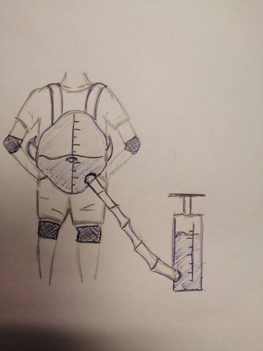
Goal of this week’s project was to physicalize any data in any form. In my opinion it is needed first to represent boring data in an interesting way for common people to understand since not anyone can look at the graph and understand all the meanings. Therefore I think that data in context of physicalizations should be represented as performance, it should shock, I cannot be some boring statistical facts it needs to have weight. It reminded me of the critical design course where it was important to deliver a message and in this case we delivering data in physical way, where our goal is to make that data interesting. The texts gave plenty examples, but what I found overwhelming is that they focused too much on what is data physicalization and what is not, criticizing visual data representation. From those papers I concluded that perfect data representation would be literal small cubes free floating in the room and arraigning themselves into shapes that represent data. The seminar was lacking and partly because it acted as some sort of reading test and how well we read the text because questions were like: “What are non-visual senses?” The only thing that was argued for was for the definition of physicalization and what counts as physicalization and how it should be evaluated, but the conversation stagnated and teacher could not guide class through it.
The goal was to come up with the concept so we thought of weight as very direct physical representation of data. Idea was to give person the feel of being overweight and to show how body slowly changes overtime on unhealthy diet. Difficulty of movement would be the shock value and the data of how fast and seeming less it can happen to a person and how sudden might be the struggles with simple everyday tasks.

Week 4
The goal for this week was to play music in a new interesting way using Wekinator. Texts were short and relevant as well as gave direct example projects and what was done to the instrument and what it added to it. Furthermore it talked about psychology of sound and benefits of auditory feedback on movements therapeutically.
During our design process we tried out several sound libraries and experimented with converting movement into sound through video input. We lacked technical skills needed to fully explore and accomplish our initial idea. In general it was similar to what we have done in interactivity course. What we could have done if we had more time would be to experiment with kinect and leap motion to have more room for controlling the sound.


0 notes
Text
10.04 Redesigning and testing
Redesign goal was rework the way the home screen look and redo some navigation aspects. I changed the hierarchy of the content, pushing it all to the top and not stretching it all on the screen. Since the content is not really a carousel I added indicators about progression. Moving the main categories to the middle in theory would imply on choosing the category at the beginning of the journey. Idea was to move the category settings to the top and make them more visible and if person want to browse he can go further down. With my prototype I tried to imply that there is carousel out of categories with most popular show poster on background as thumbnail. User can quickly skim through the list and hopefully choose the category.

User testing could go better, users wanted to click on stuff but my prototype was very limited and I asked more questions and tried to guide the user to the path – like saying you want to search for movie, what is out there, what can you see. In my prototype the most confusing were round posters, they were confusing and misleading. It supposed to be the previews of the shows which I could put cycling with the main poster. In general they users had not much to say and talked about features that they did not like in Netflix and tried to suggest how to fix those problems. Unfortunately they failed to see the benefit of moving the categories to the middle and giving access to categories, but they all have noticed it. Users liked the indicator for vertical scrolling as well as displaying content like a long grid, they said that they agree with feeling like they miss some content.

In total I asked ten people and did it in interview format, for the future prototypes I could make my prototype more intuitive and give users more freedom in selecting them. This could change the outcome of the user testing. But i think that my initial goals were fulfilled and I am happy with the result.
0 notes
Text
6.04 Deconstruct
The app has similar wireframe for all its content with couple of differences, but main content is presented the same way. It has strong film hierarchy built up and uses bunch of navigation design patterns to present the content and to categorize it. The idea is to keep user as much on the app as possible with personalized suggestions and thumbnails.
By the looks of the app it looks like big endless billboard, with colorful posters and announcements. The app also looks like cinema film catalog with dark background theme and small text which describes something.
The first thing you see when you open the app is the big almost full screen movie poster with buttons to play it or add for later watching. Right under it there is unusual carousel with previews of some shows. It has specially made poster which is round and large name. At the top left there is bright Netflix logo and next to it is the three main categories – Movie, TV Shows and My list. When I first looked at the app I did not notice it because the poster had white sky I do not think that was done intentionally, but it changed my overall progression. Down from there are only more carousels that have similar format only difference are “Netflix Originals” which are twice as big as other categories and “Available Now” category which takes half of the screen and is something I do not fully understand. From all of that I can see strong hierarchy of that Netflix is building by giving some shows more screen space.


Every poster is a thumbnail to some extent, it provides an overview of the films there are and made to catch users attention and invite user to choose a certain show. Also giving him ability to skip shows that do not look appealing to him instead of reading every description to the movie.
Every poster is somehow categorized and tagged. This design pattern helps user to skip shows which he is not interested in and search through specific shows. Tagging helps to summarize the content under that category like horror implies that the movie going to be scary. In addition it helps to define some sort of hierarchy to the movie feed.
Additionally above mentioned carousel gives user possibility to browse through all the films without going to a separate page, optimizing space. In addition it is incenting user to skim through all the content there is. App is not giving any visible indicators for the end of the list, but is not really circular it is more like horizontal continuous scrolling, you do not know where the end is but it is there it eventually stops and is not circular, therefore giving user understanding that he glanced all list through.
Last main design pattern is module tabs. At the top of the app there are three main categories providing easy access to content of interest.
All those patterns are there to make it easier for user to find the show they want to see and on the way optimizing the screen space. There are advertisements in form of bigger posters for the shows that might interest the user and adaptable content makes all to help user to find the movie of interest to watch. It is has features like continue from where you stopped watching and watch later options as well as downloading options to give user ability to be as free with his entertainment. Personally I don’t think app is made the way to keep user as long on the app as possible, because user has already paid for the service and only thing that app wants to do is to give content for a user so he would continue subscribing. Only thing that is uncertain is about the how much content there is for a user to watch and app tries to suggest as much but problem occurs when searching for certain category and you want to see all there is but app will never give you it all.
0 notes
Text
5.04 App progression
First day of using the app was not personalize and I had all the content on the home screen and I started browsing. All the movies are categorized and grouped that makes it easier to find a movie that you like to see. I could choose whatever I want and the app gave me all opportunities to choose that first film. After watching several comedy shows my whole feed changed to comedy shows and films that were suggested to me and my choice became limited and I needed to change my progression through the app. Now I could not be the same user who do not know what to watch and can glance through thumbnails waiting till I find something I want to watch.
My initial instinct was to go to press on the search icon and search directly for horror, because I felt like watching something scary. Search gave me some films under the category but there was not much movies there and at the bottom was category horror which lead me to twice as much movies to choose from, which was awkward for me as I felt like I am might miss some content. But I chose a film and marked is for later watching, that was my progression through the app.
I discussed it with my friend and he showed me that there is alternative way that he uses to search for content. I found out that there are categories at the top which I did not notice due to text being white on white movie poster. That changed my progression quite a bit. Now I could narrow my search - I chose movies, horror. And I was on a page with same layout as a home screen only for horror movies which gave me more options when choosing my film, but made me spend more time looking through all the categories. But I ended my progression the same way on the same film – marking it and leaving to the home screen.
That experience showed me that big part of Netflix is choosing the content you want to see. When comparing it to the YouTube it is easier on YouTube. On YouTube you have subscriptions, you can expect certain content and you choose that content and you can just choose what to watch from subscription videos. But that is different with Netflix, you cannot expect the similar content from a film, you can choose the genre but not the overall quality or humor etc. You can have some stability in TV series but after they end you still have to start the journey of searching for new content. It is partly fixed with adaptation of account in my opinion but personally there is some sense of missing out on content, which bugged me when I chose something to watch.
I want to try to redesign the experience provided by searching for the content and to speculate about the advantages it might give the user. I want to focus on redoing the hierarchy of the films that are shown and rethink the categories that are suggested on the home screen.
0 notes
Text
3.04 Starting with the new app
My app of choice was Netflix mobile app. I am familiar with the desktop version of Netflix and have been previously using it for watching movies and TV series. Therefore I wanted to explore features of Netflix mobile app. I am not sure what the advantages of watching movies from the phone are, thus I want to discover the situations where I want to use it.
Netflix always been for me a home theater, with large catalogue of films and interesting specials. Usually I was watching Netflix in company with someone and it was a show that we wanted to see and often Netflix was a great platform providing good quality films with no online browsing required. When watching alone I never had a certain film or show on mind and I often were scanning Netflix till something caches my eye, which could take some time.
I installed the mobile app and opened new account and skimmed through it, it looked very similar to a desktop version. It had diverse film recommendation on the home screen, promoting new series and popular among users. I found a film that I wanted to watch and put it on. Shortly I closed it and put on a standup comedy and went cleaning and cooking and doing other household chores. I used Netflix as I use YouTube on my phone – putting on something that do not require much attention or watching and doing my routine activities, letting it play in the background.
Later I asked my friend who was familiar with the app and was constantly using it during his travels. He said that he mainly uses the desktop version but on the go, whether on a train or plain or a long bus ride he uses the mobile app to watching his shows. He said that it is easy for him to download couple of episodes of a show and watch it during the day. He said that phones are quite large these days and have high quality picture and it does not matter to him where he watches the show, he just plugs in his headphones and has a great time watching his show.
This is common to watch YouTube from the phone and Netflix is similar to it. It provides lots of different content for user to watch and only difference is that YouTube has quite short 10 minute videos and are more suitable for this on the go watching. My experience shows that long movies is more preferable to watch on bigger screen in one go. But some easier shows can be split up and viewed either with lesser attention or with breaks.
1 note
·
View note