
Last Seen Blogs

luxurycarrepairgurgaon
Untitled

prismarinedebixx
prismarine!!(^_-)

manwithnoband-blog
ManWithNoBand

luxurious-em
luxurious EM

rawiky
RAVIKI
Text


Final Children's book Product.
Although there were a couple of hiccups and accidental deletions along the way. Overall I'm really happy with how this book turned out. I think this process really helped me learn more about all the programs. To begin with I was a bit overwhelmed and nervous to do this without Toby being able to guide me through it. But in the end I think being thrown in the deep end, really helped me solidify all the knowledge I have learnt this semester. The tumblr workbook actually helped a lot to guide me through, and my physical workbook also helped since I put a lot of the more obscure things that I didn't think would fit in here into it. My favorite part was definitely drawing all of the images in Illustrator. I think I have gotten a whole lot better handling curves than I was to begin with too. Really happy to have finished off the fundamentals class with something I can be proud of.
0 notes
Text
Children's book + Fundamentals #11
Now for the Final assignment:
We will create a 12 page A5 document. The document will be the beginning of a book of 5 (or more) nursery rhymes / children's songs / stories.
We will choose the selection of rhymes/songs and / or stories to populate the book with.
The book's content should be arranged as follows:
page 1: Cover, with title "Children's songs". - with or without a picture
page 2: and 3 'end papers' (more on this next week but I will explain today)
page 4: contents page
page 5 - 9: the 5 songs
page 1 and 11: end papers
page 12: back cover
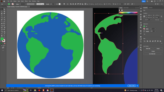
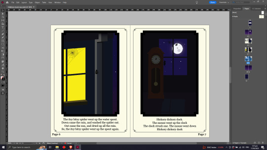
I decided to start this project by doing all the illustrations first. The brief said a minimum of 2 illustrations, but I decided to do one for every nursery rhyme. The nursery rhymes I decided to use were Hickory Dickory Dock, Row row row your boat, Incy wincy spider, Hey Diddle diddle and lastly Twinkle twinkle little star. I went into this project wanting it to be mainly night scenes since I thought a book for bed fit nicely. I cracked on in Adobe illustrator and got to work. I thought it would be a cool idea if all of the images I drew connected each story in a way. So In illustrations with the moon I would have a cow jumping over it to link it back to Hey Diddle Diddle. In some I might have the house from Incy wincy spider and Hickory Dickory dock. and in most I would have a star in the sky for twinkle twinkle little star which will draw the book to an end.
I started of on most of the illustration by giving them a blue and purple gradient background for sky. I then added to landscape (eg. Mountans, Hills, Walls ect) I colored them appropriately and added some finer details like shadows or reflection of moon or lights ect.


In most of my illustrations there is a creature of some sort. For these I usually found clipart online and cut them out using Curves and anchor points. For most of these I just wanted them in silhouette and this would also save some time since I'm on a crunch.


With some other objects I just used pieces out of stuff I found online, creating the rest of it by hand.
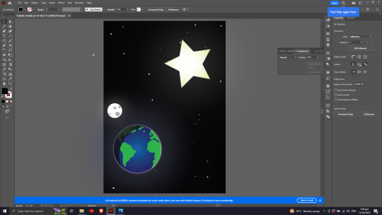
Another big thing I learnt is how useful the outer glow tool is. I used this feature for all of my Illustrations and it did an amazing job at adding atmosphere to a scene.
Now to put it all into Adobe InDesign. I created an A5 document and added 12 pages. I started off by setting up the parent pages. I changed the background to an off white color, because I quite like the look of older nursery rhyme books, You will also see examples of this with the simple cover and fancy line work I will show later. I added Page numbers and set them to a special character by making them present the number of each page. I then added frames for the Illustration. I made one frame and simply copy and pasted it onto the other pages. The reason I didn't just put them on the parent page is because I wanted to paste the illustrations into them making it an easier and cleaner process. I then Pasted the images in and added in the nursery rhyme text. I chose to use the font Georgia because I think it fits in well with the overall look and feel of the book.

I also added the contents page in a similar style.

For the cover I decided to go for an old fashioned basic look. I Liked I chose a dark blue because of the old look it has and it also fits in nicely with the color scheme of the rest of the book.

Now finally for the end papers. I started this off by finding some clipart in images that I thought would go with the overall theme of the book. I ended up choosing a flying owl and then tracing using the pen tool to make my own.


I then put it in a box and added it to the swatches. I tested out this process by making a curvy shape and then adding the swatch to it.
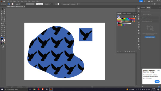
I then decided to play around with it a bit, so I changed the square box the image was in to a hexagon shape. Then after adding that to the swatches I double clicked it and messed around with the placing a bit. I ended up creating one that I thought had a cool 3D look to it. I think the gradient also adds a 3D element also.

Then after this was done I put it into a shape that would fit my InDesign document and exported it on.
0 notes
Text
Fundamentals #10
Today in indesign we started off by creating an A5 document. We then went up into the window tab and clicked on "Pages". We then decided to add 8 pages to our document.

We then added a box and increased the size. A really handy thing to know, Is when you hold shift while changing text size, It will go fast. Also if you want to change the size of text using the text box, You can hold down Shift, Command Shift Command Shift, Command Shift Command. Now if we look up on the Pages pull out, you will be able to see a seperate spread called A-Parent. When we write on a parent page it will pass down and apply it to all of the pages in our document. Very handy if you want a specific logo on each page or a header, etc. Now if we want to get rid of what the parent page has changed about a page we can drag the none page which is above the A-parent spread. And Put it onto a page of our choosing, once its dragged onto it the parent page will no longer have an influence over it. If you want to change it back you can just drag the parent page back over it.

Now if we want to use the parent page for numbering pages. We can write in Page 1 and Page 2 on the spread. This has applied but it will be 1 and 2 on every page, to fix this we will Highlight the number - right click it - press Insert Special Character - press markers - Press current page number. You will then notice it will have changed your number to an A. But if you look at all the other pages they will be numbered correctly.


A Margin is the box that surrounds surrounds your page which you usually work off of. To change the size of the margin. You want to go on your parent page spread. Go to the layout pull down and click on margins and columns, from there you can change your margin size. (make sure both Parent pages are selected)

0 notes
Text
Fundamentals #9
Today we are going to be learning how to use Adobe Indesign. We started off by opening an A4 file and changing the units from picas to millimeters.
We then learnt a little bit of interesting trivia about the return button on the keyboard and how it started off as a return carriage button on a type writer which was how you created a new line of text.
When we got into Indesign We created a text box using the type tool and filling it with placeholder text which we got to by going to the type panel and going down to Fill with Placeholder text. For the paragraph style you must select the paragraph you want to use, go to click the plus button on paragraph style and then double click it (to access this you must click on the window panel, go down to styles and you will find everything there). Once you'r there you can rename it and press okay. Now you are able to change the style of any piece of text by selecting a new paragraph and clicking on the style that you created.


We did it again on a heading and learnt how to change settings. We can see that once we double clicked a new style there are lots of settings on the side. If we go through we can change all the text settings, spacing and much more. Another handy toll is going into the settings and go to hyphenate and deselect the checked box to get rid of them.

On the topic of spacing you can change the spacing above and below your text by using the space before and space after that you will see in the photo shown above.

Now if we only want to change a selected part of a paragraph we are going to use character styles. This means when we want to change text like before it wont change the whole block of text.
To make more than 1 column of text you need to click on the text box and then change the number of columns at the top

We now put some text into the text box and are going to make bullet points. For this we are going to make a new style of text by pressing the plus button, Selecting out text and going to bullets and numbering in the settings. change the list type to bullets and then change the bullet and number postions to left indent 3mm and first line indent -2mm. You can also change spacing of the bullet points by going to the indents and spacing setting.


Also if you want to press return to move text down a line with bullet points it helps to press shift-return so it doesn't create a whole new bullet point.
Now we are going to add a photo to our indesign document. We then opened up the image separately in Photoshop. And learnt about editing the photo cross platform by using the link tool in indesign. This means you can edit a photo in photoshop while its still in an indesign folder.

To scale the border and the image in Indesign Hold down shift + Command this will scale both at once. And to scale the frame only hold down the option key.
We then moved the image on top of the block of text, but the there is still text behind it. What we will do is go to the top and click on the wrap around button, this will make the text wrap around it. But even after this it still dosent look clean, the text is still to close. To fix this we will go into properties. Go to the the text wrap settings and you will find a spacing option. You can unchain these if you want and mess around with it until you are happy with the outcome.


You can also paste the image into a shape by copying it and then right clicking the shape and clicking paste into. Once we have the shape we can put it on the text and space it out. Only this time we only have one option because its a circle.

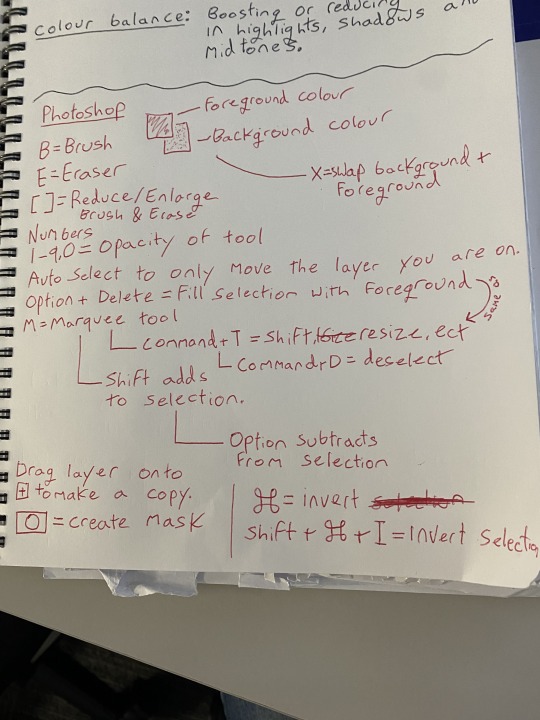
All together I learnt a lot of really handy things today. Here is some notes from my book.

Thats all Folks
0 notes
Text
Fundamentals #8
Todays task is an Illustrator skills show and tell. The main goal is to practice and build on skills we have learned so far with Illustrator.
Graphic 1 - pick and draw or draw from reference / imagination, a graphic that is shown as a silhouette - for example: Skull and crossbones, an aeroplane, a wine bottle and a glass, a rubber plant
Create a suitable drawing to work from.

For this step I found some clip art of a car and printed it out. I then got a piece of paper and traced out an outline that I could use.
Mark on the drawing where the anchor points will be.

Now I finished drawing the outline, I then marked out on it where the anchor points and handles would be if it were on Illustrator. I found for this step it helped going on Illustrator and seeing how the anchor points work with some of the angles and the drawing what I found.
Make the graphic / illustration in Illustrator, with a scan of the drawing loaded into the layer beneath the vector artwork.

I then scanned the drawing I traced and put it onto Adobe Illustrator where I can digitally trace over it and see how accurate I was wit the anchor points and handles.
Document the result with a reflection about how successful you were.


I then traced over it using the pen toon in Illustrator. To my surprise the anchor points and handles I drew actually lined up pretty well to the actual ones. Talking to Toby after about it though, I realise I probably could've used less to create the image (The main one being the anchor point on the right hand side of the front bumper). I also found I had some trouble using the handles to make broken points. Once I finished I filled the image back in putting my final image into silhouette.
Graphic 2 - this should be an object or illustration that has an outline a fill colour and a shadow shading - using some of the same tradition as the penguin illustration.
Create a suitable drawing to work from.

I found some more clipart and this time I found some clip art of a rocket ship. I printed It out and sketched it into my workbook.
Mark on the drawing where the anchor points will be.

Once the outline was finished I did the same thing as before and drew in the handles using Illustrator to double check the angles where right. For this design I would like to add the same kind of clip art style but also add in flames and a background so it looks like its going out of the atmosphere.
Make the graphic / illustration in Illustrator, with a scan of the drawing loaded into the layer beneath the vector artwork

I scanned the drawing and put it into illustrator where added it to layer 2.
Document the result with a reflection about how successful you were


I drew the Space ship out using curves and anchor points. At first I was having a bit of trouble changing the length of each handle, but later found out that you could do this by clicking the command button when setting them. I then added colour to a new layer below it so it didn't go over the border lines. Now for the fun part, adding depth and reflection to the rocket. I did this by drawing out the a seperate shape and adding it to the rocket and then making it a couple of gradients darker or lighter than the colour it was on to make it look like shadow or reflection. I then drew in the flames and added a shape with 50% opacity and added Gaussian blur to give the flames a bit of orange haze. I then added a gradient Background going from dark blue to black and added stars to finish it up. All-together i'm happy with the outcome especially the shading, But I do think I could of done a lot better on the flames.
0 notes
Text
Fundamentals #5
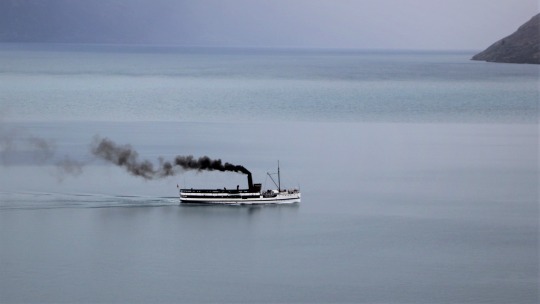
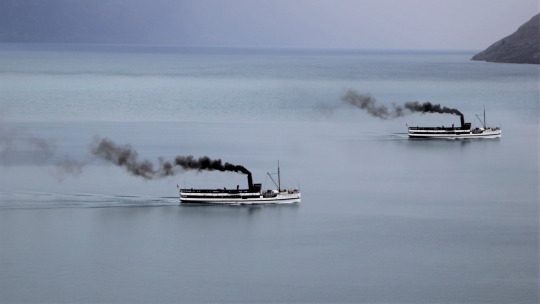
Last week we went over photoshop image adjustments, learning about colour grading using Curves, Hue/saturation etc. Following up on that, this week we learnt about Layers, Masks and selecting. We started off with a picture of a boat sailing in a lake and out goal was to duplicate it and make it look like there were two side by side. (Note: I unfortunately lost some of my screen grabs from this week, so i'll try be extra descriptive) We started off by making a copy of the original image, then using a Marquee tool to cut a box out around the boat on the copy image. Then once we had our Marquee, we Clicked the mask button, which is the little icon at the bottom of the layers panel that looks like a circle in a box. Once this was done we finally had our mask, but you could easily see that it was a cut out. To fix this we learnt to hold down Option and click on our mask this gave us a B&W view of our mask, making it easier to see what was in our mask and what was not. We then proceeded to use the brush tool (using X to change it from add to subtract). I turned the opacity of the brush way. down and turned the feather up to 90%, going around the boat. once this was done you could barely tell that it was a cut out.
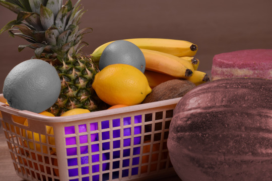
The next Image we worked on was one of a fruit basket. The goal was to make a marquee using the pen tool and changing the Hue/saturation on it. We started off by using the pen tool (which is practically the same as the one in illustrator) and cutting out the orange. We used the same techniques that we used before with the anchor points and the handles. I tried my best to use as little anchor points as possible and just focus on using the bezier curves. Once we had drawn around the orange and had the points connected we needed to turn it into a marquee. To do this we went into the Paths menu. Once in there, you could see the work path you made using the pen tool. We then selected that and then clicked the Load path as selection button, which looks like a dotted circle at the bottom of the paths menu. Now you have a Marquee You need to do the same process a before by pressing the mask button on the layers menu. And Just like that you have a cut out. Now using the same methods as we did last week, we needed to change the the saturation of the masked layer. So with our layer selected we put on an adjustment layer and change the Hue/saturation. We then need to clip this adjustment layer to the masked layer we had selected. To do this we need to click the button at the bottom of out adjustment layer menu that looks like a box with an arrow pointing down. And there you have it, now you can adjust the mask as you please. We also looked at some other tools that can make the whole masking process easier like the quick selection tool and the object selection tool.

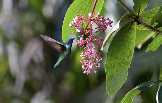
After this we kept playing around with some other images, but pretty much used the same fundamentals as the last two images I talked about. The last images we worked on was one of a humming bird. We had to cut out the humming bird using one of the methods we used before and clean up the edges a bit using the brush tool. We then copied our mask onto a different background so it looked like the humming bird was drinking from a flower. And the other one of a plant which we used the same technique I explained for the orange one we did.

Here is my bookwork where I wrote down most of the buttons and technical stuff I learnt.
For our homework we had too cut out too images and place them onto backgrounds. I cut out a space shuttle and put it onto a picture of the edge of the atmosphere. And for my other one, I cut out a car and put it onto a background of a salt desert and then blurred the background to give it a speedy look.


0 notes
Text
Fundamentals #4
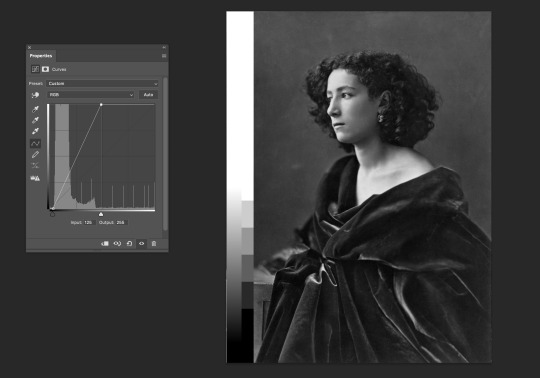
Today we did Image adjustments in Adobe Photoshop. Our first image we had to correct was a Black and white portrait that was over exposed. We learnt to use curves instead of Brightness and contrast. To do this we made an adjustment layer over the top of out image and worked on that. With the curves we slid the darks up on the Histogram.


After this we worked on the same image but one that was under exposed. This was pretty much the same process but with the lights instead of the darks.

The next Image was a cat that was under exposed. This one was a bit harder because I didn't want too blow out the whites too much so to fix this I added a curve so I don't lose any information.


We then went onto an image with colour. It started off very under exposed and unsaturated. I used what I learnt before to brighten the image up. And then to boost the saturation a little bit, I selected Hue and saturation on the adjustment layer and messed around with the saturation until I thought it was good. Still not the best image but i think i've done what i can.


Now to move onto colour balance. We got given a portrait of a mans face for this one. I don't think there was a whole of colour correction I could do here but I noticed the reflection from the wall turned his cheek a bit too orange. Pretty much all i did here was turn the brightness down a bit and then replace some of the red in the shadows with cyan. With colour balance you have the options to change the colour on the shadows, mid tones and also highlights.


Finally the last image we did which I think the biggest difference was made, was an old sun-bleached picture. The reds and yellows where super over saturated and it also came across over exposed. For this image I used everything I learnt before and incorporated it into this image. Overall i'm pretty happy with the outcome and think it turned out well.


Learnt a lot today here are some of the notes I took in class.


Homework: Two B&W photos fixed, Two Colour phots fixed.


0 notes
Text
Fundamentals #2
Today in class I started off by finishing up drawing the straight line shapes from last weeks lesson. Before starting the next exercise we touched up a bit on some of the controls for Adobe Illustrator we went over last week.
The main lesson for today is learning about Bezier curves, how to make them and how to get comfortable drawing them easily. We started off by drawing some Single arc curves. We did this by dragging on the pen-tool which gives it curvature and handles to adjust it. We went over how many anchor points you need to create different shapes and curves and how to use the handles to soften or harden them. We played around with drawing single arc curves and multi-arc curves and also drew out some closed curves. We also learnt about different types of points. Such as a corner point which is a point between 2 straight lines making a corner, a curve point which is the point on the arc of the curve, a hybrid point which is a straight line going into a curved line and finally a broken point, which is two curves going in a different shape connecting.


Our Homework for this week was to find a vector line drawing and too send it off to a partner. You will receive an image from your partner, and with that, you will need put it into adobe illustrator and remake it using the pen tool. The image I received is the one on the left and the one I made is the image on the right. I had a-lot of fun playing around with the curves and the anchor points. Im honestly really happy with how I did on this and think its really hard to tell them apart.


0 notes
Text
Fundamentals #1
Today we learnt about Bitmap Vs Vector and how they are differently used. Bitmap is made up of a grid of pixels making it better for photos. And Vector is made of lines and curves making it better for logos and graphics. We then learnt about some of the basics with Adobe Illustrator. We learnt shortcuts such as zoom (Space+Click) and how to move around (Space) ect. We Also touched on the pen tool where we played around with some straight line shapes as seen below. we Also briefly went over file organisation and how to keep everything clean and tidy.


1 note
·
View note