
Statistics
We looked inside some of the posts by liamberryupsidedown and here's what we found interesting.
Average Info
Notes Per Post
8
Likes Per Post
8
Reblog Per Post
0
Reply Per Post
0
Time Between Posts
1 day
Number of Posts By Type
Text
17
Last Seen Tumblr Blogs


Fun Fact
70% of Tumblr users say the Dashboard is their favorite place to spend time online.


Text
Art wall collection Day 1

(couldn't get progress photos for the 3 in the middle)
1 note
·
View note


Text
Moths

Progress Pictures


Reference Images


2 notes
·
View notes
Text
Some digital art I made on my phone it's a bubblegum fox.

Progress images:


Inspo:
0 notes
Text
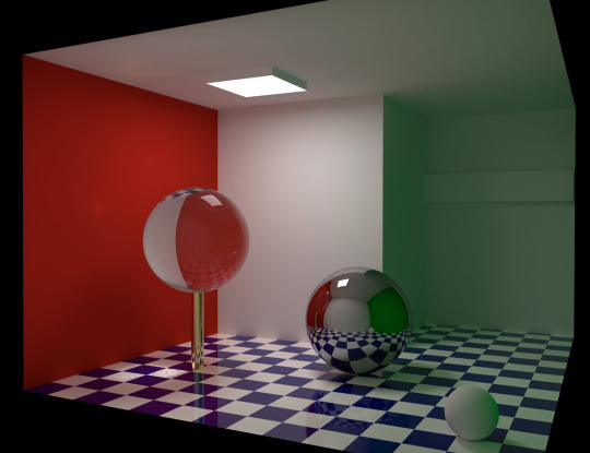
Global Illumination
Global Illumination is like adding a sun into a canvas in cinema 4D. It has shadows and makes the artwork more realistic. You can even change the time of day to get the right lighting. It also reflects off of surfaces highlighting some areas too.
0 notes


Text

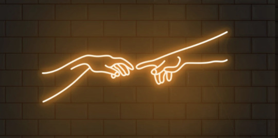
Neon signs come in many shapes and colours and seem to fit in almost any room with the right colours. I like the image ones but the text ones can be fun as well. For example:
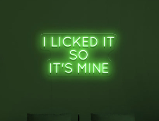

I'm a fan of the Dragon ones the most, I really like how they are done and I really wish I owned something like this, I would probably do more blue and yellow colours if I had the choice because it fits in better with my room theme but all in all I love the effort and the artwork


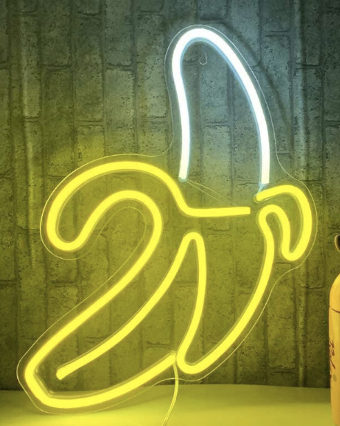
I really like the image ones, the ones shaped like things like the banana the hands trying to touch the lightning bolt and especially the Saturn planet. I own that one at the moment and its hung up in my room, I think it looks pretty neat.


0 notes
Text
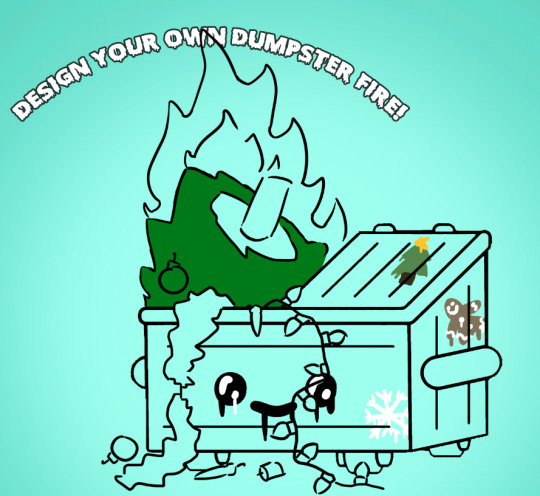
Dumpster Fire (Festive)

I was given a template and told to make my own, I think I understood he assignment well and had fun making it festive as it is the holiday season!
Here are the progress photos:


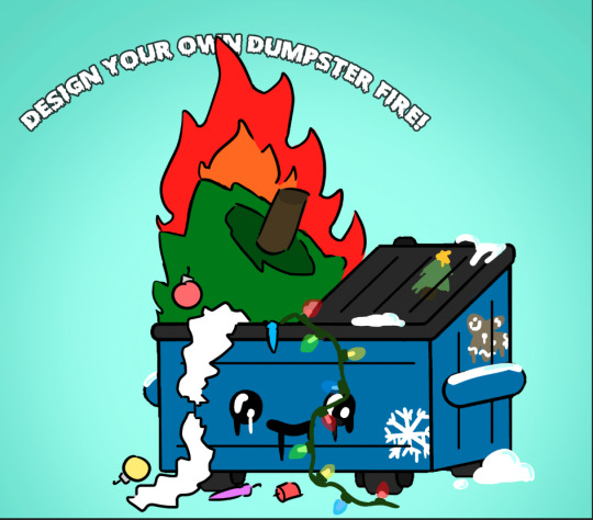

I wanted to make the lights colourful and I used this reference image to get the colour pattern I wanted. It is kiddy and festive, exactly what I wanted. I made the bin blue because I thought it would fit with the cold Christmas theme as it is a cold colour. I also added some festive spray paint, to really hone in the whole Christmas theme. I used the dissolve version of the brush to make it look like spray paint. I made it a gif because all I could envision is the lights flashing. It didn't take one and only took about 5 frames.
0 notes
Text

My task was to make a Christmas card that involves itself with the ground hog from the movie Groundhog Day. I liked the movie and had fun drawing this chubby fella.


I used a pencil and some Windsor Newton alcohol pens to make the little details and colour it in. I think it looks pretty festive and pretty cute I probably should draw like this more often. I do wish I did something better with the background tho as well as the letters.
0 notes
Text
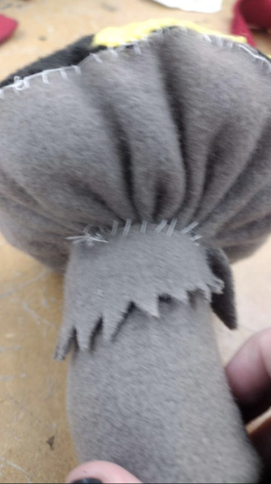
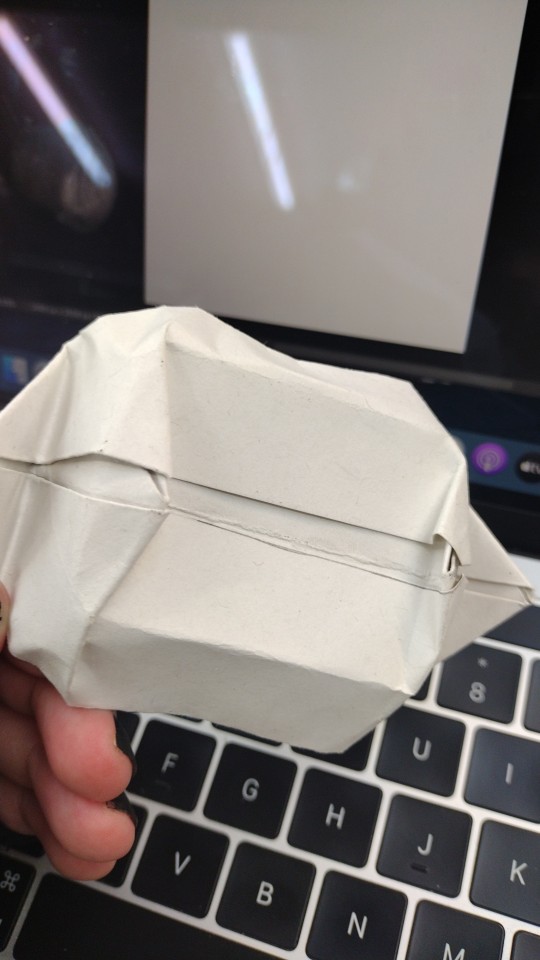
Tray
I started off by making an origami tray and I had fun following the tutorial. I used thick paper so it didn't work how it should have but next time I will be using the thinner paper and with a fun pattern on it related to the project. I actually started working on it in this post.


After I wanted to add a pattern to the tray, now that I have my head around what I'm doing I can make the thing look more customised to the restaurant. I wanted the pattern to involve some grey and some yellow a they are the colours of my fast food restaurant. I started off with a spotty pattern to show off the whole idea of the pattern on the head of the mushroom.
I did not like it so instead I made another one made of little squishy mushrooms for a pattern.


I liked how it looks so I duplicated it and made a fun pattern to be used to make the box.


I think it looks neat and pretty cool maybe I will make it bigger but I do like the size it is right now.
0 notes
Text
Adding the baby teeny details
I continued to update my portal entrance by adding little moss details and adding some textures. The textures do look kind o strange and have squeezed to fit into the shape. when rendering It looks strange. I am trying to figure out how to change it.

I did figure out how to combat this, I expanded the shapes to make the texture spread as shown below. you can see it in comparison to the rest of the stairs as being more spread out.

The result of that is a much more realistic look on the stairs, slightly ore bulbous ta I want but it still looks good.

I added some lighting as well, my idea is some guy was driving in the woods and came across it and his car lights are illuminating the building.

I saw that the grass looked really plain so I began making patches of grass and dandelions, adding a more realistic look. I duplicated a bunch of little grass shapes and squeezed them together with some other foliage.


I then started making this ivy looking material with these clover clusters. It looked a lot like ivy so I duplicated it multiple times and messed with the sizing a bit. I grouped a bunch together as well to make it easier to duplicate.
This is my progress so far:

as you can see there is multiple flowers and grass pieces, as I have done this the frame rate has dropped massively. I cant even move anything else as well. I am going to try work around it but I feel like I might have the opportunity eventually to work around it but I know it is going to take some time.

0 notes
Text

3D text can be god, can be bad, it all depends on what you are using it for. I myself probably would use it for posters and things, I would hand draw the 3D parts or maybe get a font that could do the 3D effect I wanted. There are different ways to use 3D text.

The kind of logo I really like that has this 3D drop shadow aspect is Duck Tales. I love that the logo doesn't need much to be 3D and I really like the vibe. This is the sort of 3D text I like. The following are other examples of 3D text I like:

The Super Mario Odyssey logo is very 3D and has massively taken advantage of the fact it is 3D. You can see the shadows and the likes of where they just extrude. It has some lighting some highlights. It looks good and I think it is a great use of 3D.

The Minecraft logo is one of the more simple use of 3D text but an effective one. I really like how it looks and it has this nostalgia factor for me. The kind of 3D text I thrive to have whenever I have the chance to.

The Animal Crossing New Leaf logo has a very interesting and simple use for 3D text. It had bevelled sides made with highlights and has a shadow. It is so simple and does not have many hints to the fact ut is 3D but it looks good in my opinion.
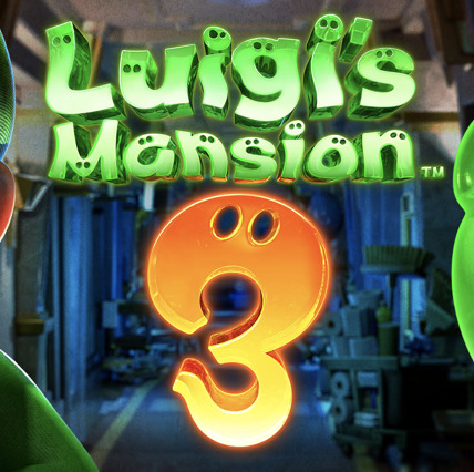
Luigi's Mansion 3 has one of the best instances for 3D text with the jelly look and the thick look. I want to eat it! it looks like this really tasty jello and probably is the most edible 3D text. I strive to make similar logos in the future if I ever need to.

The Kirby logo has this very cool and shadow look to it as well, I really like how simple it is for 3D text it has a similar effect to the Minecraft one from earlier. I probably wouldn't make anything like it though.

This Rugrats logo looks pretty neat and has the simple look like on the Kirby logo previously. I admit it looks wore though, the lines are very thin for 3D text and has a very good drop shadow.

Dora The Explorer has a very simple logo similar to the Minecraft one It is just another example of this type, which I like on logos.
0 notes
Text
Eadweard Muybridge
Eadweard is a photographer who took photos of a horse to figure out if they were simultaneously on the ground as it ran. Doing this he created a stop motion animation.
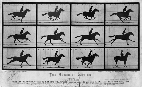
It created something surprisingly smooth and impressive. As someone who has done stop motion animation on a more miniature scale I do not think I would do it. Sure for the time this was probably really amazing but right now it is not exactly the best and easiest way to do that sort of animation. I like the result and how seamlessly the frames pass one an other I really do, the movement looks surprisingly real. But I would probably do it in an easier way.
0 notes
Text
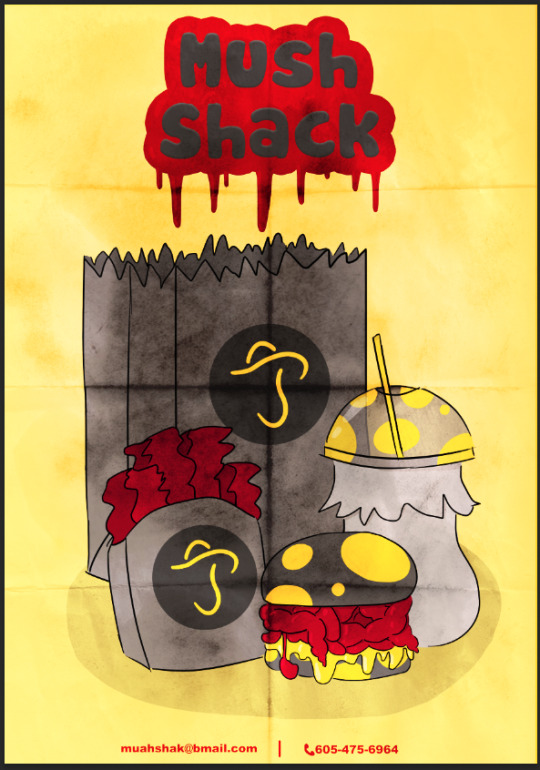
Mushroom Meal Poster (completed)

I had put the folded poster layer onto the completed poster after placing a price on it. I also added text for the meal. Its a play on words with the word Fungi and Funky.
0 notes
Text
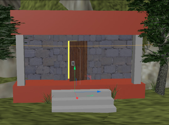
Mushroom Cave

I added a door and a little bit of frame for said door


Then I drew the keyhole in adobe illustrator to then add to Cinema 4D. I did but I had saved it wrong and had not filled the shape in it either had I grouped the lines I had made of it together.


After doing it right, I had made the shape I wanted, making it easier to make the keyhole I needed to make. I copied it and put it on the door on top of a coloured block. I will be changing the colours and textures later on. but for now I am making the base model.

I then made the door open a bit, and used booles to make a hole in the building so i could squeeze the glowing object in it. looks ominous.


I then added textures
0 notes
Text
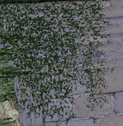
Poster Texture

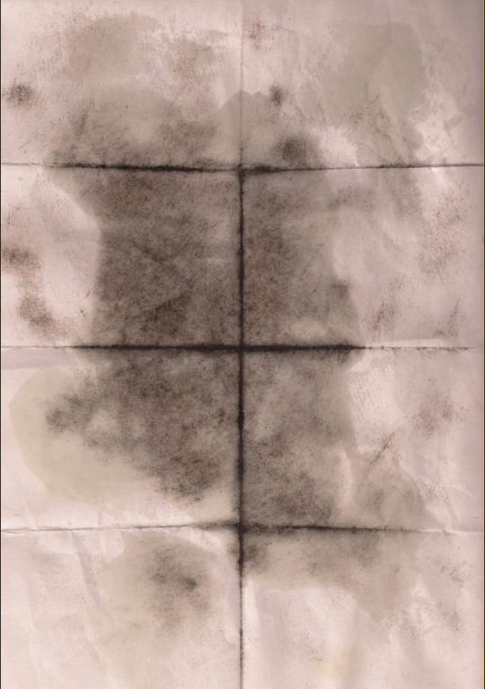
I added a photo of some folded paper with some mould in the middle then used the effects to change how it looked above said image

Soft light and hard light made it look more like a poster so I will be keeping that. The result looks nice.
0 notes