
Don't wanna be here? Send us removal request.
Statistics
We looked inside some of the posts by liaoqiaoya and here's what we found interesting.
Average Info
Notes Per Post
1
Likes Per Post
1
Reblog Per Post
0
Reply Per Post
0
Time Between Posts
17 days
Number of Posts By Type
Text
12
Last Seen Tumblr Blogs


Fun Fact
130K people were victims of a chain letter scam that affected Tumblr in May 2011.
Text
WOII Compulsory: In Summary
The World of Ideas and Imagination (WOII) module helped me rethink design as more than just making—it is interpreting, remembering, and responding. Concepts like Cultural Materialism and Poststructuralism showed me how artifacts are shaped by ideologies and histories, not just function. Meaning is never fixed—it shifts with context, time, and the viewer.
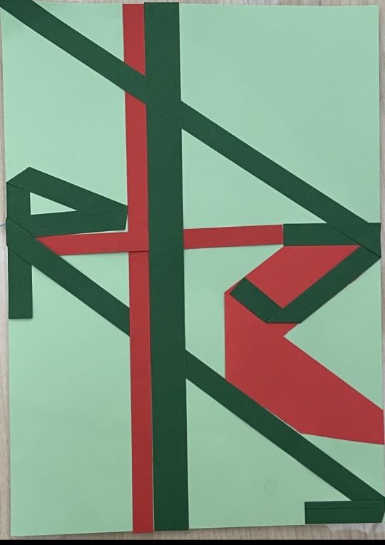
What changed my perspective most was how other modules began to echo this. In Experimental Layouts, I worked on dynamic typographic compositions (Figs. 1–2), exploring how fragmented letters and unexpected alignments disrupt the traditional grid, creating visual rhythm and movement. Later, I realized these experiments were closely linked to WOII’s idea of destabilizing meaning through design—each twist and overlap was not merely aesthetic, but an inquiry into how form affects interpretation.
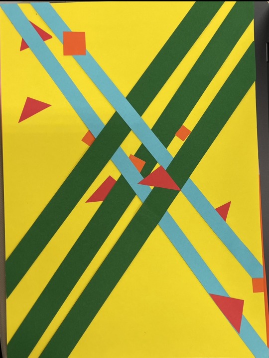
In Color, Form & Format, I experimented with vibrant geometric arrangements (Figs. 3-4). By layering bold colors and intersecting shapes, I discovered how visual tension and harmony could communicate emotion and cultural symbolism. This approach deepened my understanding of design as not only visual, but emotionally resonant, influencing interpretive work.
Now, I see design as a conversation—between disciplines, senses, and cultural memory. Moving forward, I want to keep asking not just how things look, but what they carry, and who they speak for.
(205 Words)
References:
In MLA style -
LASALLE College of the Arts. World of Ideas and Imagination – Week 1–12 Lecture Slides. 2025.
0 notes
Text
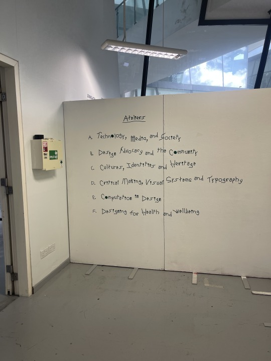
WOII: Week 12 - Art Ecosystems
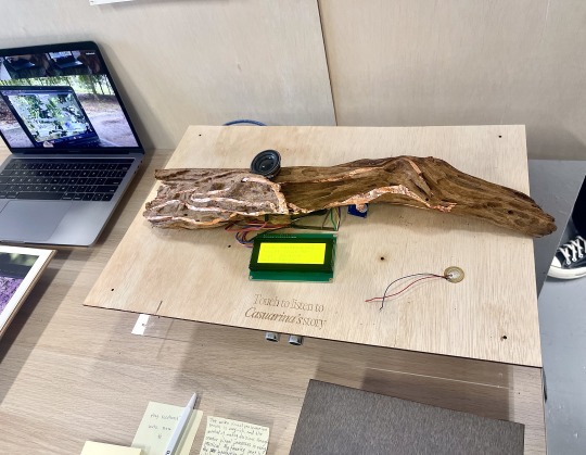
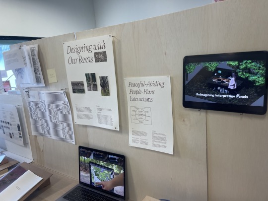
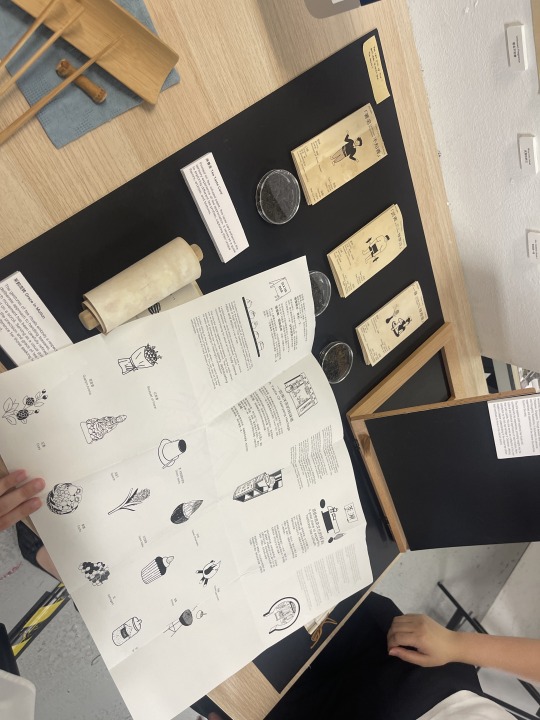
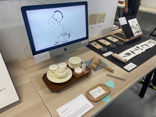
One project that left a strong impression on me was Reimagining Interpretive Panels (Figs. 1–2), which connects closely to the "Experiences (AI-enabled)" stream. Unlike traditional signs, this project uses Casuarina bark, copper tape, and sensors to create an interactive storytelling interface. When someone touches or approaches the tree, it triggers different sounds, responding uniquely to each person's presence. The phrase "Touch to listen to Casuarina's story" becomes an invitation—turning a simple glance into a personal, sensory exchange.A nearby screen displays a 3D rendering of the concept (Fig. 2), helping viewers imagine how nature and interaction could merge. This connection to "Experiences (AI-enabled)" is also visible in the exhibition overview (Fig. 3).
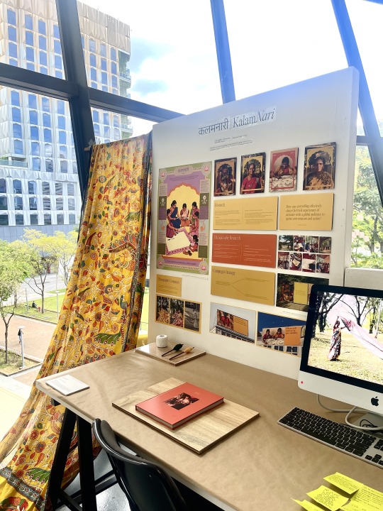
As a designer, I am drawn to intangible cultural heritage—rituals, crafts, oral traditions—and how sensory design can help reawaken them. It made me wonder: What if Chinese paper-cutting could speak through texture? What if shadow puppets whispered folktales as we moved them? Projects like the interactive tea ritual (Figs. 4–5) and the Kalamkari storytelling campaign (Fig. 6) echo this idea. The Kalamkari project combines traditional textiles, visual storytelling, and women's voices, creating something both historically meaningful and innovative.
To create work like this, I would draw inspiration from the Singapore Design Archives for cultural grounding, and from D&AD, which supports emotionally powerful, poetic storytelling. As Donald A. Norman writes, designs that engage both our senses and emotions stay with us long after their meaning fades (Norman, xi), not because they told us what to think, but because they made us feel something worth remembering.
Culture does not need to shout.
All it asks is that we reach out and listen.
(273 Words)
References:
in MLA style-
D&AD. “Purpose & Awards.” D&AD, www.dandad.org. Accessed 17 Apr. 2025.
Norman, Donald A. Emotional Design: Why We Love (or Hate) Everyday Things. Basic Books, 2004.
Singapore Design Archives. “About.” National Design Centre, www.singaporedesignarchives.org. Accessed 17 Apr. 2025.
LASALLE College of the Arts. World of Ideas and Imagination – Week 12 Lecture Slides. 2025.
0 notes
Text
WOII: Week 10 - Poststructuralism
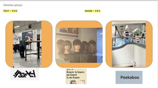
Our group activity—pairing random texts and images without knowing each other's choices—clearly showed post-structuralism's idea that meaning is not fixed. One pairing I clearly remember was the Chinese word "躺平" (lying flat, a protest against overwork) next to a photo of our lecturer stretching(Fig. 1). At first, it was funny. But then I realized: the text shouted "stop hustling," while the image quietly said "optimize harder." This contrast reminded me of Barthes' idea of the "death of the author" —we could not control the meaning; it changed depending on who saw it.
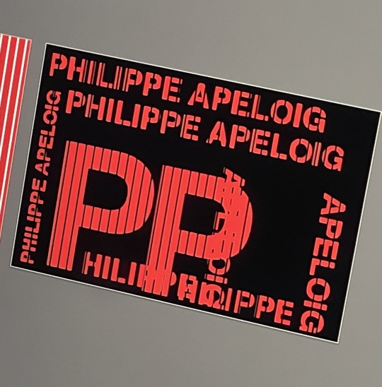
These thoughts influenced my design work as well. For a postcard inspired by Philippe Apeloig, I sliced text diagonally and layered type (Fig. 2), purposely breaking the grid—a reference to Derrida's idea of deconstruction, which celebrates the beauty of broken structure. Like Magritte's mislabeled door in La Clef des songes, my design asked: What if words and images lie in order to tell the truth?
I also borrowed ideas from David Carson's chaotic Ray Gun and April Greiman's playful WET collages, where letters and scribbles seem to dance randomly. Foucault might argue that grids control meaning; by breaking them, I invited viewers to consider who really decides what design means.
Post-structuralism taught me that good design is not about clarity—it is about curiosity. Next time, I will leave even more room for people to figure things out on their own. After all, meaning works best when it can move around freely and surprise us.
(247 Words)
References:
LASALLE College of the Arts. World of Ideas and Imagination – Week 10 Lecture Slides. 2025.
0 notes
Text
WOII Compulsory: Week 5 & 6 - Design Analysis and Field Trip
Today in class, we explored "How Design Means," looking at design from its purpose to the materials used. In our group activity, we shared favorite objects and found unexpected connections through themes like "memory," "play," and "materiality." It made me realize that design is not just about appearance—it is also about process, function, and meaning.
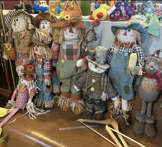
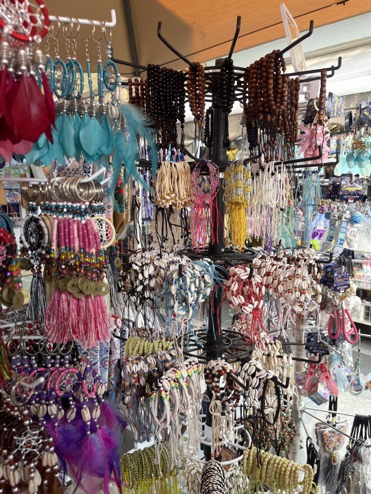
Under "Memory," photos were not just images but intentional ways to capture moments (Fig. 1). In "Handmade," Moru keychains and crafted toys showed how material choices bring unique character (Figs. 2–3). For "Materiality," a wooden book had rustic charm, while a modern hairpin reimagined tradition with new materials (Figs. 4–5).
One example I shared was a blogger who learns traditional crafts, documents her process, and creates handmade items like headdresses and paper cuttings. Her work demonstrates how design can help keep culture alive and tell stories. Many objects we explored also reflected this connection between design and meaning.
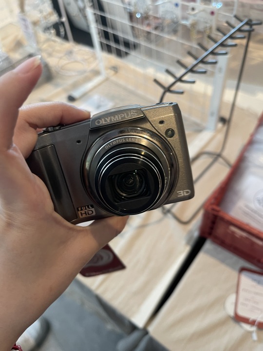
I grouped a CCD camera under "Memory" because I believe cameras are one of the most powerful tools to capture and preserve memories (Fig. 6). Each photo becomes a physical reminder of a moment, helping us recall emotions and details. A camera acts like a time capsule, allowing us to revisit the past and reflect on our personal history.
Beyond its function, the camera is made of materials like plastic, metal, and glass, making it practical and visually compelling. It also evokes nostalgia, reminding us of its role in documenting both personal and social experiences.
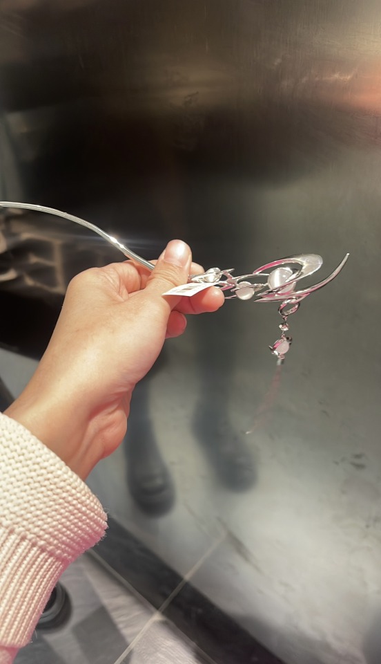
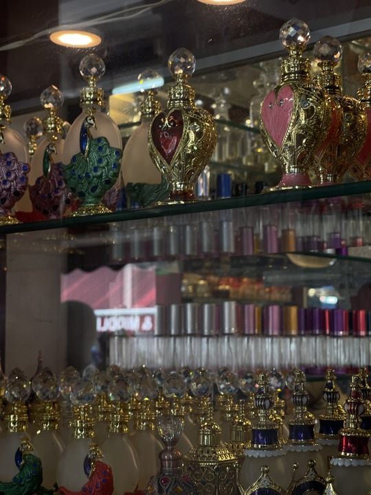
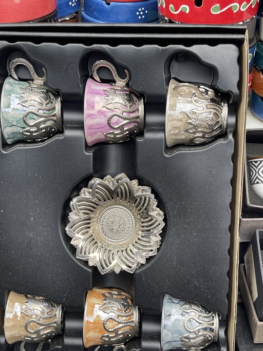
In contrast, I grouped perfume bottles, a cup set, and jewelry under "Consumption" because they reflect how people use and display objects in daily life (Figs. 7–9). These items show how design is shaped by consumer needs and personal expression. Although they are ordinary objects, they help people communicate identity, taste, and culture.
These two lessons helped me see that design is not limited to galleries or luxury—it exists in the small, meaningful objects we use, value, and share every day.
(329 Words)

Reference:
in MLA style-
Jiang XunQian. "Short dance performance with neon lights." Douyin, uploaded by Jiang XunQian, 6 Mar. 2025, www.douyin.com/video/7381068830333783333.
0 notes
Text
WOII: Week 4 - Semiotics
Today in class, we explored the basics of semiotics. One key idea came from Ferdinand de Saussure, who said that every sign has two parts: the signifier (like a word or image) and the signified (the meaning it makes us think of). We also looked at Charles Peirce's theory, which divides signs into icons, indexes, and symbols. This helped me understand how signs function differently depending on how directly they represent what they mean.
We applied these ideas through an activity where we looked at advertisements and posters using both formal and contextual methods. This made me think more deeply about how meaning is created in design—not just through what is shown, but how it is shown. Design choices carry layers of meaning beyond their surface appearance.
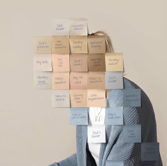
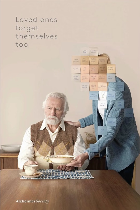
One poster I found especially powerful was from the Alzheimer Society. It showed a caregiver's face completely covered in sticky notes with tasks like "Pay his rent" and "Cook dinner" (Fig. 1). The line "Loved ones forget themselves too" made a strong emotional impact (Fig. 2). It did not just talk about stress—it showed it. The sticky notes became a symbol of the emotional and mental weight that caregivers carry.They do not physically resemble stress but culturally represent overwhelming responsibility.
This reminded me of what I have learned in design class: design is not just decoration, it is communication. Layout, font, and color are not simply visual choices—they shape how people feel and interpret. Now that I know more about semiotics, I want to use it in my own work to create thoughtful designs that connect on a deeper level.
(268 Words)
References:
in MLA style-
LASALLE College of the Arts. World of Ideas and Imagination – Week 4 Lecture Slides. 2025.
Cossette. “Loved Ones Forget Themselves Too.” Ads of the World,2021, https://www.adsoftheworld.com/campaigns/loved-ones-forget-themselves-too.
0 notes
Text
WOII: Week 1 - Phenomenology
This week, we learned about phenomenology—the idea that seeing is not just about what is in front of our eyes, but also about how we feel and experience the world. Merleau-Ponty's idea of the "lived body" helped me understand how memory, atmosphere, and emotion shape perception, especially in design. What we see is always mixed with what we have lived.
For the class activity, I photographed a traditional Chinese fortune-telling stall (Fig. 1). The stall had handwritten signs offering 八字 (Ba Zi, the Eight Characters of Birth Time) readings and palm analysis. To me, it was more than just a picture of a business—it captured a way of experiencing time that is cyclical, mysterious, and deeply personal. It reminded me how, in Chinese culture, time is often felt through patterns, not clocks. It also made me realise that time can be understood differently depending on cultural and personal contexts.
The lighting was soft, yet the stall felt quietly tense—as if something serious was unfolding beneath the surface. This mood reminded me of Heidegger's concept of "being-toward-future," where time feels like constant movement without clear arrival.
I also thought of Zhang Zai (张载), who believed qi (气) flows through everything, and that time is transformation, not measurement. This idea resonated with the moment I took the photo. The stall did not explain time—it held it.
This made me realise that design is not only about appearance—it is about how people feel, remember, and connect. I want to create spaces that leave room for personal meaning to emerge.
(256 Words)
References:
in MLA style-
Heidegger, Martin. Being and Time. 1927. Translated by John Macquarrie and Edward Robinson, Harper & Row, 1962.
Merleau-Ponty, Maurice. Phenomenology of Perception. 1945. Translated by Colin Smith, Routledge, 2002.
Zhang, Zai. Correcting Ignorance (Zheng Meng). Song Dynasty
LASALLE College of the Arts. World of Ideas and Imagination – Week 1 Lecture Slides. 2025.
0 notes
Text
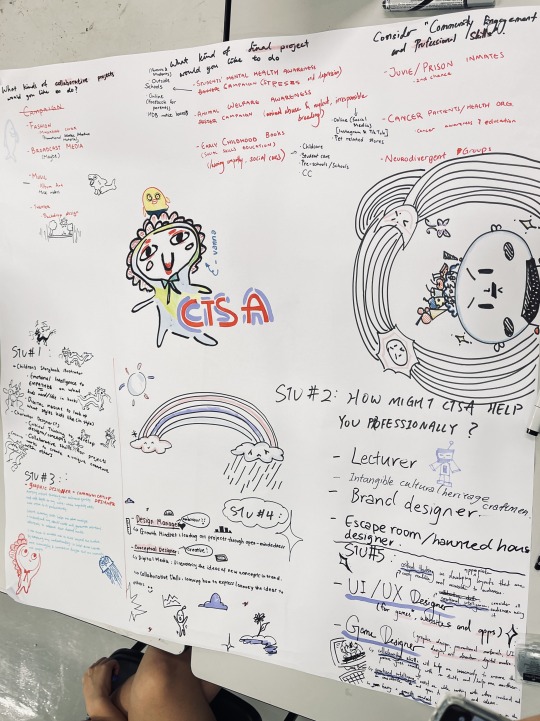
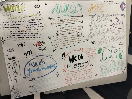
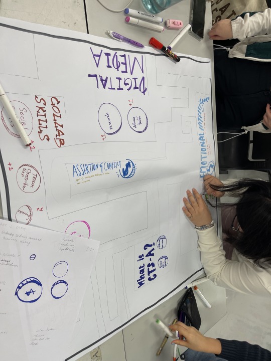
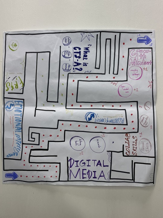
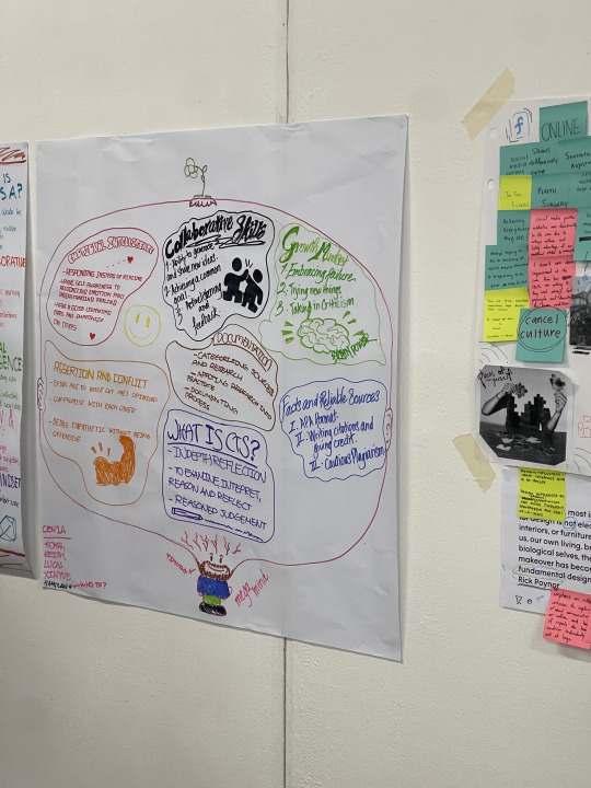
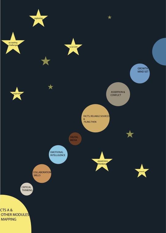
CTS A | Week 12 Summative Assessment Prep—Session 3
Design and music students can collaborate to boost creativity and introduce new ideas into projects. Music students can compose original pieces that inspire design students to create visual interpretations of the music. Design students might develop visuals such as logos, album covers, or illustrations that reflect various musical styles. Both fields rely on rhythm and emotion, allowing us to bridge cultural and language gaps effectively. Together, we could also produce short films that synchronize visuals with music, creating a unique experience. Sound, though intangible, can be symbolically represented, transforming it into images that, through synesthesia, elicit emotional responses. Design students might also support music students by filming and editing videos, designing album covers, creating social media graphics, and making posters to promote performances.
For my final project, I plan to design an anti-bullying campaign to empower students who feel powerless. Using ads, posters, and videos, the campaign will aim to raise awareness and encourage victims to speak out. The target audience will include teachers, students, and parents, with posters displayed in high-traffic areas like schools, HDB notice boards, and tuition centers. Additionally, the campaign will extend to social media platforms such as Facebook, Instagram, and TikTok to broaden its reach.
I would also like to collaborate with a health organisation, given that health, although invaluable, is often overlooked. I could design educational materials, like booklets on topics such as "How to Eat Healthy." These could be paired with posters and short videos to spread awareness. Since people often avoid lengthy videos, we would keep them under two minutes, making them engaging through creative techniques like rotoscoping.
Critical thinking is essential for my growth as a brand designer. It enables me to develop designs that align with a brand's image and connect with audiences, clients, and stakeholders. A growth mindset is also invaluable, as it allows me to appreciate and adapt to different perspectives and expectations. This skill set helps me make thoughtful design decisions, improve continuously, and overcome challenges.
(329 Words)
References :
in MlA style-
LASALLE College of the Arts. “Diploma in Music.” LASALLE College of the Arts, https://www.lasalle.edu.sg/programmes/diploma/music. Accessed 15 Nov. 2024.
Goh, Timothy. “Schools, Police Must Work Closely to Tackle Bullying, Say Teachers and Parents.” Channel News Asia, 30 Oct. 2024, https://www.channelnewsasia.com/singapore/bullying-school-teachers-parents-law-enforcement-police-caning-focus-4696551. Accessed 15 Nov. 2024.
Liew, Isabelle. “‘I Feared Going to School’: Bullying and Teenage Aggression in Singapore Schools.” The Straits Times, 2 Nov. 2024, https://www.straitstimes.com/singapore/i-feared-going-to-school-bullying-and-teenage-aggression-in-singapore-schools. Accessed 15 Nov. 2024.
McCurdy, Katie. “Things I Tell People Who Want to Become a Designer in Healthcare.” Medium, 1 May 2021, https://katiemccurdy.medium.com/things-i-tell-people-who-want-to-become-a-designer-in-healthcare-c1f39f3e9e48. Accessed 15 Nov. 2024.
0 notes
Text
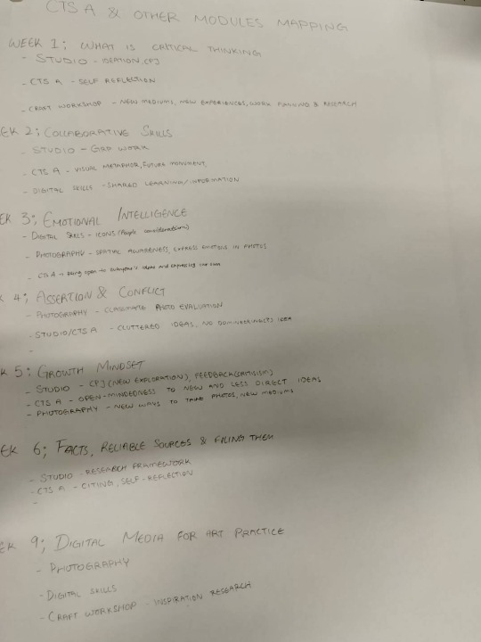
CTS A | Week 11 Summative Assessment Prep—Session 2
In Studio, working on journal entries and group projects helps me develop critical thinking and decision-making skills. I need to contribute, communicate, listen, and be open to different perspectives to align with shared goals and ensure success. Clear communication is key to avoiding conflicts and keeping the group on track. I also learn how to research effectively, gather reliable information, and organise it for future projects.
In the Craft Workshop, each week brings new challenges, like exploring different mediums and planning my work. It requires an open mind since learning new techniques can be difficult. I often turn to digital media for inspiration and ideas, which helps me expand my creative approach and improve my work.
In Critical Thinking Skills A, self-reflection and peer reviews help me grow my critical thinking and communication skills. Working with others allows me to blend ideas and receive feedback, which is essential for growth. I also learn the importance of citing sources properly to avoid plagiarism, fostering originality in my work.
In Digital skills, there are times when I fall behind, so I communicate with classmates to share learning experiences. For example, when designing icons, I have to consider if others find them understandable and visually pleasing. Digital skills classes teach me how to use tools like Illustrator, Premiere Pro, InDesign, and Photoshop, which are important for design work.
In Photography, I focus on outdoor shots, being mindful of my surroundings and photographing people respectfully. I aim to convey emotions through my images while maintaining privacy and avoiding "lens bullying." I also learn to master new digital cameras, improving my technical skills and organizing photos by specific principles.
Overall, these courses help me develop a mix of technical, creative, and collaborative skills, strengthening my ability to research, create, and work ethically in various projects.
(300 Words)

0 notes
Text
CTS A | Week 10 Summative Assessment Prep—Session 1
In the Critical Thinking Skills module, I have gained more than just academic knowledge. This module has improved my teamwork by teaching me to respect and integrate diverse perspectives, and it has strengthened my conflict resolution abilities, allowing me to handle disagreements calmly and get solutions. I have also developed mindfulness, emotional intelligence, and a growth mindset, which help me stay present, manage emotions, and view challenges as opportunities for growth. I imagine knowledge as a maze filled with coins, where each coin represents a piece of knowledge. Another comparison is to a starry sky, where each star, constellation, and planet symbolizes a unique knowledge point. Each point matters, like a star lighting up the dark sky—if ignore any, the sky stays dim. Knowledge could also be seen as fireflies, where the more I learn, the brighter I can shine.
One of my favorite activities is designing logos with my left hand, which builds exploration skills, creativity, coordination, and patience. I found it inspiring that, despite working with the same logo concept, each design was unique, demonstrating the power of individual creativity. Everyone persisted with their non-dominant hand and did their best, fostering a positive and supportive learning environment.
Teamwork emphasizes effective communication, goal-setting, and collaboration. It has taught me patience and the value of accepting others' ideas. I have learned that a different solution does not necessarily mean a wrong one, and that good teamwork depends on open communication and understanding, which strengthen solutions through varied perspectives. Unity provides strength—combining different ideas can lead to even better outcomes.
In future teamwork, I want to enhance my communication skills. When discussions get too much different points, I sometimes feel anxious and may lose my temper, so I aim to remain calm, listen attentively, and respect everyone's ideas to contribute more thoughtfully. I also want to keep a positive attitude, especially with challenging tasks or topics, facing them directly instead of avoiding them.
(322 Words)
0 notes
Text
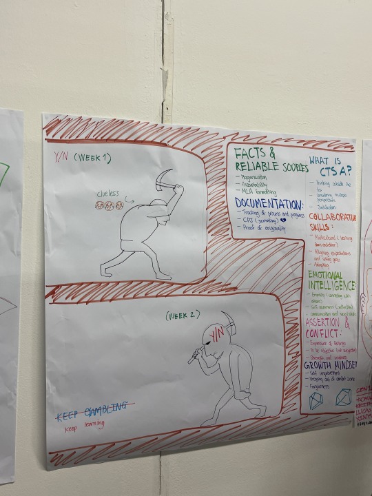
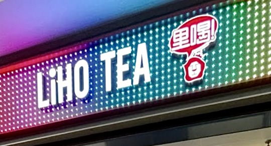
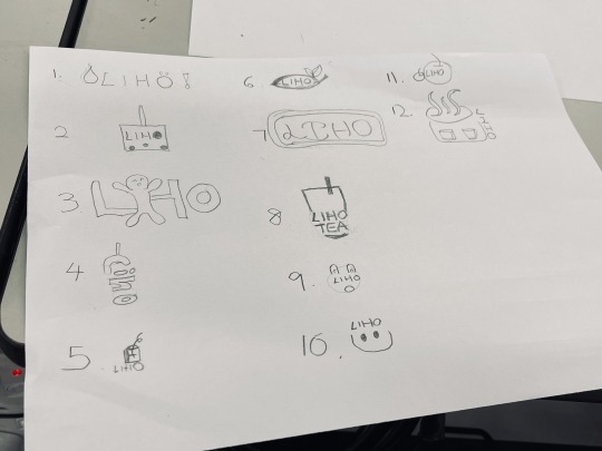
CTS A | Week 5 Growth Mindset
An Eventful moment is exploring logos outside the school.Creating and drawing logos using the left hand. It isn't accessible using my left hand, and I need a lot of patience to draw each logo. At first, it was still not bad, but after a while, I felt tired and had a headache from using my left hand to draw.Because I usually use the right hand and then suddenly use the other hand. Even though it is pretty tiring, I find using my left hand very challenging.But the process is fun and interesting because I get to challenge and explore myself.
My logo is based on Liho that sells bubble tea, so my logo mainly has pearls or cups.Some of the “o”words looks like a person shouting “ho” /the “o”is like a pearl.I also used different elements to support the logo,such as apple,leaves and face expression.
I like no4 the most because it amazed me more than my other drawings. The words are in vertical format;the top is a straw and overall the bubble tea cup shape is created. It looks simple,easy to understand and I think is more unique . My least favourite is no6. , because the design of the leaves looks like all those health supplements. I don't have the appetite to drink bubble tea if I see this logo.The words are too small to be seen and the font of the words is not obvious and looks unsuccessful.
(251 words)

0 notes
Text
CTS A | Week 2 Collaborative Skills
My strength is that I have a lot of ideas to give and share with my team members because I have a lot of creative inspiration. This gives my teammates more choices regarding specific focus points and ideas. My weakness is that I sometimes struggle to express myself clearly in English, and I might forget a word I want to use, so I rely on Google Translate, which slows down my work. To improve, I plan to build my vocabulary, practice speaking English daily, and reduce my dependence on translators.
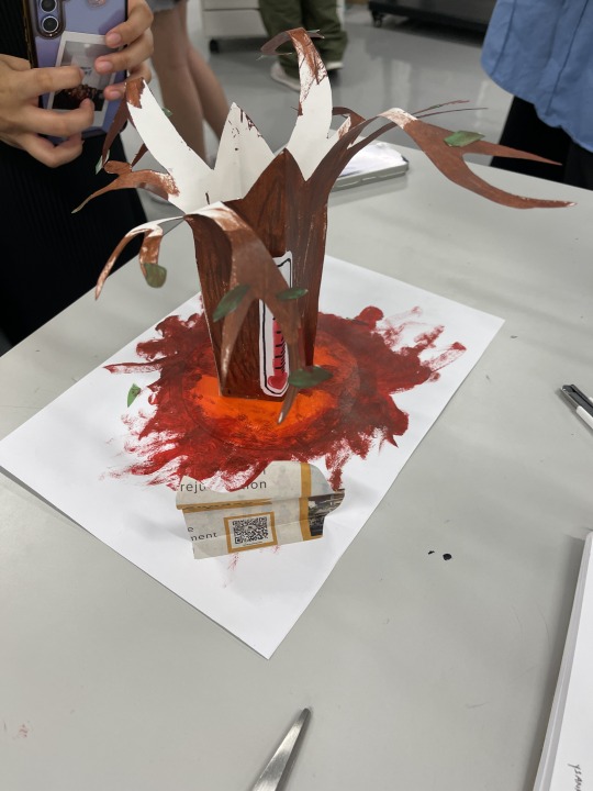
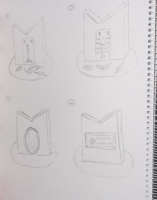
I would use different materials. I will use a woodblock(wood texture and are more stable). Then I will use a spray, to make the colors look more even. I want to change the base from blood to sun shape(sun represents hotness) For the leaves, I might change it to dry leaves on one side, and the thermometer will be at 100 degrees(boiling temperature to show is scorching).The other side will be green leaves.To prevent the leaves from dying, I will use origami to fold it, and put the actual temperature thermometer at this side(aware people of the current temperature). Then the 3 side will be a mirror for people to know everyone takes part. The 4 side will be a digital screen to show people about the past of global warming and teach them how to prevent it. Because the world is very advanced with technology, we should make it more valuable.And many people like to watch videos, I think this can attract them to stop and look at it.The base sun. I will use LED sunlight.
(275 words)
0 notes
Text
CTS A | Week 1 What is Critical thinking?
Before the class,I think critical thinking is the idea of pros and cons.After the class, I learned that is more about our interpretation, observation, and justification, making it richer. Observe and ask questions then come up with different ideas. I think the core idea is not to criticize but not passively accept information from others.Do not think that what seems to be authoritative can immediately default to the right; the point is that there must be thinking process after considering whether to agree/disagree with the point of view and creating our own thoughts of the point . Overall I learn to be thoughtful, creative, reflective, and adaptable to different opinions.
Mindfulness is the ability to be fully present in the moment and experience my state of being. Conscious awareness and focusing on the present moment at the proper time, no matter what is happening around me. I can integrate into the study environment by concentrating on something in a relaxed way eg: listening to music and breathing. Being mindful helps me manage things that can make me upset, angry, stressed, and anxious, and feel more calm ,happy, and peaceful.
One eventful moment was going to MBS to explore.Different from the usual feeling of only being in the classroom. Explore beautiful things through the lens of photography and drawings. There are many other sights and scenes that can stimulate imagination and creativity. I get to create and express scenes through feelings and imagination, making works more exciting and creative! I learned that I should not worry too much about the final drawings;might produce unpredictable results and enjoying the process is important.
(275 words)
References:
in MLA style-
"What is Critical Thinking?" YouTube, uploaded by Macat, 2 Feb. 2016, https://www.youtube.com/watch?v=HnJ1bqXUnIM&t=3s.
"Critical Thinking Skills A Week 1 Film Pooja Nansi." YouTube, uploaded by MB, 15 Aug. 2021, https://www.youtube.com/watch?v=hAHqOIuCsUs&t=2s.
1 note
·
View note