
lilyillustration
40 posts
illustration w/ integrated foundation yr
Don't wanna be here? Send us removal request.
Statistics
We looked inside some of the posts by lilyillustration and here's what we found interesting.
Average Info
Notes Per Post
3
Likes Per Post
3
Reblog Per Post
0
Reply Per Post
0
Time Between Posts
7 days
Number of Posts By Type
Text
17
Last Seen Tumblr Blogs


Fun Fact
Tumblr is used by 21% of adults online aged 18-29 years.
Text
Animation 2
I took a similar approach to my second animation, however this one was much more time consuming as it was a full body. This animation features the second concept illustration I used, which I turned into a moving image. Again, I took my initial illustration and edited the character out, leaving it a background to animate over. I then again filmed my friend to use as reference, showing her the storyboard to give her an idea of what I wanted. Like before, I used this as a reference and paused to draw each frame, which I then coloured over. I used lighting and a glow effect to put focus on one specific moth. I used a swirl pattern that the moths followed to draw the focus to the girl.
Overall I think the 2 animation clips I made were successful, in the future I'd aim to make them longer.
0 notes
Text
Animation
Now that I had my concept art for both the backgrounds and the character and I'd come up with some concept illustrations for the animation, I started working on the final short clips. I began by storyboarding some ideas, a couple of which were based on the illustrations I'd made.

The first one I made is her in bed, with the moths surrounding her and slowly continuing to come in as she lies down. I removed the character from one of my illustrations where she was in bed and drew over this to use as a background. I filmed a clip of my friend looking around and then getting into bed, using my storyboard to direct her, which I then used as a reference by slowing it down and pausing it and using it as a reference to draw each frame. I think it was effective that I went for a more simple style as it saved me time whilst animating. Overall I'm really happy with how this animation turned out and I think I captured the mood and atmosphere I was looking for.
0 notes
Text
Animation concept illustrations
Before I moved onto animating, I decided to create some full piece illustrations, in the backgrounds I designed, of my character in scene ideas. As I designed a transformation of her, I decided to illustrate her 3 stages in 3 different scenes.


I think these were really successful and I like how there's a clear narrative and progression between the pieces. These also helped me to develop my ideas around the animation.
0 notes
Text
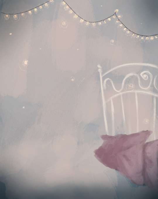
Background Design
Using my reference board for inspiration, I made loose sketches of my backgrounds, I already had ideas in mind as I'd thought about it whilst designing my character. I already knew I wanted to make a bedroom and a sort of living room for the clips I wanted to animate. I also came up with some house designs, as I originally planned to also animate part of the exterior of the house, however I didn't end up using these.
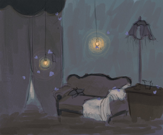


I used these sketches as an opportunity to play with the colour palette, experimenting with darker colours and lighter moths. Although I really liked the effect this had I didn't end up using this colour palette, however I really like the atmosphere it gave these sketches and it's a style I'd like to explore in the future.
Next, I used an isometric grid to finalise my room ideas into clear sketches, which would aid me in my drawings. However, despite me making these, I still ended up changing the designs as I went on.


Next, I used the perspective grid tool on Procreate to draw out my backgrounds. I went for a softer style, which I feel fit with the style of my character. I used mainly pencil brushes to keep a grainy texture to it. As much of it is about moths, I tried to keep many light sources in the rooms and create a clear difference between the light and dark areas to make this stand out.


Finally I drew parts of this separately, which I aimed to animate over. Although parts of the background weren't used this was only to save time and make sure I was using my time wisely.

0 notes
Text
Character Concept Art
Using the mood board I made earlier for inspiration, I started making lots of rough sketches of ideas for my character design. As concept artists have to work quickly I tried to jump into it, using my inspiration and research as a foundation for my ideas.

I chose my favourite ideas from my sketches and expanded on them to come up with a final design. I wanted the clothes to almost resemble a moth in a way, by this point I hadn't come up with the design for it but I knew I wanted the character to slowly transform and look more moth-like and needed a foundation to work from when I did this.

Once I had my finished design, I continued sketching this character, changing some things along the way. I began considering the face more and how it'd look from different angles. I also began putting my sketch into greyscale to consider how I'd colour it to make sure the different elements of the outfit would stand out. I think drawing her in different poses helped me to consider her personality.

Once I was certain about my design, I started working out the colour palette, I tried lots of different ideas until I found one I liked best. I particularly liked how the colours kind of ended up resembling a moth too which I think is successful and what I'm looking to achieve.

With my final colour palette figured out, I drew both a character turn around and the transformation of the girl becoming more like a moth. I decided on a much more simplistic style, considering I wanted this to be an animation I needed something I could reference and draw quickly while still looking visually pleasing.


0 notes
Text
Artist Research - character design
Jon Foster
use of strong shadows, creates a spooky feeling
dynamic lighting

Nezumiyash
(link to their twitter https://twitter.com/NN_EE_ZZ)
I've chosen to look at this artist's character designs as I'm inspired by their fantasy style and intricate designs.
They use interesting silhouettes.
use mostly sharp strokes of colour, this makes the blurred effect stand out and give them a ghostly effect.
Use of light gradients to add interest
They use aesthetically pleasing colour palettes by using colours that go well together

Mali Benedicto Vasanserekul
I've chosen to analyse this artist's work as I'm inspired both by their style and the way they display their designs.
In this first illustration you can see she uses a strong composition to layout her character design, whilst also giving different images of the character in the background which gives a strong idea of her character's personality.
She uses contrasting lighting, blue from the background and yellow from the flashlight, creates interest
their style is very soft and almost painterly, they keep some of the linework of their sketch in, which makes it appear looser and softer


Katherine Lam
I've chosen to look at this artist as she works in watercolour and I wanted to look at a bigger range of artists. I'm inspired by the tone and atmosphere she creates in her paintings, and the way she stylises her characters.
works in watercolour
She uses lighting to draw the eye to parts of the painting
clear use of colour palette to set tone
long elegant shapes and uses strong silhouettes


1 note
·
View note
Text
Contextual Research
butterflies & moths can represent:
growth and new beginnings
transformation
mystery of the night
endings
death
cocoons can represent:
the idea that to change in life, we must change ourselves
visible outer transformations, and private inner ones
wanting to feel comforted and safe
putting walls up
Mood Board of inspired ideas:


0 notes
Text
Artist Research: Coraline
As I'm looking at making concept art for an animation, I think it's key that I look specifically into an animation I'm inspired by. For this reason, I've decided to look at Coraline as I find the visuals very aesthetically pleasing.
Backgrounds/ still scenes

uses saturation and details strategically to add detail
drawn digitally but has a traditional, watercolour feel to it
clear colour palette of yellows and purples.
the darkest tone is in coraline's legs and her character is all one colour, while the rest is mixed and painterly-like, making her stand out separated from the background


they also worked in black and white limited colour palettes to plan out some backgrounds
uses scratchy texture linework to create a cartoony illustrated feel
warped shapes and perspectives, creates interest, unreal feel reflects the atmosphere and narrative of the movie. Coraline is a film with a wide audience but is mostly for children, reflected in this style.
Uses strong blocked out shadows, makes lighting very clear and gives stronger contrast. Also adds to the cartoonish, unreal feel.
clear limited colour palettes


illustrates scene from the movies to plan, similar to storyboarding but illustrates the mood and visual aspects of the scenes

Character designs

the characters are all individual and kept apart by their interestingly shaped silhouettes
coraline's design has a lot of contrast, with her blue hair and yellow raincoat, which makes her easily recognisable


Storyboarding
storyboarding in black and white with key elements in colour.
simplified design to get the point across easily and quickly
helps figure out the composition of each scene and the key parts to show the audience

1 note
·
View note
Text
Artist Research - environment
Scott Gwynn
I've chosen to analyse this illustration by Scott Gwynn as I'm inspired by how he creates a feeling of solitude in this piece.
His use of colour palette makes the house stand out. He uses complementary colours, by making the house purple toned and the grass more yellow toned, which makes the two compliment each other well and stand out beside each other. This draws the eye to the house.
Use of interesting shapes. This can be seen in the entire image but most noticeably in the trees, the house, and the pathway. This creates interest in the image and makes it more aesthetically pleasing
Use of texture brushes
Doesn't outline and uses linework sparingly to add detail

Tony Mitchell
Similarly to the work I looked at by Scott Gwynn, Mitchell has also illustrated a singular house, but from a more 3d perspective. I'm really inspired by this idea as I like how it creates a feeling of loneliness and separation, while also being a good way to display designs for a setting.
In his illustrations he uses props to tell a story. For example the Halloween pumpkins, the tire swing, and the tent in the house illustration all suggest a family is living there.
He also uses weather and lighting to create atmosphere and mood, such as the harsh light coming from the TV and the cloudy weather


Daniel Arriaga
I've chosen to look at Arriaga's visual development work from the Disney film 'Up' as I find the setting design effective and inspiring.
He uses lighting to create a feeling of loneliness/sadness
lots of old boxes to make the setting feel unattended
uses colour petting to create a homely/comfortable feeling like a grandparents house
doesn't use outlines, instead uses linework sparingly to ad detail. uses gradients and shadows to make objects stand out.
textures used sparingly to add detail, such as on the floorboards


Juan Francisco Cancelleri
plays with the perspective and shapes to create interest by warping it, creates dynamic cartoony effect
uses lighting to tell a story
more brownish/muted colour palette makes the bright pink pattern on the bed stand out and the saturated lighting from the hallway.

0 notes
Text
Module 5: project proprosal
For my fifth module, 'Launch', we were given the task of writing our own briefs to work from. I started by reflecting on my past modules this year, my favourite parts being my concept art exploration and the small animation I did early on.
For this project, I'd like to create concept art for a short animation about a house overtaken by moths and other insects. By the end of my project I'd like to have developed concept art for both the settings and characters and have animated at least one key short scene.
0 notes
Text
Mini brief #3
Penguin Books x TikTok. Create an online advert which will appear as a pop-up on social media, promoting #BookTok a hashtag used by Gen Z book lovers to share and discover new book recommendations.

penguins advertising poster campaign, celebrates relationship between book and reader by showing loved books.

I looked at some examples of posters advertising reading too. I noticed that they all had a calming vibe to them, illustrating the peacefulness in reading. A lot of them also used popular characters, such as the muppets, to associate reading with something people likely already liked.


I started by creating some preliminary sketches, as this would be a pop-up on the phone I made sure to imagine how it would appear on a phone screen. At first I was imagining it appearing as a poster, however I ended up taking a different approach and imagining it like a cut-out pop-up.

I felt the tree sketch had the most potential, as I liked the calming feeling it gave. I put it in black and white to get an idea of the colours I'd use so there'd be contrast between the different elements of the drawing.


For my final drawing, I decided to go with limited linework as I like the more simplistic look and I think it draws more attention to the writing on the sign. To add interest to my drawing, so even though it would be simplistic it wouldn't be plain, I used texture brushes and added gradients. I think I was successful in giving a calming atmosphere to the drawing, one that makes reading seem peaceful, and I think this would be particularly successful as an advert as it'd make it feel slightly less invasive.
I included penguin books name on the sign post, as I wanted to make sure the brand name was included on the ad, including the booktok hashtag.


0 notes
Text
Mini Brief #1
" Little White Lies Magazine. In celebration of the 25-year anniversary of the film ‘Titanic’, adopt the magazine’s signature cover format (illustration featuring one character in a comic book style) and produce a ‘Rose’ cover or a ‘Jack’ cover. "
Little White Lies is a British movie magazine and website. Each issue has a cover dedicated to an upcoming film release, making each one unique and in the individual style of the artist.
I started by looking at examples to see the style:


I noticed that all of the pages have their own distinct styles in the style of the artist designing them. Each one features a portrait of the main character of whichever media they're displaying.


I chose to respond to the brief with a portrait of Rose, so I started collecting a board of images that I thought would make good references. Once I had my references, I began creating some preliminary sketches to spark some ideas.


I chose the sketch I thought had the most potential, and began finalising it. I screenshot the stages of my process to show how I reached my final product. I tried to keep the portrait more stylised rather than too realistic, to ensure it fit the style of the magazine. I continued to test ideas and designs during the process, as doing this further through I felt allowed me to have more of an idea of how the final design would look, which helped me in choosing the direction to go in. I chose to go for a swirly abstract pattern in the background, which led into the portrait, as I thought this loosely resembled waves whilst also reflecting the feminine qualities of Rose and her curled hair.
When choosing my colours I tried to create a more dreamy look, as in the story Rose is retelling her past I wanted it to reflect the more romantic dreamy themes of the film rather than the sad aspects, particularly as the magazine is celebrating the films anniversary I thought this felt more appropriate. I went for more orangey colours, which I contrasted with blues to create this look. I also used an airbrush to add to this dreamy quality that I wanted, which I felt I achieved in my final piece.

Once I felt I'd finished my design, I decided to play around with the colours a bit, I put them side by side so I could compare and see which I felt looked the most successful.

I decided to choose the slightly more saturated version as I thought the original colours had the look I was going for and saturating it a little more intensified it a bit. Overall I like how my outcome turned out and, although the background is a little simple, I like how it draws attention to the portrait of Rose. As the film is so well known I didn't feel the need to add any extra writing as I felt the portrait speaks for itself, I also noted that other covers didn't usually add writing. I added the Little White Lies logo so I could see how it'd look if it was a real magazine.
0 notes
Text
Artist Research
Yoji Shinkawa
Yoji Shinkawa is an artist, best known for for his lead character and mecha design work on the game franchise Metal Gear. He's worked with Hideo Kojima on each of his games, often working as the art director, some of the concept art he created while working on these projects include his work on Death Stranding.
To begin with, he worked as a debugger for the game Policenauts, but later would work as a graphic designer for the console version of the game.
He works in a variety of mediums, including felt tip pens (particularly the pentel brush pen), as well as using Photoshop and Corel Painter. His work is very fluid and dynamic, his style is incredibly distinct and recognisable.


Phil Hale
Phil Hale is an American figurative painter and illustrator. He was born into a family of artists, as both his mother and grandmother were painters. At the age of 16 he was the apprentice to the master painter and illustrator Rick Berry, who had a huge influence on his art. Two years later he finished the apprenticeship and continued to work amongst Berry in his studio. Another 3 years later he moved to London, where he joined a circle of painters. Here he began exploring including photography in his painting process, something Berry didn't do.
In his early career, he illustrated books for Stephen King.

Craig Mullins
Craig Mullins is an American digital painter and concept artist. He studied Product Design at Art Centre College of Design and later returned to study Illustration, where he graduated in 1990.
His career in concept art started with him working for architects and theme parks, which soon led to him working in the film business. Soon he was introduced to Photoshop, and began to work exclusively digitally for his commercial work in 1994. Although he continues to work with traditional media in his personal work.
As a leading international concept artist, he's worked on many projects, including Star Wars, Halo, Assassin's Creed, and Tangled.
His style is recognisable by the incredible level of detail he achieves in each piece.


1 note
·
View note
Text
Week 4: Finalise
For this week, I was tasked with finalising some of my initial works. I thought my character designs would be successful so I worked on finishing them first.
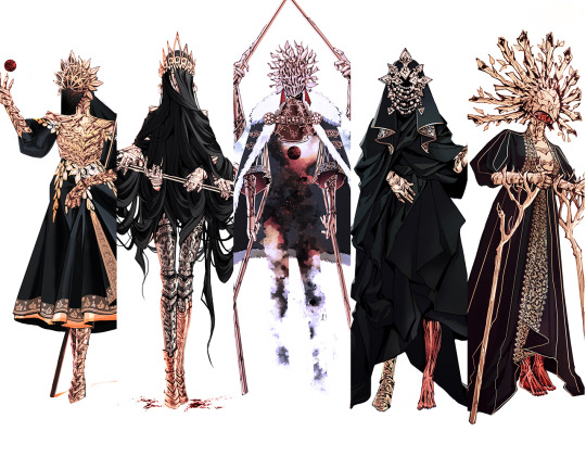
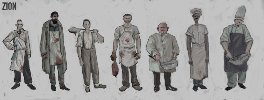
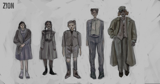
I finalised my character designs by cleaning up the pencil work and adding colour. I think the colouring was the most successful part here. I used less saturated colours to add a gloomy feel and when adding the highlights I used a colour opposite the main colour I used. For example, if the character had quite a blue suit I highlighted with a light pink, I really like the effect this gave. As I coloured over a dark grey background, I went around the characters in a near-white shade to make them stand out more, I didn't do this in a block colour and instead left some of the original background behind, I like how this has a Leyendecker inspired quality to it.
The characters at the top I imaged being part of the kitchen, I looked at old-fashioned pictures of butchers for ideas for these. I tried to add blood to some of their designs, to make them look less clean and more obviously intended to be scary. The second group is what I imagined to be the wealthy 1%. The last group of designs is some ideas to what the main playable character would look like, these ideas came out less confident as I wasn't as certain on what I wanted this person to be. Finally, I added my logo to the top corner of each of my designs as I'd noticed this on other concept art sheets and thought it'd tie them together and make them look more professional.

Next, I decided to finish one of my poster ideas. I chose my favourite idea and began looking for references and sketching it out properly.

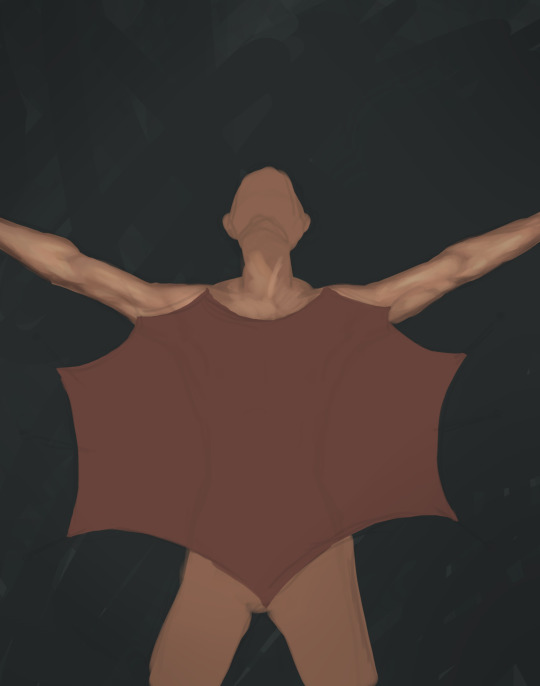

Once I had my sketch, I chose a dark background and started colouring the body. I tried to choose colours that fit the logo I'd made earlier. I looked at photos of frog dissections for references, which I thought was successful as it gave an inhumane feel to the image rather than looking like a respectful dissection. I cut out and used the knifed heart I drew for my logo as I thought this would save time whilst also tying the 2 images together in a way. I played with the brightness of the different parts of the drawing to try and make this part of it stand out.
For the title I used a font from www.dafont.com, as the image was already quite detailed I chose a simplistic font to balance this.
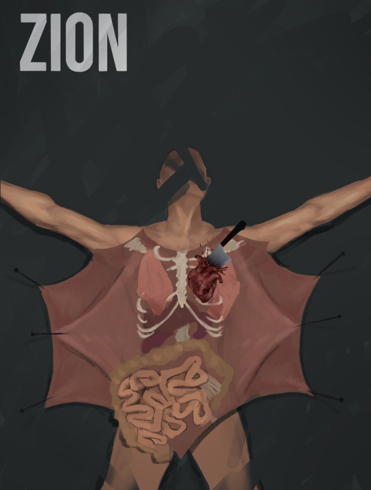
Overall I wouldn't say my poster is a huge success, I think in future I'd like to plan it out more but I think it was too complex for the time I had. However, I think it does communicate what the genre of the game is clearly being horror
0 notes
Text
Week 3: Produce
For this week, I was tasked with experimenting and creating work that communicated the message of my brief. I began with some drawing exercises to warm up, following these videos:
youtube
youtube


I found these helped to get me warmed up and in a creative headspace.
I decided to begin with some character designs of people I thought would be found in the type of world I was thinking about. I started by creating a reference board on pinterest of images that I felt related to my project and would help me spark ideas.


I began with loose sketches, using a pencil brush in procreate to imitate the look of a real pencil, as I liked the texture and also thought this was relevant to my ideas about over-reliance on technology. Although I want the game to be set in the future, I made the fashion look slightly more dated as I wanted to reflect on how we're going back in time/not moving forward with our attitudes towards the plant and other people. I wanted my designs to be inclusive to reflect how this issue affects the planet as a whole.
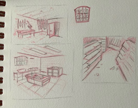
Although I'm mainly focused on creating digital work for this project, I decided to create some pencil sketches of different room ideas for this game as I liked the pencil texture. I sketched with a red pencil and added details in a normal grey pencil.
Next, I wanted to create some game poster designs. I started by looking at some of games that I felt were related in some way (genre/theme) to get a feel of how others have achieved a successful poster design. The 3 I chose to look at all come from horror games, which I think is made obvious by the posters. The first 2 both have focus on a figure, illustrating who a main character is. In the first one it's clear that the character isn't bad and is instead facing whatever makes the game horrific, whereas in the second one, it's clear that the character is meant to be something spooky. The last poster I chose to look at is much more simplified, but still recognisable, which I thought would be important to explore how this was achieved.


I sketched a range of poster design ideas, at first I was more focused on illustrating that the game would have violent themes but then I decided to focus on the story and the ideas behind the game, such as climate and food. I also wrote in where I'd place the title of the game in these designs, I liked the idea of having an image with shock value and then just the title simplistically, as I thought this might make the name more memorable.
0 notes
Text
Brand Identity
I decided to work more on my logo as I felt it might look more professional if it were more simplistic. I got a font off www.dafont.com that I felt was appropriate, I then clipped out the heart drawing and place it next to it. I feel like this outcome was much more appropriate than my first.


0 notes
Text
Creating a Brand Identity
Brand Identity is the representation of everything connected with a company, product or service. As I want to respond to the brief looking at concept art for video games, I want the brand identity I'll design to fit this too. The brand identity of a video game is usually a combination of Logo, Typography, Key Colours and Imagery.
Some examples of video game brands I like:


All of these logos are distinct and recognisable.
I decided to begin the process of designing my own brand identity by forming a brief:
I would like to design a game about a dystopian future, where people are beginning to turn to cannibalism because of food shortages due to climate change. The aim of this game is to draw attention and raise awareness to climate change by using shock value from darker themes. The target audience should be 18+ as I'd like it to be more explicitly horror and I think this wouldn't be an appropriate way to raise awareness about climate change to children. The artistic direction of this should be darker with a distinct colour palette that fits what I want with the game.
Based on my brief, I came up with a simple name idea for my campaign, as I'd need this to begin designing my brand identity. Some names I considered:
Dystopia
I looked up some synonyms of this word and ended up finding some antonyms and decided I liked the idea of giving it an ironically positive name because I thought maybe it makes a point of ridiculing us for being the problem.
sion/zion
elysium
dream
panglossian
I thought I liked the name 'Zion' best, as it means 'highest point' and I like how this is kind of mocking.
Once I had my name, I created a full mood board of images that I felt fit what I wanted the atmosphere to be like

Colour Palette Ideas:


I came up with some colour palettes to spark some ideas when designing my logo, as I thought a clear colour scheme might make it more recognisable.
I then began sketching out loose ideas of images that I thought could be relevant to be in the logo, as my idea was a lot to do with the consumption of meat I was mainly focused on including this in the logo in some way. I also wanted to depict that the game would be violent or graphic in some way, which is reflected in the knives and hooks.
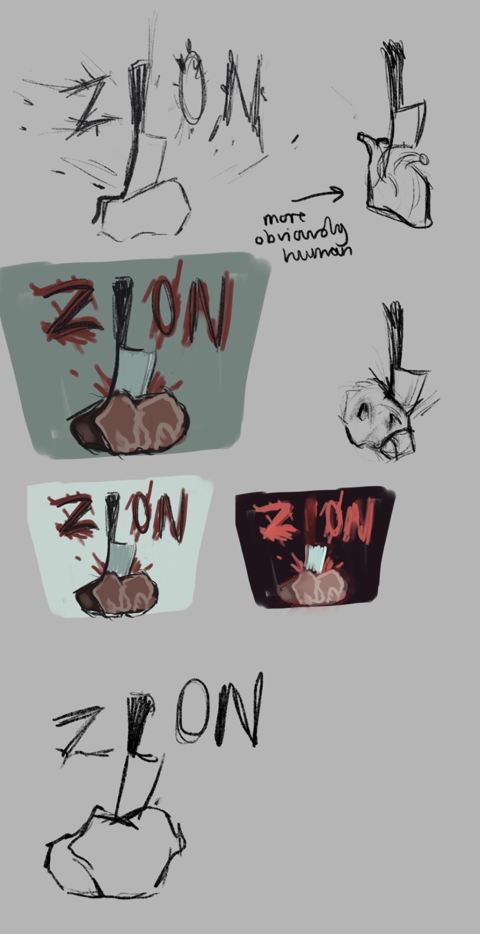
I then chose my favourite idea and starting building on it some more by seeing what it might look like in colour and exploring different variations of it.

For my finalised version, I settled on drawing a heart instead of a piece of meat that the knife was stabbing into as I thought this was more of a clue to the fact that the game would have cannibalistic themes. Although I didn't end up using any of my original colour palette ideas, it helped me to consider different colour variations.
0 notes