
Don't wanna be here? Send us removal request.
Statistics
We looked inside some of the posts by lindsayschrctrillstrion and here's what we found interesting.
Average Info
Notes Per Post
0
Likes Per Post
0
Reblog Per Post
0
Reply Per Post
0
Time Between Posts
1 day
Number of Posts By Type
Text
17
Last Seen Tumblr Blogs


Fun Fact
Tumblr.com rank in the US is 25.
Text
Final Reflection
thanks to this course i have learned alot from toby and the fundamentals of creating a character and the steps going towards it. for example, prior to this class, i had not explored values properly and instead just kept changing the colour of a character until it looked alright. my skill in character creation not only in drawing but also creating a whole story and lore about this character was a great peace to learn. this process of giving my character a story, a goal, a personality really indulged me into the entire process of storytelling and finally the poster.


the end result you can see, contrasts between when i first designed my character and to the final poster. not only has my skill in drawing bettered but the use of colour and perspective. despite not developing my skill in rendering as much as i wouldve liked, i am happy with how much more skilled i am and want to explore rendering when i get an opportunity for another class like this in the future or in my own time.


the process of designing and coming up with fictional characters as teams and communicating together was a very fun and skill learning rich activity. coming up with our character was a bit of a challenge as we were struck outta ideas so he was essentially just a bunch of ideas chucked into a character from our team. receiving back illustrations of the character interpreted by another team in a few different ways was an amazing feeling and was so cool. it was great for us to also provide critiques in order to match our imagined idea of the character. having a prompt for a character given to us as a team to interpret meant for a great learning and communicating process where we showed our WIP, discussed how to interpret the character and overall bonding and connection with one another. having our interpretations critiqued meant for more closely matching the other teams idea of the character and improving the designs through experiementation.

being tasked with the from and line study meant for improving form and our anatomy of the human body and how it moves and bends.

having a character to make an indepth analysis allowed for proper understand as to how much thought goes into character design and story telling and inspired us to further create our own characters story.


having a lengthy process to creating a poster meant for many ideas worked with and expanded and critiques allowing for more perspective on what could worked towards.
in conclusion this class has far further expanded my skills in design in more ways than i couldve ever imagined. in future i wish to further explore character design and maybe even have it as a job to do on the side or as a hobbie.
0 notes
Text
Poster Creation Part 2
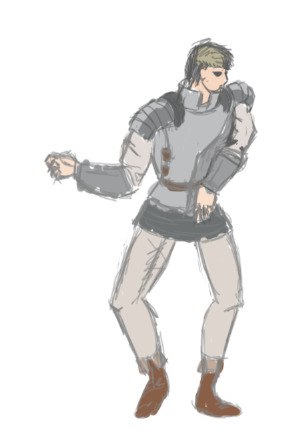
i then attempted to refine the pose and get it to look right but still found issue with the posing and how stiff it looked.

despite refining it and adjusting rotation of the shoulders, i just could not get it to look right and be happy with it.

at this point i realised that the issue was that the torso and arms wer facing 3/4 direction rather than looking straight on like most of the rest of the body which lead to the pose to look unatural.


toby providing as a reference for a dynamic pose to work off of, i was able to put together a quick readjustment to the arms, legs and torso which ended up looking far better than the previous drawing.
i then adjusted the shape of the torso and perspective of the shoulders to better match the reference
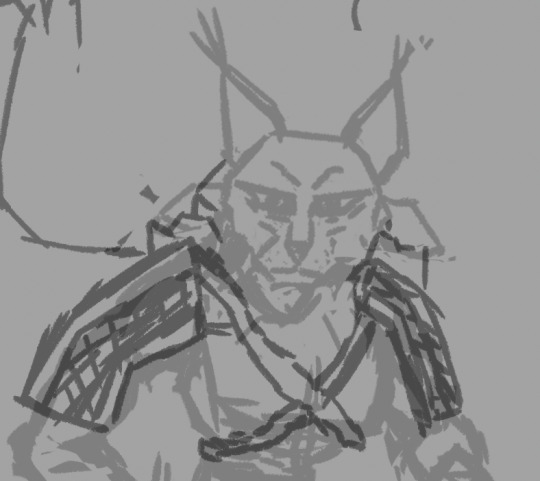
i then applied the accessories to the character with consideration of the perspective of the shoulder and bicep placement.

i then began onto the line work layer firstly working on the hand and left arm while adjusting perspective and size along the way.
finally i had for the most part completed the character drawing however you will see that i will make touch ups as the workbook goes on.

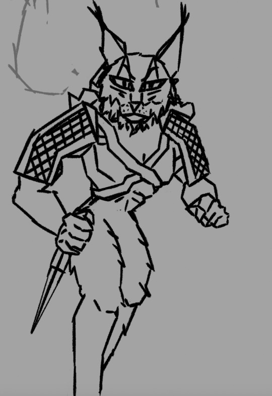
while cleaning up the line art of the cape layer by erasing the crossing over lines, i put my character into the background to see how the composition adds up. also as you can see in the left (tall building which previously had a window that looked like the building was paper thin) i had fixed the issue toby had previously pointed out.

i continue to gradually clean up the lines of the cape rips
i finally clean up all the lines, put together and clean up the cape that is in tact and add some fabric detail.

i finally begin on the colour part of the process where i made a gradient along the rips to turn into red and yellow.

using a hue saturation layer, i went ahead and adjusted the colours of the background to find the best suit to the colour palette of the character.

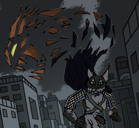
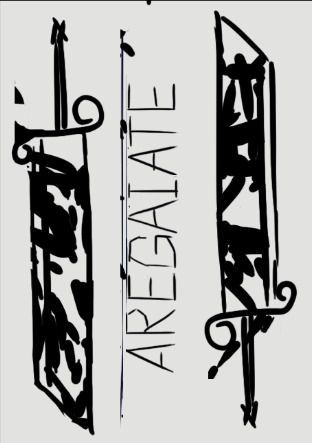
i decided on a blue to match the bleakness of the city Aregaiate was roaming the streets of. i also began with adding the colour palette to aregaiate.

using the gradient tool and the help of toby, a light gradient mask was created and placed into the middle of the street to create an atmosphere and contrast between the background and the character. an adjustment was made to the colour of the end part of the cape being mroe of a orange hue. to add some nice contrast and interest, i added some dark clouds also.

at this point. had realized i had forgotten to add a tail so it was made briefly. finally i had put together the colour palette of aregaiate.
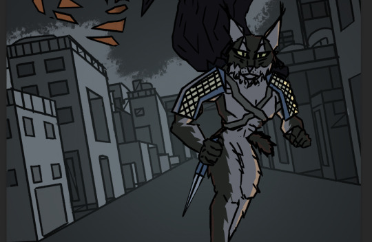
following some critiques from toby, i adjusted the shades in the background to be lighter and darker in place so the character wouldnt blend in too much or any parts of the body would be missed in translation. i also applied a shading layer by choosing a dark colour of deep blue, made the layer a darken layer and applied the opacity to about 30-50%

i made this specific part a tad darker

to stand the character out better, i made small white lines along the areas where there arent shading and light has reach aregaiate.
i then did the same for the rest of the cape. an easy way i achieved this was by selecting the aread in and around the outlines, filling area with white, then selecting the white area, shrinking selection area, hitting delete and removing any exess white lines on the inside of the drawing.
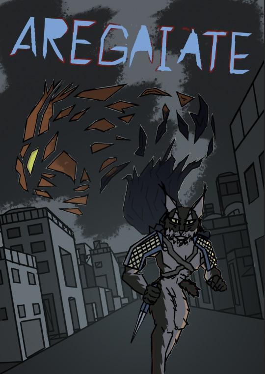
i then moved the gradient layer above the cape to give a nice popout effect on the character. i then took the title i used for the thumbnails, cleaned it up and made a partial outline area by selecting and hitting select>modify>expand and filled the selection in a layer below the title.
i then made some slight adjustments of the cape colour and lightened the background area behind aregaiate so he would stand out better as suggested by toby.

i decided on adding a small amount of more shading upon aregaiates eyes to add some depth.

after many tweaks and adjustments i was finished.
to reflect on this part of the process of creating the poster, it was so great to see how much progress i had made in the span of a day from starting with only just getting onto the posters values, to where it is now. i had alot of help from peers personal ideas and toby's which really help shape this poster together. if it wasnt for them it probably wouldnt have been such a strong poster. it was only positives having help from people. this poster helped me better my skill with background creation through the perspective and values. the shading of the character was something i havent done before in the past with my character design work. i have previously added highlights to black line edges before but that was a long time ago. in future i want to more experiment with using the gradient tool like toby showed me. i can see myself using it to create moody and foggy areas. i am honestly so happy with how this poster turned out and it has inspired me to want to continue character design once more.
0 notes
Text
Thumbnails Process Part 2

this is the reference i used for the landscape (not the best reference in terms of perspective)

to add a population to the city, i created many duplicates of these blobs for coyote civilians to add to the background by holding alt and dragging each drawing.

i then went and thickened the lines by magic selecting the entire outside of the layer and hitting select inverse and drawing around the selections. i then placed a layer underneith and filled the selections with white so they dont blend in with the background.


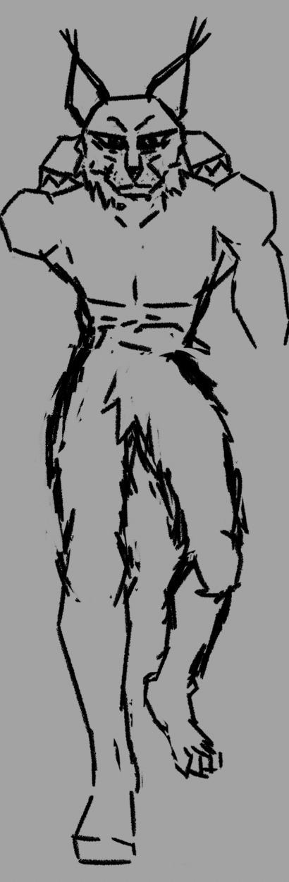
i then put together the wireframe of the character running towards the camera using the reference seen to the right.


i then sketched together the character walking towards the viewer despite the reference above as i feared have the characters back to the view would make it a challenge to understand who the character was and such
i also included the sword and cape where the cape is shaped like a werelynx which is where i wanted to connect the contrasting sides of the normal lynx and werelynx

this is the end result of all the elements together.
to reflect, this was my favourite to work on and it took me the longest to complete due to the complexity of the background and the elements being put together. i struggled the most with the pose as i was unsure at the rotation the chest and abdomen should be considering the placement of the limbs.

for the 2nd poster, i used the same sketches from the 1st thumbnail and put the title to the middle and rotated it 90 degrees.

i then drew over the sketches with slightly more refined drawings of the character in his two forms

i felt the drawings were too small compared to the negative space in the post so i enlarged them to make them the centre point


we took these refined thumbnails and displayed them as A3s up on the wall for groups of 3 to each critique each others work. the response to mine was nearly twice negative constructive critiques to the positive constructive critiques. (10 to 6) the main critique was regarding the drawings themselves and how it was difficult to decern what things were within the posters such as the poster in the top right being difficult to decern the character amongst the crowd of other people in the poster and most likely not noticing the cape being shaped like a werelynx. the other critiques were how the character was too blended in with the crowd and needed the front stage more. in response to these critiques, they were very fair but i was more looking for more compositive critiques rather than how clear the drawings were due to amount of time i allocated to each poster not being as much as they couldve been. using these critiques i will make the character more apparent and centre stage to the image

i chose to refine and work on more towards the final product as i liked this one the most and wanted to improve it.
this is the first variant i adjusted where i changed the size of the character and removed the characters in the background

this variation is where i made a tilt to the horizon line giving the poster a dutch angle

for this variant i fixed up the sketch and make the cape shred up into the air into shapes of a werelynx rather than a were lynx being in the cape

this variation is similar to the previous one however i made the title smaller to fit a coyote civilian up top a building smoking to create some visual interest and balance.
the third variation is the choice i decided to develop into the final poster.
Poster Creation

i began with the line art of the background using the thumbnail seen above. a technique that i used through out in order to get straight lines on angles, i would draw on top of the center of the horizon line and holding down shift before letting go of the pen while still holding shift and clicking on an area i would like to make a straight line to which created a long line from the point to the center horizon line. this was an easier alternative to rotating the canvas and simply just drawing straight angled lines using the rotation canvas button.

despite having trouble with drawing straight lines on angles, i was able to easily draw straight lines vertically and horizontally. the center cube is inspired by the black cube seen above at the top of this post.

while creating these buildings, i wanted to play around with the size, position and distance of each building to create interest. seeing these straight angled lines running through the drawing, you can see where it was veing used

i then added more detail to the buildings and added a big open area to the building seen on the left (this would be changed later on as it was making the building appear paper thin)

i added more detail to the top of the buildings and expanded out the closest one

i rotated the background to create a dutch angle and added a few more buildings to the background to create some interest.

i began with creating values and creating each dark and lightest shade in individual layers using the reference of the drawing of the sun seen in the corner to have a consistent lighting.

i then progressively added more values while also making sure each shade was on the right layer (this happened often)
for the buildings on the right i wanted them to have darker overall shading in contrast to the buildings on the right. i also considered which parts the light would hit and where it would bounce off to such as sides of buildings.


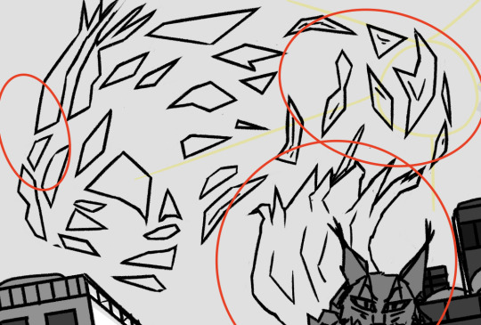
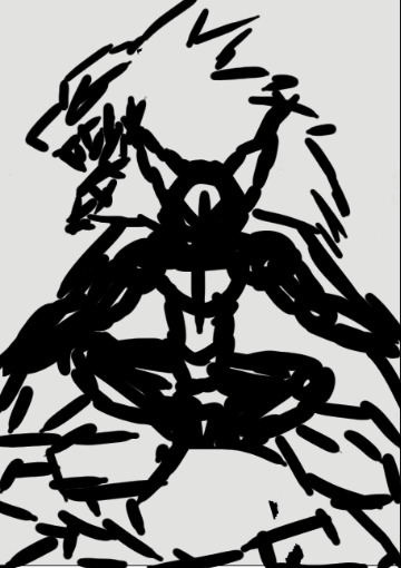
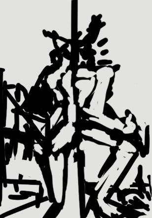
i then created the line work of the ripping cape that would turn into a shape of a werelynx using a reference seen above.

i then went ahead and put together lines that connect to the shoulders while also considering the silhouette.

using the pose as seen above, i put together a new pose of the character walking towards the viewer, i did however find trouble with this as i was wanting to make them appear hunched over. and their shoulders up in order to look sneaky but had trouble without a proper reference.
0 notes
Text
Thumbnails for Poster

i started by putting together a collage of images for inspiration mainly that of movies and drama, action type story books with use of positive/negative and other dynamic techniques to use symbols and have elements going on within them or even objects being one thing and it making up part of another shape.

these are the first few thumbnails i came up with. my intent is to really bring home that idea of aregaiate fighting the demons who took his brother and his own demons being the werelynx side of him.

these are the extra ones i drew a little more recently to add up to about 16 thumbnail ideas.

this one was the first idea that had which orignally the text was rotated 90 degrees but after a critique from toby where he explained how having them in the style i originally had, puts it out of place and makes it look more like a light up shop title.

this one was a nice idea to have a contrasting poster with a kind of thirds type composition where you have the character hiding behind an alley, the town down the alley way, and on the other side of the wall you have the shadow of the werelynx. i do feel its a nice composition but it doesnt give alot of idea about the story like the characters motive and such.
i love this concept and feel it is a cool composition and technique however i just feel its a little too vague as the idea like the one previously where its just the guy in the silhouette of a lynx paw.

this one is an interesting composition but however it falls under the same flaws as the previous ones where there isnt a clear idea of the motive and the character.

this is one i really like due to its idea of being a double edged sword and reflecting (literally) the characters two sides while also including the settings being the village and the city. however i feel it needs to add more context to the settings in terms of why theyre there.

as nice as this idea is with a positive and negative where we see the werelynx head and it transitions into a city, it still leaves for interpretation and is a bit too vague for the poster.

i like the contrast and side by side of this poster but it doesnt entail enough in terms of the story

i do olike this one for its simplicity of them balancing on top of a sword but its fault is like all the above
this one is quite a nice one as having the werelynx head in the back reflects what is going on in the lynx's mind in the clouds

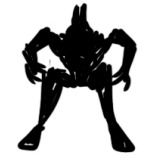
this one was possibly the laziest one as i just took the two different designs of my character and made them into silhouettes using the magic select tool and fill. people did seem to like it for its looks rather than the composition or elements. which kinda defeats the point of the poster cause we need to provide the idea and make it connect to the 100 words
i found this one to be a great representation of how aregaiate is fighting his demon or other side of him and this represents how his dark side is his werelynx form. the only thing i can see that is wrong with it is the lack of a title and setting.
this was by far one of my favourites due to the idea of aregaiates powers being a double edged sword and used that as an analogy for his two sides. through the two different faces

this idea is basically putting aregaiate at the very front of the poster and up close of him traversing through the coyote city. however having his back to the viewer leads to obscurity.
this idea is one of the stronger ones that encaptulate the idea of the two main settings and the two sides of the character in one poster. an issue that arises is the lack of title and confusion as to belief that theyre not the same character perhaps
to reflect on these thumbnails, i started off with quite a few neat ideas but however lost motivation and ideas due to a bit of burnout but after coming back and adding 4 more thumbnails, it made for stronger options. to reflect i felt like i shouldve focused more on the landscape and world the character is in just as much as the character themselves. to do this i will likely start each poster with the background before the character.

these are the posters i consider the strongest and plan to work on developing.

for my first poster i began by working on some dynamic posing as a warm up.


these were the two poses that i decided to use for my first final thumbnail. the left one being for aregaiate in his normal form and the right one being him in his werelynx form.

for the pose on the right i flipped the pose to be facing the other way to compositionally worke better with the flow of the poster. i decided on rather than having the sword be diagonal, having it straight down the middle would work together to properly cement home the idea of the double edged sword with two sides

this was the reference i used for the sword which is a French Officer's Double Edged Sword from the 18th century.


i then threw together some background and made the pose drawings into the two different versions of the character. normal lynx and werelynx

i decided to make the backgrounds of the two settings (coyote capital and aregaiates village) connect through being a one point perspective that ran across the sword connecting the two together.

i then added more to the werelynx side to the character with his cape and armor with tears flowing out following the emotions of the state his village is now in. i refined the layer for the background and broke down the buildings into small shapes of cubes

i then added silhouettes to the background and houses to the other background before applying the title to the part of the sword.
to reflect on this poster thumbnail process, i wasnt entirely happy with how the drawings came out and felt they could be more clear but i just lacked the confidence and the time to put the drawings together more clearly. in future with more practice ill be ablle to put together more clear drawings in the early stages rather than depending on refining the drawing over time over each layer like i have previously and just try to clean up the one layer

using a 1 point perspective grid, i put together a street within the streets of Coyote City using a reference of a eurasian city within the 18th century.
0 notes
Text
Character Redesign before Poster Part 2

i then applied some shading to the drawing and achieved this by creating a new layer, making the opacity 30-50%, making the layer type darken and drawing with a dark colour.
considering critiques from toby in terms of the detail of the cloak being to detailed compared to the simple details of the body.
also mentioning where the cape should cross over such as the area under the leg and crotch where you would expect to see a small bit of the cape
0 notes
Text
Character Redesign before Poster

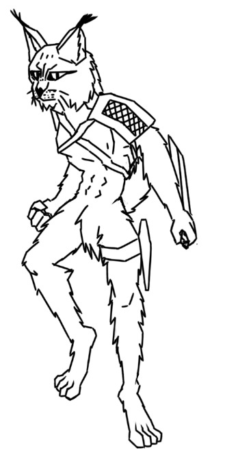
These are the silhouettes i put together. with my previous design i felt the character looked too strong for their normal form. with these silhouettes my intention was to give Aregaiate more of a lean and agile like build, similar to that of your typical feline. using this idea of speed and agility, i put together a few poses of him in frozen moments of fast movement like where he is actively in battle or stealthy. due to his character leaving his post to go into a city, he has to not be noticeable and blend in with his surroundings.

ive decided on drawing my redesign using a combonation of these two poses where it combines his stealthiness and readiness to fight.
to reflect on this, they do feel all quite silly looking but i didnt really take a ton of time to put together these silhouettes. i rather used a thick brush and made blobs of the character and their main parts of their design.

i began my drawing using my brush and putting together a wireframe or skeleton for the position of the limbs and body of where i want them to be facing.

i then broke down the limbs and body into simple shapes as can be seen in the hands and arms and added and removed parts of the shapes to connect everything together. at this point i wasnt to thoughtful about how the shape, position and proportion of the arms, hands and torso but following this i found great challenge

comparing this image to the drawing above, you can see where i took the reference into the drawing with the position, proportion and shape of the head. the markings on the eyes and above were inspiration to add to the design also.

i then put together the extra parts of the characters accessories and tools. at this point i didnt realise it wasnt so great in terms of the placement due to it blocking out core parts of the sihouette. later on i had this revelation.

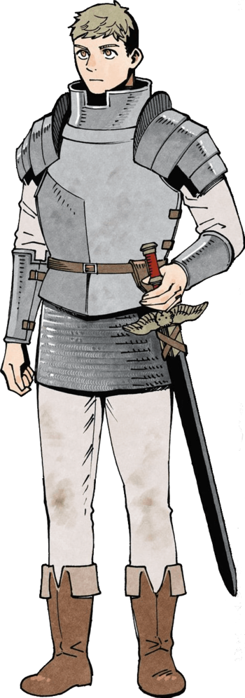
i then created another layer combing the two layers together of the outfit and the character with refined detail. i felt with the sketch the face looked a little too soft so i went with adding detail and gruntiness to the face to make him appear more fierce. the Pauldron (Shoulder Armour) was a bit of a challenge to get the perspective and shape right as you can see how it was designed below.


this was the inspiration for the Pauldron (Shoulder Armour) as i wanted to make the design more accurate to the time period and the setting being somewhere around Mongolia, Kazakhstan and Russia.

i then drew around the rest of the body and adjusted the rotation and size of the chest as it just felt off to me when compared to the sketch.

once i finished the 2nd refinement sketch you can see what parts i changed and kept the same such as the position of the arm holding the Dagger and slightly adjusting the leg placement. i also moved the head forward. i did find quite a bit of struggle with the torso and arm holding the dagger as i kept on changing it and it just didnt really feel right to me as i felt they were too bendy or too straight.
i moved onto the final lineart where most things were kept the same and just refined aside from the placement of the legs and the hand position. i did try at a reference image but i found just looking at my own hand and how i would hold something in the position i wanted would look like.
this is the reference image i used but ended up moreso drawing just from looking at my hand.
using the magic selection tool, creating a new layer, hitting select>modify>expand and expanding to 3 px before having the layer below the line art layer selected and hitting alt+return to fill.

during the process of the value fill section, i forgot to add the cape and hood part of the design and put it along the side that didnt have so much going on in terms of silhouette as the other side has the dagger, holster, hood and the pauldrons.

this is the reference i used for the cape, its details and shadow

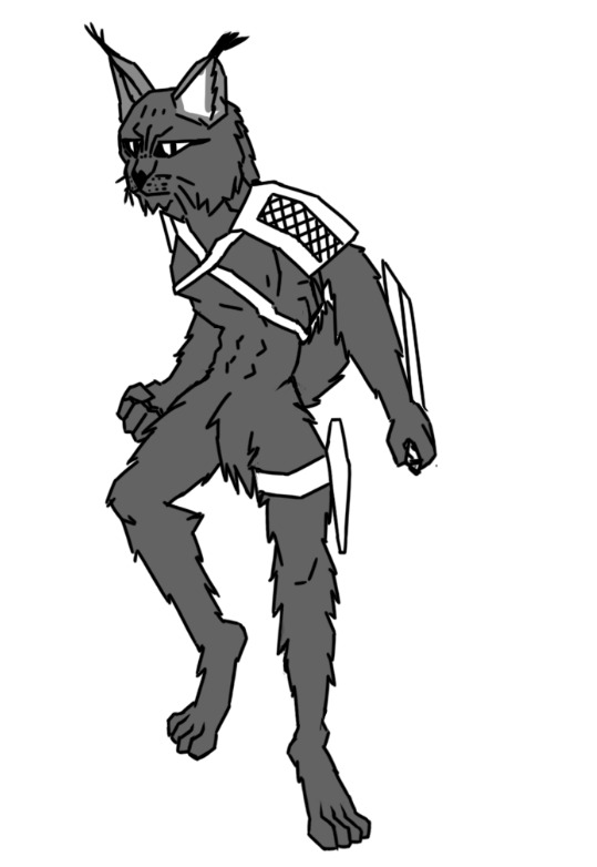
i then finished filling all the parts of the drawing and putting each section into individual layers
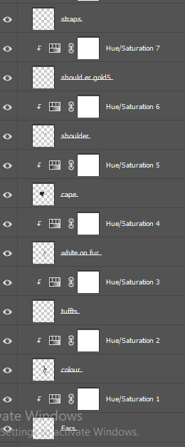
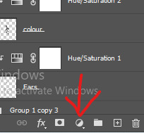
these are all the layers i have for each part of the drawing, i achieved the hue saturation by clicking on the half filled circle icon

i then clicked on this icon to have the lightness only apply to one layer
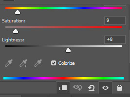
i then hit colorize and adjusted each layer to the value i desired

following the steps i took above, i suited each layer to the desired value

i then grouped the many layers and dragged the newly made group down to the plus symbol as seen above in the bottom right corner and creating two extra groups for two more variations of value choices.

using a variation of values where some had elements lighter than other versions of the same element (such as the cape seen from darkest to brightest). i felt the middle one stuck with me the most and even my peers felt the same way and believed it was the most balanced values.
i settled with the middle one and moved onto the colour stage

this was the first version of the colour palette i adjusted using the same display for the lightness adjustment where i changed the hues and saturation. i was intent of making the colours desaturated in line with the character and the story it is set in.

i then lined up the different variations of the colour palettes and look towards my peers to see what they liked the most which seemed as to be the 3rd one as the 1st one felt a little unatural and almost too evil kind of look. i wanted this character to have passion and a firey nature but not to the point of sadistic evil. so i feel the 3rd one balanced the red to yellow elements with the blue cloak and pauldron

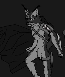
this is the chosen colour palette
0 notes
Text
Character Word Storm

i used a word storm generator to compile words to describe the world and the character within it using a gothic typeface and a colour palette very close to the colour palette of my character. to reflect it was a good visual way of compiling words to describe everything about my project but it was more of a struggle to be enough words to make a significance compared to other peers work where their generators repeated the same words.
0 notes
Text
100 Words
for our Poster, we had to put together ~100 words to sum up the Character, their setting, their challenge and the goal within the story.

at first i went a little too indepth with the lore and setting before condensing it down into the vital information to what is needed in order to still get the idea of the story across.
to reflect i did find a little bit of a challenge in putting together the 100 words in 20 minute span time which i feel i can possibly rewrite in sometime in the future.
0 notes
Text
20 Questions for my Character


with these extra questions for the character and his world, it allowed me to flesh the character out more and brainstorm more information as to what makes aregaiate the way he is and how his world affected him.
for example, where he has taken far more influence from his parents and mentor compared to his brother taking majority influence from their grandparents, leading them to hold different beliefs and approaches to life. what led to these differences were the ages at which the events of their parents passing and also how differently people react to the same situation. having these differences makes for an interesting relationship where despite the two brothers dont always get along or see eye to eye, theyre still kin and love each other in that respect.
my main inspirations for the characters are the relationship between my brother and i and how we have become far different people purely from us being different and reacting to the same situation differently and how our perspectives differed based on what age things happened.
0 notes
Text

this is the colour palette i explored using grid layouts in canva and moving around the colour wheel to fit to the closest colour palette i wanted. these two palettes reflect the most recent design of my charactes colour palette and the 2nd one is more like what i am wanting to do next with my 3rd redesign. and played with using colours mainly of red, yellow, orange and blue. contrasting colours but also some colours next door to one another.

i also went into adobe colour to play around with some colour palettes i can work with to see how they fit with one another. it was a interesting thing to work with and was a nice tool to use but i just was not satisfied with the colours compared to the one above.
0 notes
Text

for the moodboard for the 3 steps for the Character i put together photos and illustrations that sum up the world Aregaiate is within, which is essentially pre-industrial Eurasia and specifically the army. there was some challenge finding illustrations and imagery that was in the specific period before delving into industrial revolution life and society. there wasnt an exact image i could find that matched the era for what i wanted the city of coyotes to look like as any idea i did have were well within industrial era technology such as steam work, gears etc

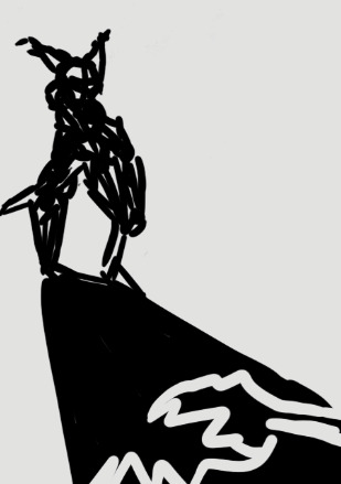
this was my idea as to somewhat coyote city would look like despite the industrial elements.
0 notes
Text


this is my written up character arc for my Character, Aregaiate. my main influences are that of Assassins Creed and the battles between the Assassin Brotherhood and the Templars longstanding for many centuries. i felt to create a divided world of anthropomorphic creatures to further the divide between each animal family and how they interact with each other.

as part of the process, i conducted some research and found that Lynx are far more protective of their babies compared to other feline which inspired me to make my Character extremely protective to the point of dropping anything to save his kin.
While the two brothers in my story are embodiments of multiple gods of greek mythology, a large influence was my complicated relationship with my own siblings and how we interacted with each other in the past but at the end of the day we would do anything to protect one another. the characters also embody part of me and my younger brother.

the districts of Panem in The Hunger Games were a small influence as to dividing each Animal Family and their heirarchal place in eurasia. some being more wealthy than the other, some being stronger or other benefits over the other.

im also so used to seeing stories of anthropomorphic creatures as seen above without an explanation as to a logistical reason to why theyre like the way they are. i decided to explain in my setting how it actually happened where it was alternate history/evolution where something changed or went wrong for there to be these animal like humans.
0 notes
Text
Character Narrative Exercise
we were assigned as a group to create a 3 component study on our assigned character using a Questionnaire, Word Bubble and Moodboard, was "Bojji" from the Anime/Manga, "Ranking Of Kings". I personally had not really heard of the Anime/Manga and was unfamiliar with it at the time of beginning the task but i conducted some research through forums and wikis about the character and his world.

I assigned myself with the Mood Board part of the exercise from my experience with creating mood boards being something I've done often and are most familiar with. i created this using a Mood Board Template on Canva. my ideas came from a place of my own experiences of Childhood especially the team based and entire class activitys and games and applied that to the moodboard with alongside common objects i could see bojji playing with and wearing such as a cape, light up shoes and a wooden sword.

this word bubble/storm was created by one of our group members, Tylah who put together words relating to the character in terms of their personality, goals and surrounding environment and the way they interact with bojji


this is the questionnaire our team member Kaushal filled out mostly with some assistance of both Tylah and I such as the additional questions and other questions that had yet to be filled out.
to reflect on this activity, alongside the lecture, this activity further expressed to us as a class on how important a characters personality and elements of what makes them human such as their goals, challenges, talents etc.
0 notes
Text
Gestures / Line of action drawing
for my Drawing Poses reference i will be using a Dance scene from the Manga/Anime Series, JoJo's Bizarre Adventure
youtube

these are the poses i came up with from each significant pose change. as can be seen from the video above from start to finish, it took many times to get into the swing of drawing basic form and sketch poses. you can visually see the difference in confidence with line weight, shape and form i.e. the first drawing appearing rigid to the last drawing flowing like water.

this is the pose i decided on drawing as it was very recognizable and dynamic in terms of the shape of the shoulders, arms, torso and legs. i decided on drawing the significant character in delicious in dungeon, Laios.

using the brush tool, i began putting together the head and shoulders using the same technique as seen above to get the overall shapes of the character

this is the result of the first sketch as you can see i broke each body part into individual shapes and blocks, such as the hands being shapes like spades and the chest being like a block.

out of the entire drawing process, the head shape and the position was the biggest challenge as im used to doing either a 3/4 angle or a side profile but the head angle was more so in between those, particularly struggled with the nose placement, its size, where the eyes should be, and the line of the jaw

after somewhat successfully drawing the hands, i went on the draw the rest of the body and the armor. the largest challenge was drawing the shoulder armor and getting the right perspective. in the sketch previously, the thighs were a little too thick in contrast to laios' leg size.
following the completion of the line work, i implimented the colour palette of laios by using the eyedropper tool on the original reference image as seen above.
to reflect on this process as a whole it was really helpful to building my confidence better at drawing people and dynamic poses. in future i want to explore study of posing and anatomy to really hone my craft. the challenges for the most part were just how i felt about the drawings and how they just didnt look good to me, but assurance from my friends and peers really helped and helped me better my confidence to just keep going.
0 notes
Text
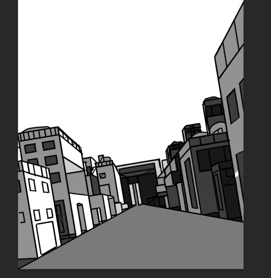
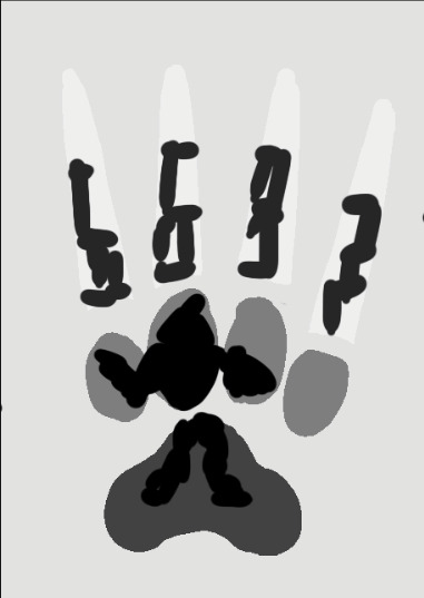
Value Study


We as a class were tasked to take the grayscale image as seen from above and use a very basic brush and the scale of white 1 to black 10. we started by very basically blocking it out as main colours. we started with a dark gray and built off it referencing the eye as close as we could

i went in and added more fine brush strokes and used a technique where i made some texture by putting scratchy lines that were lighter or darker than the blob of gray
0 notes
Text


i started by coming up with a pose for the Character we were assigned as a group to design from our Design Brief of the character's name, backstory, environment, personality and physical appearance. The character was a Dwarf Fisherman by the name of Beatriz who took large pride in himself over everyone else and felt no one could do better than him despite the rise in technology in the fishing world. with this information on the character, i wanted to go for a prideful and closed minded like energy off him

i then moved onto a slightly more detailed sketch finding the right head and body structure for my assigned style, animation. i aimed to have one hand around his hip and another over his shoulder carrying his fishing rod.

after learning of new information of what other features to add to him, and influence from one of my fellow team members who finished their drawing at this point, i put together a more detailed drawing of the character with intention to make his face be made up of his eyebrows, nose and beard for a stylistic choice. i gave him overalls, gumboots and a simple fishing rod.

after i was satisfied with my refined sketch, i moved on to the line work layer where i really went for a wavy look in his beard and pockets on his overalls for nice detail.

i continued to add more to the line work before changing the hat slightly, to make it appear to be on his head a little better


once again i fixed the bucket hat and used a reference for some help, i added more details and elements including the arms an fishing rod. once i had fully drawn the body, it was then time to find a nice design for the fishing rod. at this point i wasn't exactly happy with how it was looking so i seeked some referencing and ideas as to what a conventional fishing rod looked like during the medieval period.


this was the initial design that stuck with me for the fishing rod. i achieved this long fishing rod by using the pen tool to create the straight lines and converted the paths to a stroke.

i then took the lowest part of the fishing line off to where the hand will fit and made a dangling fishing line to connect to the fishing rod

i then put the layers together to where i was satisfied.


i then used the colour palette we were most keen on and applied the lighter colours to the hat, skin and shirt and the other colours to the pants, gloves and boots. i achieved this by using the magic wand selection tool and hitting select, modify, expand and expanded the selection to a few more pixels and separated the fills into individual layers.

i enlarged the image to fit the majority of the canvas and added a part of the arm to the left to make it appear better on his arm out and hand on his hip to show off his pride

taking the colour palette and desaturating it to check the lightness and darkness stand out and balance well, i found the boots to be bugging me the most

i selected the boots layer, applied a hue saturation mask, and decreased the lightness to make the boots stand out a little better.

after resaturating the colours i was satisfied with the shade the boots are now
to reflect i am definitely happy with how it turned out and didnt find alot of trouble other than the placement of the arms and legs as i couldnt get both legs to look right so i ended up having to duplicate on leg onto the other side. in regards to the arms, i wasnt sure where i wanted the arms placed in order for them to look right and for how i wanted them to. it took alot of trial and error but i got there. it was a challenge to keep the appearance consistent to the characters description while also considering the time period of medieval but i did what i could. in future i will conduct far more research into time period apparel while also keeping consistency to the brief in terms of features and accesories.

to reflect on our discussion as a team following review of our final drawings, we felt we could possibly allow ourselves more time to discuss the overall design of the character rather than going off and doing our own personal interpretation, while this is cool and it can work in some instances, other times it is preferred to come up with a design with more consistency. an idea we can possibly do is draw up a visual general illustration based off the characters details. we also felt we couldve made the poses more dynamic and make the beard more flowy and exageratted to fit it in the silhouette. we feel despite the contradictions and and challenge of keeping consistency to outfits time period and the creature we captured quite well.


Our critiques based on our review as a team on the designs of johnson

this is the critiques we recieved for our character designs.


from the critiques above, i adjusted the colour scheme to the graphic novel and removed the shirt. i achieved this by using the eyedropper tool, selecting each layer individual layer and hitting alt+delete. i am relieved to know that not alot of my design was required of changing and the team were happy with the drawing itself and design aside from the colour scheme.

toby recommended i experiment with some change of detail such as the size of the legs and comparing them based on ones bigger and smaller. from the observation of a fellow teammate and i, we are quite keen on the smaller legs as it fits more closely to the design of a dwarf and extenuates the stomach.

to simplify the design, i removed some details and left a little few blips on the front pocket

i then enlarged the image and hit sharpen and more sharpen as the lines became blurry. to reflect im quite happy with this fix up redesign and felt it was a great process to have peer critiques in order to refine the design i was prompted.

following critiques this is the final drawings IDK studios created as a team. the main adjustment that was made after critiques for everyone were the change of colour palette to match that of the graphic novel for the sake of consistency.
to reflect on this Client/Designer Activity, it was a great practical activity to apply a perspective and experience of a relationship between a client and the designer process in creating a piece of work. from communication to critiques. our team worked well together and we had great chemistry, however our communication on a clear path was something that will need to be worked on in future for example the design and colour palette was up in the air for interpretation on how to create the character. what we may very well do in the future is create a collaborative simple design that breaks down the core colours, shapes and appearance of a character, like a diagram if you will. i thoroughly enjoyed taking the role as the leader and this task allowed me to progress my skills at what it takes to be a great and compassionate leader, through discussion of our progress and small critiques here and there and allowing everyone to work in their own time frame in order to achieve the final goal of the task.
0 notes
Text


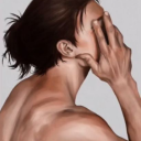
The Illustration Style I want to Develop my Skills towards and explore is the rendering style and overall energy of Concept Art.


My particular inspirations are that of the Assassins Creed Video Game Franchise, DnD and other Stories of Worlds of Fantasy with a combination of real world History.
I wish to achieve these techniques through various techniques of Blending and Digital Paint Brush strokes (like the image above).


My experience in rendering overall has not been far enough explored in my past works (as seen above). Therefore that is why I wish to build my skills in this style.
0 notes