
A reflection blog for the course Designing Interactive Artifacts (DIA)
Don't wanna be here? Send us removal request.
Statistics
We looked inside some of the posts by linedia-blog and here's what we found interesting.
Average Info
Notes Per Post
0
Likes Per Post
0
Reblog Per Post
0
Reply Per Post
0
Time Between Posts
5 days
Number of Posts By Type
Text
17
Last Seen Tumblr Blogs


Fun Fact
Tumblr Inc. is funded by 13 investors.
Text
Hi! ... & goodbye! – concluding blogpost
This blogpost is the first you will see entering my blog, but it will be my last blogpost I write in the course ‘Designing Interactive Artifacts’. I have during this course created 22 blogposts, where I reflect on relevant theory and my practice-based activities.
The blogposts matches the activities done in the course – where we first got introduced to relevant theories in the lectures about ‘Articulating Interactions’. These blogposts can be found at the blogposts #4 - #9. After this we started on our design process (‘Sketching in code and hardware’), where my group and I created the light installation ‘Proximity light’. During the design process I have been written blogposts about our design decisions, which can be seen in the blogposts #12 - #20. These blogposts are really process/practice-orientated blogposts. However I have tried to include relevant theory, to underpin our design argumentations.
This last blogpost will be about our design process, our final installation and the course/the reflective practicum with my learning outcomes.
Our design process Our design process has been inspired by Vallgårda’s trinity of forms (2014), where we have worked with the physical form, the temporal form and the interaction gestalt. We have used the terms when we brainstormed ideas or when we reframed our focus. The three forms have been a foundation for all our design decisions and that is why my blogposts have been divided into sections that can match these different forms. However I want to stress that we did not work with one form per day, they were more intertwined in the whole process. The reason why the blogposts are divided is just to give a better structure.
Proximity light Our design process framed and developed the Proximity Light. Our first idea was to leave personal marks in a semi-public place, a lot like “Leaving traces – like carving your name in a tree (however it should be not permanent)”. However during our design process we reframed our design field and started to focus on a more curious experience for a user at an exhibition setting (as will be elaborated in blogpost #18 – framing our design focus). The curious interaction is fostered through a curious physical shape, an interaction that the users need to be curious to understand, since the temporal form is different depending on how long time you interact with it. See Proximity light’s presentation movie in blogpost #22.
Reflection on the course This course has worked as what Schön describes as the reflective practicum (1987) – I describe this in my blogpost #14 the reflective practicum, where I describe it in relation to our second show and tell session. However I want to underpin that the reflective practicum has not only been when we talked with teachers, but it is a continual stage we have been working in. The reflective practicum supports ‘learning by doing’, as it states that creating something enhances reflection-in-action and reflection-on-action, which are reflective conversations with the created materials. Knowing-in-action has been perceived by creating sketches (both 2D, but also in audrio, low-fi prototypes and enactment as a sketch form), where the whole body and senses have been active. Reflection-on-action has been when we stopped creating and started to think – and then documented/created new ideas based on these findings. I have given examples of both reflection-in-action and reflection-on-action in the two blogposts: #15 - enactment and #16 – physical form giving.
Our approaches in this course have been really exploring, which has been new and rewarding for me – I am use to work with problems, as e.g. business orientated problems. The ‘problem’ we have worked with is to find the ‘right’ experience for the users. I have learned how to understand interaction and how you can design for it. I have discussed what to understand with an interaction in my blogpost #7 – Lenz: Interaction vocabulary, where I discuss if the user has to take a passive or an active role to interact. With an understanding of what an interaction is, it is possible to design an aesthetic interaction. This is something that has been new for me – because how can you design something that is a subjective opinion? Petersen, Iversen & Ludvigsen (2004) have tried to clarify it and I talk about it in my blogpost #11 – Reflection on ‘Articulating Interactions’ and Aesthetic interaction, where I state that an aesthetic interaction is connected to context, use and instrumentality.
Last I just want to highlight the word context, which is something I have experienced with our own installation. For our exhibition our context did not give the attended experience as we wished for. The context (exhibition setting with a darker lighten) was essential for our installation, since the intended context would have invited to interaction. Norman and Wensveen talk about direct coupling – how a design should be able to explain how to use it, but a light installation does not need to have this coupling. However it needs its context.
Reference:
Schön, D. A. (1987). Educating the reflective practitioner: Toward a new design for teaching and learning in the professions. San Francisco.
Petersen, M. G., Iversen, O. S. & Ludvigsen, P. G. K. M. (2004) Aesthetic Interaction – A Pragmatist’s Aesthetics of Interactive Systems
0 notes
Text
#22 - Proximity light
youtube
Proximity Light is a light installation that lets the users explore the artifact driven by their curiosity. Due to its asymmetrical shape and the size of its 18 surfaces, the users are encouraged to interact with the installation through touch and proximity. The user will have to explore Proximity Light to find the places where he/she can leave a mark.
0 notes
Text
#21 – Exhibition
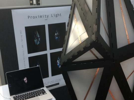
Today we had our exhibition where we presented our light installation, which we have called ‘Proximity light’. It is an installation, where you as a user need to use your curiosity to get to know it. You can interact with it just by being close to it (hover over the sensors), but if you are curious enough and get to know it (by finding the sensors) you can leave a more intimate mark (by turning on the red light) by touching it.
It is like a human – if you are curious enough and get to know a human, you will be more notable.
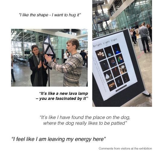
The exhibition helped to see our installation in action. We could observe if users interacted with it in the way we wished for.
The general the shape of our installation got many compliments. The weird shape was probably the reason why people came over to us initially – they saw the shape and got curious.
People interacted with it in many different ways – some people were really gentle (probably because they were afraid to destroy anything), a user stroked all the copper sticky tapes, some hovered over the surfaces really quickly (some too quick for the sensors to intercept the interaction), but often if they saw a light turned on they stopped and tried to turn it on again, by doing the same interaction.
More people tried to interact with it together with other people. Some thought it was kind of a competition, where they stole the light from each other. Other collaborated and helped each other to find the light spots.
The collage below shows pictures and quotes from the exhibition.
Overall the exhibition made something really clear for us – context is everything. Even though we wanted a exhibition setting, we also needed the lighten to be darker. It was often difficult for the users at the exhibition to see that the LEDs were turned on. Therefor context matters on how we experience interaction.
0 notes
Text
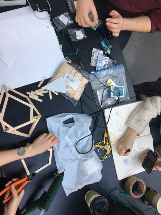
#20 – final touch
After we had created our low-hi prototype it was now time to build our final light installation. It became really handy to have a smaller prototype to compare it with – both because it was useful as a template when we collected the different surfaces, but also because it was not fragile so we could test different ideas on it before implying it at the final shape.
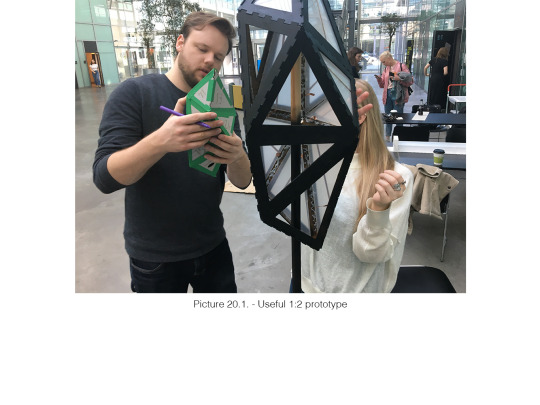
This blogpost will go through four sections, where I shortly will describe how some of the decisions were made and why our installation ended up as it did.
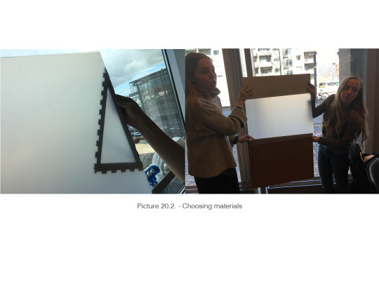
Choosing materials Our shape was made with 18 surfaces. In order to incorporate the capacity sensors, in a way where they were most well functioning, we needed the sensors to be visible for the users. Therefore we decided to make a framework, where each surface had a border.The border needed to be built in materials that are stable in order to keep the installation together when the user touches it.
Each triangle was covered in plastic paper. We decided to use plastic paper in order for the light to shine through. We tested different materials to find the best solution – we wanted the light to shine through, but we did not want the users to be able to look inside the light installation. We ended up by making the triangles with double-layered plastic paper.
For the capacity sensors we wanted to find an aesthetic solutions, which we found with copper sticky tape. To stress the curious experience we added the sticky tape on all of the triangles. We used the small prototype to find out how we could place the sticky tape in a way where it both looked nice, but also did not generate a pattern that could indicate a specific interaction - we wanted it to be random/curious look.
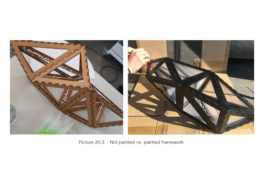
Choosing colours Choosing colours was not something we had thought about before we had collected the different borders in one piece (generated the framework). But after seeing the burned (burned from the laser cutter) borders next to the plastic triangles we felt that the borders had too much focus, which we did not want them to have. The focus should be on the triangle, since the interaction should be there. We tested different spray painting colours, but ended to colour the borders black. The black colour made the framework more invisible in relation to the context where the installation should be placed - at an exhibition, where it preferable should be a darker lighting.
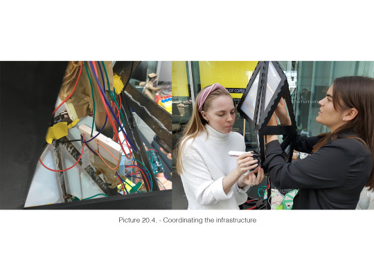
Coordinating the infrastructure After we had collected the different borders and created the framework, we started to fill it with wires, LEDs etc. We had to choose which surfaces we wanted to be interactive, which we decided based on: we wanted the five surfaces to be placed all around the object and also where it was easy to place it regarding space inside the object. Again we used the small prototype to find these surfaces. However we experienced that some of the copper sticky tapes that was not suppose to work as sensors, messed with the circuit, because the sticky tapes were too close to each other. Because of this, we decided to make more surfaces interactive, but with the same LEDs.
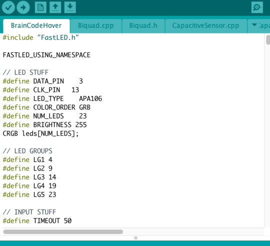
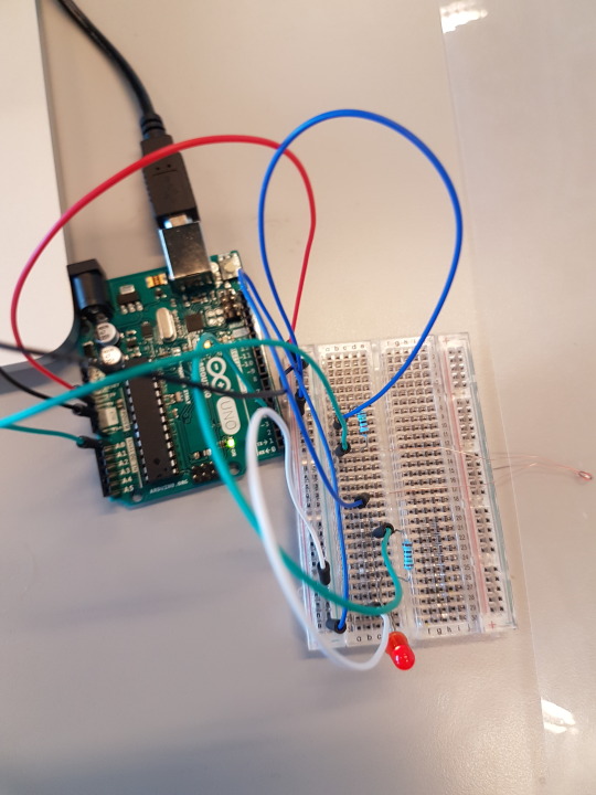
Changed temporal form Before we closed all our audrio inside the object we did some testing with the code, as it can be seen in picture 20.5.
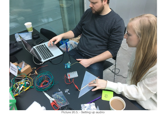
First of all it was essential that we defined each cluster in order to control which cluster with light we wanted to turned on.
After all the code was inside we wanted to test it again - just to see how it worked. We needed to define the intervals for our input. So we tested by interacting with it where we with help from our serial communicator, defined max. and min.
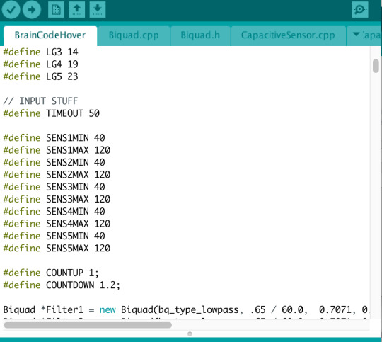
In the end we actually changed some of the code, since our first did not give the intended experience. We needed the users to be more awarded if they took time to interact with it. Therefore we decided to give change the light to red, after a while - again defined with help from our serial communicator.
youtube
0 notes
Text
#19 – Building prototypes
After our new design frame, where we wanted to foster a curious interaction for the users, it was necessary that our shape of the installation could communicate this. Therefor we started to research on different shapes that could enhance the curious aspect.
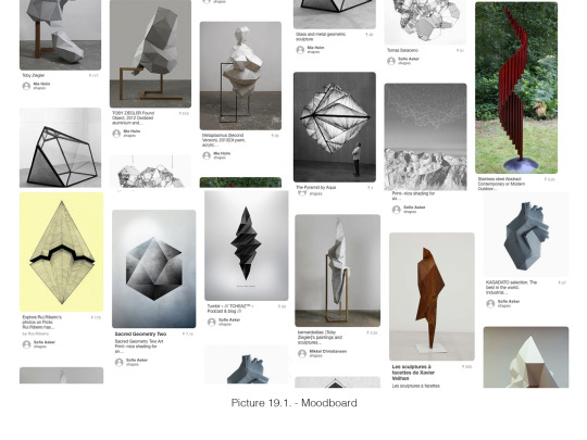
We created a moodboard only with pictures that we could use for inspiration – see the moodboard in picture 19.1.
We wanted a shape that could include multiple surfaces in order to enrich the curious interaction where the users need to search for the interactive surfaces. Furthermore we wanted a shape where some of the surfaces were ‘hidden’ and the users needed to investigate time to find the surfaces – it should not be easy.
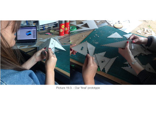
We created different shapes with help from a 3D cinema program, where we could divert the shapes into ‘puzzle pieces’ that were easy to print. We printed small versions in cardboard – just to see how easy they could be collected, but mostly to get a better feeling of the shape by making it tangible. By making low-hi prototypes we are creating a dialog with our design (Schön, 1992).
Our first prototype had around 40 surfaces and it became too complex – we never complete all the surfaces to one object, because it was too difficult.
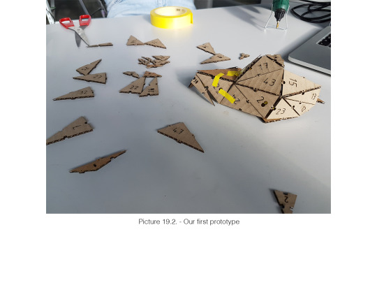
Our last prototype was made in the dimensions 1:2 and it had x surfaces. We ended up with the shape because of its asymmetric shape, where a user need to walk around to see all the different surfaces.
youtube
0 notes
Text
#18 – framing our design focus (curious interaction)
This blogpost is made after we had a talk with Laurens, where we got feedback on our present idea. Before our talk our design frame was a brain shaped light installation where only some of the surfaces could be turned on by a human interaction.
The talk led into a presentation of our current idea and by expressing our idea in words it ended up being more about the curiosity interaction, where only some of the surfaces can be interacted – this ended with us reframing of our focus.
Reframing to ‘a curiosity light installation’ We already had the idea with the curiosity, however it was not our main focus. After our talk we wanted to reframe our focus to creating a more curiosity interaction. To enhance this curiosity we wanted to make a shape that could meet this focus. However before finding the correct shape we wanted to create a solid and common understanding of the curiosity interaction we wanted form. By using Lenz’s (2013) interaction vocabulary (described in blogpost #7) we had a tool to frame our design’s experience with curiosity in mind. I do not want to go through all of the attributes, however we used all of them as a foundation for a discussion about how our focus could be enhanced best. E.g. did the attributes slow and fast start a discussion about the light behaviour, where we ended with a mix. Fast interaction, since it needs to react immediately when the users are close to tempt the users to stay and explore it more. However it also needs to be slow interaction, since we want the users to be awarded if they a curious enough to get to know it better, by touching it for a longer time.
0 notes
Text
#17 – design with audrio (temporal form)
This blogpost will be about how we used audrio as a help to frame and develop our temporal form for our design. It encompasses activities done over two days, but I will describe them both in one post, because they are intertwined.
Temperature sensor We wanted to work with the bodily interaction – our temperature. We used a temperature sensor that should intercept human temperature, when a user touched it. For output we used a LED that shined brighter according to the user’s temperature/input.
youtube
As the video illustrates it was possible to do different interactions– just touch it, polish it and blow at it. We also tried to cover the sensor with a transparent paper in order to see if the interaction could be registered through it.
Working with the temperature sensor gave us these findings:
It took too long for the users to heat up the sensor
It took too long for the sensor to be cooled down and ‘ready’ for a new user
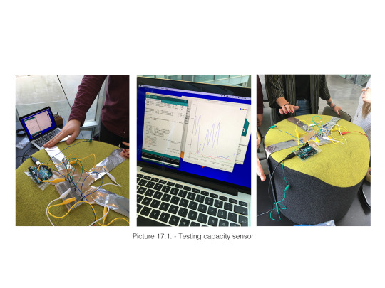
Capacity sensor Since the temperature sensor did not work, as we wanted, we started to find other potential sensors – and found the capacity sensor.
To test how a capacity sensor could work we used aluminium foil between the wires to see how it could react on human interaction. The aluminium foil is conducting the power from the audrio and by a human interaction the power takes longer time to go through. We wanted to test how sensitive a capacity sensor can be and furthermore we wanted to test if it could register more interactions, since we want a light installation that enhances a shared experience.
This test gave us these findings:
It also register when you hover over the capacity sensor, which means we can work with a light that can foster curiosity before the ‘real’ interaction
Different people leave different input – probably because the different sizes of people. This is something we need to have in mind - do we want the different input to give different output or should we map the inputs - in that case how do we indicate max. and min.
After a successful test with the capacity sensor we wanted to create light that could match our idea and give the best output. We got neopixel LED (named: F8-F LED), where we tried to put it under different materials. It became clear for us that the light needed to be close to the surface in order to shine through. Furthermore we needed to place more neopixel LEDs next to each other to get the right brightness we wanted. We were working with five neopixel next to each other.
youtube
0 notes
Text
#16 – physical form giving
This blogpost is about form giving, which has been an activity we have done over the last week (we have been meeting up with the group several times this week). Form giving has mostly been about the shape of the physical light and not about potential materials.
We started this process of form giving by setting up a frame that could match our findings from the enactment session. We decided that we wanted an object with surfaces that could maintain a whole hand. Furthermore we wanted more sides on the object to enhances the idea that more people could interact with it or the user could interact with different surfaces, while exploring its behaviour.
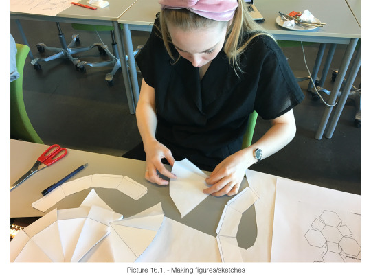
We started by making a lot of different shapes in paper. We found a lot of different figures that we printed and compiled. The idea was to be inspired by these and directly take one of those. We were merging different shapes and cutting in some just to be creative.
This activity gave goes well with the terms reflection-in-action and reflection-on-action (Schön, 1987). When we compiled the shapes it can be seen as a reflection-in-action, which is described as follow: “[...] our thinking serves to reshape what we are doing while we are doing it. I shall say, in cases like this, that we reflect-in-action” (p. 26). After we had compiled the different figures, we looked at them and it worked like a back-talk, which is the reflection-on-action. To sum up this activity ended up with us wanted something more from our shapes. We needed our shape to communicate our focus.
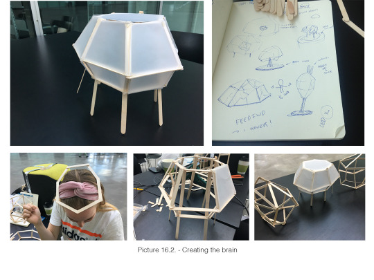
Focus: A user leaves something personal at the object and we want the light to remember that person
The word ‘remember’ made us think about a brain. We created with help from ice-lolly sticks different frameworks that could be associated with a brain – see pictures below:
References:
Schön, D. A. (1992) Designing as reflective conversation with the materials of a design situation. Research in Engineering Design 3.3: 131-147
0 notes
Text
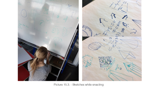
#15 – enactment
Today’s blogpost will be about our enactment we did today. Based on our brainstorms from last week (blogpost #14) we wanted to enact how the users could leave something personal at an object (lamp/light) and besides get an understanding of how the lamp physical form should be.
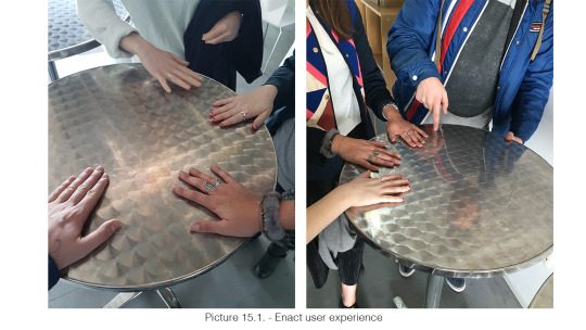
Enact user experience From the brainstorm we liked the user input as temperature, since we liked the personal and intimate aspect of it. A human’s temperature is something you cannot spot – unless you touch each other. It is something really private and that made us inquiring.
We used a metal bar table as enactment device, because we wanted to see how fast you could heat up a space and we thought that a metal surface could help with that.
This enactment gave us these findings:
People have different temperatures, which we felt by the different heated spots we each left at the table
People who has more patience regarding warming the table will leave warmer spots, e.g. holding their hands for a longer time
People can warm the table with different activities, e.g. blowing, ‘wiping’ the table with the hands
“It’s like sitting on a chair, when you can feel someone has be sitting there before you – it’s kind of intimate and disgusting feeling” - A comment said when someone felt the warm surface from someone else
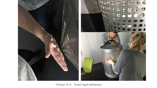
Enact light behaviour After the enactment at the table we tried to enact how the light could behave to our interactions. We used a light on the phone and a trash bin with gaps in it, where the light could shine through to enact this out.
This activity gave us these findings:
The light can both be turned on or turn off when the user touch it, but if we want the feeling of leaving something, the light should shine where the interaction occurs
If we want the shared experience between more users, the light needs to be turned on so the users can see it from different angles.
We liked the pattern the gaps in the trash bin created – it gave a aesthetic experience.
Maybe the output should be something else that did not indicate temperature – we liked the idea about turning on a pulse – a pulse can enhance the idea about a person has been there before.
Enact form
Through our enactments we started to discuss a potential form for our light. Since we are working with a light installation and we are working with a shared experience there was something that become more clear after our enactments:
The installation needs to be up in the air – it invites more the users to interact with it with their hands or maybe heads (if they want to blow at it)
Only one surface makes it easier for other users to see/feel where the previously users have been. However it does not invite to ‘fun’ interaction
If the shape of the light has more surfaces it can also give a more exciting light output - It could be as a pyramid or a diamond shape
Materials: it need to be something that we can work with (eliminate metal because of the laser cutter) and something the users want to touch, e.g. polystyrene does not feel good to touch
We should work with materials we can look through, so the light can shine through the surface exactly where the interaction happens.
youtube
This activity has been a good example of reflection-in-action and reflection-on-action. During our enactments we sketched our ideas - in order to remember reflect, document and understand our findings.
0 notes
Text
#14 – The reflective practicum (Show and Tell #2)
Today we had our second show and tell session – but the first show and tell, where we were presenting our design ideas for our light/lamp. A show and tell session fits into Schön’s (1987) idea about the reflective practicum, which is the educational environment that complies a dialogue between teachers and students.
This blogpost will short be about the show and tell session and how we worked with the feedback afterwards. Furthermore it will discuss Schön’s theory about framing/reframing.
As mentioned in last blogpost #13 we had three ideas to present to our show and tell, see them presented in picture 14.1.
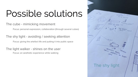
Our three ideas were open ideas, since they were only our first thoughts defined into three categories – they were actually really unclear ideas. Our unclear ideas got some different feedback from the show and tell session, e.g.
“Cube is forbidden design”…
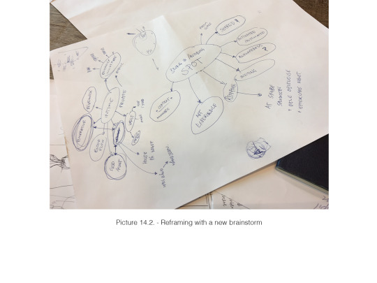
We felt that after the show and tell session that it was essential that we started to frame our design field with more details. We started by making some new brainstorms, where we worked with some of the elements we liked from the other ideas – like sharing/creating an experience together.
From our previously experience with the audrio we had learned how different input and output can affect the experience. Therefore we started to brainstorm on different behaviour from the users and the light. It became two brainstorms – one with input and one with output. It was especially our input elements that framed our design situation. Our input elements were defined by how a user could start something, like touching, blowing, sweating, their weight etc. It quickly became a bodily interaction and we liked the intimate and personal aspect of this new angle.
According to Schön (1992) a design process is a dynamic process, which consists of framing and reframing the problem and the solution by for example naming actions - “Through complementary acts of naming and framing, the practitioner selects things for attention and organizes them, guided by an appreciation of the situation that gives it coherence and sets a direction for action. So problem setting is an ontological process […] a form of worldmaking” (Schön, 1987, p. 4).
I would argue that our design process does not need the same framing as Scön has described, since we do not design for the purpose to solve a design problem. Our design process is more about exploring different design ideas. However I will use Schön’s theory about reframing in order to frame what kind of experience we want to create for the users.
After we created our brainstorms our design frame can be described as: leaving a personal mark at an light installation
Schön’s term ‘worldmaking’ is defined as the world within the designers work. It is made from the designers backgrounds, organizational roles, past histories, interests, and political/economic perspectives and it is our way to frame our design (Schön, 1987). In my group (my group members: Sofie Asker Black Calundann, Mie Holm and Mikkel Christiansen - group 7) we are all have the same DMD bachelor, which means we are used to work really explorative when we working in a design process. I think our shared understanding of how to work in the beginning of a design process is the main reason why we have not framed our design. However working really explorative makes the framing easier later, because we can argue why we have framed as we have.
References:
Schön, D. A. (1987). Educating the reflective practitioner: Toward a new design for teaching and learning in the professions. San Francisco.
Schön, D. A. (1992) Designing as reflective conversation with the materials of a design situation. Research in Engineering Design 3.3: 131-147.
0 notes
Text
#13 – design explorations
In this blog post I will shortly describe our first meeting with the laser cutter, but mostly I will focus on our design process, which we now have started on.
Laser cutting This was my first visit to DirtyLab at ITU and the first time I laser cutted. It was really simple – we made a template in illustrator, where we focussed on trying different techniques: cutting a specific border, holes, details (a skull) and simple engravings.
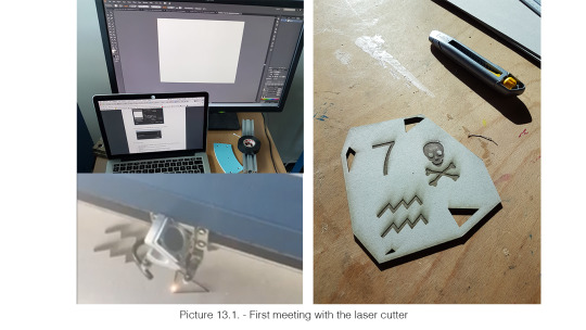
The visit to the DirtyLab showcased the different materials we could work with. It was possible for us to feel the disposal materials, which is vital since we might develop something the users need to be in close interaction with.
Design process – the beginning
At this point we have now worked with different temporal forms (audrio – read previously post #12) and we have got some insights in the materials (which is part of the physical form). Now it was time for our group to start working on our interactive lamp/light installation.
Design brief - Design of an interactive lamp/light installation that:
Is inspired by a chosen context
And motivated by a quality of interaction or intended experience
This design brief was our foundation for our design frame, where we started to brainstorm on different contexts. We chose to work with a ‘semi public’ place. A semi public place is like ITU – a place where you have some kind of a shared relation to the other people. We wanted it to be a place where the users can share the experience/interaction with other people and at the same time we wanted people to feel ‘safe’ interacting and performing with the lamp, which we feel it is something people will have in a ‘shared social environment’.
The agreement on the context made it possible to brainstorm ideas. The context was the foundation for our jointed brainstorms, where we talked about different elements that we liked and that could be interesting to work further on with. The elements we discussed where elements that came from GESTALT, PHYSICAL FORM, TEMPORAL FORM
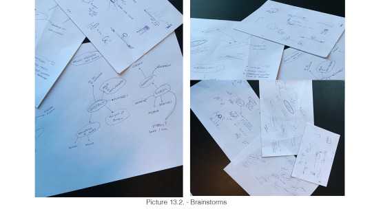
Our brainstorms are at the pictures above – some of the elements we discussed were:
The scale:
Lamp vs. light installation
Outstanding in the context - exhibited
Incorporated in an already exciting element, e.g. a table
Tangible
Full scale
Other features than light:
Rotating
Giving the light human behaviour, e.g. shy
Shared experience:
Activate the light with more people
Competition
Collaboration
How to activate the lamp:
Measure distance
Magic
In control (direct)
With the brainstorms as foundation we individually started to sketch different ideas, where we after presented them to the rest of the group. The sketches were discussed where we after found the most interesting part of each and then made some new sketches. In the end we ended up with three ideas, we could present to the next show and tell #2 session (see next blog post)
0 notes
Text
#12 – Temporal form giving
We have now had two lectures where we have worked with audrio. This is the first time I am working with this kind of programming and it has been really rewarding for me. We have worked with audrio in class, where we have learned basic audrio coding, I have worked with audrio with my group where we have explored the possibilities the audrio has, and furthermore we have had an introduction held by Ole, who told us about the options we have in IntermediaLab at ITU.
WORKING WITH LIGHT
In this blogpost I will go through some of the most fulfilling activities I have experienced - activities I think will be relevant for our further process.
Control the light
Since I am a formerly DMD student I am use to work with technology, which means being in control of technology is not something new for me. However controlling light is new and exploring how much you actually can control has giving me a new perspective to work with. Ole showed how you are able to control the exact colour for the RGB-light by adjusting the code. In our group we tried to control the light by controlling for how long the light should light up and the brightness of it.
Light can communicate
Reading the text ‘Unlocking the expressivity of point lights’ we got introduced to how we can use the light to communicate. In the text they describe how they have explored 24 different light behaviours, where some of them were easier for the users to understand than others.
One of the strongest light communicators was the information state SOS, which can be communicated with this light behaviour:
However this study do not include an investigation of the users’ context, the users’ previously experience with light communicators or their interaction with the lights. These factors are something that we are going to work with and something that probably will be essential for our process. Still I see this text as an inspiration, where I have learned how small details (small details as a light) can have a big impact on the users overall experience. Furthermore I have learned that if this so-called light ‘language’ can communicate, it can probably be helpful to use as both feedforward and feedback to our potentially users.
“The reality is users have integrated current design practice into their ‘device language’ and future designs need to build on top of this knowledge, not ignore or disregard it” (Harrison et al., 2012 p. 1688)
Input/output
We worked with the tool ‘serial communication’, that could give a visual description of the input and output we worked with. In our group we experimented with the analogue distance sensor, where the serial communicator helped us getting our input and output to fit together.
We worked a long time with the distance sensor, since we liked the interaction the sensor invited to.
youtube
Reference:
Harrison, C., Horstman, J., Hsieh, G. & Hudson, S. E. (2012) Unlocking the Expressivity of Point Lights. In Proceedings of CHI2012 (pp. 1683-1692). ACM.
0 notes
Text
#11 - Reflection on ‘Articulating Interactions’ and Aesthetic interaction
Today was the ‘show and tell’ section (see description of our presentation in the previous blog post #10), which meant we today finish our first course activity phase (Articulating Interactions). This phase has given me a broader vocabulary when we are discussing interactive artefacts. By analysing three different artefacts I have learned how to use the different terms in relation to an artefact.
Our next phase is ‘sketching in code and hardware’, which is the design process for our interactive lamp/light installation. I think it is going to be interesting to see how we can use the different terms and design understandings to design the best possible design. I believe it will be easy to use Norman’s terms as signifiers and affordances and interaction Frogger’s feedback and feedforward. These terms are something that we as designer can control, since they are something that should be incorporated in the design’s interface. However I think it will be more difficult to design the interaction gestalt, since it is the user’s experience and what is the correct experience? How do we know what is the good experience? Do our design needs to ‘tell’/express something with the experience it is giving?
Today we had a lecture about ‘Aesthetic interaction’, which was really useful regarding understanding how to design a good experience. If you search for the word ‘aesthetic’ at Dictionary.com it will states aesthetic as: “concerned with notions such as the beautiful”. But when we are going to design something the user should interact with, it can be more difficult to describe the aesthetics of that. Petersen, Iversen & Ludvigsen (2004) say: “[…] aesthetics is tightly connected to context, use and instrumentality” (p. 271), which means that those factors are something we really need to consider in our design process. Moreover we learned that giving the user a freedom and an imaginative experience to interact with the whole human body could be something that could boost the aesthetic interaction.
I want to end this blog post with the quote from Petersen, Iversen & Ludvigsen’s paper (2004), which I feel is really rewarding regarding some of my concerns about designing “the correct experience”:
“Aesthetic interaction is not about conveying meaning and direction through uniform models; it is about triggering imagination, it is thought-provoking and encourages people to think differently about the encountered interactive systems, what they do and how they might be used differently to serve differentiated goals” (p. 271)
Reference:
Petersen, M. G., Iversen, O. S. & Ludvigsen, P. G. K. M. (2004) Aesthetic Interaction – A Pragmatist’s Aesthetics of Interactive Systems
0 notes
Text
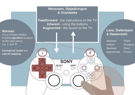
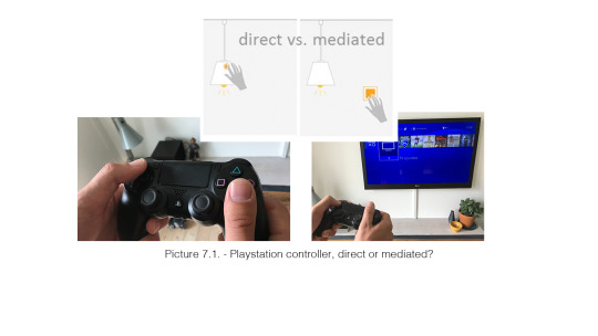
#10 – Presentation of the playstation controller (Show and Tell #1)
For our presentation we chose to present our playstation controller. We both think that his artefact has most theoretical terms that can be discussed. The three theoretical lenses we chose to point out in our presentation: Norman, Wensveen and Lenz. We chose these three because they cover three important areas: the artefact’s design and physical appearance with affordances and signifiers (Norman) that communicate with the users, the artefact in relation to the TV with feedback and feedforward (Wensveen), which help the users to understand how to use the artefact and the users’ experience with the artefact (Lenz).
Our slide:
Feedback from the class: We had a talk after our presentation about how the interaction with the controller is in close connection with the game you are playing on the screen. Both the interaction gestalt and the feedback differ according to the game.
Furthermore Sofie and I had a talk about the scope of our artefact, since another group had an apple mouse as the artefact and analysed it without a screen. This gave of cause some other outputs, since you do not have all the guidelines at a screen. If we had chosen to analysis the controller without the TV our discussions and analysis would probably had been completely different. But in the other way – maybe we could not have called it a digital artefact then?
0 notes
Text
#9 – Vallgårda’s trinity of forms
The last two theories have been about how to describe the relation between humans and artefacts. When you are designing interactive artefacts it is essential to know how the interaction can/will affect the users. However it is not the only element that needs to be in consideration. Anna Vallgårda (2013) suggests that we start thinking of interaction design as a practice of giving form to computational things. In her text “Giving form to computational things: developing a practice of interaction design” she introduces the notion trinity of forms, which advances the understanding of interaction design by; temporal form, physical form and the interaction gestalt.
As a former DMD student this is not the first time I am introduced to this framework.Therefor I do not want to go in details with it today, since I am pretty sure I will refer back to it in my design process to come. This blogpost will shortly describe the three terms physical form
The Physical Form The term physical form refers to anything we can perceive through the human sensory apparatus. The term covers both the three dimensional shape of the thing or environment, but it can also include intangible materialities such as light and sound.
Temporal Form Describes the change over time. The change can happen in a variety of ways, e.g. movement or change in light.
Interaction Gestalt The performance of movements a user does in relation to a thing or environment is covered by the term interaction gestalt. The performance can be both passive, such as listening, and active, such as touching. Vallgårda explains that the interaction gestalt covers both what the thing or environment makes us do and what we do to it.
Reference:
Vallgårda, A. (2014) Giving form to computational things: developing a practice of interaction design. Personal and Ubiquitous Computing 18.3: 577-592.
0 notes
Text
#8 - Lim: Interaction Gestalt and the Design of Aesthetic Interactions
In continuation of the Lenz’s theory about interaction attributes, we this week got introduced to Lim’s attributes that describe the immediate moment of interaction that occurs between the user and the artefact. I am calling it a continuation to Lenz’s theory, since I see some coherences in the problem field they both trying to simplify. The problem area, the two theories a working in, is basically the interaction phenomenon that emerges in-between people and digital artifacts. For todays exercises hours Sofie and I tried to get a better understanding of this area by using the graphic figure 2 from the paper (p. 246) for one of our products. The picture below illustrates how we tried to grasp this theory.
Since this area is really difficult to grasp and understand, Lim’s have made a list of attributes that can be used to describe the area. Like we also did with Lenz’s list, Sofie and I went through the list in the exactly same way by analysing our artefacts. I do not want to go through all of them, but I have decided to point out three attributes related to our artefacts.
Promximity – The controller
Described as: “The level of proximity of controlling information” – Precise to proximate
We agreed that this artefact’s interaction gestalt is really precise. This is good, since it is also something that is necessary for the users experience – imagine that you pressed the ‘down button’ and the player you where controlling ran to the left instead.
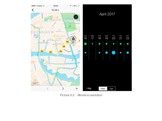
Resolution - Moves
Describe as: “The level of resolution of either users’ manipulation information or artifacts’ representing information” – scarce to dense
This was one of the attributes where we had given different score at the scale. This caused by we were looking at different frames/functions at the app. I was thinking about the map you track your whereabouts (scarce), where Sofie was looking at the dots from the weekly overview, which do not give you that many details (dense) – see the differences at the picture below, where the dots can be really difficult to ‘read’, where the map is clear.
Orderliness – The bike helmet
Described as: “The level of orderliness of either artifacts’ showing information, or users’ searching or manipulating information through an interactive artifact”
It was really difficult for us to analyse the bike helmet, but I want to point out our talk about the orderliness. Since the helmet is really easy to ‘read’ and you do not have to search for the information, we both chosen the helmet to be mostly orderly. However we had both analysed it based on the ‘closing’-function to be the only information to be understood. After talking it through we had our doubt if we could say that the ‘closing’-function was information and we search through the paper and found this quote:
“In terms of the term, information, we mean digital information. The characteristics of digital information such as flexibility, abundance, pervasiveness, and promptness enable various possibilities that are unique to interactive artifacts” (p. 247)
Therefore we question if the artefact has to be digital – maybe it would have been easier to use the terms then.
To sum up I feel if we had taken the time to discuss the attributes’ meaning before starting analysing them, it could have helped us to get a common understanding of them. In the text we get the attributes presented with a short explanation and two pictures, which I do not think give a sufficient description of them. The short descriptions make the attribute very likely to be mixed and misunderstood – as for example can it be difficult to understand the difference between movement and speed.
However - Maybe the short description is made to give the designers the opportunity to adopt the attributes in their own way.
Last I just want to stress that I do not only see these attributes as negative. However I think the attributes should be used to shape new designs and not analysing already existing design artefacts. I can see how they can be beneficial in a design process and I am looking forward to use them as a tool to explore different interactions and behaviours when we are starting to design our interactive lamp soon.
Reference:
Lim, Y. K., Stolterman, E., Jung, H., & Donaldson, J. (2007). Interaction gestalt and the design of aesthetic interactions. In Proceedings of DPPI2007 (pp. 239-254). ACM.
0 notes
Text
#7 – Lenz: Interaction vocabulary
– relationships between interaction attributes and experience
Reading the text “Exploring relationships between interaction attributes and experience” written by Eva Lenz, Sarah Diefenback and March Hassenzahl I got introduced to a new interaction vocabulary, which consists of a set of attributes that we can use to describe an user’s interaction with a design. This means that this week’s theoretical lense focuses not on functionality or material form (as the other theories I have described), but only at the users’ interaction with the design artefact.
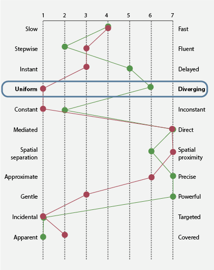
We (Sofie and I) used this theory by analysing our three artefacts in the same way as they have done in the paper figure 3 (p. 129), where the eleven dimensions (one dimension consists of two attributes, e.g. slow and fast) are being rated at a scale (the scale goes from 1-7) that goes between the two attributes. We started by filling out the scale alone, where we did not talk to each other. My experience with this was that it kind of felt like a checklist or questionnaire, where some of the dimensions were difficult to complete and I often made an impulsive decision. Maybe we should have made some different settings for this analysis – e.g. used another artefact to compare with. This could have helped clarified some of the attributes, like if it is a slow artefact. It can be difficult to say if an artefact is slow, but you can probably say if it is slower than another artefact.
After we had done it with each of the artefacts we compared our scales. These comparisons are the one I will use for my blog post today. I will go through the artefacts and describe some of the most interesting dimensions.
Moves
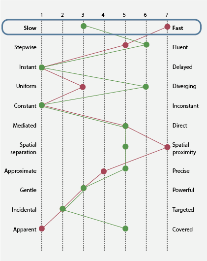
As we compared our two scales we realised that we had two different understanding of if Moves’ interaction can be categorised as slow or fast. I saw Moves as really fast, since it is constantly recording our whereabouts. However Sofie saw this as slow, since she was more looking at the interaction when you navigate around at the artifact's interface. These two understandings of the interaction developed into a discussion where we tried to get a common understanding of what we see as interaction – do we as users need to take an active part of the interaction or is the interaction also when we are passive users?
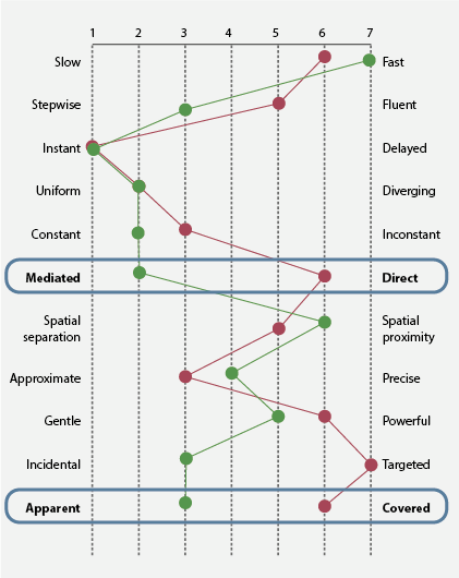
The bike helmet
This artefact was definitely influenced by our own perception and previously experience with the bike helmet – one of us is driving with it everyday and the other one does not. This affected our dimensions of the interaction attributes uniform and diverging. For the user who does not normally drive with a helmet, the helmet can be seen as an unnatural thing to interact with and take on (diverging). Where the user who always drives with the helmet can see the interaction as being in control, since they feel safe and secured in the traffic.
To continue the discussion about what is the interaction, it can in this case be discussed if the interaction is seen as using the clicking strings and the rotating stretchers or when you are wearing the helmet on your head. Analysing the interaction with the attributes uniform and diverging, Sofie and I had both analysed it in relation to the users wearing the helmet on the head.
The controller
When we compared our scales for the controller it was clearly again that we understood the interaction in two different ways. One of us saw the interaction only with the controller, where the other one saw it in relation to a screen (TV), where the screen is seen as a part of the artefact. This gave a different outcome for the mediated vs. direct scale. The images illustrate the different understanding of the interaction. I have taken images at the controller and compared them with images from figure 2 (p. 128).
Another element that affected our scales was again our own experience with the artefact. If you are used to use the artefact a lot you will probably see the artefact as apparent, since you are conscious of your own doing and you think it is very easy. However if it is the first time you are using the artefact it can be more difficult to understand the artefact and you need to really recognize the possibilities you have otherwise it can appears a little strange (covered).
To sum up this theory was good as a foundation to discuss the different artefacts and get an understanding of how we scope them – like what is the interaction? How much is included in a user’s interaction? However I think using the theory as an analysing tool (as we did with our three artefacts) is critical, since it is really a subjective experience you can have with an artefact. Still I can see why this is something that can be helpful in a design process, since it can create ideas and frame what a designer wish the users experience of an artefact should be. Therefor I am looking forward to go back to this theory when we are starting to design our lamp and use some of these attributes as ‘guidelines’ for the future lamp’s interactions possibilities.
Reference:
Lenz, E., Diefenbach, S., and Hassenzahl, M. (2013). Exploring relationships between interaction attributes and experience. Proceedings of DPPI2013. ACM.
0 notes