
An analysis of the South African Constitutional Court and surrounding areas as a linguistic landscape
Don't wanna be here? Send us removal request.
Statistics
We looked inside some of the posts by linguallaws-blog and here's what we found interesting.
Average Info
Notes Per Post
60
Likes Per Post
48
Reblog Per Post
5
Reply Per Post
7
Time Between Posts
2 days
Number of Posts By Type
Text
1
Photo
16
Last Seen Tumblr Blogs


Fun Fact
Forty percent of Tumblr users are between the ages of 18 to 25.
Text
Language and Legislature: An Overview of our Findings
The premises of Constitutional Court of South Africa can be seen to contain a wide variety of different signs, which serve various purposes. Throughout the analysis represented within this blog, it is evident that despite the establishment of the court on the basis of the Constitution, in which the equal use of all official languages and previously marginalised languages is enshrined, the de facto language policy within court signage can be seen to contain a majority use of the English language. Thus decreasing the extent to which this institution is able to truly redress the injustices caused by the language policy of Apartheid.
Despite the high levels of English within the official signage, the Constitutional Court cannot be characterised as disregarding the language policy of South Africa, as various instances of the use of official languages and other forms of communication such as braille, are evident throughout the signage presented and analysed within this blog.
The linguistic landscape of the Constitutional Court and surrounding areas can be seen to reflect the diverse nature of South African society. This is evident in the presence of many different languages within the various signs, including foreign and indigenous language, and the presence of various discourses within these signs, such as nationalist discourses in contrast to the transgressive discourses presented within the few instances of graffiti. The court can also be seen to depict the contemporary democratic nature of South Africa, as is apparent in the signs containing symbolism which perpetuate ideologies of equality and transparency.
The signage present within this premises can also be seen to reflect the nature of this area as highly regulated tourist destinations. This regulation is evident in the high levels of top-down signs, in conjunction with the smaller presence bottom-up signs which are restricted by regulations created by the court administrative body. The nature of this premises as a tourist destination is also highly evident in the use of foreign languages and English within official signage, however, the presence of signs in official South African languages can also be seen to illustrate the fact that this area is also frequented by South African civilians.
2 notes
·
View notes
Photo


The emblem of the Constitutional Court can be seen as a deeply culturally symbolic image, depicting the silhouettes of individuals under a large tree. This imagery can be seen as a reference to the traditionally African custom of “justice under a tree” during which disputes and legal matters were confronted and resolved through meetings held under a large and often socio-culturally important tree. The symbol of the tree can also be correlated to ideologies of strength and wisdom, thus allowing this emblem to serve the symbolic function of perpetuating ideologies in which the court is viewed as an insightful body which dutifully protects and upholds the legislature outlined within the Constitution. The use of this inherently African imagery within the emblem of this institution can also be characterised as signifying the commitment of this institution to its African roots, despite the presence of international cultural artefacts and languages within this space.
The use of silhouettes in order to depict the individuals within this emblem can also be regarded as a noteworthy decision, as the silhouettes cannot easily be attributed any characteristics such as race; gender or age, but rather can simply be grouped together through their humanoid qualities, thus invoking the discourse of all individuals being equal in front of the new democratic law and thereby perpetuating the ideology of the court being fair and just. This use of silhouette can also be seen to allow the few individuals depicted within the emblem to represent the South African nation as a whole, as the individuals possess no discernable identities, therefore reinforcing the ideologies of unity and nationalism and the discourse which states that the court is an arena in which the nation is able to actively participate in order to build a better democracy.
This sign can also be seen as consisting of individual gold plaques. These plaques can be characterised as an instance of duplication, as each sign contains the exact same statement:
“The first Constitutional Court of South Africa, established under the Constitution of the Republic of South Africa, 1993, was opened by President N.R. Mandela on 14. 02. 1995. The Constitution is the supreme law of the land. Let justice be administered in this Court without fear, favour or prejudice.”
in each of the eleven official languages. This use of all the official languages can also be seen as in accordance with the national language policy, which attempts to “promote the equitable use of the 11 official languages” (Department of Arts and Culture, 2002:10) in all state institutions. Each plaque can be seen as possessing the informational function of recording and conveying information regarding the establishment of the court, whereas the plaques as a whole can be seen to symbolically represent the multilingual and highly diverse nature of South African society. The concurrent use of these visual and linguistic elements in order to convey symbolic and factual information can thus allow the sign to be characterised as a multimodal sign.
The placement of each plaque within the sign as a whole can also be seen to possess symbolic meaning. This is evident as, despite the fact that the language policy of South Africa attempts to “ensure redress for the previously marginalised official indigenous languages” (Department of Arts and Culture, 2002:10) by promoting the use of these languages over the colonial languages of English and Afrikaans, the sign placed in the court can be seen to offer a position of higher prestige to three languages, namely Zulu; Afrikaans and English. This prestige is evident as both Zulu and Afrikaans are placed at the top of the lists of plaques on either side of the emblem and English is provided with the most prominent central position directly under the emblem. As mentioned in previous posts, the placement of the English translation may be attributed to the nature of the court as a tourist destination, however, the placement of these languages can still be seen to illustrate the higher de facto prestige attributed to languages such as English within the South African context, as the wall upon which this sign was mounted was long enough to allow each translation to be placed directly next to each other alongside the emblem.
This sign can be characterised as an ideal representation of a top-down sign which was commissioned and mounted by the administrative body of the Constitutional Court, as seen in the fact that it makes use of elements such as a standardised font and a border around each plaque to enhance the official nature of the sign. The top-down elements of this sign are also evident in the presence of the official court emblem and the professional design of this sign, as is apparent in the use of expensive materials such as high-quality woods and gold-plating.
#ll3009#culturalsymbolism#emblem#African#unity#duplication#multimodality#multilingualism#languagepolicy#defactolanguagepolicy#top-down
2 notes
·
View notes
Photo

The sign showcased above can be characterized as a top-down sign, as it was issued by the officials of the court. This sign can, therefore, be seen to symbolically represent the presence of an authority within the court which regulates the signage placed on the premises. The informational function of this sign is to indicate what the room below the sign is used for and to provide visitors with directions regarding the locations of various rooms within the court, as seen in the fact that this sign is mounted high on the wall to ensure heightened visibility.
This multimodal sign is twofold, on the left-hand side is a visual of what the sign is indicating. The picture is of people being seated in uniformed formation, this is a universally recognized symbol for a gathering area. The use of visuals within this sign can be attributed to attempts by the court authorities to ensure that those who are unable to understand the languages on the right-hand side are still able to gather information from the sign.
On the right-hand side, there is the name of the room which is the “auditorium” in two different languages, which can be seen as an example of duplication. The top language, “ Oditoriamo” is in a European language, more specifically Bulgarian, whereas the bottom name “iholo yabaphulaphuli” is in Xhosa. The choice of these languages, in particular Xhosa, can be seen as an attempt by court authorities to adhere to the national language policy of South Africa, which states indigenous languages should be used as official languages in order to foster national unity. The use of a European language can also be attributed to the nature of the court as a highly frequented tourist attraction, therefore the sign can also be seen to symbolically represent the court as a building of internationally high standards, which is open both to the South African population and foreign travelers.
The use of various languages throughout the court signage, as depicted within the above image, can thus be seen to illustrate the pluralistic nature of contemporary South African society.
6 notes
·
View notes
Photo

The window of transparency.
Found in the courtroom behind the Justices’ desks and wrapping around the whole chamber, lies a narrow strip of window beaming between the old court bricks.
The Constitutional Court is open to the public and allows for tours at all times and it is through this strip of windows, that the feet of the public are visible and if one wishes, they can kneel down to view the happenings in the courtroom. The reason that only the feet of passer-bys can be seen is to symbolize equality, as by looking at ones’ shoes neither class, race or economic status can be easily determined, this shows that all individuals are equal in the eyes of the law. This angle can also be seen to illustrate the ideology that the court serves at the feet of the people of South Africa.
The aim of this window is to emphasize the movement away from authoritarian ideologies and towards transparency and equality within the South African judicial system, as seen in the use of bricks from the old Apartheid jail around this window. The symbol of an unclouded window can be seen as indicative of the ideology of transparency. This ideology is further perpetuated by the fact that the public possess the right to view courtroom proceedings, through this window, and be included in the law making processes, unlike the judicial system of Apartheid which marginalized many individuals within the legislative process.
This stretch of windows serves the symbolic function of reminding individuals of the democratic principles which govern both in the court and the country as a whole and the atrocities of the past, which the court seeks to remedy.
4 notes
·
View notes
Photo

“I am prepared to die.”
The Rivonia trial in 1964, saw Nelson Mandela and many other political activists being arrested by the National Party government, in the Rivonia suburb of Johannesburg. The charges laid against these individuals were that of recruiting persons to undertake guerrilla warfare against South African, the aid of foreign military against the republic, and furthering acts of communism.
It was at the courtroom hearing that Nelson Mandela relayed a thought provoking speech which landed him into lifetime imprisonment.
The closing quote of the speech is as follows,” It is an ideal for which I hope to live for and to achieve. But if needs be it is an ideal for which I am prepared to die.”
The above signage can be found in the courtyard of the Constitutional Court and in a plain font relays this quote, as is evident through the use of inverted commas. The font is standardized so that emphasis is not taken away from the message, the implications and symbolism behind the quote are powerful enough to stand on their own. The quote is all encompassing of the fight which was fought in order to achieve South Africa’s democracy.
This is a top down sign, as it was commissioned by the officials of the court and functions to foster ideals of national unity and freedom. The perpetuation of these ideals is evident in the fact that both the quote and the author are widely known as iconic symbols associated with national pride and the fight against the Apartheid regime.
The large nature of the text can be seen to enhance the perceived salience of this sign, as it is visible from a large distance away, therefore connoting the importance of the message contained within the sign and the ideologies of freedom at all costs, which is associated with this quote. This importance can be seen as being further emphasized by the fact that the dark lettering of the sign stands in stark contrast to the light cement coloured wall and that this sign is the sole element on this wall, thereby increasing the likelihood that the sign will attract the attention of individuals passing by.
5 notes
·
View notes
Photo


The following images are a depiction of the number of days spent in jail by leaders who were imprisoned during the Apartheid era. The first granite slab, as well as the other slabs, have the number of days spent in jail by individuals such as Nelson Mandela and Ahmed Kathrada.
The slabs can be seen to include the use of tallies as a means to illustrate the number of days. This method of counting can be seen as salient as it is commonly associated with the way prisoners count their days spent in prison, therefore this connotation between the method of counting used in the sign and the use of this method by prisoners can be seen to make the message of the sign clearer and more easily interpreted. This indexing of the image of prisoners etching their days spent in prison, is further heightened by the use of a solid, flat material like the walls of a prison cell onto which prisoners would carve these tallies.
These granite slabs can be said to be restricted due to South African norms of interpretation, as specific socio-cultural meanings are attributed to the historic narrative of these slabs, which increases the value of the message contained within the sign. This is evident in the high levels of symbolism present within the signs, which relate to the symbolism used in the Constitutional Court building. The symbolic function of these signs can be seen as an attempt to fostering nationalism through the remembrance of a shared past and therefore a shared struggle for democracy, this symbolism will not be as easily identifiable for an individual who does not have knowledge of the history of Apartheid or the individuals named on each slab.
The informational function of these slabs can therefore be interpreted as illustrating the struggle of the comrades who fought for the democracy of South Africa, in an attempt to inform individuals, such as tourists, about the key individuals in the fight against the Apartheid regime and the consequences faced by these individuals.
Despite the allusion within this sign to bottom-up signs created by prisoners etching their prison sentence into the prison walls, this sign can be seen as inherently top-down. This is evident both within the textuality of the sign, which is printed onto expensive granite slabs which are thereafter professionally mounted to the wall, and in the fact that this collection of signs can be seen as being commissioned and placed by the court authorities.
5 notes
·
View notes
Photo


Sign Language
The following sign, found inside the main court building, illustrates the alphabet and numbers in American sign language. Multiple signs, such as these, can be found inside the Constitutional Court building, often near help desks or offices located inside the building. This location can be seen as particularly relevant as these signs exist in areas in which individuals are likely to be stopped, therefore allowing them time to read and process the sign, and in areas in which high levels of interpersonal communication takes place, therefore individuals are more likely to come into contact with a deaf individual in these areas and thus making the sign more relevant.
The standard A4 size of the sign can be seen as reducing the salience of this sign, as many other signs in the environment are larger and therefore attract more attention. Despite the smaller size of the sign, all signs associated with sign language can be seen as being framed by a silver; plastic border. The border can be seen to enhance both the visibility of the sign, therefore making it more accessible, and the perceived importance of the sign, as the border provides the sign with an official quality.
The sign is also a mobile sign which can be moved to various locations, should the courts’ layout change and office areas be moved. This mobility of the sign can thus be seen to illustrate the nature of the court building as ever changing and adapting to new administrative needs. This is evident in the offices inside the court which are vacant as they have moved to new areas inside the building.
The sign can be seen as an informative image, as it provides a basic insight into the communicative methods utilised by hearing impaired individuals and seeks to educate other individuals, so as to improve communication.
The symbolic function of this sign is evident in the fact that it attempts to recognise the importance of sign language as an official means of communication, thereby promoting ideals associated with the Constitution, such as equality and national unity.
The sign can be characterised as a top-down sign, as it is professionally printed and framed and can be seen as being placed in the court building by the official administrative body of the court.
6 notes
·
View notes
Photo


The doors of the Constitutional Court.
The door handle on the doors of the Constitutional Court is an extremely significant element of the overall sign incorporated into the Constitutional Court doors. This can be seen in the fact that the handle has a braille inscription, which states the 27 rights that form part of the Bill of Rights. This is salient as this is the sole use of braille throughout the court premises and can therefore be seen as an attempt to foster the inclusion of sight impaired individuals within the discourse of national unity held by the court, despite the fact that braille is not an official South African language. This attempt to perpetuate ideals of unity and inclusion is also evident in the fact that the depiction of the Bill of Rights is not only written in braille on the door handle, but craved into the wood on the doors themselves are the 27 rights in the 11 official languages, as well as in sign language, thus illustrating the use of duplication within this sign. The fact that the rights are carved directly into the door can be seen as an attempt to symbolise the fact that the core function of the court is to uphold these rights for all South African individuals, regardless of differences such as impairments; ethnicity and culture. This can also be seen to relate directly to the national language policy of South Africa, which outlines the usage of communication techniques utilised by previously marginalised groups, such as deaf and blind individuals, within national signage.
In an attempt to foster the ideology of transparency and universal accessibility, in conjunction with ideologies of equality and inclusion, the court doors remain constantly open and entrance to the court is free.
The large size of the doors, which allows the sign to be visible throughout the front courtyard, can be seen to increase the salience of this sign and can be seen to foster an ideology of the importance of the Bill of Rights within the court, as these rights are presented in a large form, at the entrance to this establishment.
In addition, the braille on the door handle can be linked to the theory of commonality of form, which refers to the fact that members of a particular genre of sign often share a common form, in conjunction with their common purpose. The individuals signs which collectively form the sign on the doors, can be seen to possess the informational function of alerting individuals to the rights which the Constitution upholds, whereas the symbolic function of these signs can be seen as illustrating the presence of a higher authority in the court which decides which languages are used in the signage present on this premises and as an attempt by the administrative body of the court to perpetuate a discourse of equality and inclusion. Despite corresponding to these functions, braille can be seen as forming a part of the genre of communication for blind individuals and is, therefore, a different way of communication. This difference is represented by the fact that this language is presented on brass, at eye-level which allows it to be accessible to the individuals who will read it rather than carved into the wood higher up on the door.
There are also two official plaques placed at eye-level on the doors. This placement can be seen as salient as individuals are able to more easily notice this smaller sign as they approach the doors.
Each plaque reads as follows, “This building was officially opened on 21 March 2004 by the President of the Republic of South Africa, Mr. T M Mbeki”
These plaques can be seen to function to provide the public with information regarding the date on which the Constitutional Court was established and symbolically illustrate the presence of a court administrative body which records the history of the court.
This statement initially occurs in English, which may be seen as representational of the fact that the court is a tourist attraction and the fact that English is a highly dominant language within South Africa. The English form of this sign is then followed by the other 10 official languages of South Africa namely; Xhosa, Zulu, Setswana, Sotho, Afrikaans, Venda, Ndebele, Xitsonga, Sepedi and lastly SiSwati. This can be seen as another instance of duplication within the signage of the court, as each translation states the exact same information. The ranking of the languages can also be seen as interesting as, despite the fact that a census conducted in 2011 showed Zulu to be the most spoken language in South Africa, followed by isiXhosa and Afrikaans, the language which initially follows the English translation is the isiXhosa translation. The reasoning for this ranking cannot be concretely identified without consulting the court designers and governing bodies, however, this may be interpellated as an attempt to further perpetuate the ideology of linguistic equality found within other aspects of this sign.
The fact that this sign was placed and created through official means can be seen to illustrate the top-down nature of this sign.
#lingual#linguistics#languagesofsouthafrica#ll3009#duplication#billofrights#symbolicunity#universalaccesibility#multiplesignsonecoherentmeaning#top-down#nationallanguagepolicy
7 notes
·
View notes
Photo


“A Luta Continua”
“The Struggle Continues”
A Luta Continua meaning “the struggle continues” in English is a historical rallying cry that was coined during the Frelimo Movement during the Mozambican war for independence. The phrase is in Portuguese and was used by Frelimo leader Samora Machel to gain popular support against the strong presence of the Portuguese colonizers.
In contemporary society, the phrase can be seen as being used in movements such as those associated with the LGBTAIQ community, on shirts and boards, and it is also widely used by Nigerian student activists during protests and riots.
This rallying cry has been depicted through the use of a neon light installation by Thomas Mulcaire in 2004. This use of bright red light, in conjunction with the height at which this sign is displayed and the use of a large 40 X 450cm size in the sign, can be seen to contribute to heightening the salience of this phrase.
This sign can be seen as an example of a top-down sign which forms part of the Constitutional Court. It is situated in the court foyer and is mounted on a wall built using the bricks of the former prison which existed during the Apartheid era. This placement of the sign is also relevant, as it illustrates the ideology held by the court that, despite the fact that the Apartheid system has been dismantled, the struggle for equality and freedom associated with that period continues within the walls of the court.
The wording “VIVA MK” meaning long live uMkhonto we Sizwe, which was the armed wing of the African National Congress resistance front, can be said to be a form of graffiti which has been on the wall for many years and has been done with spray paint. This can be characterised as graffiti, as this phrase was painted during Apartheid and can be seen as transgressive discourse which directly opposes the discourse associated with the prison, which was used to hold members of the resistance prior to their trials. Another feature that one can take from this sign is the geosemiotics that is evident. There have been many factors that contribute to the production and installation of the following signage. To elaborate on this if we look at the historical significance of the phrase “A Luta Continua” we see that it is a war cry and it has also played an important role in South Africa’s fight for freedom during apartheid. As geosemiotics is the study of how different places contribute to what is put into a sign as well as its placement and how it may be read by viewers which also determines its design, this sign thus symbolically functions to illustrate the historical background of the Constitutional Court and the struggle fought by the people of South Africa.
Another aspect that is worth discussion is the way in which language plays a role in history and how this history translates into practice within present eras. As stated above the phrase we see, is written in Portuguese, this illustrates how we adopt language as not only a form of communication but also as a way of bringing people together. This phrase was used as a motivational force in which protesters would stick together to achieve a common goal, thus symbolically representing the court as a means through which a unified South African population is able to achieve the ideals of freedom and equality. Another aspect of this which is important is that even though this sign is in a foreign language, considering that this is placed at a South African historical site where Portuguese is not widely used, it still appeals to the community and can be understood within this context.
For more information please see: https://en.wikipedia.org/wiki/A_luta_continua
3 notes
·
View notes
Photo

These cast iron sheets, found outside the court, can be seen to index the right to freedom of speech upheld by the court. This is evident as each sheet contains an uncensored quote from various individuals expressing their differences, thoughts, feelings and attitudes about the country, past, present and the Constitution. Yet, they all share the same theme as these are all likely to contain similar semantic elements such as freedom, dignity and equality.
The context of this sign is appropriate, as it relates to the nature of its environment, where citizens can freely express themselves due to the ideologies and policies outlined within the Constitution.
This particular sign reads, “Reach out to others and discover human potential bring magic, humor, joy, and happiness to other people. Live life positively, Viva freedom Viva.” Intertextuality, how meaning has evolved and assumes different connotations, is drawn from the word Viva. Viva meaning “long live” is of Portuguese origins, it has been used during times of struggle for independence and commonly used in South African during mass gatherings and protests. The term Viva is often repeated twice during chants. This can be seen to correlate with the symbolic function of these signs, which is to illustrate the ideology of freedom of speech within the court and to allude to a shared struggle, thereby enhancing ideologies of nationalism.
The type of signage is interesting when debating on the issue of top-down or bottom-up concepts. These ‘canvas sheets’ were placed there by government officials, yet the inscriptions were done by the citizens of the country.
2 notes
·
View notes
Photo


The Flame of Democracy was lit on the 15th anniversary of the Constitution. The eternal flame, found opposite the court entrance, is a permanent fixture in one of the four remaining stairways of the prison block. The Flame was originally lit in Qunu, in the Eastern Cape by Nelson Mandela on the 10 December 2011 and transported to Johannesburg in a special container.
The light symbolises inner strength, it signifies the commitment of the country to democracy, human rights and the Constitution. The placement of the flaming bowl is not at random, it tells us about the activities that occurred in that place. The bowl is partially enclosed, symbolising the incarcerated manner the people lived under during the Apartheid era.
The eternal flame could be understood as a non-verbal sign, yet not everyone would understand its symbolism without knowing the history of South Africa. The writing on the board “Flame of Democracy” only occurs in English. It could be argued that English is the language of choice to accommodate tourists, the majority of which would not know much about South African history and therefore struggle to interpret the symbolic meaning of this sign. This could also be argued to be due to the heightened importance of the English language within Southern Africa, as it is a common language which allows for communication.
2 notes
·
View notes
Photo

Found outside the Constitutional Court window. This sign can be characterised as a top-down sign as it is officially commissioned by the court, however, this sign can be seen to possess bottom-up elements, as seen in the graffiti-like style of art utilised within this sign.
Entitled ‘Life’, this sign symbolises the expression of power in numbers, as is evident in the depiction of a large group of people who can be interpreted as engaging in a protest march, as seen in the fact that the individuals are holding banners which contain phrases relating to protest action such as “demonstrate” and “picket”.
This image can be seen as symbolising the power of unity as a nation in protesting to ensure the creation of a just and equal Bill of Rights, which is the cornerstone of democracy in South Africa. According to section seventeen: Assembly, demonstration, picket and petition of this bill, everyone is allowed to assemble in groups and protest in a peaceful and unarmed manner. Thus this sign can be seen to attempt to contribute to fostering ideologies of equality and nationalism which are held by the court.
The image can be seen to further praise the use of protests in bringing about the South African democracy and the establishment of the Bill of Rights, through the imagery contained at the top of the sign, which illustrates cherub angels blowing horns. This can be seen to invoke a biblical discourse, in which the change is celebrated and heralded as good.
2 notes
·
View notes
Photo


The entrance of the Constitutional Court displays this large concrete slab, border by colourful mosaics. The lettering ‘Constitutional court’ appears duplicated in all eleven official languages of South Africa. The colours used in the text could be reflecting the diversity of our nation. The style of the font used moves away from the traditional Roman lettering that is used on official building sites. The font used is made up of a combination of signs, letters and symbols found inside and outside the court. Signs and symbols included former Justice Yacoob’s handwriting (Braille), the graffiti on the prison walls and hand painted signs by street traders outside the court. It could be said that the font serves as a genre of what the constitutional court encompasses.
A top-down signage produced by the government. The multilingualism is evident of how complex our social relations are. Our constitution is written in English yet it appears seventh on the sign. Although English and IsiZulu would reveal a different ideological stance on the linguistic landscapes in Gauteng, IsiZulu and isiXhosa makes up the majority of speakers in South Africa as a whole. Linguistic power difference is present by the priority languages placed at the top. The eleven official languages set a specific policy on language choice. Languages missing from this sign would account for the minority speakers. Khoi, Nama,San languages as well as sign language. Minority communities in South Africa speaking German, Greek, Portuguese, Hindi, Arabic, Hebrew and Sanskrit.
3 notes
·
View notes
Photo

The architecture of the court is filled with symbolic signs which attempt to foster the ideologies which are outlined within the constitution and attempt to enforce democracy. These values are evident in the engravings found on the front wall of the court building, which are able to be translated into the word equality; freedom and dignity. These engravings can be seen as being done in a bottom-up style as they reflect the handwriting of the original judges which presided over the court and are reminiscent of graffiti tagging, however, their placement by the court authorities in conjunction with the fact that they do not directly challenge the discourse of the court, but rather reinforce it, allows this sign to be characterised as inherently top-down in nature.
The symbolism within this sign is evident as the writing of these value into the concrete of the building can be characterised as an attempt to illustrate the fact that these values form the foundation of the courts’ discourse and the use of various official languages can be postulated as an attempt to foster a sense of identification with these values across various ethnic groups. This sign can thus be seen to serve the informational purpose of informing individuals of the core values of the court whilst serving the symbolic function of nation building through association with different values.
The use of only a select amount of South Africa’s official languages within this sign can be attributed to the fact that each judge wrote in the language with which they were most familiar, thus correlating to the first and third of Spolsky’s relevant conditions for public signage. The presence of the same values in these various languages can thus be seen as an instance of duplication within this sign. Despite the use of different fonts and styles, all the translations maintain a somewhat equal size which, in conjunction with the large salient nature of the sign, can be seen to greatly reinforce the ideology of equality held by the court.
#ll3009#handwriting#originaljudges#dignity#equality#freedom#officiallanguages#bottom-upstyle#top-downsign#multilingualsign#nationbuilding#writeinalanguageyouknow#duplication#salient
2 notes
·
View notes
Photo

Located between the Old Fort and the Constitutional Court building is a small restaurant, named “The Hill.” This name can be seen to arise as the restaurant is located on a region of the premises known as Constitution Hill. This restaurant makes use of a further play on words through the slogan “free to stay” which alludes to the rights enshrined within the Constitution which are designed to enhance the freedom of individuals, such as the right to freedom of movement, and creates a stark juxtaposition between the new political environment in South Africa, in which individuals possess inalienable democratic rights, and the previous political landscape of Apartheid, in which individuals rights were violated when they were unfairly jailed on the same premises on which the restaurant currently exists. The existence of chairs and tables covered by an awning can also be characterised as a sign that the area beyond the sign is a restaurant.
Due to the professionally produced materiality of the sign, this sign can be characterized as a top-down sign, however, the sign is created by a small business which operates within the framework of a larger governmental authoritative body, which owns the premises. This sign can, therefore, be seen as a bottom-up sign with top-down characteristics, which possesses the informational function of illustrating where the entrance to the restaurant is and the name of the establishment. This sign can also be seen as possessing a symbolic function, as the sign and restaurant facilities in their entirety are not permanent constructions and are easily dismantled as the historical nature of the site prevents the building of permanent structures, thus the symbolic function of this sign is to illustrate the existence of an authoritative body which controls the landscape within the premises of the court, despite the existence of privately owned establishments within this area.
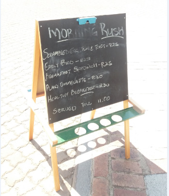
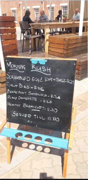
The two other images can be seen to illustrate a moveable sign placed outside the restaurant, which is clearly a bottom-up sign as it is created using chalk and a wooden chalkboard. Movable signs can be characterised as signs which are able to be transported to different areas in order to better fulfill their current or new roles. This sign can be seen to possess the informational function of informing individuals about the breakfast specials offered by the establishment, named the “morning rush” and the time at which this special ends every day, thus this sign is changed daily to reflect the specials on offer. The wording on this sign is reproduced solely in English on both sides of the board, which may be owing to an attempt by the restaurant to appeal to the tourists visiting the court and to the fact that the owners are English speaking individuals, thus they created the sign in a language in which they are proficient.
The movable nature of the chalkboard can also be seen as possessing the symbolic function of adhering to rules set by the authority which regulates the court premises and can be seen as an attempt by the owners to appeal to a broader audience, as the restaurant is not easily visible, thus the movable board is able to be placed in a region with high foot traffic allowing further individuals to become aware of the presence of the restaurant, thereby increasing the restaurants’ patronage.
This sign can be seen to occur in a site of necessity, as it is found along a minor road which runs between the court and the fort. The products offered by these signs are also available within close proximity to the area in which the sign is found and the signs can be seen to attempt to attract the attention of passer-bys.
2 notes
·
View notes
Photo


The interior of the Constitutional Court building can be seen to possess many informational signs which are intended to regulate the behaviour of individuals who visit this premises. Examples of these signs are evident in the images above which illustrate the restrictions present within the court on firearms; smoking; cell phone usage and food consumption. These signs can be characterised as informational as they provide the public with insight into the regulations which they are expected to adhere to whilst inside this building.
These signs can be seen to possess the symbolic function of illustrating the presence of an unseen authority which determines the rules of behaviour within the court building, a lack of adherence to which may result in fines or being escorted off the premises and in associating particular behaviours with particular areas of the court, as the no cell phones sign was found only outside the entrance to the courtroom in which cases are heard.
These signs can be seen to make use of easily recognisable images, such as a lit cigarette and cell phone, in conjunction with the use of the universally recognisable prohibition symbol placed over these images, in order to communicate that these actions are prohibited within this context. This form of communication can be seen as extremely inclusive, as it does not require proficiency within a particular language in order to comprehend the message, but rather requires readers to recognise specific symbols.
The placement of the signs is also designed to ensure communication to the maximum amount of people possible, as seen in the fact that the signs are placed at eye-level at each entrance within the court building. This in conjunction with the relatively large size of the signs and the use of the colour red, which is often associated with danger or restrictions, within the circles can be seen to ensure that the signs have a high visibility within the court and thus are able to achieve their regulatory aims.
#ll3009#regulatorysigns#nosmoking#nofood#nocellphones#nofirearms#universalsymbols#higherauthority#visualcues#highvisibility
4 notes
·
View notes
Photo

These multiple individual signs, which were found in the Old Fort section of the Constitutional Court premises, can be analysed as one coherent sign as they all share the function of providing information to individuals visiting the premises regarding the locations of the various facilities available for use.
The signs also make use of multimodality as they utilise both linguistic features, such as the names of the facilities as seen in the label “toilets”, and visual features, such as arrows which illustrate the direction of the facilities and images such as the universally used image depicting male and female stick figures separated by a line to indicate the toilets. The use of arrows can also be seen as emphasising the symbolic regulatory function of the signs, as the arrows are used to regulate the movement of individuals around the court premises according to which area individuals wish to visit, thus suggesting the presence of an authority which controls the division of space within the premises and the ability of individuals to access specific areas within this premises.
The monolingual aspect of these signs is also interesting, as seen in the use of only the English language on the signs. This can be seen as motivated due to the fact that the Court is a frequently visited tourist site and, due to globalisation, English is assumed to be the most commonly spoken language and thus is utilised within these signs. The possibility of individuals not being proficient in English and thus not comprehending the sign is minimalised through the use of arrows and universal or easily recognisable symbols next to each word.
The signs are also placed at a high angle on a pole found directly in front of the entrance to the fort. This can be seen as an attempt to increase the visibility of these signs, so as to ensure individuals can easily identify the presence of the sign and gain the information they require.
Despite the problematic nature of the top-down and bottom-up distinction between signs, as many signs do not easily fit into a single category, these signs can be seen as fitting neatly within the top-down category as not only have they been professionally made and mounted but so too were they commissioned by an authoritative institution, namely the Constitutional Court of South Africa.
#LL3009#informationalsign#multimodality#signsthatregulatebehaviour#symbolicmeaning#monolingualism#top-down#oldfort#highvisibility
3 notes
·
View notes