
Don't wanna be here? Send us removal request.
Statistics
We looked inside some of the posts by linzhibrief1 and here's what we found interesting.
Average Info
Notes Per Post
0
Likes Per Post
0
Reblog Per Post
0
Reply Per Post
0
Time Between Posts
7 minutes
Number of Posts By Type
Text
2
Photo
12
Video
3
Last Seen Tumblr Blogs


Fun Fact
If you dial 1-866-584-6757, you can leave an audio post for your followers.
Text
END
In my brief 1 and 2, and design research posters, I used illustrations. In the beginning, I didn't know much about illustrations and even said that I didn't know how to make illustrations at all. But now I know and I can. I can clearly see that my illustration skill has improved very quickly, and I am very proud of myself. Festival/Event assessment is the last time I finished, so the level of illustration will be better than visual essay and design research poster.
0 notes


Text
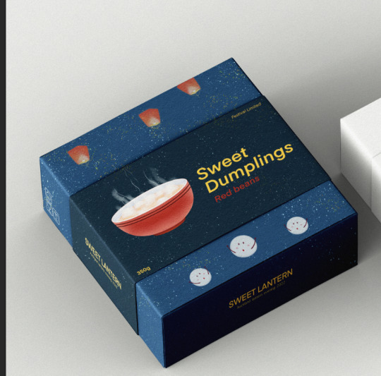
Final Packaging

Here is two packaging with difference flavor.
In this change, I put the logo into the package perfectly. There is a small detail in my packaging, the color of the bowl is the same as the color of the flavor.
for example, Red Beans is red, so the bowl is red. And the cherry filings is pink, so the bowl is pink. if the flavor is green apple, than the bowl will be green. And in my event, we have 13 flavor.
0 notes
Photo
This is my improved logo. I disassembled the logo and the Kongming lantern flew into the sky, while the sweet dumpling party looked at the lantern in the sky below. The picture was beautiful and the layout was comfortable.
But there are still advantages and disadvantages. The purpose of my packaging is to include illustrations and fonts in the middle. This picture made me lose the main information and secondary information of the packaging layout, very easy.
0 notes
Photo

This is my original packaging design. On the wallpaper, I used my poster background stars merging with the night, which is very beautiful. But I think there is a disadvantage, that is, there is no place to put the logo, if the logo is put in the picture will destroy the packaging.
0 notes
Photo


This is a reference image of my logo. The elephant is holding a balloon, which is very cute. So I have an idea, glutinous rice balls are catching flowing lanterns. In the same way, whether it is lanterns or fireworks in our activities, they all have to fly to the sky in the end. This logo looks like when we participated in the event, like the sweet dumpling on the logo, trying to catch flowing lantern lanterns and fireworks flying into the sky.
Image 1-2 is exemplar
Image 3 is my logo.
0 notes
Photo


In the first picture, I used handwritten font for the first cover of the brochure. If I used computer font instead of hand-drawn font for the third page, the whole picture would be incongruous. So I also used handwriting in The Timetable.
However, in the three pages of the promotional photo, I have not used any handwriting, so the computer comes with "Gemunu Libre Light" when I use it.
In the illustrations, I set aside enough space for adding information, and the rest are illustrations of activities. All the information sequence is the name of the activity, and then highlight the start time and end time, which is helpful for reading. Introduce the history of the event, and then indicate the focus of the event. Arrange the importance of information reasonably.
My process is to first consider the location of the information, then use the iPad to draw, and then use InDesign to complete the font layout.
0 notes
Photo


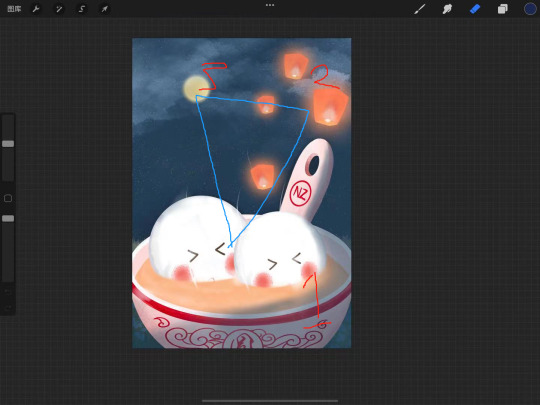
This is my illustration for poster, The first picture only has sweet dumplings, lanterns. The elements used are too few. So I added stars, and the moon I painted. The subject is sweet dumplings, then the lantern and the moon, and the stars have completely blended into the background.
poster Used the triangle composition, the picture looks very comfortable, but if I add fonts and information content, the picture will become very uncomfortable. So I can only make changes. This picture can be used as a mobile wallpaper or a no-word poster.
0 notes
Photo


This is some of the illustration I draw for poster, brochure, signage.
all of them each used close to 2 hours
0 notes
Video
tumblr
This is the logo I originally wanted to make. When I was half finished, I found that it was too complicated to be used as my logo, so I changed it into signage illustration.
This is a signage that combines the lantern with sweet dumplings, turning the lantern into a Bowl.
used 2 hours
0 notes
Video
tumblr
This is my final layout.
Title: Lantern Evening
Message: 13 kinds of sweets dumpling for free and it’s unlimited.
When: 27/03-31/03 (5:00pm - 12:00pm
Address: Auckland City Albert Park
Time of design used for payout: 3 hours 30 mins
0 notes
Video
tumblr
In terms of font, I chose to use handwriting. I found that handwriting is more suitable for illustration. This is a later video
0 notes