Don't wanna be here? Send us removal request.
Statistics
We looked inside some of the posts by lioots-grad502 and here's what we found interesting.
Average Info
Notes Per Post
0
Likes Per Post
0
Reblog Per Post
0
Reply Per Post
0
Time Between Posts
2 days
Number of Posts By Type
Text
14
Photo
3
Last Seen Tumblr Blogs


Fun Fact
Tumblr Inc. has $15.1M in annual revenue.


Text
Poster developments

By enlarging the portraits, the features become a lot more prominent. One thing I have to resolve is the logo in the bottom right corner as I am using the same yellow colour. I could either change the logo colour to b&w, place a white square behind it or just play with the opacity.
I definitely think that the tagline ‘Let’s Love Ourselves’ is a more quick read and effective when it comes to a poster.

The yellow background has changed the mood of the poster which is more positive and happy. This correlates to my tag line as I am promoting positivity.

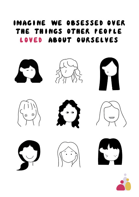
Shrinking down the number of faces and enlarging the four has removed a bit of clutter. The play with font size is also easier to digest when quickly reading as the viewer might only have to read the two words ‘obsess’ and ‘love’ to receive my message.
0 notes
Text
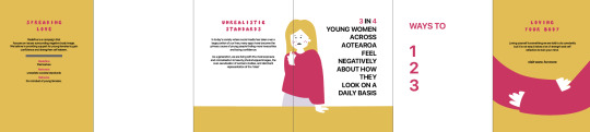
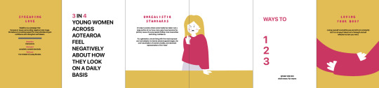
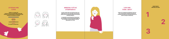
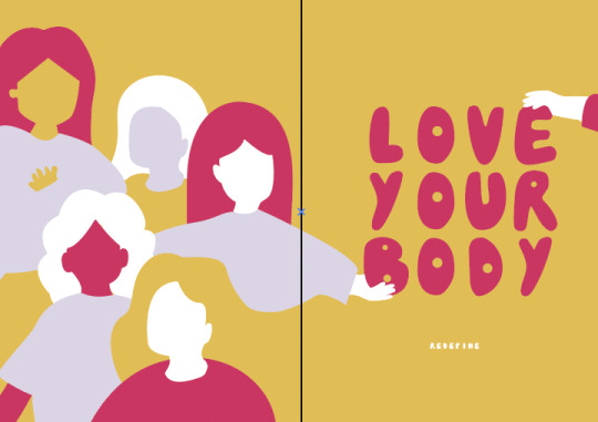
Zine Cover Page

During class, I played around with the front and back cover of my zine.
0 notes

Text
Interim Report Reflection

In class today, we pinned up 4x A3 pieces of work that displayed updated posters, a design system and zine drafts that we had been producing.
This was a helpful session as I not only received more feedback from Raul but my friends and other peers.
Some feedback I received
- play around with the background colour - any websites, links or supporters? - the ‘features’ on the face can be hard to see from far away - try to minimise the number of faces (is there a reason why there are so many?) - cut down the quote - experiment with the scale of words in the quote - black is a bolder colour, try to make the features black and maybe the portraits pink.

The features become more prominent but the line along the top is still hard to read as it is long and the overall text is small. The black background is quite bold and dark, try a different background colour.
- round the straight cut hair!
0 notes