
Don't wanna be here? Send us removal request.
Statistics
We looked inside some of the posts by liveprojectyoko-blog and here's what we found interesting.
Average Info
Notes Per Post
0
Likes Per Post
0
Reblog Per Post
0
Reply Per Post
0
Time Between Posts
1 day
Number of Posts By Type
Photo
17
Last Seen Tumblr Blogs


Fun Fact
Tumblr has a 66 index score for customer satisfaction in the US.
Photo

Tuesday 15th May
With the proofs scheduled to arrive today, I went into university so that I could see the results. I was both nervous and excited to see the proof as it would indicate further how the end product is set to look. I sat down with Ty and looked through the pages, I was so pleased with the results. Xadon had only highlighted one noticeable error, which was changing it from xadon.com to .co.uk. Ty had praised the fact that other than that very little errors had been flagged up which for my first time for a professional job seemed like a big achievement. I felt very relieved that there was now not much else to do and that it had been praised by a number of staff members for how successful NIL has been this year. I was told that a lot of the staff members would now sit down and read through the whole thing and point out any errors that could be quickly adjusted to return back to Xadon. Penny was the person who proof read the Coast interview, and she had flagged up a few points regarding areas of the interview she felt Coast would not have said, however when I sat down and went back over the interview all areas were accurate with just some small spelling mistakes or sentence structures that needed adjusting. Below are some photographs of the proofs to indicate what you get to see before the final batch are printed. All the photographs had printed to a really high standard and the magazine felt coherent and considered.


With the unit coming to an end I felt it would be beneficial to do a reflective and evaluative piece on the project. My 2000-word report did touch upon a conclusion, but I felt my blog could give a more rounded opinion towards the outcome and successes of the project. This project has been one of the toughest units I have faced since coming to university. A combination of adjusting to work within a team, to please a client and create a really high level of professional work has had its difficulties. Overcoming these challenges and learning to adjust to working in this environment has definitely boosted my skills that could now be further aligned to a position within industry.
The creation of issue 4 of NIL magazine was the most rewarding aspect of the unit. From the initial decisions around role allocations, I knew I wanted to work on NIL. Not only did it help develop pre-existing skill sets but it also helped to reveal new skills that were previously un-developed. The standard and level of professionalism required really pushed me to achieve highly and hopefully to produce a magazine the university can be proud of. A real sense of achievement comes from knowing that NIL represents not only the students who make up the majority of the content but also the university and course as a whole. Knowing that the work produced will have my name on it will really allow me to use it for my own portfolio and self-promotion of the skill set demonstrated. This year I took real precaution to ensure that this issue of NIL was better than its predaceous. I found that SWOT analysis and competitive positioning played the biggest role in achieving this. Comparing NIL to its past issues allowed to flush out any errors and improve upon previous strengths to create an issue that was conceptually fresh and stronger. Focused efforts upon the Image and communication students work took a high priority. The time taken to create a stylized flat lay shoot produced an aesthetically cohesive result. This area of content had previously felt neglected and as an Image and communication student I really felt more needed to be done to showcase the work effectively just how the graduate collections are. I hope this is a technique that is used in years to come as it received a lot of praise and works so well. An area I wish I had developed further, was the ticket design. Although I did put a lot of effort into the design and development of the tickets not having them chosen was deflating but perhaps shows an area of weakness, and where I could focus myself to improve. I found that the constant feedback and criticism faced at all areas of the project was demoralising, yet realistic for working within the industry. Learning to not be precious about efforts involved and listening to what the client requested was key in order to succeed and please.
I was pleased to have developed my writing skills further, by creating the content for both written article pieces within NIL. It allowed me to focus on writing in quite a different style to how I had previously written in other units and develop my interviewing skills further. I will be able to show this work to future employees or alongside my portfolio to demonstrate my varied ability to write. Since coming to university it is an area I have become to enjoy more and more and hope that these now developed set of skills will be useful come final year.
An area I wish I had developed further, was the ticket design. Although I did put a lot of effort into the design and development of the tickets not having them chosen was deflating but perhaps shows an area of weakness, and where I could focus myself to improve. I found that the constant feedback and criticism faced at all areas of the project was demoralising, yet realistic for working within the industry. Learning to not be precious about efforts involved and listening to what the client requested was key in order to succeed and please.
I would say the most challenging aspect of the project was learning to work efficiently within a team. A lot of the work we produce at university is largely independent with support and guidance purely from members of staff. Learning to accommodate for all was difficult as there is such a vast collection of opinions, ideas and skills. I found that the lack of contribution from some members made the process quite difficult, especially in terms of allocation and completion of roles. For members who didn’t turn up frequently it was very challenging to repeatedly catch them up whilst setting them appropriate work that you were reliant upon to get completed, which often in times was not finished. The speed I personally work at is at quite a fast pace, whilst also turning out a high quantity of work. As the deadlines began creeping up the pace of work required tripling, the members who contributed very little were therefore difficult to include. I know that the effort and time I allocated to the project were enough to meet these deadlines and please the client efficiently therefore I did expect that all would have helped to contribute as much as others, otherwise it seems unfair. I would hope that in industry this wouldn’t be tolerated, but I understand that part of the challenge is working with difficulties and making light of a bad situation. I would say that within the NIL group towards the end we accomplished a great deal, and this could have only been done through strong team work. I am pleased I had this experience as I know it offers good insight for a future within the fashion industry.
The difficulties faced within this project did not out way the positives and overall it has helped to develop my skill set to a much greater, more professional level. I am pleased to have been able to help and represent the university with their fourth edition of NIL, whilst also producing work I will easily be able to include within my personal portfolio and CV.
0 notes
Photo

Friday 11th May
Today was the final day of alterations to be made before NIL went to print. There was very little remaining to alter but just a few final checks and adjustments to content. This mostly involved chasing the final lot of third years who had not yet provided us with an email address to hang below the content they created within NIL, we felt it was important to get as many of these included as it is a good way for members of industry to directly contact any students. We got the photographs from the photographers late last night but came to realise the files were corrupt anyway so had to use Sara’s regardless. Luckily, Sara’s images worked very well and merged into the magazine fluently. The synopsis got one final proof reading by a senior design lecturer and all changes were imputed into the magazine. And finally, we were ready for print. It actually feels strange with the magazine now being completed after weeks of planning, development and creation. I am very pleased we met the deadline efficiently and hope the results reflect the hard work. We expect to receive the proof around Monday/ Tuesday and this will give a good indication of the end result.

0 notes
Photo

Thursday 10th May
With today being the last remaining day for fixing content within NIL it was so crucial to get all remaining features completed by the end of the day.
The main focus of the day was to begin inserting the completed photographs for NIL, that had now all been edited. It was quite a big test to determine whether these new edits would work better than the previously quite dark edits that were previously produced. When inserted the images definitely looked clearer and brighter, but the test would come when actually printing them out as they naturally darken when printed. Thankfully, the images came out really well and had improved dramatically. After referring back to the client, he was also very pleased with the progress made with the images and signed them off to now be used.
An area also discussed with the client was the consideration of evening out the double page synopsis to the students just with double pages of content, to ensure this looked deliberate and not a mistake. There is now a more even range of students with just double pages of work and ones with the inclusion of a synopsis (the client decided upon which students were deserving of a synopsis).
With most areas now running smoothly and well on the way to completion, there was one burning issue involved with some photographs missing. We had been in contact with the photographers who had missed out some shots of the childrenswear collection for Sarah Fielding. They had repeatedly ignored our efforts through email and social media. We decided as it was the final day to collect content to get a tutor to ring them hoping to shock them into action. They agreed to send the photographs that morning, but after waiting a few hours we tried to ring again with no luck. The decision then to use Sarah’s other shoot instead was made in order to at least having something of hers within the magazine. Throughout, the photographers have been very difficult to work with and as a result really impacted the completion time for NIL. Sarah soon replied agreeing for us to use her photographs and that she would send them later that evening.
All little details and features were also resolved. Such as the decision to increase the thickness of student’s personal details below their work as it was difficult to read when printed out. Double and triple checks of any written content features were addressed. We also included a photograph for the Coast interview which came from some beautiful illustrations created by one of the level 5 students working on the live project.

After a final test print, only really small efforts were now required to alter the final design of NIL. We decided after a long day to leave these until tomorrow (the day of print) hoping they would all be completed in time. It is very relieving that NIL is so all most complete with the print deadline around the corner.
0 notes
Photo

Wednesday 9th March
There was a lot to be done today, mostly around the reshooting of two garments and re-editing all the photos. Before the day begun I was quite apprehensive to the amount of work required to be completed in such a short amount of time. With the deadline for print fast approaching it was so important to get the majority of content completed by the end of the day.
The two re-shoots required re-doing due to the lack of styling/ accessories that were given upon that first shoot. Now, with all features had been arranged with the client and the students we knew exactly what was required to be shot. We began with Bronwyn’s pieces. It was initially quite difficult to find a good location around the campus to shoot the quite busy outfit. After shooting partially around the university, and not feeling particularly pleased with the results we decided to go into the fine art studios which are good for natural light and white backdrops. The photos actually look really strong. We used a male model from first year and he worked very well, and we got a really strong range of shots. The natural light should make the editing process a lot better than the artificial/blue tones that had appeared in the other shots that made it difficult to edit. We then quickly got the model changed as his time restrictions were quite tight and had to then shoot a further two outfits from one girls collection. Becky Wilsons collection incorporated a veil style accessorie that had not been given to us in the previous shoots. Again, the reshoot here went very well and we got a good range of new images to now work with. I am very pleased we reshot these collections and think it will benefit the entirety of NIL and in particular those students work.
After collating all the images together, Alex and I began to sort through and decide upon the final 10 or so to show to Iain unedited. Iain really liked them and told us to go ahead with the editing process. The aim with the editing today was to make the images a lot brighter and more vibrant, more in keeping with previous NIL issues. It took a long time, but we managed to get through all the images, they look so much better than they previously did. I am glad we took the feedback on board and quickly resolved the issues into something a lot better. We then showed the client (Iain) and Karen who both loved the reshoots and re-edits, we were praised for our quick turn around with the images which lifted our spirits. Below are the now finished and edited images.


Tomorrow, is the last day we have before we send the file to print, so it will be a case of proof reading, double and triple checking everything before it goes. There are still some minor tweaks that are required so we will tackle this tomorrow. I am so pleased with the progress made today, and that we seem on track to finish by Friday- hopefully.
0 notes
Photo

Tuesday 8th May
As we drew closer to the print deadline with NIL it was very important to be able to show the client the workings today, in order to receive feedback and make adjustments in time.
Initially we presented a test print that collated the most recent version of the NIL magazine to show to Karen and other members of the class. The magazine was well received with features especially such as the communication flat lays and synopsis featured. When looking through the physical version of the magazine, it helped to raise awareness towards small mistakes like page number placement, personal details of each student’s placements etc. All these errors were noted and will be adjusted as soon as possible.
The check list created earlier was examined and worked on throughout the day. A particular area of focus was gathering all the email addresses of students to insert into NIL. It is very important this is done as this will be the way many people from industry can access that student and communicate with them, so getting this completed was vital. After chasing around after some third years we have collected nearly all the student’s personal details. We also after requesting it for weeks received the work from the final communication student that could then be inserted into the magazine, which looked very strong against the other flat lay imagery on the page.
After running through the check list, we decided to sit down with lecturer Ty to receive feedback on NIL. Ty mainly focused on graphic design features within NIL, so particularly words and alignment etc. He helped us to develop the pages that had a significant amount of wording on them such as the article pages and helped to create a paragraph style that could be used throughout NIL. It was really helpful to perfect certain areas that looked messy or unfinished, a lot of detail went into certain positioning or options for the text to get the best result.
After receiving feedback from both lecturers, we decided it would be good to go and show Iain (the client) the print out and get his opinions on any adjustments required. Iain had quite a lot to say about the magazine, particularly involving the photographs taken for the graduate collections. Issues with the photographs selected, styling (lack of using accessories and editing all cropped up. He requested we went back through each photograph and looked through all the raw photographs to decide upon the final shot (which we should have addressed before with his assistance but under the difficult time restraints this was hard t.o do). After going through all 1000 or so photographs again some changes were made, whilst some remained untouched. I think it has been felt that the photographers used have not produced the strongest imagery for us to work with, and this has restricted the look of pages quite dramatically. Certain positioning and layout options were discussed for change. The editing he felt was too dark in some images and seemed to be an area critiqued a lot. For me I tried the best I could with the skills I have, I was reluctant to edit all the photos as this is not an area I am 100% familiar with. I think all that can be said is that the images when printed out on the bad quality printers looked quite different to what they should look when printed professionally. The immediate solution to address this is to get a A2 print out of all the dark images done at Uniprint to get a better idea of what it will actually look like and show this to Iain. Some photographs/ collections were felt by the client to have been misrepresented through lack of styling with accessories of features of the outfit missing. This wasn’t as such our fault as we worked with what we were given, and if students only left certain garments for us then this is what was used. Iain now wants to reshoot some of the garments featuring all styling elements tomorrow. This has been quite a sudden and drastic change in events that has led to quite a quick turn around to have to book a model, find a location and photographer. We will try our hardest to get this shot tomorrow, but there is no promise this will be done.
I feel quite deflated as it felt we were working at a good pace and now we seem to have hit a wall. I want to progress as quickly as possible to meet the deadline, but it seems as if a consideration to push the printing deadline back may be the only option. Tomorrow, we hope to reedit the photos and perhaps do a shoot to include stronger images of students work and please the client.
0 notes
Photo

Monday 7th May
With the deadline for print looming, the completion of NIL was of high priority. I spent the day tweaking areas of the magazine, whilst completing all areas of content. Areas that were completed included the contents page, adding students personal details below their image, accurate email addresses being inserted into the 2018 students page.
The reason I was so determined to get the magazine ‘completed’ by the end of the day was so that tomorrow I could test print this version, and potentially show the client and other tutors to receive feedback. The magazine does need proof reading also so having it in a physical copy will make it easier to do so.
Whilst going through the magazine I had raised a few areas of focus that should be drawn to attention to the tutors tomorrow. These include:
-Complete spell check of NIL.
-’Hello’ section get signed off and fully completed by Iain.
-Proof read ‘We are Communication’ and ‘We are the Makers’ sections.
-Check paragraph styles and all magazine is in CMYK (with Ty).
-Some communication students have not submitted content.
-There is one childrenswear collection missing from the shoot, chase photographers up about this.
-Get Alex to edit the backgrounds of two shots. (Reagen Evans and Jasmine Henry).
-Get the full resolution image for ‘Where are they now?’ article.
-Check all contributors first and last names.
-Get Karen to read over and ok the ‘study at Bournemouth section’.
To see an overall finish to the magazine, I created a collation of flat lay shots from the entire magazine. This helps to indicate variations and similarities, ensuring the publication looks coherent whilst not repetitive. I will show this tomorrow also to the tutors to gage their opinions. Overall I think the publication looks very coherent with the colour pallette coming through nicely. The image size and layout options are varied whilst working together cohesively.


AIMS FOR THE WEEK:
-NIL goes to print Friday 11th May.
-Proof read NIL
-Receive feedback from client on NIL
-Chase up photographers
-GFW handout
0 notes
Photo

Friday 4th May
Today I put all my time in getting the photographs edited, intending to have them complete by the end of the day. The editing process was quicker that anticipated as there are only 43 photographs. Adobe Lightroom made the process quicker and easier. Methods like using the reference tool allowed me to view two visuals together (usually one edited and one raw) to compare the look to ensure they look coherent or to demonstrate how the double page spread may look using both images. The ability to copy settings over and create pre-sets allowed me to easily duplicate the visuals aesthetic across from visuals. Overall, I am very pleased with the result. I felt it really tested my skills and knowledge within this area and think the photographs have been improved dramatically by only using small adjustments. I referred to previous NIL issues to see the editing style that had been previously used, and it tends to be minimal used just to enhance the visuals more. Below are the final, edited photographs. I hope to receive feedback on Tuesday and I can make alterations dependent on what the group/ tutors think.


FINAL EDITED SHOTS


With the editing time process being shorter than anticipated I decided to begin to start inserting the edited files into InDesign. The difference editing made was very dramatic and the visuals instantly looked stronger and more defined. An aspect that required some change and attention was that now since being edited the photographs did not necessarily pair up as accurately as before. Therefore, a lot of rejigging was required to reach a coherent aesthetic across the magazine. For collections, each differing in style, colour and decorative features, they work fairly well together. I was able to quite easily match most visuals together to look strong across pages. I also began to add student’s names, specialisms, email addresses and Instagrams below their visual but am waiting on the final document of information regarding each student. Below are some photographs of the current page layouts, it should be remembered that these are still initial, and changes may occur the more I play around.


0 notes
Photo

Thursday 3rd May
The content for NIL magazine, has been progressing rapidly within the last week, especially after receiving all the photographs from the photographers yesterday. The photographs make up such a big section of the magazine, allowing us to progress with the final sections with some tweaks here and there.
The first challenge that was very time-consuming, involved sorting through all the photographs to select the top four or so for each designer. Elle and I spent a few hours scrolling through what felt like endless photos, trying to order and select the strongest ones. It was decided that we would do this activity independently as it would help to speed up the process. Once this was done the selected final images would be relayed back to the class, hoping to make a joint decision on what makes the cut. The raw files look very strong, with a lot of variety and range. For future reference it would have been very helpful to have known which students were having a double page spread as more effort into varied shots would have been attained.

There had been some confusion about the responsibility of editing the photographs. Initially, we had hoped the photographers would be able to do it, but certain practical restraints like their hand in being too close to our meant the reality would be getting the photographs edited two days before NIL goes to print. The decision that this would realistically not give us enough time to proof read, test print and design the layout meant we had to consider other options. Ty suggested we ask Alex to edit the final selection of shots, but with Alex also being busy he suggested I edit them and receive help if required with certain shots. This felt like quite a big responsibility and I was apprehensive as to whether I could perform to the job in hand. However, I felt that it would be very beneficial to boost my skills within this area and agreed to do the task, and with only a week now till print there was no time to be waiting around.
To make the editing process quicker and easier, I requested that we selected the complete final image for each student before I began editing them, so I didn’t waste time on photographs that were not going to be used. This we felt needed to be a group decision, as this section of NIL makes up such a large amount of content, getting it spot on is vital. Adobe Lightroom was the intended software to use as it allows quick yet detailed editing of photographs, and it also really helped when deciding upon the final shots. The reference option allows you to view images side by side which helps when making a decision between two or more photographs, it offered a much easier and accurate way to select or remove images from the process. The ‘reject’ option also allows you to quickly remove images that you no longer require from the catalogue making it a lot easier to view the selections made. The task itself was quite challenging, with so many strong images actually selecting a final one was difficult. Below are the final raw images that were selected.


FINAL RAW IMAGES


Once selected, all final images were printed off to see in more detail. This task was also done to see which collections could work well together when sitting in NIL. This was such a difficult task as each collection is completely different to one another, mostly by looking at colour, textile or print we arranged the photographs together coherently. It is understood that the decisions made here may change once photographs are edited, as the looks may vary but it was helpful to plan. The decision to use raw images before edited was helpful just to get the content in and laid out, it would be easier to fill in the gaps with the edited photos then leaving it until everything is complete.

All corrections noted in the previous test print, were fixed today. I sat down working through each one and altering the content to each error. I mostly altered areas such as sizing of images, moving visuals up or down and general layout issues that were only highlighted through the hard-physical copy. On Wednesday I also received all corrections towards both articles (where are they now? And in question with Coast) therefore I was required to make all alterations here. Test printing really helped to highlight errors that seem blind when on screen, we hope to carry out a few more prints before NIL actually goes to final print as these mistakes are crucial to correct. The majority of the written content now seems to be nearly finished, therefore it would be good to have it test read at some point next week to ensure we spot any spelling mistakes or bloopers.
After selecting and printing the final shots, we had the idea to begin to insert them onto pages within the test print of NIL we had created. This helped conceptualize the space available for shots, where double page synopsis was required and working towards a coherent and considered arrangement of all visuals. All raw files were then inserted into the digital version of NIL magazine, to play with layout, scale and positioning.
I will now focus my time on editing the photographs and inserting the final edited versions into NIL as soon as possible. We will still encourage the photographers to produce their own edits, but now are no longer reliant on this.
0 notes
Photo

Tuesday 1st May
The final NIL shoot took place today. I am so pleased that all outfits and accessory items have now been shot, this takes a big relief off our shoulders and now it is about getting them edited in time for the hand in on the 11th.
There was quite a lot of confusion and last-minute challenges that ran alongside the shoot today. We were alerted late last evening that the photographers had both dropped out and therefore Alex the technician would now be shooting the collections instead. We therefore were required to come in early to help Alex set everything up, in the original location; the photography studios. When we went over to the studio to begin set up, the department who own the room claimed that we could no longer use the space due to the photographers dropping out on us as we had not been induced to use the equipment or space. This left a last-minute panic to try and find a new location. After searching all over the university for a spare room, Alex went to speak to the photography department and they granted us permission to use the studios.
As we returned to the fashion department to collect all the garments for the shoot, to our complete surprise both photographers had turned up. They explained that they had not cancelled on the shoot and there must have been some sort of miscommunication. This actually was a good result in the end as we really wanted to have a consistent theme to the NIL photographs and using a variety of photographers would disrupt this. There was also a last-minute decision to change the location of shooting. Previously we were going to use the photography studios, but the photographers and our group decided that shooting outside may create stronger results. It will be difficult to replicate the photographs from the previous shoot as it was shot in a completely different location, that has a lot of natural light and would therefore produce completely different results. A clear and conceptual change in scenery would not look out of place but would add variety and originality to this years NIL magazine. Vicky the tutor who we mostly rely on for help towards the styling of the shoots was also absent today, so it was really left down to us to make these crucial decisions. We had in previous weeks looked at out of studio locations with Vicky that we could use to vary the results of the photographs. The decision to shoot outside was done with confidence, using a number of locations that had been explored in previous weeks.
It was decided, also fairly last minute that another model was required for the shoot. The accountability of the time taken for each outfit to shoot and the number of outfits left to shoot was misinterpreted. Luckily, one of the models we shot with in the previous NIL shoot; Zoe was on campus and was available to shoot a range of outfits. The process of shooting was done in good time, with the weather remaining good throughout.
The range of outfits shot today looked really strong in the various backdrops used. Shooting outside allowed for easy diversity with the backgrounds and props used. From what could be seen the results of the photographs look strong. Below are some behind the scenes photographs from the shoot that show the ranges of backgrounds and props used.


The day mostly consisted of helping to keep everything running as smoothly as possible. We mostly organised the outfits, walked the models over to the locations and helped with styling references. It is very good experience in the planning and distribution of quite complicated photoshoots. This shoot in particular we had a lot more freedom and responsibility, which really helped to boost confidence levels and knowledge behind photoshoots.
Although a lot could have gone wrong today, we got what needed to be shot and I think the results will turn out very well. The previous complications with the editing were ironed out today with the photographers. It has been decided that we will go through and select the final photographs for NIL and they will just edit the final 50 or so chosen. This would help to speed the process up, allowing us to hopefully meet the deadline whilst having the photos edited to a higher standard than we could achieve. I felt the experience gained from today will be invaluable for photoshoots in the future.
0 notes
Photo

Monday 30th April
As the weeks now progress a significant amount of efforts are being focused towards the end completion of NIL. With a substantial amount of progress already underway, it is now about ‘filling’ the gaps to come around to completion by May 11th.
With the majority of the content for NIL near to finalization a lot of our work now involves creatively laying out all content to suit the style and artistic direction of the publication. We are still waiting on the photoshoot photographs from the NIL shoot and until that is produced almost 80% of the content is missing. We believe that getting all other areas of NIL almost finished will help to speed the process of completion up. Currently we have been working that as soon as content is finished it gets imputed. Today, the now finished Coast interview was inserted into the publication. The layout format we used for the ‘Where are they now?’ article remained with slight difference in column layout made. The inspirational secondary research imagery we used for the layout of the first article again came really in hand for this as well. When Karen reviewed the print out she really liked the layout and design of the pages, we hope to receive more feedback from Ty and Iain Archer later on in the week to finalise the design choices made. The Coast interview is still yet to be edited and read through but we’re hoping it will not require too much work. The title chosen for the interview with Coast is now ‘In Conversation with Coast’ which flows nicely whilst being and clear descriptive enough for the reader. Slight alterations where made in other areas of the publication, but nothing that noticeable or different, with a plan to test print later on in the day it seemed pointless to be altering things before seeing it physically in front of us.
Layout of Articles


It was noted that there was a particular barrier to overcome in terms of the layout of the communication students work. Firstly, we had not received work from around 2/3 of the students, and obviously wanting to make NIL inclusive to all we had been really pushing to receive work of everyone. As the flat lay shoot had been completed, and with there being limited time to redo these shots for the absent students (most of whom were on extensions) a decision was made to push on and just ask for the strongest image that represented their work and that would then be displayed within NIL. Luckily these students mostly had specialised in styling, so they had plenty of work to be considered for displaying within NIL. I had originally intended for all the communication work to bet shot in flat lay formation, but the reality was that some students work didn’t include many physical elements and a full-sized photograph on a page would look stronger than flat lay photography. With this now in mind we decided to change some flat lay work to full page images as it looked better. Below are some screenshots of the developments made here. I think the combination of flat lay and full size works very nicely together and helps to break all the flat lay pages up a bit whilst keeping the theme consistent. We are still waiting on work from two students, but did send reminder emails today, Vicky did say it is tough luck if they don’t produce anything for us to use, but obviously we would rather persevere and try and get content for everyone within NIL.


As these little alterations were made it now felt like a good point to do a test print. Throughout my years at university one of the most important pieces of advice is to test print as much as possible. Printing a physical copy of what you are working on is crucial as what it looks like on the screen can be deceitful. It also allows for errors to be spotted easier and any complications sorted through. Overall the test print was successful. There are obviously a few elements that need developing, removing or altering but this was the exact kind of feedback we required from the print. Below are some of the pages that flagged up as either successful or requiring change and a description as to why. We aim to alter these sections and then hopefully do another test print to see the results. From now on the constant need for test printing is crucial as the deadline for print creeps forward.
Front cover looks really strong. Colours work nicely, with white really popping off the blue block colour background. The writing is clear and easy to read which is crucial. Sizing and layout elements all seem correct, so no changes required here.

This image shows the double page ‘slip’ that is set to go between the front cover and first page of contents. Originally as shown in this photograph we had designed the page to work as a fully blue coated spread. However, when seeing it physically in hand it was decided that there was perhaps too much blue all at once. With the cover, slip and contents page all being covered in the blue a separation/gap would work nicely here. The decision to alter to orange was made, and this will be carried out and further test printed to see the final result.

The ‘Hello’ and ‘Contents’ pages work very nicely together. It was a good way to test the font size and readability of the orange font against the blue background. I think the result is very strong. The font is easy to read and if the colours remain similar to the test print, there should be no difficulties with the colour combinations. Slight alterations are required like the update of information within the contents page, and perhaps just moving the contents work up slightly, but this is what test printing enables you to recognise.

Some areas like the We are Communication description section requires slightly bolder fonts on certain areas to help them stand out more. Although the choice of font is good, in some areas it could do with amplifying to draw the reader in.

Overall the presentation of the flat lay photography looked very strong. The only obvious feature that was displayed across most was that they actually looked slightly too big for the page. So perhaps the consideration of bringing them all down in size a little may be taken. Certain sizing and positioning aspects were highlighted with this spread such as minimising the image on the right to match that with the one on the left etc.

This spread works very nicely and requires no alterations as of yet. In the image below, we have inserted a piece of paper to demonstrate what the synopsis slip in will look like and playing with the positioning of that.

This image shows the physical success of the insertion of full size images in between all the flat lay work.

Again, another successful page that looks good when printed.

The articles actually work very nicely when printed. The text is easy to read, they look clean, ordered and minimal but work nicely with the block colour backgrounds and slightly varied text colour. Here we have tried the two alterations for the Where are they now? Article and the Coast article both look really strong. It was highlighted the requirement for images, so that needs to be pressed upon urgently to get done.


This is the final page that thanks the contributors and has a small description of the Fashion course at AUB. I think the page works nicely together and merges the colours well. This page gives a really clear indication of the success of the colour combinations selected.

The changes highlighted above, and the other areas of changes required amongst the publication will be completed as soon as possible. Once this has been done another test print can be printed and further analysis can be made. But this was a very good starting point.
A collection of all student’s synopsis over the weekend were gathered. This meant that we could start laying them out into the document today. The final decision of sizing of the little inserts within NIL are still yet to be discussed but it is good to get them inserted. The consideration of colours within the inserts is difficult to choose until the NIL photoshoot images have all been collated and inserted so we have just gone for white background, blue text for now. Below are the synopsis we gathered, some need editing but I am pleased that we have gathered them together now.
Alice Kiernander
From looking for inspiration within subcultures such as Emo, Punk, New Romantic and Skinhead this collection analyses how masculinity and femininity presents itself through clothing. By incorporating drape, which is usually seen as a feminine feature but paring this with masculine qualities to create a wearable menswear collection.
Elizabeth Welland
My final collection is inspired by my personal journey with anxiety and how I experienced the help and support I needed to change a negative situation into something more optimistic. I wanted to present the positive side to enable people to gain an understanding that even though anxiety is a challenging and inhibiting, it is possible reach a stage where you feel happiness, liberation and freedom. This has generated a visual and creative journey of shape, silhouette and bold colour, enabling a celebration of my experience and giving me an opportunity to help and inspire others that may be facing this difficulty.
Bronwyn Muir
From a young child, I visited mountainous areas from around the world and found these scenic sights as an inspirational place for colour palettes and texture. I explored the Terra Nova Expedition, lead by English explorer; Captain R.Scott for the discovery of the South Pole in 1911. Incorporating the silhouettes and shapes of the explorer’s survival uniform, the garments worn in the expedition heavily influenced the oversized nature of the collection. On arrival at the South Pole Captain R. Scott and his team were in fact beaten by the Norwegian explorer Roald Amundsen. Considering Norwegian knitwear traditions, I developed contextual references with elements of modern graphic shapes. The textural collection means that each garment is tactile with an enhanced Scandinavian energy, integrating tones of vivid blues and bright whites.
Sophie Fidalgo
‘A person with direct contact with a piece of furniture becomes part of a structure, referred to an anthropotechnical system, the connection between an animate part (human body) and inanimate part (technical facility – a piece of furniture).’ Winkler.T. The concept of my collection is inspired by the relationship between furniture design and the human body; how the support from furniture influences of our structure and posture. Art installations such as Christo and Jeanne Claude’s wrapping series have influenced the approach of my designs. This is illustrated by wrapping my personal home furniture, which has shaped my structure and identity. My designs and pattern cutting have evolved from drape experiments on the mannequin originating from furniture structures.
Reagen Evans
I have always been inspired by the women in my life so I decided to research women in the world that have made fundamental differences to the way in which we live today, and the juxtaposition between their protection and vulnerability. My collection is formed of creative structure aligned with meaningful print designs and contouring stripes. I want my customer to walk into a room and stand out from the crowd by wearing consciously captivating attire. Where words are not necessary her body language and style should communicate her integrity.
Sakara Mcshane
“Throughout my work, I have always been inspired by the environment around me and things that have made me feel a certain way. This collection was initially inspired by my trips to Thailand and the devastating amount of waste which lines the beaches of koh phi phi every morning, and the piles of bin bags at maya bay. Looking into this further my collection took inspiration from the shapes and scales of plastic waste pollution in the ocean. Sustainability became a huge forefront for the design process of these garments which were all either cut with zero waste patterns or created from recycled materials.”
Rebecca Wilson
I believe the character of traditional clothing only improves with age, therefore I have based my collection on late Victorian working class garments as depicted in the photographs taken by August Sander. My intention, as a designer, is to capture the beauty of pre-loved items which have forged their own rich history. As textile experiments are fundamental to creating ‘perfect imperfections’, using traditional repair techniques together with new ones has allowed me to give an authentic appearance with a modern twist. I think quality craftsmanship is a skill we cannot ignore. Handmade garments are timeless items which cannot be bought on the High Street and their beauty should be preserved and not be discarded. I am passionate about this and feel that craftsmanship needs to be cherished and the life of an item should be extended and preserved for years to come.
Getter Vader
Database, network and encryption did not bloom with the advent of technology. They existed naturally ages ago. Just like us, they evolved from database of bogs and swamps to exhaustive directories of individuals, from ancient mycelium bionetworks to modern digital ecosystem of silicon chipsets.
Esme Silvester
"Being Frank. is a social media platform/ online publication based on transparent marketing of oneself. The site allows teenagers and young adults to connect with the individuals featured on the site who are struggling through similar issues. Being Frank. attempts to destigmatize these issues by talking about them openly. The dynamic content produced by the site is aimed to inspire and support those online. We encourage our readers to get involved with the brand and help contribute to our content, to allow them to feel part of a community of people who are all able to share their stories without fear of judgement. So, get involved, be inspired and #startbeingfrank."
One piece of work separate to NIL was the recruitment of makeup students for the Bournemouth show. It is necessary to now start advertising for students to be used so that we can receive enough come the day of the show. It was understood that last year a lot of people dropped out last minute so getting more than required seemed like a good option. I therefore redesigned the modelling poster to find makeup designers and the design is show below.
The final section of the NIL shoot is tomorrow. We are set to shoot the remaining 10 outfits using just one female model this time. I am very pleased this will be completed this week as it was necessary to get done quickly. We have discussed with tutors and we will definitely be taking the photographs off the photographers to edit ourselves or ask someone else to in order to get them completed in time. I am looking forward to the shoot tomorrow and hope it runs as smoothly as possible.
As we currently wait for the photographs. I felt it could be a crucial bit of research to look into photography and visual content layout in publications. With the particular focus of working images into bright and bold colour scheme backgrounds. Obviously not all will be displayed amongst the blues, oranges and pinks but just gathering thought on how it could be done would be useful come the insertion of the photographs.


AIMS OF THE WEEK:
-Completion of final NIL shoot.
-Take photos of photographers and begin editing.
-Completion of another test print to see progress.
-Make updated changes on NIL.
-Proof read all written content within NIL.
-Sit down and check colours and layout features with Ty.
0 notes
Photo

Saturday 28th April
I spent much of the day editing and cutting down the Coast interview I had conducted earlier on in the week. Again, trying to get all content for NIL turned around quickly so nothing is being waited on nearer the deadline. The Coast interview is more short and concise than the Where are they now articles, but I think the combination of both styles will work nicely. It is easy to read, informative and engaging. There was some discussion on whether or not to keep the article in but I believe it is an important and engaging piece of content which highlights positive aspects of the course, which will particularly be useful for handing out at open days to inform and entice potential students.
Coast interview.
As the annual live project with level 5 students commences, we sat down with this year’s participants; high-end clothing retailer Coast, to discuss the challenging journey taken from university into industry. In discussion with colour and trend design manager Faye Angel and formal/ day-wear senior designer Kate Little. They share the do’s and don’ts of tackling the ever-growing, highly competitive industry that is Fashion.
How does Coast have an individual stance on the hectic, competitive fashion market?
F: We want to be number one for occasion wear on the high street. Coast aim to dress their customer for every type of occasion; from weddings, to red carpets, parties or just for going out. We want to be her go to.
K: We focus on beautiful attention to detail and individuality. Creating wearable clothes that are beautifully made. Our designs are contemporary but not necessary led by the trends of disposable fashion.
Who would you therefore say your target market is?
K: We don’t have a specific customer. For brands like Topshop it easy to define; a very young, trendy 13-18-year-old. The difference with Coast is that we cover a lot of different attitudes. Every single woman has these special occasions in her life, whether she is 16 and going to her prom or 55/60 and is the mother of the bride. Our range of customer is expansive, making it hard to hone down.
F: Our customers range from 18 to 80. It is more about attitude I suppose. We try and cover her attitude rather than her age. You could be 18 and have the same attitude as a forty-five-year-old woman who also wants to wear that dress. But I would say our heartland is probably based around the 30s-50s.
Tell us a little bit about the live project currently being undertaken with Level 5 Fashion students?
K: We have briefed the students to design an eight-piece collection based on the different induces and attitudes that Coast covers. We led with bridesmaid and occasion wear but within that mix we also offered red-carpet, resort-wear, and a range that we call Friday night. The teams are working on each of those categories hoping to produce a beautiful range of clothes. Exploring their own interpretations of what they believe is right for the brand.
F: The end objective is Coast actually putting to work three of those chosen outfits.
What were you hoping to gain from the project both for yourselves as a company and for the students involved?
F: For the students its about following a brief, working as a team and getting an insight into the realities of industry.
K: In the industry you are provided with strict briefs. This project emphasises that just working towards what you want to do is unrealistic as ultimately everything that we do in industry is aimed at a customer. We aren’t designing clothes, prints and colour palettes for ourselves. It is about our customer and what she would want.
F: For us, it is interesting to see what the students bring to the table. Seeing their thoughts and interpretations of the set brief. We are seeing work that is completely fresh, that explores a totally different way of working and that takes a completely different view point on our brand. Bringing a sense of contemporary freshness to Coast.
As young graduate designers embark on the journey into industry, how can they best prepare themselves?
K F: Get as much experience as possible.
K: Experience of working alongside designers/ brands whether its top end, high street or suppliers is necessary for getting the broader picture of the industry.
F: Undertaking opportunities of unpaid work experience is key. Once you’ve put your foot in the door somewhere it is much easier to pursue a permanent position with a company. This current project, will be invaluable for the students involved. It will benefit all their portfolios because it actually means something future employers. Experience is absolutely key as much for deciding what do or do not want to do. Work experience can teach you things you didn’t yet know about yourself. You may walk away thinking ‘I definitely do not want to be a pattern cutter’ or ‘I did a month here and I loved that, I now want to go and pursue that’. It is amazing how those little weeks of practice here and there can in the long term become so valuable.
How important are these next level generation of designers for the industry?
K: Very important. This new generation provide a whole new way of looking at the industry. Back in its hay day when fashion was at the forth and front of everyone’s mind around the 60s and 70s, the world and its possibilities seemed endless. We are now looking at a generation where limitations need to be set. The technology introduced to this generation of designers is interesting to see especially from our point of view. Coast is a brand that doesn’t rely as much upon technology we’re still quite tactile and do things by hand. It is quite interesting to see how the possibilities are endless in terms of what you can achieve with machinery and technology.
F: Fashion is quite antiquated, especially within industry. When you’re at university the possibilities seem endless. I believe we were probably the last industry to adopt email. It is therefore so important to have this new breed/new generation of designers embarking into the industry.
What would be your best piece of advice be for a student set to immerse into the fashion industry... What should they do and where should they go?
K: A lot of it is about who you know. Put yourself out there, muck in and get involved, have a go at anything that you’re tasked to do. Do not be precious. Don’t think that you’re above anything or anyone. We’ve worked in this industry for 10/15 years and we still have to do our own filing and answer our own emails. There is no real hierarchy anymore, it’s just about being open, getting stuck in and working hard. Nothing is ever going to be handed to you on a plate. There will always be somebody else chasing your tail prepared to do what you’ve been asked to do for half the time and money.
F: Persistency is also key, don’t get disheartened. Two of the girls that we’ve got now just kept emailing offering to work for free, continually knocking on our door. They’ve now both got full time jobs with us. A lot of it comes down to confidence, you could be a first-class student, but it is actually the people skills, hard work and confidence that is sometimes harder to find than talent.
What is the most rewarding aspect working for a high street brand like Coast?
K: For me one of the things I love about working for Coast is that pretty much everybody that comes through our doors and buys an outfit does so to feel the best they’ve ever felt for a special occasion. It’s just that part of knowing you’re making someone feel amazing on a day where they want to look and feel their best. It is also quite nice going to a wedding and seeing people wear the dresses you have made and scaring them by saying I designed that.
F: Selling your garments and seeing your own designs come to life has got to be the most rewarding part surely. Seeing someone truly happy in a garment you designed is priceless.
0 notes
Photo

Friday 27th April
Today I wanted to carry out research into the competing universities who also produce mini publications like that of ‘NIL’. I know that NIL has a very strong reputation in regard to this area of practice, so I felt it was important to critically analyse other universities efforts. I wanted to consider areas of clear strength, weaknesses and potential threats and opportunities for NIL magazine to over perform against. The impression AUB sets across all areas of the live project is so crucial as it will be under public scrutiny. The name and reputation of studying Fashion at AUB relies on these elements and therefore perfecting them as well as standing above and beyond competing universities is key. A SWOT analysis diagram will be used to review each publication. I have selected 5 publications to analyse, some strong, some weak, but all will provide good moving forward points to take into NIL. I felt this was the best time to do this research activity as although we have begun the process of creating the NIL magazine there is easily still room for change and it is important to pick up on these changes now before going to print.
University for the Creative Arts
The overall aesthetic of the publication is a smaller than A4 thin booklet. The paper type is uncoated, with the whole publication only reaching 17 pages. The booklet is more informative than creative or artistic, mostly displaying information on the course rather than final year students.
Strengths
-It is immediately clear what university this publication represents. Makes it easy and user friendly to pick up and examine. (Front cover).
-Contents page is easy to read and define, making it universally user friendly. (Contents page).
-Strong and clear colour palette used, accentuated using bold and colourful image. Strong use of visuals on this page. (Contents page).
-If it is being read as an informative style of booklet, it fulfils its purpose well. It is very descriptive of the course, prospects and future opportunities. Whether it is suited to be handed out at Graduate Fashion Week, or a university open day still remains questionable.
-The combination of interviews between Year 1, 2 and 3 students give a well-rounded perception of student satisfaction and experience within the whole course not just third year student like in NIL magazine.
Weaknesses
-The front cover does not feel artistically refined or considered. The design incorporates geometric style pattern across an image which feels quite corporate and commercial. (Front cover)
-The image on the front of the page is quite distracting, and not particularly that strong of an image to use to entice people to read the booklet. (Front cover).
-The amount of information, graphics and visuals on the page makes it cluttered and overbearing. Less is more especially in the case of front covers. (Front cover).
-The recognition of the creators of aspects of the front cover and contents page is distracting and cluttered on the page. Perhaps this could be left until the last page on a contributor’s style of spread. (Contents page).
-Font size seems too bulky and large, consideration of the placement of large text is poor- in this case too close to the edge look unintentional. (Contents page).
-Font used for this spread feels quite corporate and systematic, doesn’t bring anything aesthetical to the design or layout. (Contents page).
-Immediately this page feels completely cluttered and off putting to read. There is too much content being pushed onto one spread. The heavy combination of visuals, text, quotes and headings make it difficult to navigate and read. (Page 2 and 3).
-The booklet feels more like an information handout than a celebration or display of students work. Those elements are just featured in amongst the cluttered pages.
-The chose of visuals for this spread seem mismatched, unconsidered and have very little coordination. (Page 2 and 3).
-The combination of a very formal, descriptive piece of writing that switches to a first personal context interview with a student doesn’t work and feels messy. As the tone used throughout the publication is quite straight and informative, trying to include personality this far on feels strange. (Page 4).
-The layout is very bland, continually feels corporate, lacking creativity and art direction.
-This interview with graduate student Cherice Wilkins, seems very thrown together and poorly distributed. The questions asked are predictable and boring, with only four questions being asked you’d expect really thought-out, interesting discussions. (Page 5).
-Visuals unrepresentative of content displayed on pages. Making it confusing and not cohesive. (Page 7).
-Visual style and layout of quotes across images are distracting and takeaway from the image. The block text boxes that sit behind the text are distracting. (Page 8).
-The whole tone of the booklet feels very proud of the course they have produced with little reference to student effort and reflection. It really doesn’t provide a platform for students to showcase their work efficiently, or for members of industry to pick up the book and remember students work or collections displayed that year, which should become its purpose.
-Inclusion of random design features like the coloured squares on the bottom of this page feel very questionable. There is no clear design thought or process undertaken for any page. (Page 10 and 11).
Opportunities
-Like NIL magazine has, the pages at the back explore ‘why you should study Fashion at AUB’. It is kept short and simple and does not take away from the remaining content. It is important to include some information about the course and its features, but this booklet seems mostly to only do that. For creative thinkers and readers which most reading will be it is far too descriptive and impersonal.
-The interviews conducted throughout, use a question and answer style of interview. This perhaps provides NIL magazine to show some difference. Creating interview content in a more considered and descriptive format that reads more like an article could both provide a sense of thought and feeling of a higher considered level of content for readers. Q&As feel quite thrown together and rushed especially in the format of this publication.
-All interview questions are the same and not filtered or catered to each individual student. It makes it repetitive and boring to read. NIL magazine catering each set of interview questions to that recipient could help to create a diverse range of interesting content.
Threats
-Considered to NIL this is a very different style of publication. It presents itself as an informative, descriptive source for what seems like suited best to upcoming students. It feels less suited to Graduate Fashion Week and more to university open day. However, it does display a completely different perspective to take with the publications that are handed out at GFW.
Overall, this publication stands at a weaker platform that NIL magazine. It was useful to see the different purposes each publication has; this publication is more informative and descriptive about the course rather than the students work. NIL’s tone and content seems better suited to the event it is promoted at and can also be used at open days etc. to display past students work, expectations and the results of studying Fashion at AUB. Each of NIL’s previous issues use of artistic direction, layout and style presents way above this publication which makes it stand out above University for the Creative Arts.


Sheffield Hallam University
This was one of the stronger publications I selected for analysis. We had previously used it earlier on in the unit to reference to for inspiration especially with regards to art direction and layout. The publication that is slightly bigger than A5 uses a coated front cover, with uncoated pages within. The publication serves more as a visual look-book of final year students work, following closer to NIL’s purpose than other universities.
Strengths
-It was made aware that the front cover of this publication matches the stands aesthetic and design at Graduate Fashion Week that year. Making sure there is a clear aesthetic running throughout all areas of the live project is crucial to establish a correlation and clear aesthetic for that university.
-Colour palette that is used throughout is clearly demonstrated upon the first spread of the publication. The palette is strong and aesthetically pleasing. (Page 1 and 2).
-Strong use of artistic imagery across pages 2 and 3, adds style and direction to the pages without the imagery necessarily being that relevant. (Page 2 and 3).
-The effect of colour matching the imagery to the texts colour works very nicely. It helps to maintain purpose with the imagery and gives an interesting, innovative aesthetic to quite a minimalistic page. (page 3 and 4).
-The introductory paragraph is written well, in a personable and relatable manner. Comparably to other publications from other universities it uses a similar tone to AUB, this tone feels more effective and more enjoyable to read from. (page 4).
-The photography used throughout is very strong. A diverse use of models, scenography and backgrounds, poses and direction makes the visual content of the publication interesting, unique and eye catching.
-An area of inspiration for this issue of NIL has come from the layout references used in this publication. The display of visuals, bold names and a small synopsis behind each designer was very innovative and interesting to read. The small synopsis gave some information and description about the collection you see not just a photograph left for you to remember. It adds to the user friendliness particularly by including both telephone number and email address making it very easy for members of industry and readers to reference and contact students. The easier the publication makes content will result in members of industry being more likely to reach out and contact.
-Each page alters in layout keeping it interesting. Particularly in regard to placement, size and number of visuals used.
-Accessories/ props used in this shot work very well. In previous years NIL magazine has struggled to make head pieces, or large accessories look strong in imagery, but with students requesting they are inserted into the pieces references like this could help to affirm how to do so. (Page 15 and 16).
-The layout and selection of imagery on this spread work very well together. Working different angels could provide NIL with more creative and interesting photography. (Page 23 and 24).
-The use of platforms and levels in some photographs works very well. Particularly in the case of the image displayed here, works quite a difficult outfit to shoot very well. (Page 29 and 30).
-The alteration of layout of visuals on this page is fresh and innovative. Changing up the different perspectives can really keep the publication fluid and more interesting to read. (Page 35 and 36).
-Changing the sponsorship logo colour is a very good way of making the page look aesthetically pleasing. This page has been quite hard to make look good in previous years with NIL so perhaps this is the way forward.
Weaknesses
-No contents page makes it difficult to easily identify students, or their work. This could be quite an important feature when members from industry and Graduate Fashion Week easily want to track a student down. Content pages seem to be a feature that adds user friendliness and interactivity.
-The writing title on the front cover is ever so slightly difficult to read and make out. Clear and bolder information may have been better received. (Front cover).
-Careless features like not turning off hyphenation devalue the aesthetic of the written content on this page. (page 4).
-The written content on page 5 about the course feels slightly careless and not very well edited. A lot of repetition around we…, we… a negative feature that could have been easily avoidable with a little more time spent upon writing and editing of the piece. (Page 4).
-Spelling mistakes noticed on written content about the course. It shows unprofessionalism and a level of disregard. With such little written content in this publication, you would expect that the limited bits of written content would be done so perfectly. (page 4).
-Synopsis content for each designer again is quite poorly written and edited. More time and consideration should have been made as it is one of the strongest areas of the publication. (page 5 and 6).
-The publication only displays 15 designers work in total. This means in total there is not much content but also is it fair to not include certain students work.
Opportunities
-Although this publication displays very limited written content, comparably to NIL’s suggested and past content it is much weaker. NIL magazines past issues have all had a very high-quality level of finish. This publication surprisingly for all its other strong displays of content seems to struggle with the written pieces. With spelling mistakes, repetition and a lack of interesting content NIL’s written content is above Sheffield Hallam’s.
-Model range is strong however diversity is not apparent throughout the decisions of models. An area perhaps where AUB could signify and display their strong values upon diversity.
-AUB demonstrate equality and fairness by letting all students feature within NIL. This could be a standing mark above Sheffield Hallam who only display 15 students.
-Only one group shot has been taken in this publication. NIL to include all students uses shots with group, single and double usage of the models. It creates interesting and varied photography and could help differentiate from their closest competitors like Sheffield.
Threats
-Like AUB a very similar tone and style of introductory paragraph from the course leader is used. Consideration on how to make AUB’s more unique could help distinguish and set themselves apart from these close competitors.
-Sheffield have been seen to use a very similar format to describe the course as AUB. Keeping it quite short and simple. This is again a very close similarity they share and perhaps an area of differentiation necessary from AUB.
-Photography is perhaps of a higher level than used in NIL’s previous issues.


University of Central Lancashire
University of Central Lancashire’s publication was one of the weaker selected. The publication made from newspaper print is just below A4 in size. The publication named FP ‘Flipping proud’ displays the work of Fashion promotion students work. It would good to consider how they display work centred more similarly to Image and Communication work in NIL magazine.
Strengths
-The colour palette selected (pink, green and white) could be a strong combination. However, the use of paper type- Newspaper print makes the colours look off. If they were used on uncoated or coated paper type the colours would come through a lot better.
-The ‘Forward’ written content section at the beginning of the publication sums up the course quite well and is easy and fluid to read. The organisation of information about the course being first is used less than at the end. (Page 2).
-Using first person quotes from previous or current students adds a nice personal tone to the publication. It will feel more real and relatable to those reading it rather than it all coming from the course leader. (Page 3).
-The use of small synopsis to describe each students work is interesting and descriptive. In previous years NIL hasn’t done this so no collections can be understood or investigated. This could be a strong way to provide a small but detailed amount of information to the reader.
-Colour combination on this spread works well. Incorporating the blue of the image with a blue graphic on the other visual works nicely. Making them look cohesive. (Page 5 and 6).
-The personal first-person descriptions of the items displayed works well to achieve a more personal, relatable and honest tone throughout.
Weaknesses
-Front cover is messy and cluttered. The design features and graphics are poor with little skill or design being considered. (Front cover).
-The arrangement of text on the front cover is poorly done and difficult to read. (Front cover).
-Contact information for the course leader on the very first page seems unnecessary and a bit of a space filler. When the page would have benefitted by being left bare. (page 1).
-Lack of contents page makes it very difficult to direct around the publication. For a publication of this size a contents page and page numbering are required.
-The name of the publication ‘Flipping proud’ seems unprofessional and lazy.
-Very simple and careless spelling mistakes made. Results in an unprofessional, lazy effort of writing and editing. (Page 2).
-The section ‘Forward’ seems to indicate perhaps an area of written content of where the course is planning to go, how they will grow on their successes etc. But instead it is purely just descriptive information about the course structure and transmission of it. Ensuring titles are relevant to content is crucial as many people may skim read or skip titles or content if they do not think it discusses particular sections of content. (Page 2).
-The colour combinations of the title font, and beginning few words are quite difficult to read against the lighter pink background. This restricts the user friendliness of the product and may restrict the content from readers. (Page 2).
-Quoting students from 1998 seems slightly strange and outdated. Using current student or recently graduated students seems more suitable. (Page 3).
-The graphic design features used throughout are poorly designed and placed. There is often a lot too much going on. Going for a more simplistic and minimalistic style could definitely have benefited the outcome of this publication.
-Main body font usage feels immature and unconsidered.
-Carless design features such as not turning hyphenate off looking messy and unedited.
-There has been some attempt to relate students work to one another and place them onto the same spread to prevent clashing. This however is very hard to achieve, and the combination of work can look messy at times.
-The names of students combine their full name, email address and presumably their Instagram URL into one line. It looks messy and cluttered and should be spread out into different sections.
-The Instagram’s featured in the names of students mostly take you to private Instagram accounts that do not display relative work.
-Unsure about the use of motivational words used as filler pages. (Page 24).
-Displaying work like this is very difficult to make look aesthetically refined and pleasing, and definitely hasn’t been achieved here. (Page 29).
-Some of the synopsis are more account of themselves as a student and the skills they have learnt whilst being at university. The contrasting between the two isn’t very successful. (Page 38).
-Insertion of poor quality images, that have remained in the final print shows carelessness and poor editing. (Page 64).
-The acknowledgements page is messy and difficult to read and pick out from.
-The back page is again unnecessarily cluttered with words, graphics and colours.
Opportunities
-Similarly, to NIL publication the design of this magazine has to display a number of courses and a variety of many students work. An opportunity highlighted from the poor design of this publication that could also aid NIL is to have small descriptions of each course. NIL has to display both Image and Communication work and Design and manufacture work therefore a small description could help explain what each course is. Otherwise for the onlookers it’s difficult to differentiate and understand the differences, making it more user friendly.
Threats
-Another publication that uses synopsis style of description for each of the students work. Should NIL be considering this trend?
-Inclusivity is maintained in this universities publication. All students work has been displayed. Taking off one of AUB’s USP.


University of Brighton
Brighton is another top competitor for AUB. Across all aspects Brighton perform well and therefore keeping a close eye on their efforts can help AUB to move beyond them. Their publication is one of the smallest being only slightly bigger than A5. The publication uses coated paper type. The publication named B 1 7, is a physical look book of students work.
Strengths
-The simplistic and minimalistic style of the cover catches your attention. The contrasting tones of colour makes the green font pop of the page. (Front cover).
-The title font choice is different and unique, this makes it feel more considered and part of a design feature. (Front cover).
-The introduction piece on page five is very well written. Compared to most of the other universities written pieces it uses good grammar, vocabulary and no careless spelling mistakes have been made. It introduces the course well and sums it up nicely. (Page 5).
-Contents page is used in this publication which makes it easier for users to navigate around.
-Each student gets a double page spread with two visual images to represent them. A clearer picture is therefore drawn from that individual and their collection of work.
-The descriptive information to go alongside each student; their name, the collections name, their email address and the apprentice opportunities they undertook are used below each designer works well. It is concise but provides enough information to easily contact the student (Improving the user friendliness of the product).
-No two photograph is the same. They have used a complete range of locations, props and models to create truly diverse images, that keep the look book very versatile and unique.
-The range of colour and black and white photography works very well. Black and White is not used in NIL, perhaps because most collections want to reflect their use of materials and colours but could be considered for some.
Weaknesses
-The second page of content displays the sponsors of the look book. This page looks messy, the writing is too large and the introduction of yellow through the font colour is random. It is unsure whether this page had to be there or whether there is a way around removing it, but it looks out of place.
-Layout errors such as missed gaps between paragraphs shows carelessness and lack of time spent editing. (Page 6).
-Main body text feels quite old fashion and outdated. Use of serif font could have been updated by using sans serif.
-These pages that display written content feel very bare. Although this feels like an intentional design feature I am not sure it is very successful and in return makes the page feel a little lost, with little artistic direction.
-The contents page has no numbers, as the pages are not numbered so is therefore pretty useless for direction.
-The final pages of content display the universities thank-you pieces. The list seems fairly endless and could have done with being shortened and refined down.
-There is not indication of the people behind the photographs, makeup etc. This seems unfair that no one has been credited and people from industry may wish to contact a MUA, photographer or stylist through these means.
-The what seems random photograph at the end of the various students working from a Birdseye view looks odd and mistakenly placed and not cohesive with the rest of the content.
Opportunities
-The University of Brighton very clearly highlight the placement opportunities undertaken by graduates throughout the publication. This is because the course is a sandwich year, they want to highlight the successes of the opportunities that it offers. AUB do not offer a sandwich year but could however present upon areas that only they or a few universities offer, such as Lectra.
Threats
-The use off on studio and off studio photography is something not included within NIL’s photoshoot, but the results here look very strong.
-The introduction section similarly to NIL magazine addresses the reader from the perspective of course leader. Consideration of efforts of differentiation need to be made. (Page 5 and 6).
-Each student being granted a double page spread perhaps reflects badly upon AUB filling pages with a number of students work.
-Diversity is prominent with Brighton’s values evident through their choices of models. This threatens AUB’s USP.


De Montfort University Leicester
De Montfort also produce a publication similar to NIL’s aesthetic. The publication displays third and final year student’s collections. The publication is just below A4 in size and uses a glossy coated paper type throughout. The publication is more successfully than others in its category but displays a good example of good and bad features that NIL could choose to leave or adopt.
Strengths
-The image on the front cover is very strong. The model is gripping and draws your eyes in. It would have been more effective if the image was full screen without the graphics.
-This is one of the only publication that hasn’t cluttered the first spread with unnecessary content. The page just simply displays the title of the course which is important information. The graphic works better on this page as there is very little going on. (Page 1 and 2).
-The description of the course is kept short and simple. It has been well edited with no mistakes found. Again, a university who has placed this at the front of the publication rather than the back like NIL chooses to. (Page 3 and 4).
-Although the style is not perhaps the most aesthetically pleasing, they have maintained a fluid style throughout the whole publication. Making it consistent.
-The small information displayed with each collection is done in a very discreate tidy manner. Although being placed near the imagery it does not take away from the visual at all. The use of symbols works well too.
-The combination of a slightly smaller booklet changes the dynamics of the publication and keeps it interesting and more interactive.
-The ‘thank you’ sectioned page narrative works well. Coming instead from the students as opposed to the tutors or course leader, adds a more personal touch to the publication. By the students from the student’s perspective.
Weaknesses
-The front cover design is over complicated. The graphics seem unnecessary and the look could have been finished to a much more sophisticated standard have this not have been used. (Front Cover).
-The inclusion of the logo makes it feel commercialised and corporate. The decision upon a title/ name for the publication would work a lot better. (Front Cover).
-No contents page makes it difficult to navigate through.
-The inclusion of the Gold Award Winner seems randomly thrown in. The page could have benefited by using an interview article that focuses mostly on written content and removed the technical designs and drawings. (Page 5 and 6).
-This page feels overly cluttered. The range of visuals, technical drawings, illustrations and written content is too much. (Page 5 and 6).
-The competition news page again has way too much information crammed onto one page. It isn’t necessarily the amount of written content or images alone but the combination of so many in such a small space. The images are not consistent or reflective to one another making the whole page feel crowded and messy. (Page 7 and 8).
-The way the pages just transition into one another feels awkward and hard to understand. There are no titles or descriptions into the sudden change. Particularly amongst the pages between the written content and the photographs it just jumps right to them.
-The range of models used for the main shoots displayed are very limited. Only two models have been used making the photos feel very familiar, very quickly. The identify of each student’s collection is lost as there is no differentiation with background/location, editing, model choice etc. The look book quickly becomes quite tiresome.
-The colour combinations of the blue and white and yellow, pink and orange do not necessarily work that well together overall. Therefore, the look feels a little lost.
-The graphic is just over used. The whole publication feels completely overdone, with very little differentiation. The use of the tearing style graphic sometimes covers the images and ruins the visibility of the image.
-The insertion of a smaller booklet ‘darkroom’ although is an interesting design feature feels very out of place to the rest of the colours and design of the book and feels quite random. None of the students work featured in this section are provided with contact details etc.
-This page feels overall cluttered. The placement of visuals, illustrations and written content is too much. (Page 51 and 52).
Opportunities
-NIL magazine used a much vaster variety of models and the photography displayed within NIL is to a much more varied and higher standard.
Threats
-There aren’t any clear definable threats presented by this publication towards NIL.


0 notes
Photo

Thursday 26th April
The content progression with NIL is coming along very nicely. Again, the full extent of the day was spent working towards any content completion required for the magazine. We mostly wanted to focus upon displaying the large bodies of text that are scheduled for the articles pages.
Focusing on using the ‘where are they now’ articles we began to experiment with layout and design of a piece which such a large amount of text. It is quite difficult to make pages that feature this amount of text compared with visuals aesthetically pleasing. Therefore, we decided to look for inspiration off Pinterest on previous creative styling of articles within publications. We really liked the placement and distribution techniques of the text and therefore decided to do a similar style for our article. We kept the column sizes quite small in width which gives a more minimalistic style. Karen gave me the final feedback upon the article, the decision for Georges segment was to be removed due to the negative tone throughout. Therefore, we were left with three case studies. However, I believe all three case studies provide enough variety as there is a womenswear Lectra ex-student, a menswear student and Image and Communication student.


Below are the screenshots from the progression of the NIL magazine today. We inserted page numbers, ordered all pages, and began layout of the articles. One area we also sorted today was the creation of start and end pages to break up the hard cover from the content. We altered a lot of the document making It accurate for the printers. We decided collectively that we wanted to push the date for completion of NIL back to May 11th to give us and the photographers some more time.


It has been requested that we converse with the photographers and consider editing the NIL photoshoots ourselves as it will probably be completed at a much more rapid pace. I agree with this decision as I feel we are becoming more and more pushed for time and the production of content.
I have decided to take some of the other universities previous years publications collected from Graduate Fashion week and explore them analytically to draw upon strengths, weaknesses and potential areas of growth and opportunity for NIL in comparison. I will draw upon these conclusions tomorrow but believe it could provide crucial research before NIL gets completed.
0 notes
Photo

Wednesday 25th April
I went into university today with other print team member Elle to get some progression on the editing of the flat lays completed. We are currently working to quite a tight schedule so any quick progress that can be made the better, therefore the turnaround for these flat lay imageries was very quick as we can’t be waiting around for it next week.
Below are the final edited versions of each flat lay. By using Adobe Lightroom, I was really able to get an accurate, consistent, high quality result from each photograph. Some photographs were more difficult to edit due to most being too bright when they were taken. Therefore, I had to play with aspects like exposure and contrast which worked better for some than others. The references aspect on Lightroom easily allowed me to compare and contrast between images, so for those who had more than one photo featured in NIL I was able to get as aesthetically accurate to one another as possible. I added grain throughout to bring a slightly grungy, textured aesthetic to the photos as I felt this would suit the publications style more. I am very pleased with the final outcome of the flat lays.


Once we had completed the editing of the photos it was then time to begin inserting and laying them out within NIL. This was perhaps the most substantial content yet to be inserted into NIL, so it was quite exciting to see actual finished work being placed inside and making it fit and work. I was apprehensive as to whether the photos would work especially with the bold colour theme that is present throughout, but I was positively surprised. I really like the layout of the pages produced today. I think there is a definite level of consistency with the choices and ranges of images selected, as well as there being a strong level of design and style. The publication feels considered with a strong sense of art direction throughout. I am so pleased we decided to create these ranges of flat lay photographs as they all look very professional whilst giving a very consistent style across. In previous NIL magazines this was not done, and I feel it really restricted the work of communication students making it look scruffy and unorganised.


The progression made today with the flat lay photography was so crucial in moving at a steady forward pace with the whole of NIL magazine. It fills a chunk of the magazine with really strong content. We still need to pursue collecting content for the two communication students who are currently on extensions and hopefully get their work photographed sometime next week.
With a bit of time spare we decided to focus upon some of the other written content within NIL. As previously discussed with the client Iain we wanted to create title like pages that would break up each category of work such as the communication and designers work. Below are the two written descriptions of the sections on the title pages. They both include dictionary definitions of the words associated with that specialism along with a personal description from the current fashion students from that specialism.
Fashion branding and communication description
Image; noun
- 1. A physical likeness or representation of a person, animal, or thing, photographed, painted, sculptured, or otherwise made visible.
Brand; noun
- 1. Kind, grade, or make, as indicated by a stamp or trademark.
Communication; noun
- 1. The act or process of communicating; fact of being communicated.
- 2. The imparting or interchange of thoughts, opinions, or information by speech, writing or signs.
“For us, communication means telling a visual story, learnt through a diverse range of mediums. From fashion brand development, to styling and the creation of publications. Working constantly with new media developments, becoming forward thinkers.
We are the voices, we are the framework, we are the advocates behind the fashion industry.
We are communication”.
-Fashion Branding and Communication students.
Fashion design description
Fashion; noun
- 1. A prevailing custom or style of dress, etiquette, form of socializing.
Design; noun
- 1. To prepare the preliminary sketch or the plans for (a work to be executed), especially to plan the form and structure of: to design a new bridge.
-2. To plan and fashion artistically or skilfully.
Creator; noun
- 1. A person or thing that creates.
“The function of clothing goes beyond its physicality’s. We are the creators who enable an expressive form through cloth. Through an experimentation with colour, pattern, texture and cut we create the pieces you treasure, love and admire.
We are the inventors, we are the discovers, we are the change.
We are the makers.
-Fashion Design students.
The shoot scheduled for tomorrow, to shoot the remainder of the third-year collections for Nil has been cancelled as the photographers are not available. This is quite a set back as it now needs to be arranged for next week which does cut it slightly fine but nevertheless we will try to reorganise and plan this to make sure it does.
0 notes
Photo

Tuesday 24th April
A lot of progression with content for NIL was made today. Scheduled both was the Image and Communication flat lay shots and also the Coast interview. I believe that the amount of progress we are currently making is really strong and should definitely be on target to complete NIL by the 8th of May ready for print.
Below are some unedited snapshots from the flat lay shoots that we did in the morning. We really flew through the photoshoot and completed all necessary shots but midday. Initially we had planned to take two days to take the photos, but it soon became evident this wouldn’t be necessary. We experimented with layout, colour combinations and prop design. I absolutely love the result of the shoot. The photos present the students work in a very clean, minimalistic style that also has clear and individual aesthetic to each piece. I think the inspiration I prepared yesterday definitely helped to inspire certain elements of the shots and the look I intended to meet definitely came across. Therefore, I am hoping that the shots will insert very nicely against the bright colours of the NIL magazine as these filler shots had done. This technique of presentation of communication students work has never been attained before but I think it will be a very successful element of this years NIL and I hope to see it continue in years to come.


Another progression came with the completion of the interview with Coast team members Kate and Faye. The interview went very well and I think the content is interesting whilst also being the correct length. I really enjoyed practicing my interviewing skills and I look forward to write the article. Below are they final questions that were asked and the responses as they were given to me. The responses will obviously need editing and fine tuning but I was very pleased with the interesting and insightful responses from both interviewees.
Coast Interview
How does COAST have an individual stance on the hectic, competitive fashion market?
F: So, we are probably, we want to be number one for occasion wear on the high street. So, we are high end high street brand.
K: We focus on beautiful attention to detail and individuality and wearable clothes that are beautifully made and are very contemporary but not necessary led by the trends of disposable fashion.
F: And what we want to do is dress her for every occasion, so we want to dress her from being a bridesmaid to going to a wedding, to going out, so every occasion a woman has in their life we want to be her go to for all those occasions so not just dressing as a bridesmaid but every occasion
Who would you say your target market is then if you could describe your customer?
K: We don’t have a specific customer, like brands like Topshop have a very young, trendy 13-18-year-old Coast is a brand that covers a lot different attitudes. Every single woman has an occasion to go to and we want to cater for her no matter whether she is 16 and going to her prom or whether she’s 55-60 and she’s the mother of the bride. So, we have a very very wide range of customers. It is very hard to specifically hone it down which makes us quite a unique brand.
F: 18 to 80. It is more about attitude I suppose. We try and cover her attitude rather than her age, so you could be 18 and you might have the same attitude as a forty-five-year-old women who wants to wear that dress. I would say our heartland is probably around the 30s-50s and we develop everything else around this.
Tell us a little bit about the live project currently being undertaken with Level 5 Fashion Students?
K: We’ve briefed them to design collections based on the different induces and different attitudes that Coast covers as a brand. So, we are leading with bridesmaid and occasion wear but within that mix we also have a red carpet collection, we have a more relaxed product like the resort collections and a range that we call Friday night, which is more of a day and evening wear used in more relaxed occasions like going to the pub with your friends. The teams are working on each of those categories and producing a beautiful range of clothes between them and their interpretation of what they believe is right for the brand.
F: It is an eight-piece collection based on upon our customer- the Coast customer. Based with the end objective of us actually putting into work three of those outfits.
What were you hoping to gain from the project both for yourselves as a company and the students involved?
F: For the students its about following a brief, work as a team and try and get more of an insight into reality almost, what it is like to work for a company outside of university, in the big old world.
K: What its actually like to work in the industry and not just having to follow a brief of what you want to do ultimately everything that we do as a brand is aimed at a customer so we aren’t designing clothes for ourselves and prints and colour pallets for ourselves. It is all about our customer and what she would want and encapsulating that more for the students.
F: And I guess for us, it has been really interesting just to see what they bring to the table, what their thoughts are and bring something completely new and fresh and a totally different way of working from what we’ve been used to in our 10/15 years of experience in the industry and just seeing a completely different view point on our brand. Bringing that sort of contemporary freshness to it.
As young graduate designers embark on the journey into industry, how can they best prepare themselves?
K F: As much experience as possible.
K: As much work experience as they can, as much experience in working alongside designers/ brands whether its top end or high street or suppliers. It necessary to get a broader picture of the industry they can before they sit down and decide what they want to do.
F: Experience really is key, unpaid work experience, something there, something here once you’ve put your foot in the door somewhere it is much easier then on your CV and portfolio to come to a company and say “Oh I did this for so and so” or going in somewhere and doing a project for that company, having something tangible. This project, this Coast project will be really beneficial for all their portfolios because it actually means something to a future employer. So, yeah experience is absolutely key. As much as for deciding what they don’t want to do as they do want to do. Sometimes you can do a work experience and think “Oh my God I definitely do not want to be a pattern cutter” but actually I did a month here and I loved that, and I want to go and pursue that. But it is amazing how those little weeks here and there if you can’t do a whole year of placement if you can do any experience in industry it is so so valuable.
K: Definitely.
How important are these next level generation of designers for the industry?
F: Really important. We when we were here last a big takeaway was some of the questions to us were about our eco stance and our ethical stance within the industry not just in fabrics but factories.
K: I think its really important that there is a whole new way of looking at the industry and back in its hay day when fashion was at the forth and front of everyone’s mind around the 60s and 70s people were changing their mindsets around the way they dressed, the world and possibilities were endless and were now going into a generation where actually we have to put a bit of limitation back on ourselves because we’ve broken quite a lot of things and in the past its quite interesting to see that different approaches with all the technology that is coming through is really interesting to see from our point of view. We don’t have that much technology within our brand and in our offices, its quite interesting to see how the possibilities are a bit endless in terms of what you can achieve with machinery and technology.
F: Fashion is really antiquated, out there in actually industry, when you’re at university the possibilities seem endless, but actually we were probably the last industry to adopt email.
K: We’re quite tactile and we do things by hand, we still draw everything.
F: And its so important to have the new breed, new generation of designers.
What would be your strongest piece of advice for students immersing into the fashion industry, if they have just graduated what should they do where should they go?
K: A lot of it is about who you know and putting yourself out there and making sure that you become someone that’s indefensible to have. Muck in and get really involved and have a go at anything that you’re tasked to do. Don’t be precious and don’t think that you’re above anything like we’ve worked 10/15 years in industry and we still have to do our own filing and answer our own emails. So, there is no real hierarchy anymore I think its just about being really open and getting stuck in and working really hard, nothing is ever going to be handed to you on a plate. There will always be somebody else chasing your tail and prepared to do what you’ve been asked to do.
F: For half the money and less time say. And experience does come back to that and persistency. Don’t be disheartened two girls that we’ve got at the moment certainly on my team were girls that just kept emailing me “Ill come and do it for free, Ill do a week for free, I don’t want to be paid” and just kept on knocking on our door and now they’ve both got full time jobs with us. That comes down to confidence, you can be a first-class student but actually people skills and hard work and confidence is almost sometimes harder to find than talent.
What is the most rewarding aspect of working for high street brands like COAST?
F: Selling your garments!
K: For me one of the things that I love about working at Coast is that pretty much everybody that comes through our doors and buys an outfit there not just like “aw I’m going to wear that down the pub on Friday night with my jeans on or your sweatshirt to go to the gym” they’re buying it because they want to feel the best they’ve felt at the occasion their going to and they’re really really thinking about it, they’re going to have the best time with their friends and their family and they want to look amazing. It’s just that little part of making someone feel amazing and really great on the day where they wanted to feel their best and look their best. It is quite nice going to a wedding and seeing people wear your dresses and scaring them by saying I designed that.
F: Seeing your own designs has got to be the most rewarding part surely. And seeing someone really happy. Or in a magazine, although the world doesn’t have as much editorial as we used to. Seeing press and seeing someone wearing their garments. And if it has made lots of money.
We hope to begin editing the flat lays tomorrow and trialling inserting them into the NIL magazine. Another progression has come with the other shoot day for the remaining collections required to shoot. This will now take place on Thursday. It is important for us to keep onto the photographers for the edits of the NIL shoots as there is not much else required now to be done for NIL and hoping the deadline can be met.
0 notes
Photo

Monday 23rd April
As we head into the latter half of half of the project there seems to be a higher level of focus directed at specialist areas. For my own involvement this is mostly around the design and creation of the NIL magazine. Tasks perhaps that took up time initially are no longer required to be attained or were finished in the week before. This is a good opportunity to really press on with NIL and hopefully finish on schedule for the 8th of May. A lot of the content is coming along with NIL and strong progression is being made.
A section of work I focused upon today was any preparation required for the Flat lay photoshoots scheduled to take place Tuesday and Wednesday this week. The purpose of the flat lay shoot is to photograph the Image and communications students work to a very high standard whilst also making them all look consistent so that they flow well within the magazine. It was noted in previous NILs (shown in screenshots below) that the communication work looked cluttered and random in its organisation and layout. To avoid that this was the solution we best saw fit.


I spent the majority of the morning looking for inspiration for flat lay designs. I have never really shot flat lay photography especially in regard to publication/magazine layout, so I felt this could definitely be insightful research for tomorrow shoots especially to print off and reference on the day. This project has definitely encouraged me to always prepare and bring physical research to reference back to and this is particularly important within shoots. I definitely found this to be the case with the NIL shoot and therefore I definitely wanted to prepare in the same way. Below are a number of images that caught my attention when scrolling through Pinterest. I have included a brief description to why I liked each one and perhaps how I wish to replicate some of the features found.
I felt this flat lay presented a really innovative and creative way of laying out perhaps more than one piece. If tomorrow, we have to capture a publication that is quite content/ written word heavy this can create a more artistic feel to the photograph. I like the different shapes and angels created from the positioning of the artwork here. I am not particularly keen on the use of an all-black background, not that this would go with NIL’s colour palette anyway, but I don’t think it makes the photo that inviting especially the contrast of the red and black. I therefore do think consideration of background colouration and the colour palette of NIL is crucial to get a more aesthetically refined style.

I love the simplicity and minimalistic style of this photograph. The NIL magazine this year is going for a colour yet minimalistic style and therefore I think aesthetics like this could fit in very easily with most colour palettes including our chosen one. The use of props helps to set more of a scene and tell a bit of a story behind the publication being shot, whilst also increasing the aesthetical and creative styling of the shot. I think keeping the styling very basic and uncluttered works nicely with just the inclusion of a few ‘interior/ lifestyle props’. I think using props to almost create the image of the consumer reading the publication works well, making it feel more personal.
Again, the same publication is used with a variation in styling and prop use. Keeping the number of props to a minimum works really in the favour of these shots. I think simple uses of plant/ flowers and interior decoration features work well. The background colour of this flat lay and the previous one could be incorporated well within the publication, something neutral and clean will work. Particularly if it is to be placed upon brightly block coloured pages it can contrast to far against this.

This flat lay shot displays the options for placement of many pieces of work. It should be considered that some students may want to display a number of physical attributes therefore an understanding of how to lay multiple pieces of work in a minimalistic and aesthetically pleasing manner can be done. Here the flat lay focuses upon a range of books, ranging in sizes and shapes but clever layout and placement has created a strong photograph. Again, a similar background colour to the other flat lays has been used and I think it works very effectively.

The style of this flat lay caught my attention as it worked with quite a brightly coloured background colour. As the colour palette we are using has quite strong and bold shades potentially incorporating these into the flat lay photography could be difficult and therefore looking and reference photography could help to achieve this. I do feel that using bold colours as the background tones is quite risky considering we have not yet seen any of the students work and the colours that come across from their pieces could definitely clash with ours. It may therefore e easier to use a natural, monotone background shade to avoid this.

This flat lay shot plays with angles. The positioning of the magazine is angled slightly which is quite different to the flat and straight angels mostly seen in this style of photography. I think it adds something a little different and perhaps could be used to alternate the looks of students work when baring in mind around 30 flat lays will appear in the magazine so making them looking interesting and diverse is key. A strong use of simplistic placement of props works well. I think the layout of the flowers in the top left corner brings more substance to the photo and fills the shot out more. Shooting on a fabric that looks similar to a cotton bed sheet adds texture to the photograph which can be lacking in using plain block colours.

The insertion of a model’s hand into the shot can make the flat lay feel more personable. It gives a sense of character and life to the shot. This shot uses no props apart from the hand and this could be a feature used across a set of the shots tomorrow to add some differentiation.

This shot again plays with the angels of the publication being laid out. I think the angels work well for showing the cover of the magazine as well as perhaps the inside content pages. Could work for students work who should display both front cover and inside sections. Noted that neutral background colours have been used again.
Although I think this shot feels a little cluttered due to the sheer number of props being used I think a reduction in props could have created a really strong image. I like the use of a neutral textured background it adds more aesthetical consideration and quality to the shot. The combinations of colour on this image are beautiful and work very well together.

Consideration behind students work who have used interesting packaging techniques should also be thought of. In previous years Image and Communication students have tended to present their publications in very innovative and stylized ways, capturing this could create really strong and interesting flat lays. This flat lay does it well whilst also playing with quite an interesting angle for the magazine to be laid out like.
The use of lighting and shadowing in this image is what drew my attention. It creates different perceptions and angles of light that create shapes across the publication. I think it creates a very interesting display. I like the simplistic use of one prop in the top left-hand corner again it fills the page out more and creates greater substance. I think playing with natural and synthetic lighting tomorrow will be key in producing aesthetically varied imagery and could produce some very nice results.
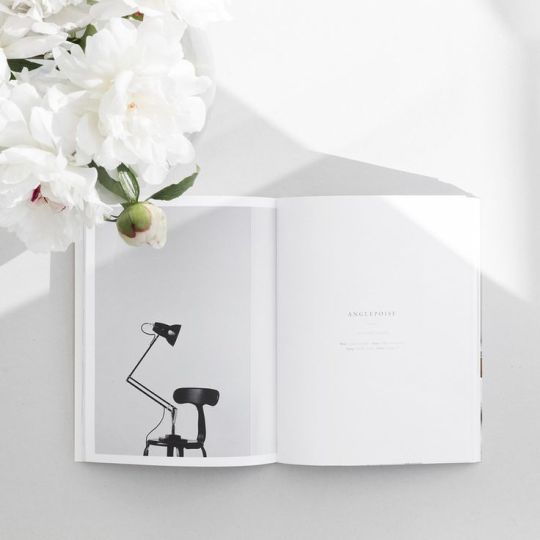
This image like a previous one used hands in the image. I like the personal and character like feel including someone’s hands feels. I think it could definitely be attempted in tomorrow’s shoots.

This image shows how publications could be shot effectively without the use of props. I understand that the props included into some of tomorrows shots may not be suitable for all due to a clash of aesthetic or colours etc. Therefore, imagery like this show a very simplistic and minimalistic way of beautifully displaying physical work like publications. By using quite, a busy double page spread the page definitely doesn’t feel bare or empty and your eyes are drawn right to the content of the pages. I like the neutral coloured choice of background.

This shot plays particularly with the spacing and positioning of content. I like the way the items are spread across the space with some even going off shot. It keeps it interesting and varied. The usage of props again has been done in a considered and simplistic regard.

I like the combination of considered positioning and layout of both the publication/ content and the usage of props. The varied angels and interaction between the props makes it interesting to look at and therefore draws the viewers eyes right in. To me there may be a little too much going on here. I do prefer the use of less props but also consideration of the layout and positioning of the props should be considered well like in this shot.

This flat lay again explores using a brightly coloured background in case we choose to work with this. However, I think using block coloured pages of the actual NIL publication instead to incorporate the colour palette will work more efficiently. I think this shot works well because of the combinations of colours used, but as the colours that will be displayed on all student’s work will be very varied it is difficult to predict this.

This design presents another very minimalist and simplistic style of flat lay. This aesthetic is definitely my preferred one and I think it works a lot better than using too many props or trying to incorporate colours into the background. I like the use of overlapping of the two products in this, and although aesthetically looks great could also work to fit more elements into a shot without making it look cluttered.

I like the combinations of colours in this shot. It gives a more contemporary style, which gives it more character and personality. However, achieving this with the varied amount of publications, content and products will be very difficult. I like the interesting angels used and the minimal use of props.

The rest of the day I spent progressing with the layout of the final NIL publication. I hadn’t actually worked on the magazine since I initially created the layout concepts way back in the first weeks of the project. As the content was now coming along well I felt it would be good to make a real start on the magazine. I want to create all the pages that do not rely upon the NIL shoots, flat lay photography or articles and slowly begin to put these in as they are created/ given to us. I have begun filling in information that perhaps was just filler text before and also experimenting with layout and design. For some of the publication I have used placeholder imagery to get a sense of layout in respect to particularly the flat lay imagery we hope to produce this week. From my previous research today, I decided I think the best aesthetic is simplistic prop use with a plain monotone background that experiences frequently with angels and positioning to keep it interesting and varied. I wanted to see how that could be incorporated into such a brightly coloured publication and pages. I think it works very well and demonstrates this aesthetic needs to be achieved tomorrow as it looks so strong inserted into the publication. Below is a flat lay of the layout of the current pages of NIL. I think they work very well together whilst also being varied enough keeping each page interesting.

The client- Iain also came in for a brief meeting so there were a few things I wanted to relay to him before I progressed upon them. Firstly, we wanted to include a short snippet of description behind the Image and Communication course and we felt this could best come from senior lecturer Vicky. I needed to get Iain’s opinion and for him to okay that this was to be included. However, when set to him he actually suggested a really strong idea. This was to in the tone of current students write our own piece on both the Image and Communication course and design course here at AUB. As NIL is often given out at open days it is a good idea to provide potential future student an informal and personal insight into the course. The other option he suggested was to have a dictionary like description of the course like exploring what the words ‘communication’ mean etc. or perhaps a combination of the both. I also received some feedback and guidance into the conduction and portrayal of the Coast interview scheduled for tomorrow. To perhaps vary the tone and style of the article by using a similar technique Iain referred to have been used in Graduate Fashion Weeks recent interviews- A Q&A style of article. I think this again was a very strong idea to use to vary the content and keep it interesting and easy for the readers. There may be the potential of them scrapping the Coast interview as they feel it may not be relevant enough for the magazine, but they are mostly leaving it down to us to decide. I am happy to interview and write the article regardless as it is very good practice for my writing skills. Overall, he seemed very pleased with the whole groups efforts.
Karen also spent some time looking over my ‘Where are they now’ article which received positive feedback. She felt it was very well written and loved the descriptions and case studies used. There may perhaps be one major adaptation to the article in that they may remove George Hollins piece from the article. Karen felt his perception felt inherently negative which is not the result they are wishing to demonstrate. The consideration may be to keep it to three case studies or perhaps interview a different graduate that they select. The article was later given to Iain to read so I will wait for feedback and then act upon that.
PLAN FOR THIS WEEK
-Conduct Coast interview.
-Write up Coast interview.
-Photograph and collate flat lay photography for Image and Communication students.
-Progress with all areas of NIL that are not reliant on photography or detailed written content.
-Finalise shooting remaining graduate collections for NIL.
-Finish ‘Where are they now’ completely.
0 notes
Photo

Sunday 22nd April
Today I continued with the final ‘Where are they now’ interview.
Daniel Rynne
Daniel Rynne is one of AUB’s most recent graduates, specialising in menswear design Daniel graduated in the year of 2017. Daniels final year collection took inspiration from American photographer Dorothea Lange and the Farm Security Administration. The result- a collection that captured the era through a focus upon details inspired by photographs of the time; the colours, the vibes and the deconstructed and reconstructed look. Daniel went on to impress at Graduate Fashion week, he was awarded the Debenhams Menswear Award, as well as First Runner Up in the George Catwalk to Store Award, for his unisex collection inspired by The Great Depression. Daniels successes at GFW prompted retail department store Debenhams to approach him for a year’s placement opportunity. Daniel continues to work for Debenhams as a menswear design assistant whilst living in London.
Daniels journey at AUB was ‘experimental’ to say the least. He moved across a number of specialisms: firstly, Image and communication, over to Product and Accessories and finally landed himself in Design. His path to his final collection wasn’t straight forward. “When I came to AUB I wasn’t really sure on what I wanted to do, accessories screamed out to me as I began to love and appreciate the hand-crafted elements of working with leather. I began to experiment, learn new ways of handling the material and pushing it to the limits of my ability, all supported by the lecturers and Technicians. It wasn’t until I took part in the live project with Bolongaro Trevor that I truly found my niche”. It was Iain Archer the head of Fashion at AUB that encouraged Daniel to take the risk. “Iain took it upon himself to direct me to menswear as a specialism. I still can’t thank him enough for that”. Daniel took his attention to detail from accessories and pushed himself to experiment exploring how he could intertwine his specialism into menswear. “It just felt right, the knowledge I had gained from my experiences and understanding of menswear in the past all helped me justify what I was doing.” Daniel then begun to question the mark he wished to imprint upon the industry. “People want to be excited and engaged with in clothing and I tried to push myself to find out what I could do to evoke that same kind of reaction in my pieces. I wanted to create honest authentic clothing that would stand the test of time, be loved by the wearer to the extent in which they could hand it to the next generation”. Daniel still maintains the values he kept close throughout his years at university. “It is a concept that I hope to grow in the future. I think every designer wants to be remembered for the right reason and I want my clothing to represent that, I want the pieces to change and develop into an heirloom for the owner and have their own story and memories”.
The opportunities offered to Daniel have truly been invaluable to his journey into the industry. The Graduate Fashion Week 2017 Debenhams Menswear Award being perhaps the most significant. “It opened so many doors for me. I have been introduced to many amazing people and it has given me the opportunity to start my career on an absolute high. I feel honoured for it all”. The effects of his successes at Graduate Fashion week have been everlasting. “I have a lot of exciting things going on at the moment and it’s all thanks to Graduate Fashion Week and AUB”. Daniel expressed the importance of events like Graduate Fashion Week for emerging young designers. “We are very lucky to have this opportunity in the U.K. I would say it is the best graduate platform in the world and to have an opportunity to be a part of it whilst also winning an award is spectacular. It will forever be a highlight on my C.V that I am definitely going to struggle to top”.
I was interested to discover more about Daniels current role at Debenhams. “Designing for high street is a whole new discipline. You are designing for an existing customer, who knows what they want to buy and has a lot of options to choose from if you don’t design them the right item. The number of elements to consider are endless”. Daniel explains that when working for a high street brand like Debenhams certain areas are unavoidable. “Trend for High Street is important, especially in this climate with how fast everything changes and keeping on top of that is a big part of my role. Personally, I do not agree with trends but it’s an element of my job that I have to work with”. But for Daniel the opportunity he has to work with luxury designer’s brands gives him the freedom to own an identity within the store. “Both Jasper J Conran and Hammond & co by Patrick Grant have such contrasting DNA that no day I go in I’m working on the same thing, it’s great”. Although the highstreets offers a number of positive implications for designers it also brings a lot of challenges. “The most challenging part is understanding the hierarchy of getting a garment to production and the boxes it has to tick and the people who have to say yes. I always say to people that you need to own your designs, believe in them and make others believe you when you are presenting them”.
Daniel explains that the route to success in the fashion industry requires a few strong values. “Listen and be nice to people. Listen to different opinions, take on board what other people say. Never be too precious about your designs, there are plenty of people who know far more than you about this subject, listen filter and apply but always stay true to yourself. Fashion is about opinions, everyone has one and they are all different”. Daniel encourages aspiring designers to “learn the craft, always learn and never stop. Understanding how a garment works, discover the origins of elements in a garment and feed your brain with this information! Justification is 90% of convincing a person about your design, if you don’t know why it’s there, you should question yourself”. Since leaving AUB a lot of things have changed for him, I wondered what he most missed about university. “I miss everything! The people, the lecturers, the technicians, the campus, honestly AUB was the making of me and I love coming back when I get the opportunity. The spirit of the whole campus is great I think because it’s so small. It’s so easy to collaborate and be inspired by other courses and you always get the support you need; it is truly an awesome university to be part of”.
The future for Daniel is definitely set to remain within menswear. Daniel hopes to develop his own pieces more and nail a design aesthetic across his garments. “I want to create something that is quintessentially my design identity and hold onto that. Menswear is still new to me and I am still learning every day and that will never stop. I want to learn more about my craft and generate more exciting pieces”. Daniels future goals and ambitions may be clear, but the future of menswear is uncertain. “Menswear is having such a turbulent time at the moment I really don’t know. I really hope to see a step back to true craft and handmade product. I want to see an appreciation to the make and story behind the garment”. For Daniel the appreciation for authenticity has been forgotten. “Authentic referencing and concept should be the starting point for every designer or collection and I want to see new designers designing from the heart not the high street”.
I am very pleased that I have managed to finish editing all four Where are they now interviews. We finally have some substantial content to put into the NIL template we had created a few weeks ago. I will ensure it is checked over and edited by the tutors, but I feel a lot of progress has been made. I am looking forward to the interview with Coast next week as I have really enjoyed writing this article.
0 notes