Don't wanna be here? Send us removal request.
Statistics
We looked inside some of the posts by liyaheva and here's what we found interesting.
Average Info
Notes Per Post
1
Likes Per Post
1
Reblog Per Post
0
Reply Per Post
0
Time Between Posts
9 days
Number of Posts By Type
Text
12
Last Seen Tumblr Blogs


Fun Fact
28.6 is the average number of monthly visits per US mobile user.


Text
Liyah's poster
For this poster, I decided to make a poster for a summer event that is very popular amongst young adults. Since I am Caribbean, it also made sense for me to create something related to that. I really wanted to create a poster that is pretty enough to hang on my wall and that I could be proud of. When I think about a summer event I think about colors that catch the eye of the people that might pass by the poster. For the background, I used a tan rectangle because of one of the posters that I was inspired by. I then added some pink and yellow shapes that added some brightness to the poster and really stuck to the themes and color of the festival. I wanted to add some aspects of the Caribbean culture by using the painting style of the painters of the islands. I found a picture that I liked and went to photoshop to remove the background of the picture. After removing the background, I copied the picture onto the poster. For the title, i wanted to use a font that was somewhat bubbly, a font that would make the letters rounder. To find my desired font, i went to a site called “Dafont”, which is a site with multiple fonts that my high school teacher showed to our class; after finding the desired font, I exported the font and was then able to use it on Adobe Illustrator. I wrote the title and the information about the festival with the font, and it added that touch of joyful summertime that I was searching for. I wanted to add the flags from all the Caribbean countries and to do so I found a picture on google, I exported the picture to photoshop and I used the tool to remove the background and the eraser. I added the flags in the corner to make it look a little bit like a logo. After adding all these elements, I felt like my poster was missing the carnival aspect of the festival and to fix that I used wings that I found on google to add on the back of the girl. I thought that there was too much pink and to make the wings stand out more, I changed the pink shape from the background to white. To finish the poster, a rectangle with the same color from the background was placed at the bottom of the poster behind the information about the festival.
0 notes
Text
CONSTRUCT DECONSTRUCT
For my construct and deconstruct project, I decided to go with coca cola for the company. The coca cola company has been founded in 1892 in America. It sells soft drinks like coca cola classic, coca cola zero sugar, diet coke and also Sprite, Fanta and many other variations of these drinks. They also sell water like Dasani Glaceau smartwater, sports drinks like Powerade, juice like minute maid, teas and coffees and many more. The beverages mostly consist of non-alcoholic drinks concentrates and syrups and also alcoholic beverages. On there site they make it very clear that their aim is to improve the lives of the people that work for the company to the people that is in touch with their business, They are also aiming to make a difference in the different communities around the world and they are doing so by investing in transformative institutions and ideas. They have given more than 1.6 billions of dollars to support the different and help with problems addressing sustainable access to water, a circular economy and many more. My strategy was to find the colors that I think would match more with the theme of this project and then find shapes that would go well, and I could incorporate in my design. I thought about making a bottle with the different shapes that were given in the adobe illustrator. I then decided to give a retro vibe to the bottle by duplicating it and lowering the opacity and juxtaposing the bottles one on top of the others. For the actual coca cola logo, I first wanted it to be very abstract to represent the fizziness of the drinks, but I made the letter more readable because I thought that it might be hard to read. To replace the abstract letters, I added some stars in the bottle to somewhat send the same message. I then decided to recreate the little atomic design from one of my inspiration pictures to stay in the theme of the mid-century.
0 notes


Text
TYPOGRAPHY
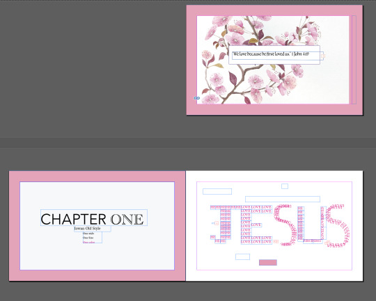
For my typography, I decided to do something related to my beliefs. When the teacher said that we needed a quote to do the project I immediately thought about a bible verse because there are so there are so many relatable verses that I had to take one. I decided to take a verse that talks about love because I think that it is a subject that can generate a lot of ideas, and it will help a lot with that project. I started to try different fonts to find one that I liked and that offers different features like “Bold” and “Italic”. I chose “Iowan Old Style” because I liked the aesthetic and what it could bring to the final project. To find my ideas, I used pictures and themes found in the bible. The color pink is the main color because it is my favorite color, and it fits with the theme of love in the quote. I started by creating all the first pages of the chapters. To do so I wrote the chapter number, the font used and what the chapter will consist of. After writing all of the first pages I created a pink rectangle that I put last in the layers then a white smaller rectangle that I put just above the pink rectangle to create that simple minimalistic effect. For the first chapter, I used the duplication effect to write the name of the most important person in the bible, because I thought it would be a great way to start the typography. The second chapter I wrote the word “we” all around the quote, because I wanted to show that the message is for everyone, and no one is excluded. I wanted to create an effect community and unity because that is what religion is about. The chapter three is the infinity sign to represent the love that God has for us, because it is greater than what we can imagine. To create that design, I drew the infinity sign, and I copied the quote many times on the sign, after that I copied the sign many times and each time smaller than the other. I place each sign inside the other to continue that infinity symbol. The fourth chapter is the cross, because it is a very important symbol in my religion, and I used the duplication method again to create the design. The fifth chapter is the quote repeated many times, but some words were pink to create a heart to remain in the theme of love. Lastly the last chapter, is the star of David that I created by placing the phrase in a way to create a star, I then used the black arrow to select the design and then copied it two more times.
0 notes


Text
For my font sculpture, I used many different tools and explored many different shapes in order to create my final work. To create my font sculpture, I decided to use the letter “P” to create a butterfly. In order to shape the letter “P” I had to click on “type”, “create an outline” and with the white arrow I reshaped every letter into a butterfly and for the wings I duplicated the first part to create the beautiful butterfly wings. The duplication of the wings helped with creating symmetry and to make sure that the wings were as similar as possible. The body of the butterfly is multiple “P” placed one on top of the other. The “head” of the butterfly is thicker to stand out from the rest of the body to make it obvious. I decided to keep the body simple in a way to see the letter clearer. When I was done with the base of the butterfly, I wanted to add some color and experience the “gradient” option a bit more. The base color of the insect is blue and like all butterflies, the closer you get to the center or the body, the darker it gets, and I wanted to recreate that. The gradient option helped me create that darker tone on the wings and that lighter blue going on the outside of the wings creating that beautiful color. To do that I had to use the option on each of the wings individually, because I had already made the different parts of the wings. After I was done with the base of the butterfly, I thought that adding some designs inside of the wings would create a better effect. The “p” s inside of the butterfly were a pink neon color because at first that is the design that I was going for. To make the design come to life, I decided to use the gradient tool once more to create that blue going on pink then black effect inside of the butterfly and then duplicate that design into each one of the wings.
0 notes
Text
"we love because he first loved us." 1 John 4:19 "The two most powerful warriors are patience and time." Leo Tolstoy
0 notes