
Statistics
We looked inside some of the posts by lolofrizzle and here's what we found interesting.
Average Info
Notes Per Post
2
Likes Per Post
2
Reblog Per Post
0
Reply Per Post
0
Time Between Posts
12 days
Number of Posts By Type
Text
6
Last Seen Tumblr Blogs


Fun Fact
Tumblr’s reach among the 26-to-35-year-olds in the US is 11%.
Text
Module 6 Scavenger Hunt
Lauren Freeland

This visualization was one used in my Global Change class this semester. This infographic was generated to tell me about my consumption on Earth. It has an underlying agenda of trying to convince me that I need to do a better job at being less wasteful and helping my environment. Although they’re right, I should do better - this graph is used to guilt me into changing my habits. The pie chart and bar graphs do a good job of clearly illustrating what I am most wasteful with. You do not need to have any science background to understand these visualizations.

This syrup container is part of the larger identity system of Starbucks. It’s very easy to see with the large Starbucks icon in the center of the design. Although the actual word “Starbucks” is small, the icon is a big part of pop culture and is easy to recognize. The font and design of the packaging plays into the larger theme of Starbucks as a brand, although the yellow background used sets it apart from other products. We are used to associating Starbucks with a green, black, and brown color palette, and this yellow and blue scheme makes it a bit different and more eye catching to consumers in a grocery store.
0 notes
Text
Module 5 Scavenger Hunt
Lauren Freeland

This advertisement projects the sentence “Powerful performance wherever you go.” This literally means that the equipment being sold is going to give you quality sound from the speaker in any element. The denotive meaning is that this company ensures its speakers to work well wherever you are. This is further explained by the rain drops shown on the speakers.
However, I believe there is an underlying connotative meaning behind this same sentence used in the advertisement. I think the ad subconsciously alludes to the idea that these speakers will enhance the buyer’s ability to have a powerful performance themselves wherever they go - if they have these speakers. I think the rain droplets may have a dual representation of the sweat and effort you may be exerting while needing some music to pump up a workout or “powerful performance”.

This piece of graphic design takes an icon perspective using a coffee bean directly how it is translated through the text shown. This is because it displays a giant coffee bean to enclose the idea that this small object is actually a giant concept at this particular coffee shop. There really isn't a hidden message within this design, the image directly portrays what is spelled out through the text.

This packaging for a lightbulb shows some type of indexical function in my opinion. This is because the image and colors used relate to the word “relax” at the top of the box. The bulbs themselves don't say anything, but the warm brown color palette and soft yellow haze surrounding them imply that they will give the buyer a relaxed environment.

This advertisement uses a lot of symbolic function. For starters, the “O” in the word “beloved” is a heart. We, as humans, directly associate this shape with love/ The use of flowers and fruit around the edge of the advertisement also contribute to the use of symbolic function. Blossoms and fruit are associated with health, beauty, growth, and wellbeing - and that is what this ad is hinting at without even displaying any of their products.

This coaster is from a newly constructed restaurant, and the design and font used clearly references a past style. By portraying their business with this image, they are alluding to their restaurant being a 50′s/60′s style diner. This gives possible customers an idea of what to expect, but also is what brings in most of their customers in the first place. It is attention grabbing because it is unique and “from the past”.
0 notes
Text
Module 4 Scavenger Hunt
Lauren Freeland

This image shows rhythm through repetition, lines, contrast, consistency, and balance. The words align with each other and the white subtext offsets the text with a clean and simple balance. The repetitiveness creates a rhythm although the words are all different from one another.

This magazine cover demonstrates hierarchy through font size, placement, color, and thickness. The title of the magazine is in a different color and is at the top of the design in bold lettering. Following that is the rest of the specific issue’s title and continued are the subtitles and descriptions of what is found inside.
The T is ascended much above the rest of the letters in this design. It is one specific letter that is much more elevated that the rest. It makes the typography stand out and attract passerby’s eyes.

The A in this graphic descends down much further than the I R also featured on this page. The A creates a sense of imbalance and flow. It also hugs the lines of the background creating a rhythm throughout the entire design.

The O’s in this design five us a look at counter in typography. They are filled in with a shape, and in this case a line. This gives the design quite a bit of character and busies the overall design as a whole. It fits in with the overall aesthetic of the magazine page.

This text reading “Shoes” demonstrates crossbars within text. Specifically, the H stands out to me. The thin crossbar stands out compared to the rest of the thicker lines in the word. This creates a nice balance and takes a simple font to the next level.

This seed packet shows a large x height because of the lack ascenders. It all seems to fit within an inviable rectangular boundary. It is very legible because of this, and all letters appear to be the same size within the design.

This magazine cover shows a good example of a small x height. The ascenders are larger, and this creates a thinner and slightly less legible look. This design is great for the more handwriting styled fonts, and less for boxier and evenly spaced fonts.

This page demonstrates a “Modernist” themed design. The blocks of brightly colored photos offset by bold and spaced text creates a boxy and modern look. The change in font and color is subtle, yet effective. I think this is a good example of “Modernism” concerning what we learned through “Helvetica”.

Although this font does indeed entail the look and natural feel of the word “earth”, I believe it does more than that. The font shows a movement and delicacy that goes to reveal earth in a more natural and flowy way instead on science, planetary, or geographical. It also is balanced with the actual earth in the background of the photo, and I think this goes to add to that effect.
1 note
·
View note
Text
Module 3 Scavenger Hunt
Lauren Freeland

This photo demonstrates a relationship between complementary colors. The majority of the image is blue, but you see a flash of orange in the bottom left corner. Although the dashes and flowing lines direct your eye around the piece, the drastic change in color takes your eye immediately to the orange area of the piece. This changes how the viewer interprets the design as a whole right from the first glance.

This design offers an example of analogous color. The pinks, oranges, and yellows all fall within the same side of the color wheel, and this creates a balanced flow throughout the design. This creates a visual queue to the bottom left corner, as it is the only area that shows that specific tone. The pieces flows a lot more naturally than other pieces demonstrating complementary color usage.

The design for these uniforms I wore last year is predominately cool toned. This obviously creates unity between the jersey and warm up t shirt, but after thinking about it more, I think there is more to the color tone choice. At this meet, we were competing against other states with different colored jerseys. I think the people in charge of our uniforms wanted to make a reference towards Michigan being surrounded by the Great Lakes. They would choose a blue and cool toned color to reference all of the freshwater around our state.

This piece is predominately warm toned. All of the monks and reds blend together to create a warm and rosy looking pig. I think the artist wanted to convey a sense of warm happiness and maybe even a bit of comedy or cuteness. This warm colors, mostly shades of pink, do a great job of this.

This design demonstrates proximity, in my opinion. The closeness of the lines and space between sets create a sense of togetherness. The close lines in the middle form their own group, while the smaller outsider lines form their own corner groups. This creates a textbook example of Gestalt’s proximity definition.

This image demonstrated a clear relationship between the subject and focus of the image from the background. There are even several layers to it. You can distinguish the bubble gum from the moose, the moose from the fence, and the fence from the sky. This creates a believable relationship between all of the factors pictured.

The snapshot enraptures a small and encrypted phrase on the top of a doorway. This is in a modern building, and therefore demonstrates the illusion of something historical. Even the domed archway and yellow, discolored walls create a historic feeling. The etched words using a beautiful font and interesting phrases creates a grand and alluring historic vibe throughout the building.

This design uses color to draw the viewer’s eye to certain aspects of the art piece. The pink splotches create some type of tension in the design, because they do not seem to necessarily belong in their surrounding environment. It challenges the viewer to look closer and try to grasp what these splotches might be. The blue water creates a lovely backdrop that indicate an environment that only adds to the interesting choice of color used in this design.
0 notes
Text
Module 2 - Lauren Freeland

This piece of art is one that quickly stood out to me as soon as I entered the room it was in. This painting would be completely different if the background would have been filled with exciting lines and details, but the simplistic and solid background gives all of the attention to the large figure. The shape of the lines create a twisted shape, and this contrasts each individual section from the next. This strange twisted feature also contrasts the idea of what we would expect a human figure to look like, which adds to the overall intrique.

The depth of this display provides quite a bit of contrast. Each letter is raised out from the wall, and then light seeps out from behind. This creates a dramatic light and shadow contrast that is very eye catching, yet simple. The bright center and quick fade of light creates contrast on the wall, and provides an aesthetic outline around each letter.

This wall pieces creates contrast within all of the lines present. What may seem chaotic at first can be sloppy dissected into several forms of contrast. The left side of the painting is much less cluttered than the right, and this creates a contrasting flow to the piece. The lines are thicker, larger, and have less space between them on the right side. Each line leads the eye astray, but there is a general sense of movement from the top right corner to the bottom left corner. This creates more weight on the right side of the painting. All of the lines add quite a bit of texture as well.

This apparel design is beautifully done piece of art work. There is a heavy contrast between the body and the sleeves/belt. The body piece provides a delicate and solid backdrop for the bold designs on the sleeves and belt. The large font draws the eye and creates space between the shirt and belt. The shirt uses delicate lines and creates subtle texture for the bolder pieces to accentuate.

This Nike display uses contrast in a vivid and slightly chaotic manner. Although there is a lot going on, the “Nike Joyride” still draws the eye before anything else. This is partly due to placing, as the words are the focal point along with the circular screen. These words separate themselves by being the only letter around a ton of circular objects. They take on a whole new shape and therefore draw the viewer’s attention. The bright light used to illuminate the words also create contrast.
0 notes
Text
GD Scavenger Hunt Module 1
Lauren Freeland

Run Chicago Brick Floor Design: Creative visual additive to the plain flooring throughout the Nike store in Chicago. The lettering and styles embraces a brick like design almost breaking through the floor of the store. The colors draw the shopper’s eye and makes you think about the sport and city.

MoCP Window Logo: The Museum of Contemporary Photography utilizes a window to give directions and advertise their museum on the street side. The logo is designed to be simple, easy to read, clean-cut, and contrasting. It looks professional and draws the attention of someone walking down the street in Chicago.

Graphic T Shirt: This t shirt drew my attention, enough that I wanted a picture of it. The white fabric and black font contrast greatly and create a clean and simple look. The lettering is left centered and all lowercase - it catches a shopper’s eye and does a good job of sending a powerful message.

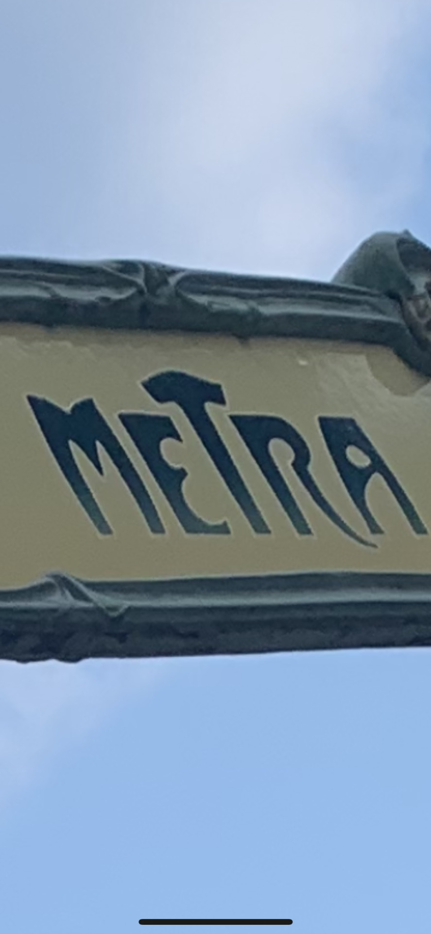
Bookstore Sign: This beautifully done sign advertising a bookshop on the street demonstrates marketing towards a specific feeling cultivated. Bookstores want to create a strange, cozy, exciting, and unique experience for visitors, and this sign is a little tease of that - inviting the passerby inside. The colors and design draw attention and make you stop and read.

Nike Logo Sign: This giant neon wall piece inside of the Nike store in Chicago is an exciting and large art piece that dozens of shoppers were stopping to get their picture in front of. The design, colors, size, and lack of light around the lettering creates an electric feel and invites the shopper up to the next level of Nike clothing. It doubles as advertising for the brand when people stop to take a picture with it, too.
1 note
·
View note