
Don't wanna be here? Send us removal request.
Statistics
We looked inside some of the posts by louthomsonba3 and here's what we found interesting.
Average Info
Notes Per Post
0
Likes Per Post
0
Reblog Per Post
0
Reply Per Post
0
Time Between Posts
17 seconds
Number of Posts By Type
Text
17
Last Seen Tumblr Blogs


Fun Fact
Tumblr Inc. is funded by 13 investors.
Text
**Colours in some images may appear slightly less vibrant/saturated in posts on Tumblr due to them being MacBook screenshots instead of JPEGs to allow me to fit multiple images in the one post. The Final JPEG images will be true to their colour quality. Posts should also be viewed from the bottom upwards, thank you!
0 notes
Text
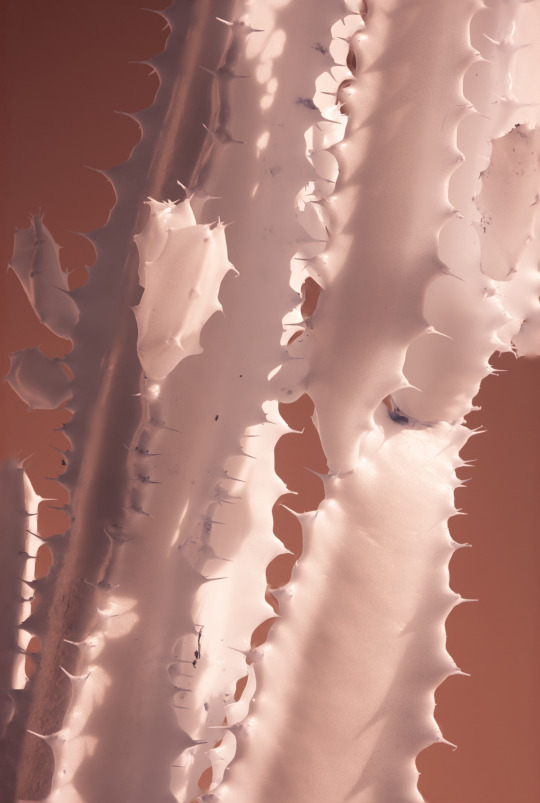
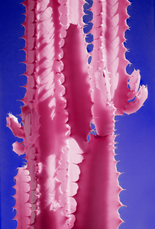
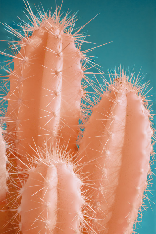
Exhibition
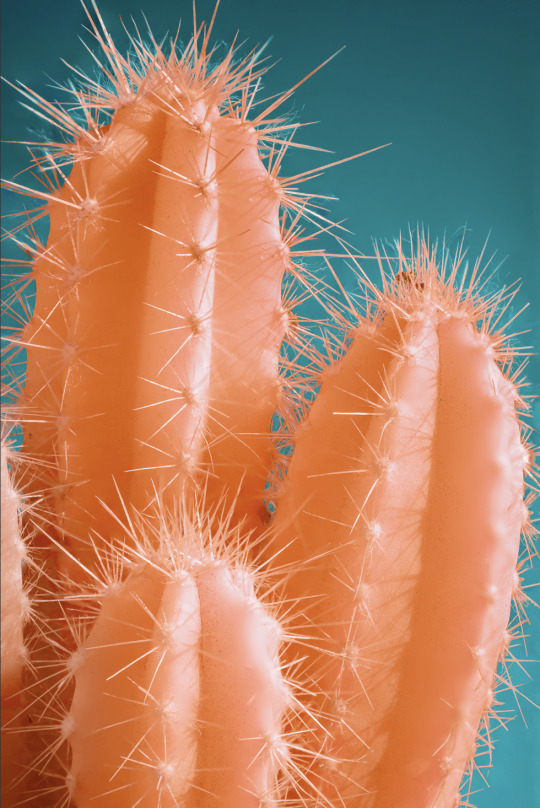
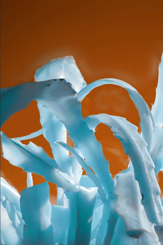
After some consideration I have decided to feature the below image for presenting at exhibition.

I chose this one to be my main image due to its very unique and vibrant colour scheme. The blue hues are very unique for an infrared image and the very vibrant red as the background creates lots of contrast which I think will show up well in an exhibitions setting as the bright colours will definitely attract viewers eyes. In addition to this the way the sunlight has created these very unique shadows and dapples of light - showing off the quality of the light in the image.
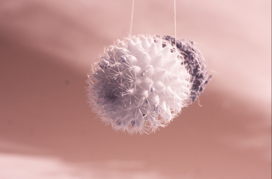
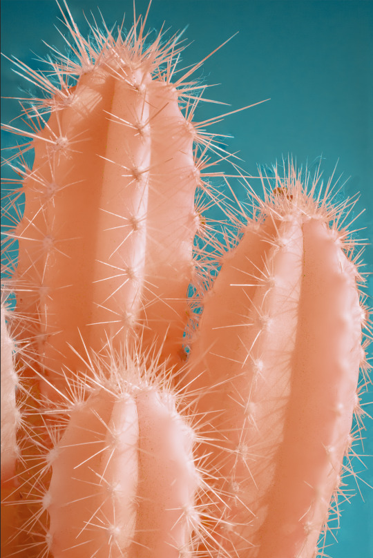
Printing on fabric
I have decided to print the above image on fabric for the upcoming exhibition. this is because I believe printing on fabric will add some texture to the result, and I want to print on a larger scale in order to highlight the close up details to show off the macro aspect of the project, and printing on fabric should allow me to print at a much larger scale with a lower risk of the image quality being as visible as it would be if I made a print at the same size. This is because my converted camera uses a crop sensor instead of full frame so image quality is something I need to consider.


I ended up going to the Centre for Advanced Textiles at the Glasgow School of Art to get this printed. I chose them because I wanted to see and feel the fabrics in person as I knew this would help me make an informed decision as opposed to doing it all online and hoping or the best. They were very helpful in assisting my decision by showing me the different fabrics as well as the two printing processes they offer, being pigment and reactive. Pigment printing essentially places the ink on top of the fabric, while reactive embeds it into the fabric itself.
I decided to go with a cotton voile fabric, as I decided I wanted it the fabric print to be slightly see through but not too much, and I was told that this fabric would allow this while still keeping the vibrancy of the colours which was very important to me. I asked to get it printed at roughly an A0 scale, which resulted in the overall cost being around £30 which is very reasonable.

I am very pleased with the result, the colours are still vibrant and true to how they looked on the computer, while the fabric is quite light and has some body, especially when it is hung with a slight droop at the top, which is how I intend to hang it for the exhibition. I also intend of cutting around the edges slightly to remove the colour test in the corner while still keeping a border around the image to show off the quality of the fabric itself.
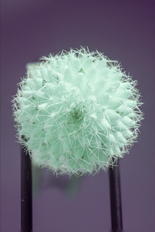
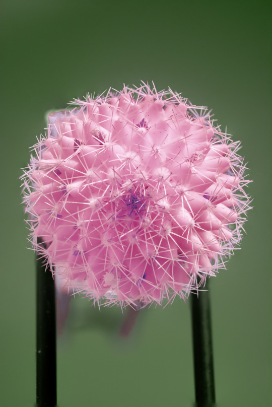
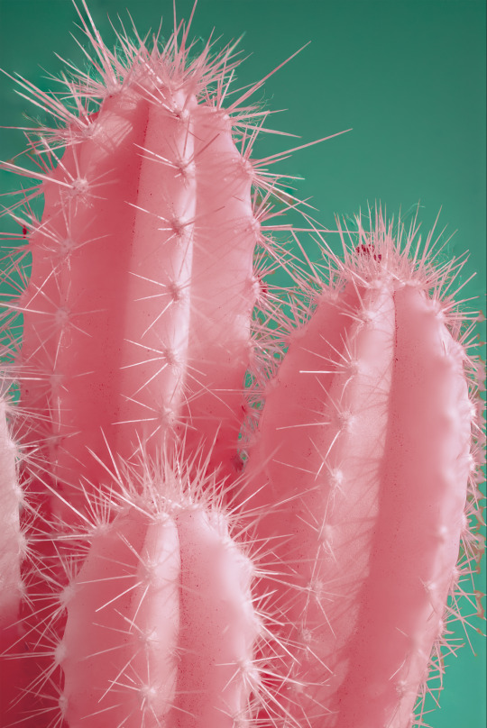
Additional Prints
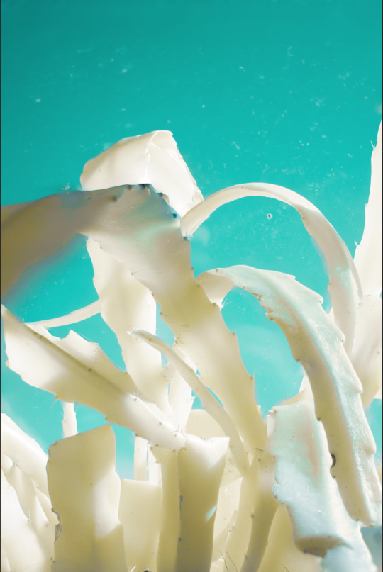
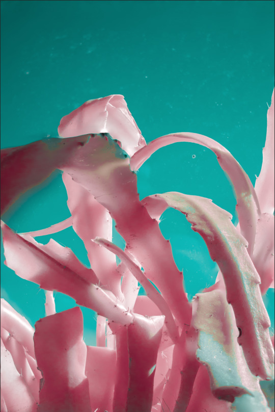
In addition to my larger fabric print, I intend on feature two smaller prints to accompany this, I have chosen the below images -


I am doing this as I want to provide some more context to the project itself by showing that the project is focused on cacti/desert plants. And the above two images are very diverse in their texture and composition so are ideal in communicating this. I decided to revert back to a portrait format for the pink cactus image just for the exhibition as it made sense to me to keep it uniform to the other portrait print and the portrait fabric print.

I decided to print on glossy paper as not only would this bring out and compliment the vibrant colours as opposed to a matte for example, but it also helps to highlight the sharpness of the little details such as the fuzz on the panda plant and the spikes on the circular cactus. I also decided to print on A3 as I didn't want to print these too big as I would risk them taking away from the large fabric print, and instead want them to compliment it. Printing at this size with deadly digital also meant that I saved a considerable amount of money, resulting in the two prints, mounted on 2mm display board, costing around another £30.
0 notes
Text
Final JPEG Images and Viewing Order


I chose the viewing order mostly based on the colour schemes, as I wanted them to be as mixed up as possible, avoiding the same colour being present in the same images that are next to each other in order to highlight the large variation in colour in series has which is something I aimed to achieve from the start.
Overall, I am pleased with what I was able to achieve with this project and am glad to have used my infrared camera that I have become so familiar with in a new way by shooting subject matter I never have before. I am glad during my development that I shifted my focus from flowers to cacti as I think the level of variation in form and shape is greater than what I could achieve with shooting flowers. Furthermore, showing specifically cacti in this way gives a unique alien feel to the plants, making the viewer imagine what plants would look like on another planet or alien desert, much like Marcus Wendt does with his series. It is for this reason that I have decided to name the project "Alien Sun" to signify this.
However, I do regret not being able photograph even more cacti across more shoots in order to encapsulate an even bigger sense of diversity across the subjects as cacti come in so many shapes and sizes. Despite me being able to capture the above images using my infrared converted camera, I do wish I was able to get access to a full spectrum camera, as this would have allowed me to capture a much wider array of colour within the single images after editing, like Kate Ballis and Marcus Wendt have done with their projects. Although I am very interested in using one as some point in the future to see what I can achieve, and could also revisit this project to see the difference using one can make.
0 notes
Text
Square crops
I decided to crop all of my images to a square format to see how they would look, as many of them feature sections of cacti rather than the full plant, and I feel like a square crop would add to this.


I decided that the below images benefitted most from a square crop, with the one on left having too much negative space at the top of the image and cropping to a square removed this and gave a more balanced composition. And the one of the right benefits by complimenting the circular shape of the cactus and makes the overall image even more symmetrical.
The rest I think are better staying as a 2:3 ratio as there are details present in them that I don't want to loose out on, such as certain shadows on the cacti on the images from shoot three and the fuzziness of the image from shoot 1.
0 notes
Text
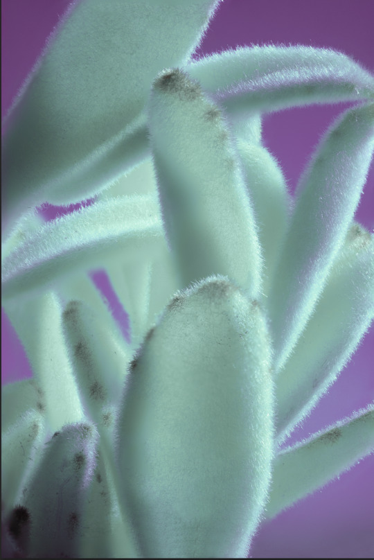
Final images/colour scheme selection


Above are the images I have chosen from each shoot I undertook and their chosen colour schemes. I chose some of the images colour schemes based on what colours were already present in other images so that there was as much colour variation as possible. I also decided to choose two images from my third shoot as their individual colour schemes contrasted greatly and added more variation of colour to the mix of images. Looking at all of them together I would say I am very happy with the variation of colour I was able to achieve with my infrared converted camera, as I was worried that due to the specific filter that is over the sensor that I would only be able to achieve only certain colours.
0 notes
Text
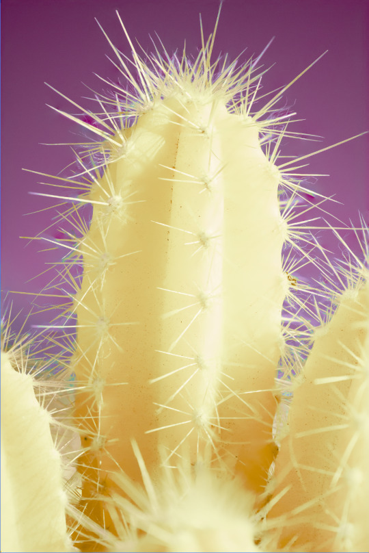
Shoot 4
For my last shoot, I purchased a small baby cactus as I was drawn particularly to its round quality and perfect circular shape when looked at from above.

Shooting this particular cactus proved quite challenging, I first started by simply photographing it on my windowsill, but I knew I wouldn't be able to get a colourful or flat background as I wasn't shooting with a clear sky behind the subject.

I then tried hanging from the curtain pole above my open window using a piece of thin thread, which was an improvement as I was able to get the sky in the background now. However it was difficult to keep the cactus static for long enough to get enough images for focus stacking. I would have also had to remove the roots and soil in post which I think would have taken too long.


I then had the idea to use a toilet roll holder I had in my bathroom and tape the cactus to the end. This was very ideal in that it allowed me to capture the cactus as it would be seen from above as seen in the second image, allowing me to capture its circular and symmetrical nature all while having a clear sky in the background.
RAW Image

I carefully aligned my camera with where the spikes converge in the centre so subject was perfectly centred. The poles from the toilet roll holder are still there but these can be easily removed in post.

After focus-stacking.

After channel swapping the red and blue channels.
Playing with colours to bring them out and provide more contrast with subject and background.

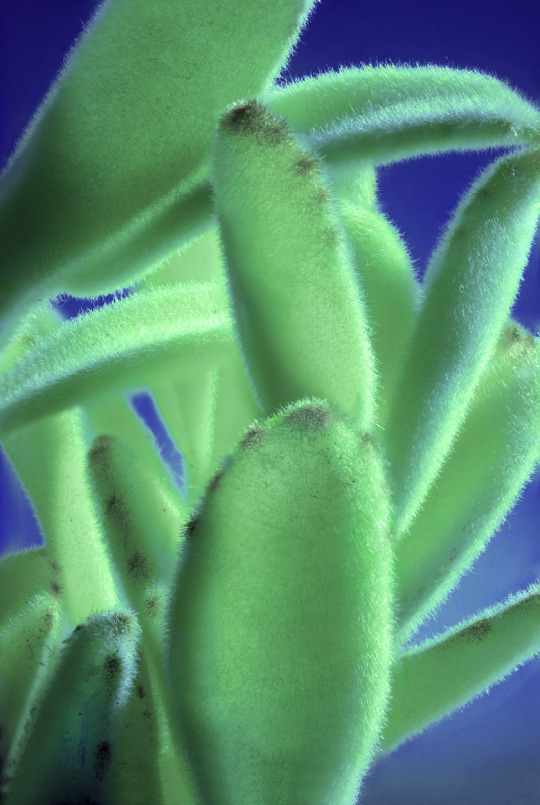
Boosting luminosity of the colours gives a more saturated and almost luminous seafoam green colour, however it is a bit too unnatural a colour for what I am going for.
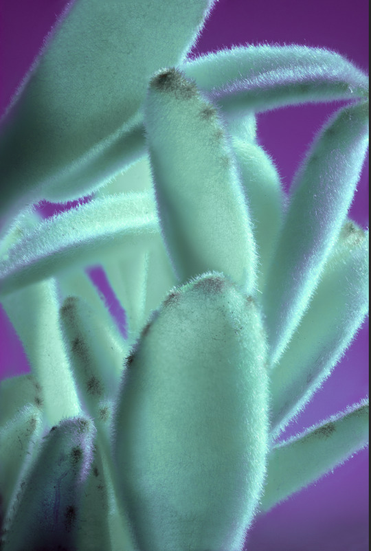
Changing to a pink and green colour scheme which I think is better, there is also some hints of purple in the centre of the spine which I like as it adds a subtle variation of colour to the image and also draws the viewers eye to the centre.

Changed the green background to a more foresty hue.

Removed metal polls from the bottom of the image and began tidying up the edges of the cactus.

Finished cleaning up edges and I also increased the shadows of the image, resulting in a darker gradient of green in the background at the top of the image.
I am glad I was able to use problem solving in order to get the exact composition I wanted with this shoot that shows of the cactuses symmetry quite well and adds some diversity to the series in terms of pattern/composition.
0 notes
Text
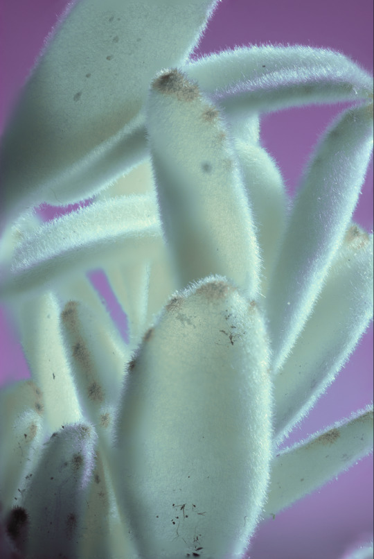
Shoot 3
For this shoot I purchased a much larger cactus. I was drawn to its particular shape with its sets of spines along the edges, and the way its segments branched off from one another so I wanted to see how it would look in infrared as I think I could capture something quite abstract.

I continued to shoot from my bedroom window as I have done with the previous shoots, with the light coming from the side relative to where I positioned my camera. There was a very clear as well so used this as a background.
RAW Image 1
I chose to edit this image (focus-stacked) as I really liked the way pattern created by the shadows that the spines were casting on the cactus, as well as the slight angle it is tilted at helps lead the viewer across the image from bottom right to top left and vice versa.

After channel swapping. I can already tell at this early point in editing that there will be a good amount of colour and contrast of colour with the background based on the blue hues of the cactus and the brown of the background.

Changed background to purple and began bringing out the blue hues of the cactus. Also adjusting the whites and blacks helped bring out the shadows on the cactus.

Changing colour scheme to a more magenta background and cactus to a more seafood green for more contrast.
Changed colour scheme once again to a full red background and a blue cactus for even more contrast of hot and cold colours.

Finally I tidied up the edges and removing bits of dirt etc. I also upped the brightness and vibrancy of the colours to make it stand out even more.
Raw Image 2 (focus-stacked)
Although the composition is very similar to my first image, there was something I liked about the straight down, uniform manner in which the cactus is positioned and highlights its very straight overall form. I also wanted to edit another image to explore more colour combinations.

After following my usual editing process, I eventually ended up with this bright yellow cactus with a nice bright magenta background `and was happy with the strong contrast between the two.
Other combinations

I really liked all of the combinations I got in the end, although I do think the shadows being cast on the cactus do stand out better with the cactus being either a periwinkle colour or the pink colours seen above. There is also a slight grainy quality on the background of the pink and purple image which I like.
Triptych

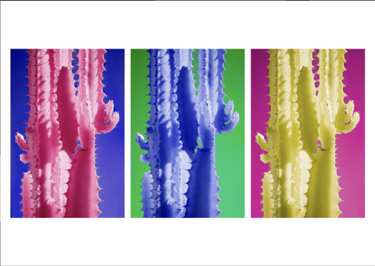
I decided to create a triptych with the above combinations to emanate a kind of Pop Art style as I was struggling to choose, and I am really happy with how it looks with all of the colours and is very eye catching. This is something I may consider when it comes to getting ready for exhibiting the work.
0 notes
Text
Shoot 2
For my next shoot I selected a cactus that had that classic cactus look to it, with the many sharp spines and the different segments of different heights, as I think having a more universally recognised cactus and showing it a new colourful way will resonate with the viewer more and help show them that project is one centred around cacti and desert plants.
RAW image

The cactus picked up a lot of infrared light, so there was already a lot of contrast between it and the background.
After focus-stacking and cropping.

After channel swapping.


I then went on to play with the colour mixer on camera raw to bring out the colours and get more contrast with the cactus and the background, but the colours I was getting on said cactus were too neon for my liking.

I was then able to achieve a more 'natural' looking pink/red hue, which I think makes the shadows and difference in tones easier to see - making it more dynamic overall.
Changed the background to a slightly colder green to add more contrast between it and the cactus. also dropped the saturation of the red in the shadowed area in the bottom left as it was a bit distracting.

increased the vibrancy gf the colours.
Once I was happy with the hues of the image, I decided to change to this orange and blue colour scheme because at this stage in the project my resulting images so far have been lacking in warm tones so I think the addition of this orange will benefit the final series. I also tidied up the spines on the right hand side as they were a bit messy.
Made the colours slightly more vibrant, while boosting the shadows made the sky in the background a deeper hue, allowing the subject to stand out even more.
I also took some images focusing on just one section of the cactus. The above image has been focus stacked however I left the section in the foreground of focus to add some depth to see how this would look.

Following my usual editing process, I again ended up with this neon blue hue.
I still wanted a more natural looking hue for the subject as it is a bit easier on the eyes, so I used the hue/saturation slider to get this warm yellow colour, which is complimentary to the purple that I kept for the background so it really helps the cactus stand out.

Finally i adjusted the light tones and shadows to make the colours appear more vibrant.
Final image

Ultimately I decided to go with this image from this shoot, due to me liking this combination of colours the. the other image. I think it works well in showing the classic cactus look in a new light which I think will help draw viewers in when looking at the series of work.
0 notes
Text
Further Research
At this stage I thought the project would benefit from some further research considering my subject matter has changed from flowers to cacti/succulents.
Suprachromacy by Marcus Wendt
I came across this project that explores the depth of green in plants and how they absorb and interact with infrared light. The project is also an exploration of colour and how important a part it plays in our visual understanding of the world.


The way the colours seamlessly transition from one to the other on the aloe vera is very nice to look at and leads the viewers eye up and down the frame. While what appears to be possibly a section of a cactus (?) has been shot close up to really show off the nice texture, while the quality of the colours along with this make it look almost metallic, which is also very interesting.


The project is very similar to my own project in terms of both subject matter and the use of infrared so I am very glad I discovered it.
Much like Kate Ballis' "Infrabotanica", the series was shot using a Full-spectrum camera which is likely how the photographer was able to capture such a huge array of colour in each single image. While I am less able to do this with the camera I am using, the project has made me consider colour as one of, if not the most important feature I want to showcase within this project. I will prioritise the post processing of my images so that they can be as vibrant and colourful as possible, while also being diverse. His use of cacti specifically as subjects provides the series with a very alien-like feel, as the viewer is looking at plants from a different planet. This is something I want to also try and convey with my project.
0 notes
Text
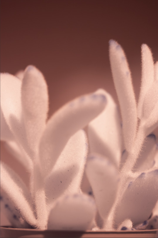
Shoot 1
After committing to exploring cacti as my new subject matter for this project I went to the west end and purchased some small cacti/succulents.
I have also began experimenting with a macro lens while shooting - a sigma 70mm as I want to begin capturing small details on my subjects that will look more interesting at a larger scale. Upto this point I have been using my 40mm lens but I have found that it doesn't allow me to get close enough to the subjects resulting in me having to crop in the images considerably which I fear is impacting image quality. For this shoot however I have used both to see if there is any difference in the results between the lenses in terms of colour I can achieve.
Plant 1
I bought a 'panda plant' to start off with because of its fuzzy nature which I thought would lend itself to macro style photography as it would capture the texture and sharpness of the tiny little hairs.

In order to achieve a clear background using the sky, I chose to shoot at an open park area near my flat and used a foldable chair with some books that I propped the plant on so that I could shoot in line with it while still having the clear sky as the background.

I instantly noticed the difference between the RAW images out the camera where shot with the sigma 70mm lens (left) and my 40mm lens (right), with the sigma having a more red overcast over the plant whereas the 40mm gave more contrast with the plant looking more white. I will need to see how this will affect post production when creating false colour and which lens is better, if it makes a difference after all.

First image I worked on from this shoot. Focus-stacked so whole portion of the plant is in focus. I was right in choosing this plant for its small hairs as they do add to the closeup nature of the image and add to its sharpness. I also tried adding some droplets of water to add to this effect as well.
My first attempt at converting to false colour didn't work very well however. There ended up being too many colours in both the plant and the background that it overall looked a bit messy.

Second attempt went a bit better but I I just wasn't very happy with the colours I was getting with them looking too washed out. I also now know there is some very out of focus foliage in the background at the top right which is stopping the background being the same colour like I want.

I decided to work on this image instead, being focus stacked using around 50 images I took on the sigma 70mm at f2.8, 1/250, ISO 100. I like how it is section of the plant with the various leaves scattered like a mosaic throughout the image.
After initial temp/tone editing with camera raw then channel swapping, I was left with the above image. This is a lot more promising as there is already a decent level of colour and contrast in colour between the plant and the background.
Further intensifying of colours using camera raw and cleaned up parts of plant that were dirty as well as fixing blurry edges.

adjusting the shadows and contrast really helps to bring the colours out.
Boosting saturation considerably.

Final image (images may look a bit less saturated on Tumblr than when printed/viewed on photoshop) I am happy with the result, the almost neon looking blue/green colour looks really alien, and coupled with the contrasting purple background makes for quite a dynamic image. This combined with the detail present in the fuzzy hairs almost makes the image look like AI ? Part of me seems to like this knowing it actually isn't AI but is still able to give that effect with normal infrared technology.
Once I had the above image with its good contrast of colours, I did try some other combinations using the hue/saturation slider on photoshop, however I felt all of them looked less natural and more artifical looking than the green and purple so I decided to stick with the original.


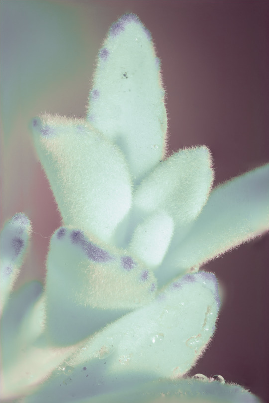
Plant 2
For this second plant I had intended on going back to the park area where I shot the previous plant, but realised that my bedroom window was providing nice light coming from the side, and also would allow me to position the plant and my camera so that there would be a clear sky as the background -

This is the image I went for, I like how the light coming from the side has created a variation of shadows and tones in amongst the various parts of the cactus that seem to intertwine in a mosaic manner. it has been focus stacked using roughly 30 images-
what I was able to get after channel swapping -

Very vibrant cyan colour, the plant itself is looking a bit white but there was some warm tones so I focused on boosting the yellows -
changing to a more vibrant red for more contrast with the background -
There was some strange colour variation on parts of there plant so I got rid of this, I also used gaussian blur and a layer mask to remove the debris from the window so the background was nice and smooth -

At this point I am pleased with what I was able to achieve in terms of contrast of colours and their vibrancy and saturation. I also tried some other colour combinations -

At this stage I am unsure what colour combination works best. I think its best to keep going with the project and get more final images as they will have their own colours and I want the finals to be as diverse in terms of colour as possible, so this will help me decide at a later stage.
I am very glad I have chosen to focus on cacti at this stage as I am getting much more out of the images in terms of colour as well as the cacti having much more interesting form than the flowers I was shooting previously.
0 notes
Text
Cacti/desert plants
I think I am onto something with focusing on green plants as subjects, the results with the ferns were an improvement from the flowers in that they showed a bit more colour however they are not varied enough for me to create a body of work with.
So I have decided to now focus on cacti - they are green so should show up well in infrared light as I have seen from shooting at the botanics previously, and they come in many different unique forms so this should give me a lot more to work with that the flowers.
Aloe Vera


Some aloe vera I had lying around for quick test shots,
Raw vs false colour, shot with clear sky in the distance to give nice full colour background to draw attention to the subject. small ridges on the plant itself is a nice detail. I like the green and purple together, especially how there is some purple on the aloe vera in the second image - makes the lighting look more natural.
0 notes
Text
Using the sky as a backdrop
I captured this daffodil while out shooting more flowers for the project and the sky was particularly clear, so I decided to shoot upwards below the flower to have it in the background.
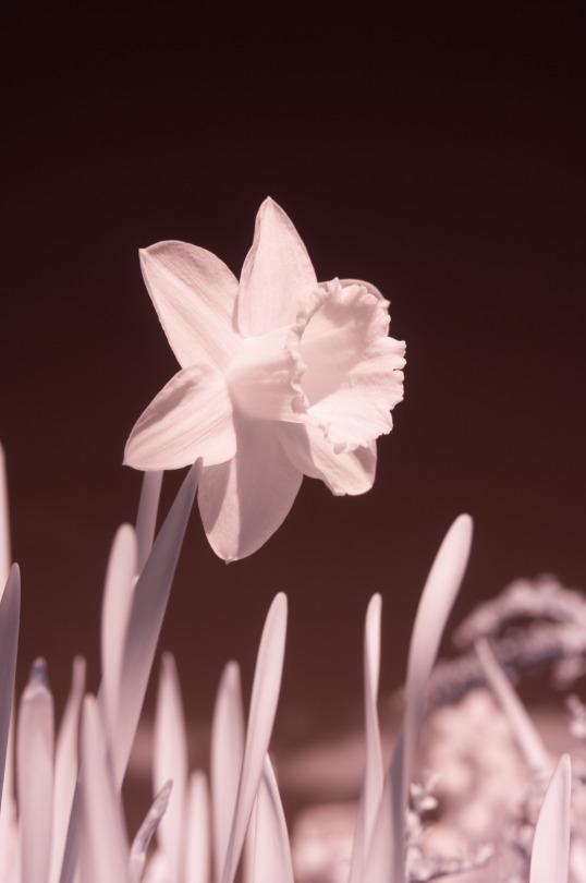
I then discovered that despite the flower not revealing much colour after being converted to infrared, the deep hue of the clear blue sky made for a very nice flat colourful background.

Then using the hue/saturation slider I can alter the colour of the sky while retaining this deep hue-

Deep red (-180)

Deep purple (+119)
This is very effective in locking in focus to the subject by providing a smooth backdrop whereas previously the out of focus content in my backgrounds were distracting and making my images messy and less bold visually.
This is also a bonus as I can now do everything in camera, rather than previously where I had tried creating a smooth background artificially on photoshop.
I am going to try and do this more from now on in this project by prioritising shooting on sunny days with a clear sky in order to achieve this effect, much like Kate Ballis has done in her work.
0 notes
Text
More flower studies
Orchids

while the form of the orchids is really nice and creates nice subtle shadows on the petals, the flower itself loses its colour after conversion and it just white.
Tulip

The same thing happens with tulips, losing most of their colour after converting.
I think I now understand that I may need to change my subject from flower plants as it seems the flowers reflect too much infrared light into the camera, resulting in very little colour or detail being present after channel swapping, resulting in an overall lack of interest.
0 notes
Text
Background
The background of the images I got at the botanics were quite messy with all of the plants in the background as well as the shadows made by the roof of the greenhouse. So I wanted to try a more plain background to draw more focus to the plants themselves and make them look more visually striking, music like Kate ballis' flower studies.
To see how this would look I created a plain colour layer and added different tones, then blurred it out to give some depth.

I then selected the plant itself and placed it on top of this background. I used the bird of paradise as its smoother sides were easier to select.

I like this version of the image a lot more as it really draws focus to the form of the plant itself, while also making the overhead light look more prominent.
More colour combinations -

red and blue creates even more contrast with the hot and cold colours to make the image really visually striking.

green and purple
0 notes
Text
Focus-stacking
Since I am shooting my subjects quite close up, this causes only a portion of the subject to be in focus, even when shooting at a higher aperture. To resolve this I want to try focus stacking. This is where I take multiple images of the same composition, with a tripod, but focusing at different parts of the subject.
Process-


Before

After

This will allow me to still have depth in my images while still allowing me to show my subjects at a much larger scale.
0 notes
Text
Different colour combinations
Using the hue/saturation slider on photoshop, I can adjust the hue of the images to give varying colour palettes. I plan to do this a lot during this project as I feel certain combinations will work better for certain plants and be more visually striking.


Blue and purple looks even more alien like and surreal


0 notes
Text
Botanic Gardens Reccie
I figured a trip to the botanics would be a good idea at this stage to help me find out more about how flowers and other plants behave under infrared light. This is because there are plenty of exotic and interesting flowering plants free for the public to view, so I went on a sunny day with my canon 40D that has been converted for infrared and did some shooting.
Contact Sheets


Pitcher plant

I was drawn to the pitcher plants because of their unique shape and at this early stage I think the more unique and obscure the form of the plant is the more interesting the overall image. I like how converting to FC you can see the veins of the plant which adds another level of detail.
Daisy
Before FC

After

I noticed that in the raw image the centre, or pollen of the flower seem to have a blue glow to it which I found intriguing, which was even more prominent after converting. The resulting image lacked enough colour everywhere else however. Maybe pollen is more sensitive to infrared light than the rest of the plant? something to consider.
Cacti


The cacti that were in the greenhouse responded quite well to being converted to false colour, showing more vibrant pinks (maybe because they are green like the pitcher plant and react to infrared light differently? something to consider) I also like the irregular and unique form they have.

I was drawn to this plant as it looked quite exotic and looked even more unique after converting to false colour with the almost neon blue colour. I also like the droplets of water that were present as they added detail and the added to the sharpness of the image.
Bird of paradise

A very exotic plant which is what I am looking for subject wise at this stage, I like how there was a contrast of pink and green on the plant itself. The unique form it exhibits when captured in this close up manner is also nice.

Very unique flower with its coiled up petals with the details jutting out at each direction. I pushed the saturation of the colours with this one to see how far I could go without making the colours look too blocky.
It was evident from this reccie that some plants react differently to infrared light, making some easier to convert into false colour than others.
0 notes