
Last Seen Blogs

peace-love-whales
Peace Love Whales

larymcfly
haha oops.

deathlywounded
Black wolf by the wooden fence.

kyuubabee
morning, bitch-chan

todosepierde
21F
Photo
31.05.19
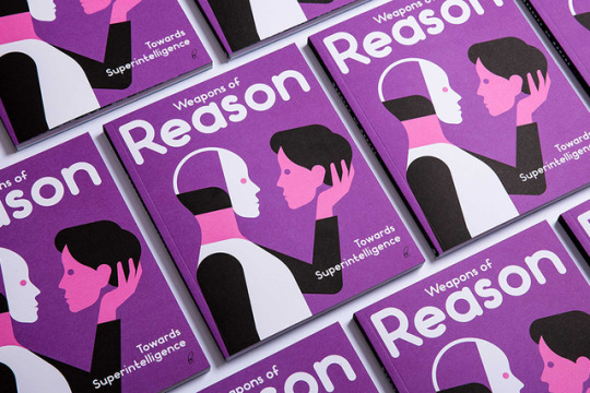
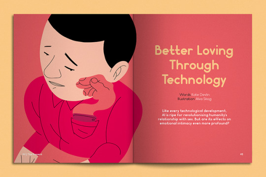
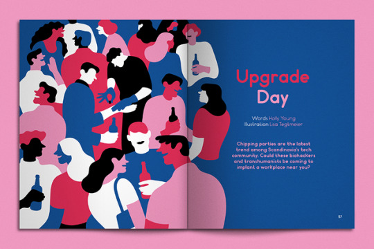
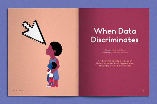
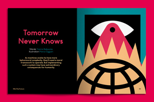
Towards Superintelligence
While much of the discourse around artificial intelligence is marred by confusion over how to separate science fiction from reality, the fact is that machine intelligence is very much upon us, just not in the ways we might once have imagined. Unless you’ve spent the duration of your career in design tucked away in the basement of a university teaching students how to set type in the old fashioned way, you’ll have a solid grasp of the impact of AI technology on our industry—from photoshop to python, it’s already everywhere.
Of course, it’s not just in design that AI and automation are having a profound effect; machine intelligence now permeates every aspect of modern life. While this has innumerable benefits, it also poses enormous challenges for society as a whole — from how we allow the data generated by our devices to be used by third parties, to the moral frameworks we use to build more complex forms of artificial intelligence.
These are the themes explored in the latest issue of Weapons of Reason magazine, a publishing project by London’s Human After All agency that aims to understand the complex challenges facing our world. Its sixth edition, Towards Superintelligence, examines how “Artificial Intelligence has already transformed humanity for the better, but its downsides are no less insidious than the plots of dystopian sci-fi fantasies that taught us to fear a robotic future. Humanity’s next challenge will be how to navigate all this uncertainty by designing systems and frameworks that protect us from AI’s potential dangers.”
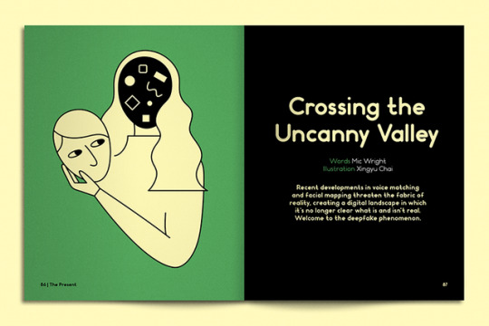
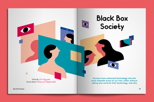
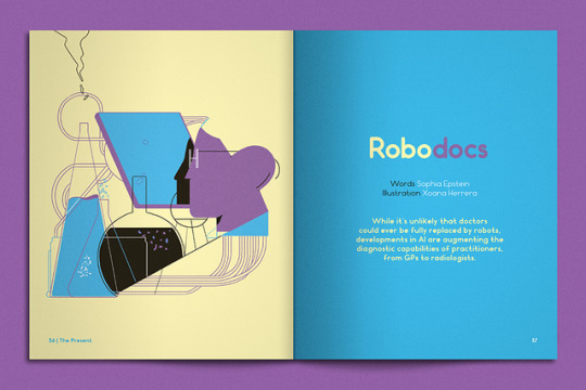
To this end, the articles within explore the rise in the use of algorithms in modern medicine to detect complex pathologies, how the misuse of data can exacerbate historical discrimination and injustice, and the tech industry’s new infatuation with technology that can be implanted under the skin. It also takes a deep dive into the recent development of neural networks that demonstrate original creative powers and how they could shake up the art world—perhaps the first step towards the redundancy of the design industry?
You can pick up the latest issue on the Weapons of Reason website, or if you prefer to read online, all the articles are now available on Medium. Happy reading!
0 notes
Photo
29.05.19
Eight Heads High
The Roman author, architect, and civil engineer Marcus Vitruvius Pollio was a firm believer in the idea that true beauty could be built into man-made structures through the mastery of universal laws of proportion and symmetry. By drawing on the work of other scholars and physicians he set out to prove that the ideal male body always conformed to certain desirable proportions—it fit simultaneously within a square and a circle—essentially a living blueprint for the creation of beautiful physical forms.
Over a thousand years later, Leonardo Da Vinci took this idea one step further, claiming that the proportions of the perfect human body were exactly eight heads high and immortalising this idea in his drawing of the Vitruvian Man.
It’s unlikely that either Vitruvius or Da Vinci expected their ideas to form the backbone of an experimental type project in the early 21st Century, but studio Hato’s latest work is exactly that. Eight Heads High is an immersive digital installation and online experience that pays homage to Vitruvius’ theories of perfect geometry, albeit in an experimental and inclusive way.
Launched at Milan Design Week, gallery visitors were invited to contribute their own physical proportions to a database by recording poses of their choice. Now, online users can do the same from the comfort of their own home, using their webcam to document their bodies in fixed poses and in motion. “From the tallest stance to the deepest lunge,” Hato will use these mapped forms in aggregate to inform the proportions and design of a final font—in effect the logical typographic conclusion to Vitruvius’ millennia-old ideas.
Another engaging experience from London’s masters of co-creation, connection and play.
0 notes
Photo
22.05.19
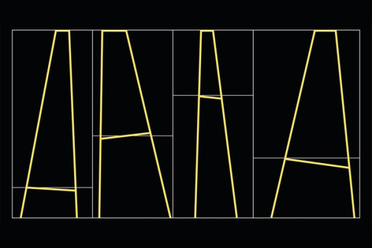
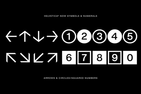
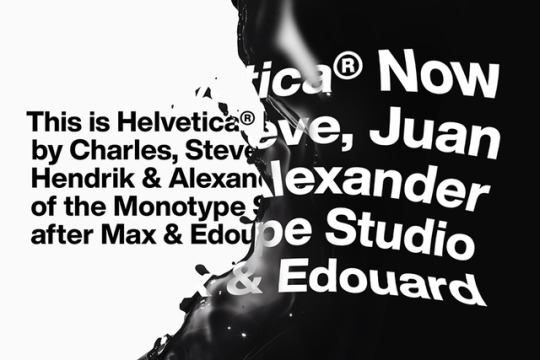
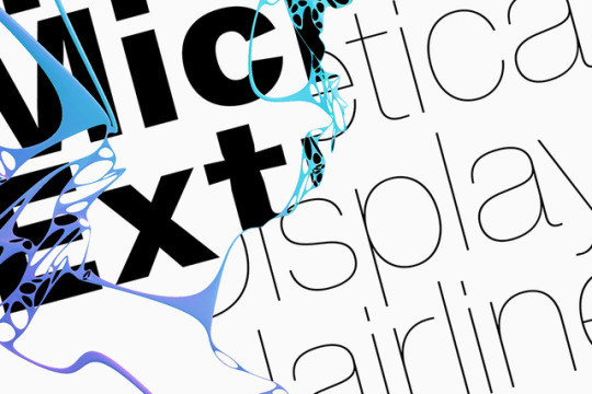
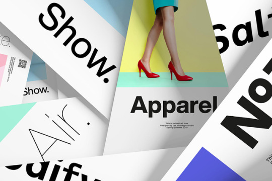
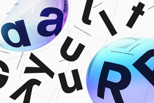
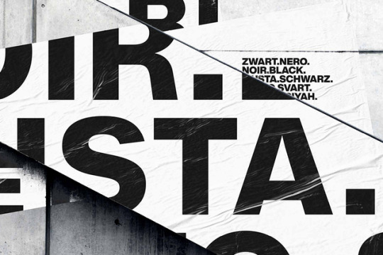
Helvetica’s New Look
After Gary Hustwit’s hugely successful 2007 documentary, the typography community, the design community, heck, the whole world assumed that the story of Helvetica was over. Anything that could be said had been said about the sans serif formerly known as Neue Haas Grotesk. In the decade since Hustwit brought the intricate practice of typographic design into the public consciousness, Helvetica has become the only typeface apart from Comic Sans that is universally known, and this universality has seen it fall from favour as a useful tool in the designer’s arsenal (in-house teams at Chanel, Apple, American Apparel and a myriad others notwithstanding) replaced by cheap imitators like Aperçu.
But what’s really been holding Helvetica back is the fact that it hasn’t been updated since 1982, meaning it’s less than functional in a design landscape that demands compatibility across multi-channel applications. Sympathising with this fall from grace and dwindling utility, Charles Nix, Monotype’s type director, has recently overseen the development of a new version of Helvetica, Helvetica Now, which boasts new glyphs, alternates and display weights as well as looser spacing, to bring the beloved font up to date. It’s still Helvetica, but it fits how we design today.
Helvetica now comes in display, text and micro, each with sixteen variations in style and weight. Nix and his team have redrawn and simplified what little ornamentation the original face had to ensure maximum legibility across applications. “Helvetica Now is designed to function flawlessly in a range of design applications” boasts the Monotype site, ”from large, eye-catching display text in advertising to hyper-legible micro type in multi-level information design. Helvetica Now Display is big and beautiful. Helvetica Now Micro is tiny and precise. Between the two is the true workhorse—Helvetica Now Text.”
Perhaps it’s time for Mr. Hustwit to shoot the sequel.
0 notes
Photo

17.05.19
Medium’s New Channels
While some of the publishing industry’s biggest names scale back or mothball their operations, Medium, the crowd-sourced editorial platform that’s had a fairly turbulent history to date, spent the first quarter of 2019 adding a stream of new channels to its network. Medium’s VP of content, Siobhan O’Connor, has hired four new editors in chief to launch and lead publications that deal with some of the platform’s most popular topics.
All of these new hires come from existing publications with serious chops (including O’Connor herself, previously executive editor of Time magazine). Brendan Vaughan, formerly an executive editor at Penguin Random House will run a publication exploring power, Paul Smalera, an executive editor at Fast Company takes on a publication focussing on business, Indrani Sen, the founder of Quartzy, will edit a personal development publication, and Vanessa DeLuca, formerly editor in chief of Essence magazine, will lead a publication for black women.
All of this is possible due to the apparent success of Medium’s business model — an ad-free subscription service for which users pay $50 a year for unlimited exclusive content and writers earn revenue on their articles depending on the volume of traffic they generate. While the editorial staff at Medium still only numbers 30, it’s a promising sign that digital publishing is able to find new, ad-free ways to grow.
It should also be a boon to the global illustration and photography community who will now have at least four new editorial channels in need of and able to pay for visual material, alongside existing verticals like Elemental, Heated, Gay Mag and OneZero. Maybe there’s still life in publishing after all.
0 notes
Photo
14.05.19
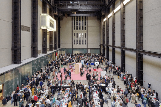
Offprint London 2019
From 2pm Friday to 10pm Sunday this weekend, the Tate Modern will play host to over 130 independent and self-publishers from around the world at one of London’s largest annual book fairs, Offprint London. Offprint runs alongside Photo London and began in 2015 as a one-off commission for Yannick Bouillis of Offprint Paris from then director of Tate Modern, Chris Dercon and his curator of photography Simon Baker. Now in its fifth year, Offprint goes from strength to strength under the stewardship of Bouillis who invites guest curators and publishers to handle aspects of its programming each year.
This year, Photoworks will be hosting a packed programme of talks conceived as an exquisite corps of programming in which Photoworks has invited the first speaker who in turn has invited the next, creating a chain of speakers “interlinked through professional and social connections.” The series will explore broad topics across the spectrum of visual arts, addressing subjects pertinent in these most unstable creative times.
Although Offprint trades in books, zines, magazines, CDs, posters, prints and more, Bouillis has always been keen to distance his event from the wider revival of the book form. Instead, he sees it as an opportunity for artists to reclaim their independence by controlling the dissemination of their work in an era that increasingly strips them of such agency.
“It seems obvious that artists and curators are pressured to fulfil the objectives of governments and cities,” he has written, “and that demanding galleries are no longer able to stand up for young artists in a market that is subject to global capitalism. In other words, when it comes to art nowadays, government and companies speak first. Somewhere between soft-power strategies, economic policies, and the luxury market, art no longer seems able to speak its own name.
“In this context, publishing seems to offer an authentic, autonomous space within the art community. Books and other publishing artefacts such as magazines, posters, and tapes are—in comparison to artworks—relatively free from public and market concerns. It is meaningful to note that despite the public and private funding cuts that have affected the art-publishing world over the past few years, artists, photographers, and graphic designers have continued to show a deep interest in publishing, finding alternative routes to creating and distributing art on their own terms.”
As a result, Offprint trades in works of highbrow conceptual content, not the twee or cute to which many self-publishing fares often subscribe. Expect to be intellectually challenged, engaged, sometimes baffled, but never, ever bored across three days of intense activity in Tate Modern’s turbine hall. Best of all, tickets are free.
0 notes
Photo
30.04.19
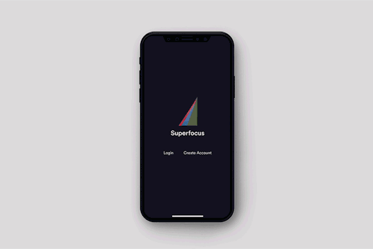
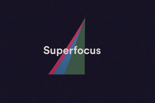
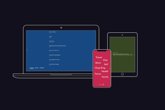
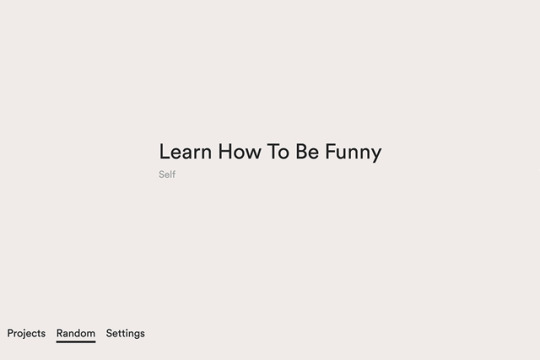
Superfocus
There are plenty of apps out there that want to help you to be more productive; work smarter, earn faster, ideate quicker etc. Silicon Valley is awash with startups offering the streamlining of your professional life at the click of a button. But the majority of these services are only really interested in helping you out in the workplace—none of them is going to enable you to finally get to grips with the bassoon or upgrade your French from moyenne to incroyable.
What’s more, most productivity apps are all about jostling for pole position on your already overcrowded smartphone; they flash and buzz and click at you, distracting you from the task at hand. “In a world of visual overload, our eyes and our minds need a breath of fresh air,” say LA-based designers Adi Goodrich and Sean Pecknold. “Superfocus is designed to calm your daily hustle and help you focus.”
Superfocus is a simply-designed, easy-to-use, colourful addition to the App Store that lets you set and manage achievable (or outrageous) goals for yourself. Both Adi and Sean lead busy lives making creative work for commercial clients but wanted to make something useful for themselves. Superfocus gave them the chance to do just that, and claim some time back from their busy professional lives.
“Sometimes, while we are busy with the things we have to do, we lose sight of the things we want to do. As visual thinkers, we craved a calm and beautiful place to see everything we wanted to do...our dream projects for the year...alongside our weekly to-dos. This required an app that felt cleaner and leaner than others. We didn’t want notifications or group chats, so we made this dreamy app ourselves.”
Those of a purist bent might argue that the aim of the game should be to keep clear of the smartphone altogether and go back to pen and paper, but Superfocus is perhaps the next best thing. While our French skills and bassoon playing are still travaux en cours after a few months of use, it’s easily become one of our favourite icons to click on each day.
0 notes
Photo
18.04.19
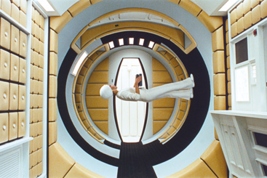
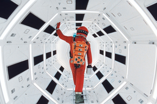
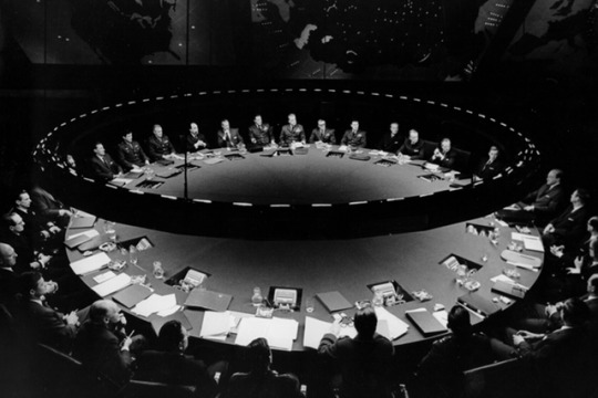
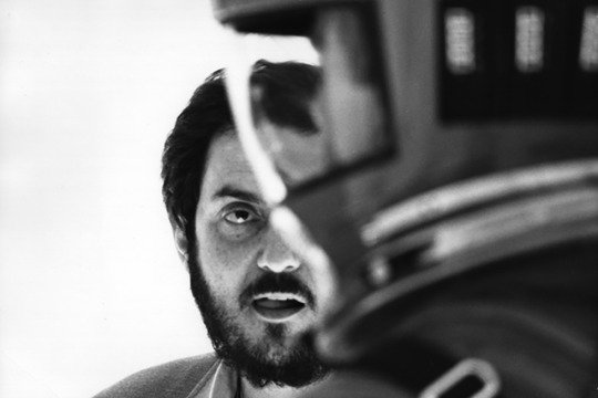
Stanley Kubrick: The Exhibition
In honour of the 20th anniversary of his death, the internationally acclaimed touring exhibition of the life and work of Stanley Kubrick is finally coming to the UK, opening its doors at London’s Design Museum from April 26th. The exhibition takes a comprehensive look at the extraordinary achievements of one of cinema’s greatest auteurs, exploring his obsession with London’s landscape, his on-set innovation, and his close working relationship with some of the most celebrated designers of the 20th Century.
Part of Kubrick’s lasting appeal lies in the ability he had to reinvent himself for each new film he produced, running the gamut of horror, thriller, satire, sci-fi, war movie and period drama during his career, and making each his own in the process. To do so, Kubrick fostered strong working relationships with design greats like Saul Bass, Hardy Amies and Philip Castle to create posters, props, costumes and sets that ensured his films were leagues ahead of other directors.
In addition, Kubrick’s detailed, almost myopic focus on innovation in set design and cinematography led to the creation of a centrifuge set for 2001: A Space Odyssey, and the adoption of NASA-commissioned Zeiss lenses to enable him to film by candlelight in Barry Lyndon.
Kubrick’s fascination with London also plays a large part in the exhibition. The director made the UK his home for more than 30 years, and in that time used the capital as the backdrop for his most celebrated films. A Clockwork Orange was famously shot in the brutalist surroundings of Thamesmead, while Kubrick studded Beckton Gas Works near The Isle of Dogs with palm trees and Vietnamese road signs to transform it into the city of Hue in Full Metal Jacket. Even 1999s Greenwich Village-based Eyes Wide Shut was largely shot in east London and Soho.
Whether you’re a full-on Kubrick nut, or just an occasional fan, there’s an abundance of material to get lost in on Kensington High Street until September 15.
0 notes
Photo
17.04.19
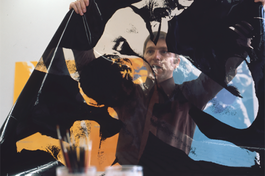
Natural Climate Solutions
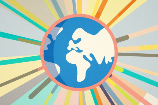
David Attenborough’s may be the voice you associate most with nature documentaries, but George Monbiot is fast becoming the voice of warning when it comes to the breakdown of the world’s climate and ecosystems. In fact, this month Monbiot has nailed his colours firmly to the mast by launching Natural Climate Solutions, an action group of scientists, environmentalists and public figures, that calls for simple, sustainable, and ecologically sound solutions to the impending natural crises facing the world.
The kind of blunt pragmatism with which Monbiot likes to deliver these messages is tempered with a captivating identity from illustrator and motion designer Al Boardman, who was responsible for creating all the visual material for the new organisation (including the stunning animation shown below). Boardman’s rich, patterned illustrations and animations remind us of the complex beauty of the natural world, reminding us just how important it is to preserve it while clearly and cleverly explaining the processes through which it can be saved.
It’s clear that Al isn’t just a gun for hire, commissioned to produce this work because his style fit the brief. He’s an involved founding member of the organisation who shares in its aims and objectives. “When living systems – like forests, peat bogs, saltmarshes and the seabed – are allowed to recover,” he writes, “they draw down carbon from the atmosphere, reducing the chances of climate catastrophe.”
youtube
0 notes
Photo
12.04.19
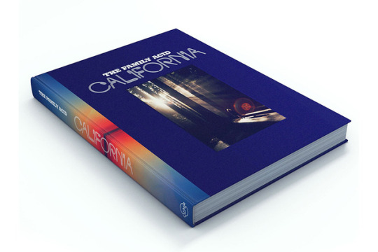
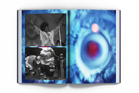
The Family Acid: California
To say that actor, author, lecturer, editor, photographer, reggae archivist, director and producer Roger Steffens has led a colourful life would be an understatement. The New York native was born in the middle of World War 2 and came of age at the most febrile era for the counterculture—though at the height of the swinging 60s he was serving a 26-month stint in Vietnam. After being discharged from the military, he spent a year lecturing against the war, took some time out in Morocco, and then returned to Berkeley, California, to dive headlong into the world of 1970s psychedelia.
An acid head and astral traveller, Steffens met his wife Mary while on LSD at a lunar eclipse party in a pygmy forest in Mendocino. Shortly after, they had two kids, Kate and Devon (both now artists and musicians), and the family foursome began to take epic vacations along the West Coast, “from the gritty glam of Hollywood’s Sunset Strip to reggae festivals in Humboldt, fiery protests in Berkeley to the ancient redwoods of Big Sur and the wilds of Death Valley. Along the way, they’d rendezvous with like-minded freaks, artists, musicians, and writers, from Bob Marley and Timothy Leary to actor John Ritter and war photographer Tim Page, the inspiration for Dennis Hopper’s character in Apocalypse Now.
“They’d take in the wonders of nature — hallucinatory sunsets, expansive mountain vistas, the dreamlike haze engulfing foggy mountain roads. And, of course, the adults would occasionally lose their minds in psychoactive celebrations of creativity, freedom, and hope. Set and setting were everything.” As they did all this, Roger took thousands of pictures (40,000 Kodachrome slides and hundreds of thousands more in black and white) that documented the escapades of this most unusual family.
Their travels in the golden state are all documented in a brand new book The Family Acid: California, available to pre-order from Ozma Records, a new music and publishing venture from David Pescovitz, Timothy Daly and Lawrence Azerrad. The book features a collection of snapshots taken between 1968 and 2015, as Roger, Mary, Kate and Devon stop off at festivals, freak-outs and giant redwood forests as they go, Roger and Mary keeping their psychedelic roots alive along the way.
The whole package is a hopeful, hedonistic look at an extraordinary family life lived on the road, the dreamy photography complemented by sensitive design from Rob Carmichael of SEEN studio, and some stunning cover art from the graphic artist of the moment, Robert Beatty.
“The journey is the destination.”
0 notes
Photo
05.04.19
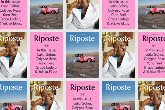
Riposte Issue 11
11 issues in and the team at Riposte are getting pretty comfortable with their biannual output. What began as “a smart magazine for women” just keeps getting smarter, not to mention more engaged in the complexities of the modern world. Riposte’s secret to success has been its ability to balance celebrity profiles with rigorous long-form reporting, short, sharp fashion and beauty pieces with heavyweight features exploring pressing cultural issues. A tall order for such a small team.
Issue 11 may be their best yet (not just according to us, the response on twitter and instagram has been unequivocal) with superb big-name interviews with the likes of Calypso Rose, Tobago’s 78-year-old queen of calypso, and Serpentine Galleries’ CEO Yana Peel.
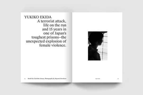
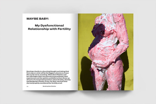
But the features that set Riposte apart from its competitors come in the form of an in-depth interview with Yukiko Ekida, a former Japanese Red Army activist, imprisoned for 20 years for the bombing of the headquarters of some of Japan’s largest corporations, an intimate and painful portrait of one woman’s fertility treatment, and a no-holds-barred discussion with a group of teenage girls who give their opinions on the realities of growing up in the UK (politicians are idiots, FYI).
All of which is packaged up with ever-slick design from Shaz Madani and a roster of visual artists that make it a treat for the eyes. A personal favourite in this issue comes from photographer Sophie Jane Stafford, who documented the women of the World Nomad Games.
Officially launched last night at the ACE Hotel in collaboration with Stack Magazines, Riposte Issue 11 is now available on general release, and we’d recommend picking up a copy.
0 notes
Photo
29.03.19
Mono No Aware
It’s fitting that an exhibition showcasing a body of work concerned with the transience of things should only last a week. But that didn’t make it any less frustrating for those of us who missed it. In late February, London-based artist and illustrator Alice Tye took over the entrance hall at Mother London with a series of paintings based on a personal trip to Japan during “hanami” or cherry blossom season.
Long-term fans of Tye’s work will find themselves at home in this series—the hallmarks are all there; the thick, painterly brushwork, the panoramic vistas, the exultation of the mundane. But while usually, Tye preoccupies herself with the cinematic landscapes of America, the viewer now finds themselves transported halfway across the world, as if stood by the artist observing these scenes for the first time.
Her first trip to the country, Tye was overwhelmed by the sights and sounds that she found there, and the images she produced upon her return buzz with an intensity of feeling that suggests she may still be reeling from the trip.
The title, Mono No Aware, means literally “the pathos of things” and refers to the Japanese tradition of welcoming the spring during hanami. It’s also a nod to the way that Tye travelled and created the work; stopping fleetingly in different locations, barely scratching the surface of the places she visited, and only allowing time to digest the experience and produce work on her return.
Luckily, for anyone looking for a more permanent relationship with Tye’s work, prints of the series are now for sale on her website.
0 notes
Photo
27.03.19
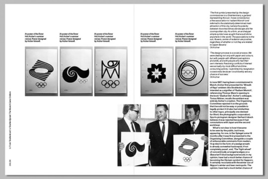
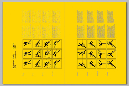
Munich '72. The Visual Output of Otl Aicher's Dept. XI
Otl Aicher’s name is already firmly secured in the annals of design history. The Ulm School founder, Lufthansa brand designer and creative director of the 1972 Munich Olympics already has comprehensive texts dedicated to securing his legacy.
But while Aicher’s name lives on in current design discourse, many of the collaborators who helped him achieve such an impressive stature have drifted into obscurity.
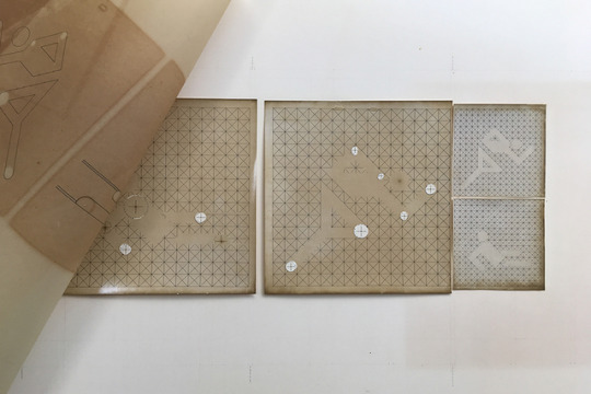
Nowhere is this more the case than in his work for the ‘72 Olympics, in which Aicher was just one of 80 people working to achieve a gesamtkunstwerk of user experience and branding. In spite of this, only he is credited for this sprawling body of work.
Munich ’72. The Visual Output of Otl Aicher’s Dept. XI seeks to address this historical injustice; the first in-depth account of the full range of outputs as well as the structure and composition of the team that brought Aicher’s vision to life. Three years in the making, it is the result of research in both Germany and Switzerland and contains many unseen images and a number of key documents translated from German.
Its creator, Mark Holt, is now funding the project on Kickstarter, and with only eight days left to fund the project, we sat down with him for a chat to find out more.
What was the rationale for putting this together in the first place? Why now?
It’s always amazed me there has not been an in-depth account of the visual outputs of the Munich Games. There has been a Phaidon biography of Aicher, but only a small part of that dealt with the Munich Games and only then, the printed outputs and pictograms. The project will be 50 years old in 2022 and it remains one of the most thorough and rigorous identities of the 20th century – if not the most. It’s still a beacon in terms of consistency of execution and reach, and yet so many people know so little about it beyond the basic level stuff.
How much did you draw on existing material to inform this new compendium?
I didn’t draw on it that much at all. I had some knowledge and I worked outwards from that. I didn’t want to trust what I’d read elsewhere. I wanted to explore and discover and find evidence myself, so I visited the archives in Germany and Switzerland and began tracking down as many team members as I could.
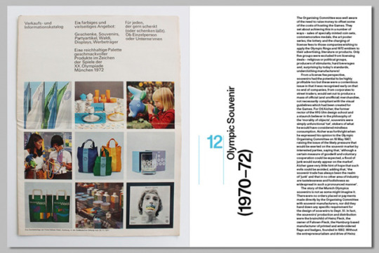
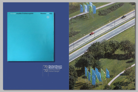
All exhibitions on Aicher and the Games have focused on printed graphics only and I wanted to get beyond that and look at the holistic image of the Games; cityscapes, apparel, stadium decoration, souvenirs, [Olympic mascot] Waldi. I wanted to discover as much as I could about the origins of these components.
Much of what has been written about Munich ’72 focuses on Aicher. He remains, somewhat incorrectly, solely credited for the work, which is ludicrous. He had a team of 70-80 people behind him, including ten team leaders. Very few know about them or their roles.
It seems contradictory that for someone so known for his collaborations in practice and in teaching, that Aicher has always been portrayed as the singular creative force behind the 1972 Olympic work. Was this something you were looking to address?
Yes, Aicher solely credited himself on all projects throughout his life. He was quite open about that when he first hired his deputy Rolf Müller at Munich. Yet there’s something about that that does not sit well with me. The Munich project started in 1965, work commenced in 1967 and ended a year after the games in 1973, by which time Aicher had left to form his Rotis studio. Certain members of the team worked with him before Munich and after at Rotis, yet history seems to have airbrushed them out forever.
Is it intimidating to work on a subject where there is already a body of quality output, or were you confident in your additions to the Aicher canon?
You have to get beyond any sense of intimidation early on. As soon as I struck on the idea of trying to discover more about the team and see the book as a catalyst for change in the way that the project is credited, I knew I had found a way in. I was interested to find out as much as I could about the team and attempting to credit individuals against jobs where possible.
How did you go about tracking down and interviewing his collaborators?
Good old Sherlock Holmes legwork. I used to work with Micheal Burke, who was on the team, and he was still in contact with a couple of people. The Ulm archive also had contact with a couple of others. I then spent a huge amount of time tracking people down on the internet and validating that they were the people I thought they were. I visited Germany and interviewed four or five of them.
And what about the research process more generally; How much time have you spent buried in the archives?
The research process has been very time-consuming. I had a broad narrative in mind for the book, starting with early collaborators and early studio locations, then moving into the earliest works and when the more senior members of the team joined. That gave me an idea for what I needed to find out and triggered literally hundreds of questions.
I bombarded the people I had met with all kinds of queries – not all the answers came back. I was absolutely committed to getting the pieces of the story in place so then set about visiting archives: mainly the Ulm archive, the Koblenz archive and the IOC archive in Lausanne. The joy was in finding some stuff that I never thought I would, and a couple of items which were something of a holy grail for me.
Does Aicher's work still have something to teach us in a design landscape that’s changed so much over the past half-century?
Aicher was chosen for the Munich job because he was Aicher. He’d founded the HfG Ulm, he’d done the Lufthansa identity, he was eminently qualified to do such an enormous job as the Munich Games.
Having said that, he had struggles with certain senior members of the Organising Committee who didn’t like his modernist approach and tried to make life difficult. He also invested a lot of time at the start of the job extracting the brief and trying to educate the client about what needed to be put in place. I translated over 30,000 words original letters from Aicher to the Committee and it’s interesting to note that even someone with Aicher’s stature did not have an easy ride. The job was a very difficult one for him, to the extent that his health suffered. Things have not changed there much.
What was particularly interesting were some of Aicher’s writings as he tried to steer the project - they are entirely contemporary in their content.
Finally, I’d say that for me, Munich is the forerunner of what we call user experience today, in that Aicher tried to shape every facet of the Games, to control the lasting memories that visitors would take from the Games. It had all the elements. In that sense, Munich is still a very modern Games.
0 notes
Photo


15.03.19
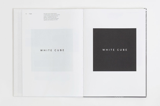
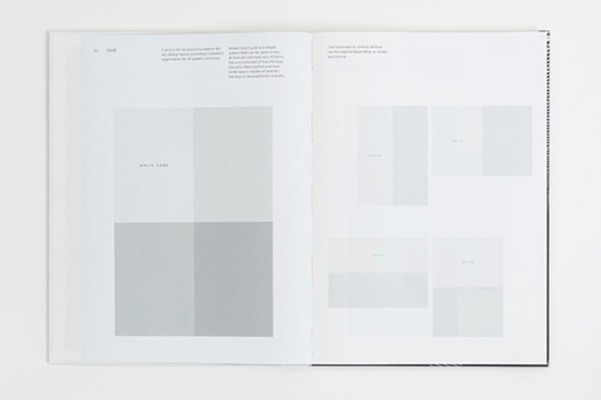
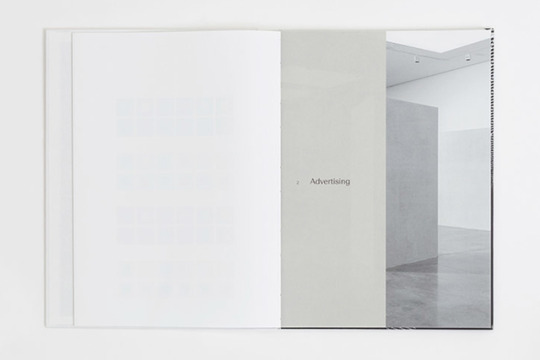
B.A.M Does White Cube
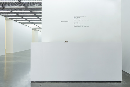
That an institution with a name and reputation like White Cube should need branding seems fundamentally counterintuitive. Jay Jopling’s gallery has spent nearly 30 years at the forefront of the global modern art market, and in that time been steadfast in its minimal approach to the exhibition of its works. White Cube is first and foremost a vehicle for the artists it represents and the works on display, and so to brand it, to give it an identity that allows it to stand out, would likely do it’s ‘brand’ in the abstract more harm than good.
But David McKendrick and Lee Belcher of London-based studio B.A.M are sensitive to this fact and as a result, their work for the gallery over the last 12 months has been more about refining the modes and media through which White Cube communicates than slapping a bold new logo in places where such a device is largely redundant.
Instead, the studio has created an identity that is almost invisible, evolving what already existed into something more refined. Instead of making work that competes with the talent and celebrity of the artists represented by the gallery, B.A.M has created a coherent design framework to better showcase the work and amplify their artists.
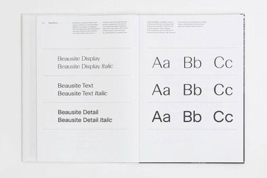
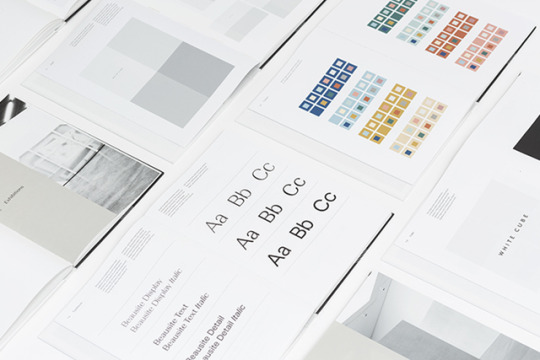
To whit, a whisper of a sans serif logo mark that has seen minimal intervention paired with a specially cut version of Fatype’s Beausite face to be applied to all communication and signage. Unusually, B.A.M also introduced a brand-specific colour palette, which it stresses is only to be used sparingly and across invitations and social media where a bit of additional graphic clout is key.
In fact, much of B.A.M’s work with White Cube focused on reimagining its existing identity to reflect the fact that it no longer communicates with its audience in print as much as it does online, and as a result, required new guidelines to reflect this evolution. These have all been compiled into a clothbound hardback book (perhaps reflecting the client’s reluctance to go fully digital?) that maintains the look and feel we’d typically expect from the gallery — it’s all white.
0 notes
Photo

08.03.19
Rosine’s Hot Chocolate Salon
Just in case it passed you by, March 3rd marked the end of Fairtrade Fortnight in the UK, a two-week initiative to draw attention to the work of the Fairtrade Foundation and their efforts to provide living wages to workers in the global south.
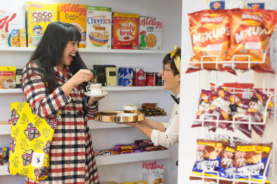
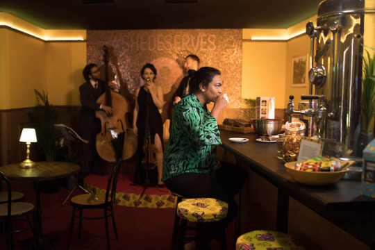
Among the most inspiring and engaging of the events to mark the occasion was Rosine’s Hot Chocolate Salon in Dalston. Sequestered away in the back of an otherwise unremarkable newsagent, creative agency Glimpse worked with the Fairtrade Foundation to create a secret hot chocolate speakeasy with a twist.
On pressing a button hidden behind the racks of everyday goods, the wall gave way to reveal a low-lit, luxurious bar with a live jazz band onstage. Inside, shoppers were invited into a world of mid-century decadence, able to sample three different types of hot chocolate with recipes concocted by celebrity chefs.
But the pop-up wasn’t all about consumption—each hot chocolate was priced at £1.86 to reflect the living wage of a cocoa farmer in the West African Côte d’Ivoire, and each recipe named after a different real-life grower from the region.
Predominantly women, these farmers typically make only 74p per day doing some of the most gruelling work in the chain of production that ships chocolate to the four corners of the globe. Low wages expose women like Rosine to precarious living conditions at the bottom of an industry that is globally worth billions.
This is just one of many projects from Glimpse that deals with pressing global issues. For the last two years in the run-up to Christmas, they’ve run Choose Love stores for Help Refugees in which shoppers were invited to purchase practical gifts for refugees living in camps. They’re also currently working on projects to curb the proliferation of ocean plastics. A true creative force for good.
0 notes
Photo

04.03.19
Meet Jack Gilbey
To graduate from the Royal College of Art and immediately land a job at Wolff Olins could be attributed to plain good luck. To then move through the ranks of London’s most respected design studios, stopping off at Graphic Thought Facility, Pentagram and Bibliothèque, suggests a degree of talent and dedication to one’s craft that not all designers possess.
It only takes a quick browse of Jack Gilbey’s portfolio to realise that he’s definitely not all designers; the work contained within demonstrates creative sensitivity, detail orientation and conceptual rigour that combine to create work that is both functional and beautiful, often ornate but never for ornament’s sake.
Of particular note is Jack’s experimentation with typography – a discipline in which only the most fastidious excel – through which he imbues letterforms with both frenetic energy and peculiar idiosyncracies that elevate text, adding new layers of interpretation and meaning. We sat down to find out more...
“I am interested in challenging the universally accepted concept of a typeface as a static set of visual forms,” is something you wrote during your MA at the RCA. Is this still something that rings true in your work now?
This was something that really interested me during my studies. I wanted to produce work that asked questions about typography and letterforms themselves, with a view to opening up discussion about what could be done to add extra communicative value to type; what if letterforms could evolve with a narrative? What if a font was actually an internet-based system? It’s still very much an area of interest of mine.
Some of the ideas I was exploring during my MA produced outcomes that were deliberately quite extreme and wouldn’t necessarily work outside of a personal research project per se, but I’d say the thinking is relevant in some degree to any type-based communication problem.
Does that mean you’d be reluctant to make work that was “deliberately quite extreme” for a client?
I think it depends entirely on the project and the client. Something like the Calvino book [a special edition of Italo Calvino’s Cosmicomics, which featured a typeface that continuously evolved in line with the book’s narrative] could absolutely be a ‘real’ solution for a client, but as with any live project, the realities of budget and timing constraints enter the frame and can make things very difficult.
Having a great client who is equally passionate and motivated as the designer with regards to pushing new ideas and trying to make them happen is very helpful, but things aren’t always that straightforward! One of the things that I had to learn to adjust to very quickly after leaving the utopian design bubble of college was the fact that designers in the ‘real’ word are often working against the clock, for demanding clients, and a level of compromise is sometimes unavoidable.
It seems like the work you make for personal clients offers you space to compromise less and facilitates experimentation. Is that how you see that side of your practice, and what do you get from these clients?
Yes. I’m fortunate to have some personal clients, and for these projects, I enjoy greater freedom when it comes to experimenting and trying new ideas. We’re able to avoid the typical designer/client relationship format in favour of a constant flow of ideas back and forth over WhatsApp; I’ve found ideas develop and evolve much more organically in this way.
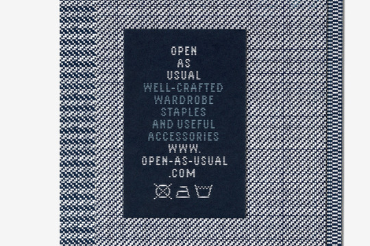
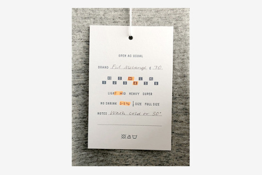
Open As Usual is a great clothing store run by Dan Carroll, based in Hackney’s Netil House. The store specialises in great-fitting, long-lasting basics – predominantly t-shirts and sweatshirts — and stocks fantastic brands from all over the globe that most of us might not be familiar with, but provide excellent quality and value. When designing the brand’s identity, we were intent on finding a solution that communicates the utilitarian nature of its output — the store is refreshingly ‘anti-fashion’— but in a way that we felt we could own. A woven garment care label inside a shirt I was wearing one day while researching this project became a bizarre obsession of mine. This tiny typographic information system seemed perfect as a starting point for the identity, and everything developed from there.
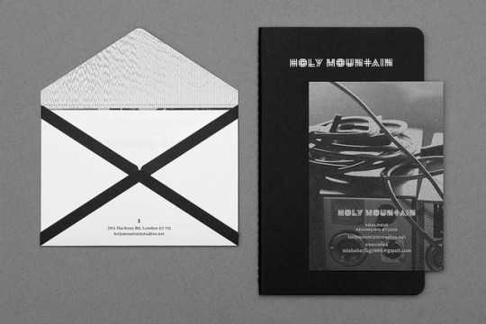
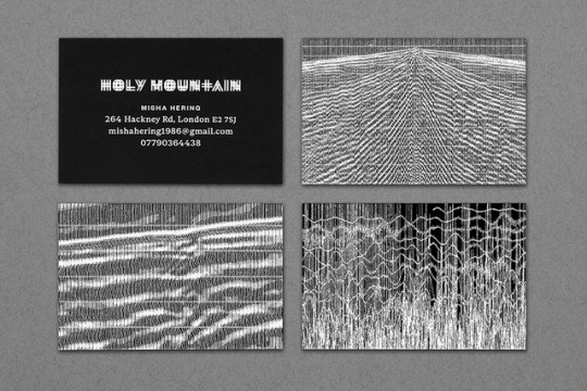
Holy Mountain is an incredible analogue recording studio run by Misha Hering, also in Hackney. The studio’s focus is the heavy, weird, and psychedelic areas of the musical spectrum — although it regularly caters for all sorts of musicians — and needed a visual identity that it could move forward with.
In a world of vernacular black metal logotypes, we wanted to produce a set of collateral that almost felt ‘corporate’, but with a twist. A diagram of a waveform was the logotype’s initial reference, and this idea was carried forward into an image-making session with earthquake seismographs – a suitably epic reference that sits well within the studio’s geological theme.
Your work seems to strike a balance between design as a communications service and design as creative expression. How would you define what you do and how would you like it to be seen?
First and foremost, I’d say I’m a visual communicator, and most of the work that I do from day to day is in a service capacity for clients. However, I am always wrestling with an urge to work on my own experimental projects, but the reality is that the time I have for these is in much shorter supply than when I was at college! They say you only truly appreciate things when they’re gone…
How different is the work you produce as part of a team at an agency like GTF or Wolff Olins compared to what you produce solo?
Sometimes quite different. The nature of working collaboratively as part of a studio, particularly early on in a career, means that sometimes you will be working under the creative direction of other designers. This can be rewarding and at times frustrating, but one thing I’ve realised is that you’re always learning, regardless of whether you feel a particular project is successful or not. In fact, the times when things don’t seem to be going to plan are the times when the most valuable lessons are learned.
The best thing about working with other designers are the times when everyone connects creatively and a project gets taken somewhere that it wouldn’t have been able to go without that teamwork.
You can reach Jack for commissions on jack (at) jack gilbey (dot) co (dot) uk.
0 notes
Photo
31.01.19
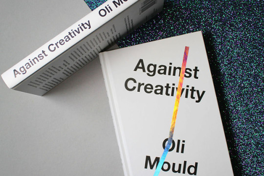
Against Creativity
Don’t worry, the following isn’t some rant against our industries, but a review of a new-ish book from Verso with a striking and provocative name. Oli Mould is a lecturer in human geography at London’s Royal Holloway, and Against Creativity is his reflection on and critique of how we define creativity today.
“Heralded as the driving force of society, creativity is, allegedly, the wellspring of the knowledge economy,” reads his blurb, “shaping the cities we inhabit and even defining our politics. What would possibly be wrong with this?” Not sure Oli, that sounds pretty good to us.
But there is, he argues, a more insidious side to the use of the word by politicians and big business that undermines true creative work while co-opting its perceived values for destructive and inequitable ends.
“The rhetoric of ‘creative work,’” he says, “is merely a ruse that allows ‘work-like’ practices to invade our leisure, social and non-economic lives”. Specific to our particular industry is the notion of the ‘side-hustle’, in which a practitioner makes their free time economically productive with ‘creative’ work, simultaneously bolstering their day-job credentials. In the NHS, ‘creativity’ has been used by former health secretary Jeremy Hunt as a rallying cry to staff to put in more time and effort outside of paid hours—all to mask austerity-fuelled cuts for which he is responsible.
These two examples may not sound interlinked, but Mould argues they represent the same threat to true creativity, in which the word is used to strip workers of their agency to be exploited by powerful individuals. This same model means we celebrate and excessively reward the creative genius of individuals like Steve Jobs, Elon Musk and Mark Zuckerberg, ignoring the fact that their empires were built on the work of thousands of others.
While Against Creativity makes some pretty compelling arguments and Mould’s assessment of the word’s over- and misuse is absolutely sound, he doesn’t offer a particularly appealing view of how creativity should be defined. He reduces creativity to original thinking around different political models or forms of collective action, glossing over a multitude of creative disciplines that have little or no political motive. Where do the playwrights, painters and musicians fit in?
This is a shortcoming that nearly undermines the truth of his central argument—that creativity should be more than a buzzword applied to each and every industry as a rhetorical cover for poor remuneration, long hours, or product production for production’s sake. Real creativity is about far more than the balance and exchange of capital, and Mould does an excellent job of helping to explain why.
Give it a read!
0 notes
Photo
25.01.19
Modern Couples
The following serves more as a warning than a review of an exhibition, as Modern Couples: Art, Intimacy and the Avant-garde is only exhibiting at the Barbican for another two days. If like us, you were late to discover this extraordinary show, we’d recommend you hightail it to east London tout suite! Should that be impossible between now and Sunday evening, here’s an overview of what you missed.
“Featuring the biggest names in Modern Art, Modern Couples explores creative relationships, across painting, sculpture, photography, design and literature. Meet the artist couples that forged new ways of making art and of living and loving. The exhibition illuminates these creative and personal relationships, from the obsessional and fleeting to the life-long.”
This ‘greatest hits’ introduction to the show does little to capture the breadth and depth of Modern Couples, nor its illumination of many lesser-known talents of the 20th Century. Of course, the show pays homage to some of art’s most celebrated relationships; Frida Kahlo and Diego Rivera are featured, so too are Picasso and his lover Dora Marr. But both of these couples have already been editorialised extensively in books and exhibitions, and we learn little more about them from the scant offerings on display.
But that really doesn’t matter. We know these people already, and where Modern Couples really excels is in its exploration of the lesser known. It is unlikely, for example, that anyone without an in-depth knowledge of the Bauhaus would know that Walter Gropius had an illicit affair with Gustav Mahler’s wife, Alma, and that the two were married some years after Gustav’s death.
Fewer still would be aware that in between those two relationships Alma shared an intense romance with the painter Oskar Kokoschka. For three years the painter rendered his lover and muse obsessively in all manner of media until his affections smothered her and she left him for Gropius while Kokoschka fought in the First World War. To deal with this loss, Kokoschka kept a life-size furry replica of Alma in his studio for almost four years after the relationship ended.
After her marriage to Gropius, Mahler married a third time, to the novelist and playwright Franz Werfel, whose work she supported until his death in 1945. A composer, writer and socialite of iconic status at the time, Alma Mahler was a prodigious talent in her own right. In Modern Couples, she is presented not simply as a passive bystander and muse, but an active partner engaged in the creative development of her lovers.
Elsewhere in Modern Couples, the artistic and romantic links are more tenuous, and it’s debatable whether particular relationships are really echoed in the creative work. In spite of this, the reward of revelatory stories like Mahler’s, or the exploration of the relationship between Salvador Dali and Frederico Garcia Lorca (Gala barely gets a look in) ensure that there is an abundance of material for the viewer to enjoy.
Modern Couples: Art, Intimacy and the Avant-garde is at The Barbican until January 27
0 notes