
lrdesigntsu-blog
17 posts
Communication Design Student at TSU
Don't wanna be here? Send us removal request.
Statistics
We looked inside some of the posts by lrdesigntsu-blog and here's what we found interesting.
Average Info
Notes Per Post
188K
Likes Per Post
109K
Reblog Per Post
79K
Reply Per Post
45
Time Between Posts
6 days
Number of Posts By Type
Text
10
Photo
7
Last Seen Tumblr Blogs


Fun Fact
Tumblr has been banned in Indonesia for providing people with access to pornographic content.
Text
Vernacular Poster
For this project, I chose to photograph my way to school, which takes me from Crestview station to Plaza Satillo before boarding the CARTS system to the main campus. The majority of these photos are from Plaza Satillo. I chose this area because it has lots of graffiti, with an abundance of color values to choose from, which would make creating contrast within the poster easier. Additionally, some of the graffiti was more abstract, which lent itself well to the abstract nature of this assignment. For the main focal point, the top of the visual hierarchy is the word, yourself. This was taken from a mural painted on a building next to the plaza, and overall says “Love Yourself”, in what I considered to be an aesthetically pleasing visual as the font is more organic, and would help with the flow of the piece instead of cutting it off or being too stiff in comparison with the more fluid graffiti. I wanted to make the piece look more lively, so I chose bright colors for the background, and played with various gradient effects to make the color look more cohesive together.

3 notes
·
View notes
Text
Opposing Forces
For this project, I took inspiration from the song 'Evil Eye" by Franz Ferdinand; "I have the evil eye, I see your soul, You wear it on your face, It's worn in what you do. This song also pairs well with the "internal/external theme" with the piercing gaze that is said to be the "window to the soul" as well as the unusual placement of the third eye, on a more external body part than traditionally.
I took three different images and composed them together, adjusting the lighting to make the hand and face match each other better, but left the hand a bit lighter as to draw the eye to it first, additionally the eye within the palm has been highlighted using the dodge tool to create a highlight and place it at the top of the visual hierarchy. The background was kept dark to draw the eye to the main images, but I overlayed a peeling paint texture to evoke more of an aged feel, playing into the creep factor.
The imagery created in this piece are meant to be reminiscent of the Hamsa, which protects against the evil eye traditionally in many religions, instead transforming the Hamsa into the "evil eye" itself. Originally this piece had only one hand with the eye on the palm like the traditional symbol of the Hamsa, and took inspiration from Pan's Labyrinth and their representation of the Pale Man who has eyes in his hands on the palms.

0 notes
Text
Pictograms
For this project, I wanted to represent the animals in a simplistic, but natural style. To achieve this. I used the pathfinder tool to create mostly crescent shapes to make up the animals, and adjusted the handles on the anchor points to create tapering lines to look more like it was brush strokes, and unified the animals by using the same eye across all four, and balancing positive and negative space so no single one was too unbalanced in comparison.

0 notes
Text
Letterforms & Objects
For this project I have chosen to use Univers for my san serif font with the letter R, and Caslon for my serif font with the letter L.
Univers: a typeface introduced in the early nineteenth century; is a strong font, with crisp bold lines, that conveys a sense of steadiness. There is little to no contrast within the typeface's thickness. By placing my design mostly within the counter form, the eye is drawn to the head of the letter form, where the two gears offset each other to help balance the weight of the head and the film to give eye movement and add to readability. The stem and leg of the R now both give the impression of legs for the projector, the constant thickness of the form giving a sense of stability to the overall composition.
Caslon: a roman typeface introduced in the late fifteenth century, is characterized by it's angled and bracketed serif and biased stress; has two serifs on top and one on the bottom. The varying contrast of the letter form gives the eye more movement as the letter narrows along it's foot. The stem of the L has become the stem for the lemons, and the serifs have become leaves to mimic the branching off of the stem. The stem has been adorned with lemons, the largest on the bottom to pull the weight of the composition down along the foot, and the draw the eye down the stem.
0 notes
Text
Dust Jacket
For this project, I chose to read the book Willful Creatures by Aimee Bender. Since it is a collection of short stories, which overall has rather dark themes throughout. To tie them all together into a fitting cover, I kept the color scheme rather dark, but not deep black since there is a sense of morbid humor, and the stories treat darker themes with a light hand. The cover is a drawing of the first short story, inspired by a scene where the man cuts himself shaving, and the blood spell out MORTAL in blood in the sink. The back cover is also representative of the ten men in the first story who have to deal with facing their own mortality. However, not all of them die due to a doctors error, hence the crossed out figures and the not crossed out figures.

0 notes
Text
Creative Book
For this project, I chose to interview my Fiancée Sean Cunniff about his job as a big data consultant. I wanted to focus on the surroundings of the office as well as the software used as the primary tools for this profession. Having grown up in Silicon Valley, the general atmosphere from many smaller tech workplaces tend to be very similar. The offices usually have "incentives" such as nicer updated furniture, etc. However, very frequently they tend to be founded in smaller buildings due to high rent, in less desirable areas.
I consulted with Sean to create the cover of the book, as many visual examples of "big data" researched online were not accurate representations of the data, usually portrayed as interconnecting modules. I kept a consistent margin along each page to help tie the pages to each other. I used differing guidelines on Photoshop to arrange my images. To keep the focus on the primary images I left those larger and more intact than the software screenshots we gathered. [All data was screened to make sure there was no data that could actually be interpreted/was sensitive/private] Due to the abstract nature of his job, I wanted to break up the software, being less consistent in the cutouts while balancing the proportions on each spread, while still maintaining those same margins across the book.
For the binding I left a 1 inch margin along where the binding would be, originally left to give space for a more complex stab binding, [an example book was made to practice] and then edited to a more simple bonding pattern, but allows for more added stability overall. There was also a sample book to test how of the spread the binding would obscure, and several extra pages were printed to account for any errors with cutting or binding in case a replacement was needed. Originally the cover and back cover were regular paper, but was then changed to cardstock for stability, durability, and to give a different weight to the covers vs. the rest of the book, to give it more qualities of a book than a pamphlet.


0 notes
Text
Headline Interpretation
"Want to Fall Asleep? Read This Story" in National Geographic by Michael Finkel covers the mechanics of sleep and sleep deprivation in detail, how our sleeping habits have not evolved to match our modern life, and how the blue lights that surround us are the most sleep disruptive of all.
The design is printed on blue cardstock to simulate the blue glow from the phone, lighting the face from underneath as it looks down at the device. The background is left black to push the face to the front of the visual hierarchy, and to give some ambiguity of the setting of the figure. By doing so, the figure can represent the following:
Finkel touches on scenarios where blue light is used to keep people from falling asleep to reset their circadian rhythms, or after traumatic experiences so the brain can process instead of just retain the memory. On the other hand people are chronically overworked which greatly contributes to sleep deprivation in the population. Also mentioned; people with insomnia or other sleeping problems often lay in bed looking at their phones.
The blue light ties all of these topics together, and evokes a familiar sense of exhaustion common to our modern life.

0 notes


Text
Design Thinking
Design Thinking
What is design thinking? According to the Interaction Design Foundation; design thinking is “an iterative process in which we seek to understand the user, challenge assumptions, and redefine problems in an attempt to identify alternative strategies and solutions that might not be instantly apparent with our initial level of understanding. Design thinking has five overall “steps”; empathize, define, ideate, prototype, and test. It is important to note that the five phases, (stages, or modes) are not always sequential. They do not have to follow any specific order and can often occur in parallel and repeat iteratively. Given that, you should not understand the phases as a hierarchal or step-by-step process. Instead, you should look at it as an overview of the modes or phases that contribute to an innovative project, rather than sequential steps.”(Dam) I personally like this process since it allows me to jump from stage to stage and follow ideas as they come, and helps to break out of patterned thinking, by taking something and running with it. With each iteration we can always learn something, building on the base of the previous version.
However, design thinking isn’t just a theory that applies to only work, but possibly our daily lives. “What’s special about Design Thinking is that designers’ work processes can help us systematically extract, teach, learn, and apply these human-centered techniques to solve problems in a creative and innovative way – in our designs, in our businesses, in our nations (and eventually, if things go really well, beyond), in our lives.” (Dam) I agree that it could be very beneficial, teaching more people to think outside of themselves and consider the needs of others on a wider scale, while encouraging innovation beyond typical patterned thinking.
As Tim Brown says; “Design thinking taps into capacities we all have but that are overlooked by more conventional problem-solving practices. It is not only human-centered; it is deeply human in and of itself. Design thinking relies on our ability to be intuitive, to recognize patterns, to construct ideas that have emotional meaning as well as functionality, to express ourselves in media other than words or symbols. Nobody wants to run a business based on feeling, intuition, and inspiration, but an overreliance on the rational and the analytical can be just as dangerous. The integrated approach at the core of the design process suggests a ‘third way.’ “(Brown, Change by Design, Introduction) I agree that there needs to be a “third way” of thinking; very rarely are problems completely solved by a singular method. Often there are design flaws that either don’t address additional problems, or don’t address them effectively.
“Thinking outside of the box can provide an innovative solution to a sticky problem. However, thinking outside of the box can be a real challenge as we naturally develop patterns of thinking that are modeled on the repetitive activities and commonly accessed knowledge we surround ourselves with.”(Dam) Design thinking is all about exploring possibilities and testing them, which inherently means that there will be failure; however that failure should been seen as a stepping stone to new innovation. Prototyping our ideas allow us to test our different approaches and improve on them, hence why design thinking is an iterative process. “These patterns of thinking are often referred to as schemas, which are organized sets of information and relationships between things, actions and thoughts that are stimulated and initiated in the human mind when we encounter some environmental stimuli.”(Dam) Being aware of your personal schemas is essential to personal growth in my opinion, acknowledging our bias is the first stage in examining them and growing above them.
I agree with this article, I believe it could be very beneficial in other areas outside of just work. It promotes “thinking outside of the box” and disrupting our patterned behavior that can stifle innovation. Design thinking allows us to examine problems in any category from multiple angles, and encourages creative thinking that can be applied to many facets of life.
Dam, Rikke, and Teo Siang. “What Is Design Thinking and Why Is It So Popular?” The Interaction Design Foundation, www.interaction-design.org/literature/article/what-is-design-thinking-and-why-is-it-so-popular.
2 notes
·
View notes
Text

Innovation lights the way though the darkness of the future unknown> Humanity's problems are tackled by those who push beyond the current boundaries in their chosen field, in the sciences and the arts. This chandelier poses as a visual metaphor for those who lights the way forward, the importance of innovation and creativity without which we would grow stagnant. The strong contrast between the positive space of the light bulbs and the negative space of the background pushes the light bulbs to the top of the visual hierarchy. The light bulbs are representative of our ideas; of the creative process. The overall piece features mostly curved lines, the fluidity representing the creative process of our ideas; of the creative process. The overall piece features mostly curved lines, the fluidity representing the creative process as ideas run into one another to form something new, nothing rigidly defined or set in stone. The bulbs have more static noise around them than the rest of the piece, not fully formed ideas yet save for the middle bulb, the only one that has a complete filament inside, hence it's prominence in the composition.
1 note
·
View note
Photo


Your weekly dose of prop sheets. I’m thinking about selling 11x17 prints of these and the others, if there is interest? I’m also thinking about some kind of a booklet at some point, if I wind up getting to complete enough sheets.
1K notes
·
View notes
Photo


Hi lovely people!
Today I’m sharing tips how to introduce variety in body. Use the somatotypes.
It’s based on a natural occurring differences in human bodies based on differences in skeleton and body composition.
Very short tip this week but I hope you still gonna like it ! <3
4K notes
·
View notes
Photo
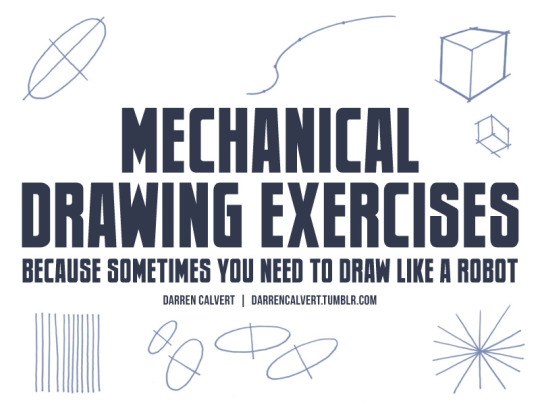
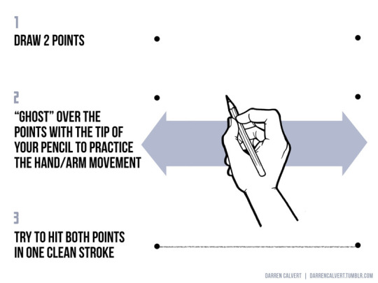
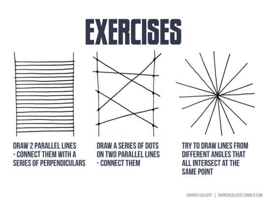

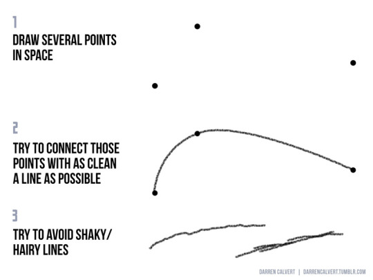

People often say to me: “You draw like some kind of inhuman machine. If I eat your brain, will I gain your power?” The answer is yes, but there is another way. The key to precise drawing is building up muscle memory so that your arm/hand/fingers do the things you want them to do when you want them to do them. Teaching yourself to draw a straight line or to make sweet curves is just a matter of practice and there are some exercises you can do to help improve. If you’re going to be doodling in class or during meetings anyway, why not put that time to good use?
178K notes
·
View notes


Photo


The amazing concept art of emmanuel shiu for Thor: Ragnarok
Marvel’s Thor: Ragnarok - The Art of the Movie
4K notes
·
View notes