
Don't wanna be here? Send us removal request.
Statistics
We looked inside some of the posts by luckylevi-mave and here's what we found interesting.
Average Info
Notes Per Post
0
Likes Per Post
0
Reblog Per Post
0
Reply Per Post
0
Time Between Posts
16 hours
Number of Posts By Type
Text
17
Last Seen Tumblr Blogs


Fun Fact
The most popular pages on Tumblr are about Minecraft, GIFs, and David J. Peterson.
Text

The poster is finally pinned up on Level 5 and overall, I’m pretty happy with how it turned out. The only thing is the colour looks a bit different from what I expected. The version on the rationale piece of paper shows the original colour I was going for, but when the poster got printed on a large A4 sheet, the words didn’t show up as clearly, especially where the fade happens. It’s something I noticed straight away. But like I mentioned in my In Design document, the words are definitely more visible on screen. The lighting and scale just changed a bit in print.
0 notes
Text
Final Animation
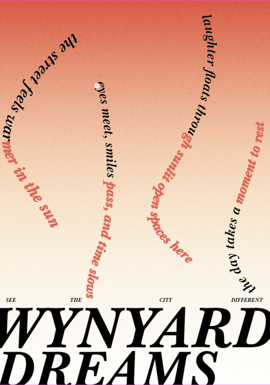
For my animation, I was still a bit confused about what to do because I changed my designs and even topics multiple times throughout the weeks. But overall, I’m proud of the animation I was able to create in After Effects. My poster design has a simple, dreamy feel that fits how I see Wynyard Quarter. With the animation, I wanted to continue that theme and make it flow naturally with the poster’s design. The words flow like a wave, representing how free and carefree people are at Wynyard Quarter, they’re at ease, enjoying the moment with no worries. I wanted to capture this feeling by shaping the quote in wave like lines.
The animation reflects people having fun, communicating, and making the most of the open, modern space while soaking in the sun. I made the lines move unpredictably in After Effects to symbolise people strolling and exploring the area without any specific purpose just enjoying themselves. The fast movements of the words remind me of someone filming from a bird’s eye view, like a time-lapse showing people moving through the space. To make the ending cleaner and more professional, I added an “ease in” to the animation, which helped the words settle smoothly. The gradient fade on the words shows people slowly shifting into a calm mood, helping reflect how the atmosphere changes with the people and their interactions, not just the space itself.
0 notes
Text
This version was really close to what I was trying to achieve with my design. The unpredictable movements of the words matched exactly what I was going for. But the sudden stop at the end of the animation made it feel rushed and unfinished, so I looked up ways to make the final animation cleaner.
0 notes
Text
This was my first attempt at working with my poster design in After Effects. I already had a solid idea of what I wanted to do with the animation, but I knew there was room to try different versions, especially ones that connect better with my message and what I’m trying to show through the poster.
0 notes
Text
instagram
Voggenreiter, P. (2023). Moving poster for the 8th Burgas International Film Festival [Animated poster].
This animated poster really intrigued me because it reminded me of the area I’m basing my own work on Wynyard Quarter. The use of colour and how it interacts with the text feels seamless and visually balanced. I was especially drawn to the layout of the type; even if it were just static text, it would still look professional. But the addition of animation, particularly the sun element, adds warmth and movement that enhances the whole piece. It gives a strong sense of atmosphere without being over complicated. I could definitely see myself integrating a similar animated feature like the shining sun into my own design in the future, especially since it connects so well with the open, seaside feel of Wynyard.
0 notes
Text

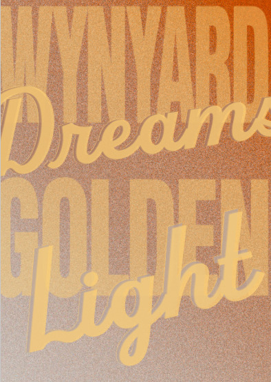
Final Poster
For the final poster, I played around more with the grain in the background and adjusted the colours. I think this version really captures what I imagine when I think of Wynyard Quarter, hanging out and enjoying the sunshine in the space. The gradient words turned out exactly how I pictured them, and I think they look great on screen.
Rationale:
My poster design is based on personal experiences and reflections from a visit to Wynyard Quarter. I wanted to capture the warmth and relaxed energy of the space, so I developed the phrase “Golden light, Wynyard dreams” as the central concept. This quote helped guide my colour choices and layout. I used soft golden hues/colour to reflect the warm light of the late afternoon, creating a calm and inviting tone. Lighter shades were added to suggest openness and ease, while deeper tones linked back to the location and people. I laid out the text in a way that’s clear but still has a dreamy, flowing feel to match the social and youthful vibe of the space. The wavy lines in the design represent how people move freely through Wynyard Quarter, giving the poster a relaxed energy. The colours and layout are meant to give off the feeling of being at Wynyard, sunny, open, and full of small, happy moments shared with others.
0 notes
Text

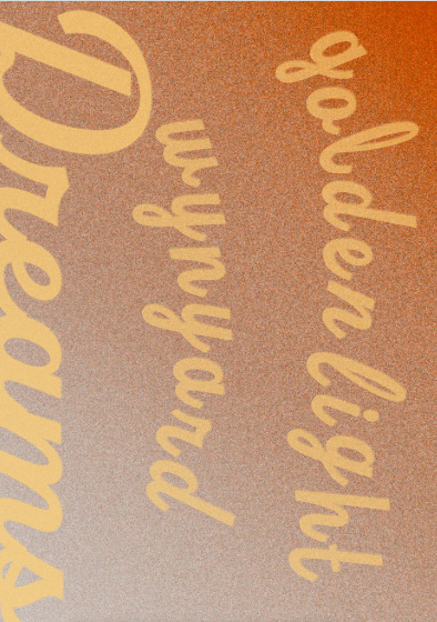
These are some of the designs I tried out. In my opinion, they’re okay, but I felt like the teacher’s suggestion to use gradient words was a key element I really wanted to include in my final design. As for the faded background coming from the bottom, I was still unsure about it, but it started to make more sense when thinking about the sun, like the top being lighter and the bottom fading darker, as if the sun was shining down in a natural way.
0 notes
Text

This was feedback I got on what I thought was my final design, but I wanted some last minute feedback, and Caroline gave me some constructive criticism on what I should do to improve my design.
- Caroline
I wonder if you need to frame the page with 'Golden Light' at the top and 'Wynyard Dreams' at the bottom? If you decide to then maybe the 'Golden Light' at the top could be in a lighter weight or italic or a pale tone that's not far off the background? This might work better than changing fonts completely? Otherwise maybe the 'Golden Light' text could be integrated into the waves? Or removed as the design is telling me this already?
—overall, the idea of soft gradients works for the idea… but you need to develop the flow of colour / light. It looks like the sun is glowing from the bottom… kind of more dawn than dusk? You could try options with the wavy text… so that it has a slowly changing colour gradient… look at whether that works best going bottom to top? Ot top down?
—please also have a play with the scale / placement of the wavy lines of text… consider the negative spaces between them / they could be different sizes? weights? colours even??
—the contrast between the blocky text at the bottom and the wavy text and gradient above communicates the idea of a city and sky without it being obvious… good stuff.
0 notes
Text
I was just having a go at After Effects in my own time to try things out, since I missed the class where we made this.
0 notes
Text


SDL Development (Designs)
These were some of my earlier designs, and honestly, I don’t think they turned out that well. They included most of the elements I wanted in my final poster, but the overall design just didn’t work. This made me rethink my whole approach, I felt stuck. I had a lot of ideas in my head, but once I tried putting them into InDesign, they just didn’t look right.
Because of this, I reached out to both Caroline and David for feedback and guidance. They gave me some helpful suggestions and really liked the idea of breaking down each word to find visual concepts for the poster. That feedback helped me move forward with developing a stronger design.
0 notes
Text
Poster Planning (Summative)
With planning my new poster idea and design, it was something of which I went back to my Wynyard Quarter site visit and thought about what I enjoyed about the area other than the basketball aspect. I said, “The sounds of conversation and laughter” and “a youthful atmosphere as everyone makes the most of their day.” This is what I wanted to encapsulate with my new themes. I had to break down words individually that were in my quotes I had written. “Golden light, Wynyard dreams” was a quote I had come up with, and I decided to break down each word to come up with visual design elements:
Golden light Sun rays, flares, gradients
Soft glow / hazy light
Late afternoon (golden hour), sunset
Wynyard Retro surfy style
Slight nostalgia or beach culture
Dreams Floaty, surreal, abstract, imaginative
Clouds, stars, drifting shapes
Abstract textures
Layers, slight blur
This helped a lot, as it gave me different ideas for colours, gradients, font, layout, and more.
0 notes
Text
instagram
Interactive Poster Design
Skala Design. (2024). Moving in and rearranging [Motion graphic poster]. Kunstraum Baden.
This design also reminds me of the popular brand “Off-White,” created by Virgil Abloh. The brand’s now iconic, popular cross design shares some visual similarities with this poster. Off-White also uses Helvetica Neue Bold, which is the same or very similar to the typeface used in this design, adding to that connection.
0 notes
Text
instagram
Interactive Poster Review
Klinksik, M. (n.d.). Unused animated poster for the MODECi Club in Seoul [Motion graphic].
This poster design intrigued me because of how simple it looked at first, using only two colours, red and black. Before the animation starts, it might not seem very busy, but once it’s in motion, it becomes much more dynamic. The font is quite large and easy to read, which leaves enough space for the red background to stay clearly visible. The typeface has a tech like feel to it, which matches the overall vibe of a club in Seoul. The animation instantly reminded me of dominoes each broken up square falls as if being tipped over. Once the animation finishes, each piece fits back together seamlessly, making the advertisement clear and easy to read.
0 notes
Text
instagram
Interactive Poster Review
hello_ep. (2024). Act / National Asian Culture Centre / Seoul (motion graphic). National Asian Culture Centre.
This design was super interesting to me, as something was always moving, whether the text was disappearing or appearing. The repetitive use of text made the design feel really busy, but I actually appreciated that. The fast, twitchy movement of the text caught my attention and made me focus on the different animations happening throughout the piece. The use of size and scale in the font also added to the busy, energetic feel, but when certain words disappeared, it created moments of space that balanced the layout really well.
0 notes
Text

Poster Review - Courtney Croot
This poster was one of my favourites when looking at all the other students work. I really liked the use of texture and colour throughout the design. At first glance, it seems simple, but after looking more closely, the design choices become clear and explain why it’s so visual appealing. The use of red, black, and white clearly references Aotearoa and the Māori flag, adding cultural depth to the design.
The quote “Where silence speaks louder than words” really stood out to me. It shows how art and exhibitions can communicate powerful messages without needing lots of text, encouraging viewers to focus on visuals and subtle details. I found this very interesting, since we’re creating posters that are meant to show our design skills and share a message through visual elements.
Even though the quote is placed behind a layer in the design, the bold red text still shows through the textured surface. I thought this was a nice touch as it ties into the idea that meaning can come through different angles and obstacles, which makes the message even stronger.
If I had to give one small fix I would recommend, it would be the spacing between “est. 1888” and “Toi O Tāmaki.” The alignment felt slightly off compared to the rest of the design. But honestly, that’s just me nitpicking. Overall, the poster is really strong and well thought out.
0 notes
Text

Poster Review - Ryan Bosson
This poster stood out to me because of its yellow and black colour scheme. The colours really pop but also work well together, creating a bold and balanced look. I also liked how the design connected both Maungakiekie and Royal Oak in a unique way. The added texture and the spacing between “Maungakiekie” and “Royal Oak” were nice touches that made the layout feel intentional.
If I had to suggest a few improvements, I’d say maybe try to make the text connect and flow together a bit more. Making the text bolder could also help it stand out better. These are just small fixes, and overall, I think the poster is strong and visually interesting.
0 notes
Text

Poster Review - Bree Luca
This poster really stands out because of its bright colours and mix of abstract shapes, which match the creative and fun feel of St. Kevin’s Arcade. The playful design gives off a sense of fun and connection, which fits the social vibe of the space. The way the text is arranged adds movement and helps guide your eyes around the poster.
The slogan “Talk and Tea” works well. It matches the chill, friendly atmosphere of the arcade and makes the poster feel welcoming. One small downside is that some of the shapes and colours can be a bit distracting, which might make the message harder to focus on at first. Texture could also be added as a feature to make the poster more interesting, but I do find that the clean, fun aesthetic fits the theme.
Overall, it’s a strong design that captures the energy of the space. It’s eye catching and fun, and with a bit more balance, it could be even clearer.
0 notes