
Bonjour ladies, I am Adam and this page is dedicated to blending the residue from my brain with my interest in design, enjoy.
Don't wanna be here? Send us removal request.
Statistics
We looked inside some of the posts by madamchiles and here's what we found interesting.
Average Info
Notes Per Post
5
Likes Per Post
5
Reblog Per Post
0
Reply Per Post
0
Time Between Posts
10 days
Number of Posts By Type
Text
17
Last Seen Tumblr Blogs


Fun Fact
Tumblr was named as a finalist in Lead411’s New York City Hot 125 in Aug 2010.
Text
Studio Three Blog Eleven
My Studio Three Experience

This semester has been one of the most intense modules I have done speaking in terms of project management. Over the 13 weeks I have done an external client project, creative advertising project, collaboration project and various tasks in between. Managing these projects I needed to find a system that worked for me in order to move on with what I was doing, I therefore followed the technique described by Aleksandar Olic (2017) as waterfall, where I went through a process of planning, creating, reviewing and then releasing. This technique allowed me to not get stuck on one thing during the progress of my projects and move on to the next thing, further improving my time management. Through this I have learned most importantly the natural process of experimentation. Through trial and error, it helps strengthen the final outcome and also helps you adapt skills by repeating. I learnt that not everything has to be perfect first go.
Although time management going pretty well this semester there were some improvements that needed to be made throughout the process such as re-reading briefs, user testing earlier on and starting on the poster after packaging. Re-reading briefs needed to take place during my work on the external client projects, I have already discussed the problems that arose from this in a previous blog post however in short, I went too far from the brief gulines. User testing and starting my poster after packaging would have been useful at the start as I found myself at the end of the project not liking the cohesiveness of my poster compared to the rest of the campaign.
Although needing improvement in some areas, I also learnt things such as animation, dealing with real world clients, managing multiple projects at once , professional practise, typeface customisation, and interactive PDFs.
Overall for this semester I believe I deserve a distinction or high distinction for this module as I have demonstrated my ability to engage in brand development, team work, problem solving, reflection, time management and effective communication while producing quality work.
Olic, A. (2017) Waterfall Management Methodology. Active Collab. Retrieved online December 9 2019. https://activecollab.com/blog/project-management/waterfall-project-management-methodology
5 notes
·
View notes
Text
Studio Three Blog Ten
Collaboration Ideation
In week 10 I was contacted by an Audio studio by the name of Gary Chen after he had read my elevator pitch and saw the work I had done. Gary commented on some typography I had done previously which was inspired by 80′s movies with neon lights and chrome lettering. After this I agreed to meet with him and go through a brief of what exactly he wanted, here are some notes i took away from the brief he gave me,
Due:
Mid week 12
Deliverable:
80’s synth wave single cover
Personal logo
Name of the song:
The Machine
Specific colours:
Pink, blues - neons
Visual:
Just text , icon if I can, a car.
Logo style and tone:
contemporary, classic, quirky, professional
Quirky, minimal line work
Components:
Name as a logo
Icon of him - symbol
Gary Chen :Cap- round glasses GC,
Navy blue - royal blue
After this I went to Pintrest and gained inspiration for both the single and logo, here is what I gathered through my Pintrest:

I then started my thumbnailing of Gary himself:

and then continued on to roughs which Gary enjoyed very much:

this project is still underway at this moment however I will be able to report and reflect on this final products in my final reflection post.
0 notes
Text
Studio Three Blog Nine
External Client Reflection
At the start of this semester we were required to take on two external clients to do real world design work for, one being Heidi Matthee and the other being The Wheel Of Brisbane. Both briefs were quite different to each other, Heidi was after a business card / logo for her consulting business in a very serious professional style and tone, whereas The Wheel Of Brisbane was after a fun, bright and creative tourist magnet.
Heidi’s project initially was a challenge to me due to misconception of what her brand actually was and what she wanted, The first round of roughs that I had produced for her exhibited a very playful creative context with things such as stairs, doorways and puzzles communicating the idea of her creating pathways for clients. Take a look at some of the roughs:

After showing her these I did get helpful feedback, however not exactly what I wanted to hear, The archways to her seemed like stairways to hell, the shadows in the doorways communicated dark mysteries, the head and hair looked like panda legs to her and she was not a fan of the puzzle pieces. Although confronting to hear this at first, this experience allowed me to grow and prepare for the real world where sometimes clients can be picky or change their vision or miscommunicate their vision.
After going back to the drawing board I was able to produce some graphics that were more in line with what she was after:


Following presentations to her, she was very pleased with the outcome. As for The Wheel Of Brisbane I produced to cute little magnets representing the night and day life of the wheel:


Reflecting on this experience, as stressful as it was for me, I believe that it was useful for my growth and I got more out of it than if I was just told happy answers the whole time. It has taught me to not think too deep into client briefs that are after simplicity.
0 notes
Text
Studio Three Blog Eight
User Testing
“Getting some typical users in front of your design is critical so you can get a feel for what works and — equally — what doesn’t.” (Murphy, 2018)
This week in class we are learning about user testing, in order to gain some opinions on the work we have done to further shape our work. In this journal post I will be referencing the Christopher Murphy (2018) article on comprehensive user testing.It is mentioned in this article that most of the time, you may think that your design is already finished and looking good however design is an interactive process meaning that there will always be changes that need to be made, hence why user testing is important. It is mentioned by Murphy (2018) that testing should be done during the paper prototype period, during the changes and ten after the final product to help further shape your future work. In the real industry, the goal of user testing is to get as much feedback as early as possible in order to avoid mistakes in the expensive parts such as printing. Christopher Murphygoes into the vital steps into creating a user test, below I have summarised what they are:
Plan : Develop a solid plan of the overview of the test and its goals, timing, equipment needed etc.
Create a script: Write the actual questions and figure out what you want from the feedback
Recruit: Select individuals who will play a vital role in the feedback you want, generally from the audience who would use the product.
Run the test
Close the test: Gather your information, preferably in an infographic and use that data to shape your next move in your design.
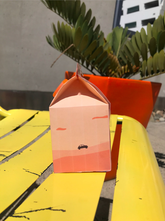
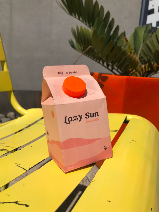
After this I took the opportunity of the research I conducted into user testing into action. I created a series of questions that related to the packaging prototype that I made and asked my audience about the overall effectiveness of the brand and packaging. I firstly drafted up specific question which would give e the answers and results I was looking for, such as demographic questions, psychographic questions and brand specific questions. I then made myself a prototype milk carton and took images for the viewers to critique, here is what they saw:


After this I made my survey and sent it to the recipients, here are a summary some of the questions and answers:
Genders:
33% Male
60% Female
Ages:
21,22,28
Social media:
100% use Instagram
Frequency:
33% check Instagram once or twice a day
60% check instagram hourly
Beverage Habits:
100% of recipients buy drinks on the odd occasion to refresh themselves.

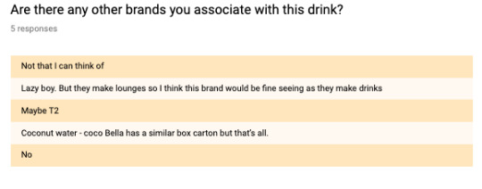


From the results I gathered, there were a few points that made obvious to me:
- My packaging is something that is ‘Instagramable’, which supports my market plan which a goal of Lazy Sun was to create packaging which is shareable on social media for the ‘Insta girls’ which result in free marketing / word of mouth.
- The front of the packaging is a little plain, perhaps the action I need to take with this is to add a more distinguishable illustration on the front which gives ot more balance and eye captures
- I am achieving the themes / overall brand message of summer time and lazy , warm desert scenery.
- For the most part the branding stands out and makes customers want to know more about the product.
References:
Murphy, C (2018). A Comprehensive Guide To User Testing. Smashing Magazine. Retrieved Online November 25 2019 https://www.smashingmagazine.com/2018/03/guide-user-testing/
0 notes
Text
Studio Three Blog Seven
Professional Practise

This week in class we are learning about professional practise within the industry and working with others. Firstly we are looking at the code of ethics via the AGDA website on professional practise in design. Here is my definition of
Code of ethics:
Following a code of ethics as a designer allows your practise to be as professional and non problematic as possible. It teaches a designer how to interact with clients, other designers and even their own self / their work.A code of ethics is also vital for designers to learn their rights in the industry.
Copyright
After this activity we also learned about copyright and who owns what. Copyright deals with work such as drawings, logos, photos and visual images however it does not protect ideas, styles or techniques. The ownership of it differs from each circumstance, here are some that I looked up: Work for employment:
“Works created in the course of employment Unless there is an agreement to the contrary, the first owner of copyright will be the employer if the artistic work was created as part of the employee's usual duties.”
Work for magazine or newspaper:
“If a work is created by an employee of a newspaper or magazine, the artist and the employer own separate parts of the copyright, unless there is an agreement to the contrary. This does not apply to freelance artists or photographers.”
Work for freelance / commission:
“In general terms, if a graphic artist is commissioned to create an artistic work, the graphic artist will own copyright, unless there is an agreement to the contrary. In these cases, the client will have the right (“licence”) to use the work for the purposes for which it was commissioned.”
Morally speaking me as a designer also have rights wither im the owner of the copyright or not, for example
If I made work but did not own it i should be:
be attributed as the creator of their work;
take action if their work is falsely attributed as being the work of someone else;
take action if their work is distorted or treated in a way that is prejudicial to their reputation.
References:
ACC. (2014) Graphic Designers & Copyright. Australian Copyright Council. Retrieved Online November 18 2019 http://www.copyright.org.au/ACC_Prod/ACC/Information_Sheets/Graphic_Designers___Copyright.aspx
AGDA. (2019) Code of Ethics. Retrieved Online November 18 2019 https://www.agda.com.au/about/code-of-ethics/
0 notes
Text
Studio Three: Blog Six
ECO Packaging & Printing

In the past two weeks of classes we were able to go on an excursion to a printing warehouse and learn about the process first hand. Some things that I found most interesting about the process were the die cutting techniques, the amount of spare paper they order for mess ups and the importance of getting designs right before they are sent to printing. After our excursion I decided that I wanted to try a various amount of different printing techniques for my business cards. Spot varnish and die cutting were two main ones that I want to try.
Essentially spot varnishing will apple texture to a particular section of your design in order to give it a special edge or elegance (Kwik, 2019). Die cutting is the process of using a die to cut a custom shape of a design in order to separate it from other designs and make it its own.(Print Group, 2015). Our next class we learned about printing and packaging design. The things we were looking into were specialised printing effects, eco packaging, packaging techniques and more. Below I have researched some strategies in which help reduce the environmental impact of packaging both pre consumer and post consumer.
Strategy 1 :
Reducing the size, weight or thickness of packaging; and optimising void space within the design.
Why? Minimising the size and thickness of packaging can therefore lower the rate of energy we use to produce these designs.
Strategy 2:
Companies should consider their common law liabilities, assess the packaging for potentially toxic or hazardous substances that are likely to pose risk, and endeavour to reduce that risk accordingly.
Why? Producing toxic packaging with chemicals can be harmful to the packaging which ends up as litter therefore harming the environment more.
Strategy 3:
Packaging should be designed to maximise the efficiency of transport through light weighting, fully utilising shipping space (‘cubing out’) and using bulk packaging for distribution where appropriate.
Why? The lighter and more efficient the packaging is the easier it is to transport and leaving lest labour on the transportation devices used. Transport can also harm the environment.
Renourish Strategies:
Production-
Tier 1:
Files should be transmitted online to share, all stakeholders must have meetings and communication channels to reduce transport to each other, all the stakeholders must have waste strategies implied themselves as well, and employs local printing services.
Tier 2-
Files should be transmitted online to share, all stakeholders must have meetings and communication channels to reduce transport to each other, all the stakeholders must have waste strategies implied themselves as well, and employs local printing services.
Tier 3-
Files should be transmitted online to share, all stakeholders must have meetings and communication channels to reduce transport to each other, all the stakeholders must have waste strategies implied themselves as well, and employs local printing services.
Doing these exercises on how we can efficiently print without making too much of an environmental footprint was vital and a great way to think for someone just starting in this industry.
References:
Kwik Kopy, (2019). Spot Varnish Printing. Retrieved Online November 14 2019. https://www.kwikkopy.com.au/printing-services/finishing-services/spot-varnish
The Print Group, (2015). What Is Die Cutting?. Retrieved Online November 14 2019. https://www.theprintgroup.com.au/information-bank/what-is-die-cutting.html
0 notes
Text
Studio Three: Blog Five
Self Branding
This week in class we were introduced to our next project, being self branding. A part of this task was to research into different creatives who are new and starting to become successful. Here is what I found:
stooodio.dooodle
This person on instagram doesn't use their real name but the brand they made for themselves, It is run by Marta Ryczko who keep herself separate from stooodio dooodle. This visual account posts 10 minute doodles everyday and keeps fans interested by the range of versatile content they provide. Another thing that they do well is sharing development videos of their work and engaging with fans via comments. This way of engaging is great because most fans of a successful creative want to know how they produce their work and get inspired by it.
As an independent creative, It is important to make a visual representation of yourself like stooodio.dooodle has. Whether you actually have your name on it or a brand name, the cohesive visual branding is what brings in more fans and viewers. Reflecting on this, I believe showing that I have a social media account which is cohesive would be a great way of showing potential employers that I can run social media and I can produce different styles.

RealFunWow
This account is a successful graphic designer by Darren Thomas who has a very distinct style. I chose to look at what he does on social media as he is one of my biggest inspirations as a graphic designer style wise. Darren does things such as daily posts, story posts and videos on skill share in order to engage his audience and fans. He also allows people to buy his artwork and also get it tattooed. This is a great way of engaging with an audience and make them feel like they can support him in ways that benefit themselves.
As an aspiring graphic designer and creative director, It important to reflect on How Darren started his account. When looking right at the start of his page it seems as though he grew with his audience and gradually poster more and more often to keep people interested. This is something that I can take on board as the more often you post or schedule posts, the more followers and overall engagement I will get from people which will be a great way to achieve exposure and a good impression on a potential employer.

After researching into this example creatives, I then was able to answer some questions about myself in order to make a 20 second pitch to have in order tp gain a good understanding of what MY brand is:
My name is Adam, I am a graphic designer and copywriter who is aspiring to be a creative director.I am selling satisfaction. I apply my adaptable skills I have acquired over the years in order to achieve a sense of fulfilment to the people I work with. I offer versatility and creativity while thriving in a team environment.
Now that I have discovered this, I am going to start developing a visual inspiration of my own branding and develop a social media plan in order to plan out how I will execute the content I have made for myself through doing projects. I want this account to almost be a portfolio and a mood of my style all at once.
0 notes
Text
Studio Three: Blog Four
Slogans
This week we looked into creating a brand voice / personality. This comprised of an activity where we basically profiled our brand, here is what I came up with for Lazy Sun:
Who would they be ?
Miley Cyrus - She is fun, young colourful, has a fixation with Australian men and the concept of a beach boy and beach life and summer time

How would they speak?
Laid back. Injecting humour in when it's appropriate, knowledgeable, socially aware, references pop and current things.
Call to action:
Exotic drink
Try the flavour
For creamy fruit lovers
For sweet talkers
Yummy inside
Come taste the flavour
Introduce your tastebuds
Two coming together to make a good taste
After looking into our own brand identity we also researched in big ideas as these are the foundations for great posters and slogans. A part of this was a task in researching a brand example.
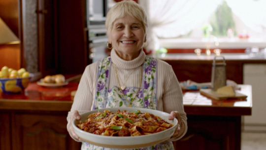
Have you eaten? Leggos ad :
This ad won an Effie due to its well thought big idea. The idea came from an insight that Italian brands were now just relying on their product alone to sell. Leggos therefore brought the characteristics back into the Italian range by highlighting Australia's lost love for traditional Italian cooking with a staple character such as a Nonna.
For their big idea to work they needed a genuine representation of a Nonna, and thus executed their message by casting not an actor but a real Nonna in her real house. This therefore conveyed the genuine Italian cooking message that they were aiming for. By adding warmth, and embarrassing humour into the tone of the ad, it helped convey their message of genuine and light heartedness.
After this we also looked into slogan examples I talked about the Kombucha, “love your guts” slogan.
This slogan is great because i s creative and representative of the product itself, it is witty and a pun at the same time. Playing on the saying “ I love you guts”.
This slogan shows that something fun, quick and playful is a great way to quickly pull your target in and create a good first impression with your brand. A pinch of humour is a great way to have a positive connotation to the brand and also give a ‘cutesy’ impression.
References:
Effie Awards, (2019). Entry 107: Leggos Have You Eaten?. Retrieved Online October 8 2019. https://effies.com.au/attachments/107-leggo-s-entry-sensitive-information-delete.pdf
0 notes
Text
Studio Three: Blog Three
Marketing and social media plans
This week we looked into the backbone of a graphic design campaign, delving into what components must be considered in every big marketing plan. In class we began a business plan model composing of things such as key partners, key activities, value propositions, customer relationships and segments and the channels. Here is an example from class that I filled out.

After producing a real marketing plan we moved on to researching about social media plans.
I was given the task of researching two successful social media campaigns and what each company did in order to reach this success. Here's what I found:
One
Campaign: Spotify 2018 goals
Brief: Spotify used market research in order to set off a marketing campaign that wasn't necessarily intended for social media but it worked. The campaign basically gathered statistics into what, who and how many times people listened to certain genres, artists and songs. The campaign was shown via billboard which were targeted local specific meaning people would resonate with the messages. Due to the quirky nature of the copywriting of this campaign it prompted people to take to social media and share their end of year Spotify data, sharing who their top artist was and what songs they repeated over and over.
Takeaway: Create a social media campaign that is local specific, which people can relate to. Personalising your campaign will bring in more popularity.

Two
Campaign: Fortnite season 5 2018
Brief: In 2018 Fortnite was coming out with their fifth season which was multiverse/ time warp themed where symbols of the future and past would rift into the present and even real life. The campaign promoted a character in real life to get rifted into the game and a few elements from the game rifted into real life. This featured llamas and big burger heads places over the country, which soon enough became landmarks that people wanted to visit, take pictures and share it on social media. This campaign caused ,any people to want to share and hashtag pictures of themselves with the props, achieved widespread popularity of the game.
Takeaway: Create a media campaign which interacts with real life and prompts people to want to have photos with or share it around. Something that is cool and worth consumers publicising that they are partaking in it.

After this activity I also searched into what things I should be looking out for in a media plan, here is what I got:
Social media Plan:
Goals and objectives-
Audit of existing social media presence-
Competitor analysis-
Plan your visual content-
Calendar-
Ways to Engage-
Ways to measure success-
After this week and doing those two activities It made me realise the importance of creating campaigns that are memorable and familiar with the geographic audience.
References:
The Drum, (2019) SPOTIFY: 2018 GOALS. Retrieved online October 6 2019. https://www.thedrum.com/creative-works/project/spotify-2018-goals
0 notes
Text
Studio Three: Blog Two
Successful campaigns
This week we did an activity to expand our knowledge into market plans and delve into different brand examples. I was tasked with choosing different brands from local, national and international levels and researching about their various campaigns. Here is what I found:
One
Studio: bigfish, Brisbane, local
Campaign: What’s Golden
Analysis: What’s Golden is a new live music venue by the visionary team at The Tivoli. Channeling the intimate, enigmatic nature of the space, we created an identity with curiosity at its core.This campaign exhibits the opulent,drinking life in Brisbane, exploring the idea that people in Brisbane gather to the Tivoli not to just get shit faced, but mingle with their friends over a drink and have a great live music experience.
Examples:
Logo:

Website:

Poster:

Two
Studio: Leo Burnett Melbourne, national
Campaign: Bonds X-temp mens underwear
Analysis: This was a large scale national campaign comprising TV, OOH, radio, POS, digital and social media activity, which encourages men to fight the good fight and pull on a pair of Bonds X-Temp – the latest in undie innovation with built in technology to trigger cooling when your body temperature rises. The ad expresses an actual problem men face with a humorous touch in which approaches an unspoken or embarrassing subject with a laid back and relatable manor.The campaign was marketed at men in their 30’s which most likely have trades like jobs or go to the gym where their body temperatures and constantly high.
Examples:
TV:
https://www.youtube.com/watch?v=3RhRwDjO4dE
Social media:

Three Studio: AMAZON
Campaign: Amazon Alexa (Alexa loses her voice) - Superbowl2018
Link: https://youtu.be/QIVTSelVurI
analysis: The advertisement uses simple humour and a star studded cast to attract and hold attention and encourage sharing. “The 90-second spot continues by including the teaser, where a woman at home asks Alexa for the weather, but Alexa coughs and dries up. Cut to Amazon HQ, where the urgent news is flooding in and a concerned Bezos is unconvincingly reassured by an aide that the situation is under control and that they have stand-ins at the ready.Those stand-ins include a star-studded cast – Gordon Ramsay, Rebel Wilson, Cardi B and Sir Anthony Hopkins – trying, and spectacularly failing, to replace Alexa.”
Target Audience: Attempting to appeal to the largest demographic they can given the placement within such a high profile event by incorporating as many celebrities with different fan bases (gordon ramsay, rebel wilson, cardi b, sir anthony hopkins, jeff bzos) as possible.
Relies on this star power to create impact - something that only really big companies can often do. This is necessary to compete with the other Superbowl advertisements (“noisiest day for advertising”)
Top rated commercial in 3th annual USA TODAY ad meter
+50 million views on youtube - this would be a primary goal for the company in enlisting celebrities to encourage sharing online.
Overall comparison:
It seems as if the more wide the target audience ad personas get, the more quirky and experimental the studios are able to get with their campaigns. Although I personally like the more local rooted campaigns visuals such as bigfishs, i do like the tongue in cheek.
Larger companies mean bigger budgets, in the case of the amazon commercial they rely on their ability to cast big names to attract attention which the smaller scale companies aren’t capable of.
References:
Bigfishtv, (2018). What’s Golden. Retrieved online October 4 2019, https://bigfish.tv/work/whats-golden
Bonds, (2019). Bonds X-temp mens underwear, Retrieved online October 4 2019, https://www.bonds.com.au/stories/x-temp/trunks.html
Effie Awards, (2018). Amazon Alexa, Retrieved online October 4 2019, https://developer.amazon.com/docs/alexa-voice-service/marketing-and-branding-guidelines.html
0 notes
Text
Studio Three : Blog One
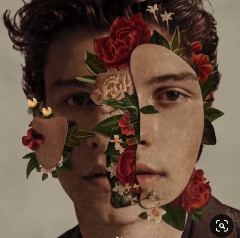
This is the logo for Recess, it shows how simple yet effective a script logo can look. It is also noted that this is their only logo and the rest of their branding is used to be funky and fun with their brand identity. Gaining inspiration
Heading into week one of studio 3 we were presented with many projects that we will be working on during this semester, one of which being a creative advertising project. This project requires us to come up with a mockup business and basically build w whole brand identity around them.
In light of this project I has three main business ideas that I wanted to go with which were a beauty brand, a kombucha brand or a cider brand. Here is a little mind map of the pathways in which a thought I could go down:

Doing this mind mapping task brought me to a conclusion that i wanted to do some sort of beverage brand. With this in mind it reminded me of an exotic drink I had tried on the weekend which was called mango milk from Taiwan at a market which was the most unique taste ever. I therefore decided that a niche beverage brand would be a milky fruit drink with the flavours mango, peach and lychee exemplifying sunset.
This required me to do some research on other successful brands in order to see what they do with a similar product.
Brand one :
Brand name : Recess
description : Recess is a sparkling water infused with hemp extract and adaptogens for balance and clarity.(Recess, 2019)This brand has an extremely funky yet minimal aesthetic which is a similar one that I am going for with the colour scheme and overall style.
logo :

(Recess, 2019)
This is the logo for Recess, it shows how simple yet effective a script logo can look. It is also noted that this is their only logo and the rest of their branding is used to be funky and fun with their brand identity.

This is their social media and logo usage throughout their brand identity. As you can see they have done a great job at having a distinct style that sets them apart from the rest of the clutter in this ‘kombucha’ category.
Brand two :
Brand name: serious food co.
description : This brand is a snacking food brand comprising of products such as popcorn, cookies, ice cream etc. The unique selling point which they have is that “From the farm to the bag, our organic products are 100% traceable, and free-from chemical nasties. So you can snack in a way that’s sustainable for your body and sustainable for the world. We call this sustainable snacking.” (Serious Food Co, 2019) .
Logo:

Although this logo is quite simple and not very eye opening, it is their packaging which is cute and quirky which sets the a part of other businesses. Keeping with their minimal design they produce packaging such as this which make the brand distinguishable and putting their logo usage to play.

Overall examining these two brands gives me great inspiration to do less for my logo yet more for the overall brand look and packaging.
References:
Recess, (2019). Cool Calm Collected. Retrieved October 2, 2019. https://www.takearecess.com/
Serious Food Co. (2019) Products. Retrieved October 2, 2019. https://www.seriousfoodco.com/
0 notes
Text
Studio 2 Week Eleven
Thats a wrap
As my last blog post I would like to go over a reflection of my Studio 2 experience and also show a few things before synergy night.
Beginning studio 2 I had in mind that it would be mostly photography and not much illustration however , these last few weeks I have found challenging trying to come up with a distinct style that I enjoyed. After much trial and error I believe I have come up with a distinct style that most probably doesn't have a label to it however I would describe it as contemporary minimalism with hints of retro .. and not afraid to step a foot out of minimalism as well.
In this stage of my project all i have left to do is:
x 1 portrait + collateral
x 1 collateral for my conceptual shot
x 1 analogue piece
x 1 collaboration shoot
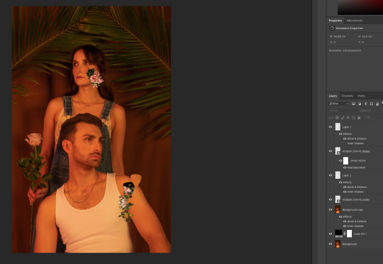
In light of this I would love to show some of the finished pieces that i have worked on throughout the semester including some photos and digital pieces.


0 notes
Text
Studio 2 Week Eleven
Planning - Trial and error
This week I have been head down ass up in all of my collateral. I have been switching from digital to photo editing a lot while also keeping in mind that I would like to have one more of my analogues re-done. A part of this mess has come my idea to plan out my weeks given that I have a collab project as well before synergy. Here is a show of my calendar and how i've planned it out:

In other news I have been working on some photos in the editing process, the most difficult thing for me is a concept shot at the moment as I am relying on complete post production to make it conceptual. Here is a trial and failure that I was trying to follow with this video clip:

Along with this I am making my magazine featuring the ads, photos and some digital work throughout so I have begun writing copy for one of the pages:
“This semester I have been heads down ass up in a project we call Studio Two where we are given the challenge to use our photography, illustration and analogue skills to produce a fine little project I know better as - Sucker Magazine.
This short and sweet little magazine showcases my photography, illustration and technical skills by including some of the collateral I have branded into collateral for Suck Magazine. Sucker Magazine is a concept I came up with myself in order to appeal to a young audience and freshen up this dusty portfolio of my with vibrant art. I hope you enjoy!”
As visible by my calendar I am hoping to have some of my photos edited and ready by the end of this week and ready to pop into my magazine.
0 notes
Text
Studio 2 Week Ten
A change in a fast current
As the weeks are going by so quickly I have found myself rushing into things worrying about getting end products finished rather than what I like. Although doing some analogue art last week that I was proud of, I still found that is was not relating to my overall campaign, therefore I spent time earlier this week changing the course of my art a little. While changing my analogue art style a bit I have also reconnected myself to digital illustration.
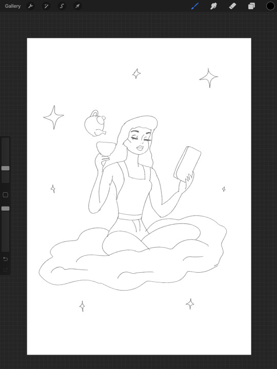
After consulting with Paul i found out that I was able to transfer my analogue concepts into digital work and use that, therefore that inspired me to transfer that style I was achieving in analogue and enhancing it digitally. Here is the particular style that I am going for within digital.


As you can see it is quite vector yet still has style textures to it that is obviously done in after effects through photoshop. I do love the matchbook look like this:


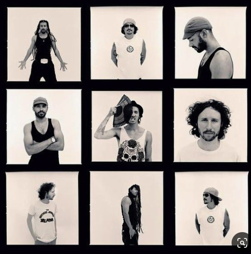
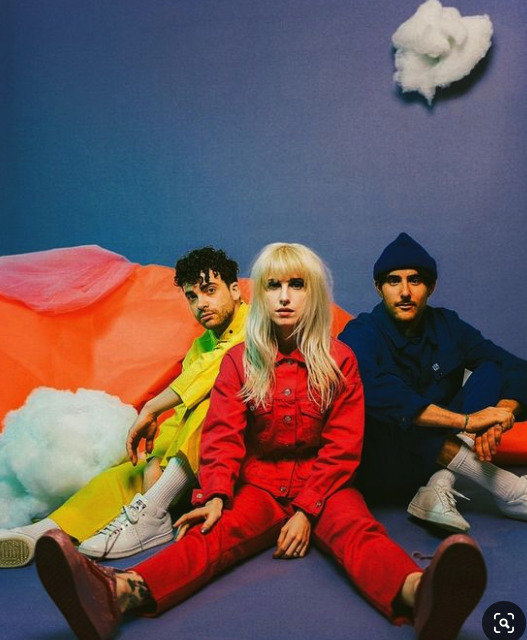
In other news we were also given the next project to do the collaboration projects, I came across an offer to shoot for a band in partnership with another student, therefore Natalie and I took the opportunity to collab together and do this shoot which I am looking forward to. Here is some of the band photoshoot moods I have looked at:

As for planning goes, I am currently trying to execute all my work like this:
This Week: Finish analogue, start digital
Week Eleven: Finish analogue, start photos
Week Twelve: Finish Photos, start collab
Week Thirteen: DONE
... Lets hope i keep afloat in this fast current.
0 notes
Text
Studio 2 Week Eight
A Spanner (Paintbrush) in the Works
In my blog post last week I went over the direction I was going in for the digital illustration, after giving many attempts and fails at it i put it on pause whilst we learnt about analogue art in class. This learning really but a spanner in my digital works as I basically completely shifted my focus on analogue art. I was introduced to water painting by Paul, learning how to use different types of colours and techniques to achieve amazing effects. If there's one thing i learnt from water colours it is that they are very unpredictable. Although a rocky start I slowly got the hang of it and produced some things I was extremely happy with in class, take a look:


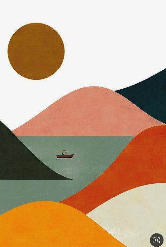
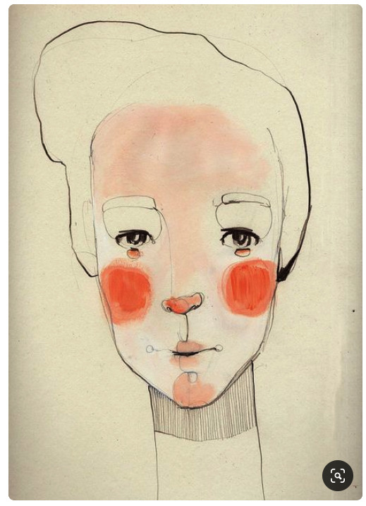
After learning that I can actually work with watercolours this lead me to the conclusion that I wanted to produce some water colour works to submit along with acrylic paintings. I then began researching what styles of water colouring I wanted to show in my submissions, I found I really enjoyed minimalist watercolour drawings (you will see in my mood board and thumbnails).


After getting inspiration from this mood-board I then started a thumb-nailing page where I experimented with different things, discovering that I wanted to do a warm yellow orange colour theme throughout here are some pictures:


So as you can tell, analogue art has thrown a spanner into the works of digital illustration at the moment, therefore I will stick with it and smash it all out this week and the next so I can come back to digital with a fresh mind set. I am looking forward to seeing what i produce in the next week so stay tuned.
0 notes
Text
Studio 2 Week Seven
*Cracks knuckles and grabs pencil
After taking a long break from blogging, I am finally back with some new content to update everyone with. The past weeks I have been heads down in my photography shoots in the studio with Natalie where we spent a long three days spread over two weeks accomplishing each shot that we wanted to achieve for our end result. I am quite happy to say that I am proud of what we achieved and am satisfied with the results of the shoot as well. I have not taken them into Lightroom or any post production yet as I have been carried away with planning my next pathway of this project.
Digital Illustration
The past week I have been brainstorming ways that i can incorporate digital illustration into my sucker magazine concept that I am going with. The goal I am trying to achieve with this project is to have every piece of collateral somewhat link up, thus i thought of some ways I could make this happen.
- Incorporate the digital illustration as a cover , middle and back page for the magazine keeping some of the same colour palette as the shoot.
- Draw over the existing photos that I have taken
- Draw art with a specific style that incorporates some elements from my shoot and somehow fit that into the magazine.
Through much thought process I am leaning towards my third option at the moment as I am looking for as much creative flexibility as I could encounter barriers with my skill level. Given all this strategy I decided it would be a great idea to start expanding my mood board once again and gain some inspiration for what style I wanted to go for. Here are some examples of things that stuck out to me the most:

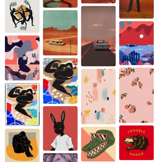

As you can tell through my mood board there were two distinct styles I had an interest for which were a more vector alternative style and then a retro almost pinup art style. Still while writing this blog post, I do not know what road I want to go down so why not both?

Both of these styles are something that I have not tried at all, which presented itself both a challenge and also an exciting journey to me. This lead me to start researching into how I can acquire the skills and tools to achieve the looks, here are some youtube tutorials that I found which i have been practising with:
youtube
youtube
youtube
youtube
This practicing process then lead me to think about how I can incorporate some elements from my photoshoot into the art, although in extreme early stages, here is an example of me incorporating one on the images from my shoot into the retro art style as a rough sketch:

0 notes
Text
Studio 2 Week Four
Preparing For The Shoot
Part One
As you guys might have seen in my previous weeks post, I crossed over into this week where I talked about the macro photography that I learnt during class with the fly pictures. In our second half of the week we moved on from macro and focused on camera techniques, in particular using the shutter modes for some great effects. The camera technique that we explored was light painting where in summary you put the camera’s shutter setting to BULB and ISO 200 Aperture F9 you are able to capture different light moments with the manual pressing of the flash and shutter. Most students went for big light effects with many colours shown everywhere however I wanted to experiment creatively with creating stores behind my images, here are some of my favourites:


After experimenting with the light painting technique, Natalie and I decided that we would experiment without the lights and attempts some shutter stop techniques in order to achieve duplicates of ourselves and movements, have a look at some of the fun we had with this experimentation:


Upon taking images with this shutter technique I believe that is the procedure I would like to use for my technique shot in the assessment.
Part Two
In preparation for shooting day this weekend which Natalie and I booked in, I made some official mock up plans of what each photo i would like to do and the inspiration for that. I am also in the makings of a checklist which I can use in the days leading to the shoot to make sure I have everything I need for the shoot. Here are some of the plans I have done:


After this week I will have officially taken all of the pictures I want for assessment which means I will then move into the post editing side of things. I look forward to my time in the studio with the models and the creative freedom we will have.
0 notes