
Don't wanna be here? Send us removal request.
Statistics
We looked inside some of the posts by maddieprokop and here's what we found interesting.
Average Info
Notes Per Post
2
Likes Per Post
2
Reblog Per Post
0
Reply Per Post
0
Time Between Posts
5 days
Number of Posts By Type
Text
8
Last Seen Tumblr Blogs


Fun Fact
The average Tumblr user visits about 67 pages every month.
Text
Week 8 - Industrial design
1. This might be a weird way to start, but my roommates and I were discussing our cluttered fridge, and how a lot of it is due to the french-door design. We can’t stand how it’s so small and deep instead of wide and shallow. The design makes it difficult to reach items in the far back, and hard to organize into drawers or shelves for individual members of the house.
2. My mom once told me a story about using post-its in the Bible, and honestly to this day I’m just fascinated by the design of the post-it note. It was actually a mistake since the adhesive was too weak, but turned out to be an incredible tool for offices, not taking, bookmarking, etc. I use them in my apartment, in my cubicle, etc.
3. Tupperware. Are. You. Kidding. Brilliant!!! Even better: lunch boxes. Whoever decided it was a good idea to create special containers and bags to keep our food clean and insulated was an absolute genius. I use these items at least weekly when saving produce, leftovers, etc. They’re honestly quite life-changing designs and I couldn’t imagine trying to keep food fresh without them.
4. This is another weird one, but Q-tips are kind of incredible designs. I use them daily for a clay acne spot-treatment. The thought of putting a small, tight ball of cotton on the end of a stick to clean small spots (usually on the body) is amazing. It’s versatile, easy to use, etc.
5. Look, i’m a dancer. I’m constantly getting bruises, injuries, and scrapes all over my body. I go through bandaids like candy (sometimes as a preventative measure). The design of a bandaid is so innovative! Little adhesive strips with a sterile gauze pad that you can apply Neosporin to and improve the safety, health, and overall healing of the wound is such a thoughtful improvement to how we take care of ourselves.
7. I have a pet snake, and there’s this one cage I’ve been eyeing for my python with an amazing design. The front of the cage opens like french doors, with a strip of glass holding the bedding in the bottom. This makes it so that you don’t have to remove the heat lamps or humidifier from the mesh top every time you want to clean the tank or take your lil reptile out. The cage locks at the front after you close it, so you don’t have to worry about the animal popping the doors open and escaping, either. If it weren’t almost $200 I’d buy one immediately.
8. I have awful eyesight, and I also never wear contacts. The intricate design of glasses and their frames is astounding. It’s something I totally take for granted. The way they shape to sit on the nose, the way they hook my ears, the way they bend at the corners to fit a case or even just take up less space. It’s an incredible idea, really, and has changed the lives of thousands upon thousands of people for decades.
9. I carry a bag or backpack basically everywhere. One in particular is my favorite - it’s a Patagonia bag. I use it for school, hiking, travel, etc. It’s design is perfect for basically all my needs. The front pocket has a vertical zipper, so if i need to slip something small in after packing my bag full it adds a little extra space. The mesh sides that often hold water or snacks are tight enough to hold small objects like my wallet and phone, but expand enough to hold a large Nalgene. The bag has a built in laptop case, as well as a small mesh pocket on the interior for pens. My favorite part, however, is the small zipper pocket on the inside that’s basically asking to be used for feminine products, makeup wipes, etc. It’s got a spot for everything!
10. My house is filled with quirky little things, but one of my favorites is all the candles scattered around every room. We actually don’t use lighters, but we have matches scattered around as well. The idea of a match, similarly to a Q-tip, is a genius idea. A small, flammable stick to control fire? A small box that lights the fire? Amazing.
1 note
·
View note
Text
Week 7 - Architecture
Universal Design element: Equitable Use - We see designs with a wide range of ability-usage all over, but often don’t realize it as able-bodied people. One example is a wheelchair ramp. Sure, we can walk up and down a ramp with no problem, but it’s vital to those in wheelchairs, or even people with mobility issues. Another great example of inclusivity in design is an elevator. Again, we as able bodied people can often choose between stairs and elevators given the circumstances, but the disabled community is often bound to an elevator rather than stairs.
Universal Design element: Simple and Intuitive Use - again, we see designs with this all over but rarely take the time to stop and consider them. The first one that pops into my head is beauty projects like shampoo, conditioner, lipstick, etc. The way the shampoo bottle pops open, the way it can squeeze or drip out for use, etc. The way lipstick is often designed with a pointed top to fill the points of your upper lip. These little things have so much thought and consideration for human abilities and allow easy usage for all.
0 notes
Text
Week 6 - Architecture
1. My house alone is filled with weird architectural choices. There’s one small section of exposed brick in in our kitchen and nowhere else in the house. Our dining room has salmon pink walls with arched framing that has lighting tucked behind the frames. There are Bose speakers built into what was likely a record player in the dining room - but we have no idea how to make them work. There are arched doorframes in the living room and dining room, but not the bedrooms or hallways. Overall, our house has a 60s - 70s vibe about it.
2. This is probably kind of a cop-out, but the BEAUTIFUL architecture of the Milwaukee Art Museum is always stunning to look at on my way in and out of the city on Wednesdays for work. It’s inspired by Frank Lloyd Wright's Prairie-style architecture. The opening and closing wings? Fantastic. Stunning.
3. I was driving my (long distance) boyfriend through Milwaukee and he commented on how it’s odd that so many of our houses and apartments have balconies, and most of the houses in his town don’t. I believe they’re derived from Italian architecture and scaffolding, but as far as I know Milwaukee doesn’t have a huge Italian architectural history.
4. I have no idea if this is true, but I like to believe it. I was once told that the reason why Milwaukee has so many massive duplexes is because sailors used to land in Milwaukee and build these crazy mansions for their families that were later divided into two flats for renters. It’s crazy to me how the designs of former sailors have lived on and taken a new life as renovations occur. Did those sailors think that one day their homes would be inhabited by partying college kids? Probably not.
5. There’s one house in my home town that my mom and I always referred to as the “tea party house.” We always said we wanted to buy it, renovate it, and host little tea parties there. When I moved to Milwaukee I noticed a similar house on Maryland. I think the reason why we think it looks like a tea party house is it’s huge balconies with tons of Roman tuscan columns on both floors of the building. It gives off this old, sophisticated vibe - especially for a college house.
0 notes
Text
Week 5 - History of Design
Something we see around us daily (and something that translates into my work as a dance major) is the use of negative space. I’m drawn to the idea of negative space in performance and had never really considered it in terms of design until learning about Bauhaus. Sure, we use design to consider where we put things, but also where *not* to put things. For example, we have three sketches of plants above the couch in our living room. No more, no less. They’re all equally spaced and aligned. We made a choice about where to not place the sketches.
One element of design I notice a lot of in our day-to-day lives is the typography of our emails, especially in this digital COVID time. The fonts we choose, the organization of our phrases and paragraphs, what we include in our signature, etc.
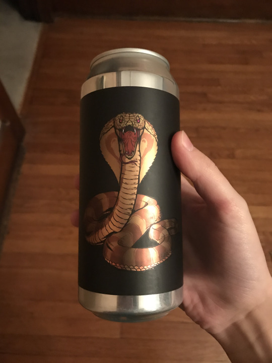
Lastly, I was recently at Total Wine with a friend and we LOVE good, craft beers. We’re walking around, picking out a few drinks to try, and I realized I was basing my decisions off of the packaging designs. One I immediately gravitated towards was a matte black cover with a golden brown cobra across the front. It was a sour, and I’m a sucker for a good sour, so I had to try it. Not only did I love the beer, but I loved the design so much I almost saved it just because of it’s look. I’m sure there were other amazing sour beers, but the design caught my eye. Brilliant marketing really does the trick when you’re in a cluttered, booze-filled store.

0 notes
Text
Week 4 - Found Object
For this assignment, I took a walk through my neighborhood. I live about six blocks south of campus near Sendiks on Downer. One of my favorite parts of the neighborhood is it’s mix of college students/renters and young families/home owners. It feels home-y, and all the local businesses/restaurants are a convenient addition. My favorite part, however, is the church I attend and live a block north of. On my walk, I spent a lot of time just admiring the architecture and design. The church has tons of large and small stained glass windows, but I had never really spent a ton of time observing them until now. The largest one is a big arch with a point right at the top. It almost looks like a pizza slice with rounded sides. The center is a circle in which designs pop out of - almost shaped like a daisy. In the corners of the design there are these circles that - I kid you not - look like fidget spinners. All of the colors are vibrant and compliment each other with greens, blues, purples, etc.
Functionally, it’s a window. It lets light in during the morning services (and probably saves us money on electricity since we don’t really need lights in the “house” until like 5 PM).
Yet, design wise, it’s a gorgeous addition to the space. It reflects the smaller stained glass windows that create little pictures of biblical passages. It ties the space together and serves as a backdrop for the worship band and preacher. The reflection of light through it as the sun sets creates such a strong ambiance inside and outside of the building.
The church has a few lights inside and outside of the main window to add a little color during worship sets. The ones outside usually shine green - not sure why. It adds a little extra to the colors the stained glass already has.
A glass window is something so simple, yet so beautiful. I’m sad I’ve never paid attention to it in the past! I’ve been going to church here for over four years and have lived in this neighborhood for two! Just goes to show how much we sedate ourselves these days. Our surroundings are beautiful and rich with design and light, but we choose to only perceive a small portion of what’s in front of us.
0 notes
Text
Week 3 - History of Design
1. I’m often very drawn to fonts. Because i work in PR, how words are portrayed visually is important to me and how I believe copy is perceived. Recently, I was grocery shopping at Trader Joe’s and was struck by their use of font. Everything is cohesive (even between stores considering it’s a chain), yet it all looks hand drawn and carefully created. There’s this sense of raw, naturalness to their signs which is incredibly fitting to their brand as a whole.
2. I went for a walk with a friend through walkers point and we stumbled upon a furniture restoration store. First of all, every single piece they were selling was gorgeous. Second, I was drawn to the mid century modern furniture - specifically the dressers. The legs are a bit curious to me, since most of our dressers now days either have short, rounded legs/pads or none at all. The handles that dig into the wood rather than attach are also quite striking. It feels like the definition of “retro” and that nostalgic culture.
3. I live quite close to lake park and spend a lot of time there during the summer and fall. There are a few beautiful bridges with ornate railings. I love the juxtaposition of their function, making sure people don’t fall off the bridge and die, and their beautiful craftsmanship. The gentle, curves of the structure versus the nature of their function.
4. My second job is helping out around University Housing on campus. I’ve always been interested in their signage because of it’s function. You can almost always tell when a sign is for an event because of it’s fun, almost campy qualities versus when a sign is about safety or policy within the res halls. There’s a much more stark, bold approach to the design elements on graphics made solely for information.
5. My church, Epikos (east side original fam - woop woop!) redid their logo within the past few weeks and I’m AMAZED with their new designs. Everything is cohesive, from the children’s ministry, to youth group, to Sunday service, to the website, etc. They’re centered around an image of a crown tipped on it’s side. The double meaning is that Jesus tipped our expectations sideways, but also the crown on it’s side looks like and E for Epikos! Brilliant and informative in multiple ways.
6. This might be a cop-out or a dumb one, but I would literally pee myself if I saw someone design this logo in a class at UWM it’s SO. GOOD. I drive past the Brewers stadium every Wednesday on my way home from teaching dance in Oconomowoc. Their logo with the m b forming a baseball mit? WHAT. SO GOOD. Thoughtful, informative, functional, and a HUGE staple for the team/Milwaukee as a whole.
7. There’s a new sign that was put up down by the art museum/US Bank building area. It’s an-almost stick person white light that’s shown endlessly walking. At first, I mistook it as a “walk” sign to go across the street - or just a fancy version of one. I think it’s meant to be more of a spectacle than an interactive or functional project, but it makes me think about the endless work of the business world the sculpture inhabits.
8. I was recently trying to get into a zoom call and in the process was messing with my airpods when I noticed how sleek and consistent Apple’s designs are. They trick us into thinking they’re innovative with their beautiful craftsmanship. The weight, the simplicity, etc. It’s truly beautiful, and fantastic marketing.
9. In my house we have one particular chandelier that always makes me giggle. It’s function, obviously, is to provide light, but the design, however, is my landlords name etched into glass surrounding the light which creates a shadow of his name around our hallway. Hilarious, and now I want one of my own.
10. I live close to Stone Creek, and although I don’t like coffee I find myself meeting people their quite often. A friend of mine and I stopped by for him to grab coffee, and I was playing with their mugs. I actually really appreciated the detail in one specifically, where the top of the handle was flat for your thumb to rest on. It’s an additional thought in the design that makes the mug that much more functional. If I liked Stone Creek, maybe I’d buy the mug!
0 notes
Text
Week 2 - Design Thinking
TI would define design thinking as an innovative, collaborative process where designers create through a thorough knowledge and understanding of the idea, product, or service the design is being created for. It’s a deeper, more integrated way of approaching design, rather than just making an already thought-out product more flashy or desirable through graphics.
The Harvard Business Review defines design thinking as, “a methodology that imbues the full spectrum of innovation activities with a human-centered design ethos” and goes on to say, “ innovation is powered by a thorough understanding, through direct observation, of what people want and need in their lives and what they like or dis-like about the way particular products are made, packaged, marketed, sold, and supported.
One of the significant concepts touched on by this article was what I called the “keys” to design thinking (and likely just design/art in general). The keys were listed as:
Empathy
Innovative thinking
Optimism
Experimentalism
Collaboration I think a lot of times we look at design in a productive way. How does this serve the client, the consumer, the product, etc.? That can put a barrier between the creative and the creation, so these “keys” are an amazing way to simplify the complexity of design thinking. It allows for the artist to focus on a more humanistic approach to their work. The second significant concept I was struck by is best explained by the article itself, “ The myth of creative genius is resilient: We believe that great ideas pop fully formed out of brilliant minds, in feats of imagination well beyond the abilities of mere mortals...[design is] neither a sudden breakthrough nor the lightning strike of genius; it is the result of hard work augmented by a creative human-centered discovery process and followed by iterative cycles of prototyping, testing, and refinement.” Many people view art as some ethereal gift bestowed upon a select few by God himself, and while natural talent/viewing the world differently can be inherent, that does not beat hard work and refining. The greatest work is honest, tended to, and understanding.
0 notes
Text
Week 1 - About Me
My name is Maddie and I’m in my last semester at UWM. I’m a double major in Dance Performance and Choreography, and JAMS with a focus in Advertising. I’m probably one of the busiest college students you’ll ever meet between two majors, two jobs, working on a SURF research project, volunteering at multiple churches/religious student organizations, dating long distance, and being a snake mom to the cutest lil ball python in the whole wide world!
I’ve always been interested in design--especially because of JAMS--but have never taken the time to learn about it past basic photoshop and indesign skills. I decided to take this class to broaden my understanding of how design has progressed and influences us.
I’m always inspired by people who create and design out of the box. I recently finished an internship with Bader Rutter, and I was so amazed by the Art Directors and Graphic Designers at the agency. Design can take the most mundane products or simple copy and turn it into an eye-catching advertisement. Without them, my work is almost lifeless.
I’m often drawn to designs that are either nostalgic/retro, minimalist, or muted tones. From hand-drawn script to bold bubble letters, if it’s a subtle statement I’m probably interested. However, anything with bright colors (unless it’s a neon sign for some reason) is a big no from me. I hate color, which probably isn’t great from a design perspective. This is definitely reflected in my work (and also my entire wardrobe with it’s black, white, grey, taupe, and denim shades).
Despite the difficulties surrounding COVID and the hiccups it will likely create, I’m excited to get started and learn more as the semester progresses! We’ll find out how the struggles of online learning change the way design is perceived and critiqued through this process.
Cheers! - Maddie
1 note
·
View note